Portfolio Website | WordPress Development

Fahad Qaseem Khawar


The Brief
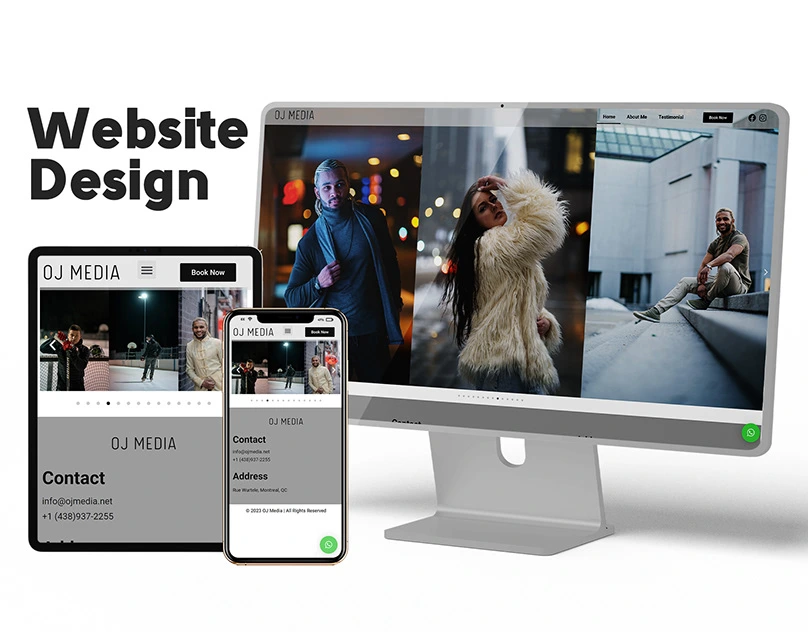
A photography and media professional needed a portfolio website that let their work do the talking. The site had to showcase photography and video projects in a visually immersive way, while being easy to update through WordPress as new work came in.
Design Approach
The design was built around one principle: get out of the way of the work. Large imagery, minimal UI chrome, and generous whitespace let each project breathe. The layout uses a grid system that adapts fluidly across screen sizes, so the portfolio looks intentional whether someone's browsing on a 27" monitor or scrolling on their phone.
Typography was kept clean and understated. Navigation is simple and direct, letting visitors move between project categories without friction.
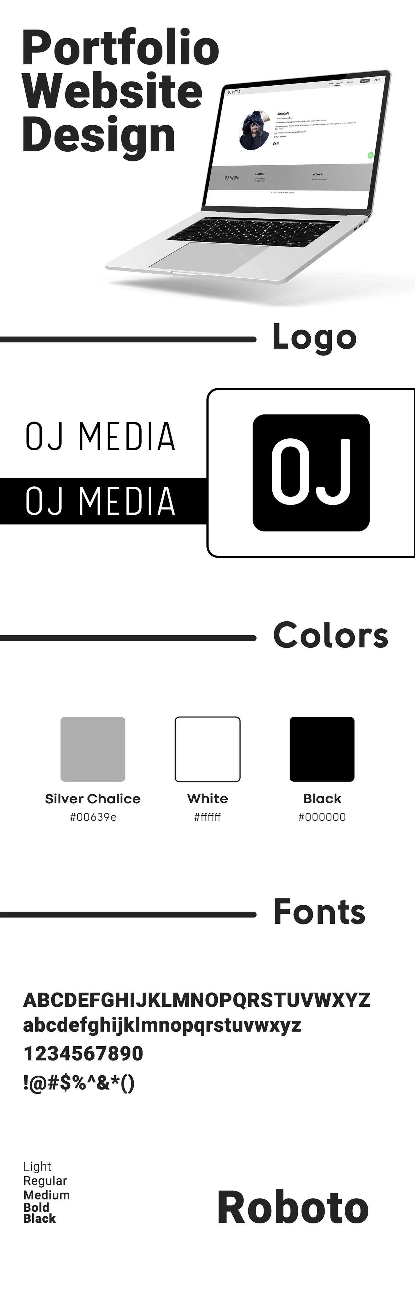
Website Overview
WordPress Development
The site was built as a custom WordPress theme with a focus on performance and ease of use:
Portfolio management: Custom post types for projects, so adding new work is as simple as uploading images and filling in a few fields
Responsive design: Fluid layouts that adapt from mobile to ultrawide without breakpoint awkwardness
Performance: Optimized image loading with lazy load, compressed assets, and clean markup for fast page speeds
SEO structure: Semantic HTML, proper heading hierarchy, and meta tag management built into the theme
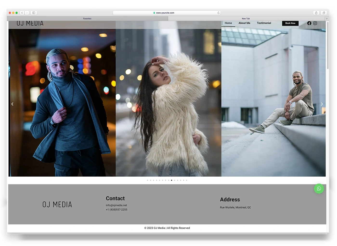
Website Sections
The Result
A portfolio site that feels premium and personal. The design puts photography front and center while the WordPress backend gives the client full control over content updates. The site serves as both a portfolio showcase and a lead generation tool for new photography clients.
Deliverables
Custom WordPress theme design and development
Responsive implementation across all devices
Portfolio/project custom post type with category filtering
Image optimization and lazy loading setup
SEO-optimized page structure
Content management system training and handoff
Launch support and hosting configuration
Like this project
Posted Jul 3, 2026
Likes
0
Views
12
Timeline
Mar 1, 2023 - Ongoing
Clients
OJ Media
Ecombranding.co