UI UX Design - Crypto Currency app - Case of Study
Check out the prototype of the whole app
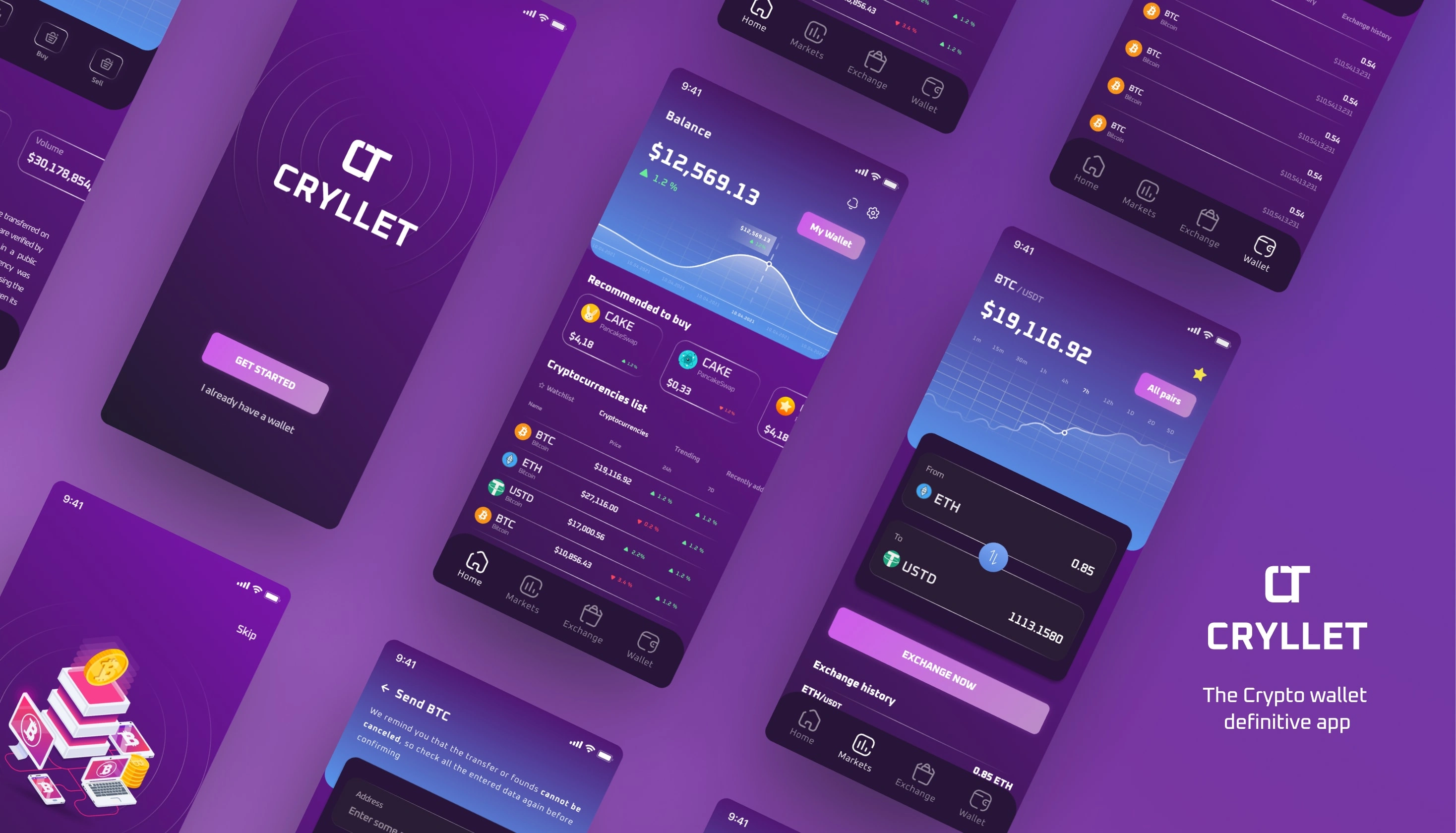
Project Thumbnail
About Cryllet
Cryllet is a conceptual Crypto wallet app that I designed using Figma. The app is a modern crypto wallet for all the users that would like to exchange, buy, send or receive all the types of crypto currencies. The main feature of the app is to use all the method of interaction, with all the safe warranties. Every user can transfer and exchange cryptocurrencies and exploring new features.
Responsibility
Conduct Interviews
Understanding Empathy
Analyzing Research Data
User Flows and Sitemaps
Mobile Navigation
Low-High FIdelity Protoyping
Conduct Usability studies
Problem - Case of Study
Lack of security features like 2-factor authentication and biometric logins which makes users wary of using the app and storing large amounts of crypto assets in it.
Limited support for only a few major cryptocurrencies. This reduces the app's appeal to crypto enthusiasts interested in a wider range of altcoins.
Lack of integration with hardware wallets which limits the options for users interested in maximum security.
Solution
To solve these issues, I proposed the following solutions:
Add 2-factor authentication and biometric logins for enhanced security. This would make users feel more secure about their funds and build trust.
Integrate hardware wallets to provide maximum security. This would attract more advanced users and crypto enthusiasts.
Regularly add new features and coins to keep the app up-to-date with the latest technologies and trends in the crypto space. This would keep users engaged and attract new users.
By implementing these solutions, Cryllet can overcome its key issues, gain more users and become a popular crypto wallet app. Continuous improvements and innovation would help Cryllet stay ahead of the competition.
Design Process

Design Process
User Research
I conducted a interview session for people of different age groups. Its helped me knowing their daily routines, problems they are facing while exchange, buy send or recibe any crypto currency and many more helpful things
To gather insight for the project, I conduct one by one interviews with 4 people at the age group of 20 to 40 years old.
Understanding the users
To gain the insights into the user behavior and expectations for using the crypto currencies, i asked some open-ended questions to some of the participants
My aim was fo find out what needs of the user I need to fulfill and what are their pain points
The questions i asked the users
What are your major reasons for using cryptocurrencies?
How often do you use cryptocurrency apps or wallets?
What are the features you look for in a cryptocurrency wallet or app?
Which cryptocurrencies do you trade or invest in the most?
Afinity Mapping
Affinity Mapping incluides the sorted user statements through which we can sort out Motivations, Pain Points, Age group, Goals and habits
Person 1

Afinity mapping person 1
Person 2
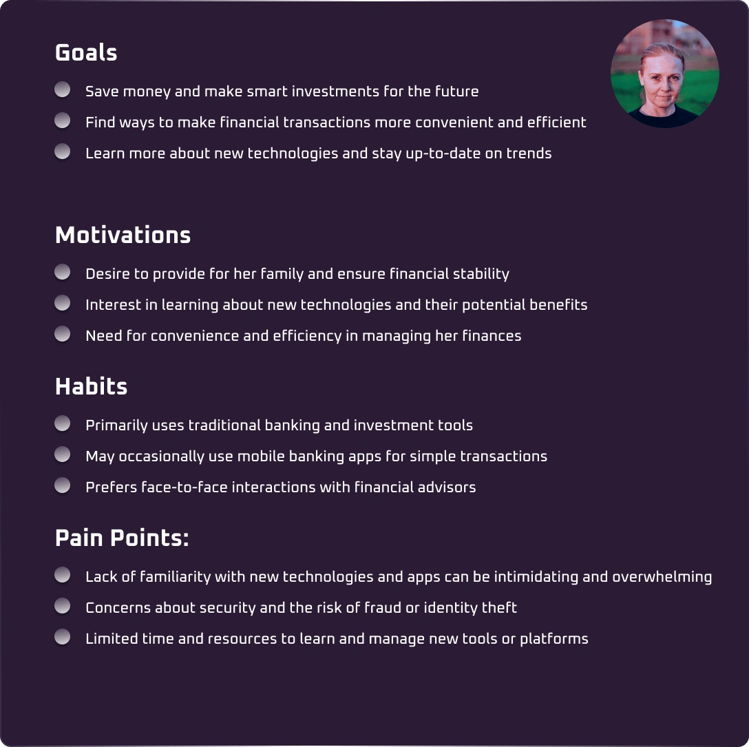
Afinity mapping person 2
Person 3

Afinity mapping person 3
Empathy mapping
Affinity Mapping incluides the sorted user statements through which we can sort out Motivations, Pain Points, Age group, Goals and habits.
Person 1
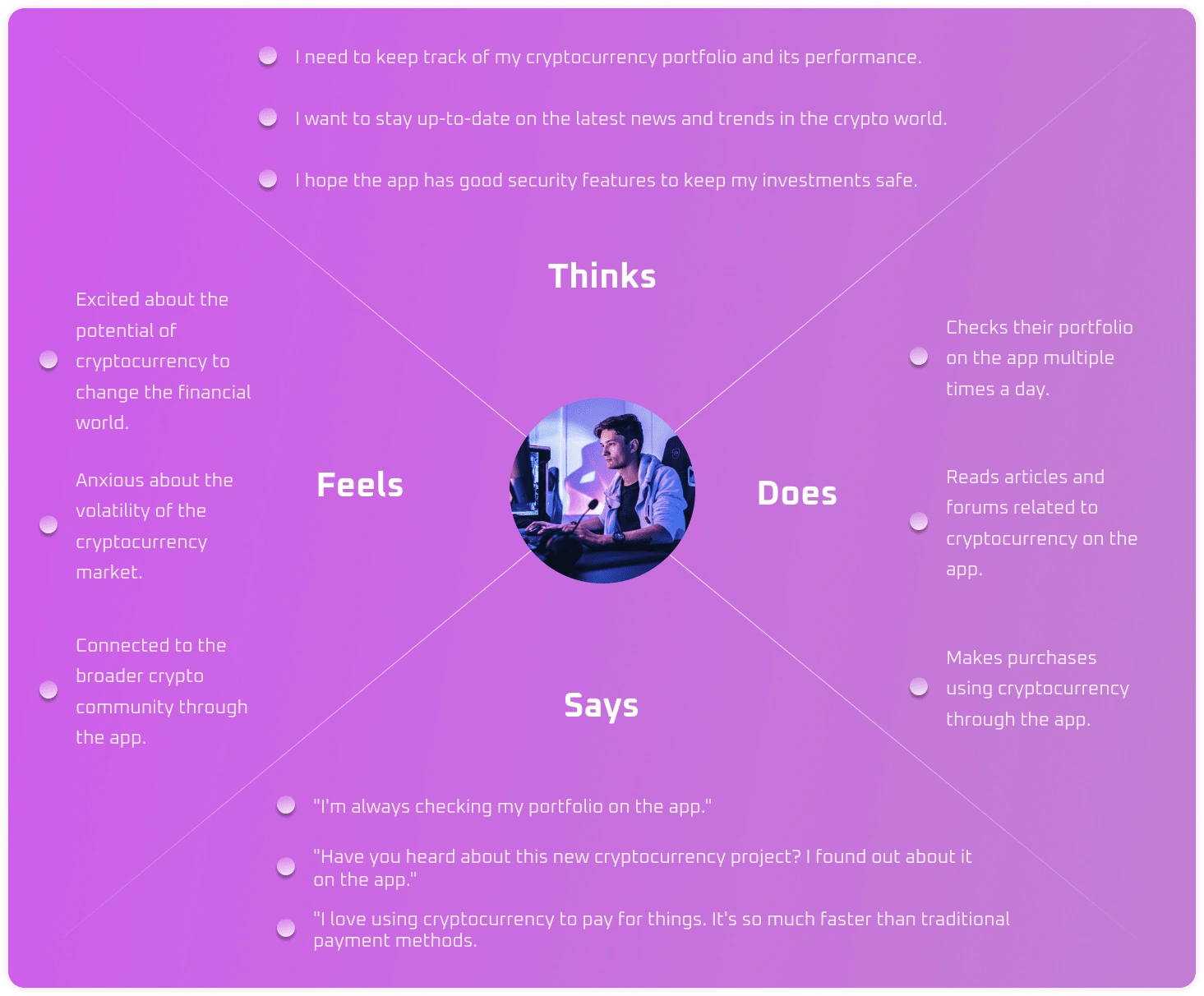
Empathy mapping person 1
Person 2
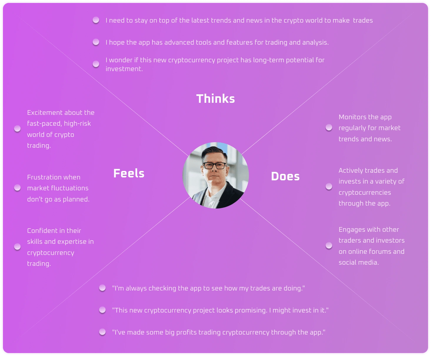
Empathy mapping person 2
Person 3
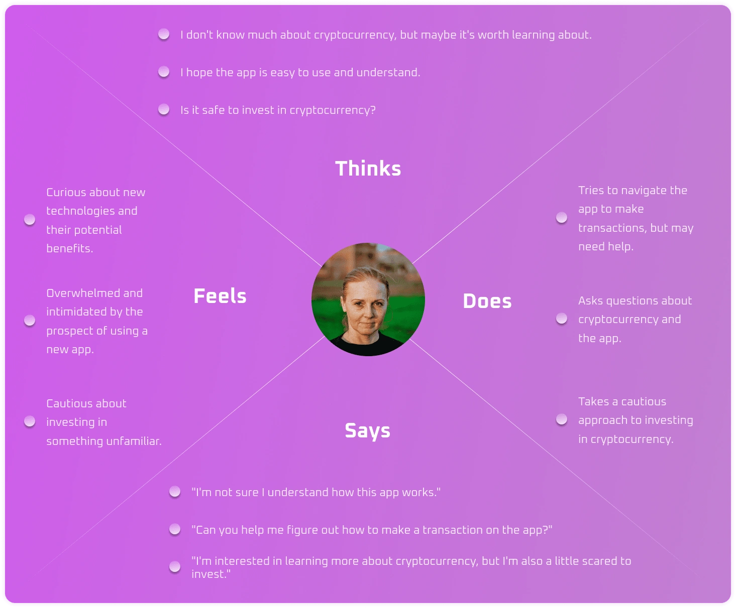
Empathy mapping person 3
Site Map
Once all the Person's dutys are done, now its time to provide a clear site map of the posible parts of the app, considering all the pain points and needs.
Due to this rationale, I opted to construct the site map in hierarchical tiers aligned with the users' interaction levels. Additionally, I established five primary links to facilitate user engagement, each encompassing a minimum of three interaction levels:
Home
Markets
Exchanges
Wallet
Configuration
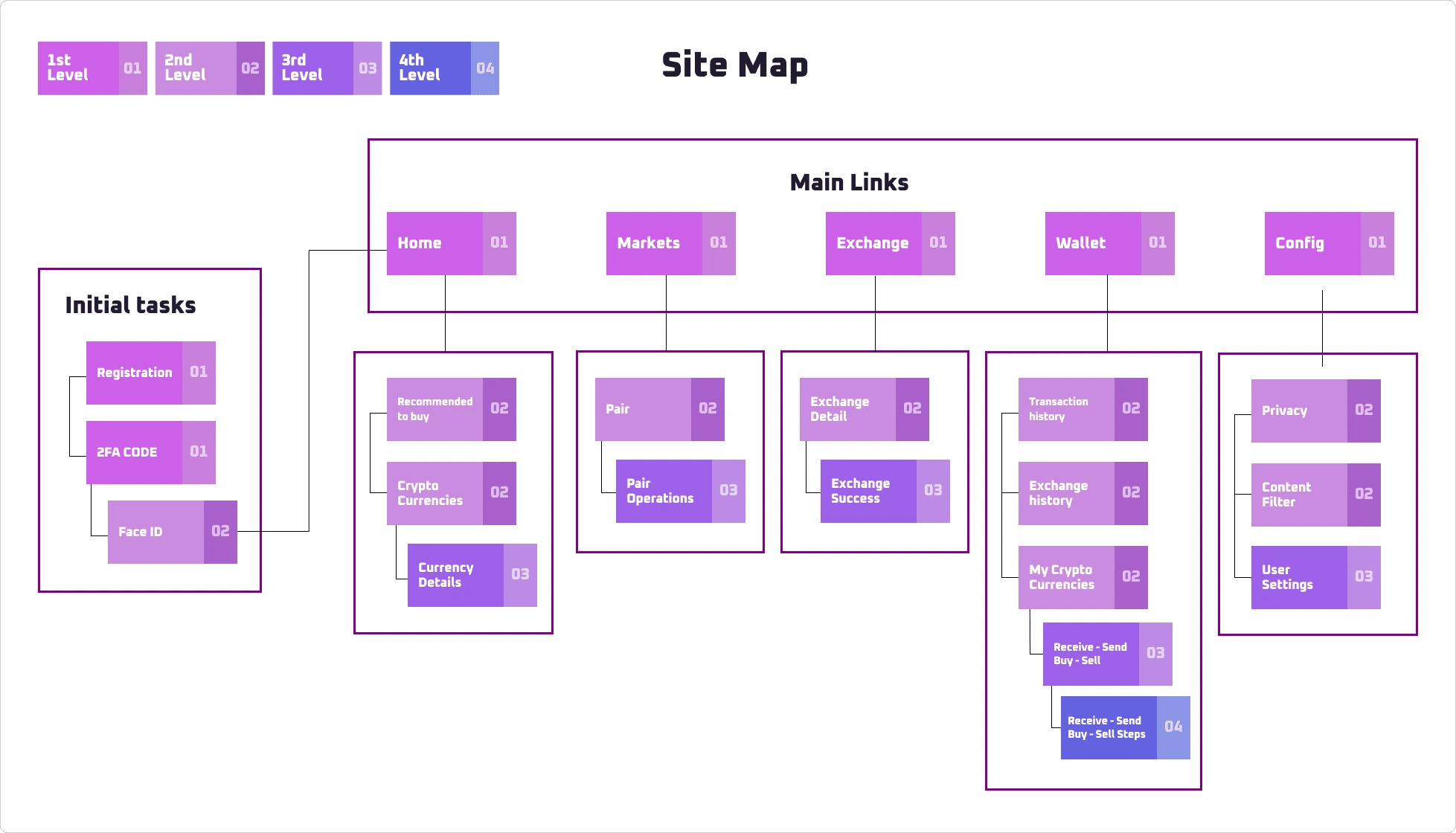
Site map of Cryllet
User Flow
With the completion of the site map, the next phase involves creating the user flow. In this instance, I focused on the action of sending currency, outlining the sequential steps users need to follow to send a specific type of currency to another user. The process is intricately detailed, encompassing potential future actions and presenting users with alternative options in case they do not meet the task requirements.
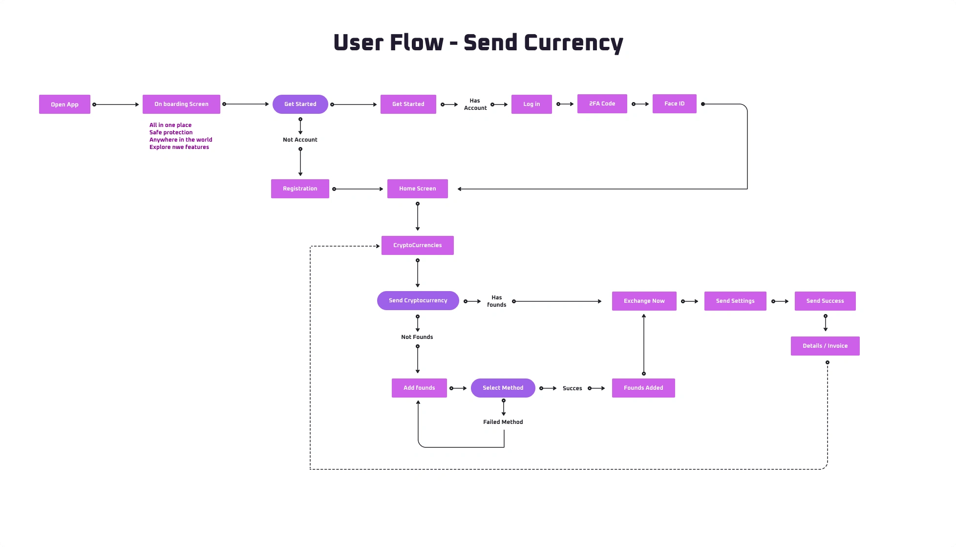
User Flow - Send Currency
Visual Design, Colors and Typography
Following extensive user research and the definition of main content and components, the focus has now shifted to applying a stylistic approach. Opting for a modern aesthetic with a futuristic flair, I chose a purple chromatic palette that resonates with specific user preferences. This choice is informed by research indicating that such colors are closely associated with the crypto world and its trends. The result is a minimalist and contemporary style that aligns seamlessly with the aesthetics prevalent in the crypto space.
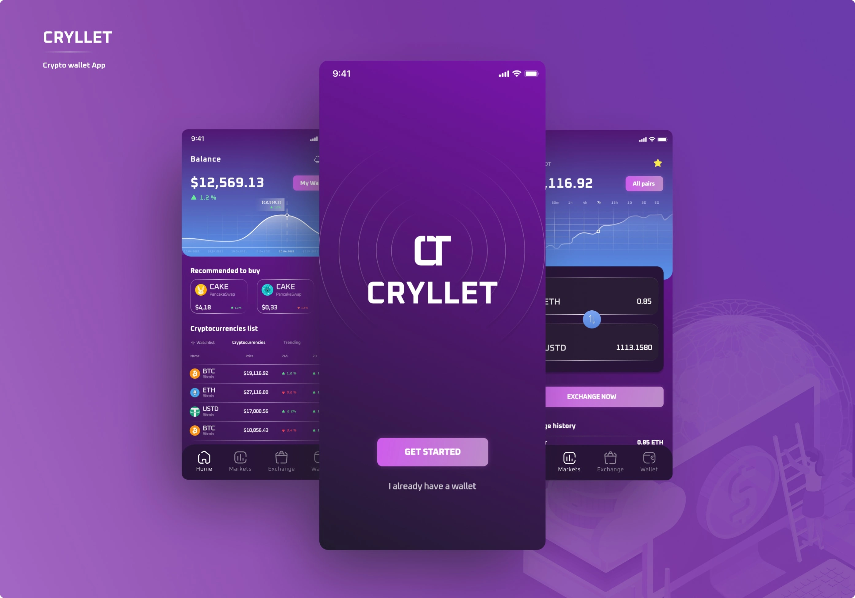
Cryllet - Crypto wallet app
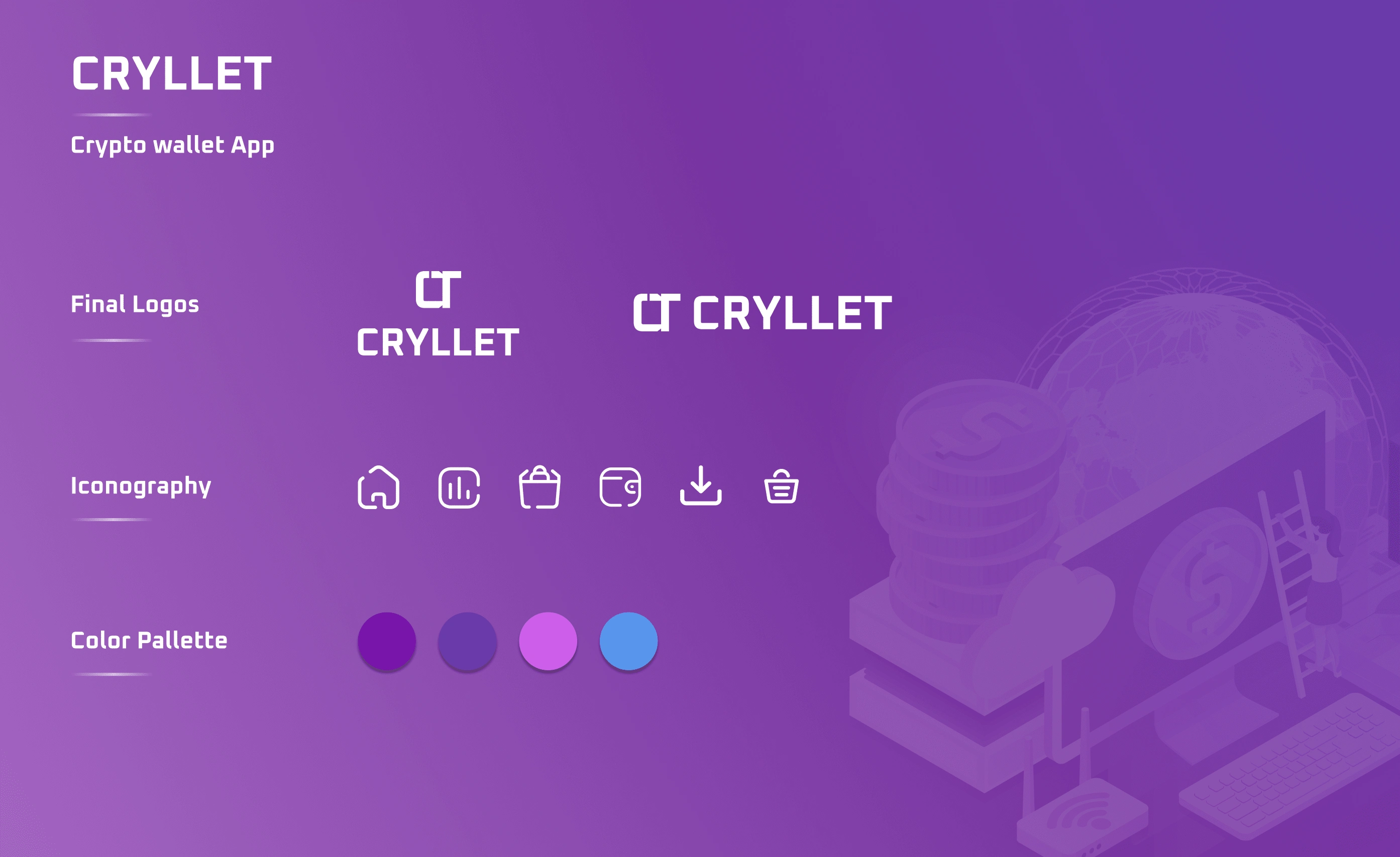
brand style
Onboarding
Initially, users can access comprehensive insights into the app's key features: centralized information, robust security measures, global accessibility, and exploration of new functionalities, all conveniently located in one place. Subsequently, the login process unfolds, encompassing authentication phases and providing users with the option to integrate Face ID, streamlining access and reducing reliance on password entry for every interaction.
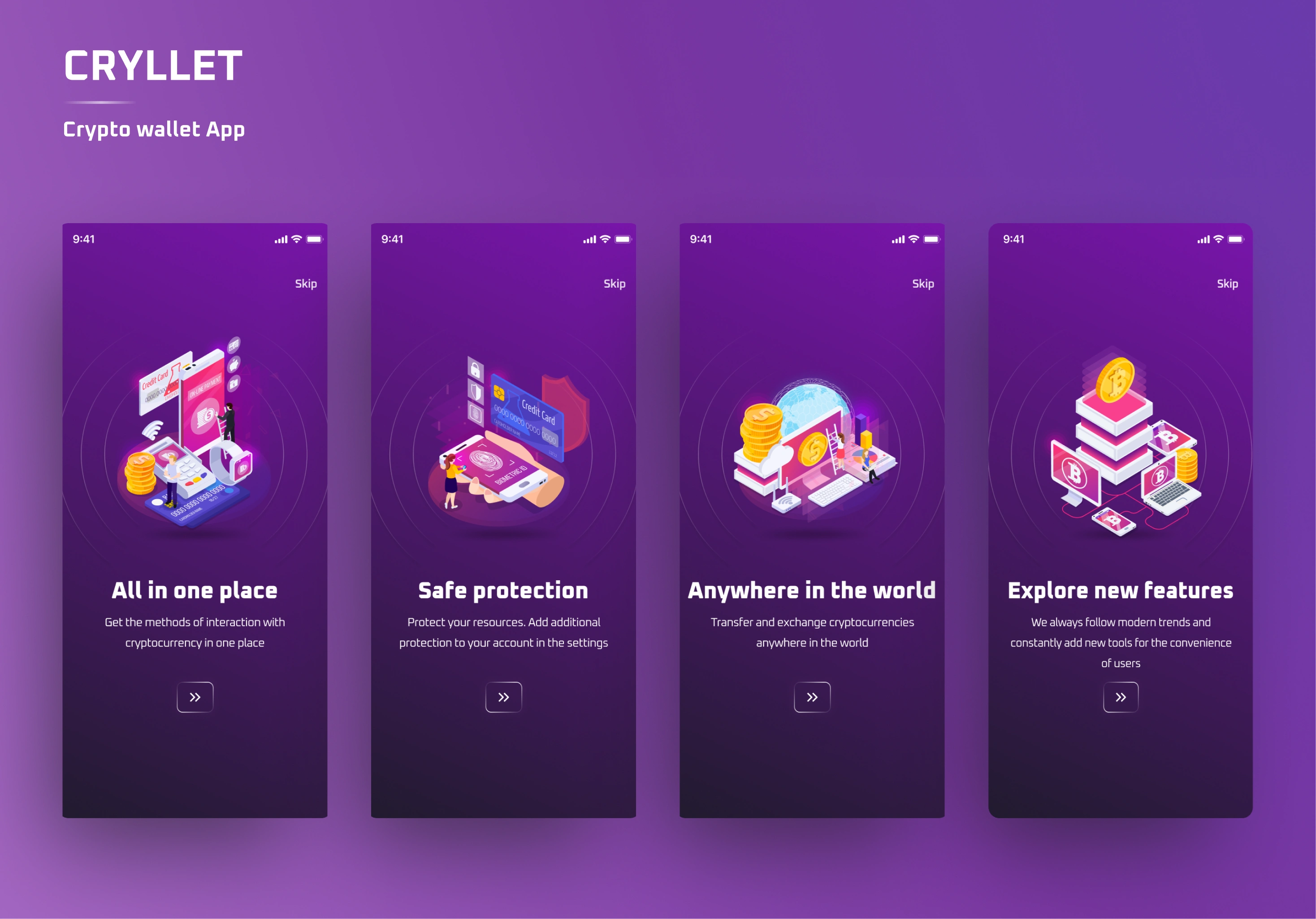
All the app features
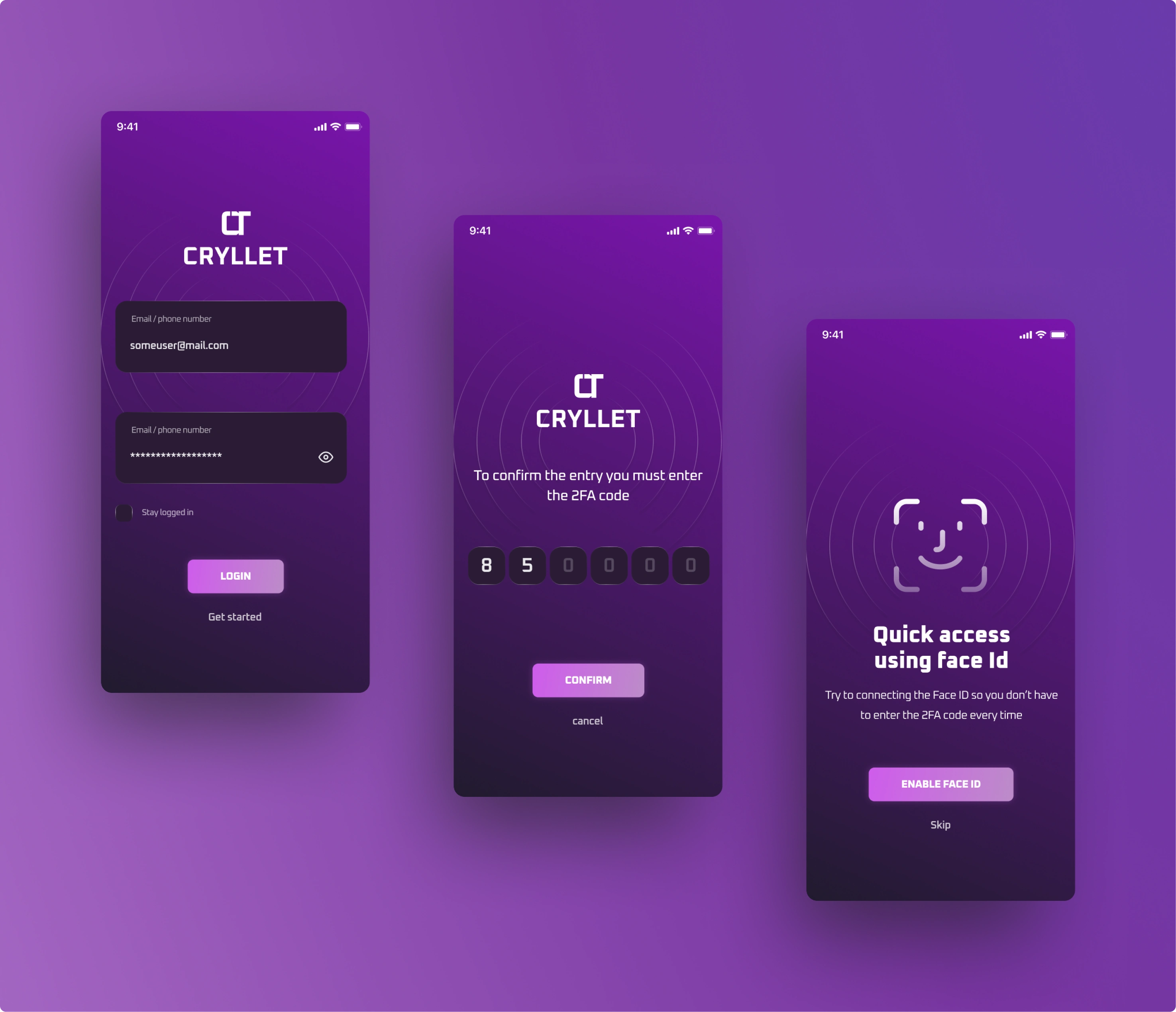
Cryllet - Login Process
Home and Cryptos
On the home screen, users can seamlessly immerse themselves in the cryptocurrency market while obtaining an overview of their wallet's general status. The screen displays a comprehensive list of current cryptocurrencies, providing brief insights into each. Users also have the option to augment their experience by adding a currency to the watchlist. Notably, the platform offers a valuable feature allowing users to monitor currencies that align with market trends and their individual preferences, aiding in informed decision-making regarding potential purchases.
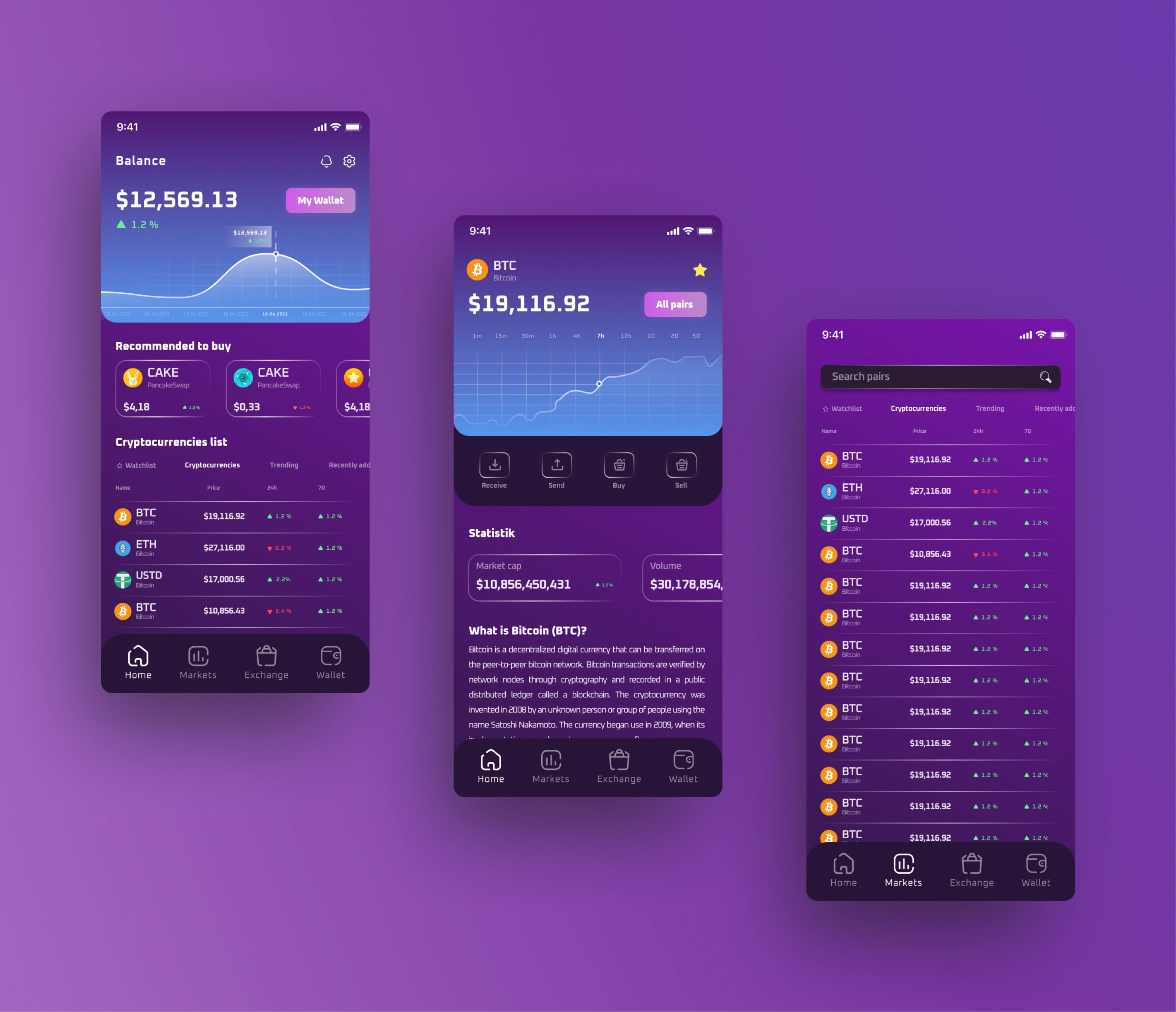
Home Screen and Cryptos
Exchange / Sell - Buy a currency
Now comes the currency exchange feature, empowering users to select the currency they wish to exchange and concurrently determine the desired counterpart. Towards the bottom of this section, users have access to the exchange history for the chosen currency, as well as an overall history spanning all currencies. Upon selecting both currencies, the exchange process unfolds, presenting users with comprehensive details and relevant information. Subsequently, users can opt to continue, and the app seamlessly redirects them to the main screen, offering the flexibility to either select another currency for exchange or proceed with sending the exchanged funds to another account.
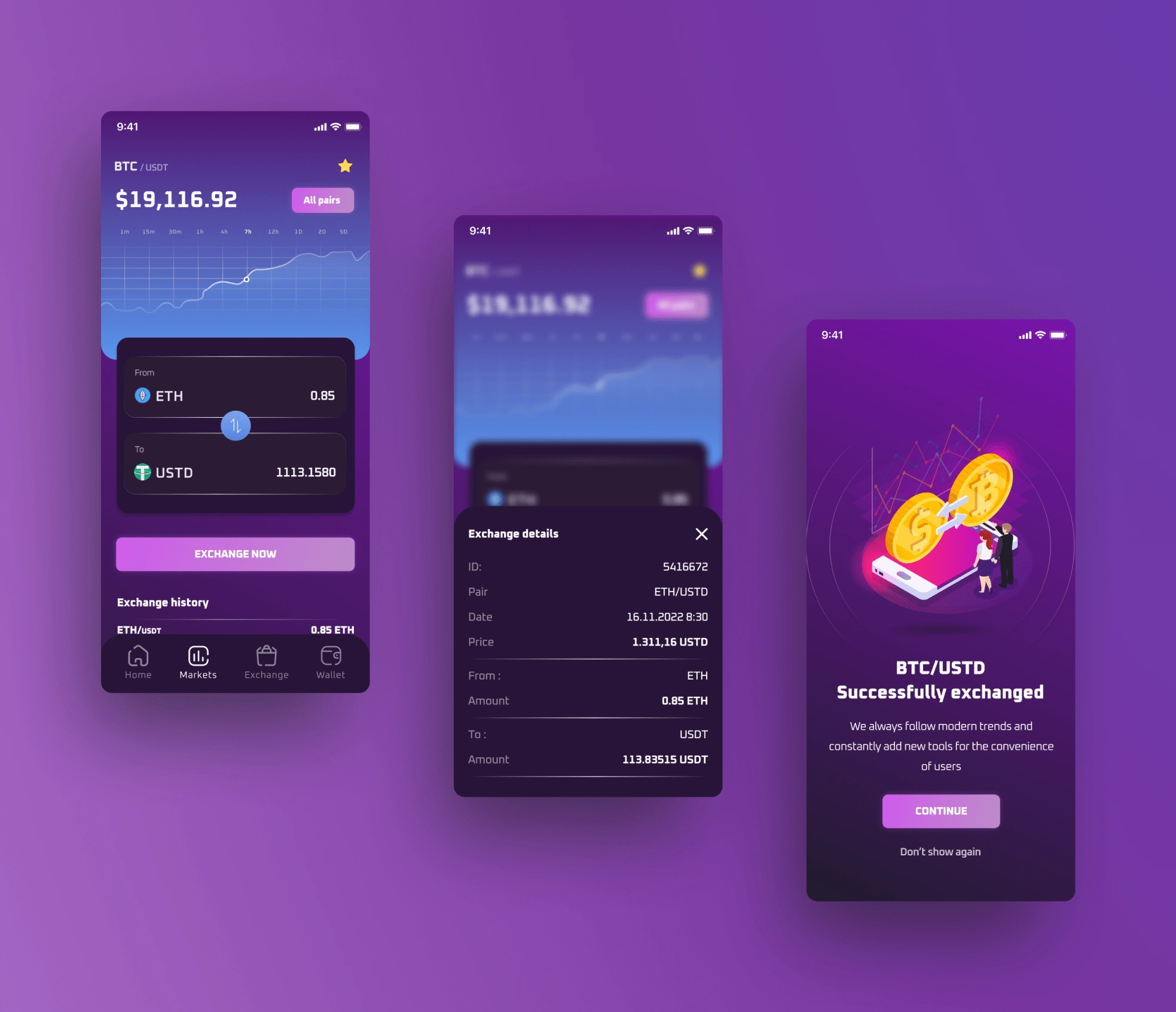
Exchange currency
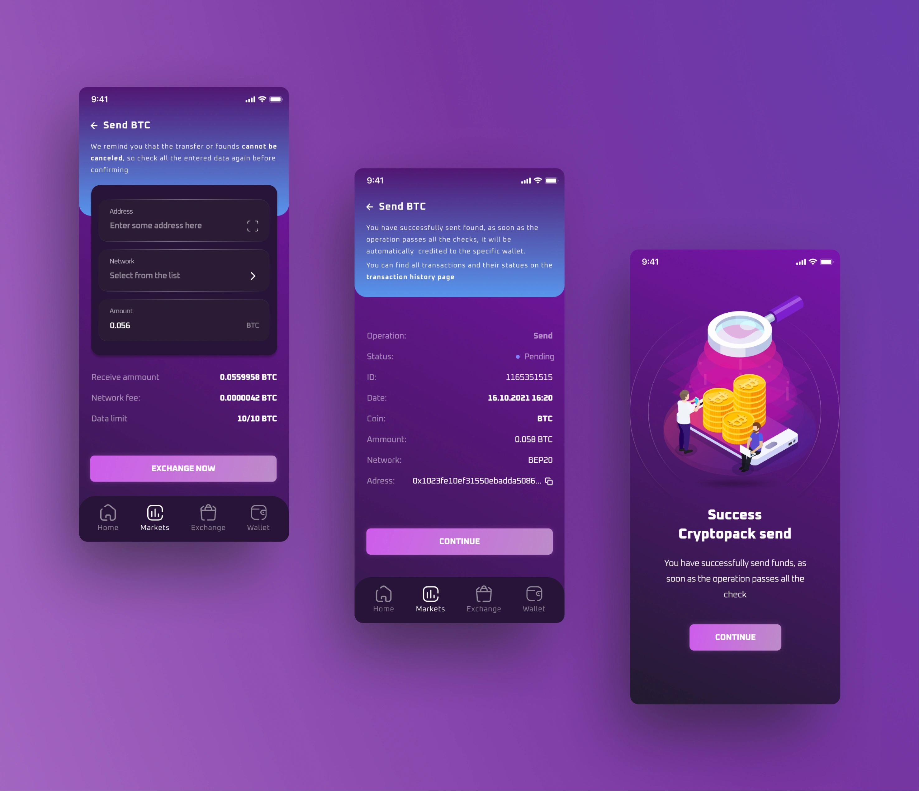
Send currency
Conclusion and Learnings
In conclusion, the user interface (UI) and user experience (UX) design considerations for the cryptocurrency app are meticulously crafted to enhance user interaction and engagement. The modern and minimalist style, informed by a futuristic approach, aligns seamlessly with the preferences of the crypto community. The comprehensive home screen provides users with a centralized hub for exploring the cryptocurrency market, managing their wallet, and making informed decisions based on market trends.
The user flow, from logging in with authentication options such as Face ID to navigating through currency exchange, is thoughtfully designed to prioritize user convenience and security. Each feature, from exploring and adding currencies to the watchlist to executing exchanges, is seamlessly integrated into the app's framework. The intuitive design facilitates a smooth and efficient user experience.
Noteworthy features, such as the ability to monitor market tendencies for potential purchases, contribute to the app's user-centric approach. The exchange process is transparent, offering users detailed information and history to foster confidence in their transactions.
As a final learning, the key takeaway is the importance of a user-centric approach that embraces continuous improvement. By remaining adaptable, receptive to user feedback, and attuned to industry shifts, future designs can be refined to meet the evolving expectations and demands of users in the cryptocurrency space.
Like this project
Posted Feb 5, 2024
Cryllet is a conceptual Crypto wallet app. The app is a modern crypto wallet for all the users that would like to exchange, buy, send receive currencies
Likes
0
Views
168

