Zero Bakers. Zero Photographers. Kritsi Brand Identity

Isabella Guran

Zero Bakers. Zero Photographers. Zero Budget. Here's a Full Brand System Anyway.
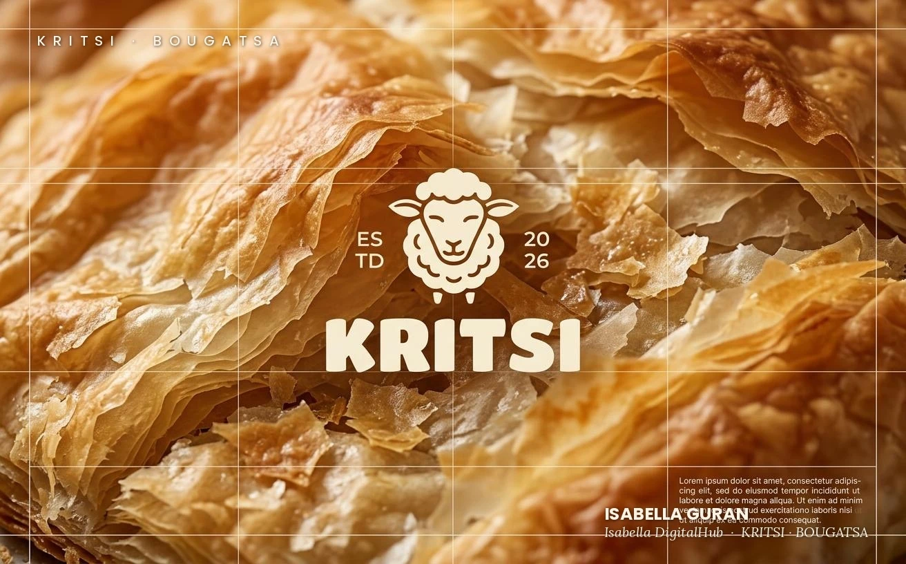
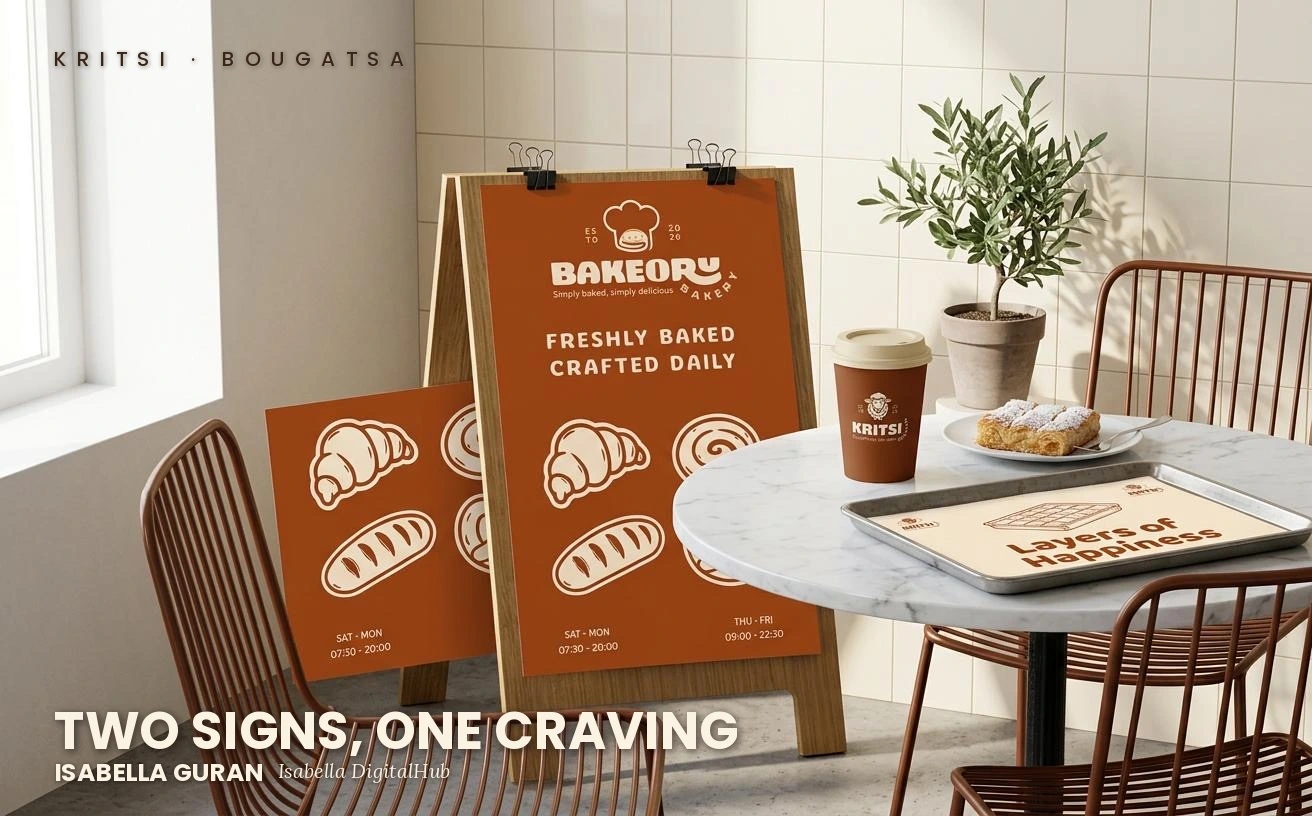
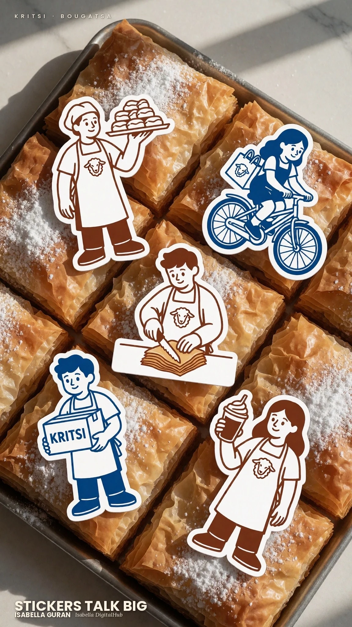
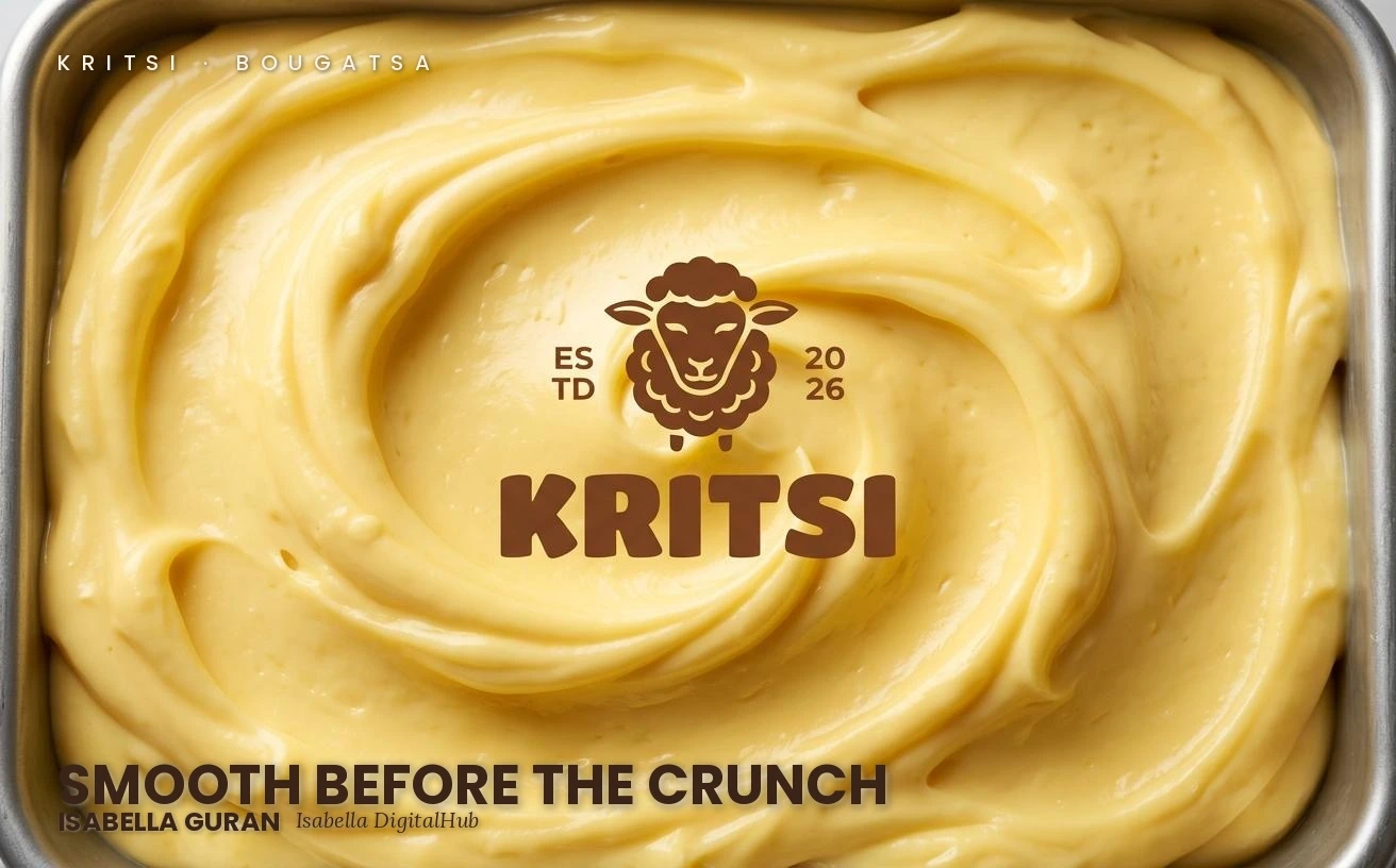
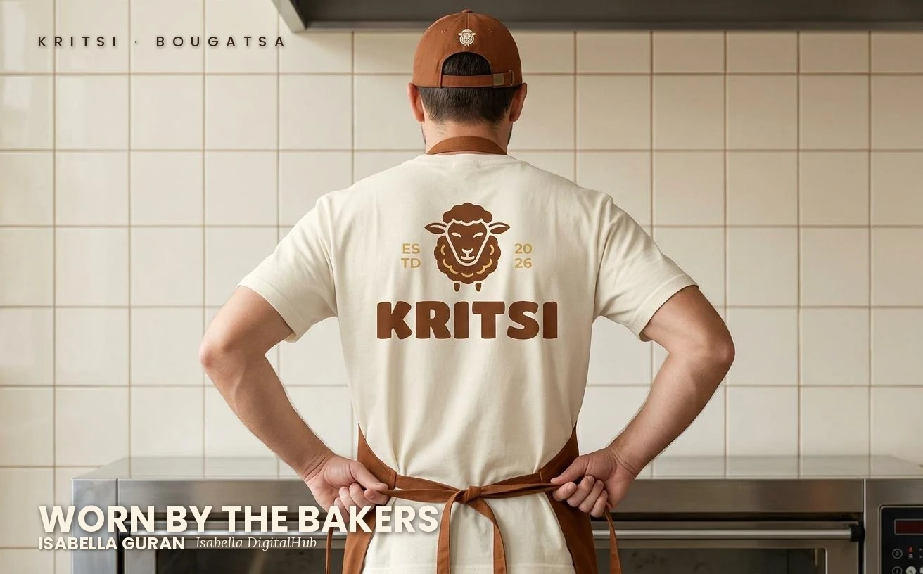
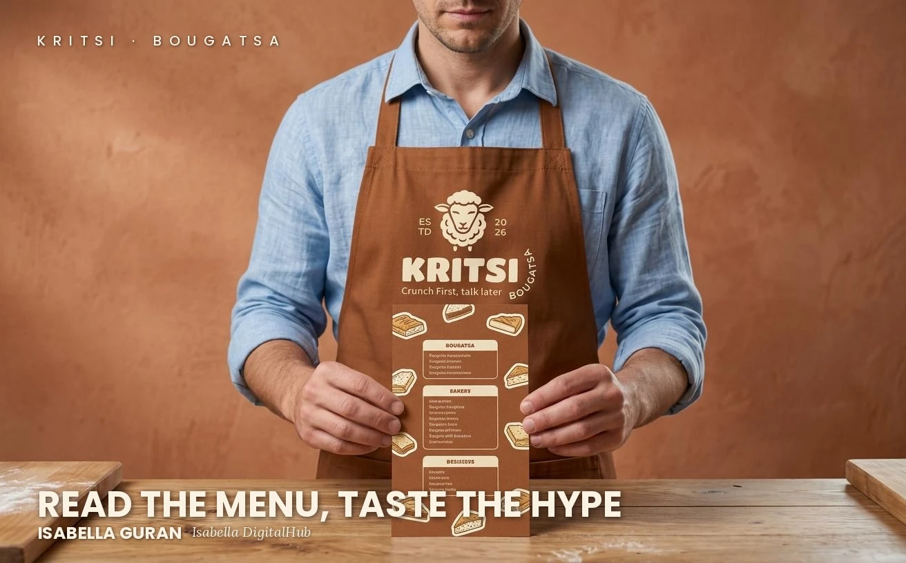
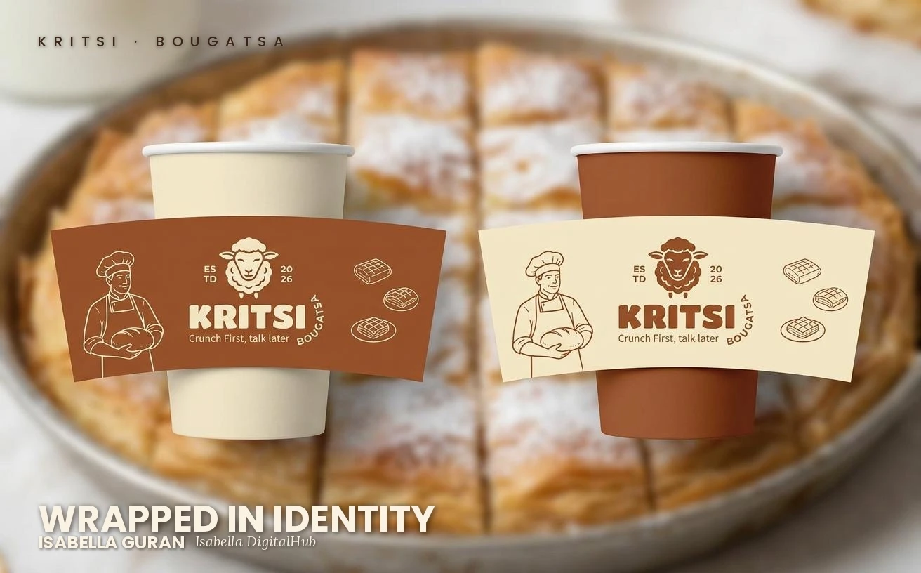
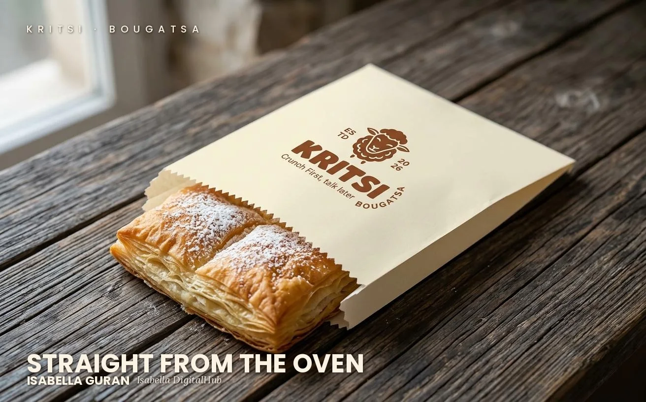
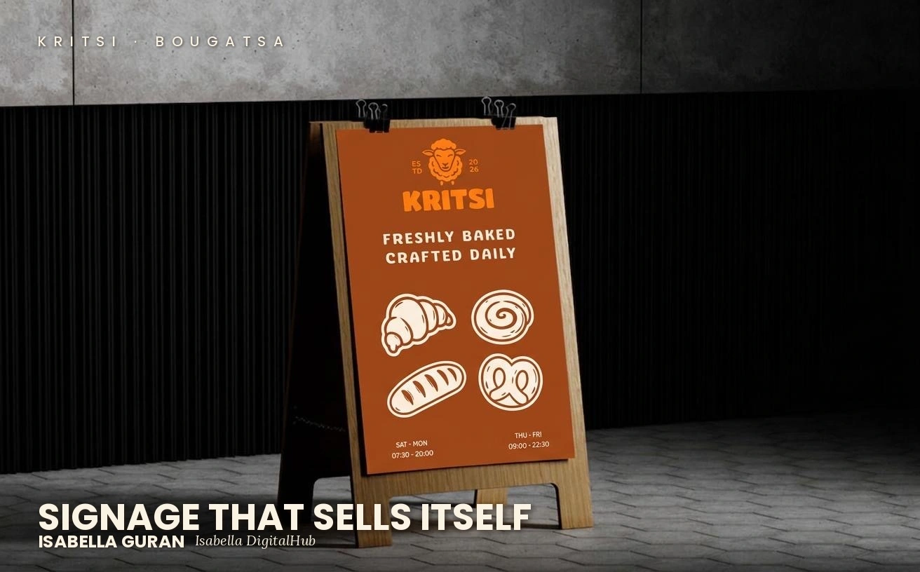
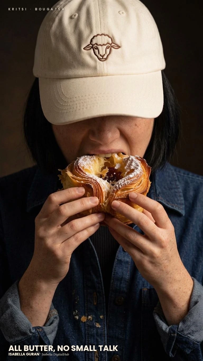
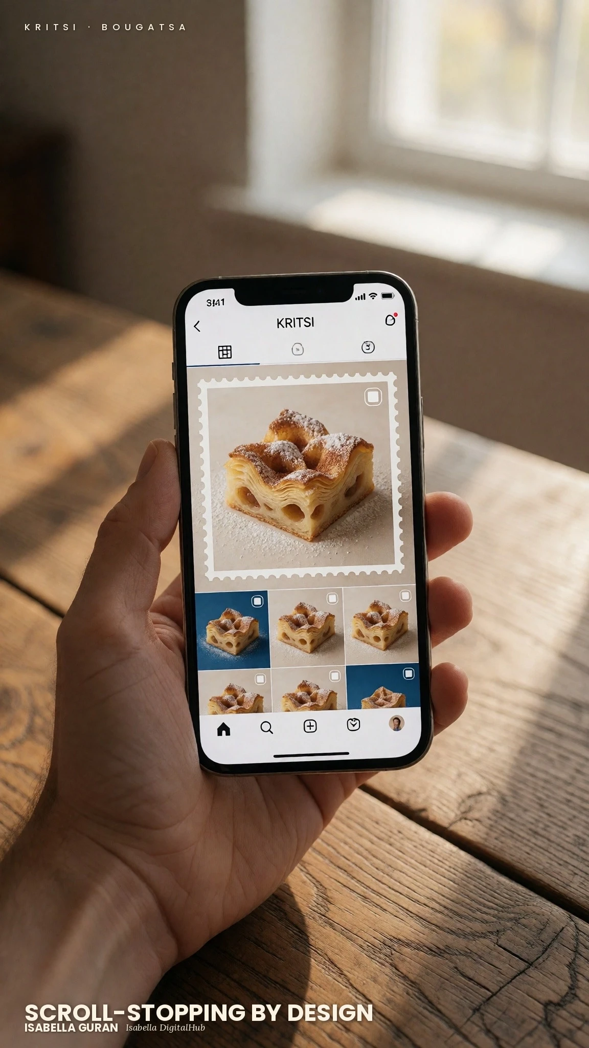
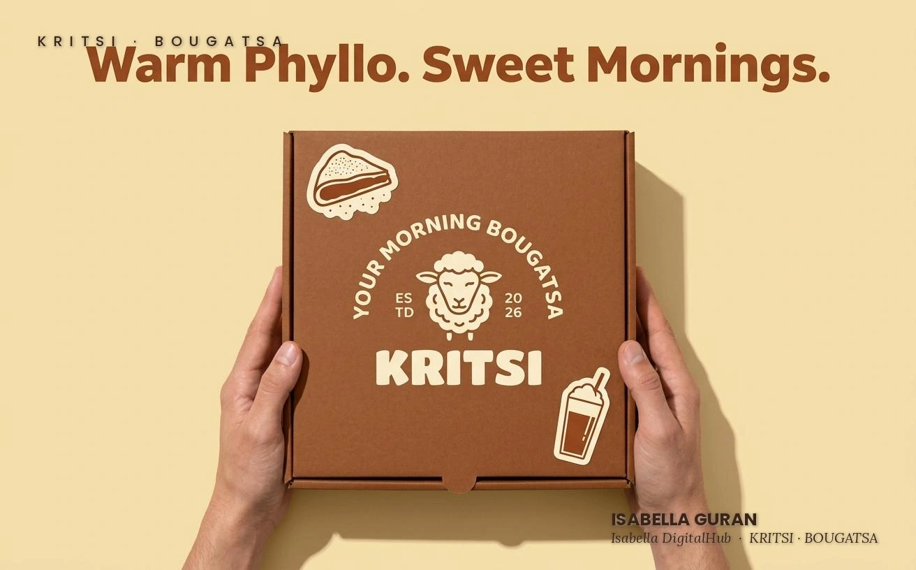
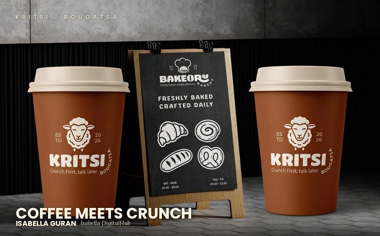
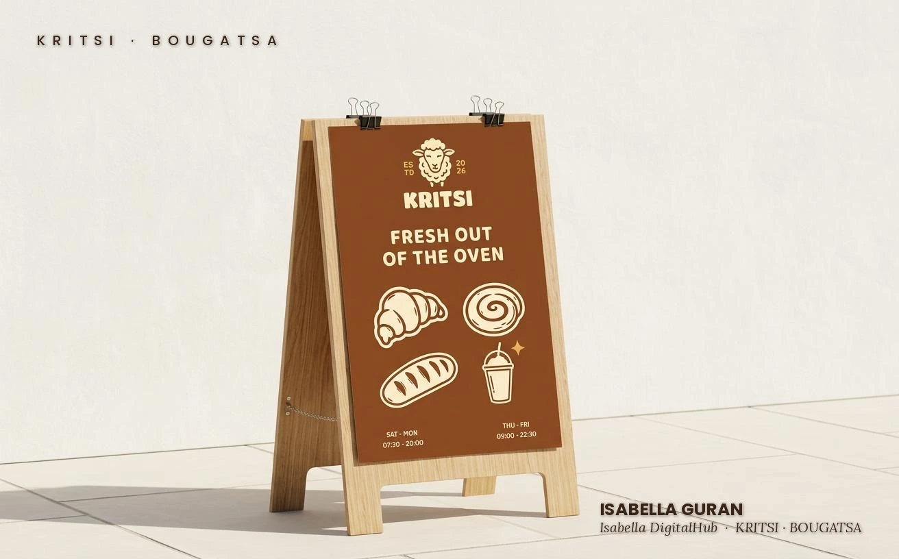
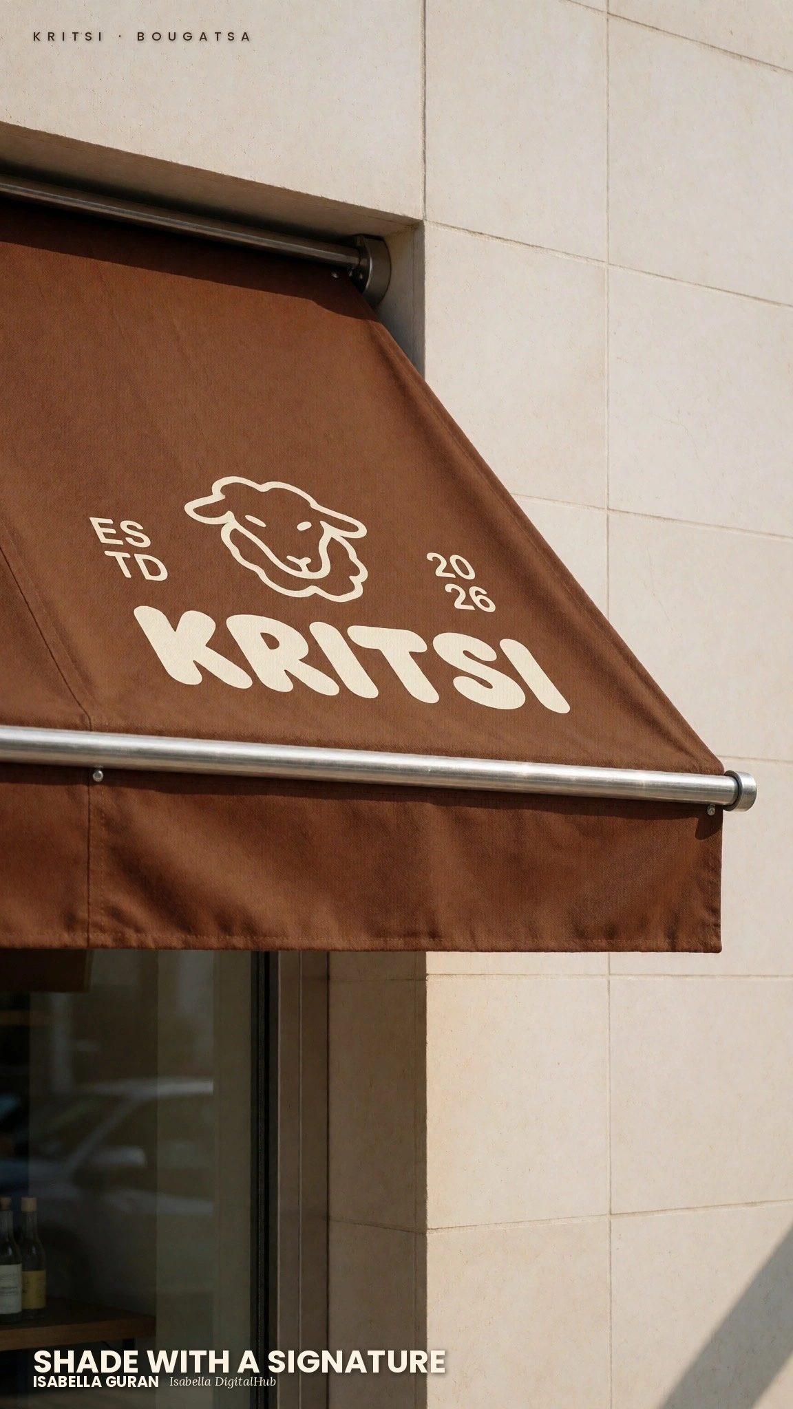
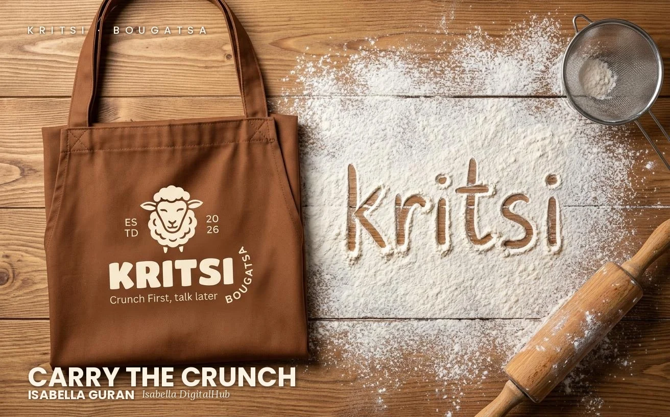
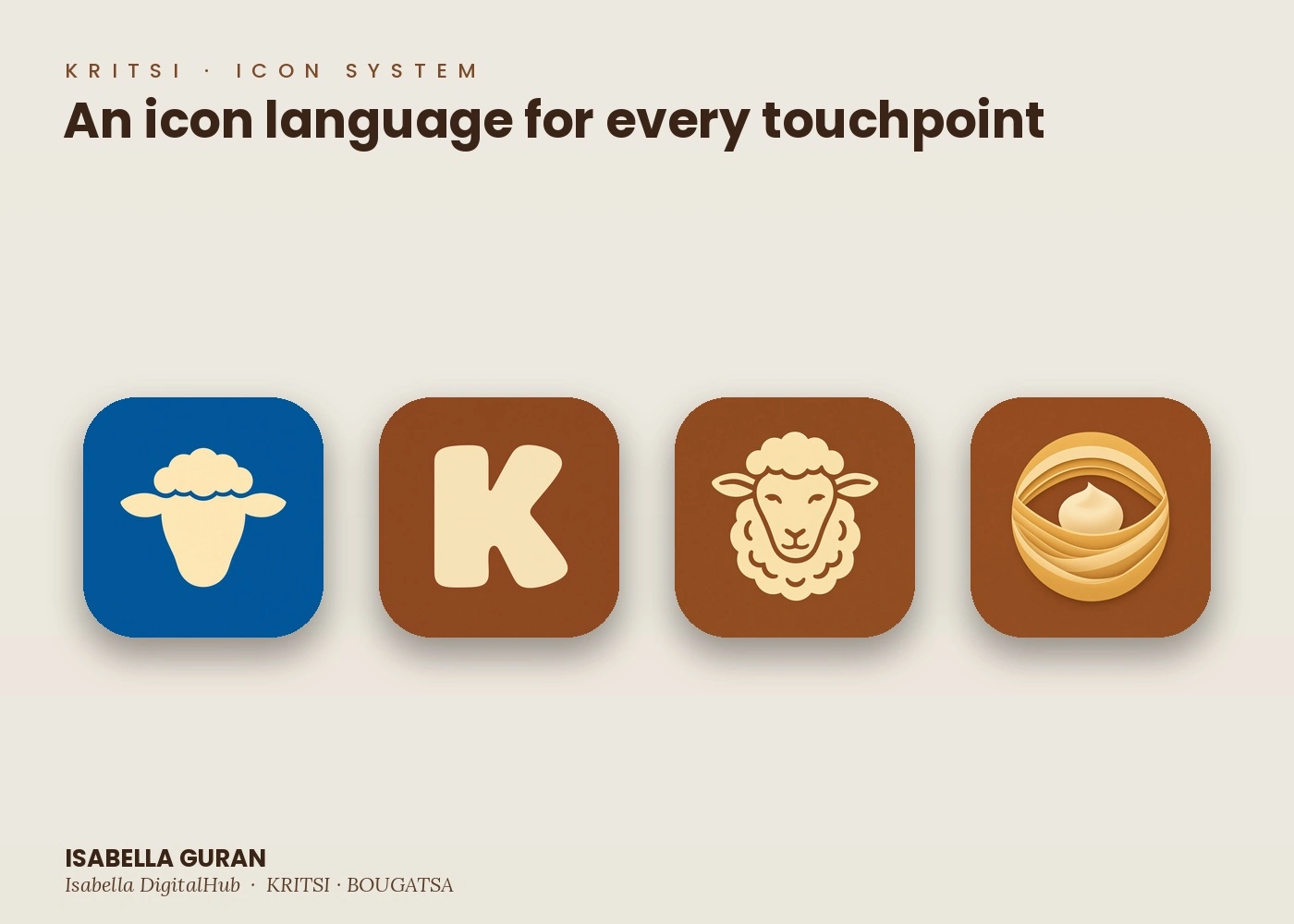
KRITSI started as a question I couldn't stop chasing: what happens when you strip a brand launch down to nothing but an idea and a laptop. No bakery. No hired photographer. No production budget. Just a concept for a bougatsa brand and every tool I could throw at it.
What came out the other side is a complete identity system. A name, a wordmark, a color story built on warm brown and cream, a sheep mark that carries through packaging, signage, apparel and social. Lifestyle photography that never touched a camera. Product shots of pastries that were never baked. Storefronts, aprons, cup sleeves, a full icon system, all generated, art directed and assembled by one person doing the job of an entire brand team.
I'm not sharing this to prove AI can replace craft. I'm sharing it because the craft didn't go anywhere. Every decision here, the palette, the typography, the composition, the mood, is still a creative director's job. The tools changed. The eye didn't.
This is a concept project built entirely with AI generated imagery, exploring what a modern brand identity and campaign can look like when execution stops being the bottleneck.
Like this project
Posted Sep 29, 2026
No bakery. No shoot. No budget. Just a full brand system for bougatsa, built from nothing but imagination and Isabella DigitalHub's design eye.