Product-Led Pitch Deck Design for Summerville Spirits
Merve Okutan
Product-Led Pitch Deck Design
Client: Summerville Spirits
Industry: Spirits & Beverage Brand
Year: 2024
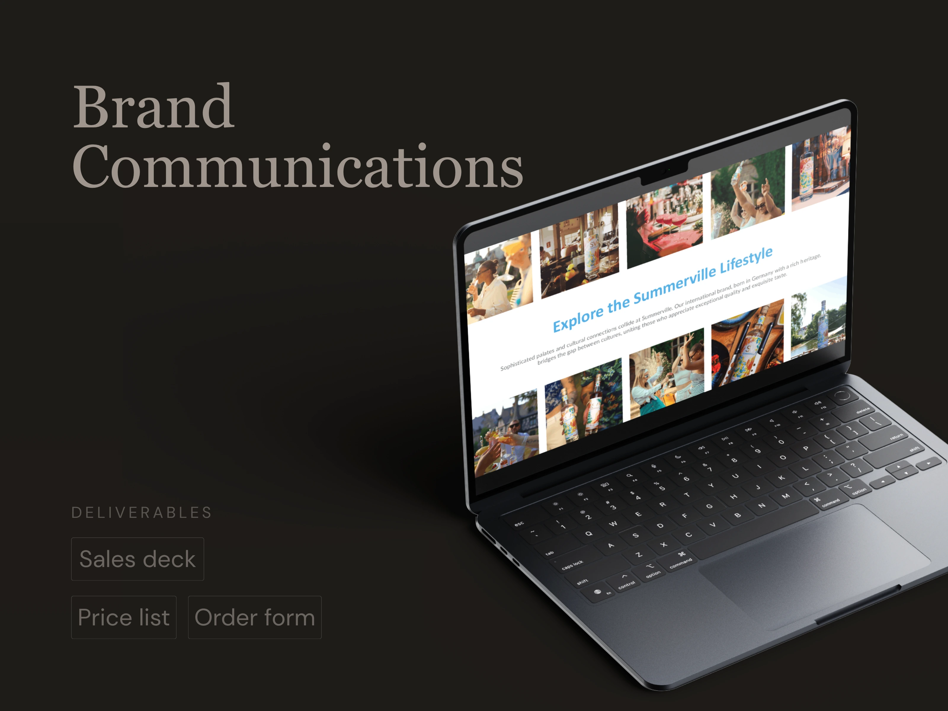
Need: Summerville came with a defined brand identity, content, and a clear visual direction. Their main request was a presentation that felt energetic and in motion, rather than a static slide deck.
The Challenge
The content and structure were already defined. The challenge was executional and creative. The client wanted the deck to feel dynamic and brand-led, closer to an ad experience than a traditional investor presentation. Achieving that without overcomplicating individual slides or losing clarity required a specific approach to sequencing and pacing.
The Work
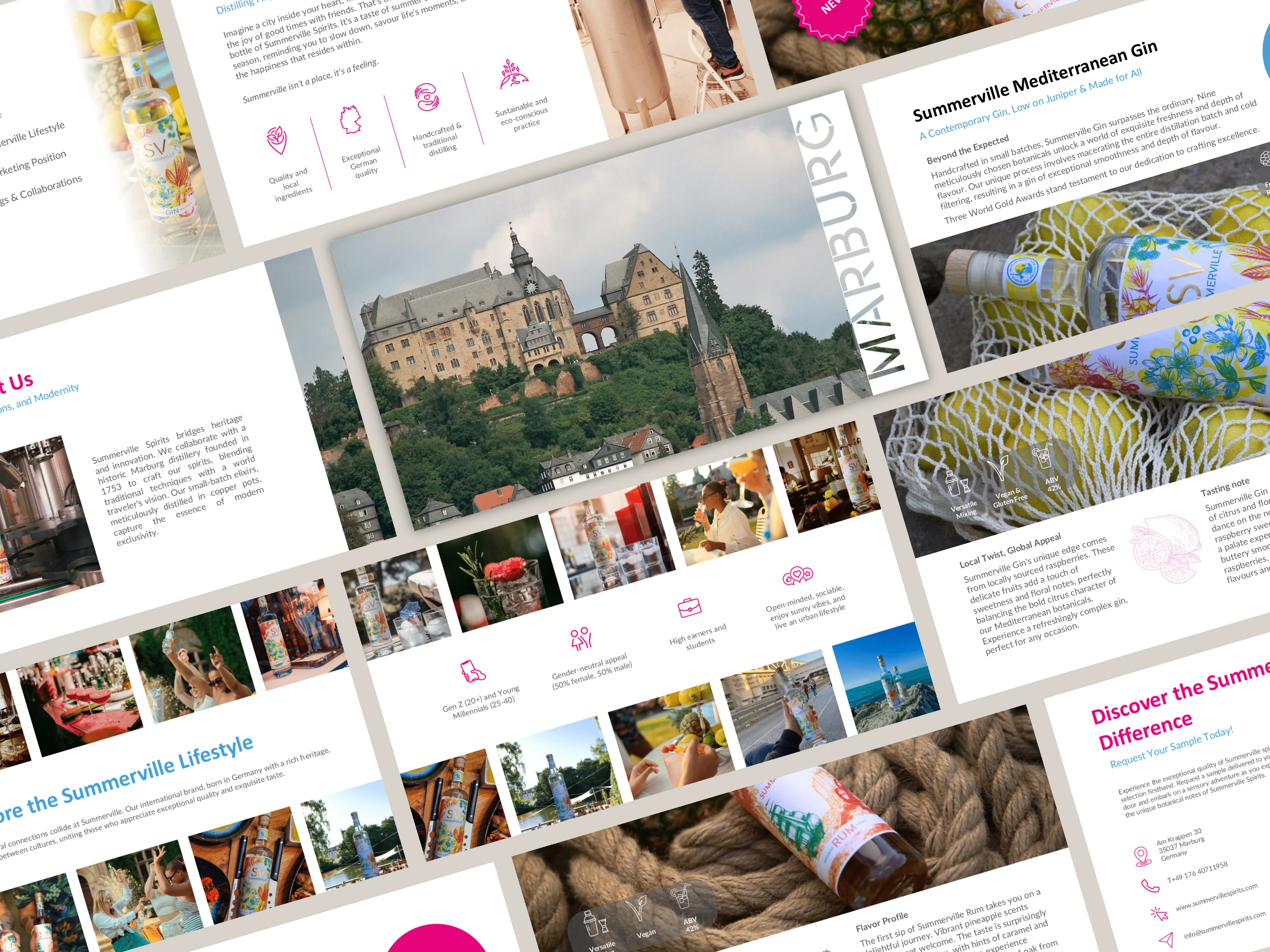
Rather than treating each slide as a standalone unit, I approached the deck as a single continuous sequence, where momentum and flow were the primary design tools.
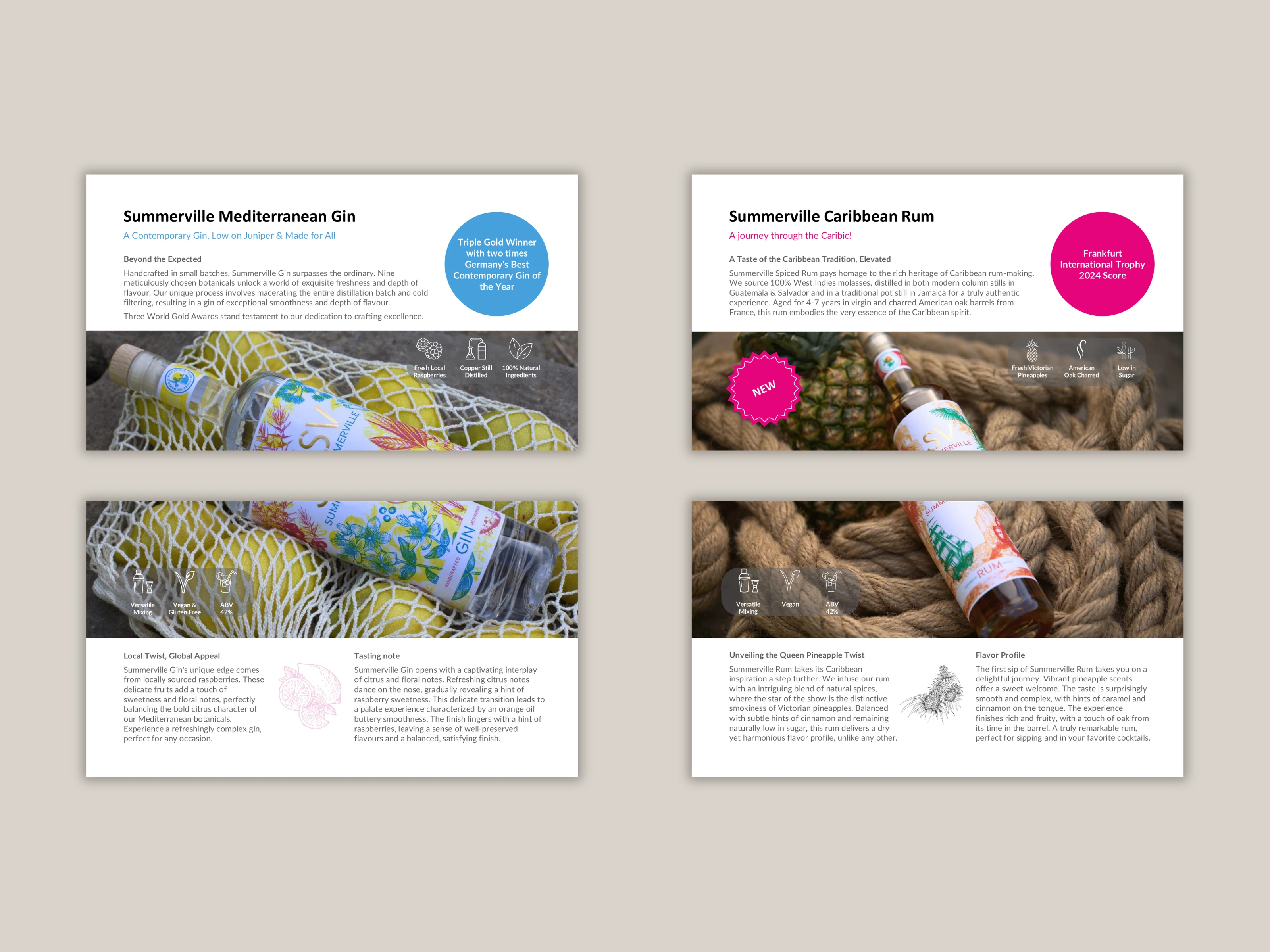
Designed product-led layouts that prioritised bold imagery and colour
Created visual continuity across slides by splitting large product visuals across multiple pages
Used subtle, well-timed transitions to give the impression of a single canvas moving forward
Kept individual slide structures familiar and clean, allowing motion and pacing to do the heavy lifting
This approach delivered the movement the client was looking for while keeping the deck easy to follow and on-brand.
The Outcome
Delivered a deck that met the client's brief precisely: energetic, product-led, and brand-consistent throughout. The project demonstrates a different kind of pitch deck challenge, where executing a specific creative vision with discipline and clarity was the key. Sometimes the brief is tight and the job is to deliver it exceptionally well.
Looking to add energy and flow to your pitch deck without overdesigning it? Let’s create a presentation that moves with your story.
Like this project
Posted Jan 19, 2026
Designed a product-led pitch deck for Summerville Spirits, built around visual continuity and pacing to feel more like a brand film than a static presentation.
Likes
0
Views
3
Timeline
May 22, 2024 - Jun 14, 2024