Farmland [UX/UI Design, Branding, Illustrations]
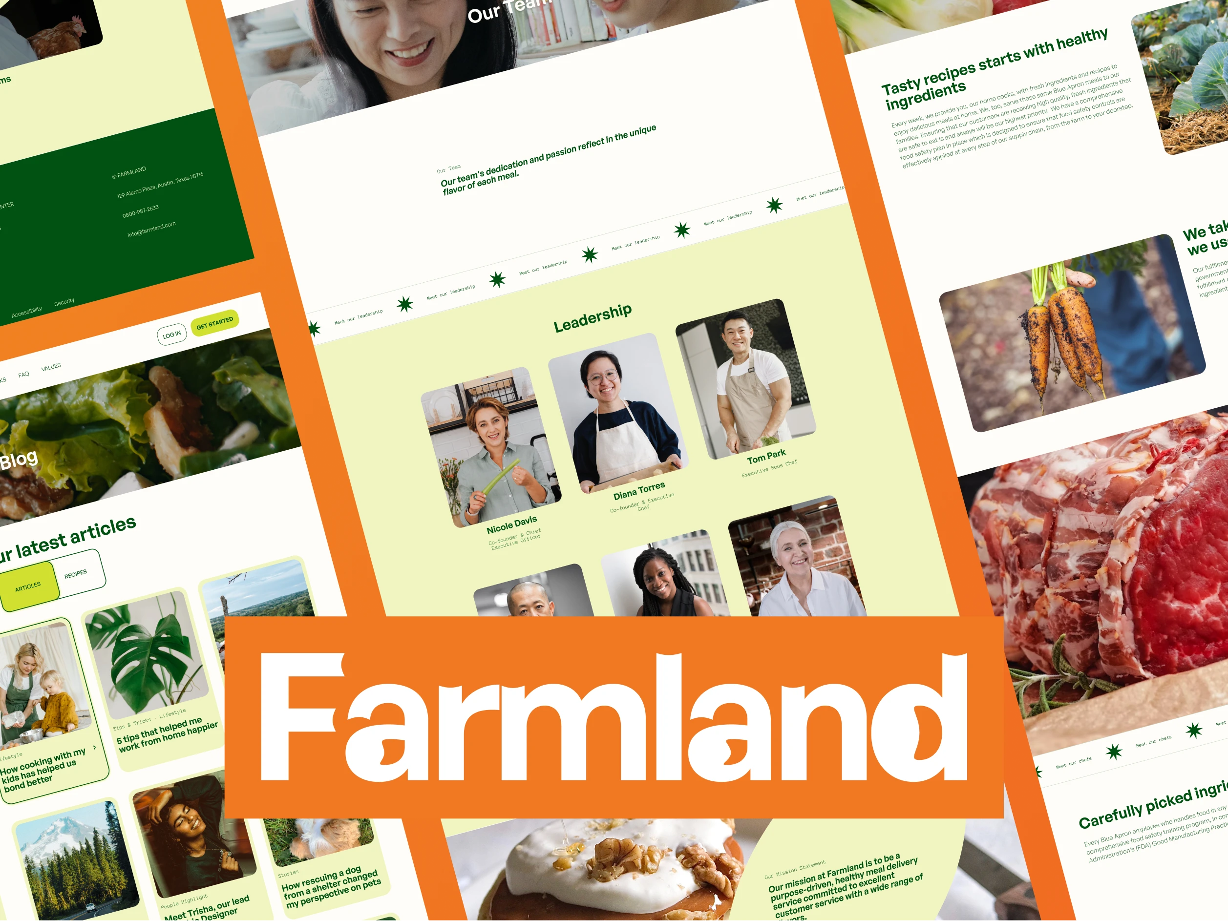
I focused on creating a clean and modern design that showcases the fresh, natural ingredients used in Farmland's meals.

Farmland is a unique subscription meal delivery service that brings the farm-to-table experience straight to your door. With a focus on organic and sustainable ingredients, Farmland provides its members with fresh produce and recipes each week, allowing them to cook their meals with a personal touch.
In this case study, we will delve into the design and development process behind Farmland's website and explore how we used visual design to create a cohesive and engaging user experience for their customers. We will also discuss challenges and the solutions implemented to bring Farmland's vision to life.
I'll highlight some of the pages created for this website and the rationale behind them.
Homepage
The design of the Farmland homepage aims to encourage users to sign up for a subscription by prominently displaying calls to action, highlighting the benefits of the service, and showcasing customer testimonials. To make the design engaging, I used bold and eye-catching colors, clean and modern typography, and high-quality imagery showcasing the fresh ingredients and recipes available through the service.
I also included prominent calls to action throughout the page to make it easy for users to take the next step and sign up for a subscription. Overall, the goal was to create a visually appealing and intuitive user experience that communicates the value and convenience of the Farmland service.

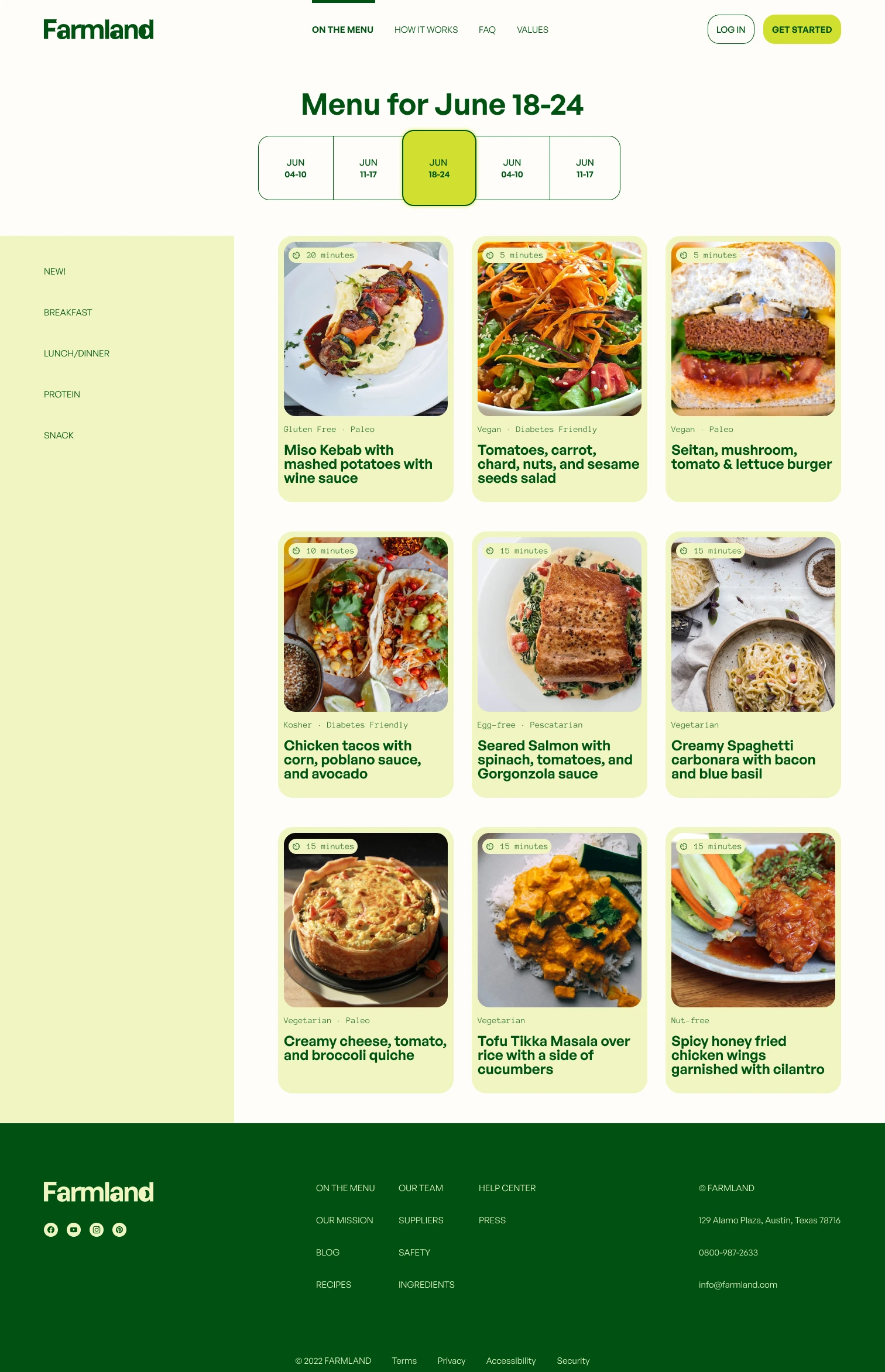
Menu Page
The design of the Farmland menu page aims to showcase the variety and quality of the ingredients and recipes offered by Farmland, using high-quality images to capture the freshness and deliciousness of the dishes. To make the design engaging, I used visually appealing layouts and clean, modern typography to highlight the key information about each dish. I also included detailed descriptions and information about the sources of the ingredients to give users a sense of the care and attention that goes into every meal. Overall, the goal was to create a visually appealing and intuitive user experience that showcases the variety and freshness of the dishes on the Farmland menu.

How it works
The design of the Farmland "how it works" page aims to clearly and concisely explain the process of signing up for and receiving a Farmland subscription. To achieve this goal, I included a step-by-step guide or visual flowchart to make the process easy to understand and information about payment options and delivery schedules to provide users with a clear understanding of what to expect.

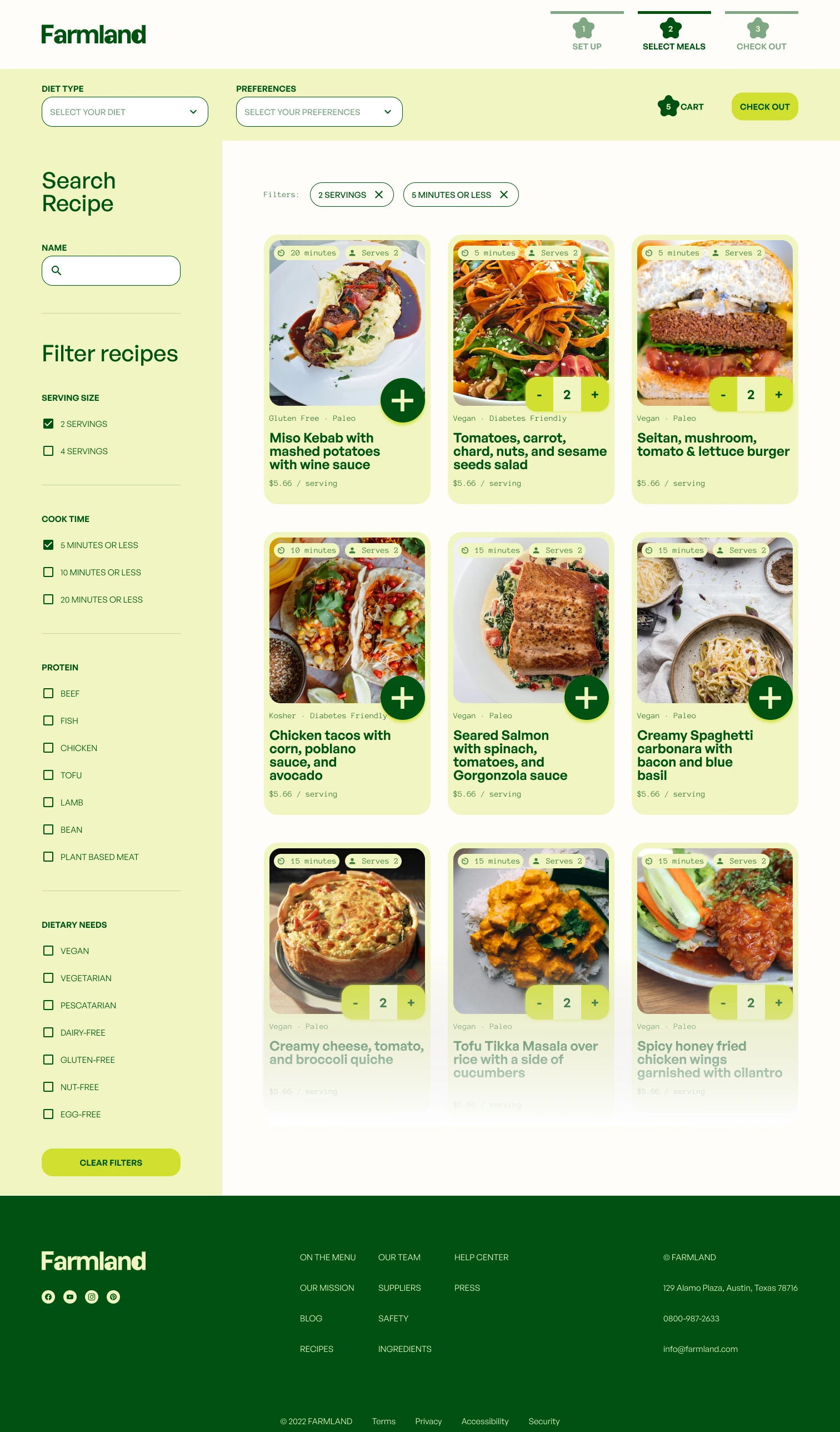
Select Meals
The design of the Farmland "select meal" page aims to allow users to quickly and easily browse and choose ingredients and recipes for their subscription. To accomplish this, I have included various features to make the selection process seamless and straightforward. A search bar and filters allow users to quickly narrow their options, while clear categories and detailed descriptions provide in-depth information about each item. High-quality images showcase the freshness and quality of the ingredients, giving users a sense of what they can expect from their subscriptions. The goal is to create a user-friendly and visually appealing experience that helps users find exactly what they are looking for.

Like this project
Posted Dec 27, 2022
I focused on creating a clean and modern design that showcases the fresh, natural ingredients used in Farmland's meals.
Likes
0
Views
88

![Garota Skincare [Web UX/UI Design]](https://media.contra.com/image/upload/w_700,c_fill/l3cr8vsmjrydw050sdyi.avif)