NOMNOM Guest Checkout
Florencia Ezcurra
NOMNOM Guest Checkout
NOMNOM is an online platform to buy your groceries online and get them delivered to your doorstep.
The aim of the experience is to provide a seamless and intuitive user experience to the app users.
This flow will be showcasing the experience of a guest checkout.
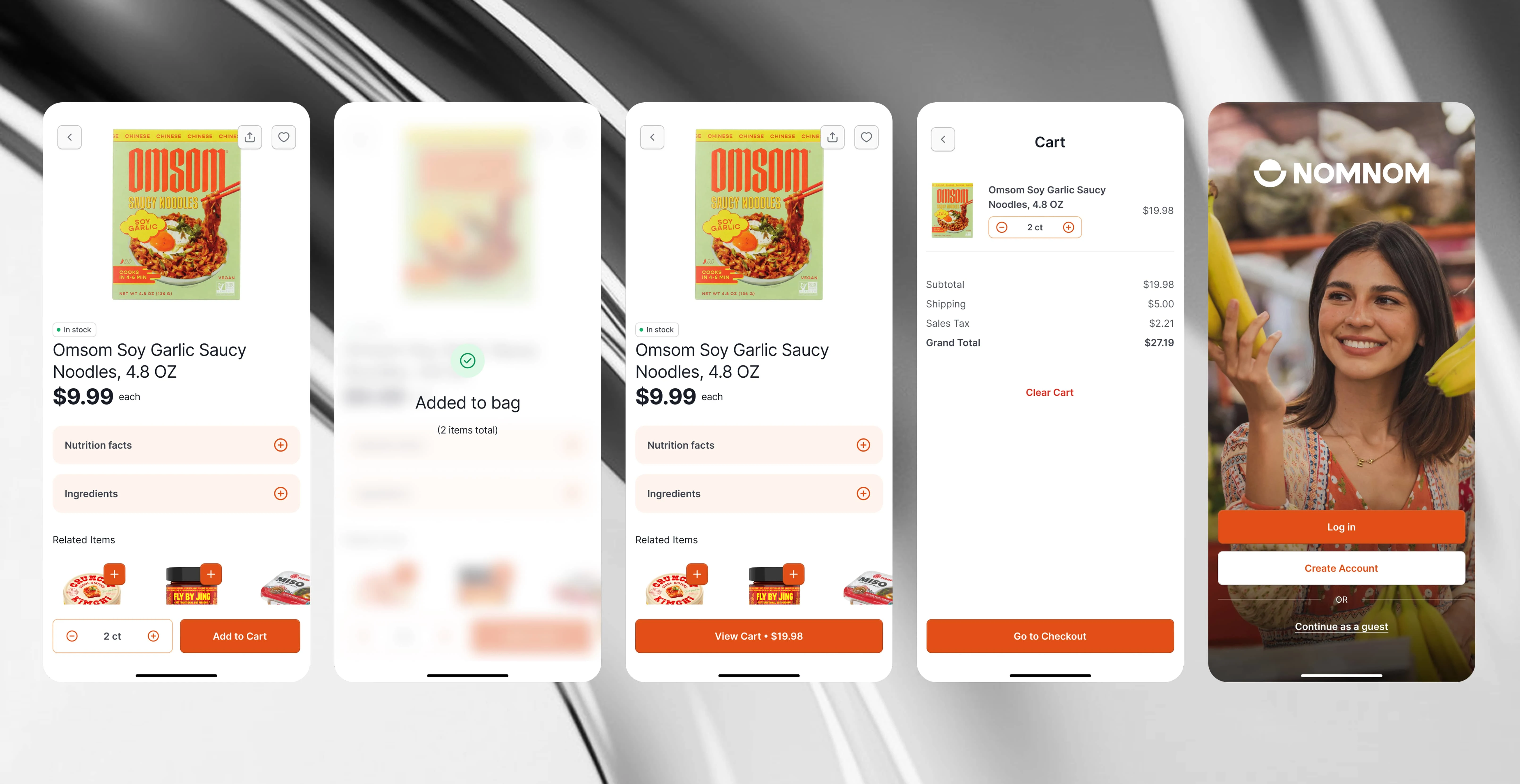
Adding a product to Cart
The user can add or remove products as they like before adding them to the cart. Once added, the system provides pricing transparency, showing how much the selected products cost in total. On the cart page, the user sees a grand total with a detailed pricing breakdown.
The available actions include:
Increasing or decreasing product quantities
Clearing the cart
Proceeding to checkout
Since the user is not logged in, they are presented with three options:
Log in (for returning users)
Create an account (for new users)
Continue as a guest (to minimize friction)
UX Principles & Best Practices: Flexibility & Control (Jakob Nielsen’s Usability Heuristics), Pricing Transparency, Conversion Optimization, Progressive Disclosure.
Add product to cart flow
Checkout - Shipping
The checkout process is divided into three clear steps: Shipping, Payment, and Review. A stepper indicator at the top visually breaks down the process into manageable chunks, reducing cognitive load and keeping users informed about their progress and next steps.
Upon landing on the page, users immediately see an express checkout section with three quick-payment options (e.g., PayPal, Apple Pay, Google Pay). Below this, a condensed form provides a traditional checkout path with minimal required fields (marked with an asterisk*).
Key optimizations include:
A single "Full Name" input (instead of splitting into first/last name)
Only essential fields to reduce friction
Inline validation to instantly flag errors and prevent frustration
Users can click "Save and Continue" to proceed to Step 2 (Payment).
UX Principles & Best Practices: Chunking & Progressive Disclosure (Miller’s Law), Speed & Flexibility (Hick’s Law), Error Prevention & Feedback (Nielsen’s Heuristics), Visibility of System Status (Jakob Nielsen).
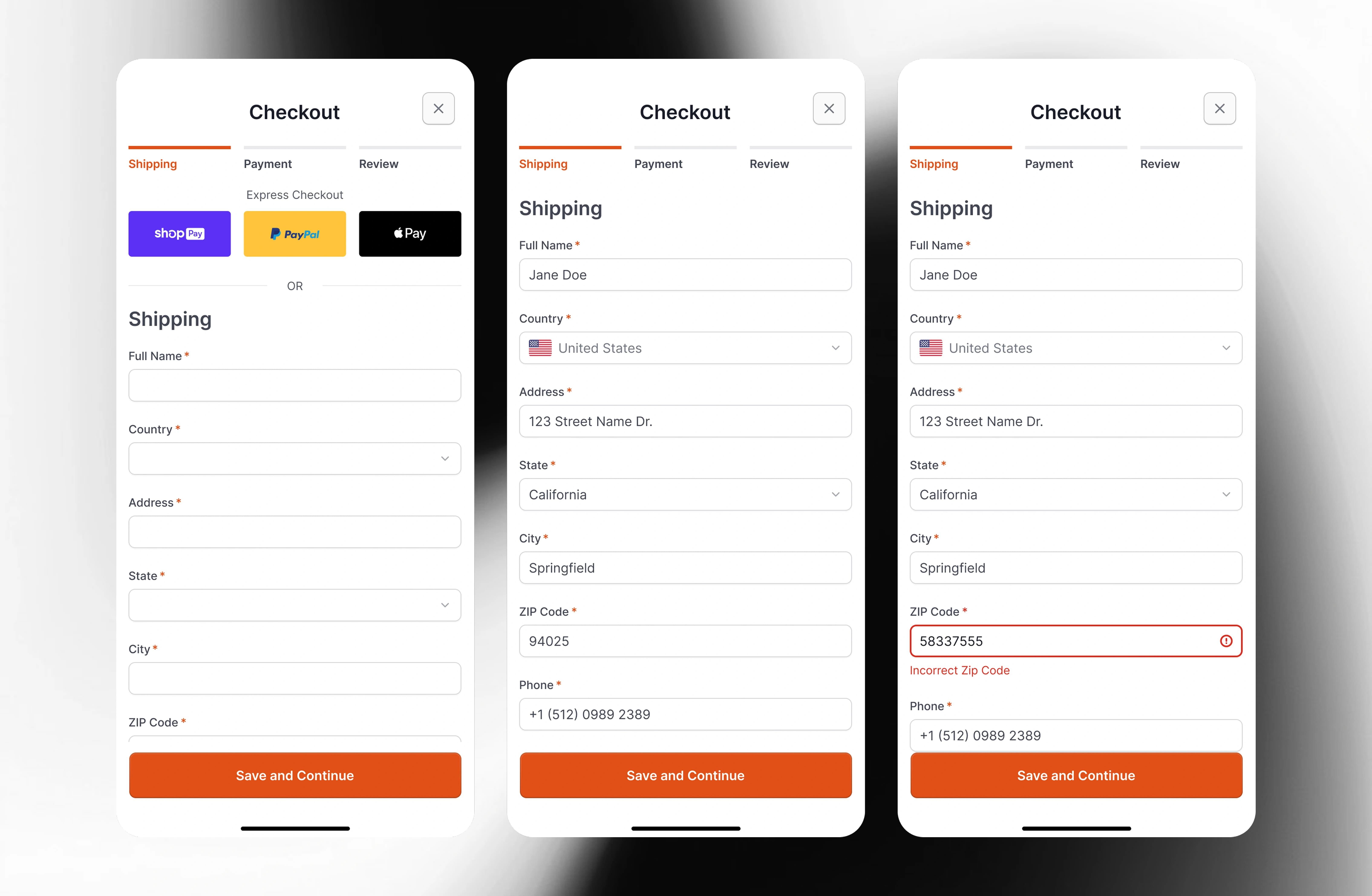
Shipping screen states
Checkout - Payment
On the Payment screen, users select their preferred payment method via a radio button group. The options include the most popular choices:
Credit/Debit Card
PayPal
Shop Pay
Klarna
Each option is accompanied by the company’s logo for faster visual recognition and scannability. Below the payment selector, a checkbox allows users to "Use shipping address as billing address"—reducing redundant form filling.
The form also includes inline error validation, ensuring mistakes are caught and corrected in real time.
UX Principles & Best Practices: Recognition Over Recall (Jakob Nielsen), Hick’s Law (Decision Simplicity), Hick’s Law (Decision Simplicity), Default Efficiency.
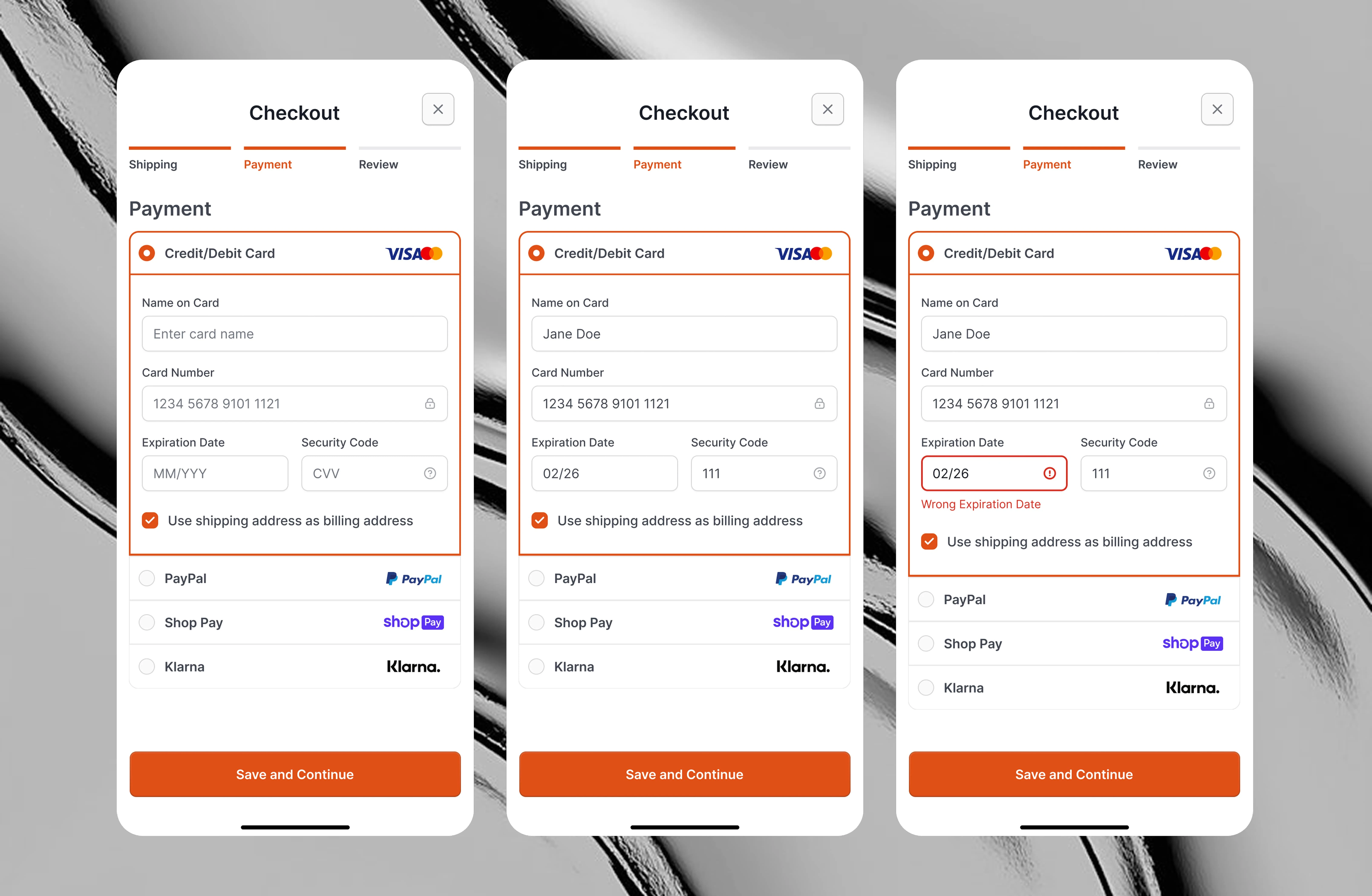
Payment screen states
Checkout - Review, Processing, Confirmation
The Review screen serves as the final step before purchase, allowing users to:
Adjust product quantities
Modify shipping details
Change payment methods
A prominent "Pay Now" button (primary action) triggers the transaction. Upon clicking:
The processing Screen displays "Your order is being processed" to reassure users the system is working.
The confirmation screen covers all the information related to the transaction.
A "Need Help? Contact Us" link is strategically placed to proactively address potential issues, reducing post-purchase friction.
UX Principles & Best Practices: Jakob Nielsen’s Error Prevention, Feedback & System Status (Nielsen’s Heuristics), Post-Completion Clarity, Proactive Support.
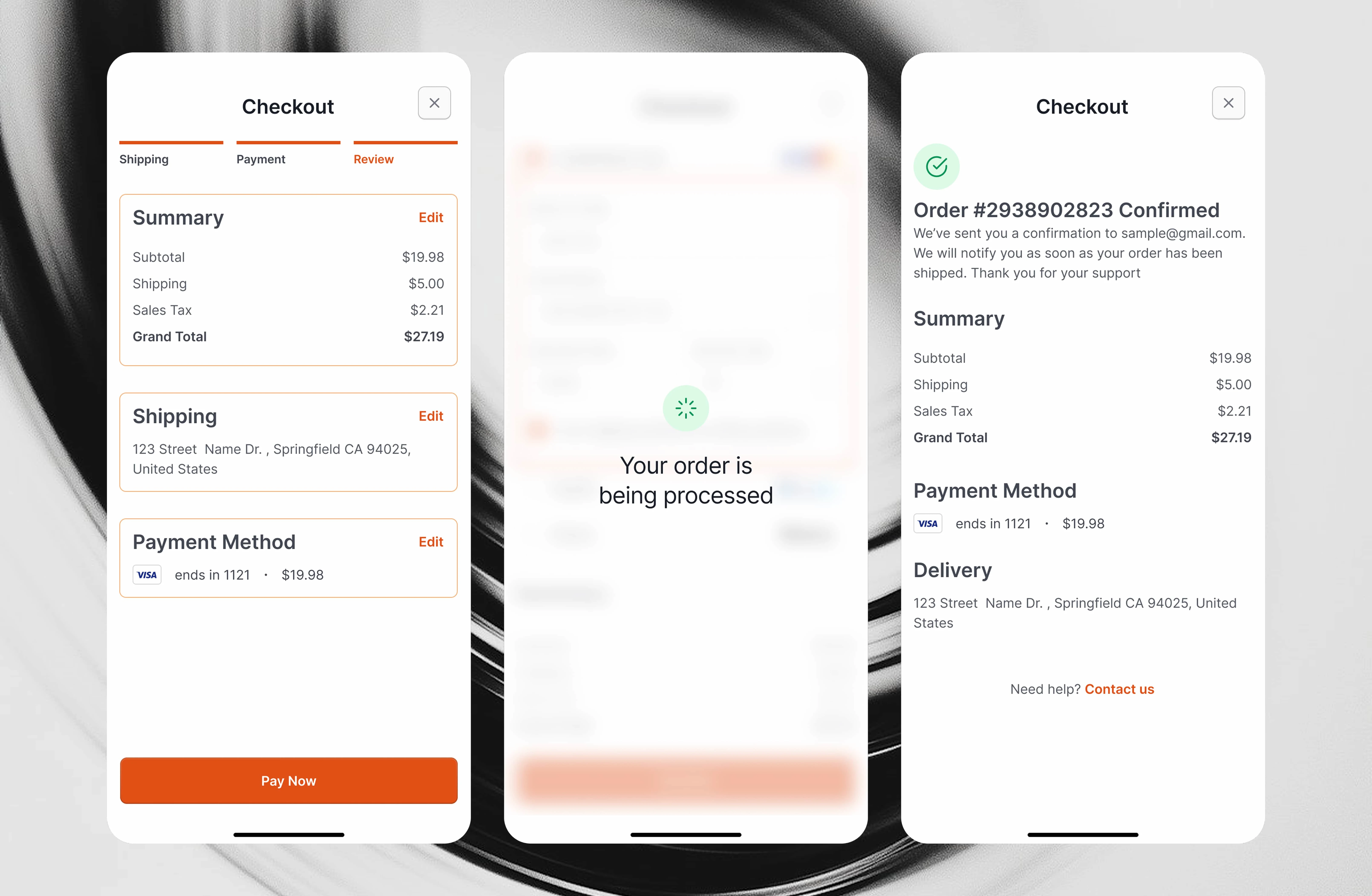
review, processing, and confirmation screens
Like this project
Posted Apr 4, 2025
NOMNOM is an online platform to buy your groceries online and get them delivered to your doorstep. This flow will showcase the experience of a guest checkout.
Likes
20
Views
230