
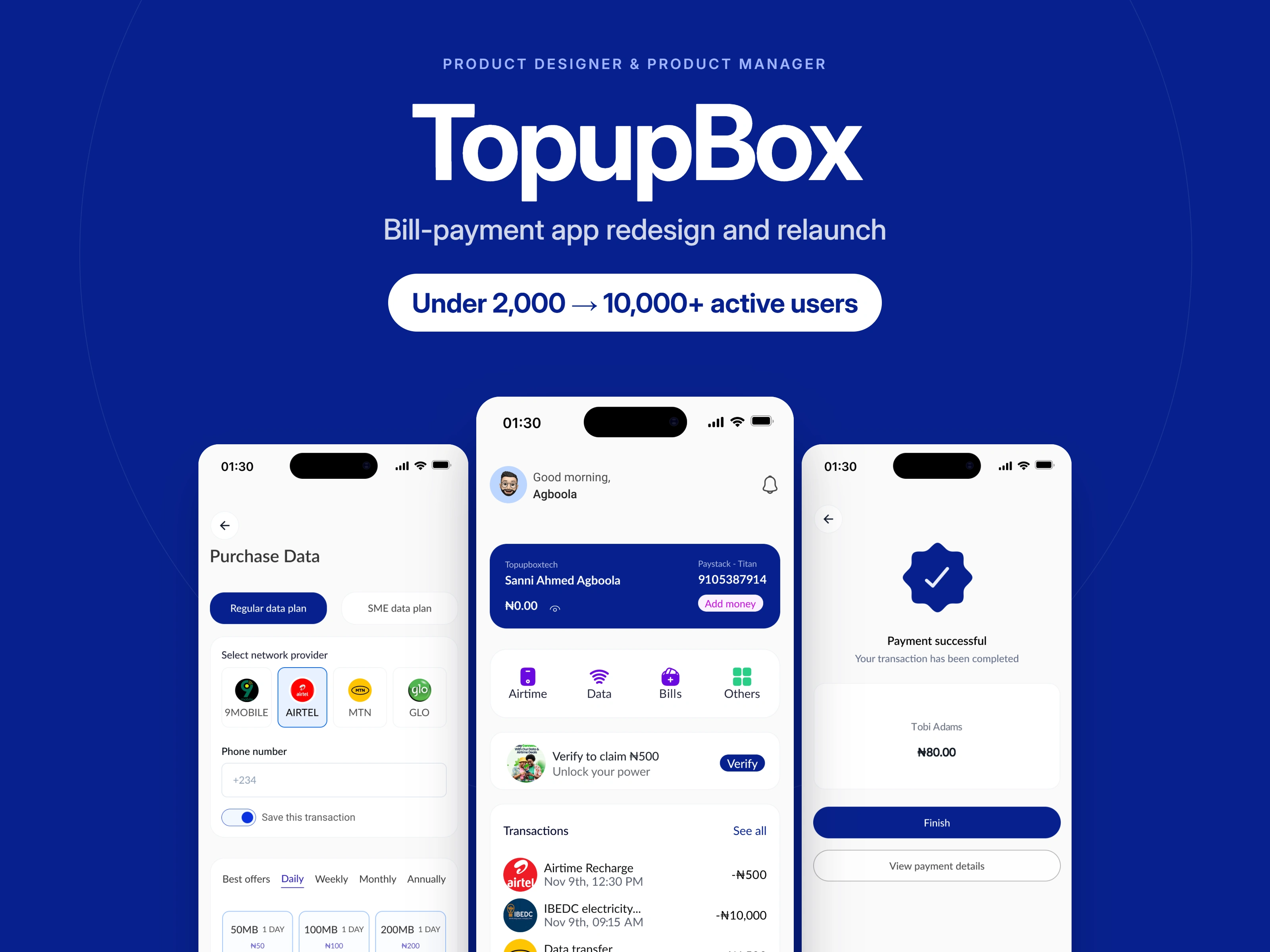
TopupBox, redesigned and relaunched.
How I redesigned and relaunched a bill-payment app that grew from under 2,000 to over 10,000 active users
This case study shows how I redesigned and relaunched TopupBox, a white-label app for airtime, data and bill payments, as both its product designer and product manager. The old app had fewer than 2,000 active users, and 5 merchants had refused to offer it to their customers. I reviewed the old app, set the redesign priorities, designed the new app and managed delivery through to launch. After the relaunch, active users grew to over 10,000, downloads grew by over 30%, and 11 merchants adopted the app, including the 5 who had refused the old one.
Results:
Active users grew from under 2,000 to over 10,000.
Downloads grew by over 30%.
11 merchants adopted the white-label app: the 5 who had refused the old one, plus 6 new merchants.
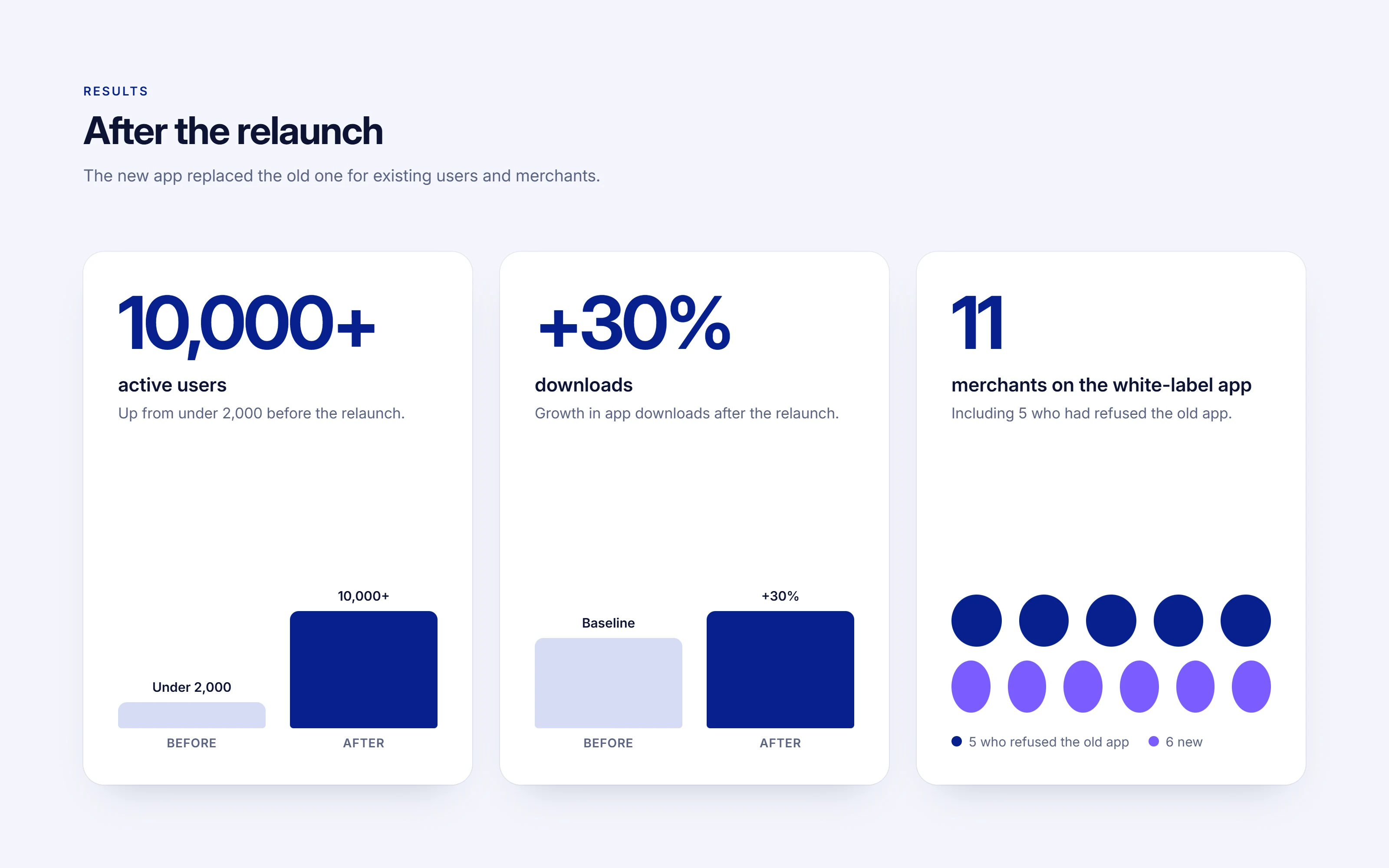
Active users, downloads and merchants after the relaunch.
Client: TopupBox, a Nigerian fintech app for everyday payments.
People add money to a wallet, then buy airtime and data, pay bills such as electricity, and send money, all from one place. Merchants offer the app to their own customers under their own name, as a white-label product.
My role covered both sides of the project: product design (every screen of the new app) and product management (priorities, timeline and delivery).
The problem
Fewer than 2,000 people used the old app actively.5 merchants had refused to offer it to their customers.The new app had to replace the old one for every existing user and merchant, so nobody could be left behind in the switch.
Goals Fast access: the most common actions sit on the home screen, one tap away.Short purchases: every purchase follows the same few steps (choose, enter, pay).Clear confirmation: a confirmation screen and a receipt remove any doubt after paying.Trust: security, support and account options are easy to find.
Reviewing the old app
Before designing anything, I reviewed the old app screen by screen to find where people got stuck and why merchants didn't want to put their name on it. I turned that review into a short list of redesign priorities, so every design decision traced back to a real problem.
Planning and delivery
As product manager, I planned the timeline in Asana and coordinated design and development so the relaunch shipped on schedule. Because the new app replaced the old one for existing users and merchants, the plan covered the migration as well as the new screens.
The redesigned app
Four core screens carry almost everything people do in TopupBox: the home screen, buying data, confirming a payment and managing the account. I designed them as one system, with the same layout, the same buttons and the same pattern for every purchase, so learning one flow teaches them all.
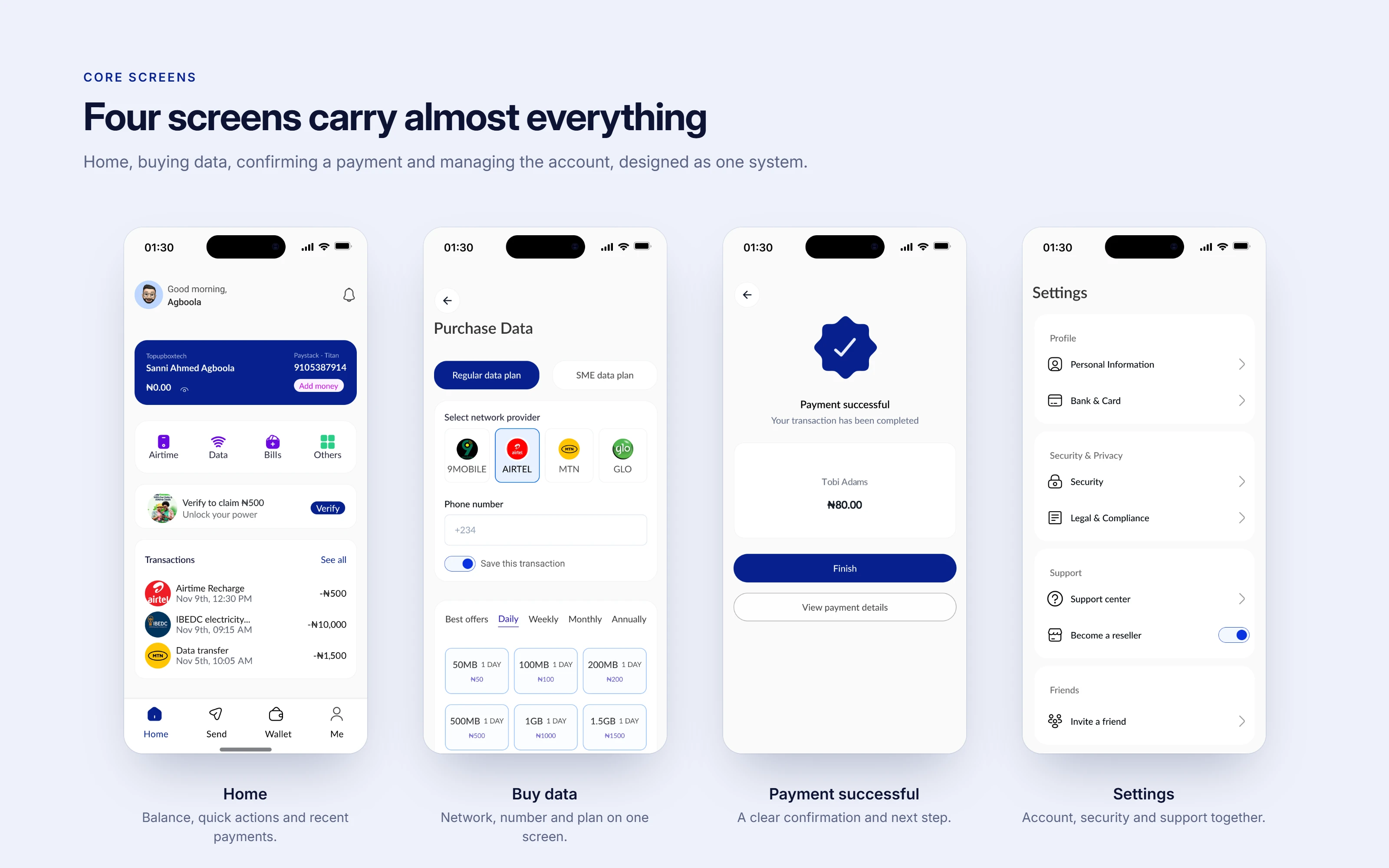
Caption: Home, buying data, payment successful and settings.
Home
The home screen answers three questions at a glance: how much do I have, what can I do next, and what did I pay for recently?
Balance, account number and Add money sit together at the top, with an option to hide the balance in public.
Airtime, data and bills are the first things you can tap, because they are what people open the app for.
A reward prompt nudges new users to verify their account, without blocking them.
Recent payments show the provider, time and amount, so people can check a payment without opening a receipt.
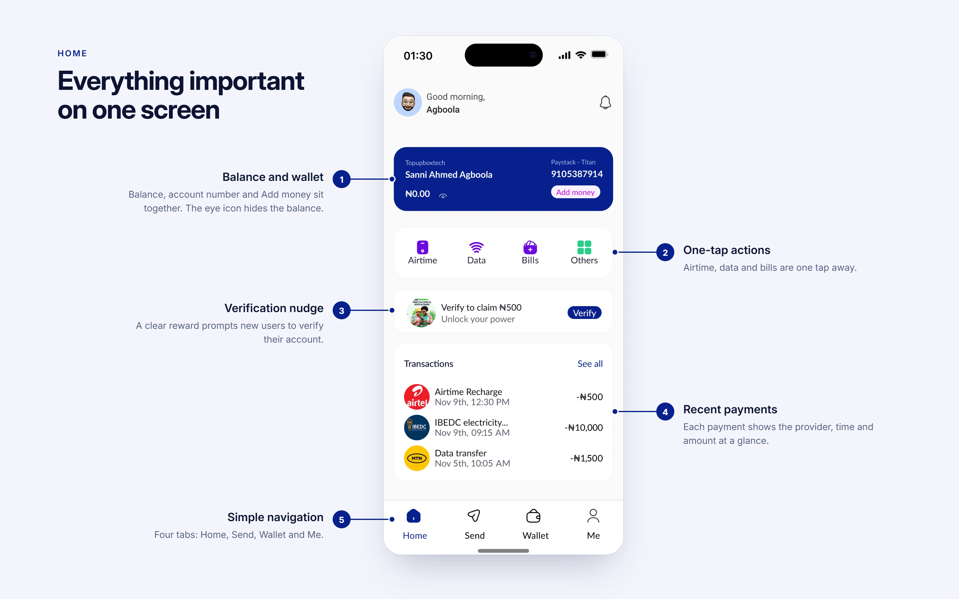
The home screen, annotated.
Empty and active states
The app opens on a splash screen with the new mark and the line "Pay with ease". Designers often design only the "full" version of a screen. I designed the first-visit state too: new users see an empty state that explains what will appear there, instead of a blank space. After a few payments, recent transactions replace it.
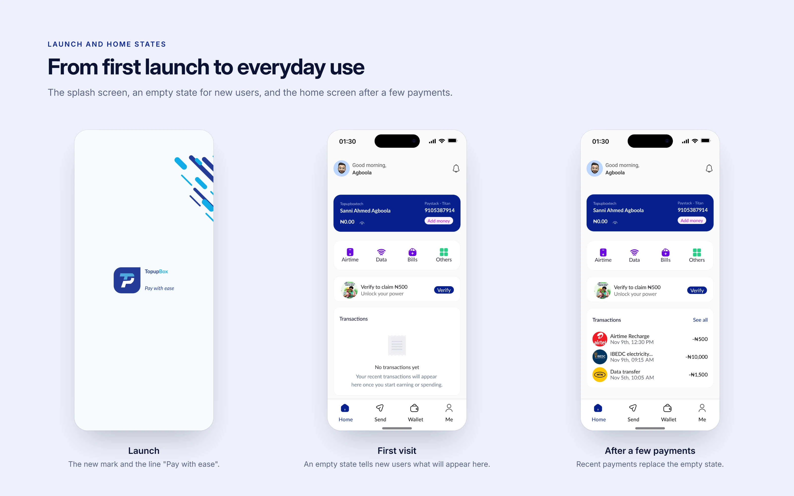
Splash screen, first visit and after a few payments.
Buying data
Buying data uses the same pattern as every purchase in the app:
Choose the plan type: regular or SME data.
Pick the network by its logo: 9mobile, Airtel, MTN or Glo.
Enter the phone number, with an option to save it for next time.
Pick a plan, filtered by daily, weekly, monthly or annual.
Each plan tile shows the data, validity and price together, so there's nothing to work out.
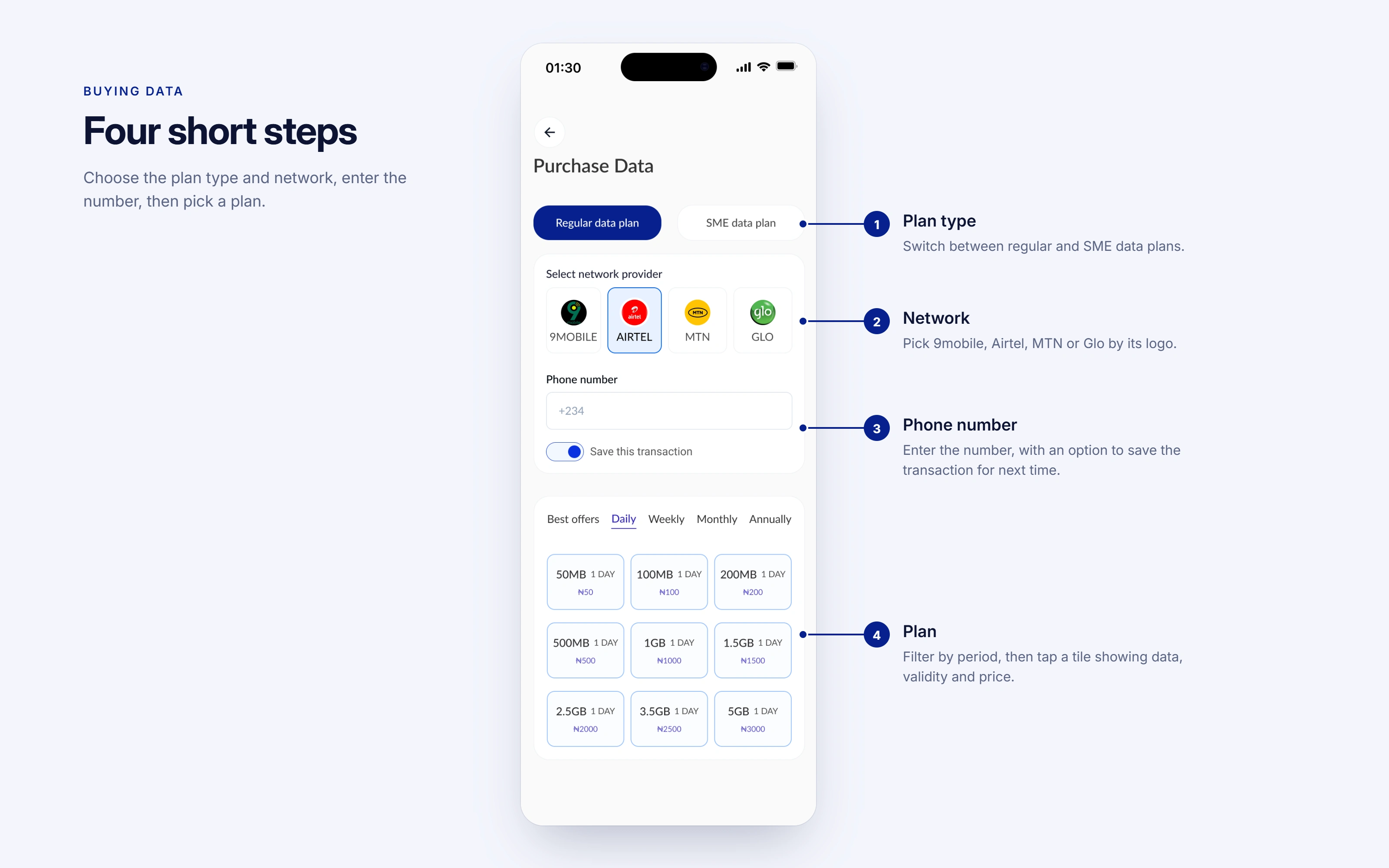
Buying data in four steps.
Payment confirmation
The moment after paying is when people trust or distrust a payment app. The success screen confirms the payment and offers one clear next step, Finish, with the details a tap away. The payment details screen lists the recipient, transaction ID, date, discount and amount paid, and the receipt can be shared.
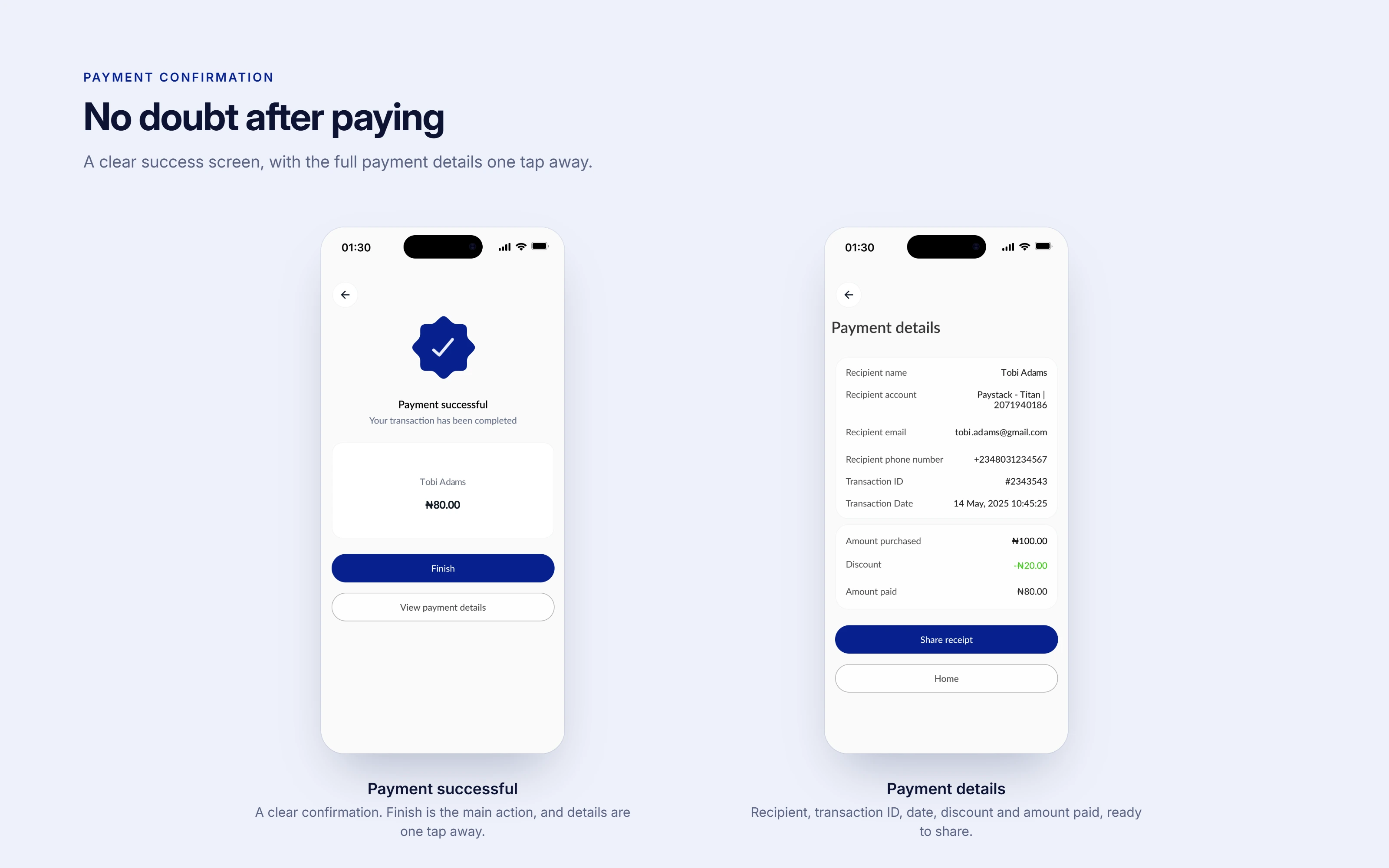
Payment successful and payment details.
Settings
Account options are grouped by what people look for, not by how the system is built: profile, security and privacy, support, inviting friends, and sessions. For people who want to sell airtime, data and other utility bills, they can also switch on reseller mode from the same screen and start making money without stress.
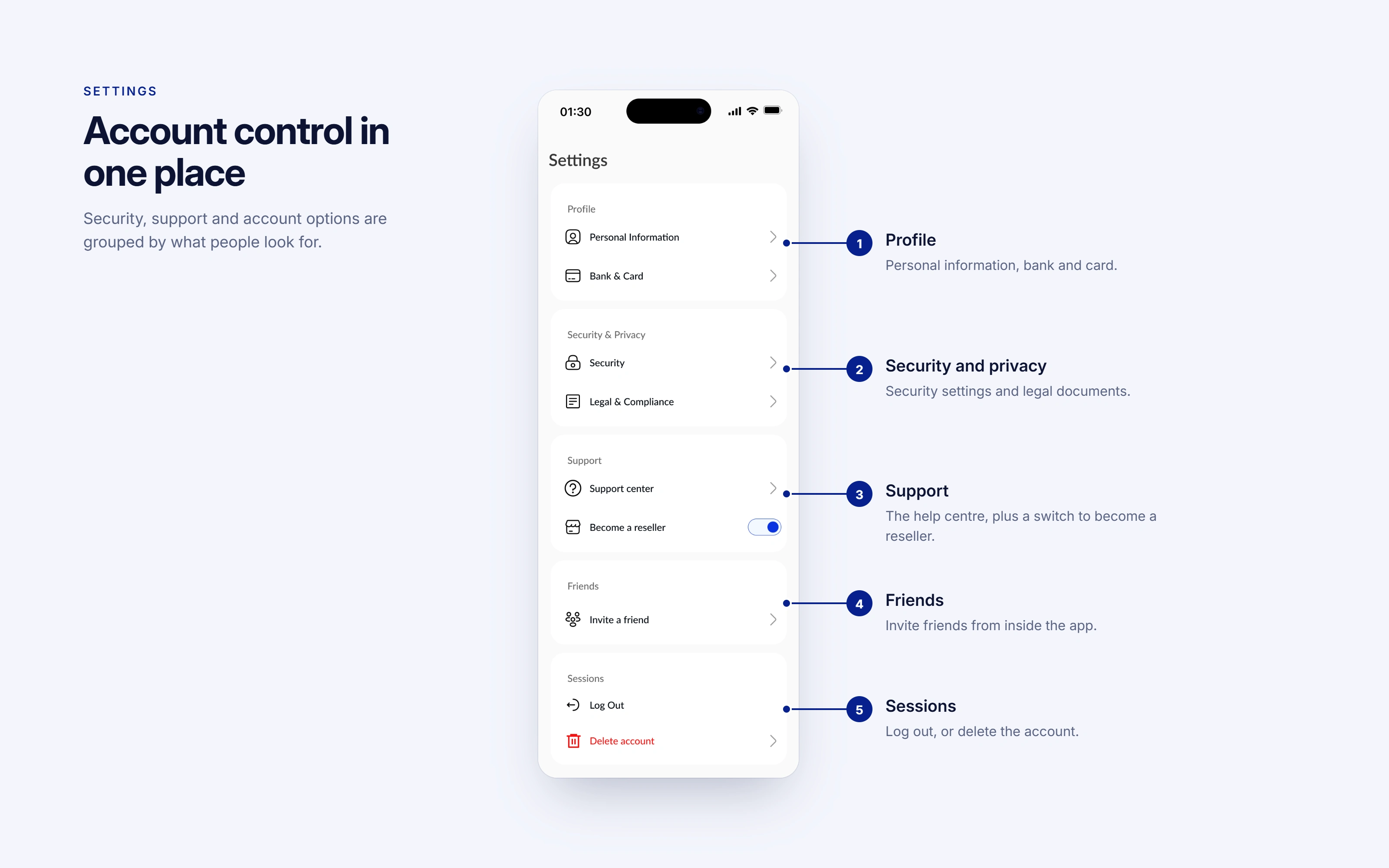
Settings, grouped by what people look for.
Testing before launch
Before launch, we tested the main flows in-house with the team: funding the wallet, buying airtime and data, and confirming a payment. Anything that confused the team was fixed before real users saw it.
Scope of work
Product design: the full mobile app, covering home, airtime, data and bill purchases, payment confirmation, receipts and settings.
Product management: the old-app review, redesign priorities, the delivery timeline and the migration from the old app.
Closing
Planning a fintech or mobile product, or redesigning one that isn't working? Message me or book a free 20-minute product strategy call through my profile. I'll review your request and come back with a plan, timeline and estimate.
0 likes · 2 views · Nov 1, 2026
A fintech mobile app that makes transactions and utility bill payments simple, fast, and clear.

