
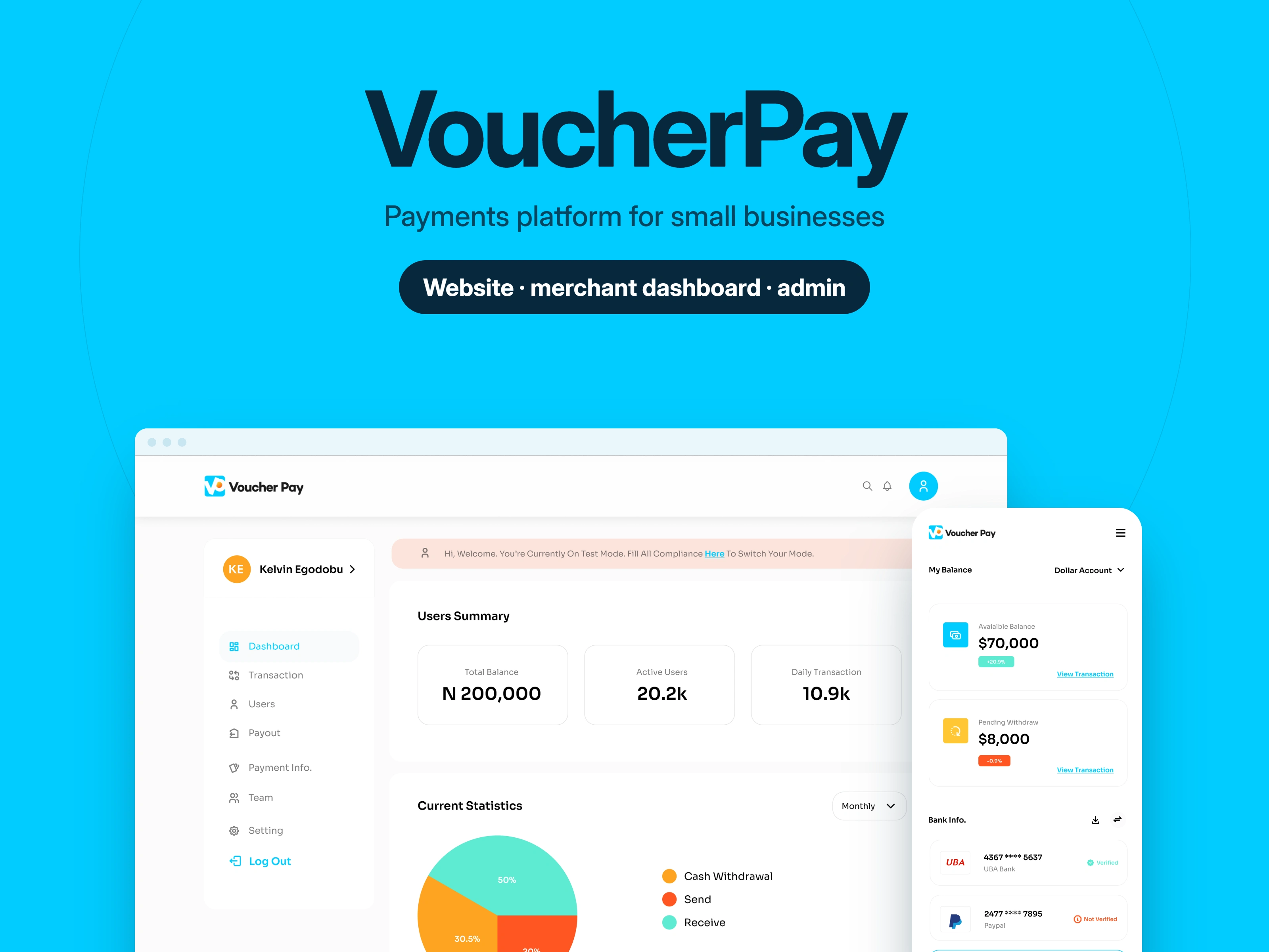
VoucherPay merchant dashboard and mobile view.
VoucherPay: UI/UX Design for a Business Payments Platform
A website, merchant dashboard, and admin dashboard that help small businesses collect payments, pay out funds, and stay compliant.
Role
UI/UX Design, Website Design, Dashboard Design, Email Template Design
How I designed a payments platform for small businesses: website, onboarding, merchant and admin dashboards
This case study shows how I designed VoucherPay end to end: a payments platform that helps small businesses in remote parts of Africa accept payments, manage payouts and stay compliant. I designed the marketing website, the sign-up and compliance flow, the merchant dashboard, the admin dashboard, and the emails and notifications that connect them. I started by watching merchants and operators use the product, then mapped it into one journey across four audiences.
Client: VoucherPay (MSMEs). Timeline: January to July 2023. Tools: Figma.
VoucherPay brings digital financial services to businesses in the most remote parts of Africa: payment links, wallets, POS, QR codes and NFC cards, plus an API and SDK for developers.
The problem
Many small businesses in remote areas are financially excluded and need a simple way to accept payments and manage their money.
Payment tools often feel complicated, and registration and compliance can stop a business before it makes its first sale.
The VoucherPay team needed tools to review businesses, resolve disputes and support customers.
Research and mapping
I observed merchants and operators using the product to see where they got stuck. Then I mapped the product into the journeys of its four audiences (visitors, new businesses, merchants and the VoucherPay team) and designed each step so it feels like one product: learn, sign up, get verified, collect, pay out, resolve.
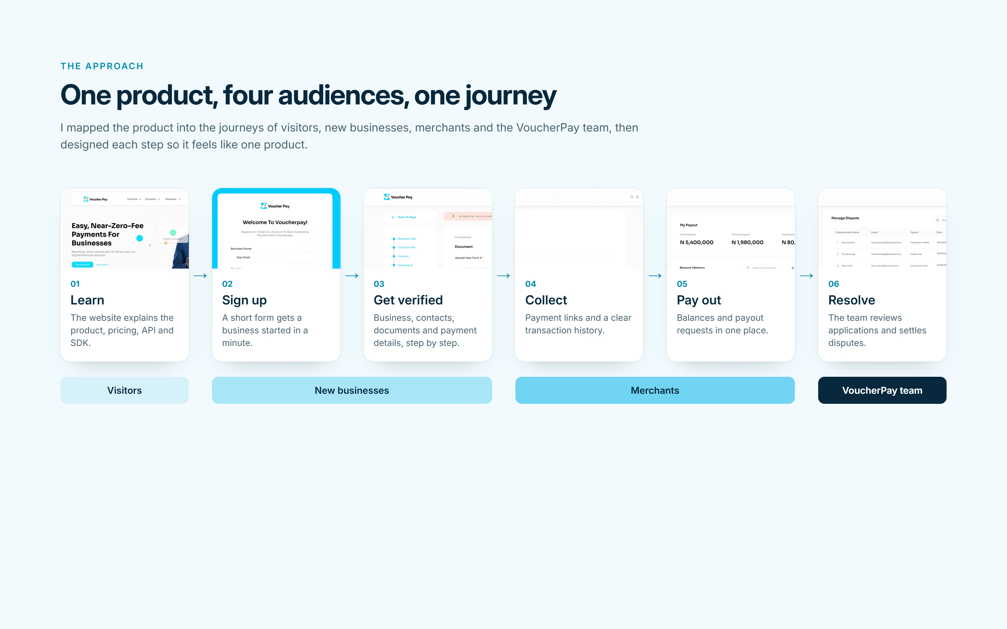
Six steps, four audiences, one product.
Key design decisions
Sign up first, comply after. Sign-up asks for the minimum, and compliance follows in clear steps, so registration never blocks a business at the start.
Nudge, don't block. In test mode, a banner reminds businesses to finish compliance, while the dashboard stays usable.
Summary before detail. Every dashboard opens with summary cards, then the detail.
One table pattern and one form pattern throughout, so every new screen feels familiar.
One accent colour. A single bright cyan on a clean white base keeps the interface calm.
Website
The website explains VoucherPay quickly and gives developers a clear path to integrate. The home page leads with one promise, then shows who it's for (co-operatives, entrepreneurs, corporations, schools, government and agencies) and how to get started. About, Pricing, Software, Devices, SDK and API pages, plus the blog, careers and FAQ, share the same components, layout and navigation.
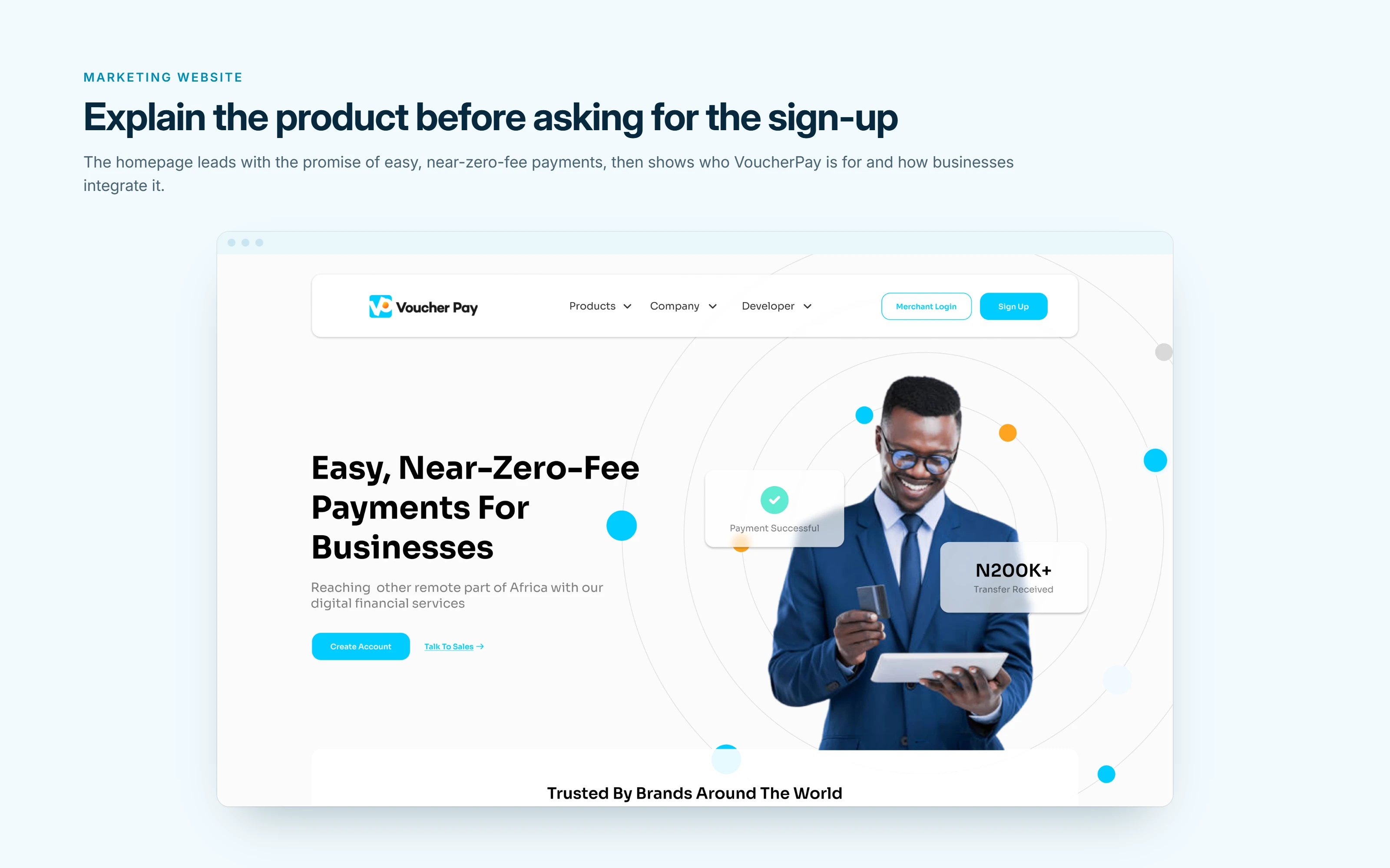
The homepage hero.
The approach
I started by mapping the product into the journeys of its four audiences: visitors, new businesses, merchants, and the VoucherPay admin team. Then I designed each journey so it feels like one product.
Learn → Sign up → Get verified → Collect → Pay out → Resolve
Learn: A website that explains the product, pricing, API, and SDK in plain language.
Get started: A short sign up, then a step by step registration for business details, contacts, documents, and payment information.
Operate: A merchant dashboard for payment links, transactions, payouts, team access, and API keys.
Oversee: An admin dashboard for applications, businesses, disputes, helpdesk, and payouts.
Stay connected: Emails and notifications for sign up, compliance, and balance updates.
Across every screen, I kept one bright cyan accent on a clean white base, summary cards before detail, and the same table and form patterns, so each new screen feels familiar.
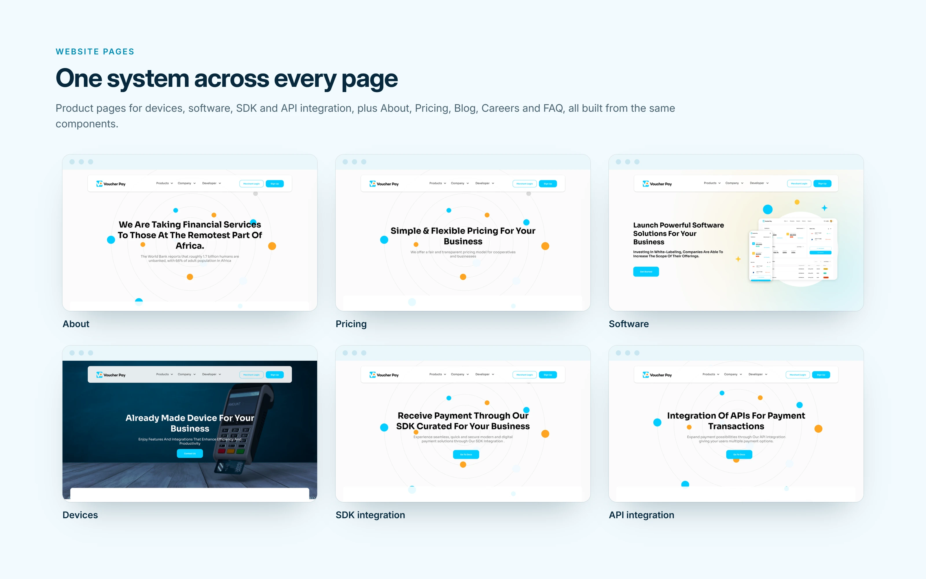
About, Pricing, Software, Devices, SDK and API pages, built from one set of components.
Website
The website explains VoucherPay quickly and gives developers a clear path to integrate. The home page leads with a clear promise, then explains why VoucherPay, how it scales with wallets, POS, QR code, and NFC cards, and how developers can integrate. The system also covers about, pricing, API, SDK, software, blog, career, and FAQ pages, all using the same layout and navigation.
A scroll through the full homepage.
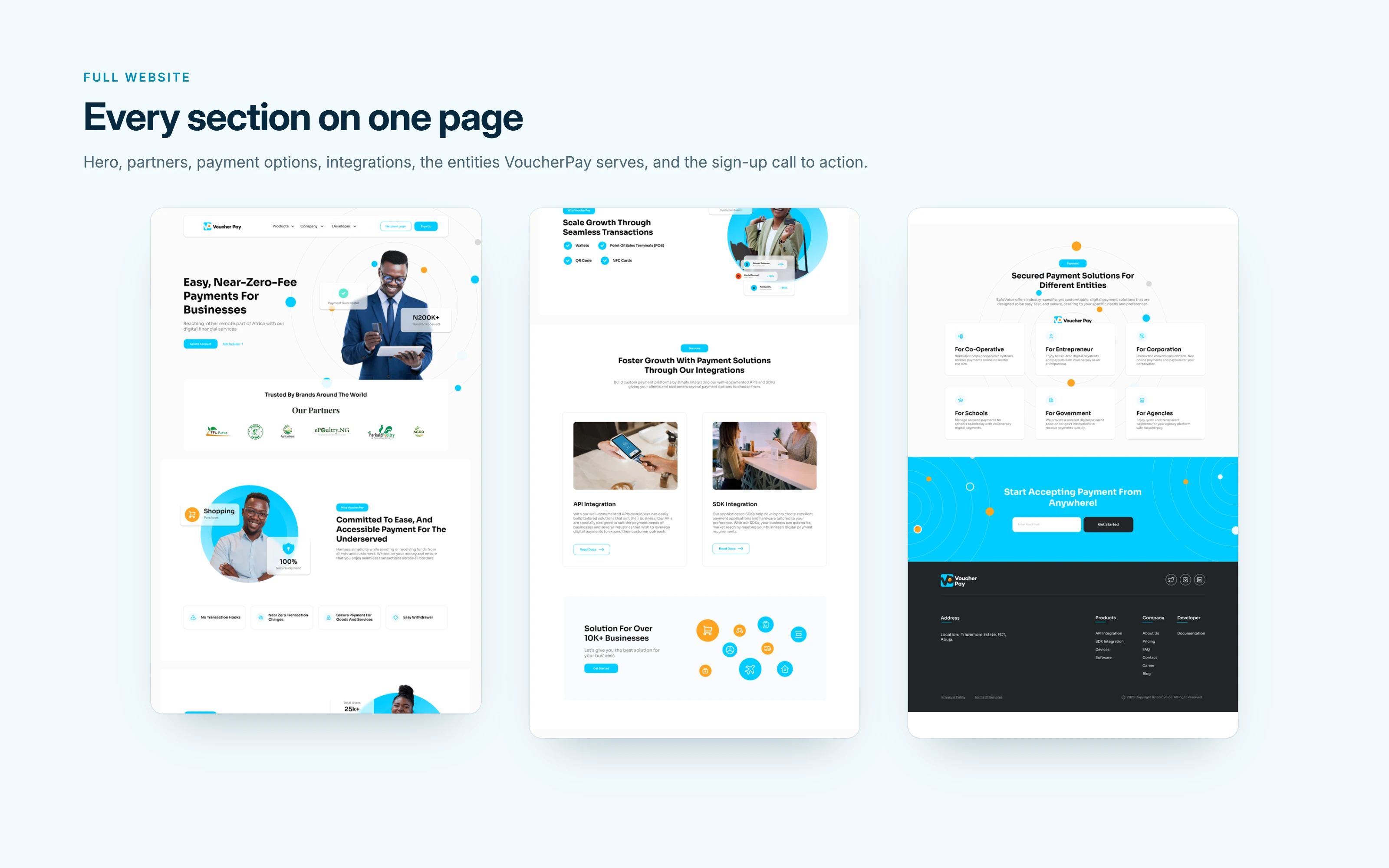
Every section of the homepage on one page.
Onboarding and compliance
Sign-up takes a minute: business name, country, name and email. Registration then continues in steps (business, contacts, owners, documents and payment details), with progress shown on the left. Businesses choose their registration type, from sole proprietorship to a company limited by shares, and only see the fields that apply.
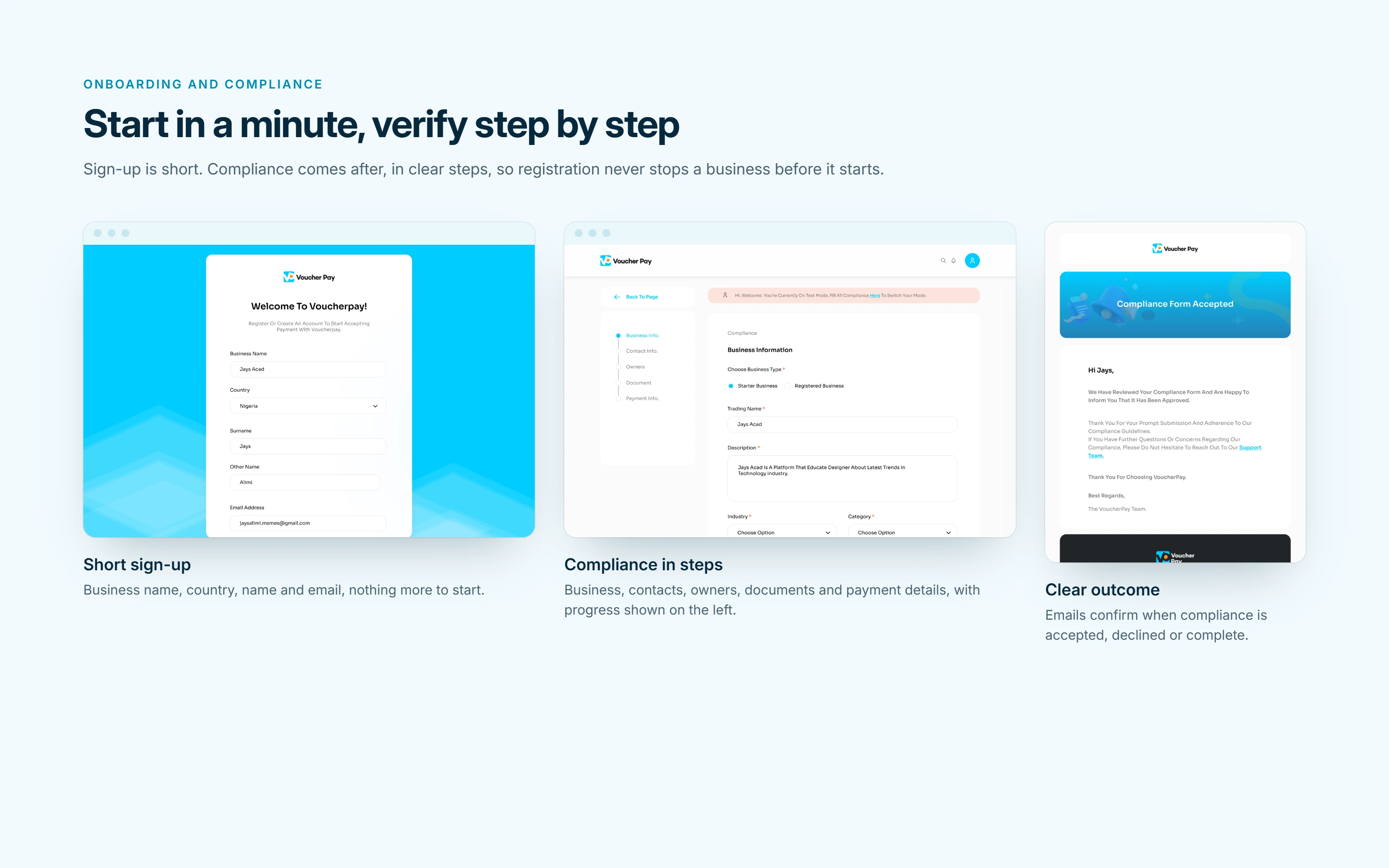
Sign-up, a compliance step, and the acceptance email.
Merchant dashboard
Merchants create payment links, review transactions, request payouts, invite their team, and manage API keys and webhooks from one place. A fixed sidebar and consistent tables keep everything within one or two clicks.
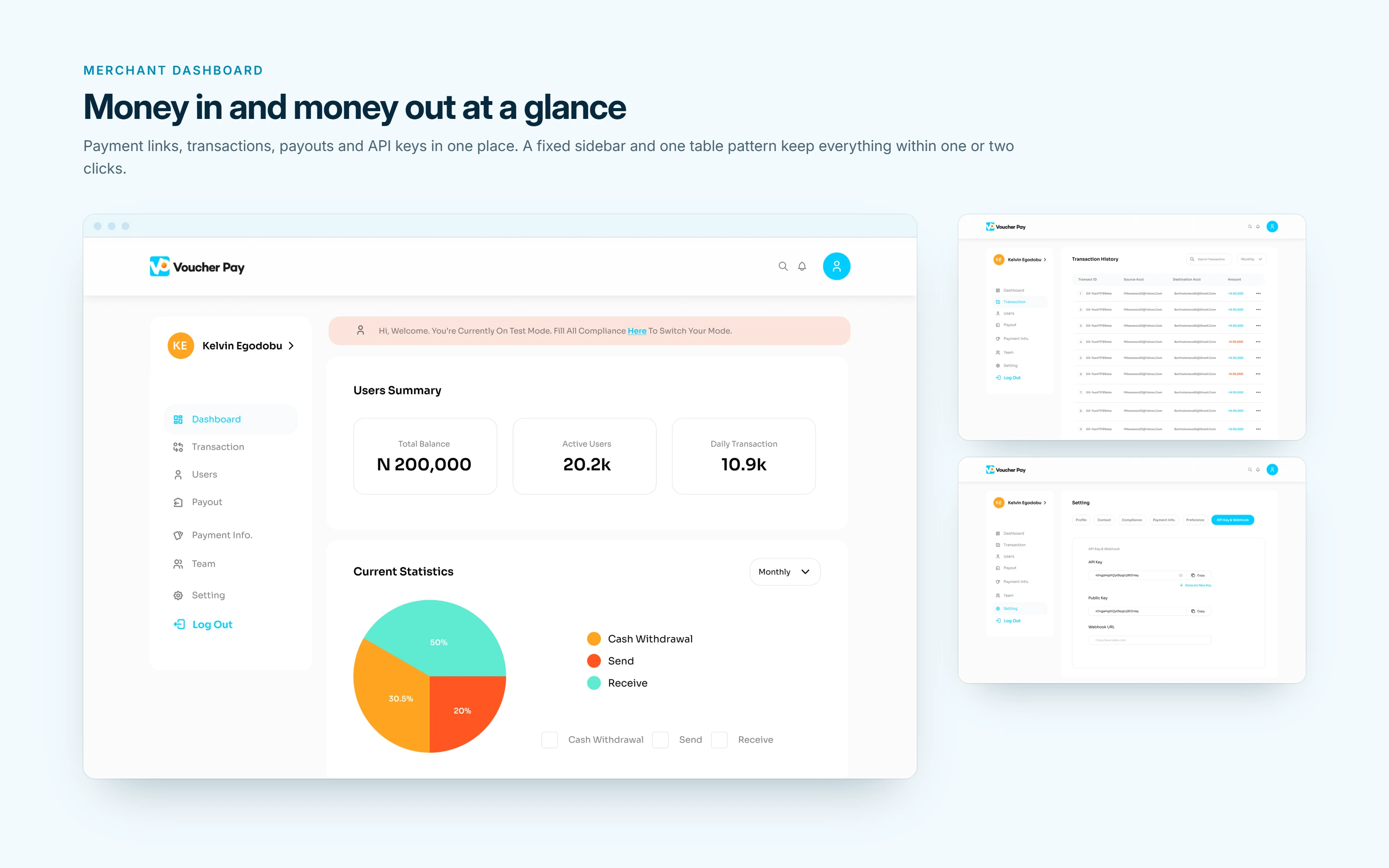
Overview, transactions, and API keys and webhooks.
Admin dashboard
The VoucherPay team gets a view of every business on the platform, with summary cards and charts, then lists of what needs action: applications to review, disputes to resolve, helpdesk requests and payouts.
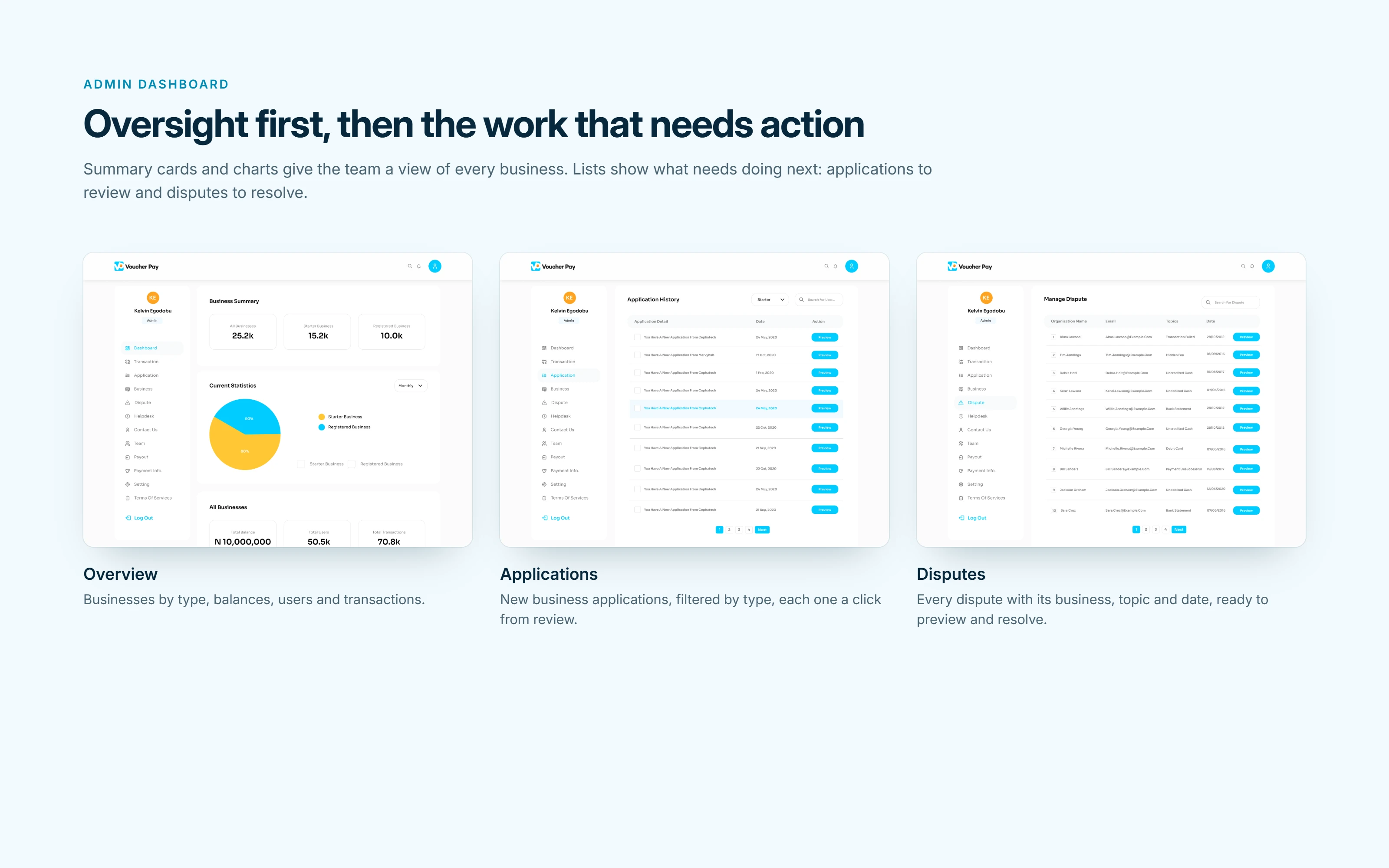
Admin overview, applications and disputes.
Emails, notifications, and mobile
The product doesn't end in the browser. Emails cover sign-up, sign-in, password resets, team invites, compliance results (accepted, declined or complete) and balance updates. The mobile view keeps balances and linked bank accounts within reach.
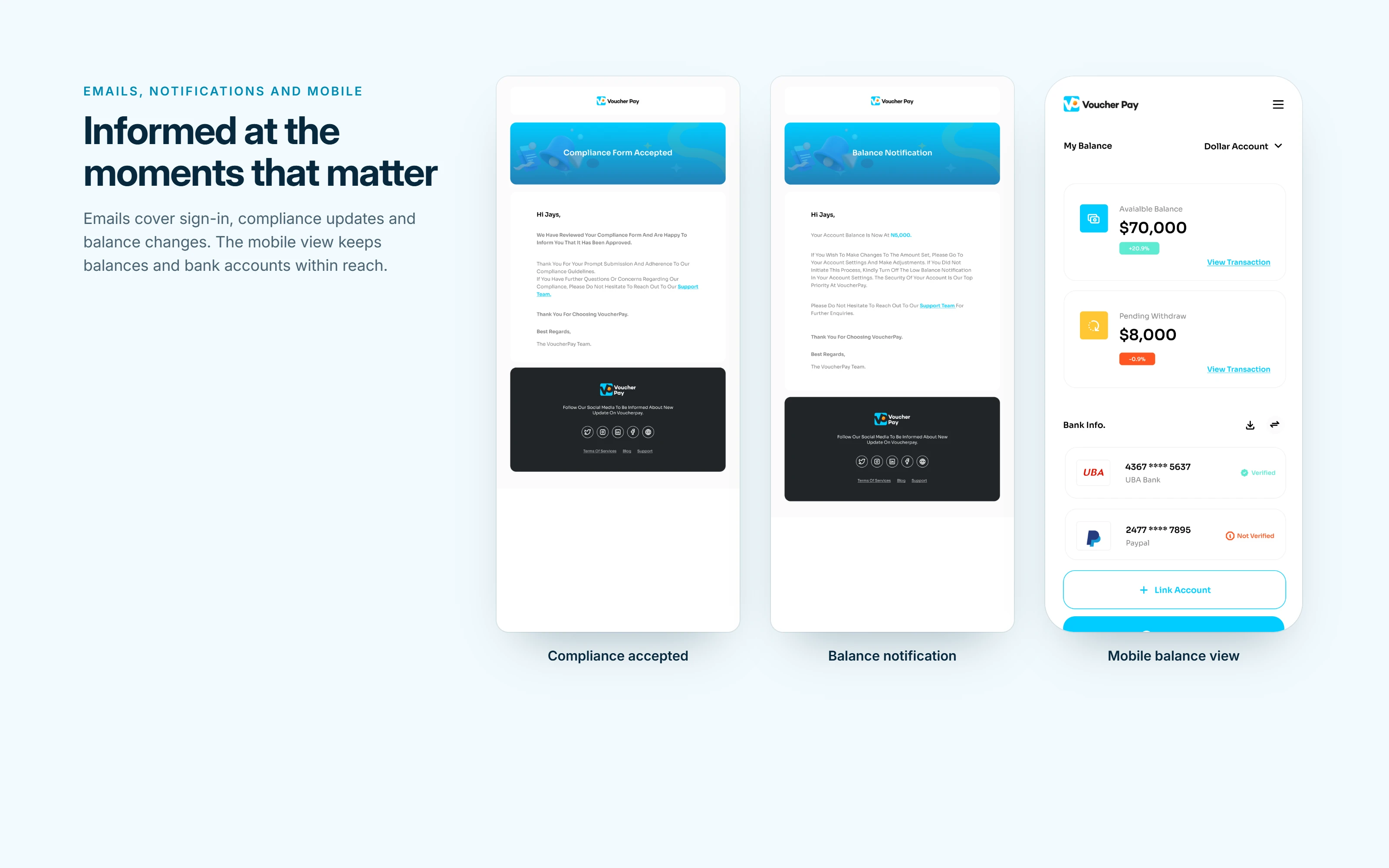
Compliance and balance emails, and the mobile balance view.
Results
What I delivered:
The full marketing website: home, about, pricing, API, SDK, devices, software, blog, careers, FAQ and legal pages.
Sign-up and the five-step compliance flow.
The merchant dashboard: transactions, payment links, payouts, customers, disputes, helpdesk, team and API settings.
The admin dashboard: businesses, applications, transactions, disputes, helpdesk, payouts and team.
Email templates, notifications and the mobile view.
Results
The redesigned transaction dashboard cut the steps needed to complete core payment tasks.
Restructured navigation reduced support tickets.
Closing
Building a payments product or a dashboard your team will use every day? Message me or book a free 20-minute product strategy call through my profile. I'll review your request and come back with a plan, timeline and estimate.
0 likes · 1 view · Nov 4, 2026
Full resposive website screens, merchant dashboard, and admin dashboard that help small businesses collect payments, pay out funds, and stay compliant.
