
How I built a brand and a Framer website for a global cultural storytelling organisation in 4 weeks
This case study shows how I created Global Culture Network's brand identity from the ground up, then designed and built its website in Framer, in light and dark mode. GCN runs four divisions, and visitors couldn't tell what it does or how to support it. The new brand gives it a clear, trusted look, and the website explains the organisation in seconds. The site is built so the GCN team can update it without a developer.
Context
Client: Global Culture Network (GCN). Duration: 4 weeks. Tools: Figma, Illustrator, Framer.
GCN documents, preserves, connects and teaches the world's cultures and human stories through documentaries, cultural event coverage, research and storytelling.
The challenge: GCN had no distinct brand identity. It runs four divisions (documentary, media, an institute and a foundation), and visitors couldn't tell what it does, why it matters or how to support it.The brand had to feel warm and human, and still look credible to partners and donors.
My approach
I started with one question: what should someone understand about GCN in five seconds? The answer shaped both the brand and the site.Brand first. I designed the identity before the website, so every touchpoint, from the site to a staff ID card, looks like it comes from the same organisation.Then structure. The website follows the order in which a visitor decides: understand, trust, explore, support.
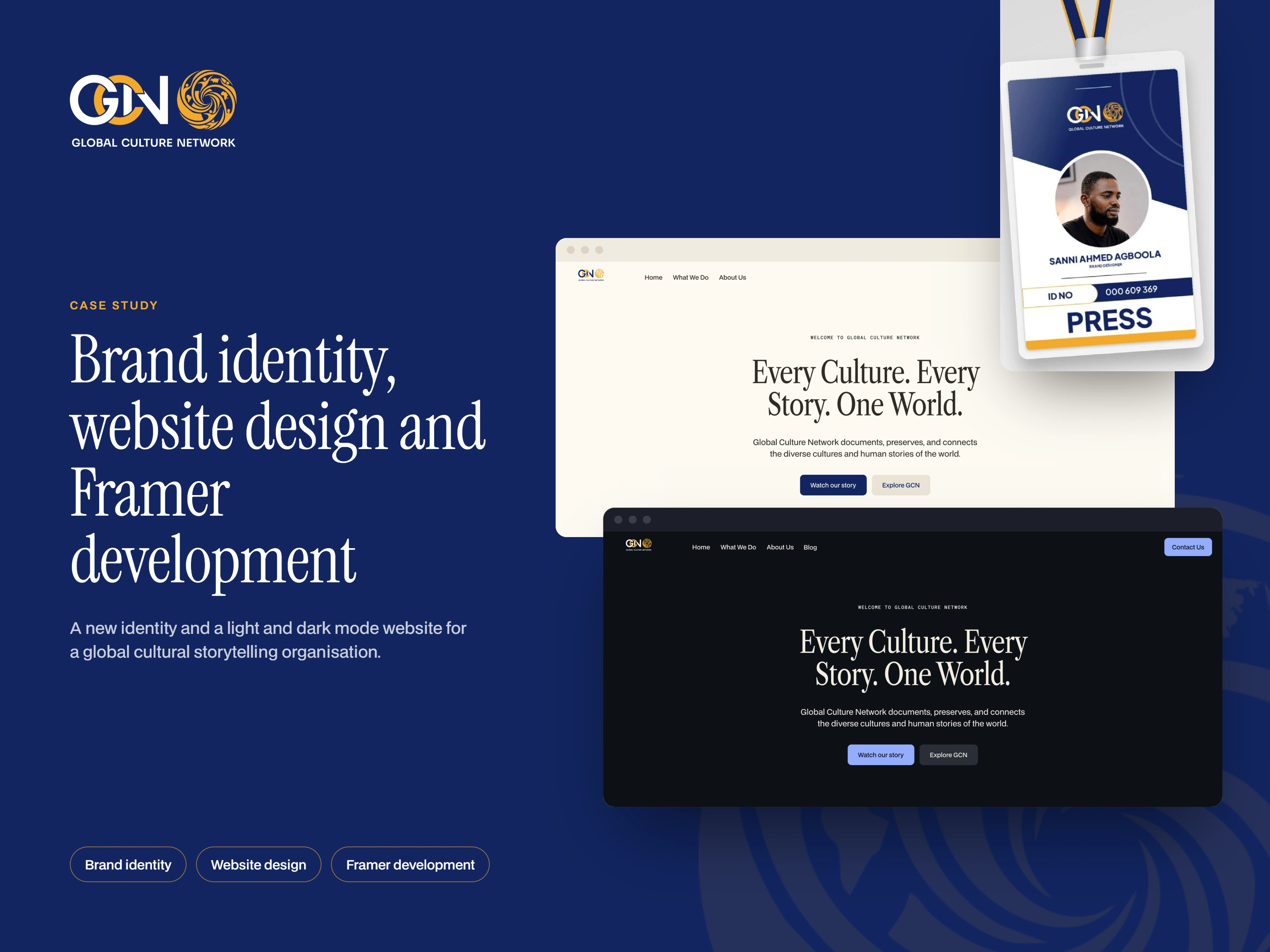
Global Culture Network: brand identity and website.
Brand identity
I designed the identity from the ground up. The logo pairs the GCN monogram with a circular emblem: the circle stands for global unity, and the intertwined letters G, C and N stand for connection. The two work together or apart: the primary logo on light backgrounds, the reversed logo on navy and in dark mode, and the emblem alone for small spaces such as profile pictures and favicons.
Navy gives the brand authority, gold adds warmth and energy, and cream keeps everything human and readable. Instrument Serif gives headlines the weight of a publication, and BDO Grotesk keeps body text clean and easy to read.
To make sure the identity holds up beyond the website, I applied it to a staff ID card, a film title card, social posts and business cards.
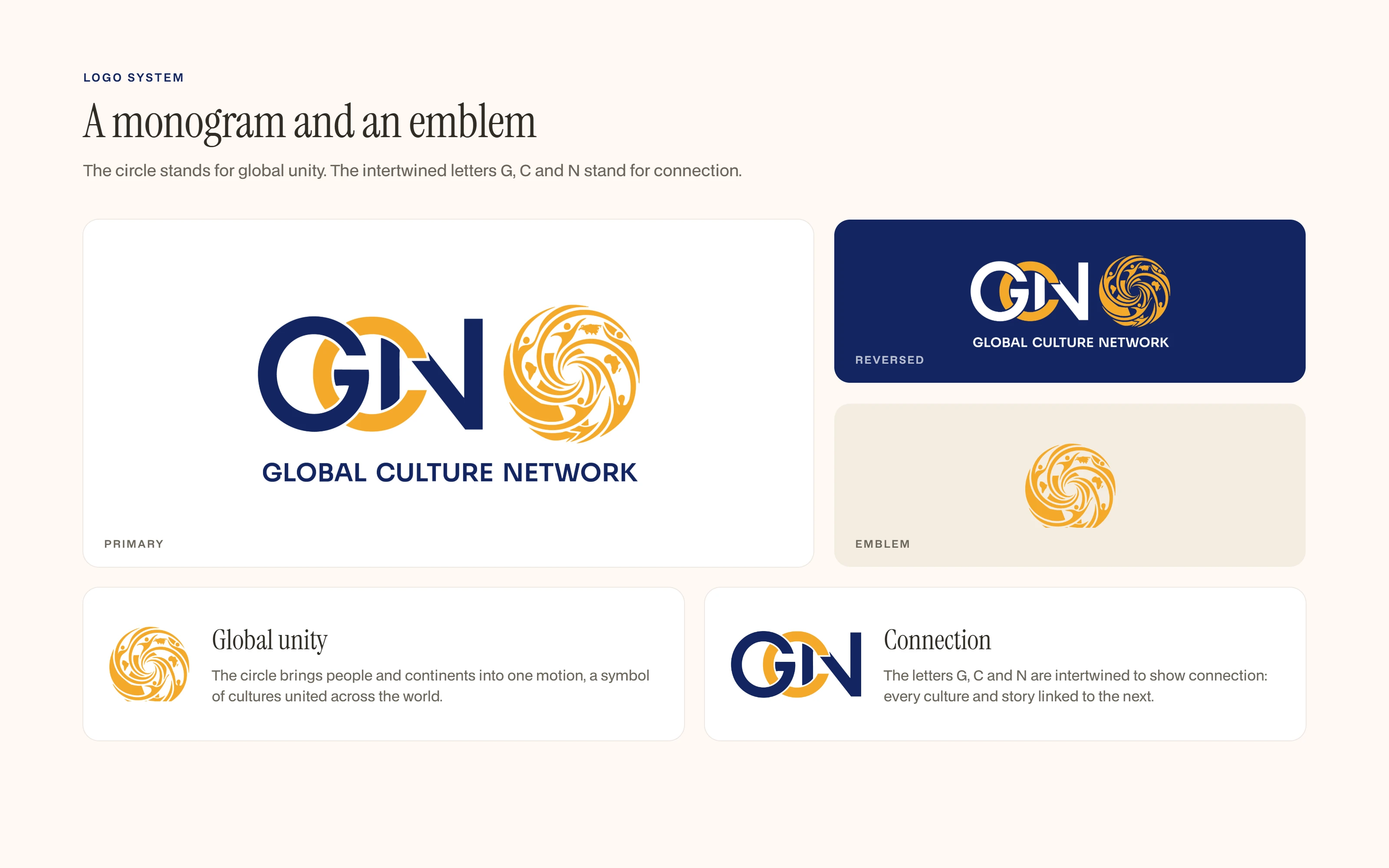
Primary, reversed and emblem versions, with the meaning behind the mark.
Colour and typography
Navy gives the brand authority, gold adds warmth and energy, and cream keeps everything human and readable. Instrument Serif gives headlines the weight of a publication, and BDO Grotesk keeps body text clean and easy to read. Dark mode uses a near-black surface with the same hierarchy.
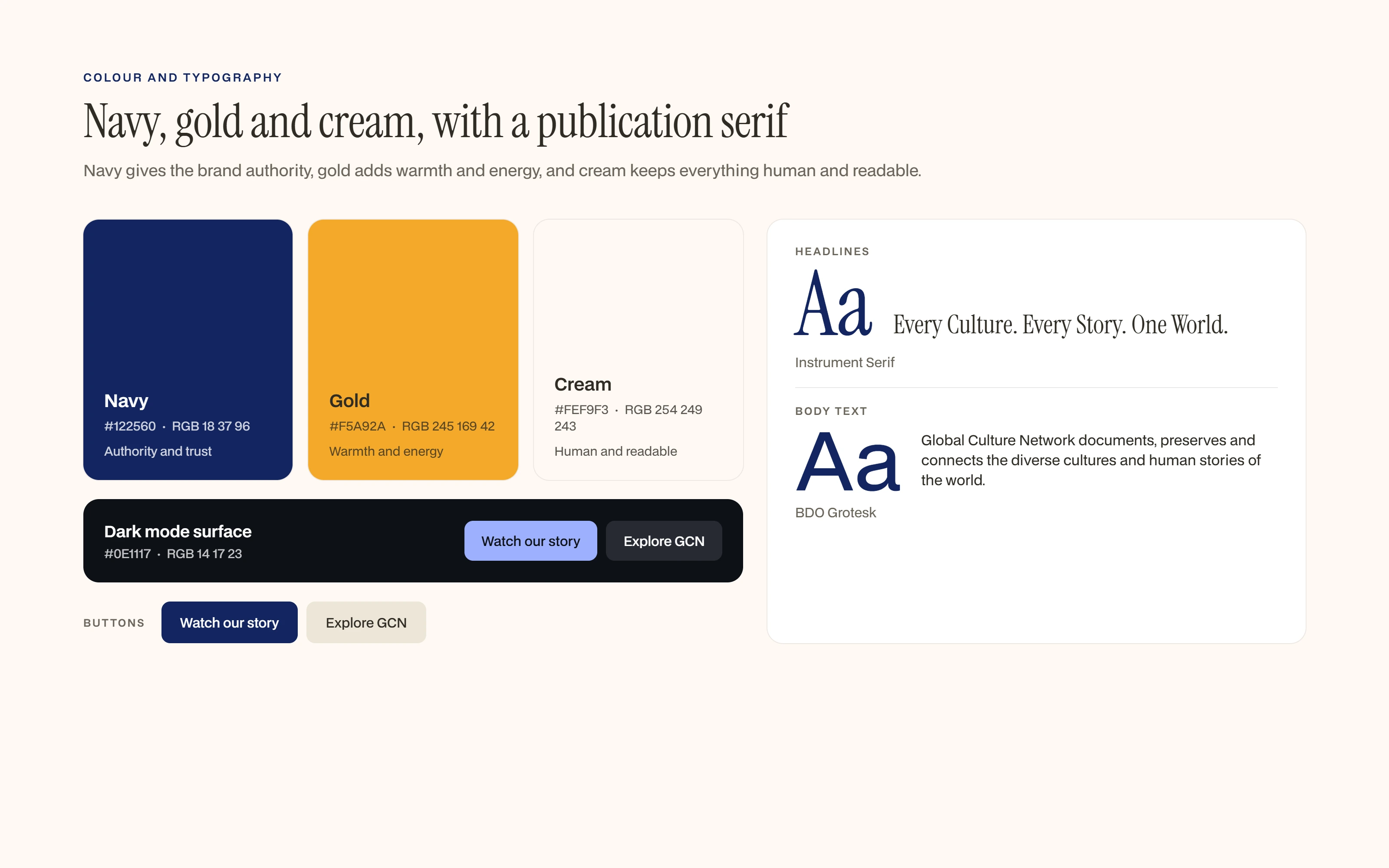
Navy, gold and cream, the dark mode surface, buttons and the type pairing.
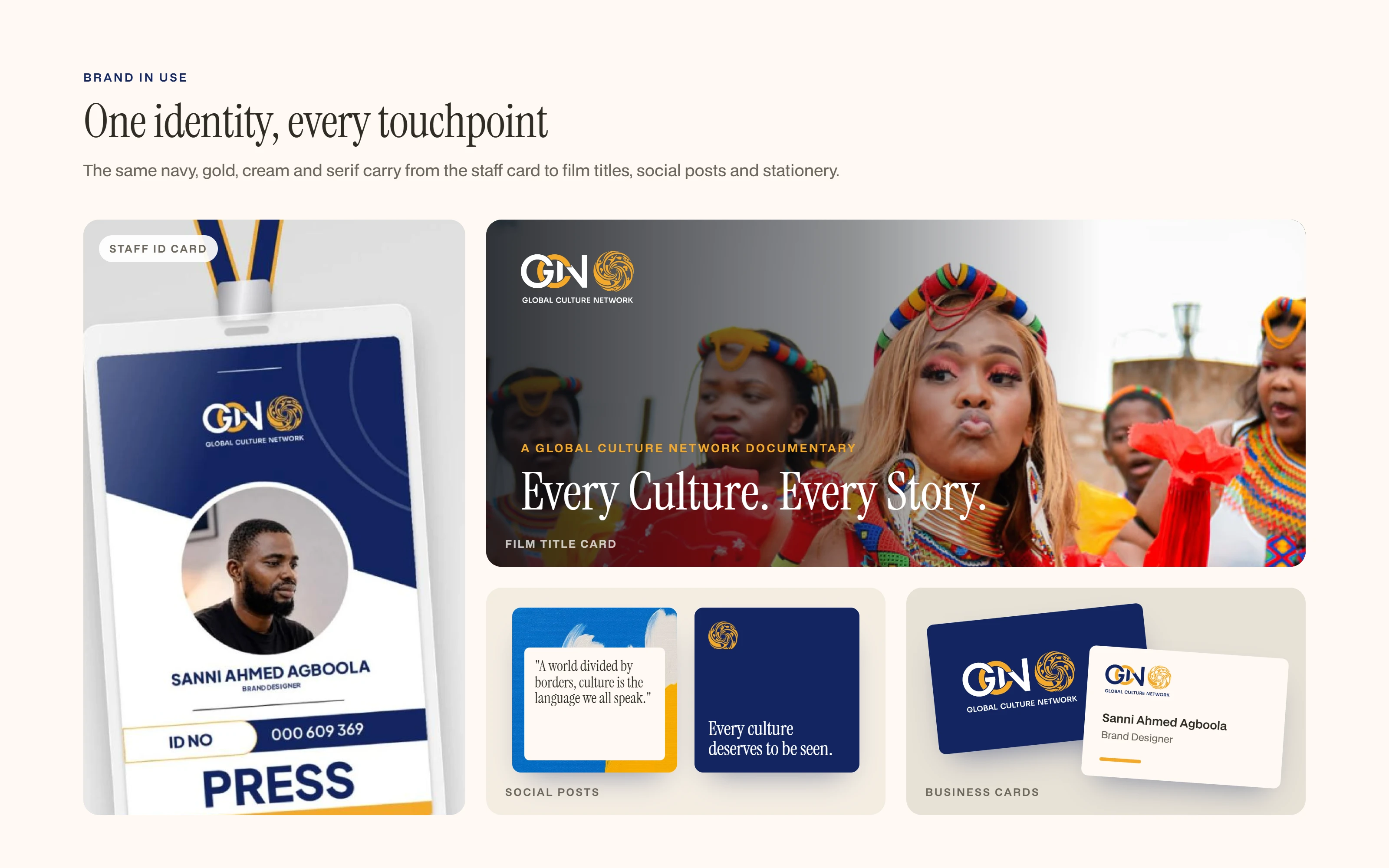
The identity on a staff ID card, a film title card, social posts and business cards.
Understand: the hero, in light and dark mode
The first screen answers what GCN is in one line, "Every Culture. Every Story. One World.", with two clear actions: watch the story, or explore GCN. The whole site works in light and dark mode, and dark mode keeps the same hierarchy with softer contrast, so the brand stays consistent in both themes.
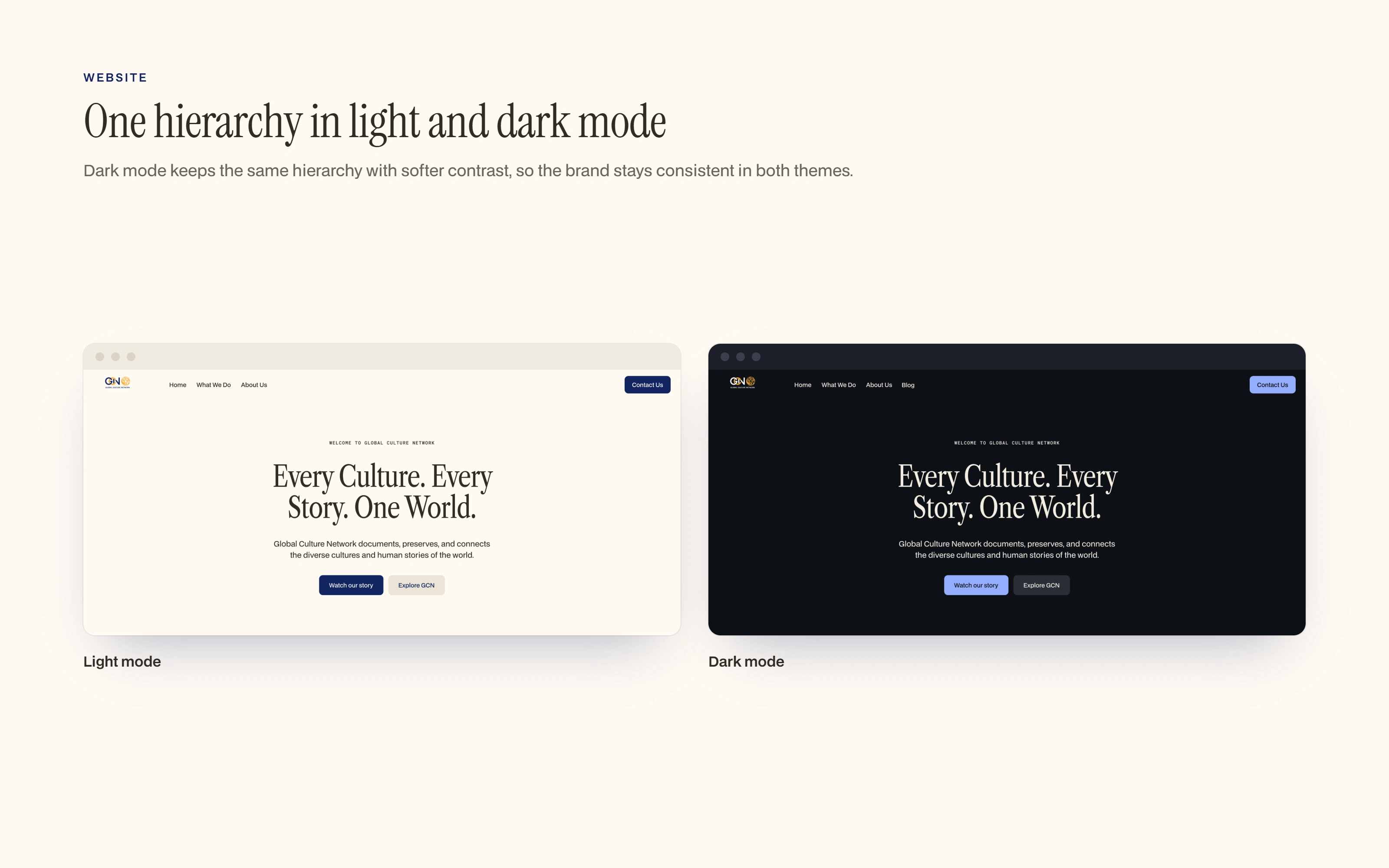
The homepage hero in light and dark mode.
Trust: the four foundations
GCN's four divisions (Documentary, Media, Institute and Foundation) each get a short line, so visitors see the whole organisation at a glance and understand where their support goes.
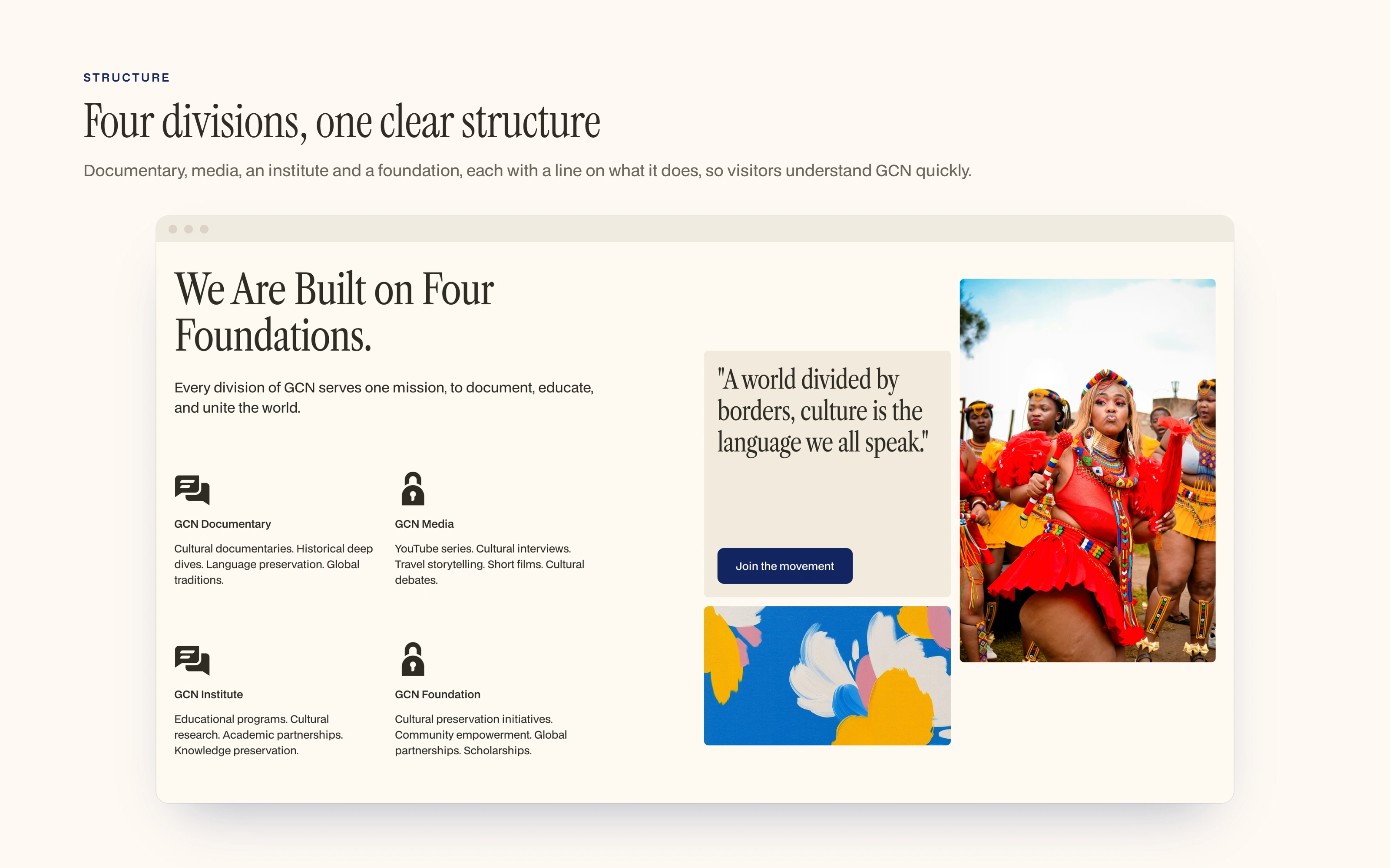
The four foundations section.
Explore: the approach
Three storytelling cards, Documentary First, Human Centered and Globally Distributed, explain how GCN works without long paragraphs.
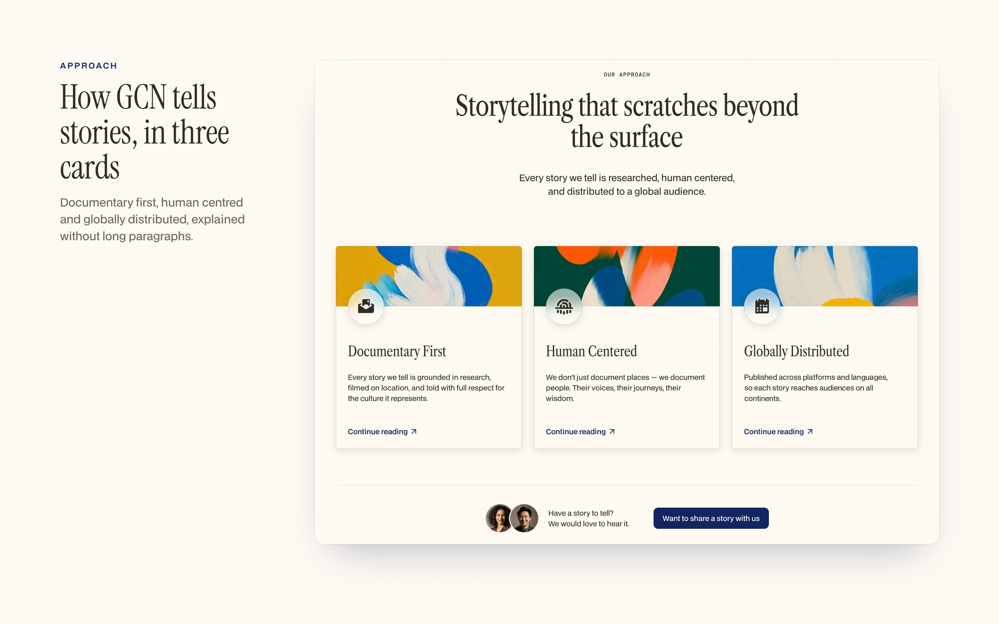
Three cards explain the approach.
Trust: impact in numbers
A single figure, stories published across six continents, broken down by type, sits next to a short statement of what GCN believes. Numbers and a clear purpose build credibility quickly.
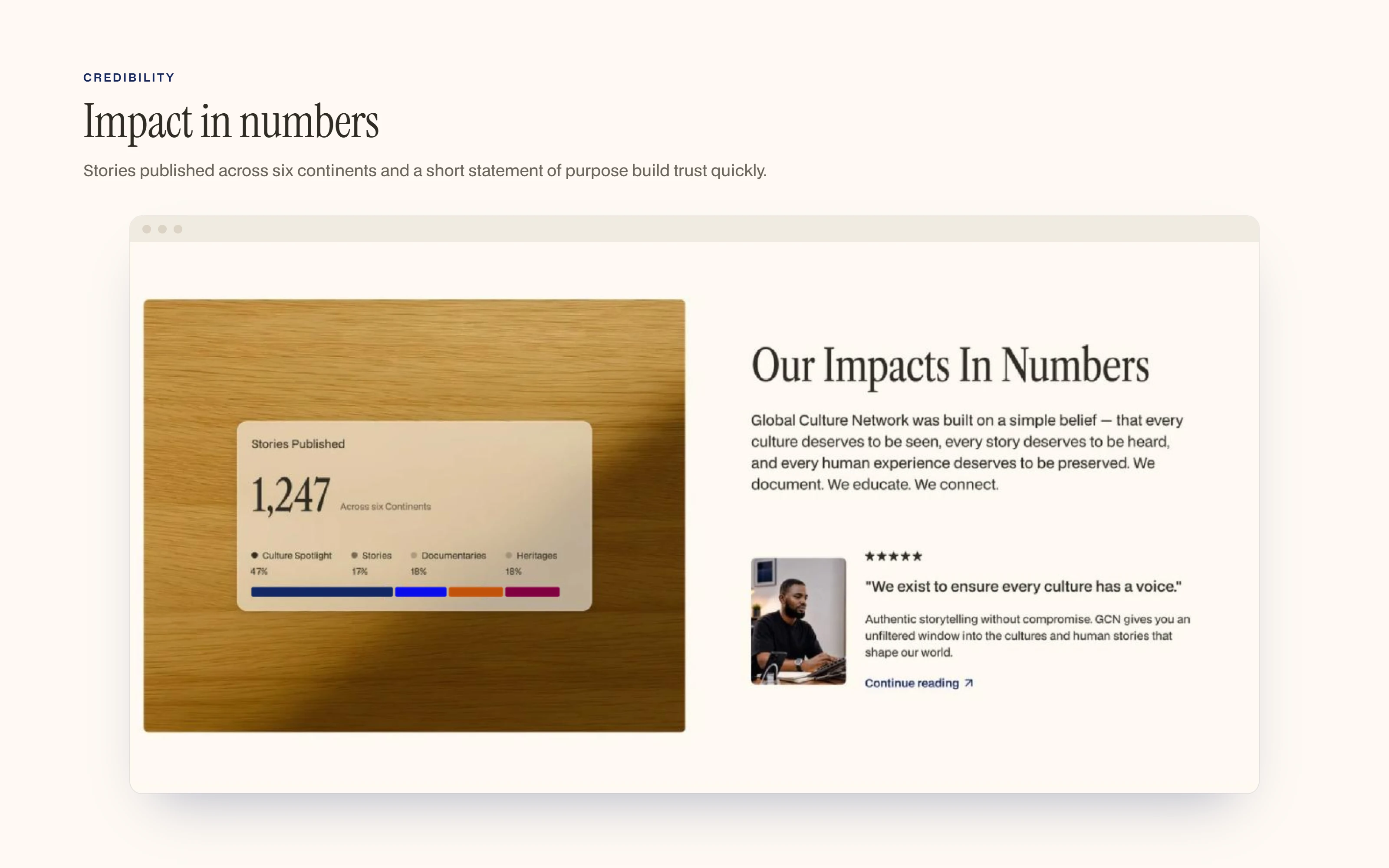
The impact section.
Explore: film
A featured documentary brings the mission to life: "Every culture we document is a world preserved for the next generation."
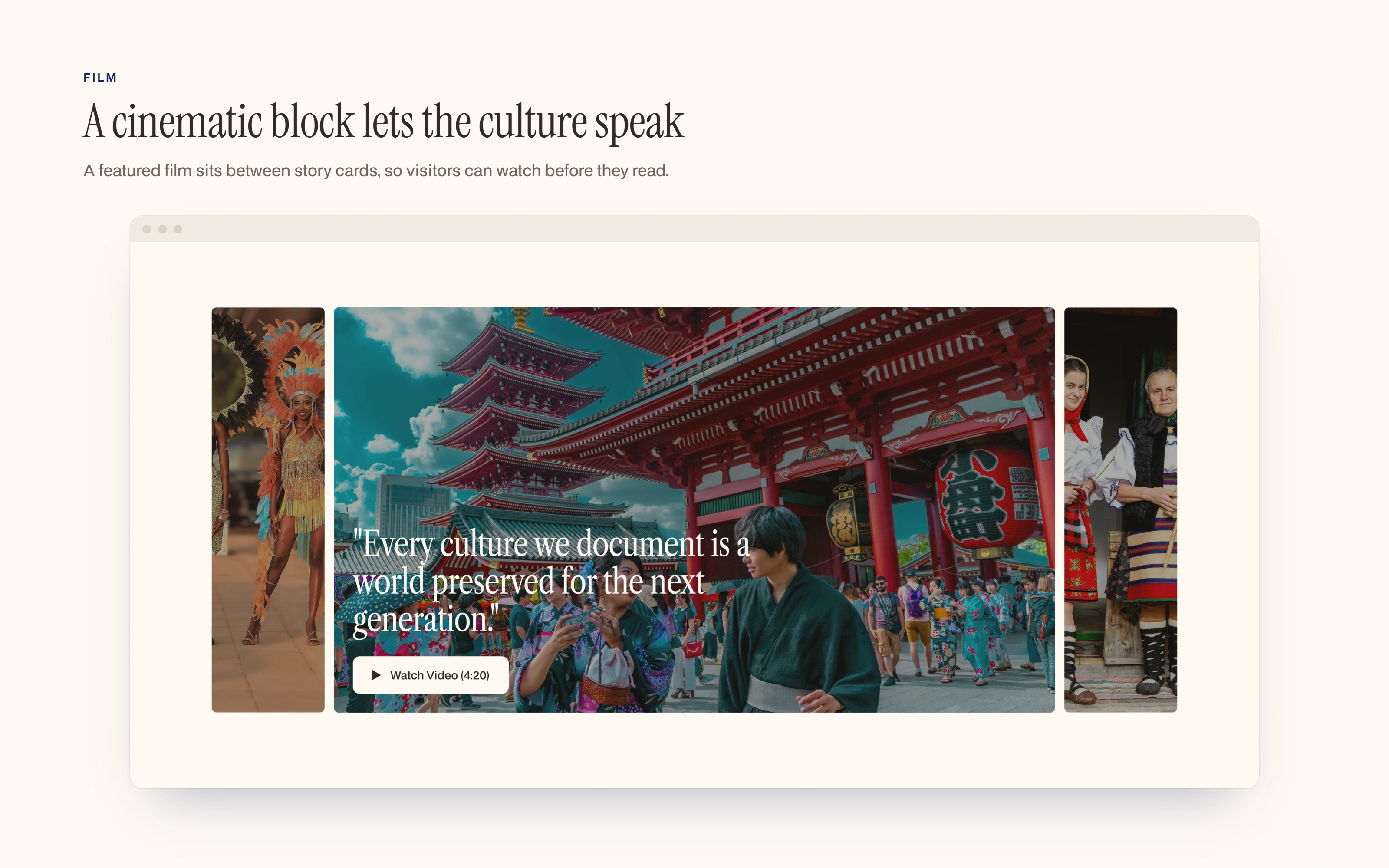
The featured film section.
Support: two clear options
A free tier, Friend of GCN, lets people follow the work. A paid tier, GCN Supporter, directly funds documentary production. Two options keep the decision simple.
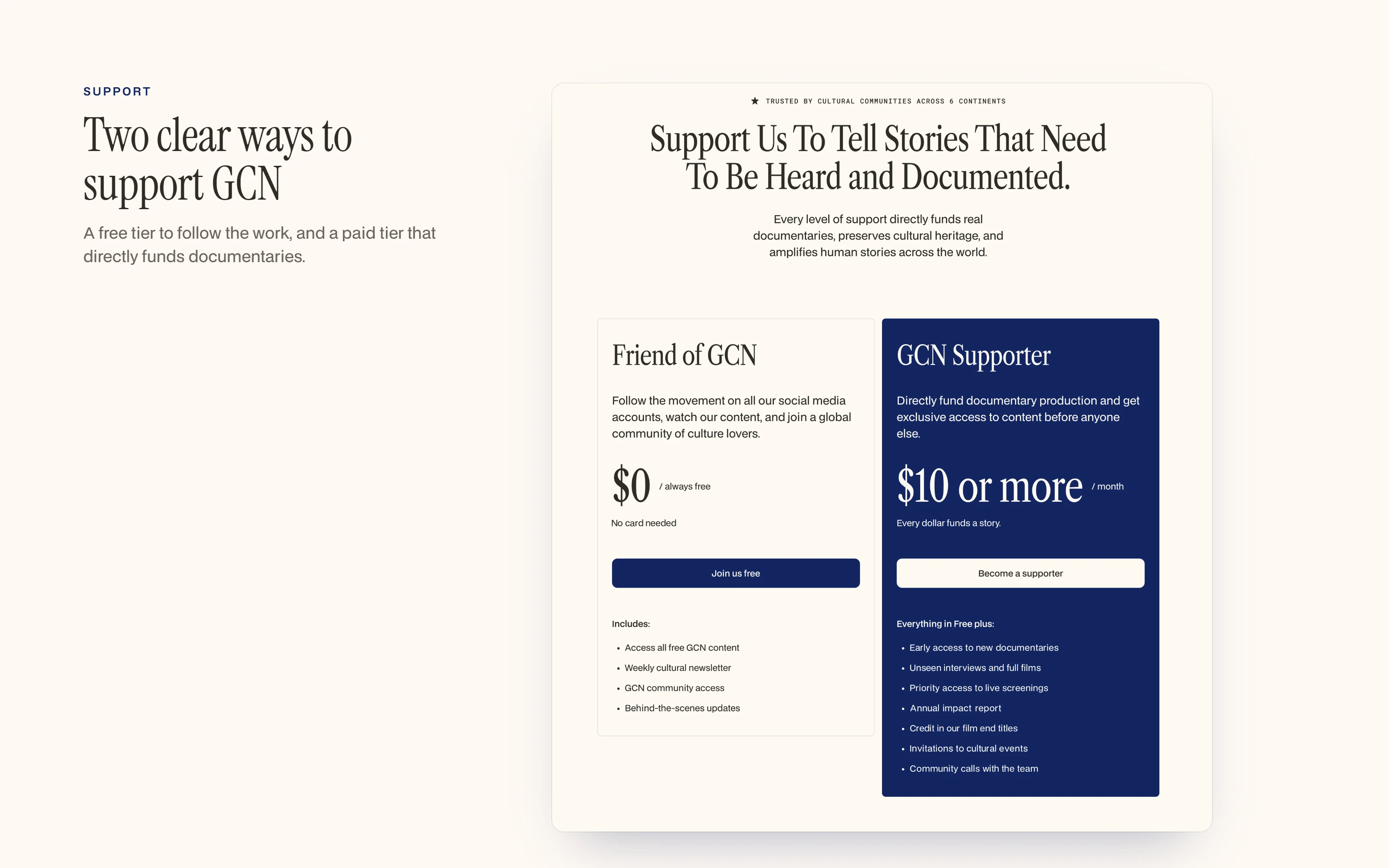
Free and paid ways to support GCN.
Development in Framer
I built the site in Framer with responsive layouts and smooth interactions. I structured the pages so the GCN team can update content without a developer, and so the build matches the design exactly.
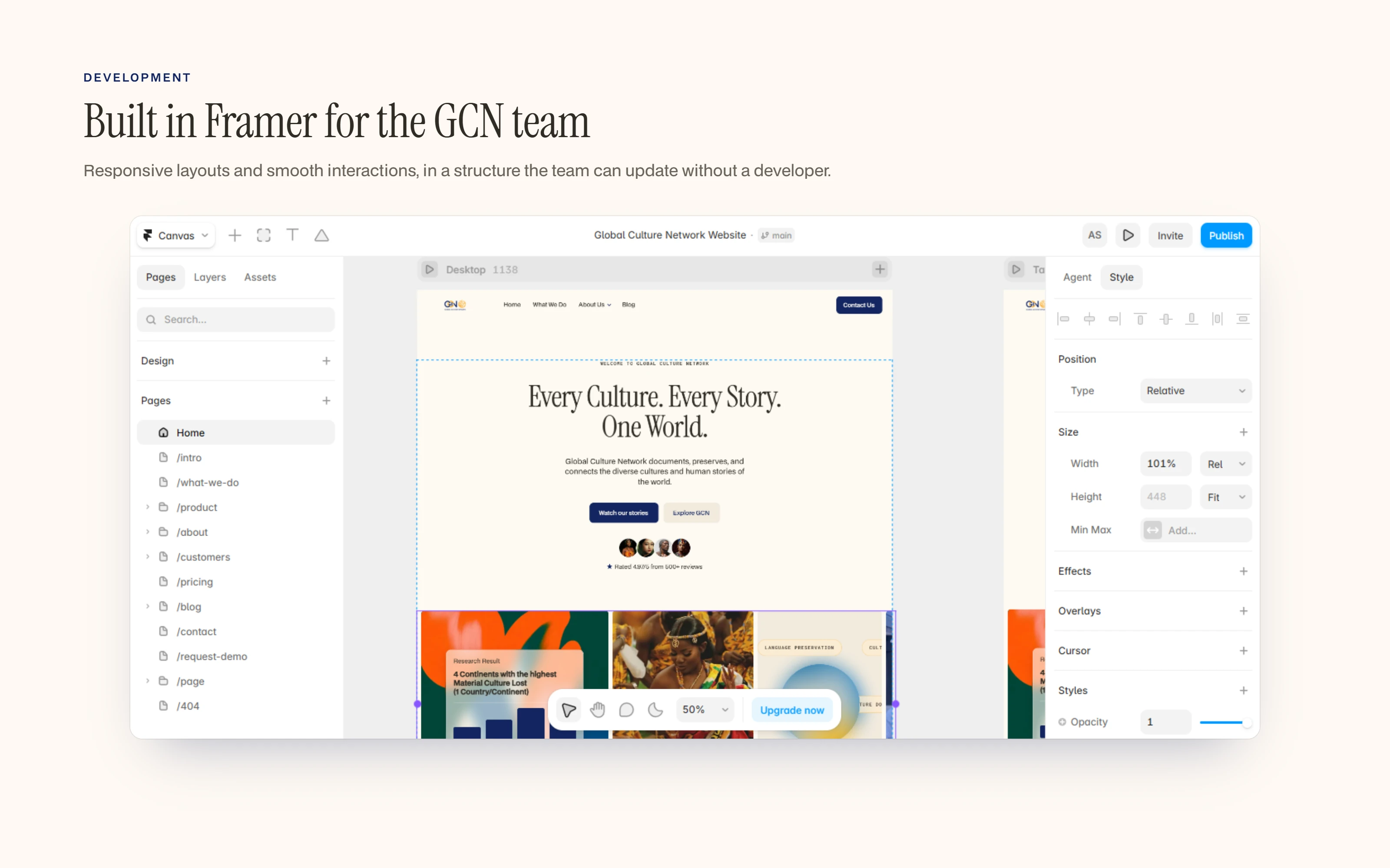
The GCN site in the Framer editor.
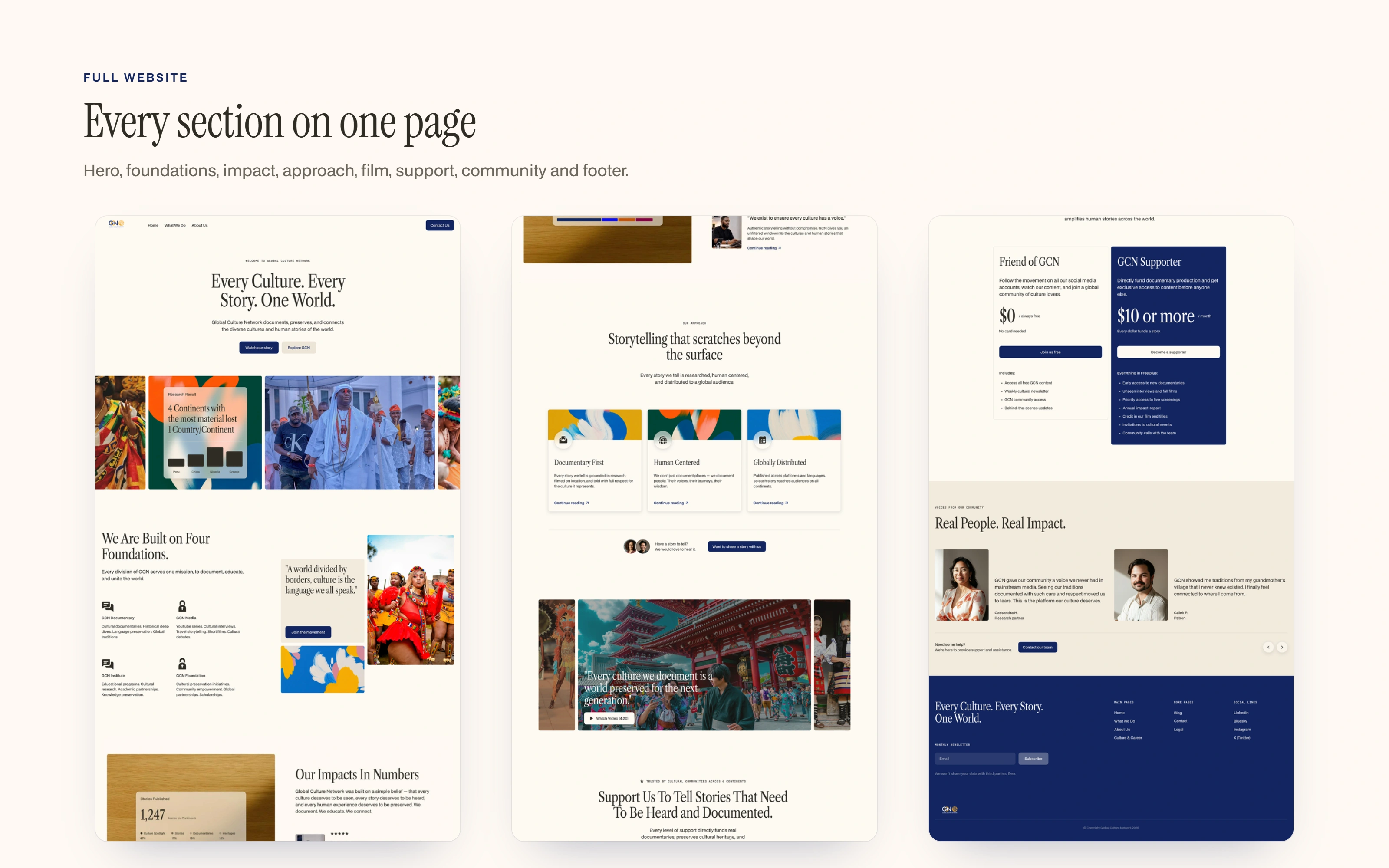
Every section of the homepage on one page.
A scroll through the homepage.
Scope of work
Brand identity: logo, emblem, colour palette, typography and brand applications.
Website: a responsive design in light and dark mode.
Development: a Framer build the team can update themselves.
Duration: 4 weeks.
Closing
Need a brand and a website that tell your story clearly? Message me or book a free 20-minute strategy call through my profile. I'll review your request and come back with a plan, timeline and estimate.
0 likes · 3 views · Oct 29, 2026
Crafted brand identity, designed website and develped it using Framer for Global Culture Network.

