Designing a budgeting app for tracking expenses
Priyanka Mandal
PROBLEM STATEMENT
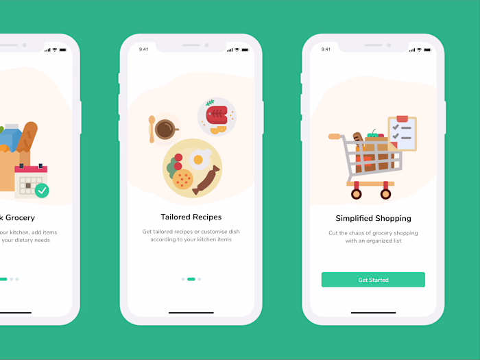
Individuals today face challenges with time and patience when it comes to cooking and maintaining a healthy diet. Youngsters often struggle with tracking kitchen items and lack knowledge about recipes, leading them to opt for ordering food and spending money. There's a clear absence in effectively managing the movement of food into and out of the kitchen.
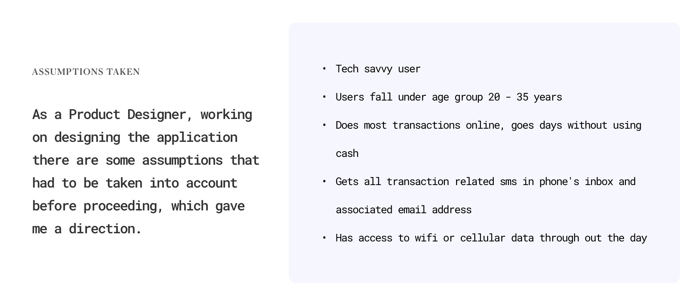
INITIAL BRAINSTORMING
As an initial starting point, I started listing out random questions and thoughts about the use and functionality of the application. A few of them were:
- Why an expense tracking app?
- Who will use it, and what is the age group?
- Are people so busy that they cannot keep track of their expenses?
- How do they do it now?
- What tools do they use to do it at present?
- Do people use digital payments mostly, or is it just the metro cities?
- What about the manual cash payments?
user goals
- Manage expenses
- Limit expenses to budgets-monthly/weekly
- Peace of mind, calculating expenses, knowing most spent categories
- Reduce or stop unnecessary spends
- Bill reminders
user tasks
- Set a monthly/weekly budget to limit expenses
- See all transactions - digital or non-digital
- Can also add manual cash expenses and non-digital payments
- Check average spend per day and spend accordingly
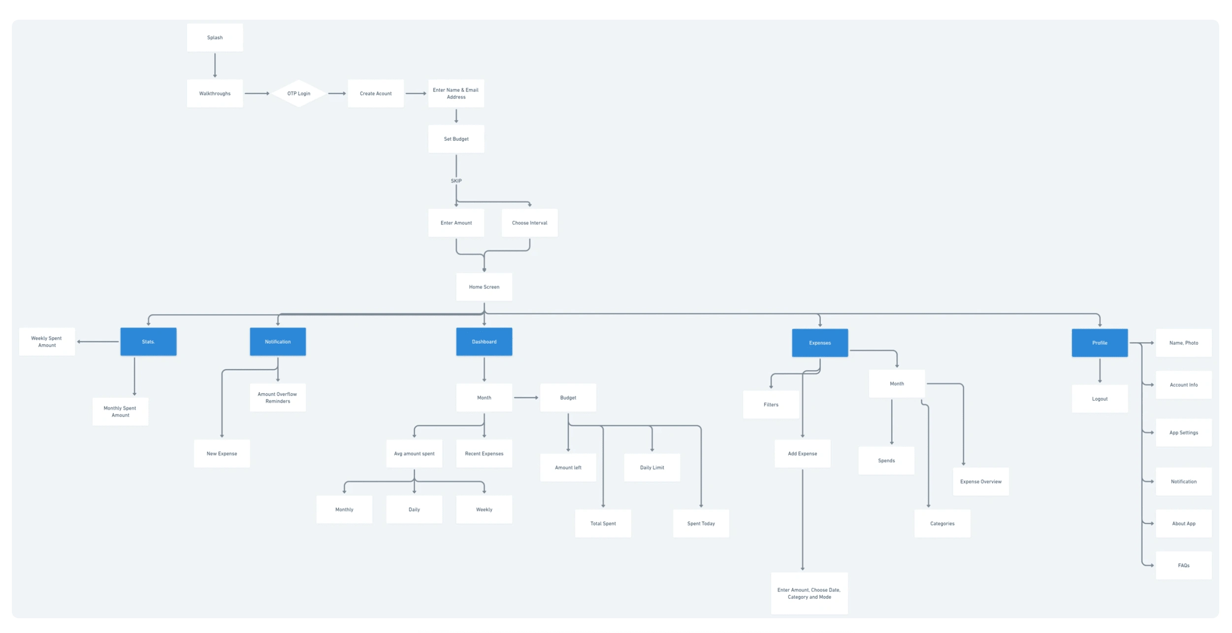
SITE MAP
DESIGNS
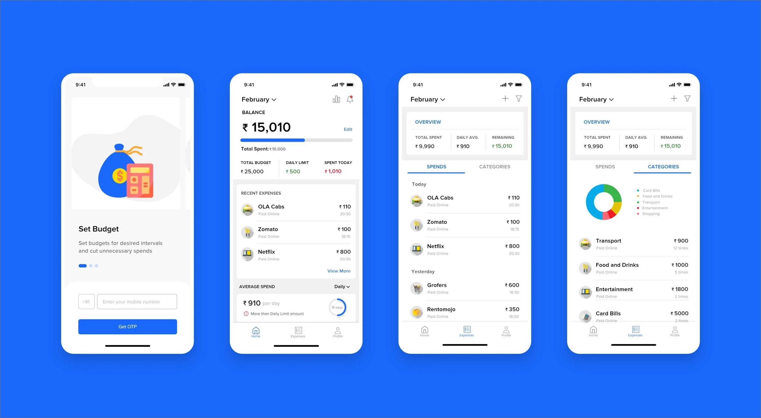
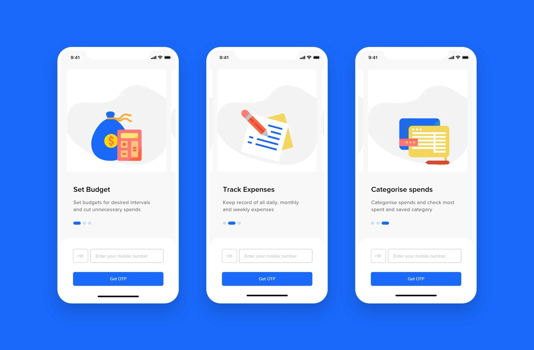
Onboarding
On-point screens to convey the goal of the app helps users to understand the functionality before they Sign Up and give access to their information.
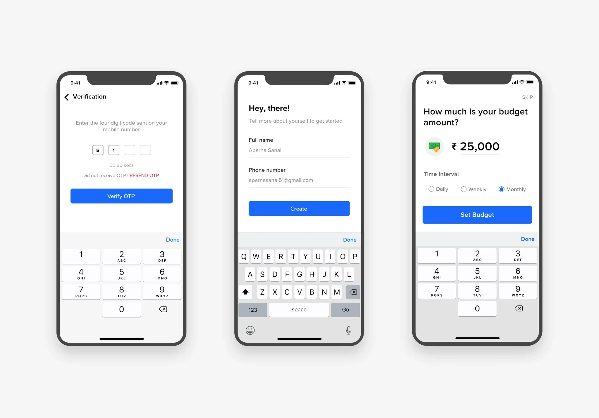
Log In/Sign Up
Users can Sign Up into the app by verifying their number with an OTP followed by a screen to enter their name and email address. The Skip option has not been provided for OTP Sign Up because the app needs to verify the person's number before any other proceedings making it secure.
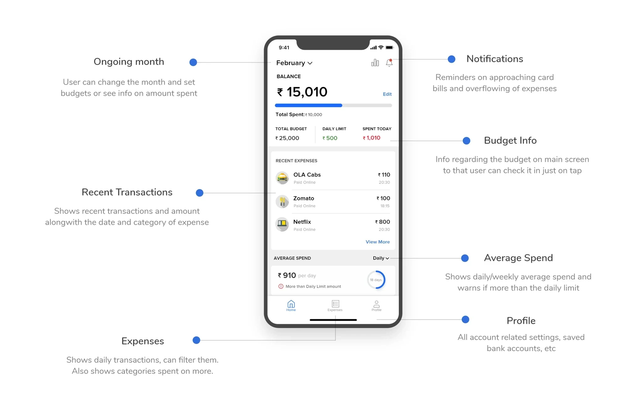
Home Screen
All the important information that the user needs to check often is displayed on the home screen, including budget info, recent transactions, average spending, and reminders.
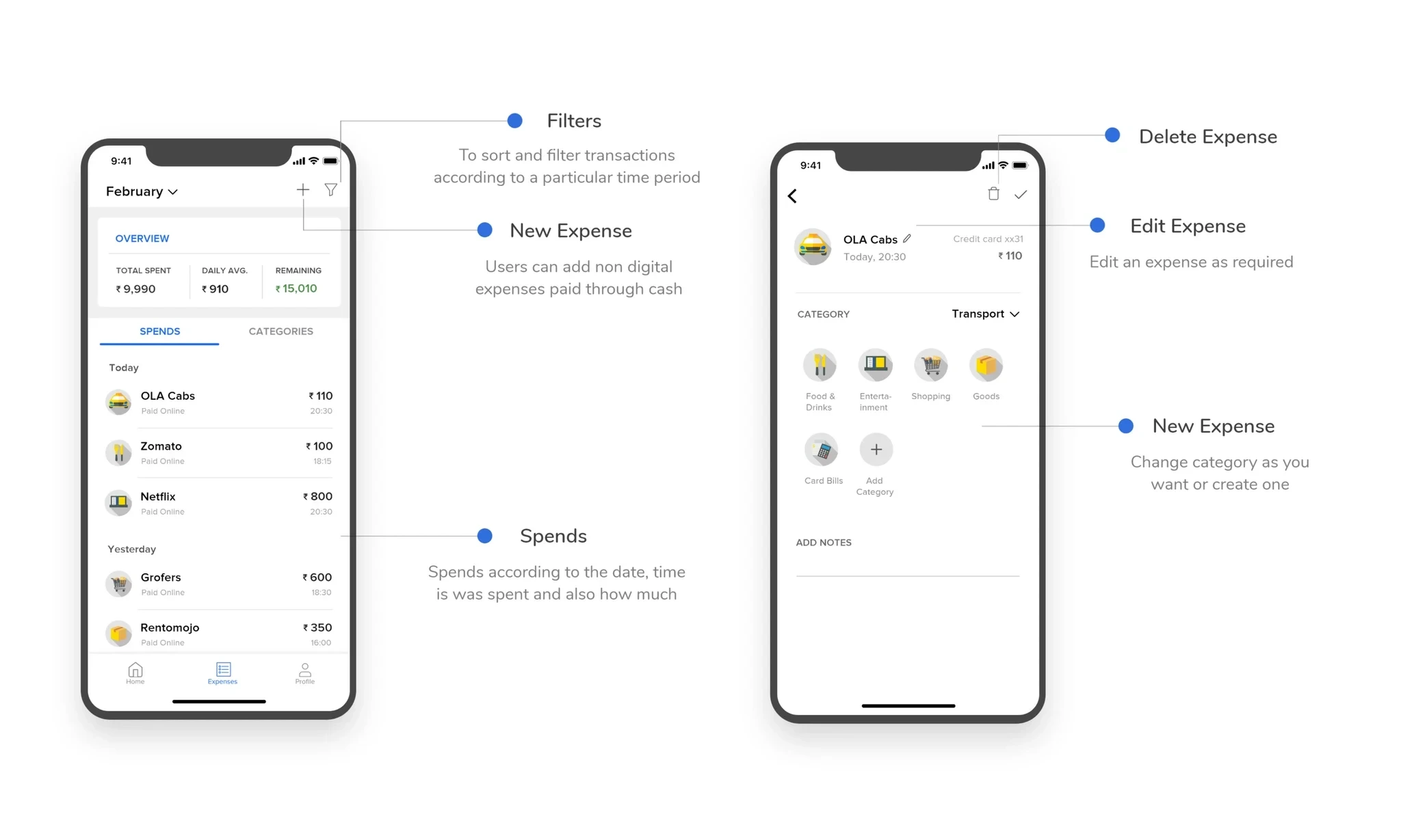
Spends
Check all the spends and transactions done, and filter it according to time intervals. Get an overview of what was spent and what was left. Add non-digital expenses manually.
VISUAL ELEMENTS
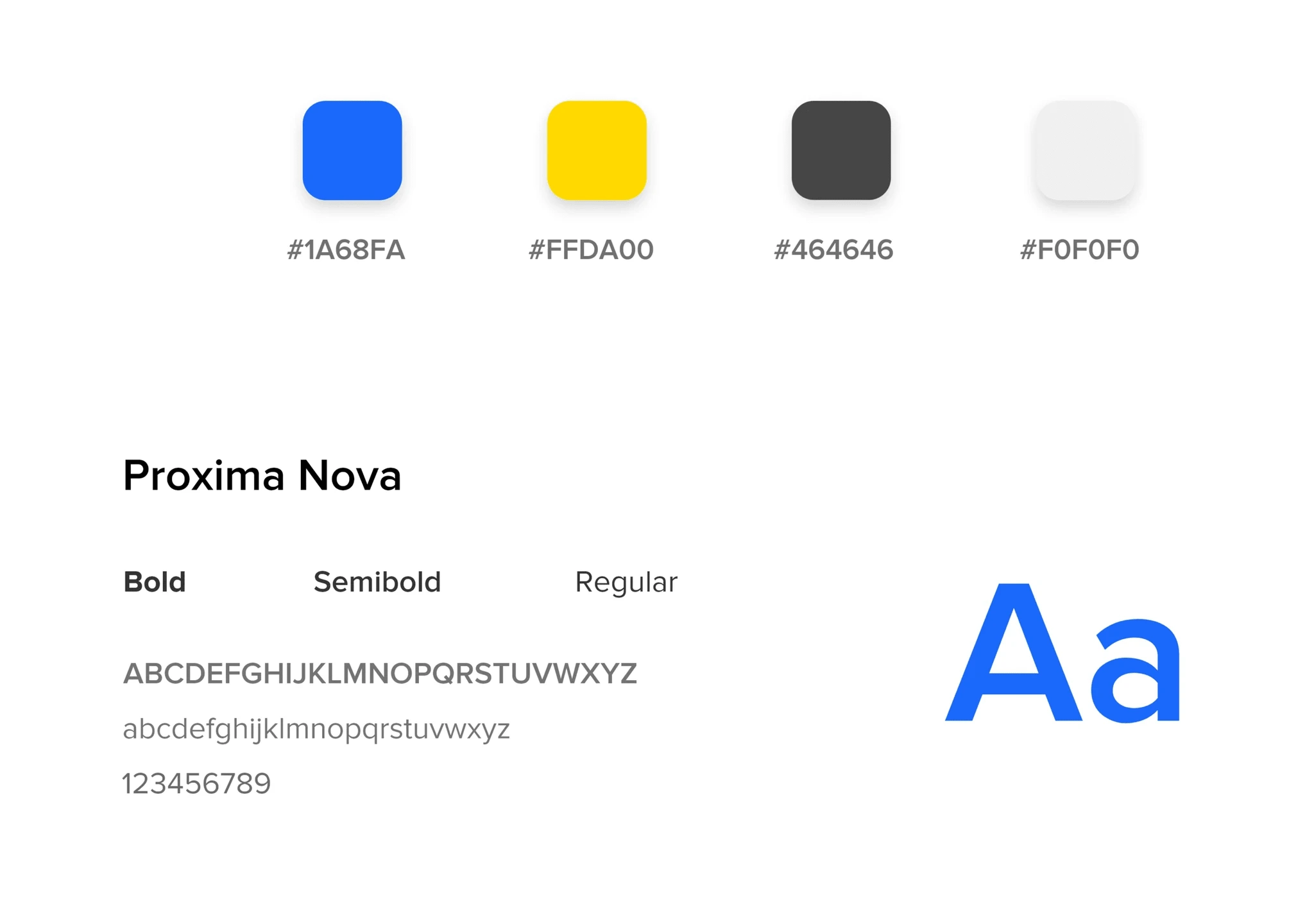
The color palette is simple and clean. The primary color is blue and the secondary color chosen is yellow. The Blue color gives a feel of security to the user as it is essential for an app that the users trust with all their SMS and bank information. The font used is Proxima Nova which is simple and clear for better legibility.
LIMITATIONS
- There is no skip option to the sign up screen. Users have to sign in before they can enter the app to use it
- Users have to sign up through mobile number only, no alternative is given. Later in the onboarding process, they have to provide an email address to get easy access to salary account debit and credit details
Thank you for your time :)
Like this project
Posted Jun 5, 2024
Safespend is a budgeting app for tracking expenses. It helps users track and manage expenses with ease.
Likes
0
Views
8