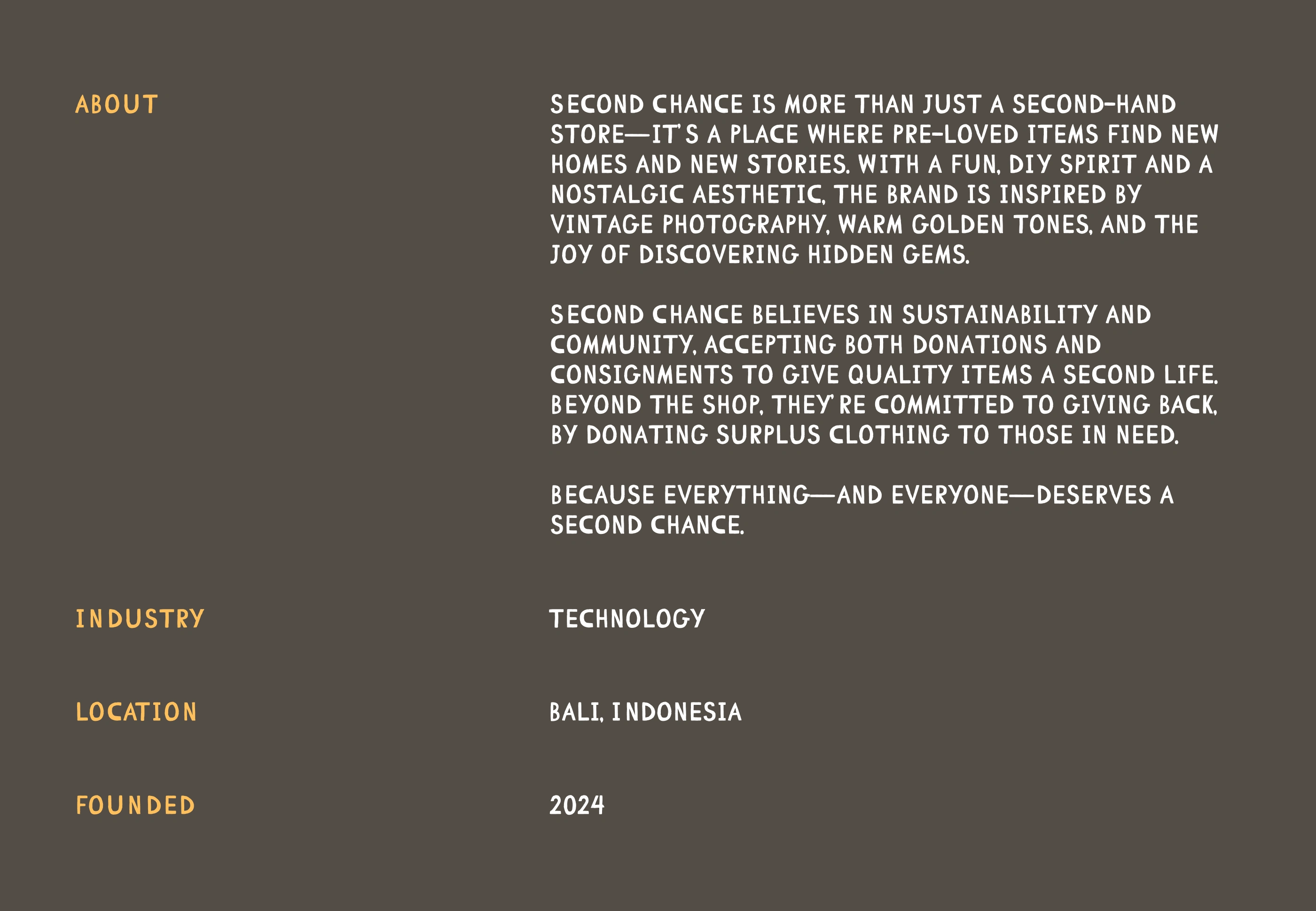
Second Chance - Brand Design and Identity
Taylor Fredrickson
The Concept
Understanding the concept of Second Chance requires a little understanding of thrift and second hand stores in Indonesia.
In the west there is a trend of second hand stores being cool and hip, these stores often evoke that feeling. Fans of second hand and thrift shopping know the feeling: finding designer clothing gems for a few dollars, the smell of old paper as you rifle through bins of records, or an old camera that hasn't worked for 40 years but will look awesome as a decoration.
Well, that doesn't really exist in Indonesia. Thrift stores tend to be rather drab and boring, you can find cool clothes in them but you wouldn't be able to tell from the outside. Partly because of this lack of aesthetic and partly because of social stigma the perception is used clothes aren't cool and are only for people who can't afford new clothes.
Second Chance wants to change that.
In a paradigm of fast fashion and incredible waste, Second Chance want's to show people that thrifting is fun, sustainable, affordable, and what we really care about, looking super dope.
Leaning into their tagline, "Everything and Everyone Deserves a Second Chance." They also want to give back to the community by donating excess clothing to people in need.
Crafting the Look
So what should the brand look like and what feelings should it evoke? The founder wanted something fun and quirky, we also wanted to lean into DIY trends. We wanted to create the feeling I mentioned above, rifling through records, marveling at the design and look of old devices and products. We thought of things like film photography, things that are hand drawn or handwritten, vinyl records and the art of their sleeves. The goal is to capture that essence.
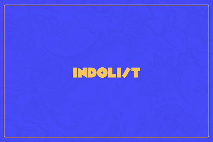
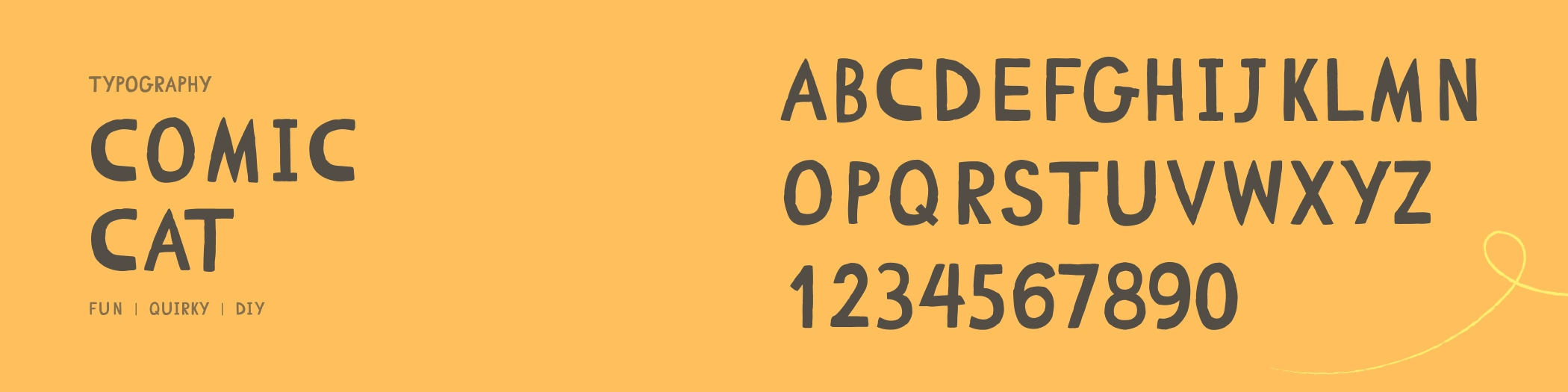
Typography
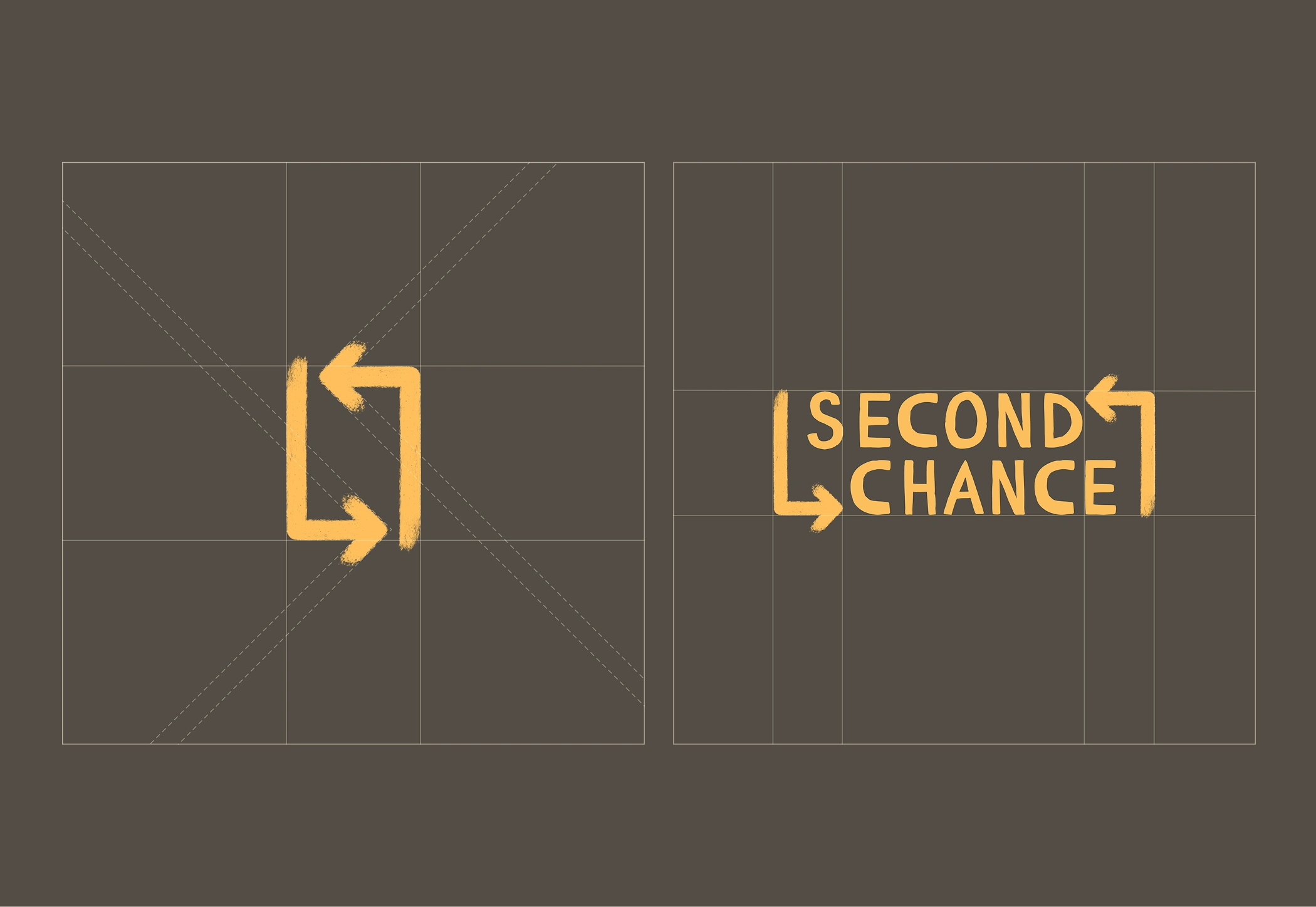
For typography we wanted something that could look handwritten. We selected Comic Cat, made by Vitaliy Lazarenko. It definitely checked off our boxes for fun, quirky, and DIY.
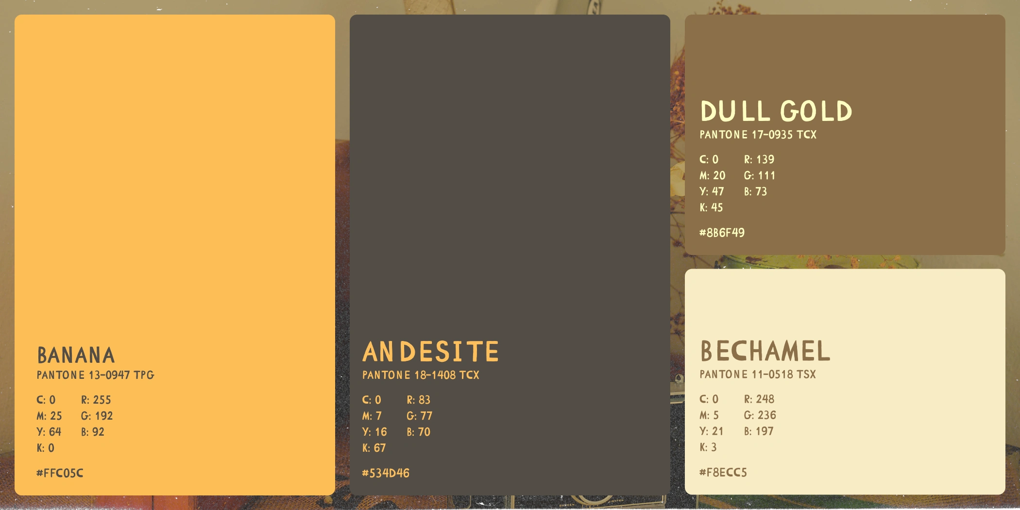
Color
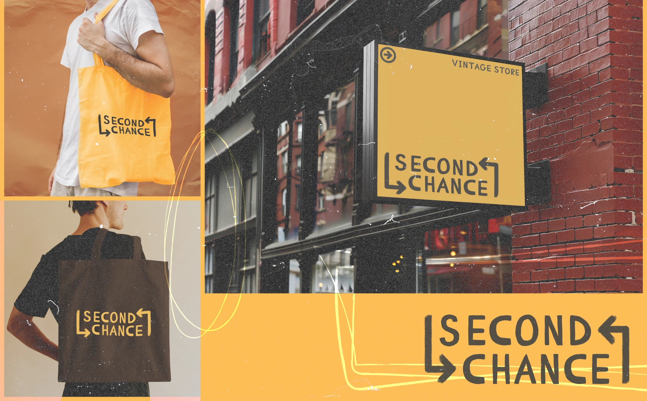
The colors of Second Chance were inspired by vintage film photography. The yellow we selected, Pantone's Banana, is meant to mimic the warm, vintage tone of older film photography, especially classic films like Kodak Gold.
The browns were meant to capture the the feel and look of American thrift stores, especially those you find in the rural west.
Lastly, bechamel, is selected as our white tone to evoke the look of aged paper.
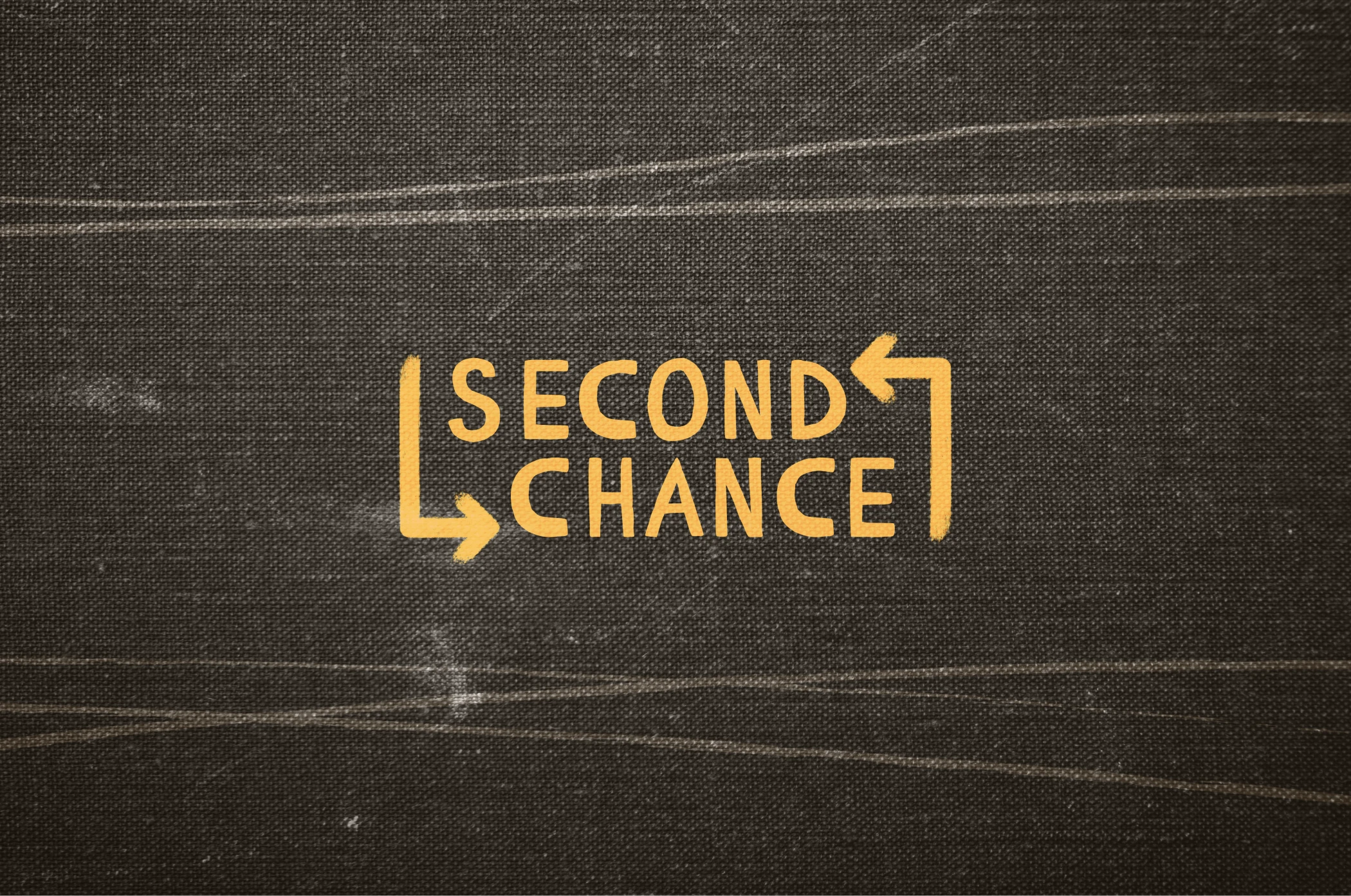
Logo
Still leaning into the DIY look we wanted to eschew the current trend of super clean, precise, geometric logos and monograms and create that hand drawn, DIY look. We also wanted to capture the essence of Second Chance, renewal, sustainability and, well everything deserves a second chance.
We used the brand font, Comic Cat as a base and incorporated hand drawn arrows symbolizing recycling and renewal.
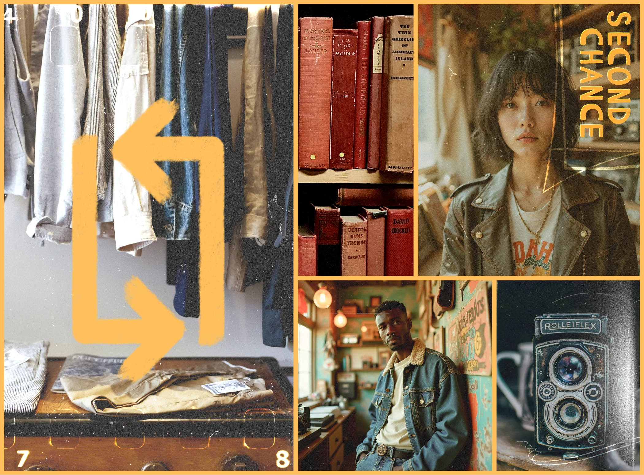
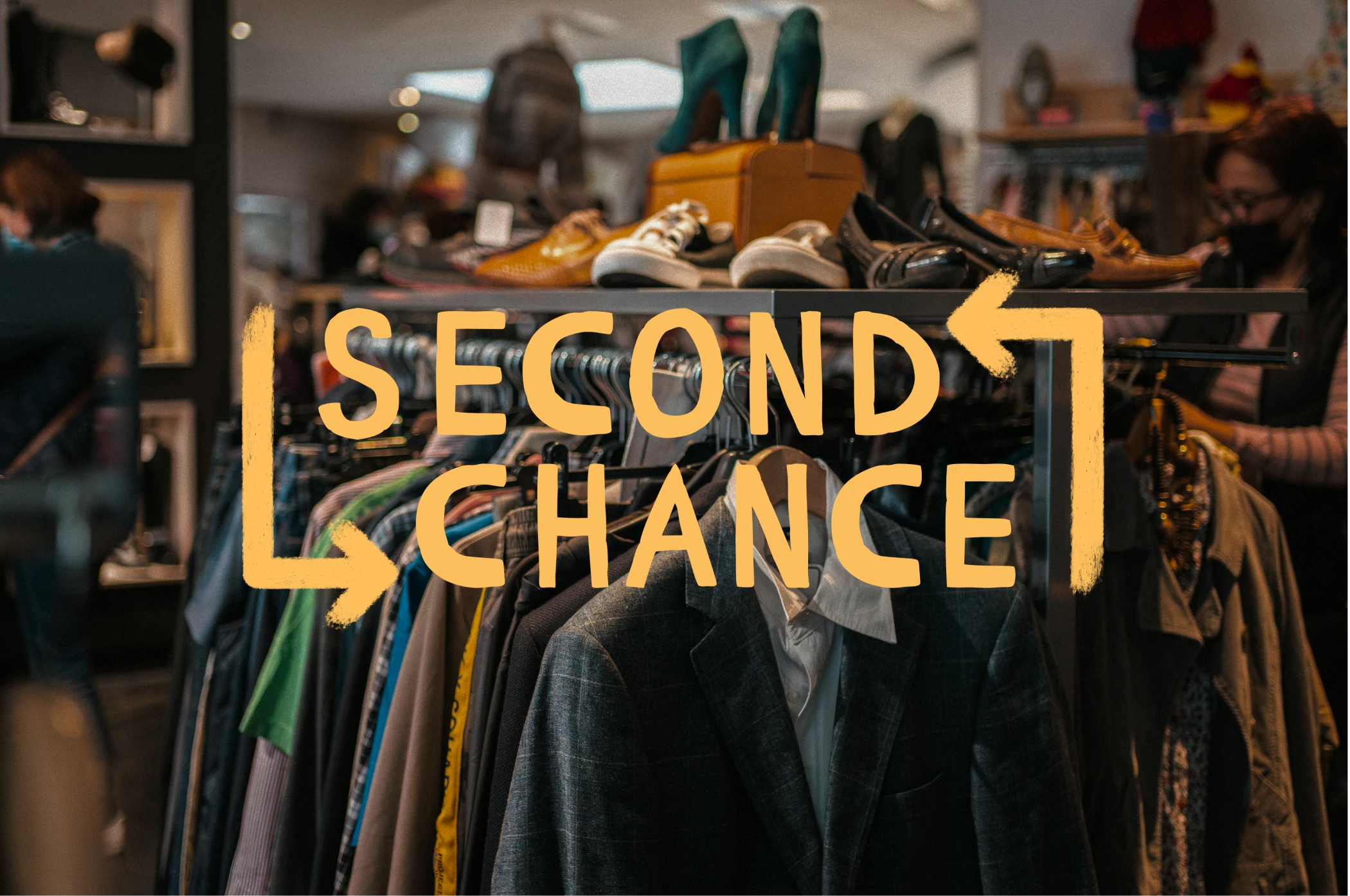
The Image
To capture the feel of of Second Chance we used photography, a combination of store images, old books, cameras, and models to capture that hip aesthetic.
The images are overlayed with different scans of old film negatives and hand drawn assets.
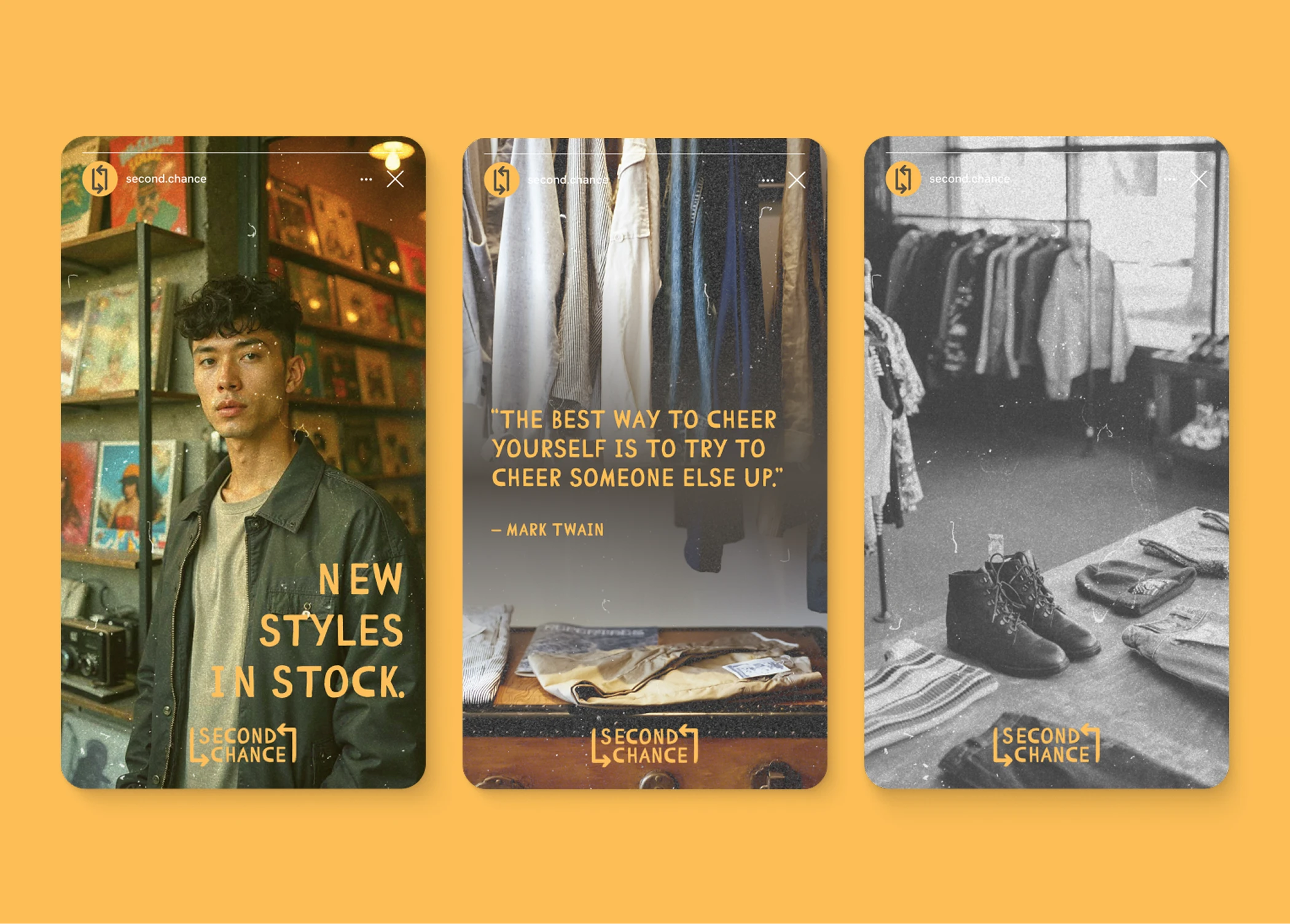
Social Media
We created mockups for a few major categories of posts and stories, store images including people shopping in the store, people with Second Chance merchandise, inspirational quotes, and models to show second hand clothes can be fun and cool.
Like this project
Posted Mar 13, 2025
Second Chance is a modern second hand store going against the grain of modern "fast fashion" trends, providing hip styles, at low cost, without the waste.
Likes
1
Views
9
Timeline
Feb 22, 2025 - Mar 1, 2025