Playgrounds - Product Design - Brand, UX/UI, Web
Progress is never in a straight line
Playgrounds was a data and analytics SaaS, turned AI SaaS that I co-founded. What you see here is a long process of refinement to get it to the point it was at when I left the company.
When we first started the company I was a junior designer and had no idea what I was doing. Through trial and error, constant learning and studying, the design of Playgrounds greatly evolved over time.
I was the only designer at Playgrounds for my entire tenure there. While there I was responsible for building and maintaining the brand, building websites, web applications, UX/UI, marketing materials, and pitch decks; you name it, I was doing it.
The Concept
The mission of Playgrounds was to create tools to empower developers and data scientists to access blockchain data easier than ever before. Our vision was data was like a Playground, you can play with it, make different visualizations and present it in different, creative and expressive ways.
I wanted to make something focused on developers but also elegant, presentable, and recognizable.
Typography
For typography I used Sophia Pro for the main brand font. It is clean, geometric and exceptionally readable. This helps developers when reading and following documentation and is a good choice for nice looking web copy.
The second font was Carbona Variable which we used almost exclusively in monospace. This was chosen as fresh, modern monospace font for presenting data, code, etc...
Color
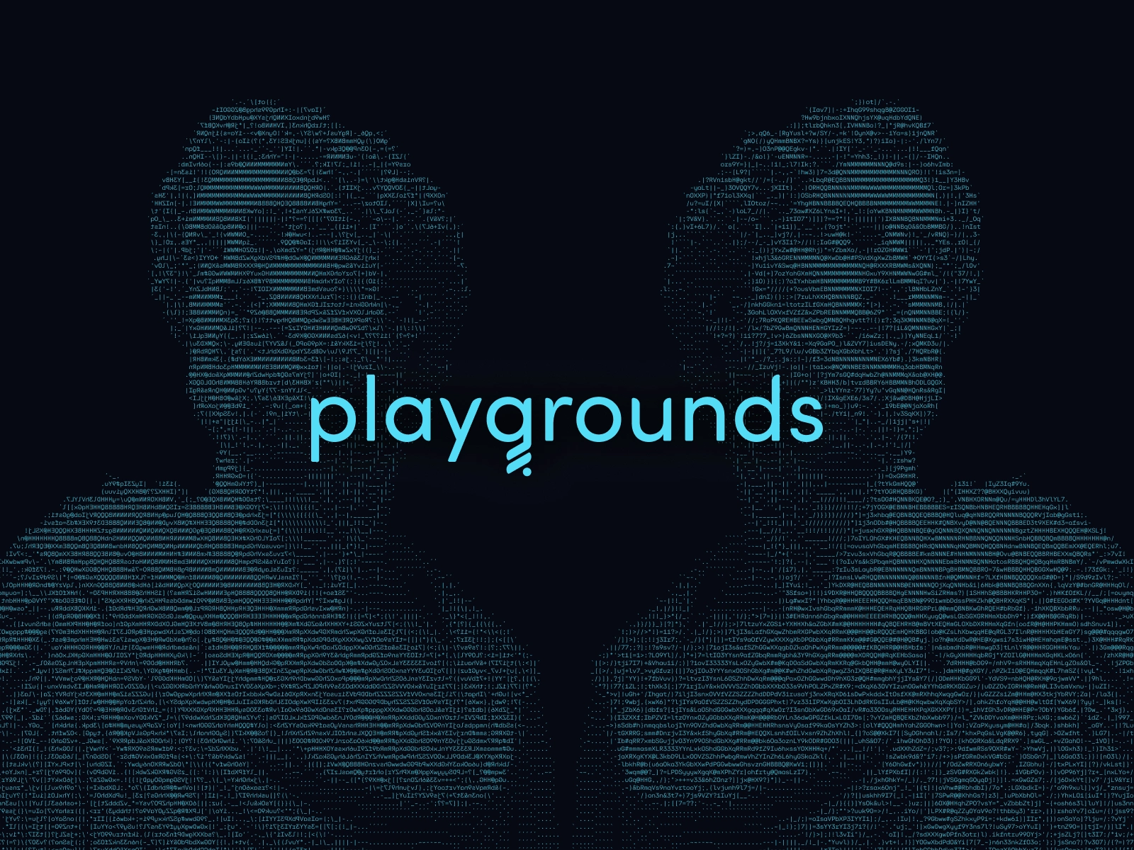
The concept was inspired by 90's hacker culture and cyberpunk aesthetics, I think of it as "a friendly Matrix", using a dark background but with friendly and energetic blue tones. Cyan was meant to bring some excitement and playfulness to the brand, the sky blue was meant to be friendly and grounded, and blue grey was nice shade I often used in UX/UI design for non-primary actions. All chosen for their exceptional contrast.
Design System
After about I realized there was way to much back and forth between developers and I. I was constantly having to do meetings to correct UX/UI errors and make sure designs were implemented consistently. Developers were also needing to modify components and elements for specific situations.
To streamline this process I created a design system derivative of IBM's Carbon design system. This vastly improved development time and consistency.
Web
The website is something that went through many iterations as the company went through ups and down and pivots. The final version I worked on is shown towards the bottom.
The main purpose of the website was to get people to use a data API we developed, the second purpose was to download an AI bot that queried data using that API. I also designed branded documentation and a blog.
I designed the website in Figma and developed it in Framer. With the exception of documentation which did not have the capabilities to have interactive documentation.


Like this project
Posted Mar 15, 2025
Designed the entire experience for Playgrounds Analytics from branding to UX/UI, web, and app design. A seamless, platform built for developers.
Likes
1
Views
16
Timeline
Sep 15, 2021 - Dec 15, 2023

