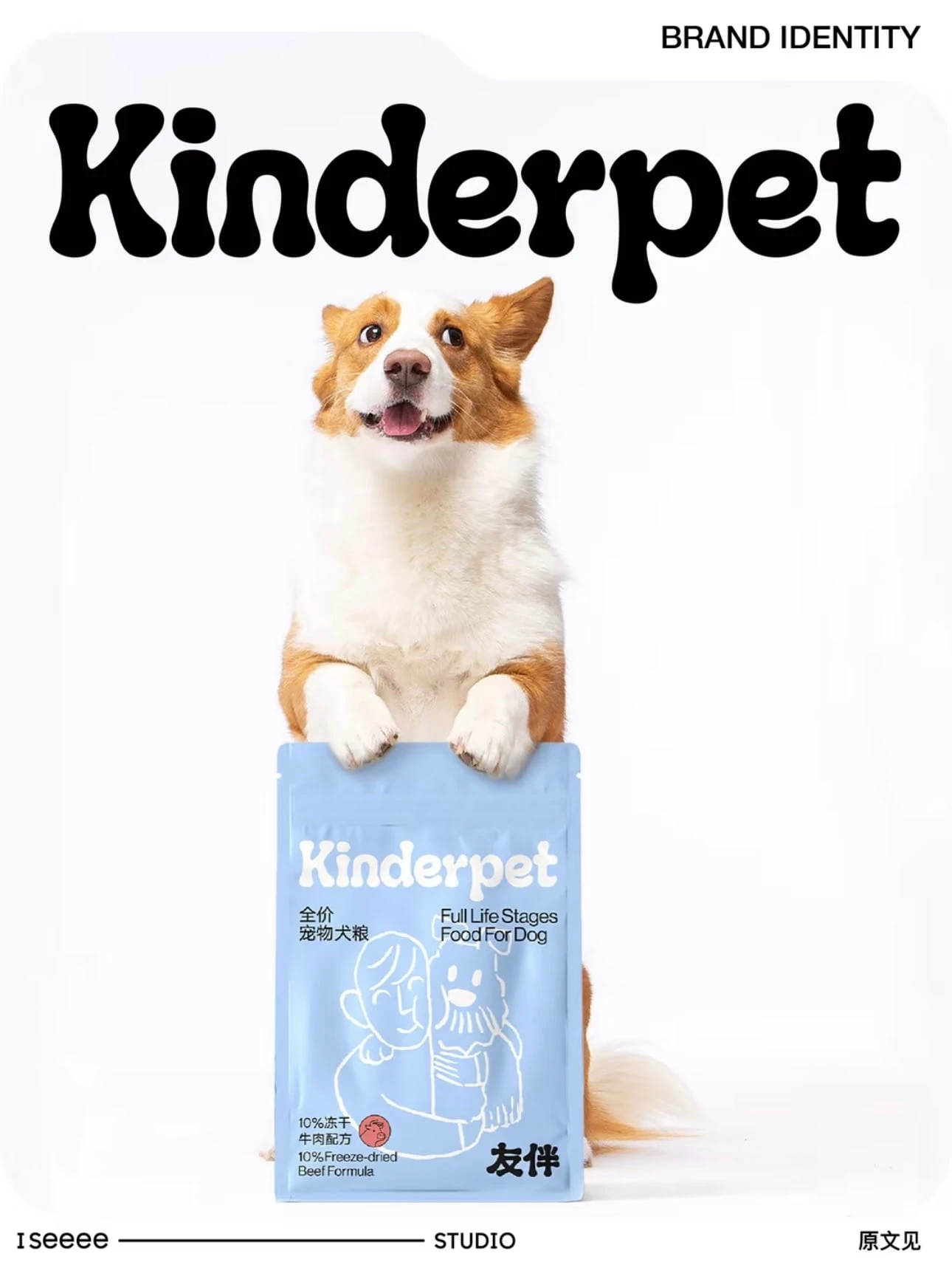
Kinderpet Brand Identity Redesign
Aisha Liu
Project Overview
Kinderpet is a long-standing pet food brand committed to developing nutritious and delicious formulas for dogs and cats. As the brand expanded, they wanted to rebuild their identity into something warmer, more emotional, and rooted in companionship - the core belief that pets are family, not just animals we care for.
The heart of Kinderpet is companionship.
In a pet’s entire life, their human is their lifelong partner. And for humans, pets are a source of comfort, loyalty, and emotional support. Kinderpet’s brand identity expresses this bond through visual storytelling, soft colors, and human–pet illustrations.
Design Approach
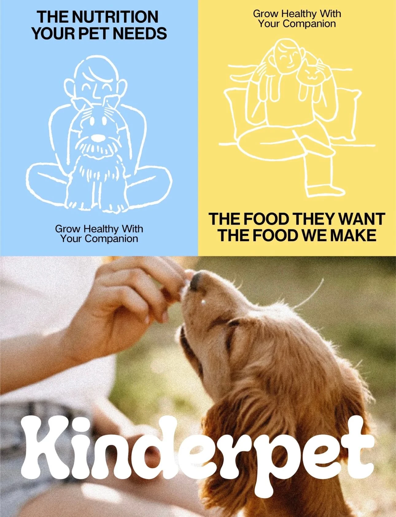
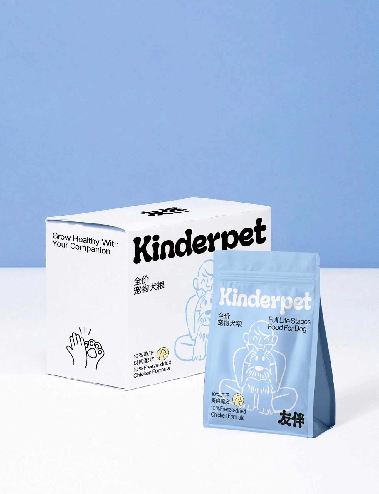
01. Visual Storytelling Through Illustration
To reflect the emotional connection between pets and their owners, we built the identity around warm, line-drawn illustrations. Each graphic shows a tender moment. Hugging, feeding, leaning together - emphasizing care, trust, and mutual growth.
02. Color Palette Inspired by What Pets See
We selected blue and yellow, the two hues that dogs and cats naturally perceive.
These soft, low-saturation tones create a healing, friendly atmosphere while making the brand feel uplifted and approachable.
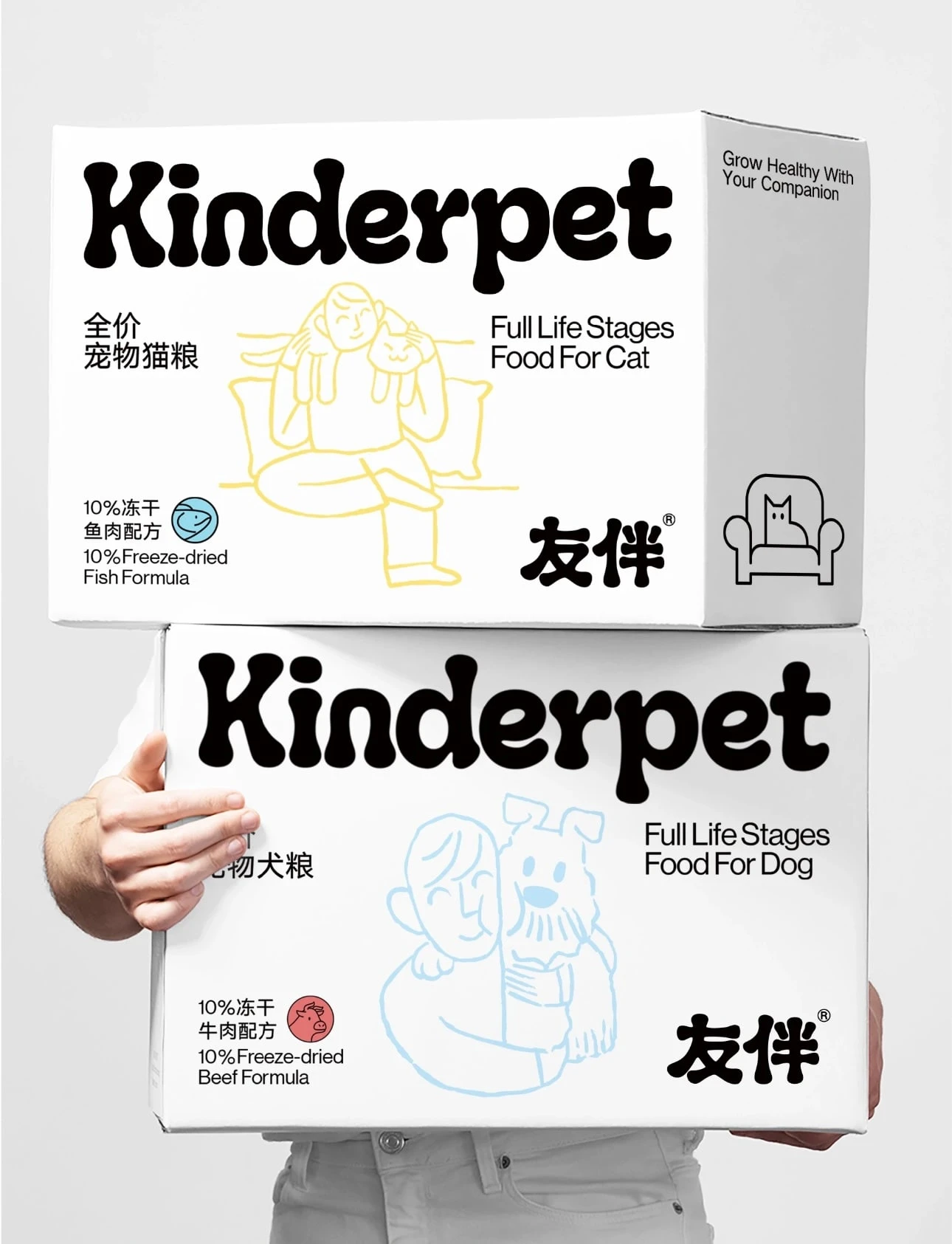
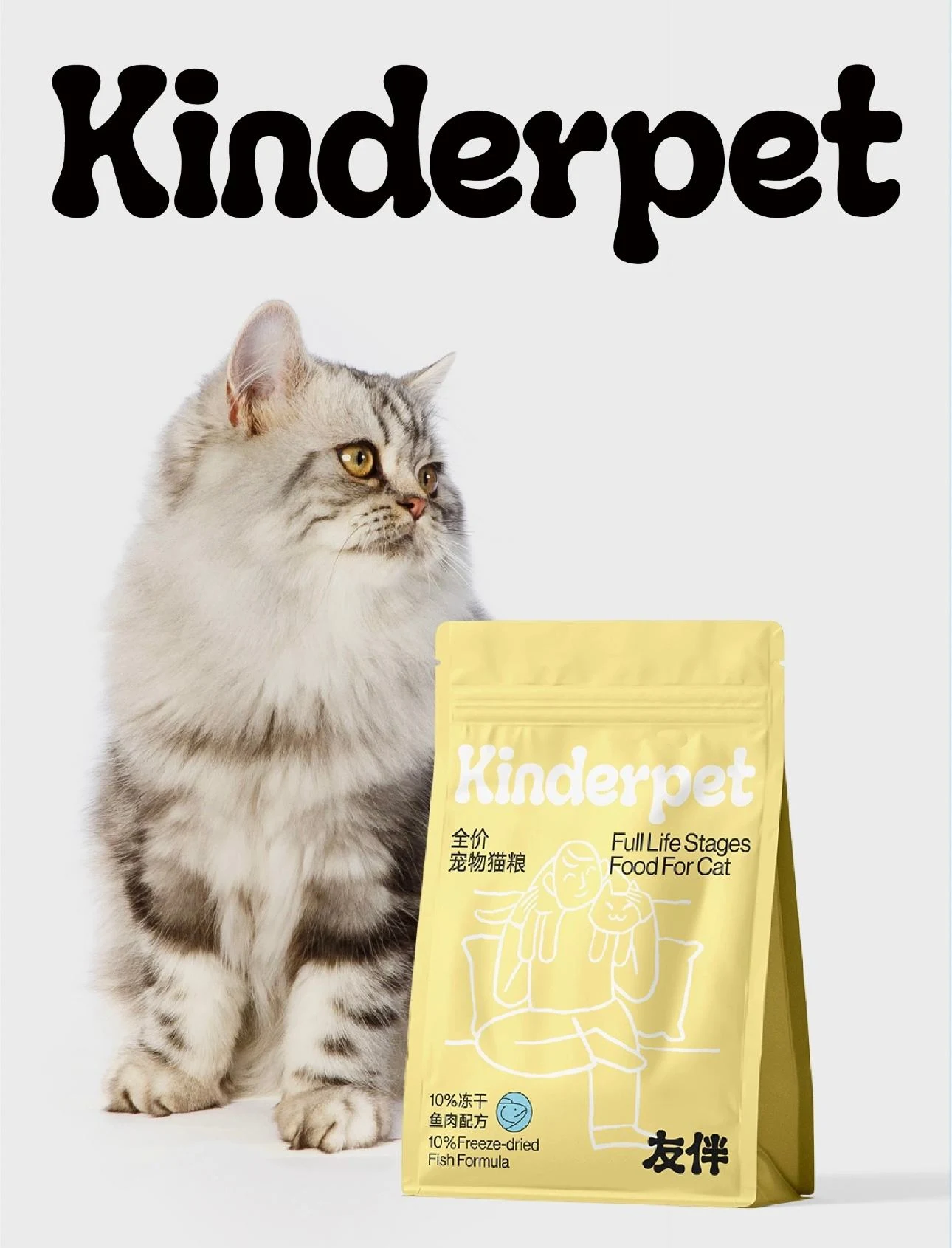
03. Packaging System
Each product variant features:
a dedicated human–pet illustration
clear formula icons (e.g., freeze-dried beef, fish, chicken)
Kinderpet’s playful, friendly logo
a clean layout with emotional warmth
The packaging balances professionalism (nutrition-focused) with cuteness and emotional bonding.
Brand Philosophy
Kinderpet aims to be a responsible, loving, emotionally supportive pet brand. Not just providing food, but providing companionship and comfort.
“健康成长,友你为伴” (Grow healthy, grow with love) becomes the core message throughout the design.
Like this project
Posted Nov 26, 2025
Rebuilt Kinderpet's brand identity with emotional design and illustrations.