Wapllo Brand Identity and Packaging Design
Aisha Liu
Project Overview
In a fast-paced urban lifestyle where people constantly chase deadlines and trends, Wapllo aims to remind consumers to nourish the most important version of themselves. As “healthy meal replacement” becomes a daily ritual, Wapllo reframes it with lightness, warmth, and a touch of joy - transforming functional nutrition into a gentle conversation with oneself.
The brand introduces a new attitude to modern wellness: soft, healing, and emotionally uplifting. Instead of the cold, clinical feel of traditional diet products, Wapllo positions meal replacement as a colorful, delightful lifestyle moment.
Brand Concept & Design Approach
01. Visual Tone: Soft, Healing & Uplifting
The identity is built on a foundation of gentle, healing energy. Wapllo’s visual direction balances clarity with personality, creating a brand world that feels approachable and emotionally supportive.
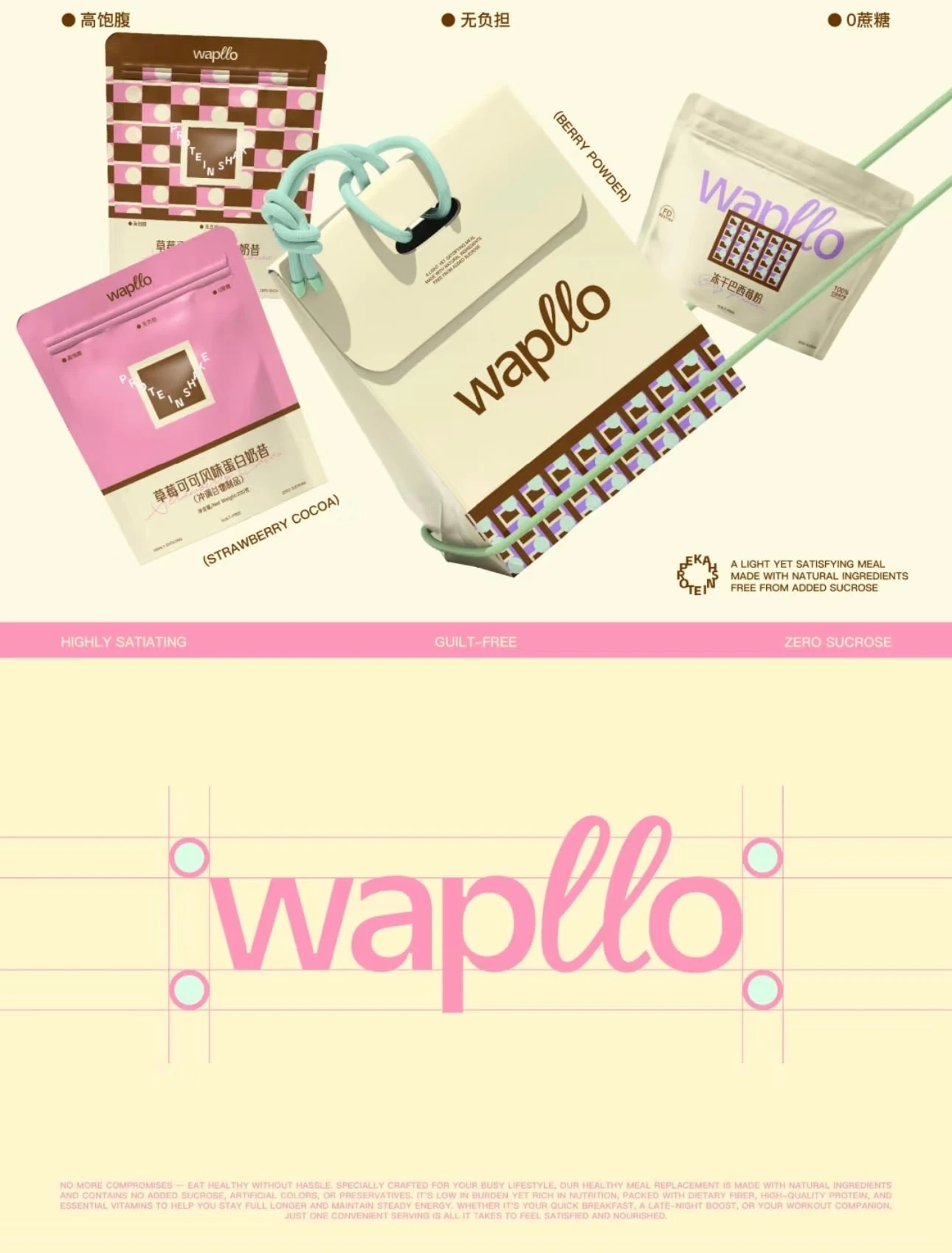
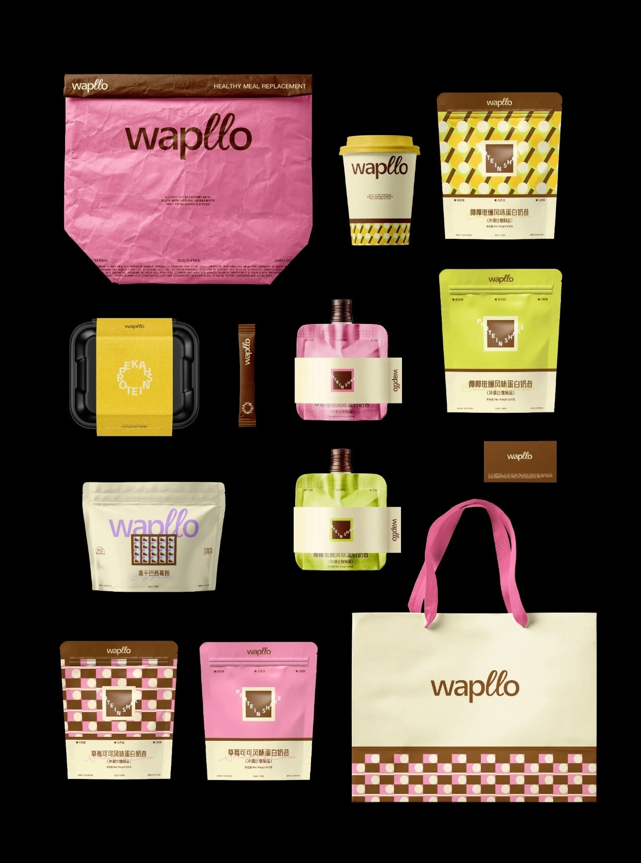
02. Logo System
We combined a clean sans-serif wordmark with playful handwritten elements, capturing both functionality and brand vitality.
This dual-type approach communicates:
clarity & modern wellness
personality & youthfulness
soft emotional connection
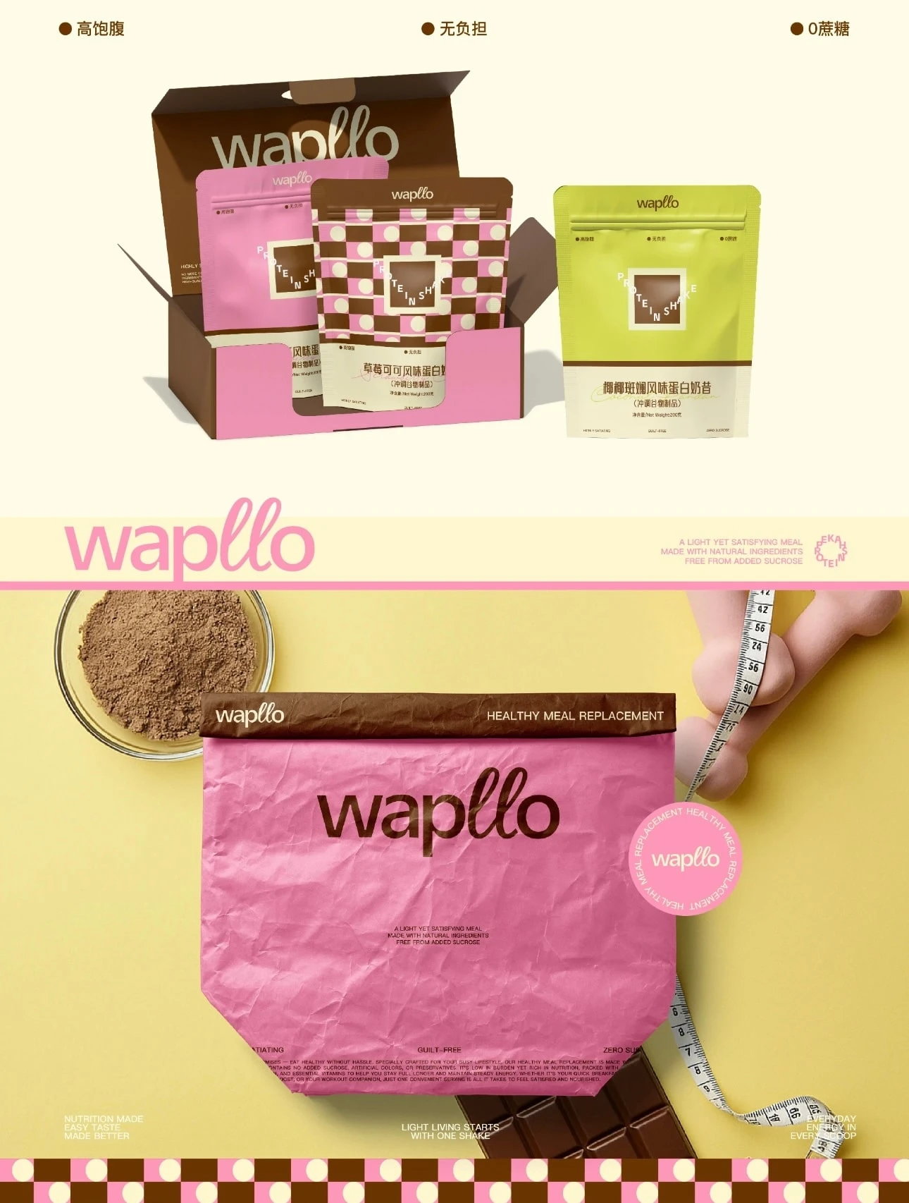
03. Color Strategy
The palette is intentionally warm and optimistic:
Blush Pink: like the first light of morning - warm, reassuring, and emotionally comforting
Chocolate Brown: grounding, trustworthy, evoking nourishment and richness
Fresh Green Accents: a symbol of vitality, growth, and “new energy”
Together, these colors create a visual experience that is soft yet lively - a healthier choice that doesn’t sacrifice joy.
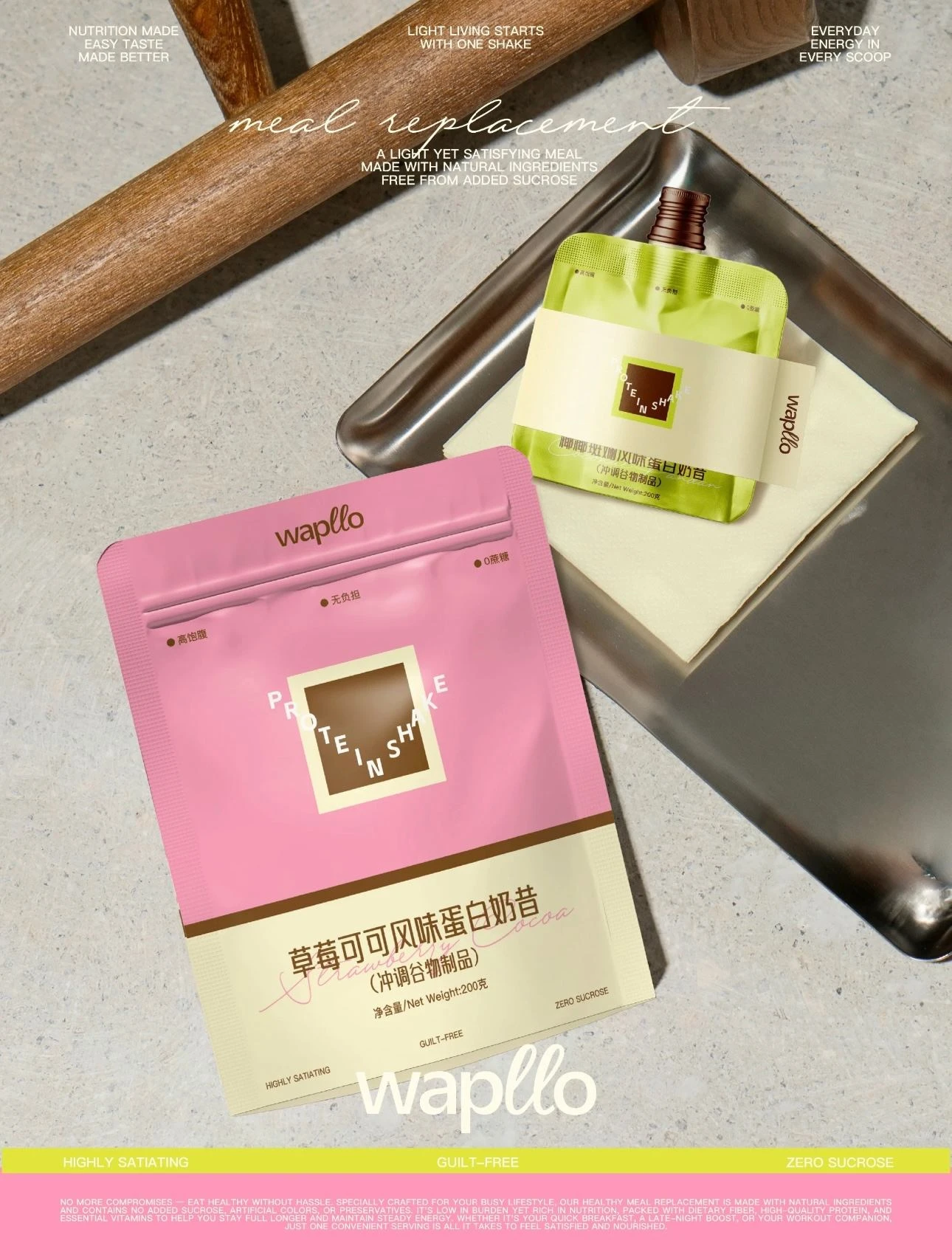
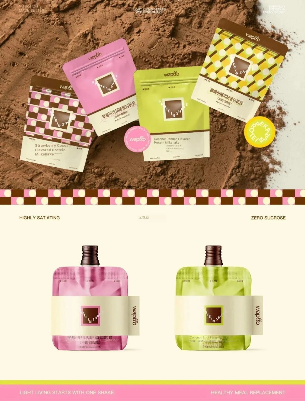
04. Packaging Direction
The packaging uses playful circles, geometric line blocks, and cheerful checkerboard patterns, forming a dynamic system across SKUs. These repeatable shapes bring rhythm and personality to the product line, helping Wapllo stand out in a category often dominated by minimal, clinical aesthetics.
The result is packaging that communicates:
positivity
energy
a youthful approach to wellness
Health doesn’t have to feel rigid or joyless. Wapllo encourages a perspective where nutritious eating is colorful, lovable, and empowering. Each shake becomes a tiny ritual of self-care - a moment of lightness within a busy day.
Our design amplifies this message through every visual touchpoint, making “light fasting” not just a functional choice, but an enjoyable lifestyle.
Like this project
Posted Nov 26, 2025
Developed Wapllo's brand identity and packaging with a soft, healing, and uplifting visual tone.