Swiftnet Brand Identity Design
Dana Kueks
SWIFTNET ⚡ — Stream More. Stress Less
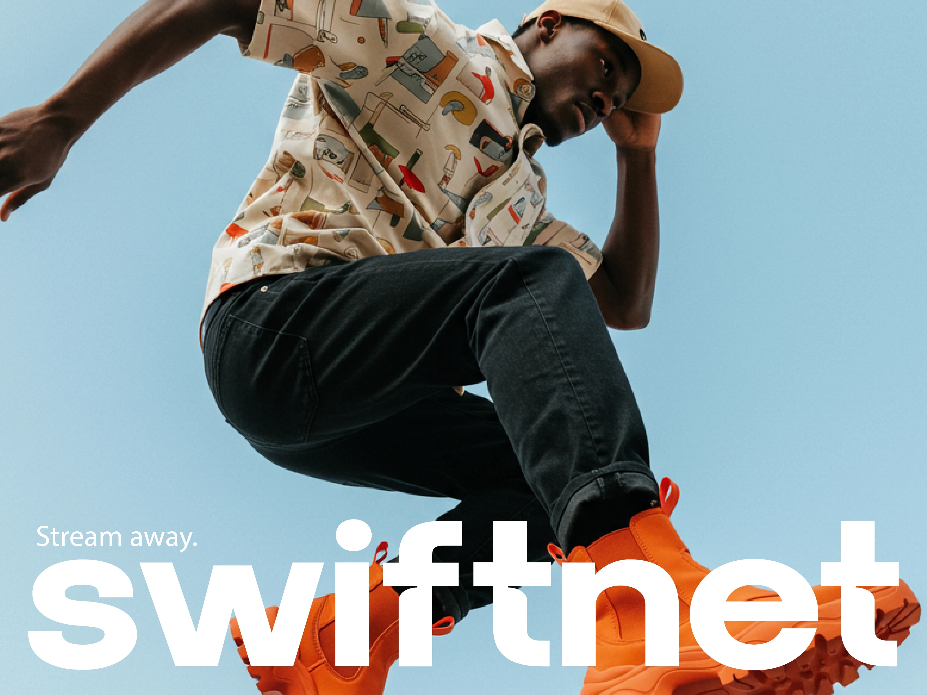
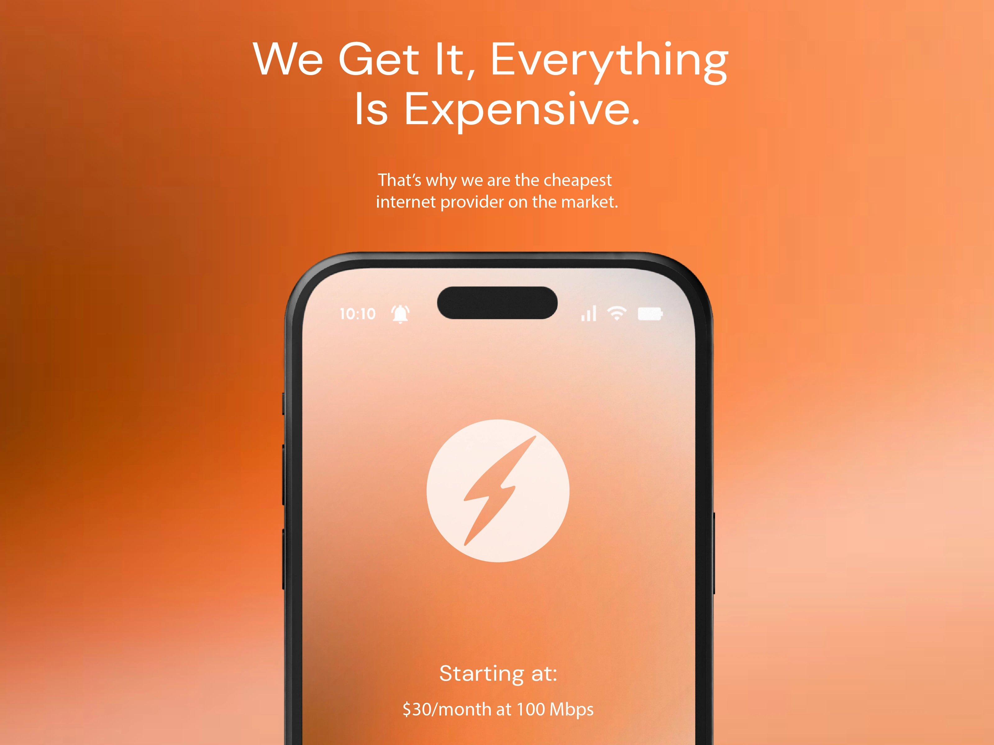
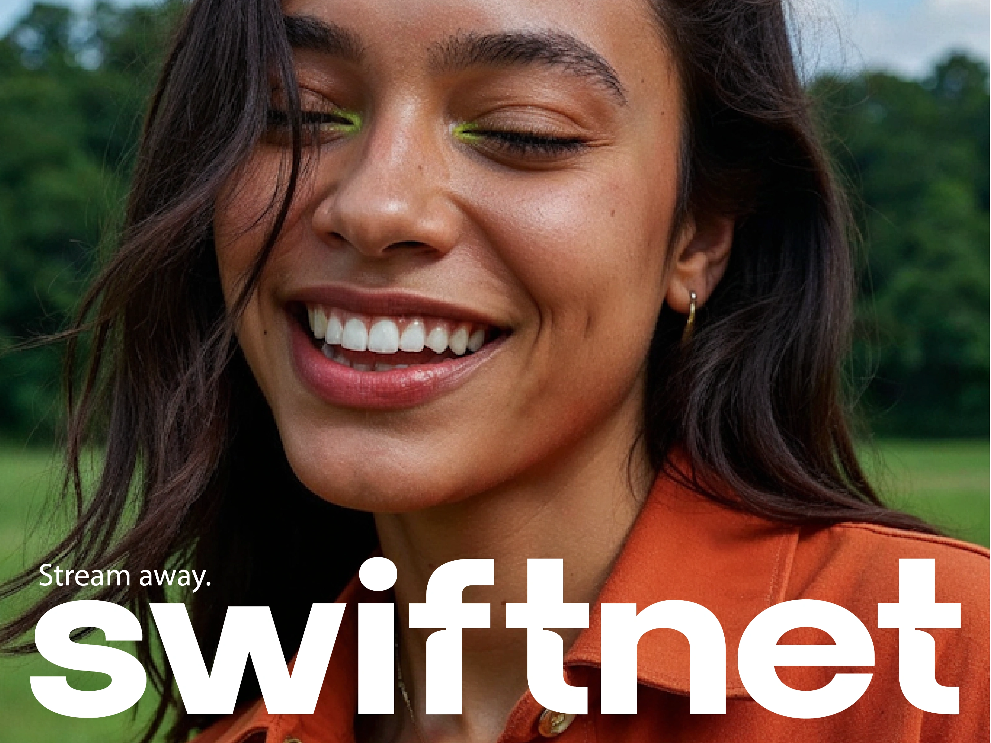
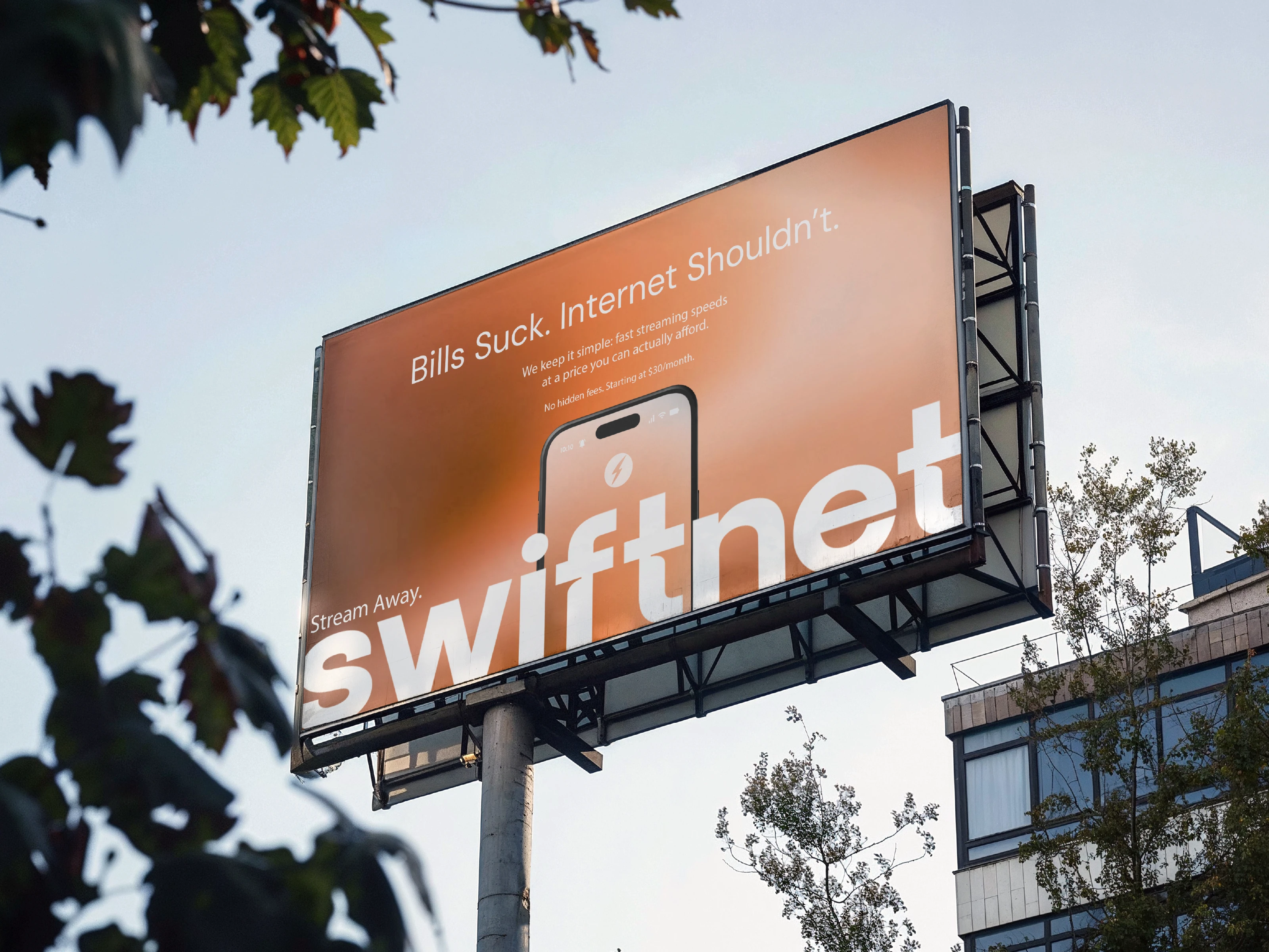
Swiftnet is a bold, minimal brand identity crafted for a next-gen internet provider redefining affordability and speed. Designed to feel modern yet approachable, the visual direction pairs vibrant orange gradients with clean, oversized typography to communicate energy, reliability, and simplicity.
Through striking lifestyle imagery and sharp digital mockups, the brand conveys connection without the clutter. From billboard campaigns to app icons, every touchpoint reinforces the promise of seamless streaming at a price people can actually afford.
Project Highlights:
Bold logotype with adaptable applications for digital and print
Vibrant orange-driven palette for instant recognition
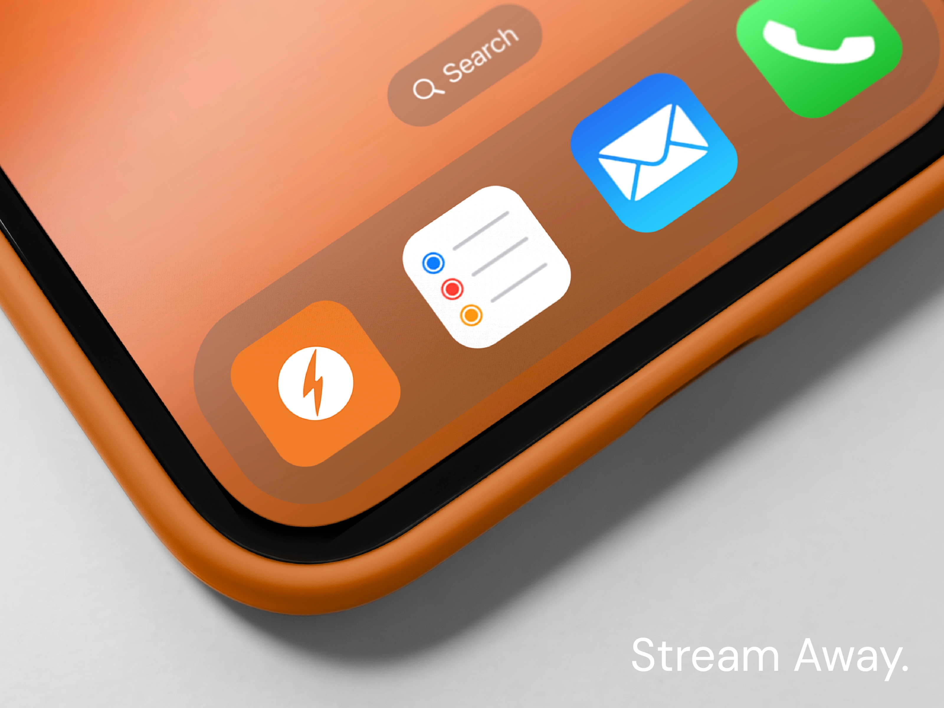
Billboard, packaging, and mobile UI mockups showcasing versatility
Cohesive tagline system: Stream Away & Stream More. Stress Less.
Tools used: Illustrator, Photoshop
Swiftnet isn’t just an internet provider—it’s a reminder that fast, affordable connection should be simple, stress-free, and designed for real life.

Like this project
Posted Aug 22, 2025
Swiftnet is a bold, minimal brand identity for an internet provider—pairing vibrant orange visuals with clean typography for fast, stress-free connection
Likes
13
Views
95
Clients
Swiftnet