Brand Identity Design for Held in Bloom
Dana Kueks
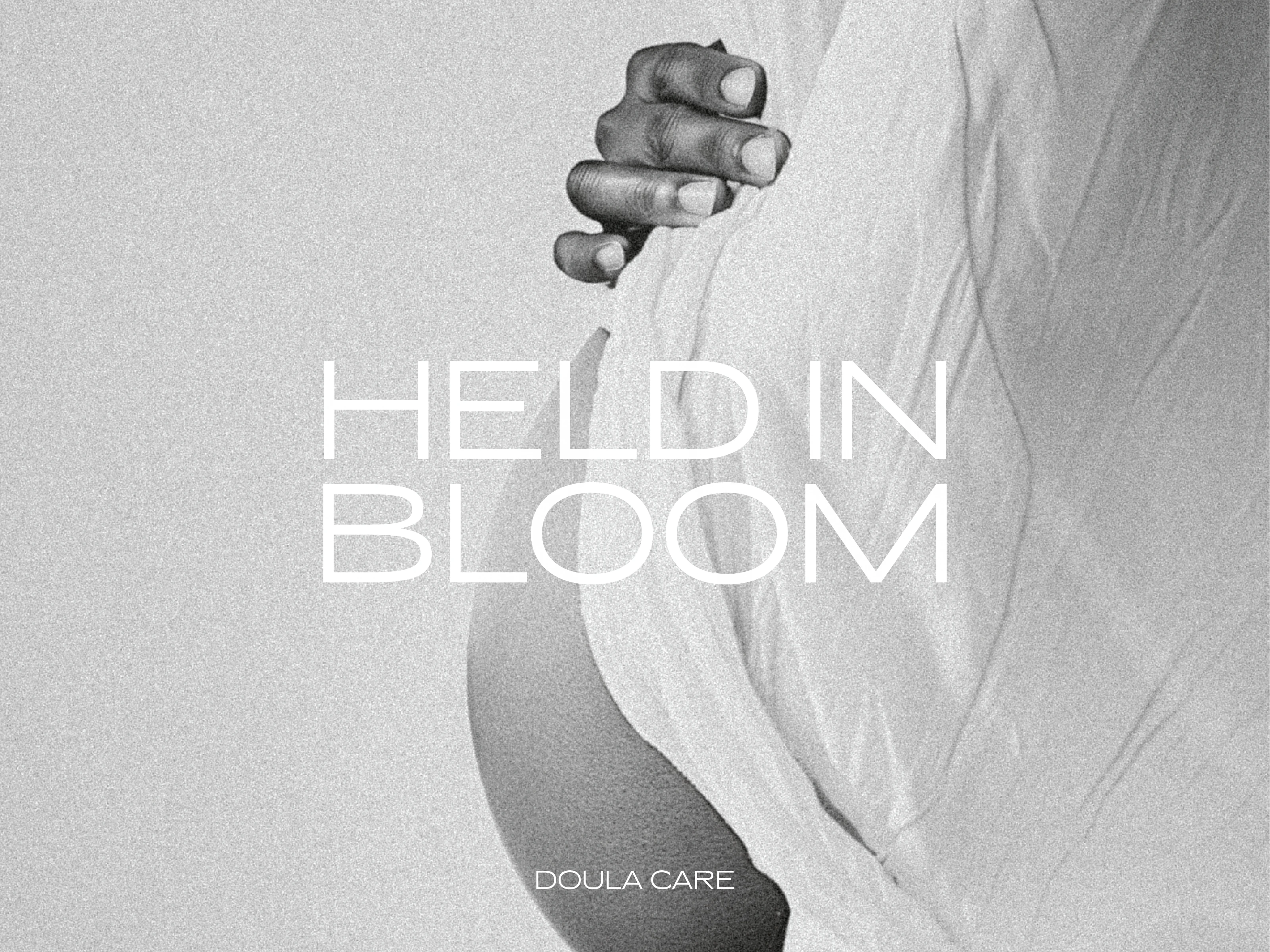
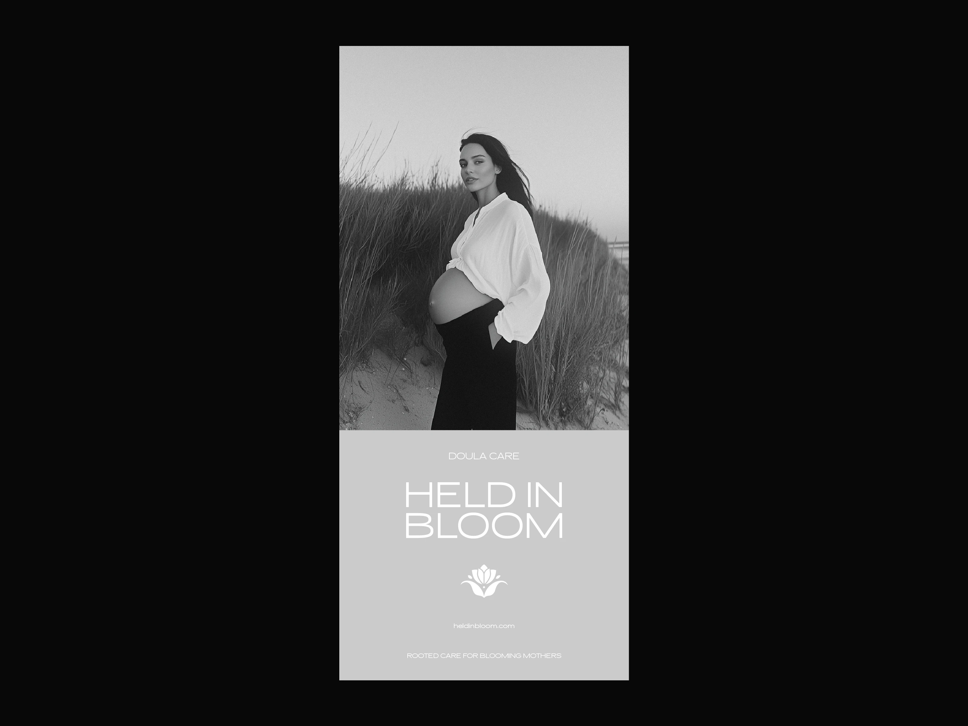
HELD IN BLOOM — Rooted Care for Blooming Mothers
Held in Bloom is a warm, intentional brand identity designed for a doula care service that supports mothers through pregnancy, birth, and postpartum. The brand is grounded in softness, simplicity, and calm — mirroring the steady, nurturing presence of doula support.
Clean typography, a soft color palette, and warm, minimal visuals come together to reflect the heart of this offering: calm, consistent support before, during, and after birth. The identity evokes trust, warmth, and quiet strength—ideal for the emotionally rich and transformative journey of motherhood.
Project Highlights:
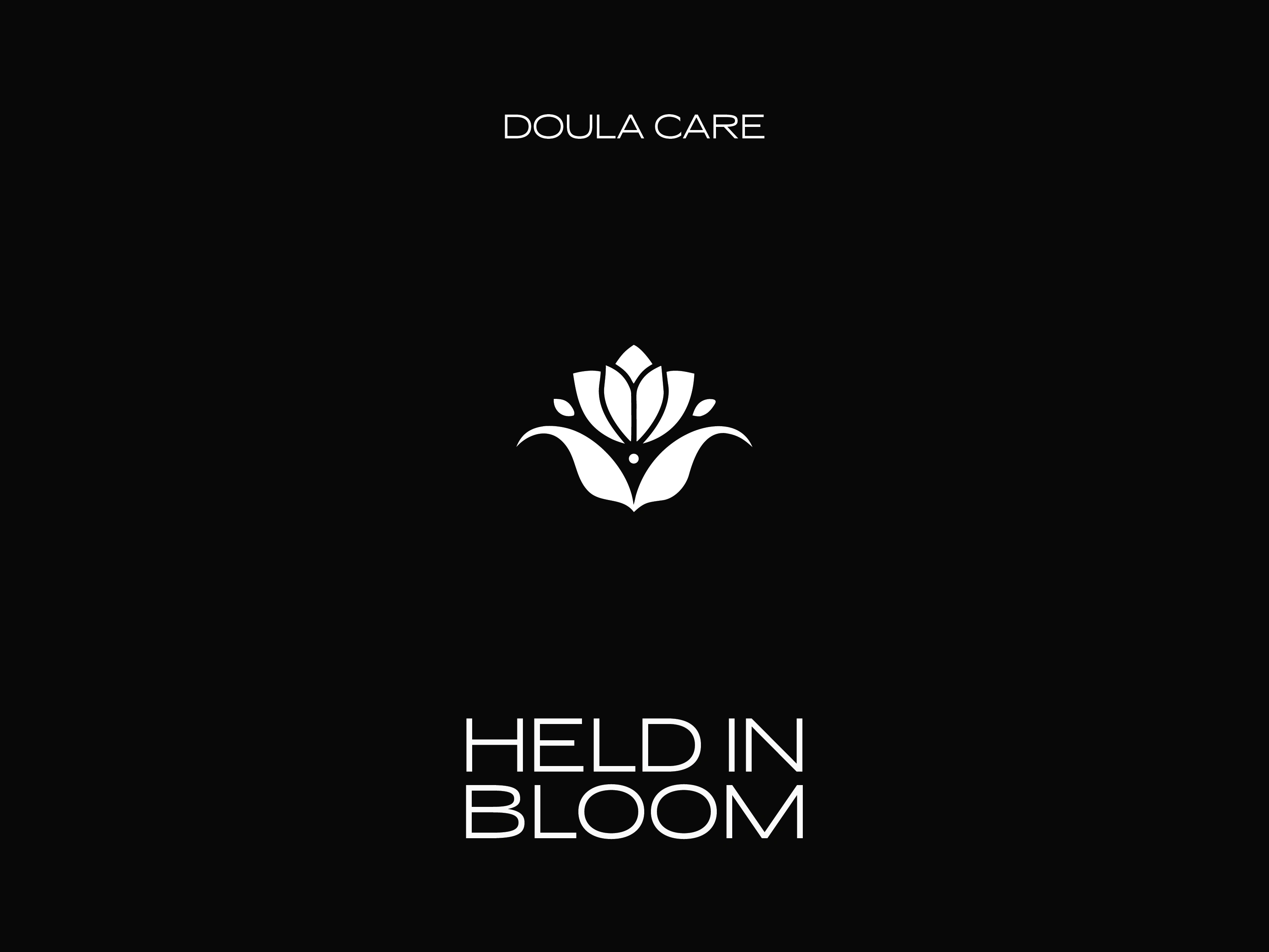
• Modern, minimal logo suite with gentle curves
• Organic, neutral-toned palette to reflect warmth and care
• Brand visuals designed to feel grounded, intimate, and reassuring
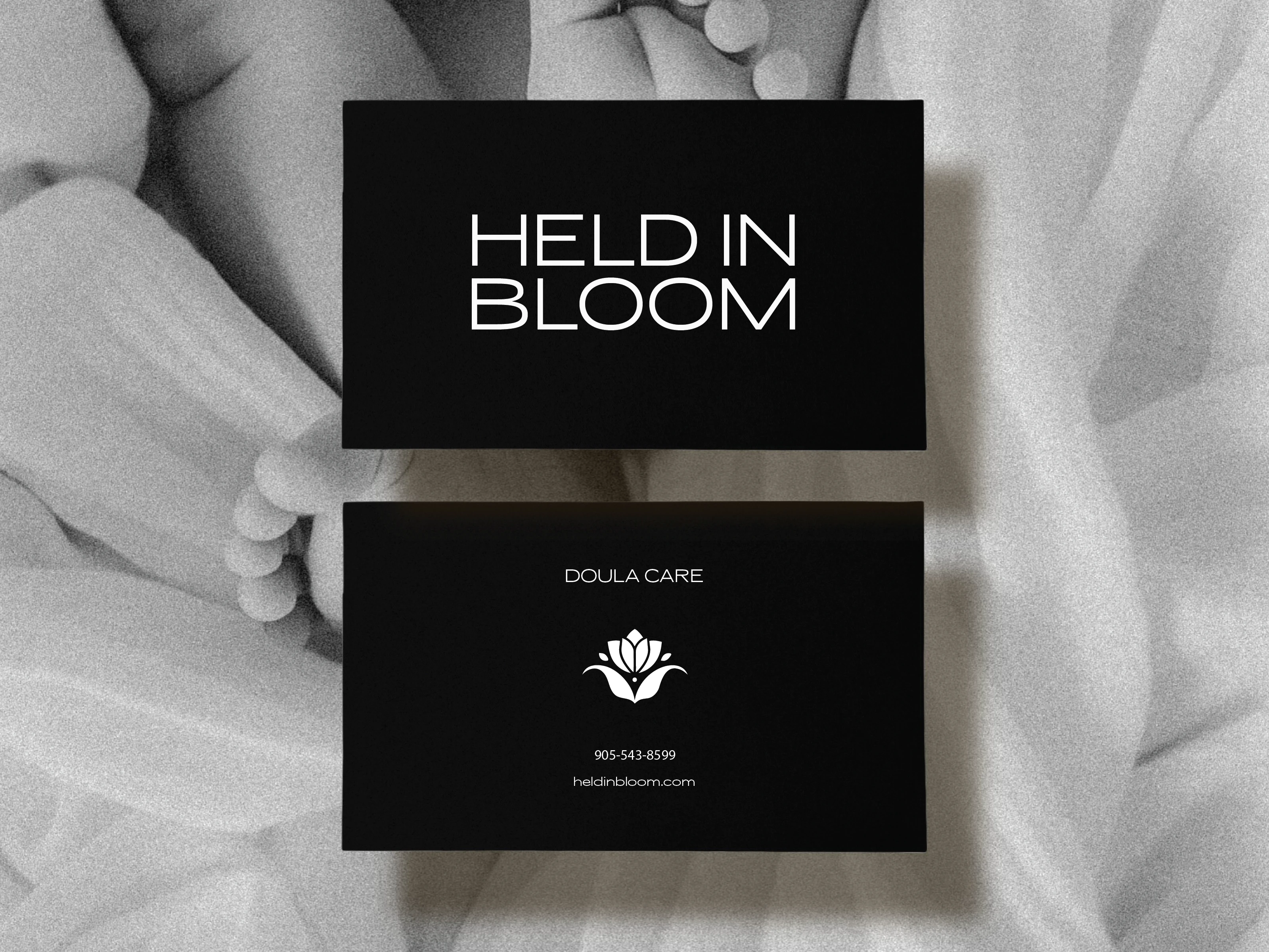
• Realistic mockups across digital and print touchpoints
Tools used: Illustrator, Photoshop
Held in Bloom isn’t just a doula service—it’s a sanctuary. A brand built to hold space for blooming mothers at every stage of their journey.
Like this project
Posted Jul 21, 2025
A calming, minimal brand identity for a doula service—rooted in support, softness, and the steady presence of care through birth and beyond.