Brand Identity for Thorn Game Studio

Mario Pleshkov


Overview
Thorn is a modern game studio specializing in competitive, high-intensity FPS titles. They needed a distinct visual identity that establishes credibility with players and industry partners while reflecting their focus on precision and tactical gameplay.
The Challenge
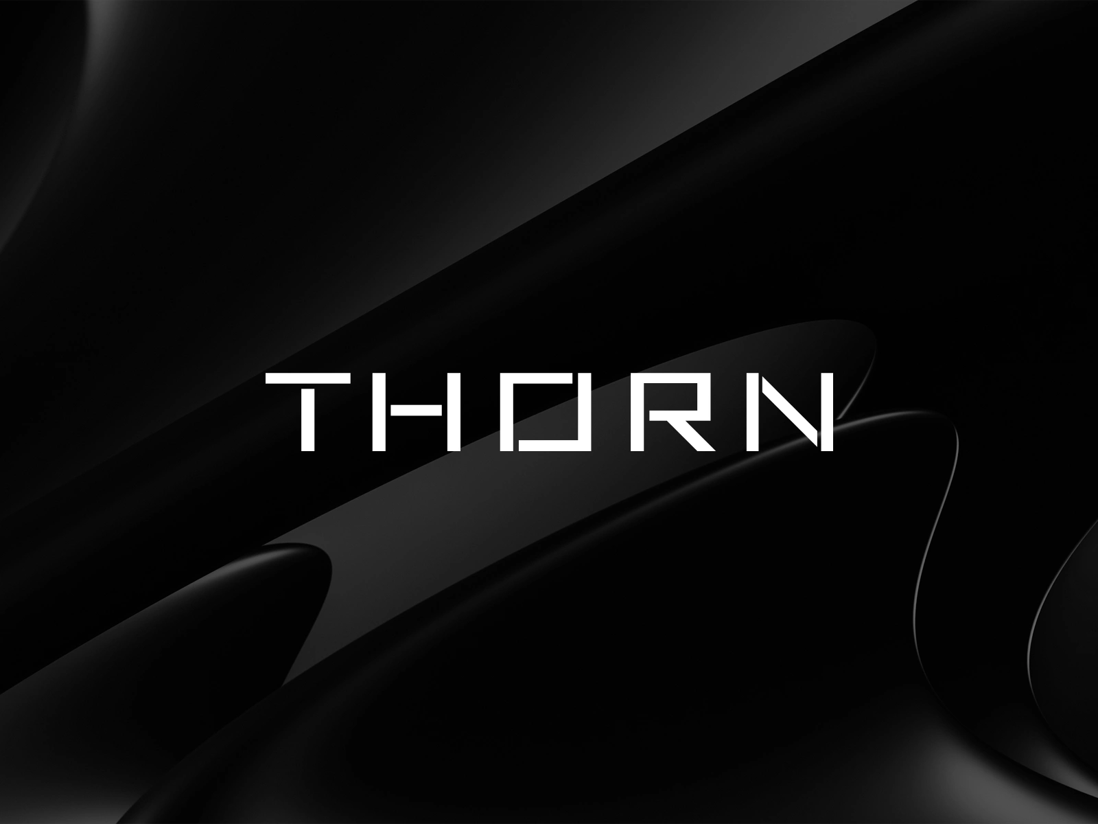
Most gaming studio brands rely heavily on loud neons, aggressive shapes, and cluttered graphics. Thorn needed the exact opposite. The challenge was crafting a brand that felt unmistakably rooted in gaming culture without falling into every overused cliché in the industry.

The Approach
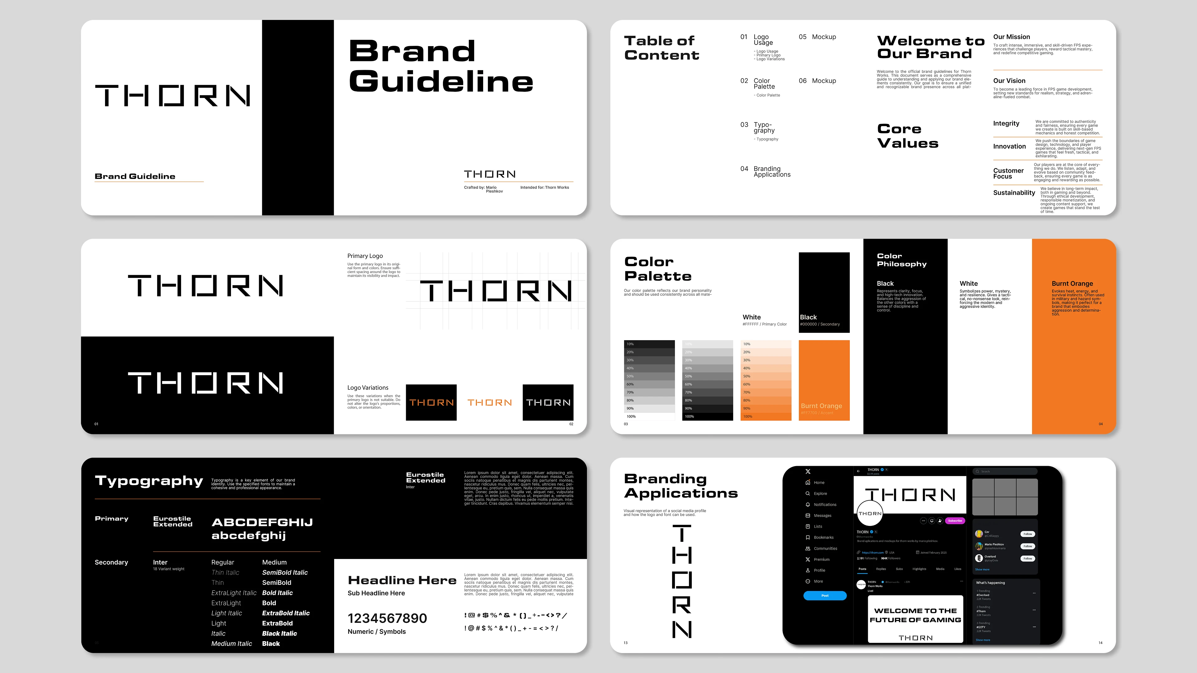
Focusing on extreme visual restraint, I constructed a geometric custom wordmark paired with a deep charcoal and black palette. A single burnt orange accent was introduced to provide contrast without overwhelming the layout. I locked down the full system in a comprehensive brand guideline deck, defining precise grid spacing, typography hierarchy, and UI/social application rules.
The Result
Delivered a complete brand identity package including the core wordmark, logo variations, color system, typography rules, and social media layout templates. The resulting guidelines give Thorn a scalable, premium identity system ready for game launches and studio announcements.
Feel free to like, comment and follow, kindly appreciated.
Have a project? Contact via Direct Message.
Like this project
Posted Jul 11, 2026
Sleek, minimal brand identity & guidelines for Thorn FPS game studio. Built a dark-mode wordmark system that avoids loud gaming clichés.
Likes
6
Views
31
Clients
Thorn