Wingz Rebranding

Mario Pleshkov


Overview
Wingz is an athletic sportswear brand seeking a complete visual identity refresh. To stand out in a competitive apparel market, they needed a modern, high-performance brand system that commands attention across activewear, headwear, digital media, and physical touchpoints.
The Challenge
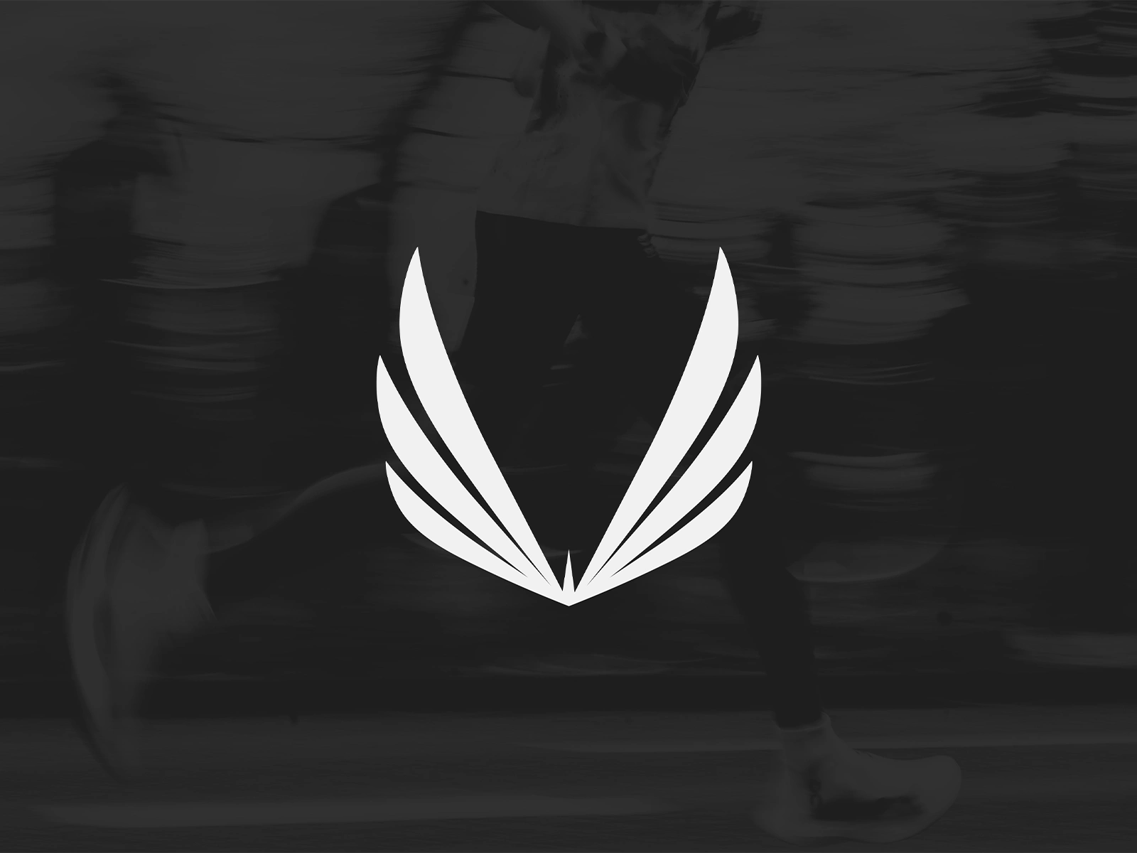
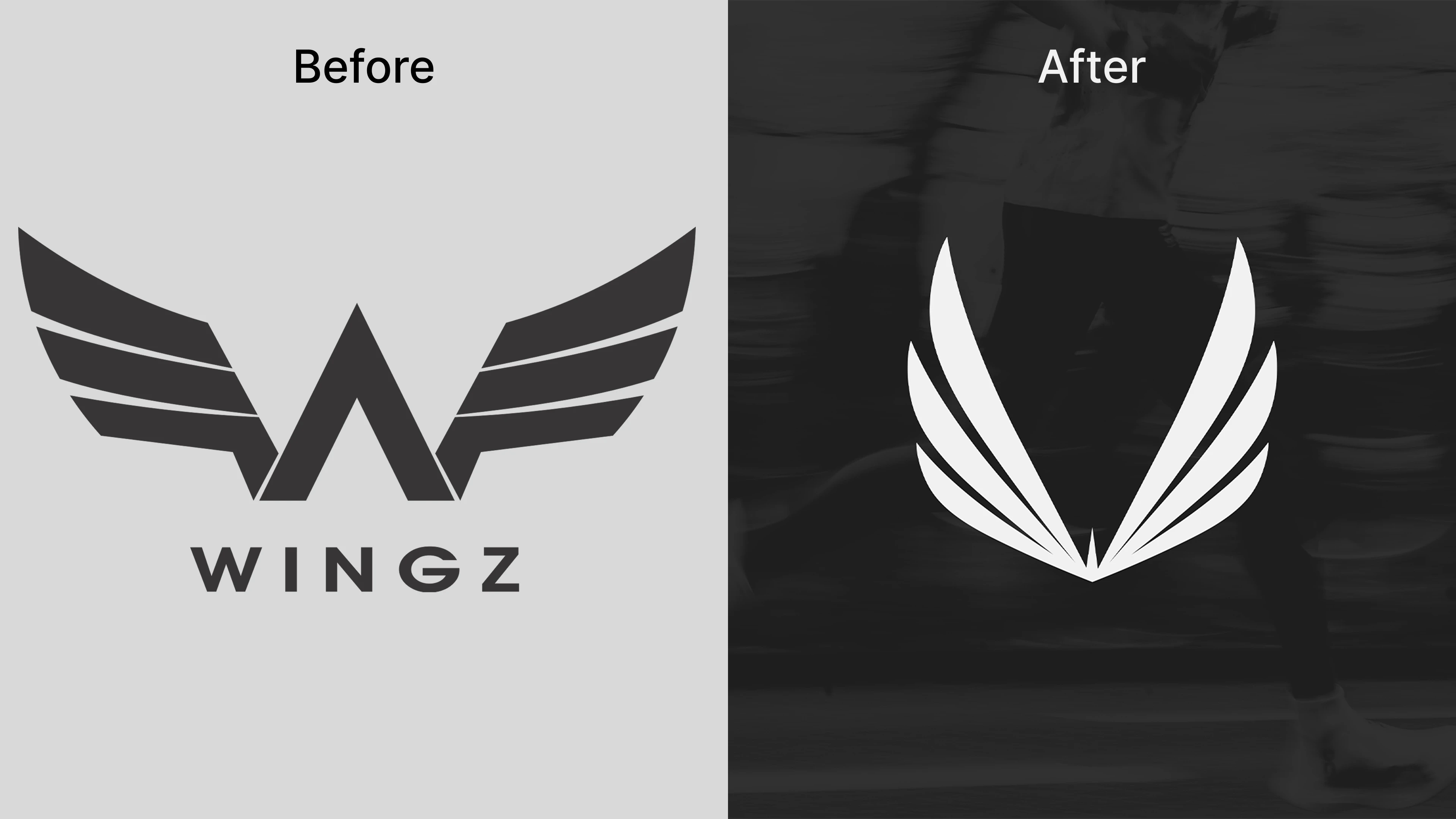
The legacy Wingz logo felt dated and overly complex, making it difficult to scale cleanly down to small apparel tags, rubberized patches, and embroidery. The goal was to preserve the brand's core winged concept while executing a full rebuild, creating a sharper, streamlined, and memorable mark engineered for modern performance gear.
Before & After
The Approach
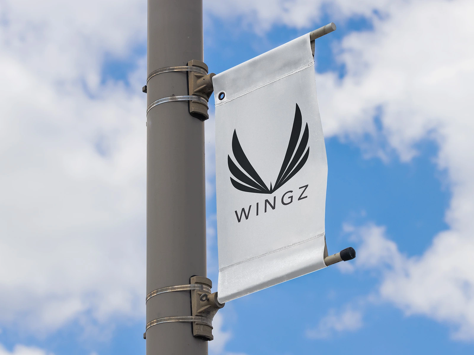
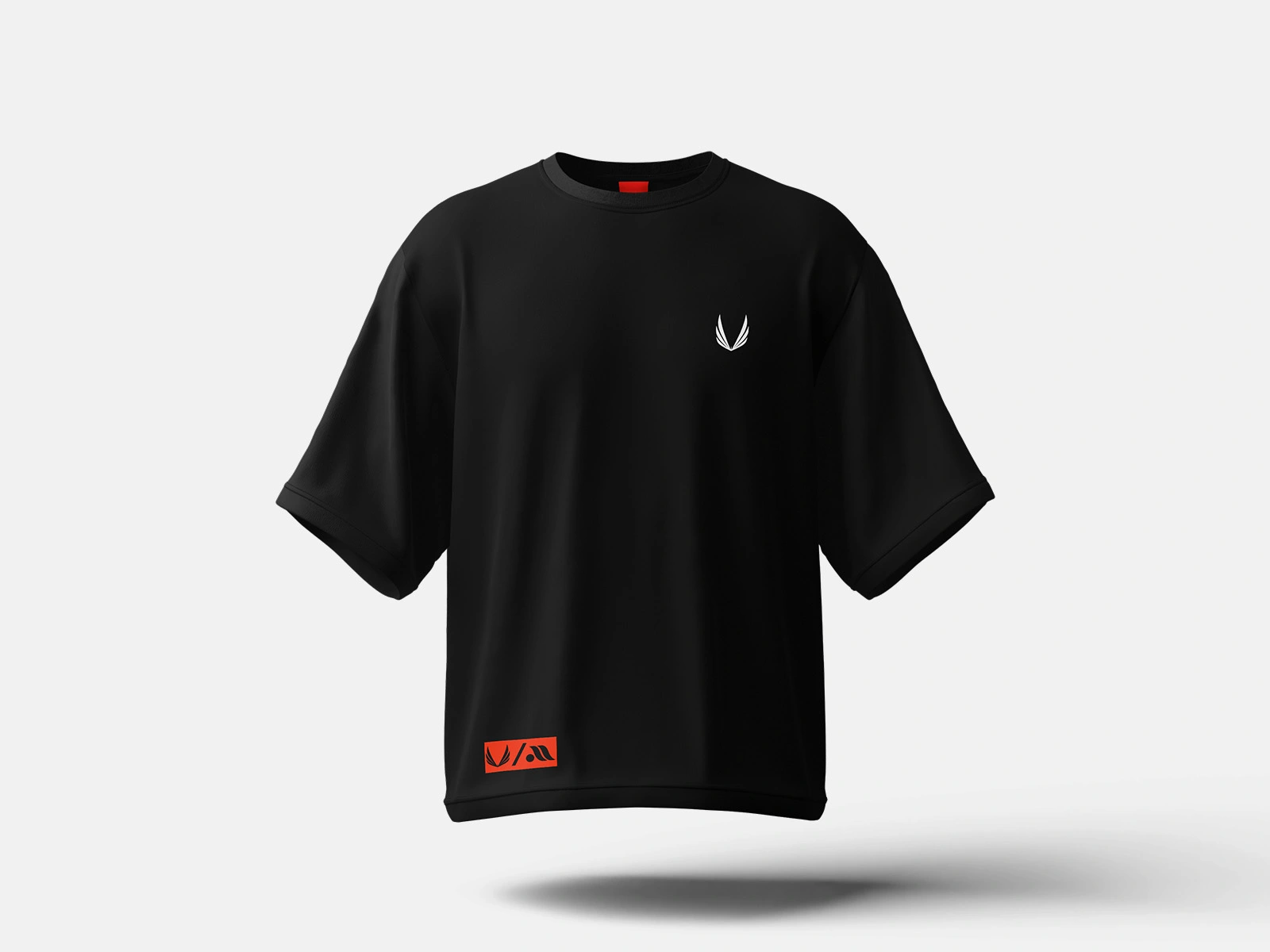
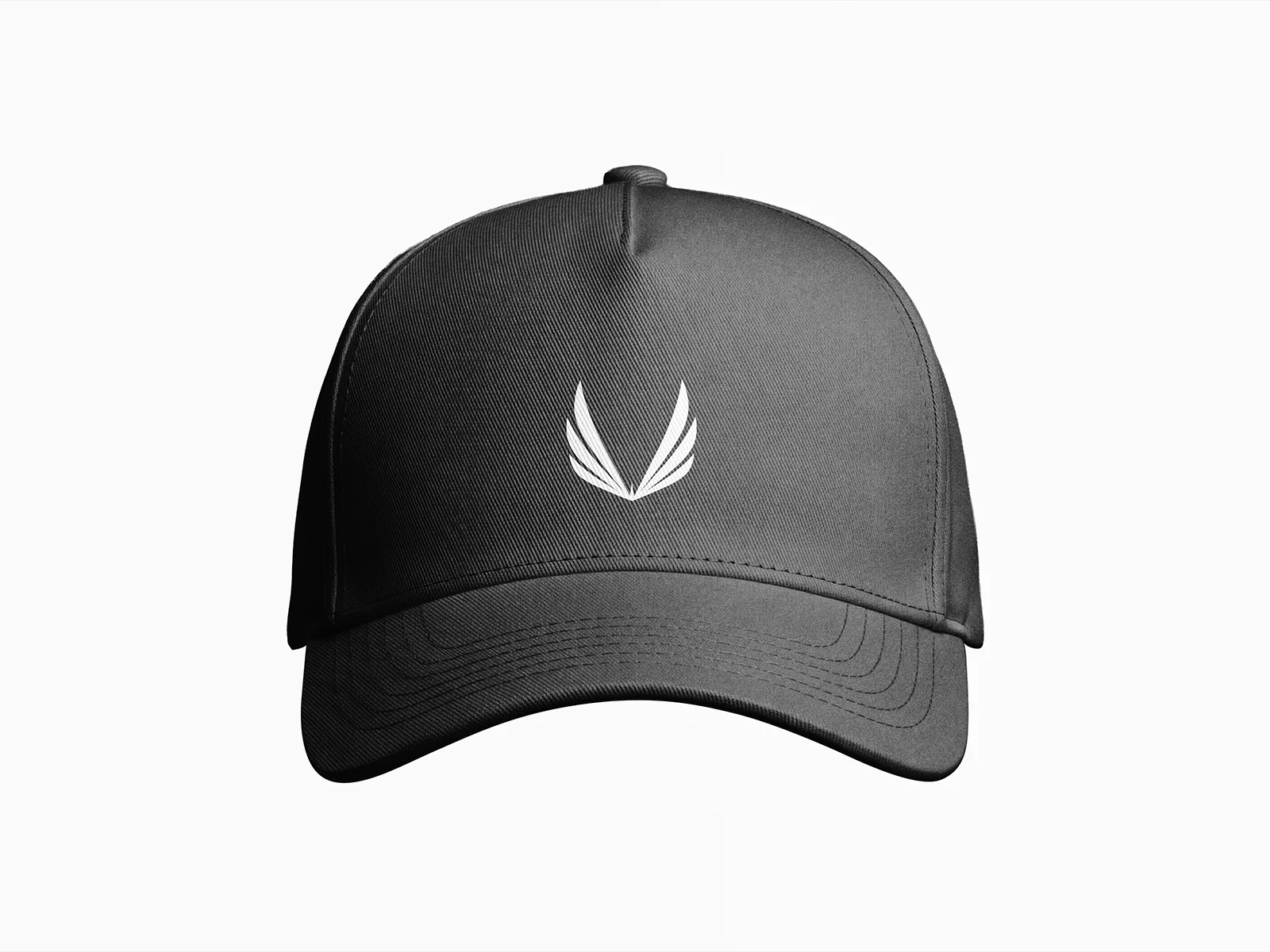
Starting on the drawing board and then in Illustrator, I deconstructed the original wings into clean, upward-sweeping geometric lines that symbolize speed, elevation, and athletic strength. I focused on bold contrast, precise symmetry, and visual weight to ensure the symbol remains instantly recognizable whether screen-printed on activewear, embroidered on caps, or displayed on large-format outdoor banners.
The Result
Delivered a complete rebrand package, including the refined wing mark, side-by-side identity evolution, and 3D product mockups. The client immediately rolled out the new brand identity across their upcoming apparel line, establishing a sleek, premium presence that elevates their market positioning.
Feel free to like, comment and follow, kindly appreciated.
Have a project? Contact via Direct Message.
Like this project
Posted Jul 10, 2026
Full rebrand for Wingz sportswear. Transformed their legacy logo into a modern, high-performance mark engineered for apparel, embroidery, and digital media.