Brand Identity Design for Design-Build Studio

Ivana Tomic


HAUS ATELIER
Reframing a remodeling company as a design-led studio built around structure, craft, and considered living.
Industry
Architecture · Interior Design · Design & Build
Market
United States
Scope
Brand Strategy · Brand Identity · Creative Direction · Logo Design · Brand Guidelines · Print & Digital Applications
The brief
Haus Atelier is a Seattle-based design-build studio creating highly tailored residential spaces where design and construction are treated as one process.
As the business evolved toward larger renovations and a more design-conscious clientele, its existing identity no longer reflected the level of its work or its ambitions. The rebrand needed to reposition Haus Atelier as a more mature, design-led studio — without losing the warmth, flexibility and collaborative approach at the heart of the business.
The opportunity was to move away from the familiar visual language of the remodeling category and build an identity with a stronger architectural point of view: refined and elevated, but never cold, overly formal or dependent on conventional luxury cues.
The identity
The identity takes its cue from the name itself. HAUS represents structure — the architectural, technical and built side of the business — while Atelier introduces craft, individuality and the more considered design perspective behind each project.
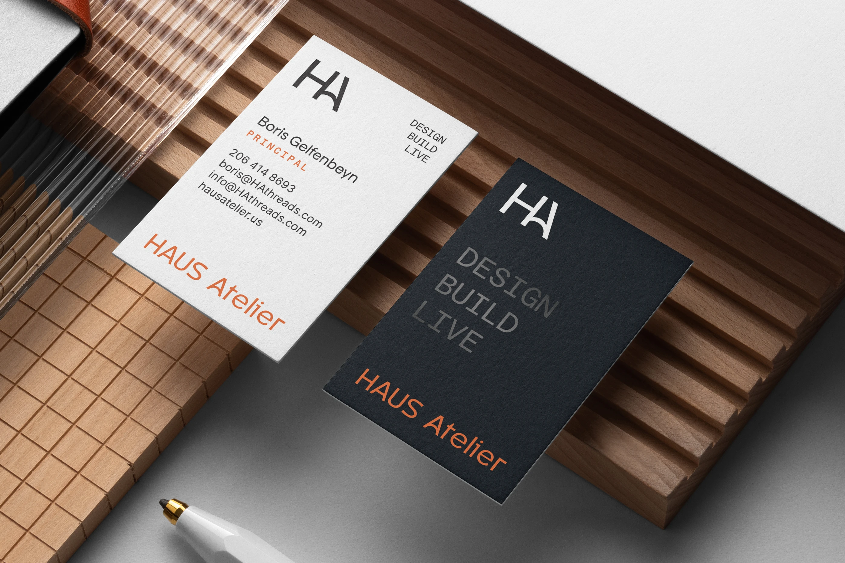
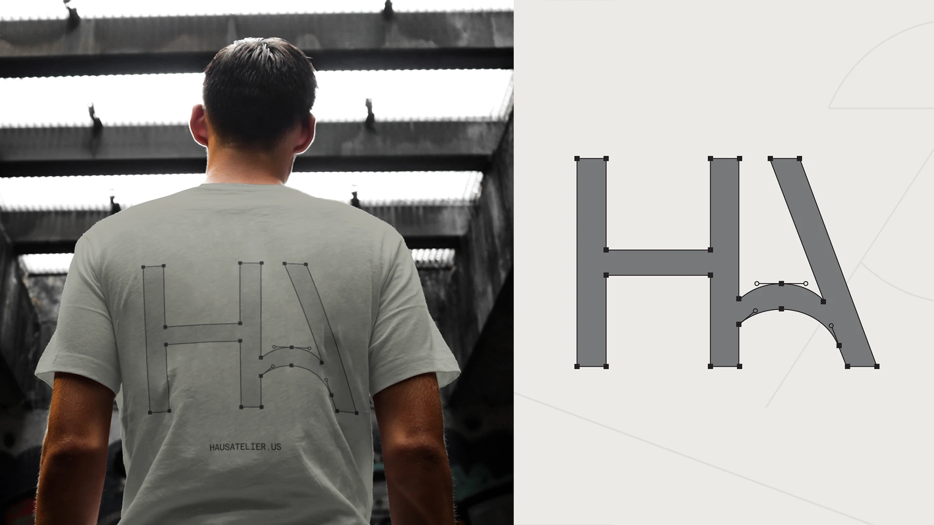
That contrast became the foundation of the wordmark. The uppercase HAUS feels grounded and architectural, while Atelier has a lighter, more nuanced character. Custom details within the letterforms introduce a crafted quality without becoming decorative, with the distinctive A acting as a bridge between the two sides of the brand. Its constructed form subtly references an architectural opening or portal, bringing the idea of building directly into the typography.
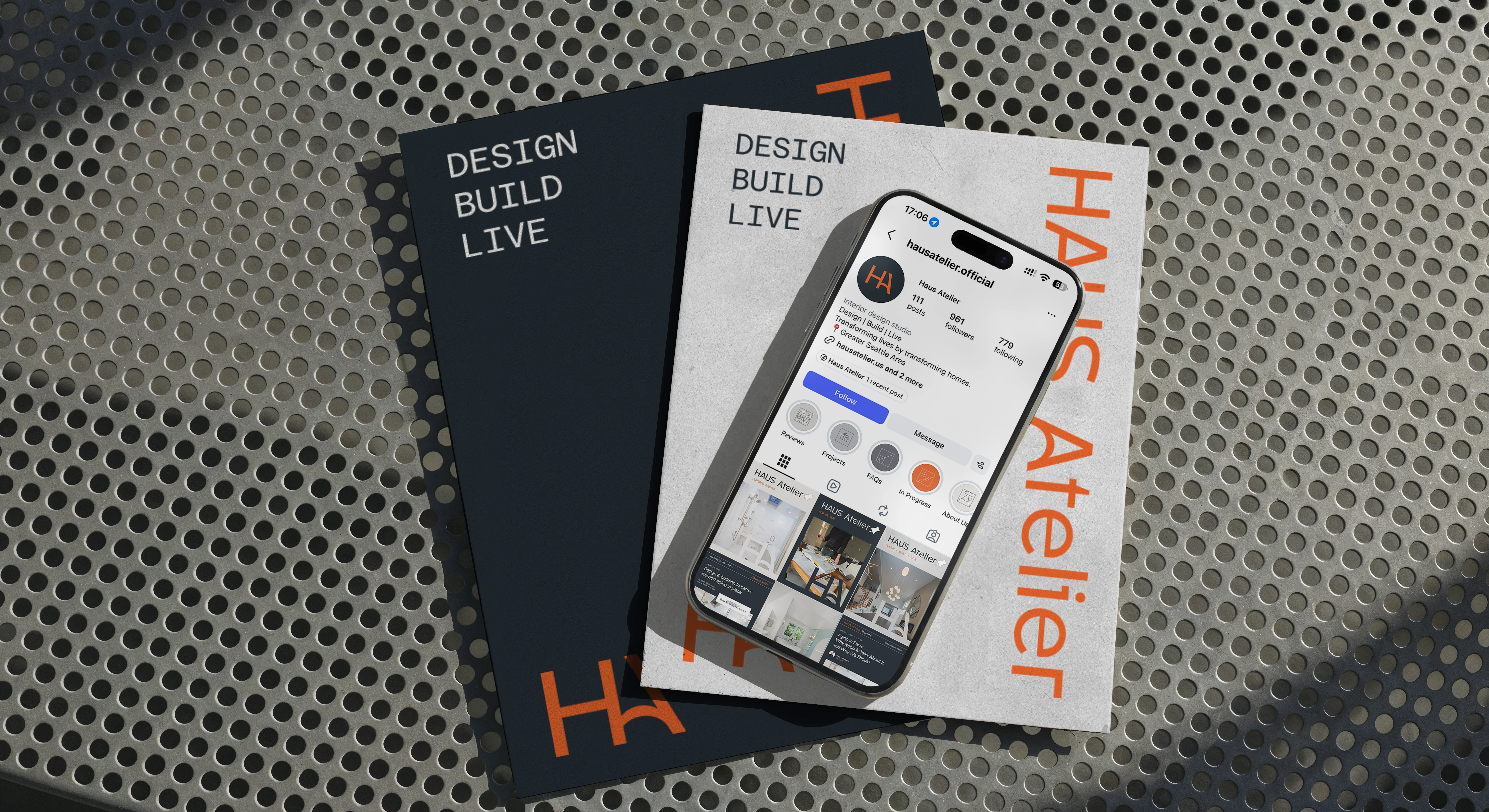
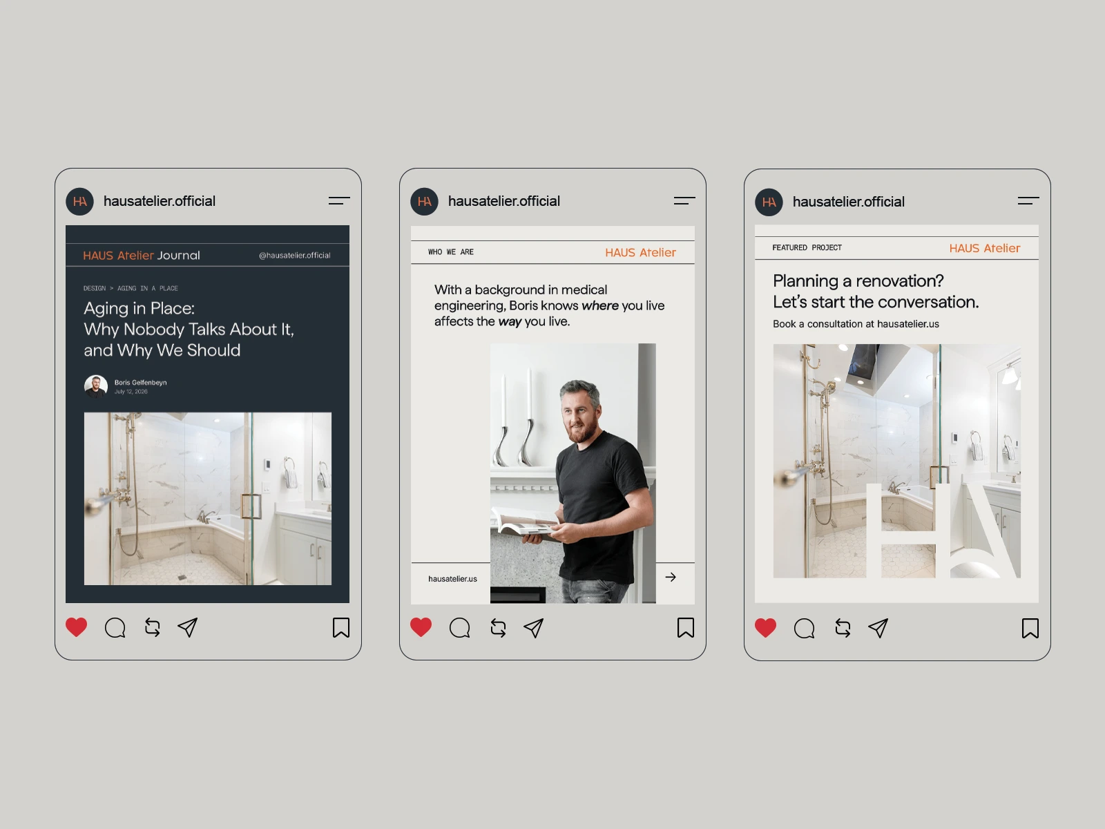
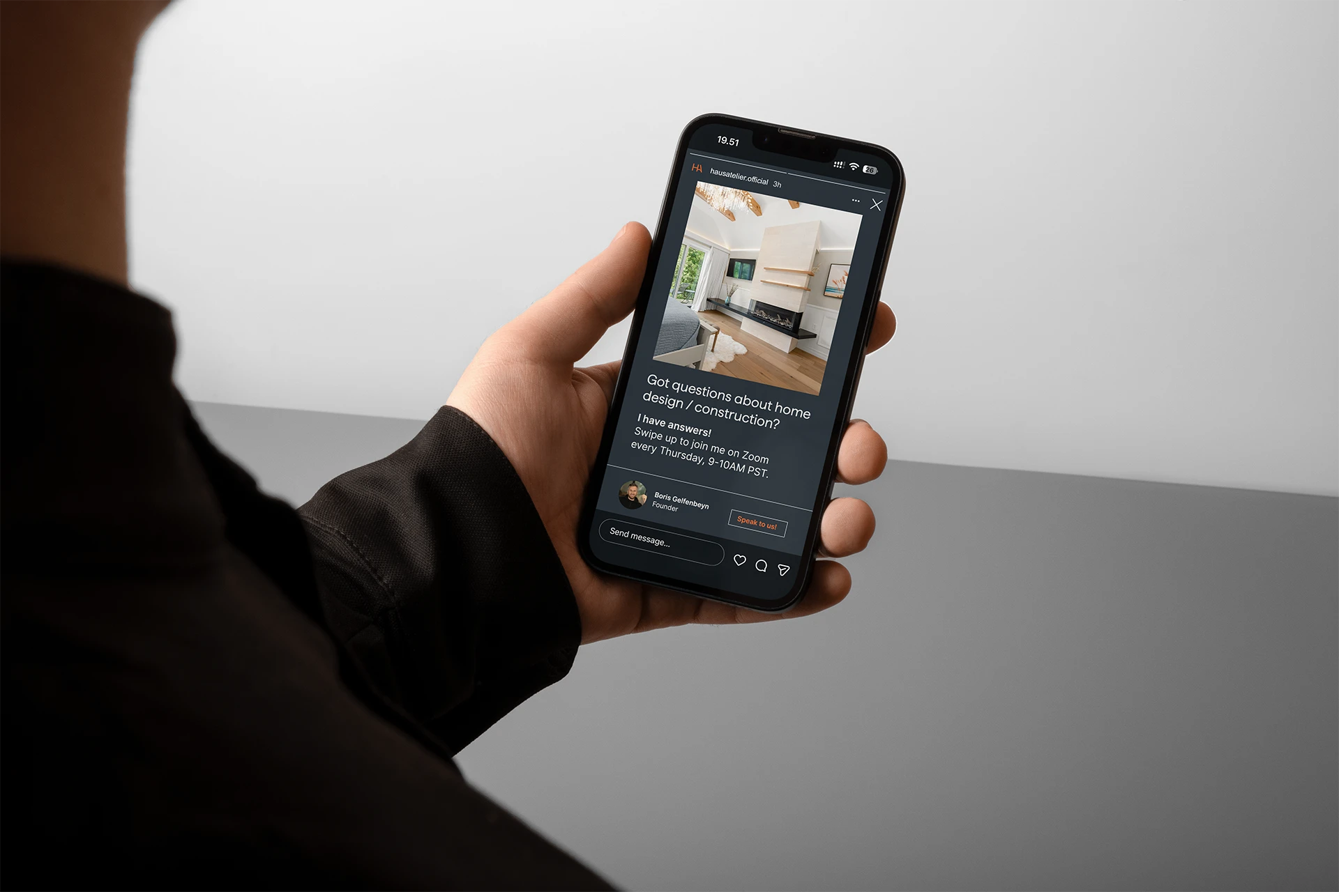
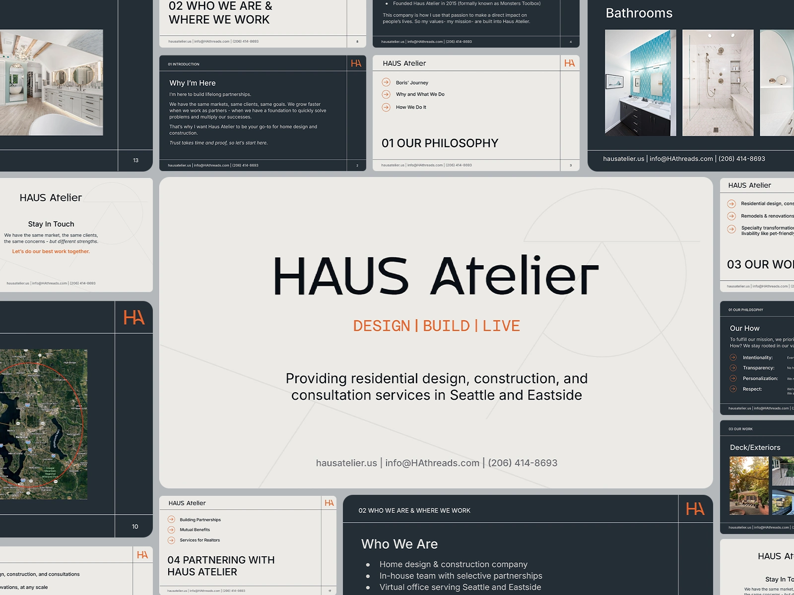
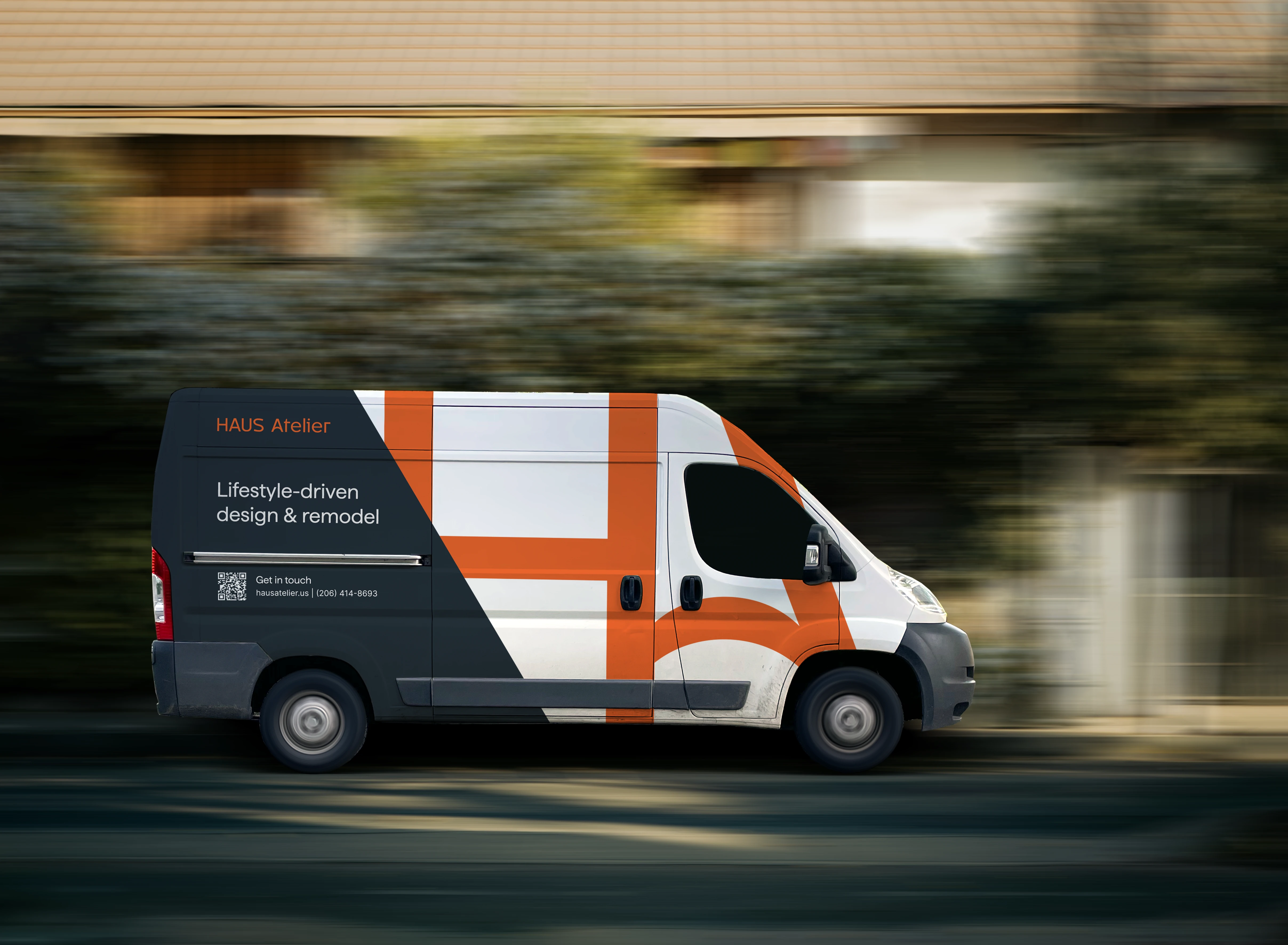
The wider system follows the same principle. Restrained typography, cool neutrals, natural tones and generous compositions create a quiet architectural foundation, while a sharp orange accent gives the identity a more recognisable edge. The result is a brand that feels considered rather than decorated — giving Haus Atelier a visual language capable of moving from residential projects and client communications to signage, print, vehicles and digital applications.
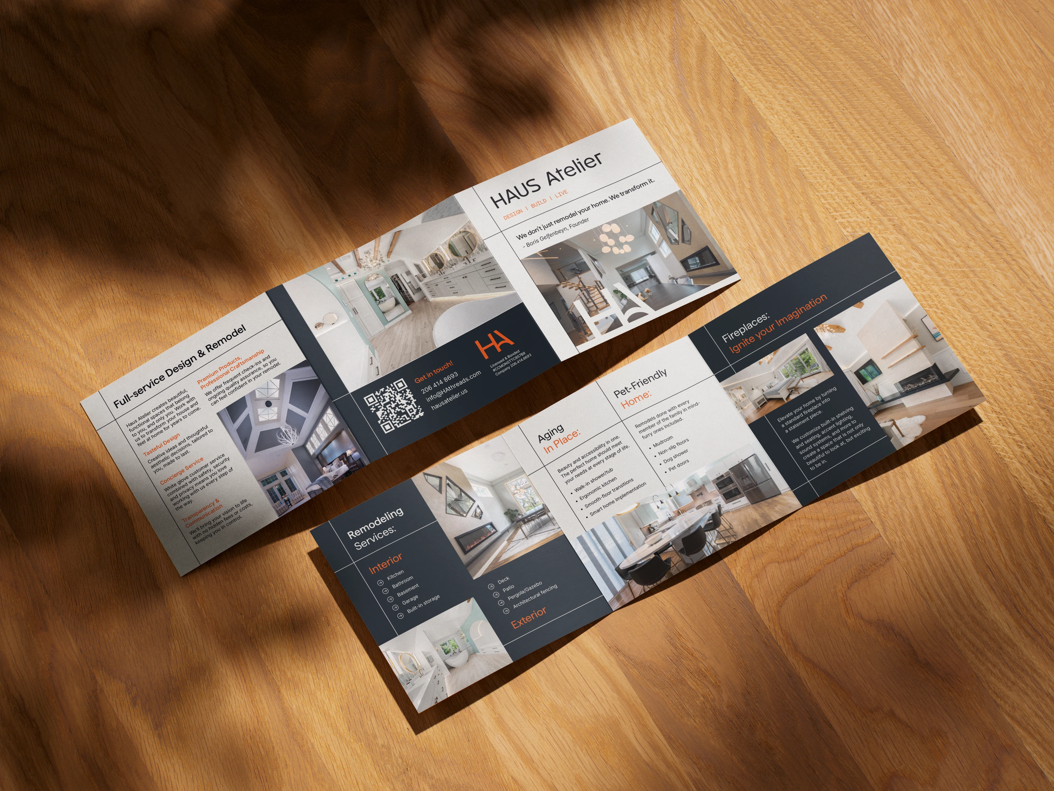
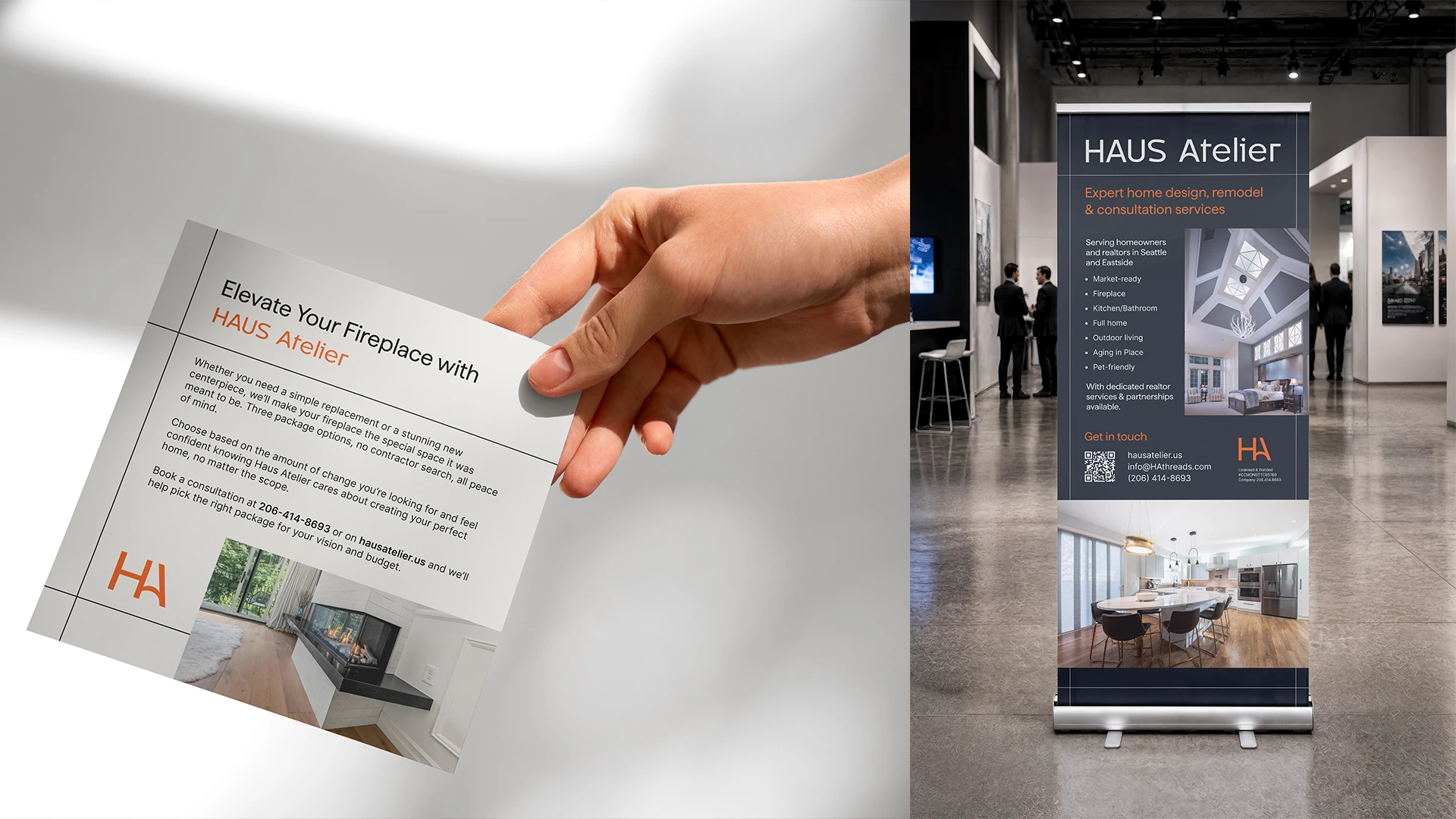
The identity has since grown into an extensive working system across business cards, brochures, project documents, presentations, apparel, vehicle graphics and other brand touchpoints — allowing the brand to remain consistent as the studio itself continues to expand.
Got a good idea that needs a better identity?
Tell me what you’re working on.
Like this project
Posted Sep 24, 2026
Brand identity for Haus Atelier, a design-build studio. The work included creative direction, a logo system, brand guidelines, and print & digital applications.
Likes
0
Views
0
Timeline
Jan 19, 2026 - Ongoing
Clients
Haus Atelier