Brand Identity Design for EdTech & SaaS Platform

Ivana Tomic


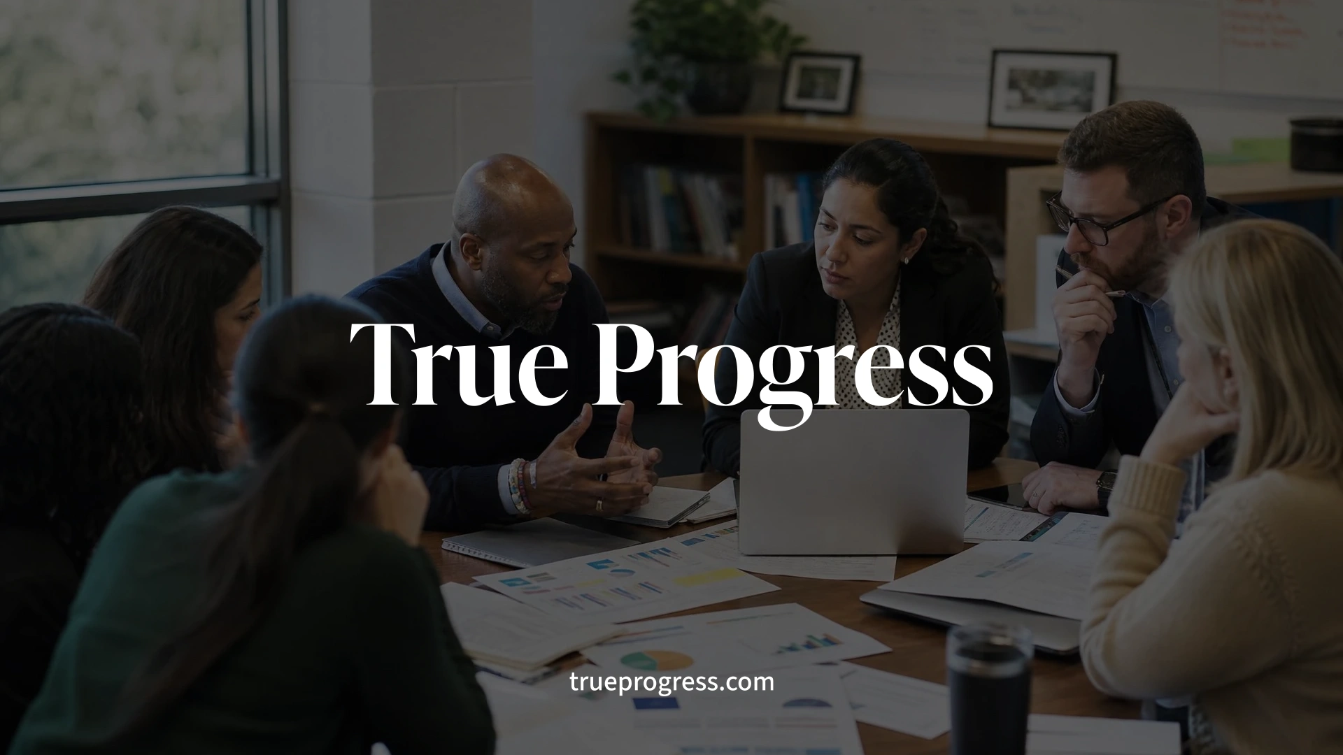
TRUE PROGRESS / PROGRESS INTELLIGENCE
Building a unified brand system for an educational intelligence platform and its growing product ecosystem.
Industry
EdTech · Education Technology
Market
United States
Scope
Brand Strategy · Brand Architecture · Brand Identity · Logo Design · Creative Direction · Brand Guidelines · Digital & Print Applications
The brief
True Progress was created to help schools move beyond isolated scores and surface-level reporting toward a deeper understanding of student progress and more informed decision-making. Progress Intelligence extends that mission through AI-powered insights and advanced analytics, turning complex educational data into clearer, more actionable information.
The challenge was to create an identity that could communicate intelligence and authority without falling into the familiar visual language of EdTech and SaaS. It also needed to establish a clear relationship between True Progress as the parent brand and Progress Intelligence as part of a broader ecosystem — connected enough to feel like one system, but flexible enough for each to have its own role.
The design
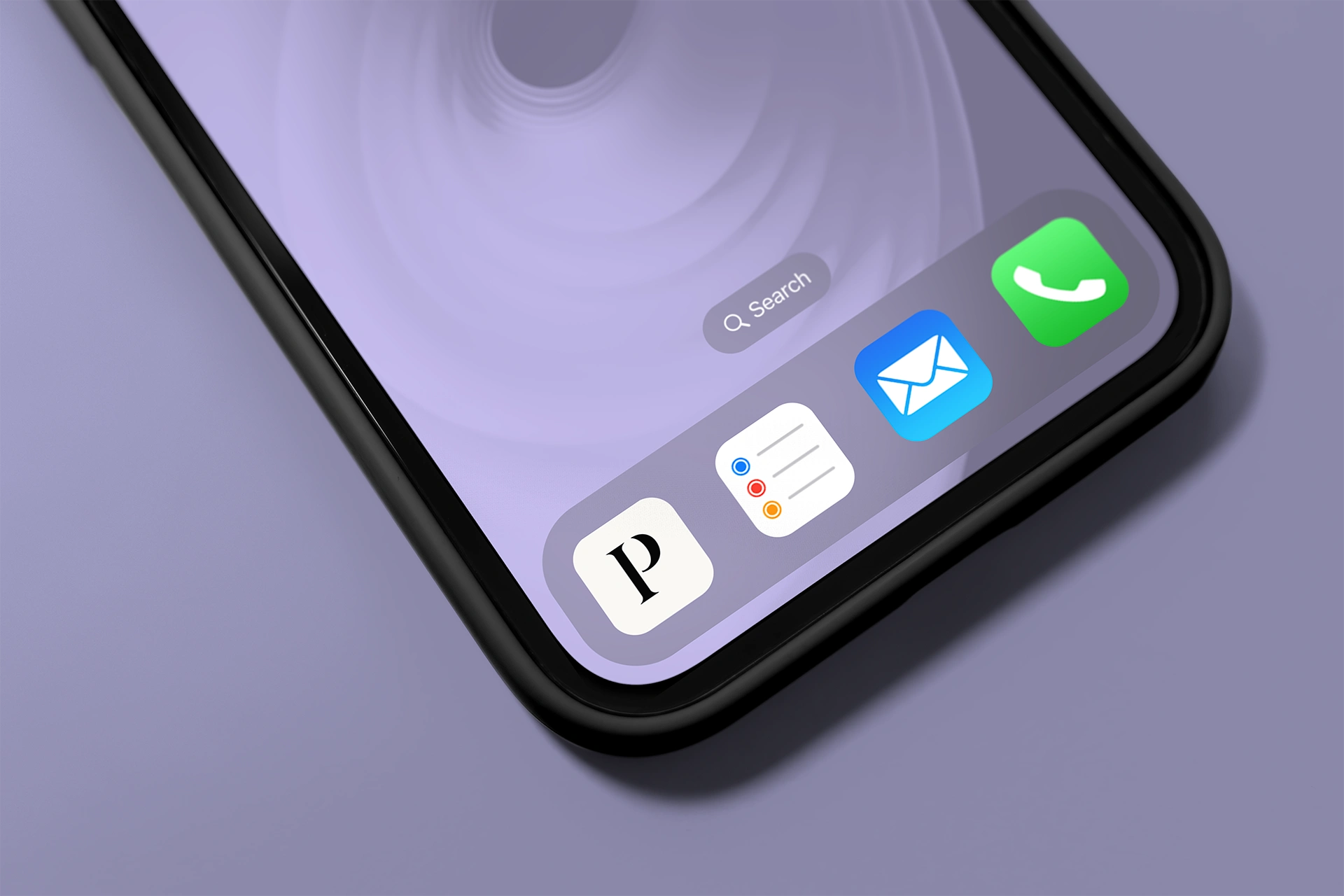
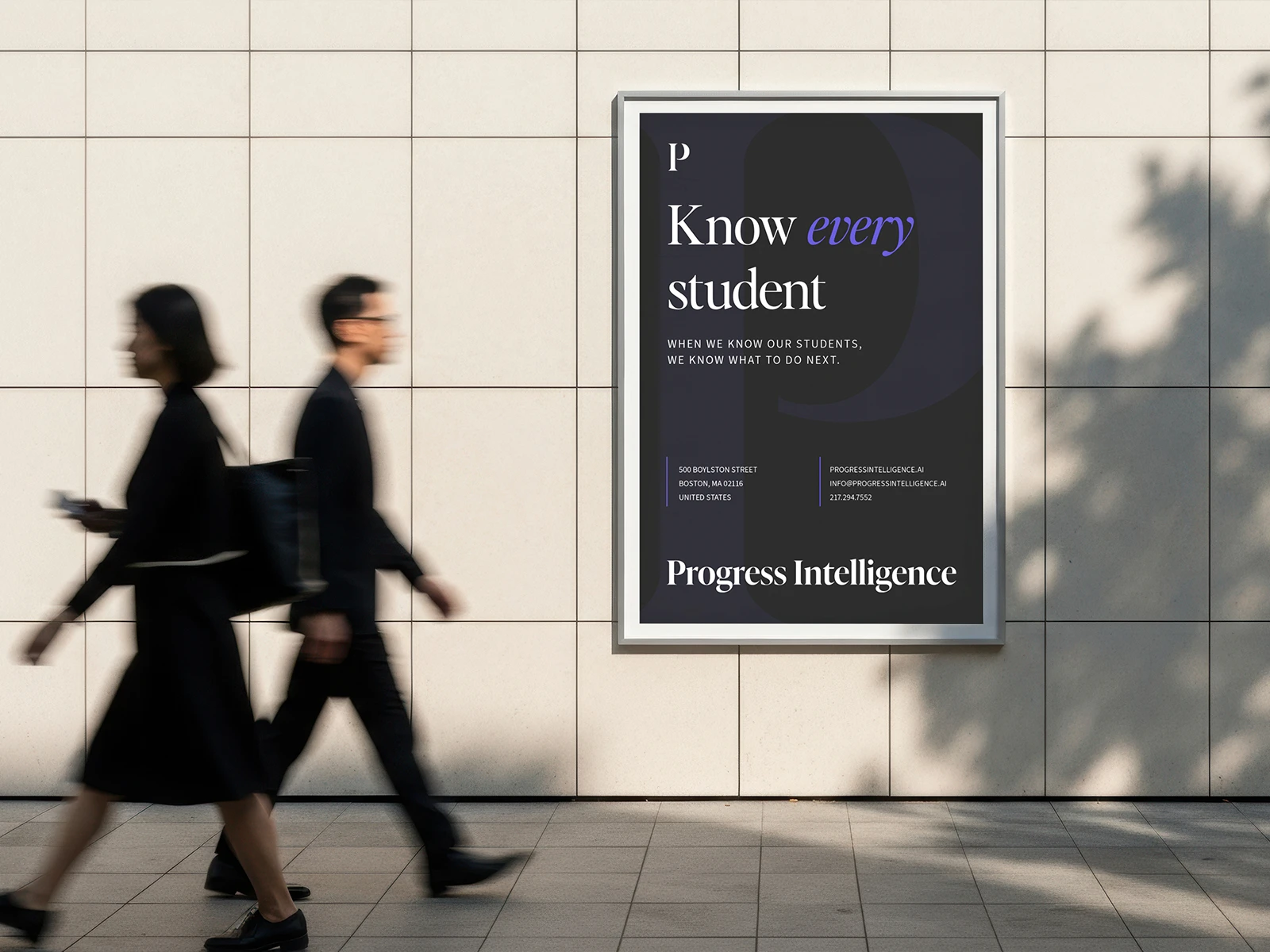
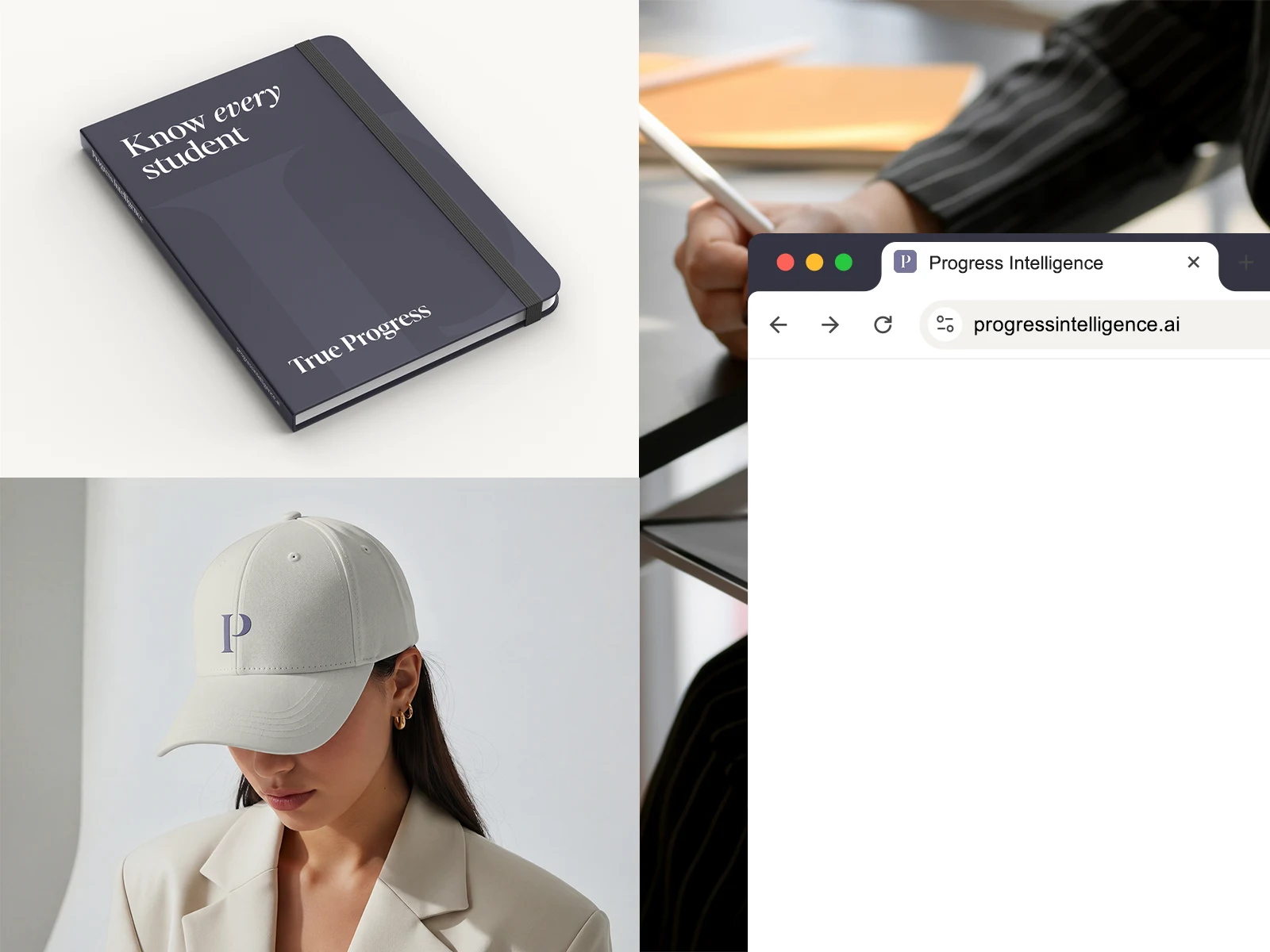
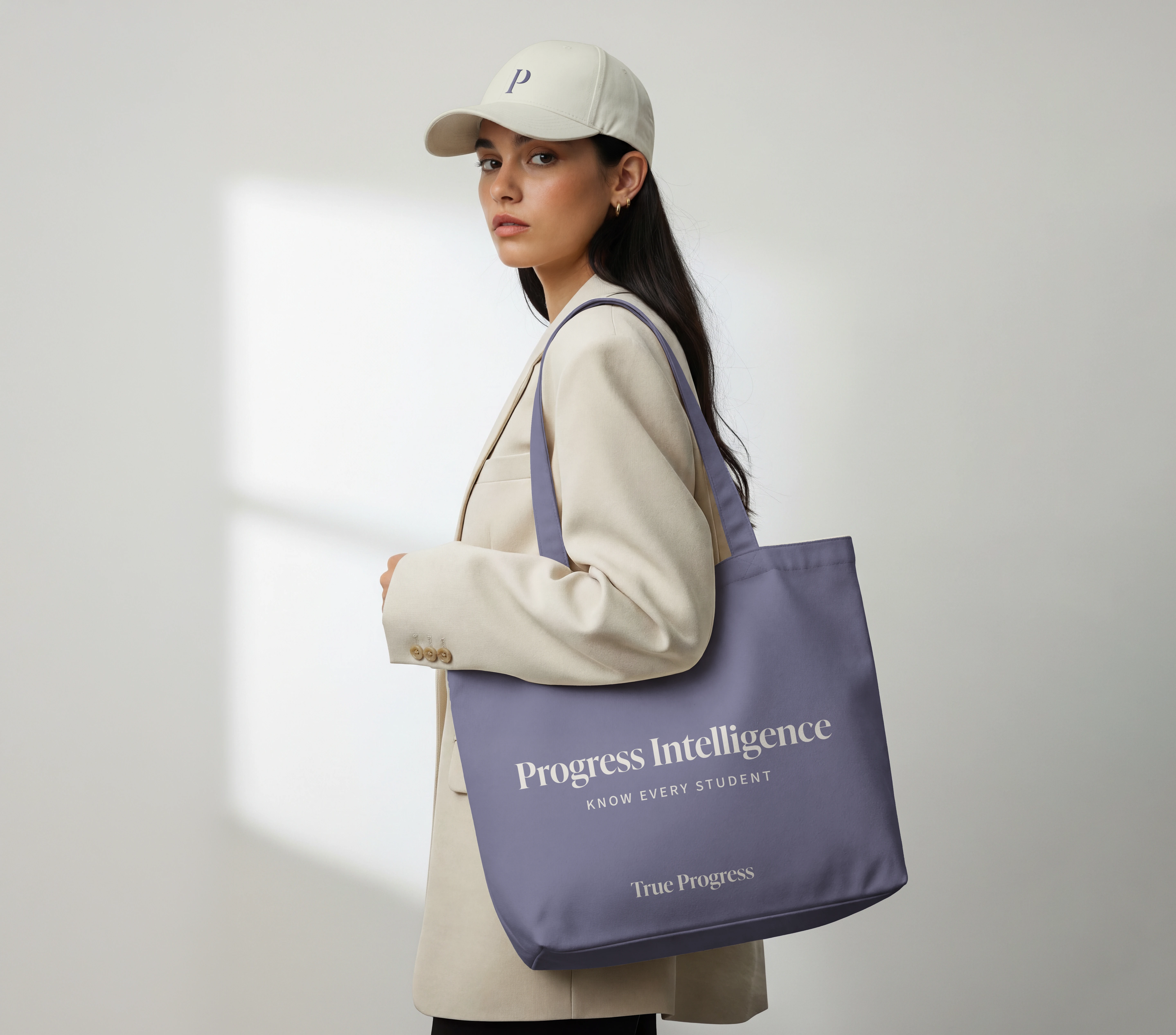
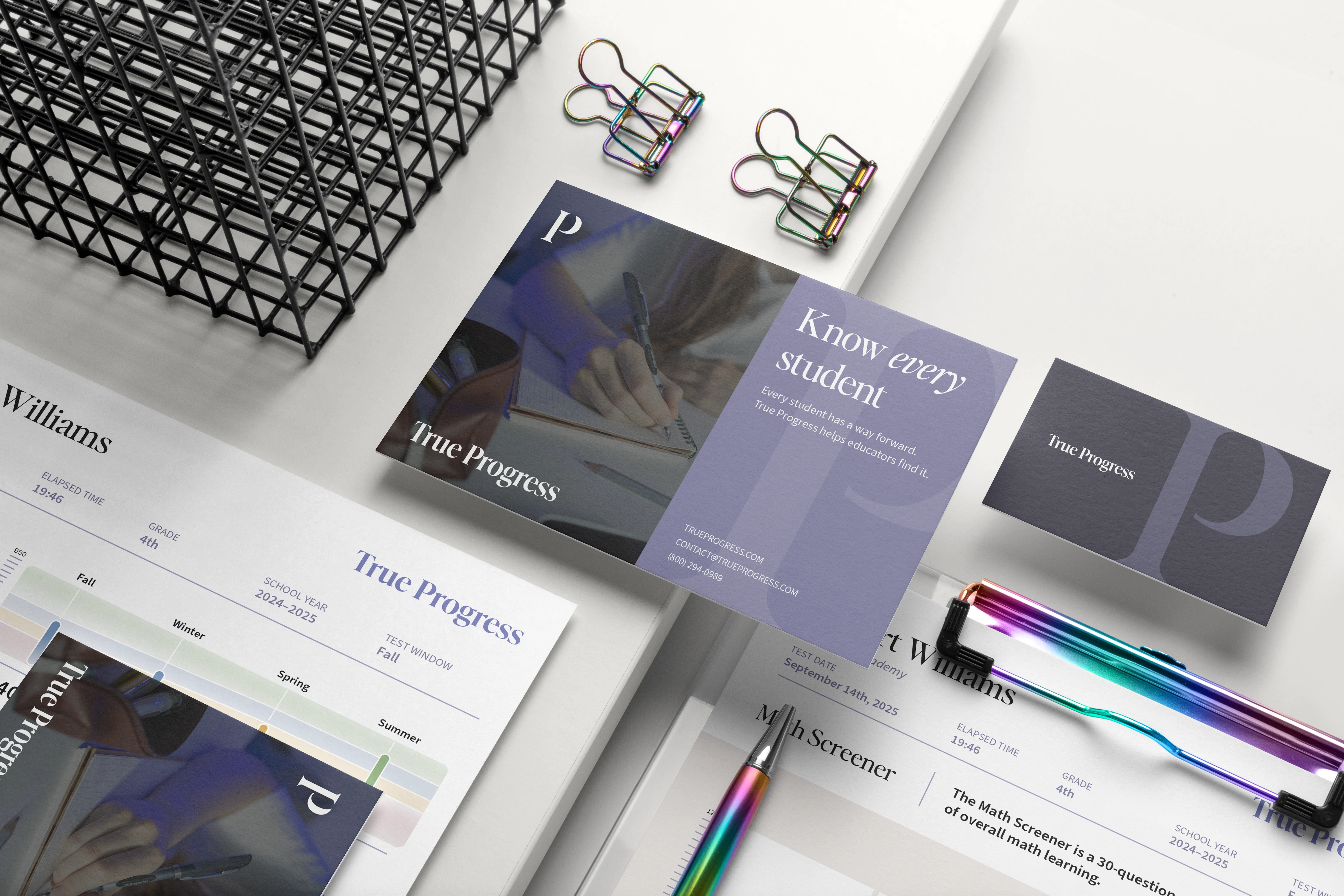
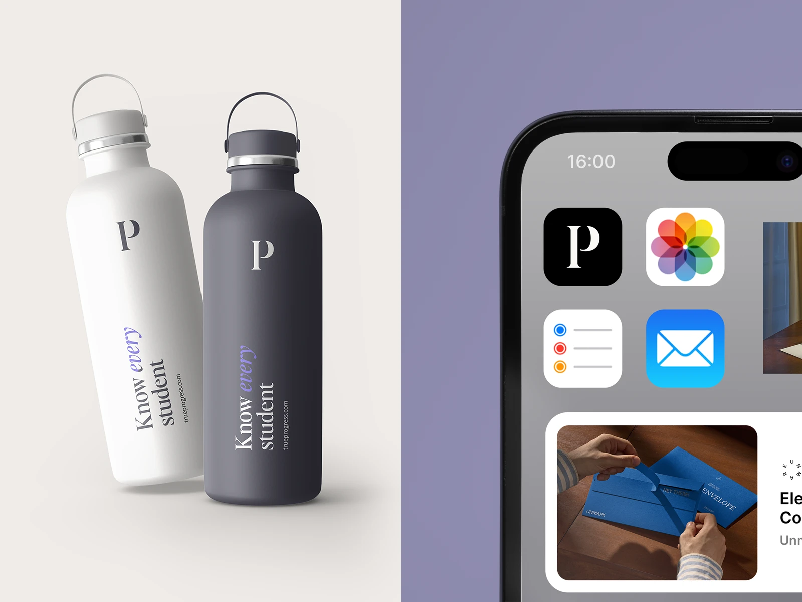
The system is built around the shared idea of progress. At its center is a custom symbol based on the letter P, with subtle interruptions in its construction introducing a secondary reading of PI — a reference to Progress Intelligence. This allows the mark to represent the wider True Progress ecosystem while retaining a meaningful connection to the product where the project originally began.
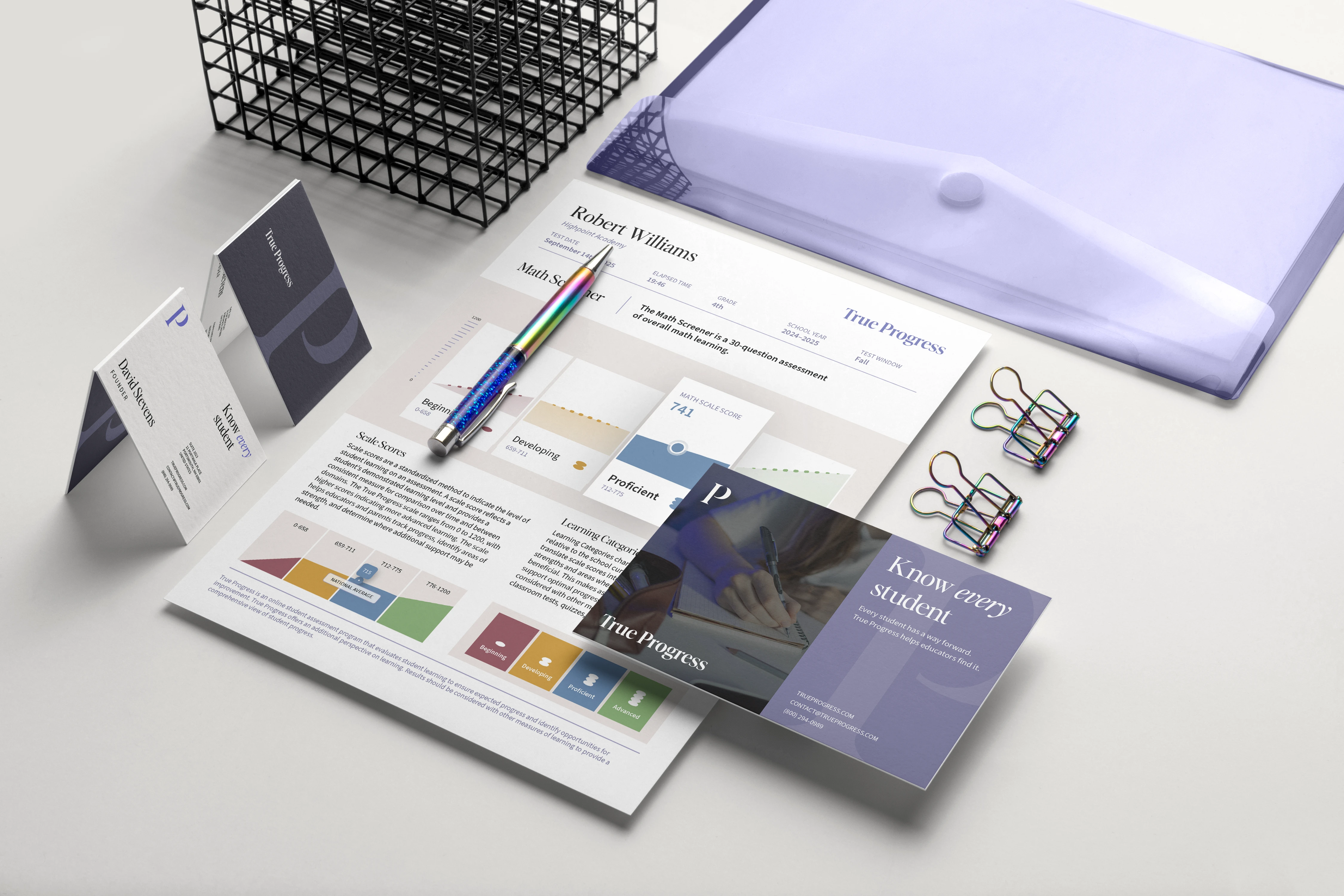
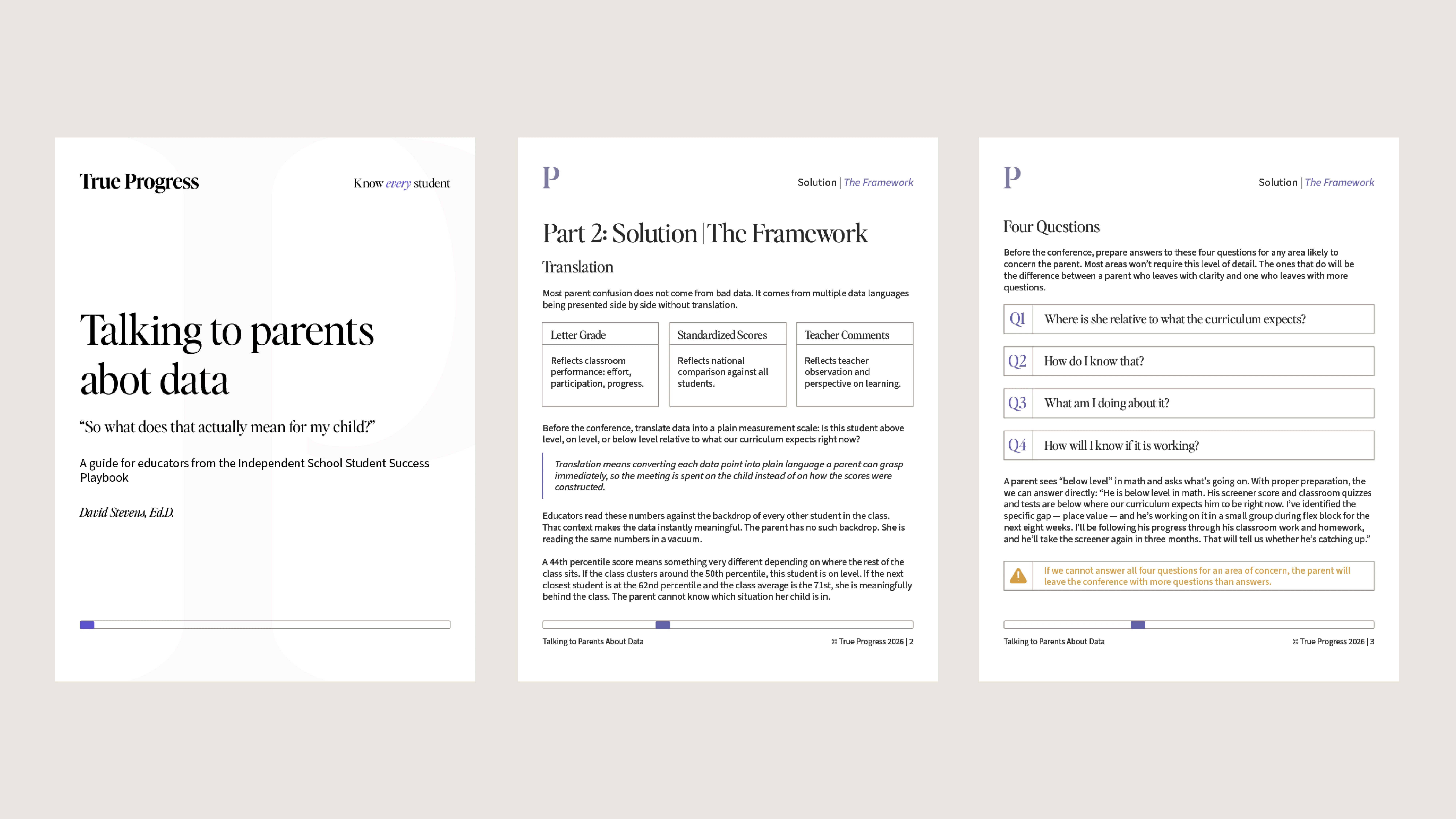
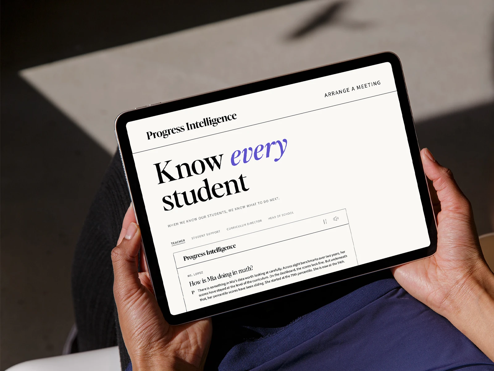
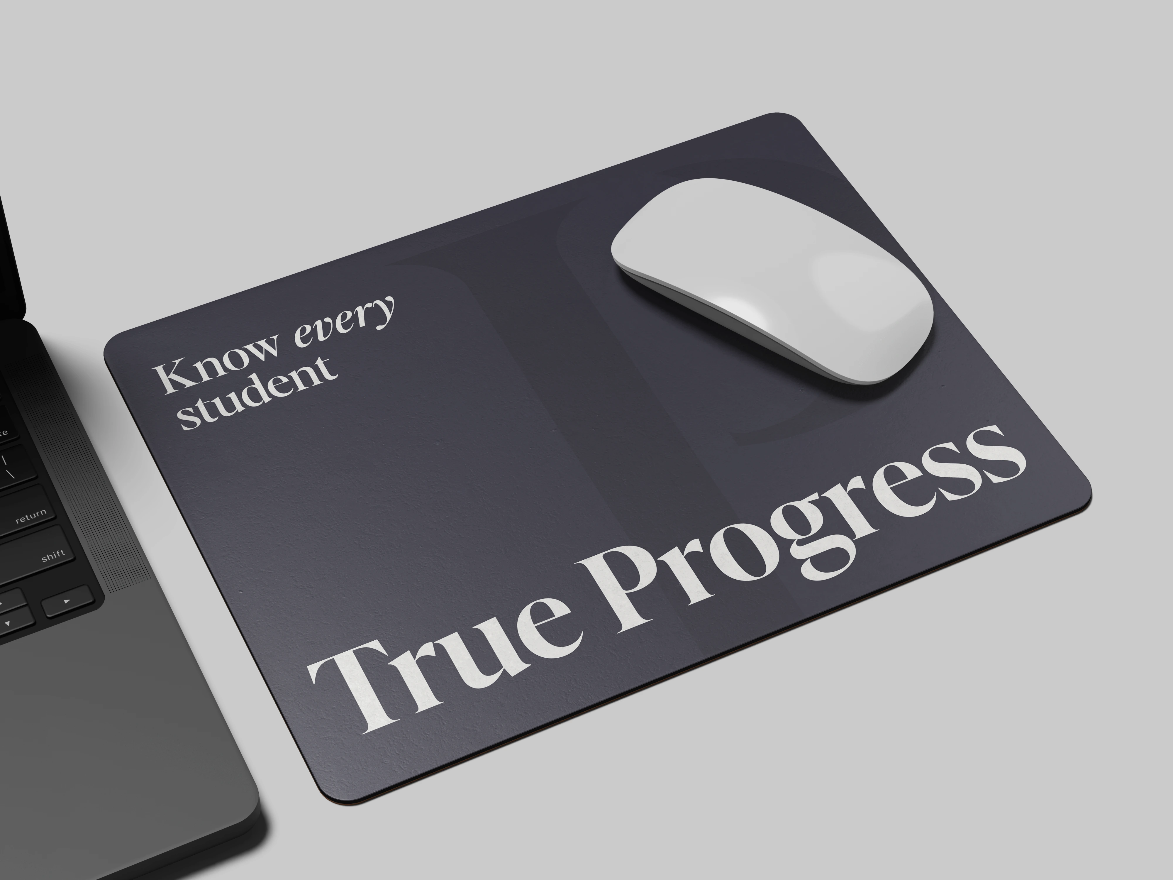
A shared editorial approach connects the True Progress and Progress Intelligence wordmarks, creating continuity between parent brand and product without making them interchangeable. The same principle extends through the wider identity: expressive editorial typography introduces character and authority, while restrained layouts and functional supporting typography keep information clear across content-heavy and digital environments.
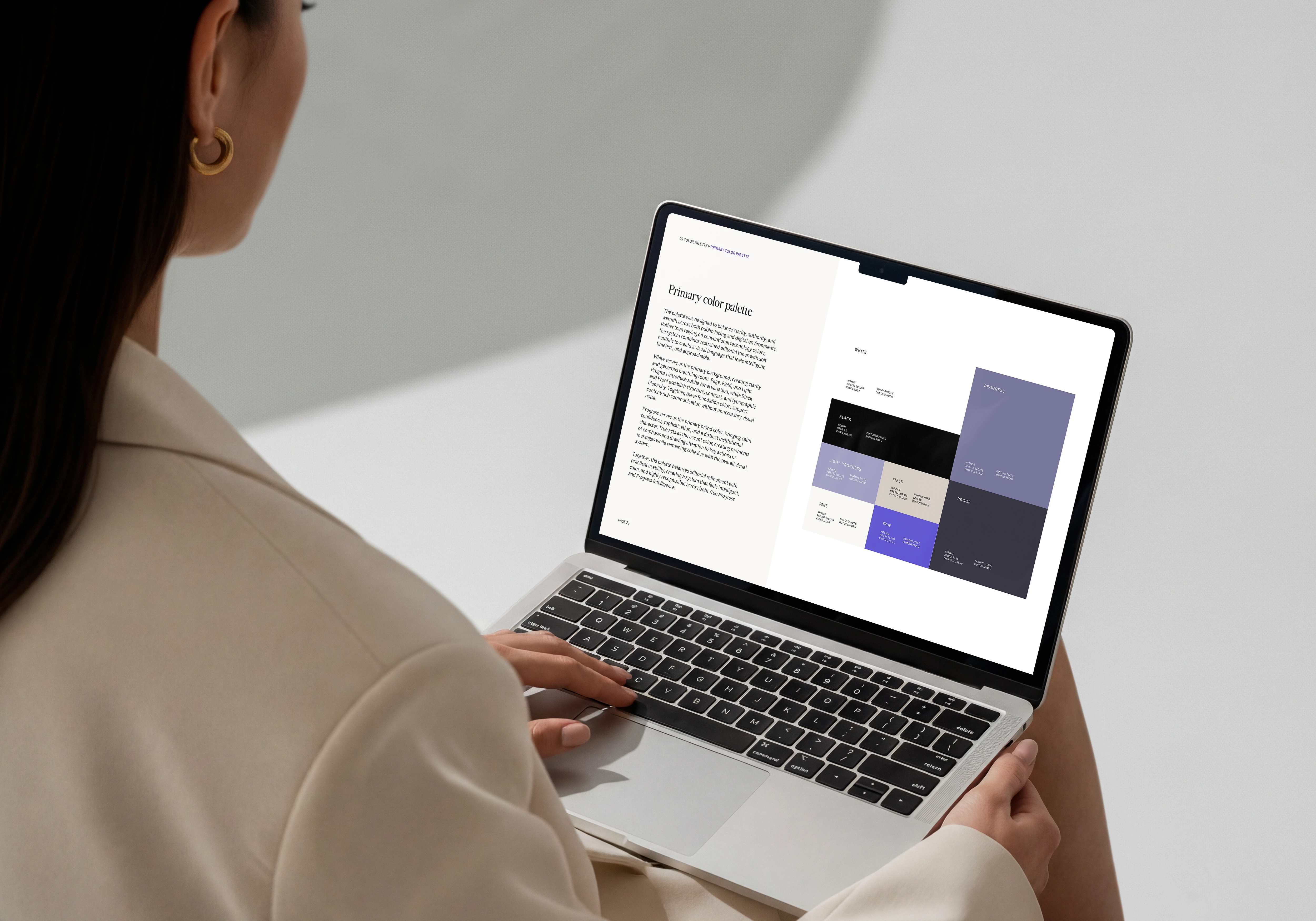
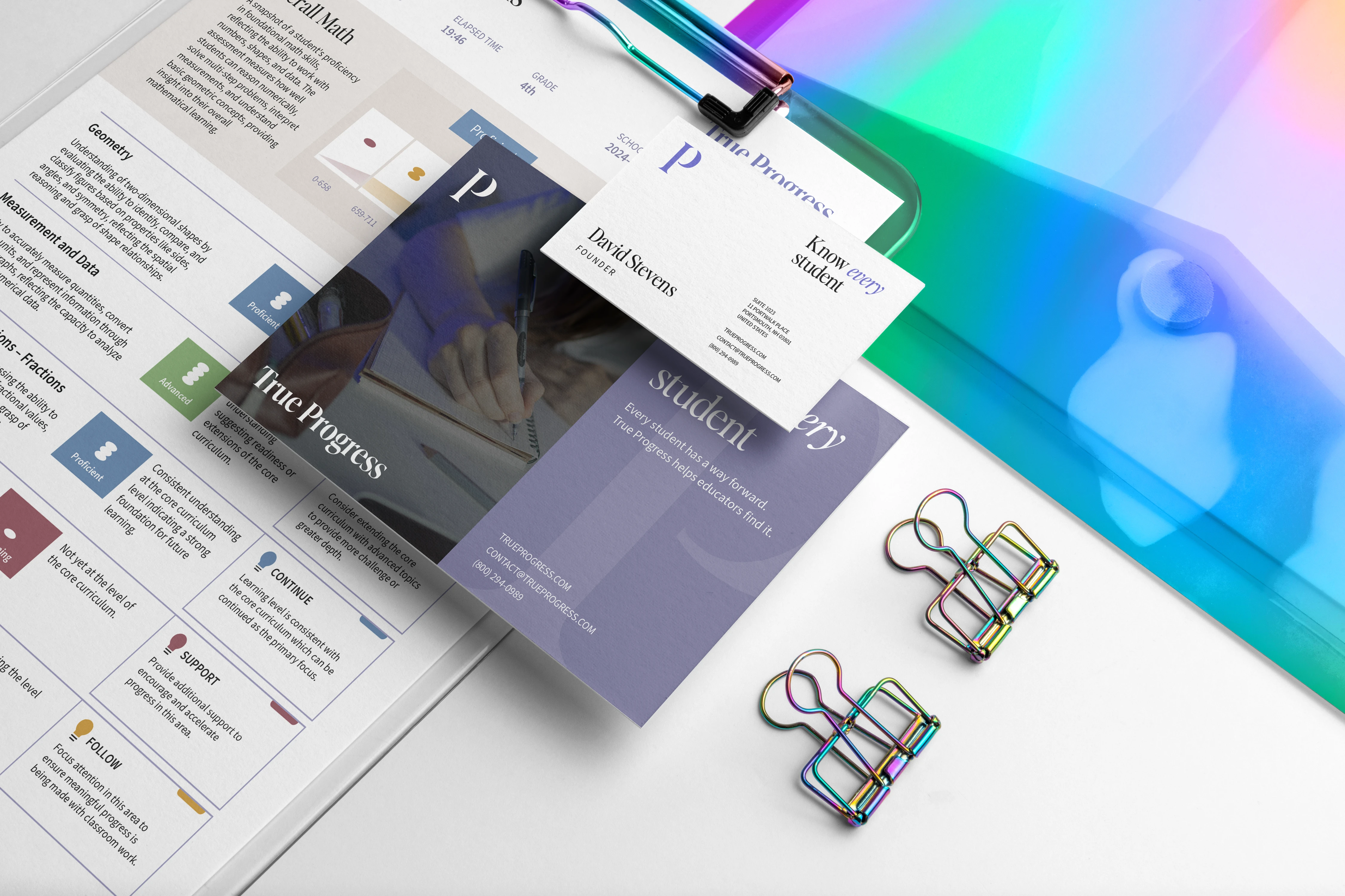
The color system combines warm neutrals and muted institutional tones with a more distinctive purple accent. A secondary performance palette extends the identity into the product itself, using color as a functional tool for communicating different levels of student performance rather than simply as decoration.
Together, the elements create a scalable visual system that can move between educational publishing, reports, digital products, communications, and branded applications while maintaining a consistent relationship between True Progress and Progress Intelligence.
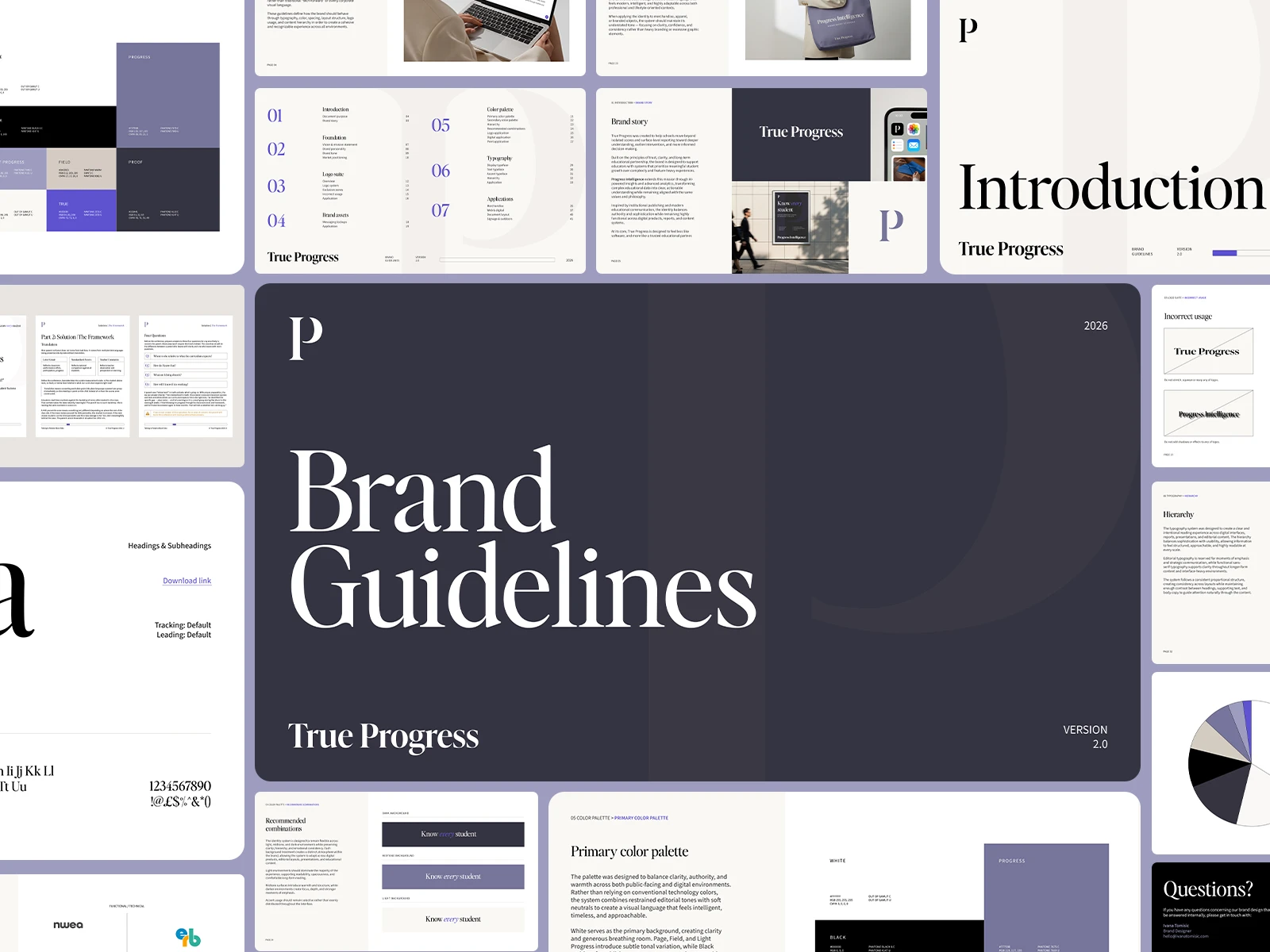
"Ivana is one of those rare designers who doesn't just execute a brief — she elevates it. She grasped the vision immediately, understood the nuance between polished and prestigious from the first conversation, and delivered work that lived in exactly the right register for my company. The logo she created is clever and elegant — a typographic monogram that feels institutional and timeless, not trendy. It's the kind of mark that looks like it's been around for decades. The full brand guidelines she produced brought coherence and grace to every detail. Typography, color system, layout principles, spacing — every decision was considered and every page reflected her impeccable taste. Beyond the design work, Ivana is a pleasure to collaborate with. She's responsive, communicates clearly, and makes the process feel effortless even when the decisions are complex. She asks the right questions, pushes back thoughtfully when something isn't working, and delivers work that consistently exceeds what you imagined when you wrote the brief. Ivana dramatically uplevels any company she works with. If you're looking for someone who can translate ambitious brand thinking into a visual system that actually earns the positioning, you will be lucky to work with her."
David, The Founder
Got a good idea that needs a better identity?
Tell me what you’re working on.
Like this project
Posted Sep 18, 2026
Brand identity and visual system for True Progress & Progress Intelligence, an EdTech platform helping schools turn student data into clearer insights.
Likes
0
Views
6
Timeline
Apr 21, 2026 - Ongoing
Clients
True Progress