Outdated Non-Profit Website Redesign: Modern UX for New Chapter
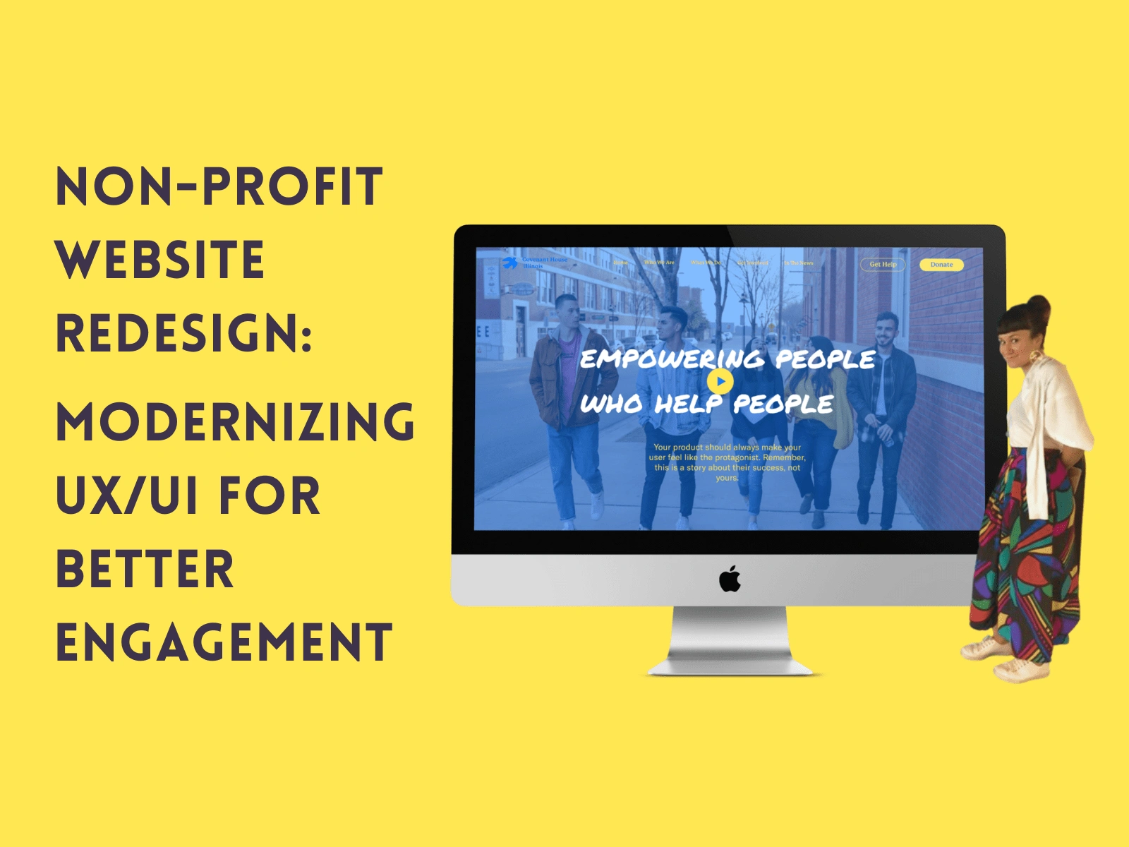
Covenant House Illinois
Helping a crucial non-profit reimagine its website for the busy, working professional and ultimately help homeless youth find housing in Chicago
Timeline
March 2022 - April 2022
6 Weeks
My Role
UX Designer
Content Inventory, user personas, information architecture, sketching, wireframing, mockups.
PROBLEM
An out-of-date and bulky website lacks the attention-grabbing appeal needed to secure donations from the public.
As Covenant House Illinois (CHIL) planned to open up donations to the public, they considered the user experience of their outdated website. It lacked the visual appeal and functionality of other non-profit sites competing for the same funds. In addition, they planned to migrate their site from Squarespace to Wix.
SOLUTION
A clean, easy-to-navigate website that informs users where donations go is key to appealing to busy donors with lots of non-profits competing for donations.
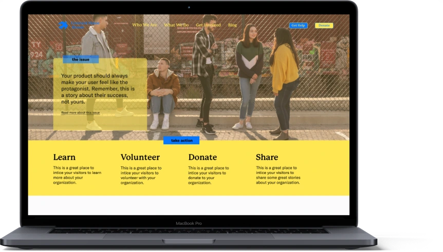
Clarity is key.
The donation button needs to be a clear call to action. Otherwise, it blends in with the rest of the navigation.
The user needs to quickly find "giving statistics" to make an educated decision on whether or not to donate.
Reorganizing a few pages will make the site more intuitive to navigate.
INITIAL RESEARCH
CONTENT INVENTORY + AUDIT
Before beginning the design process, it was imperative to conduct a content audit to take stock of our content, organize it, and identify which pieces needed to be updated or removed.
COMPETITIVE ANALYSIS
A brief competitive analysis revealed that other organizations had clearer calls to action and less cluttered sites. It was evident that CHIL needed to do the same to remain competitive.
SYNTHESIZE + ANALYZE
ANALYSIS
It became clear that the redesign's focus would be the homepage and the donation page.
CHIL decided to update or keep most of its content which was quite text-heavy. Since our ideal user is a busy philanthropic professional, we wanted to ensure they could quickly and easily access the figures and stats they need to decide to donate. The homepage would thus inform donors why they should donate to CHIL, and the donation page would secure the transaction.
USER PROFILE
Like most nonprofit websites, CHIL has two primary users: potential donors and those in need of the organization's services.
DESIGN
INFORMATION ARCHITECTURE
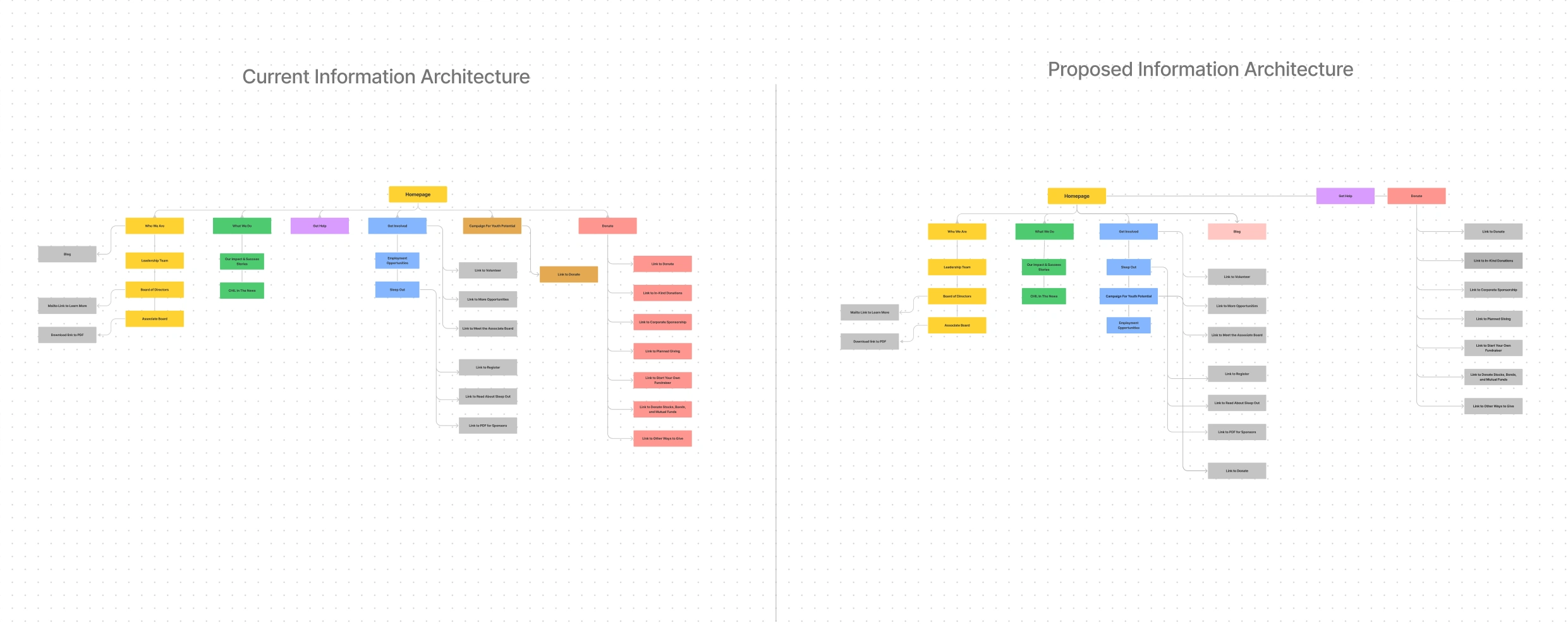
To remain intuitive, the site required reorganizing some of its pages. An information architecture map allowed me to visualize the necessary changes and communicate them to the client.
SKETCHES
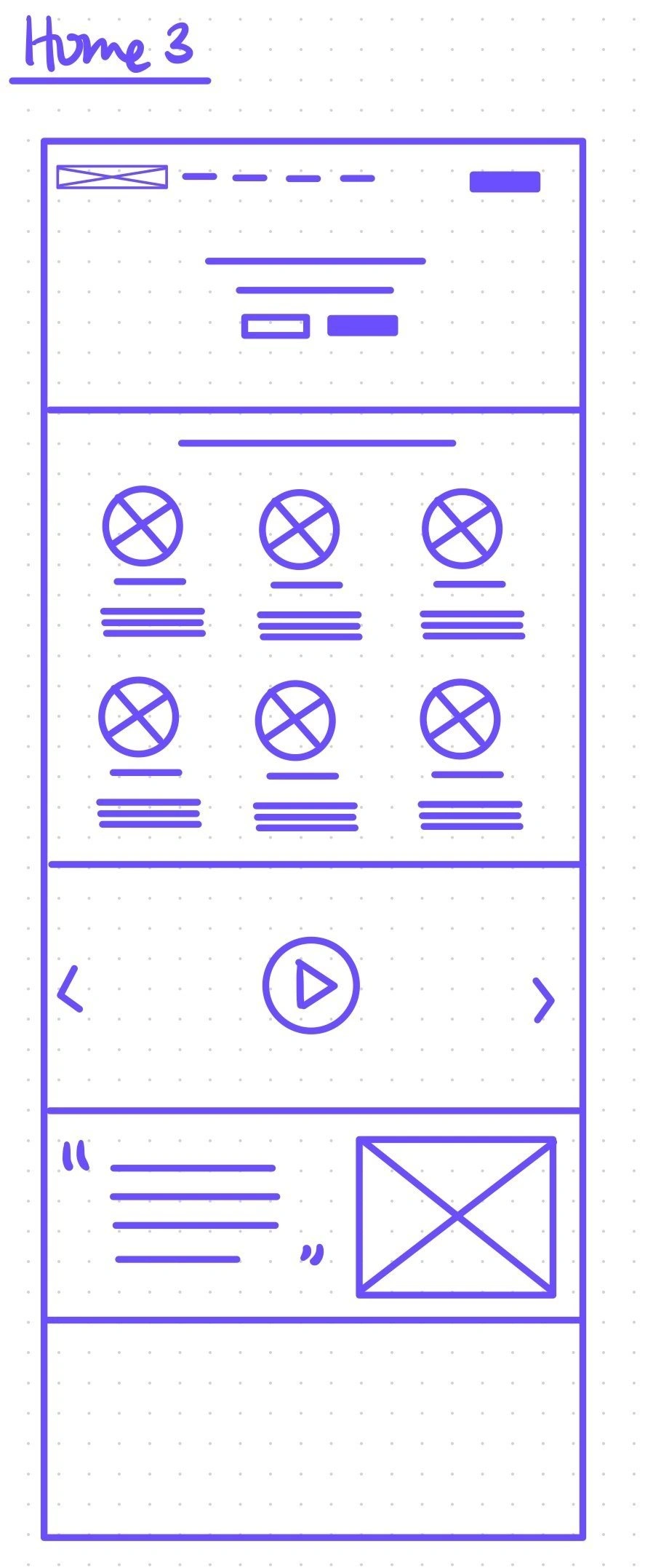
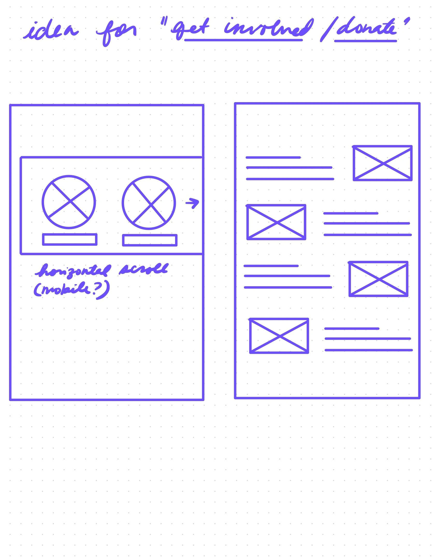
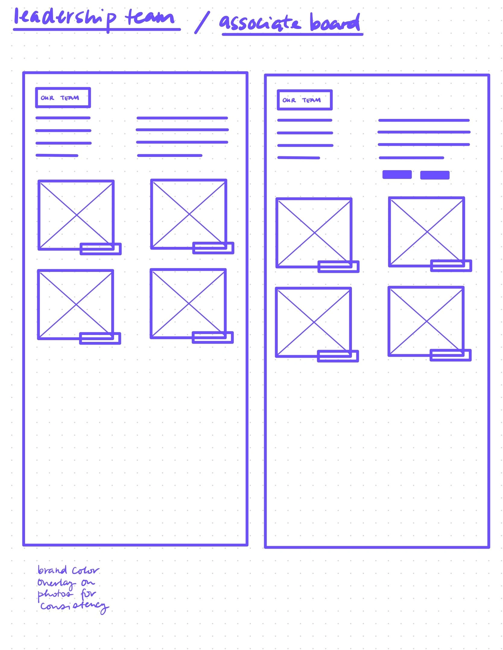
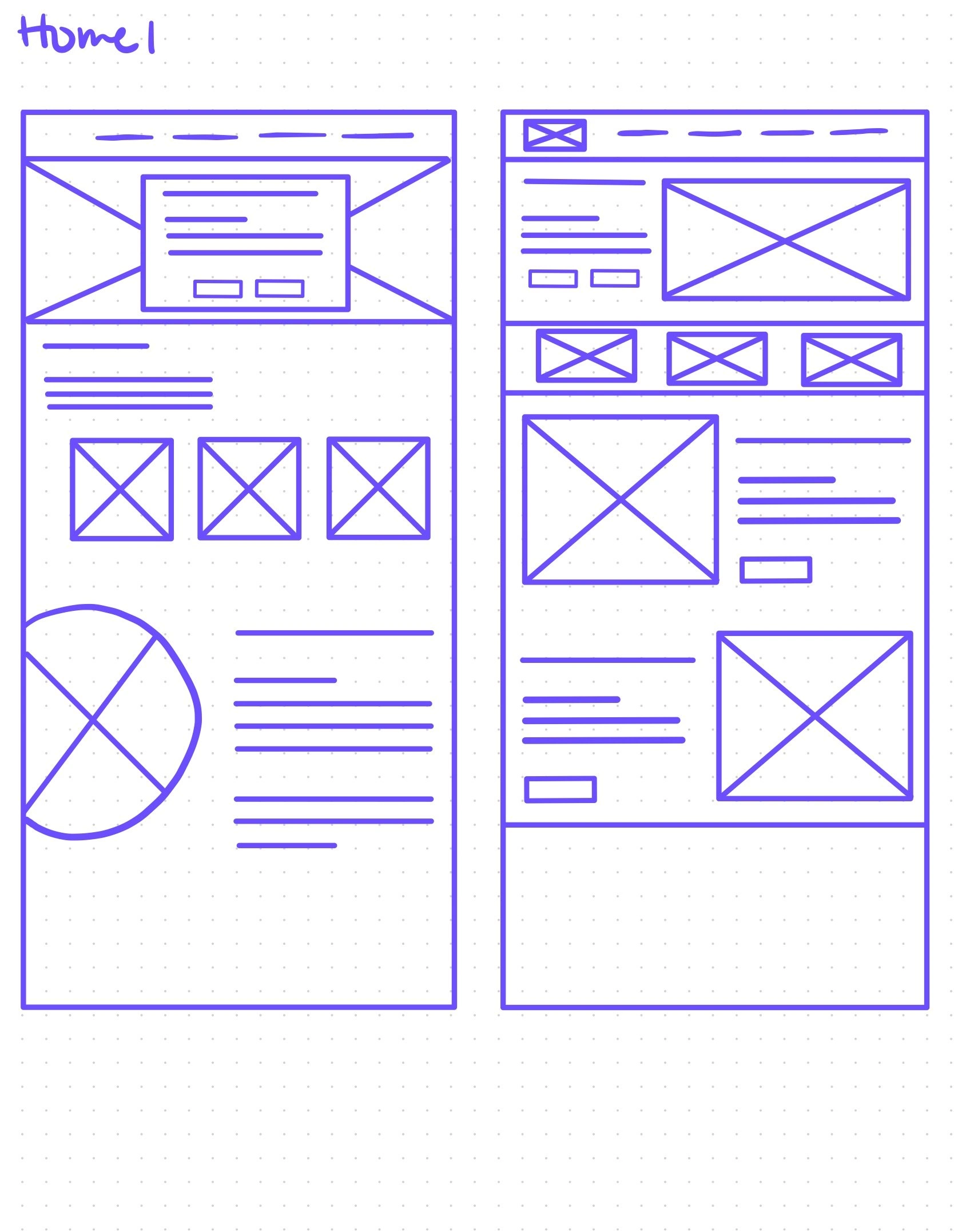
Keeping the homepage top of mind, I sketched the site's main pages. I saw to it that the designs were clean and visually appealing.
WEBSITE BUILDER CHANGE
Wix offers a lot of functionality that Squarespace does not, but it comes at a cost. I compiled a list of best practices to help my client perform maintenance easily, minimizing frustrations.
BUILD OUT
At this point, I learned that a board member was volunteering his time as a designer on this project. I adapted my approach to this new scenario.
Instead of building each page from scratch, I focused on creating mockups for the main portions of the site I had already wireframed because I now had another, more seasoned designer doing the building. I also focused on making maintaining the site easier for my client.
PROVIDING VALUE TO THE CLIENT
As the project ended, I educated my client on creating templates to save time.
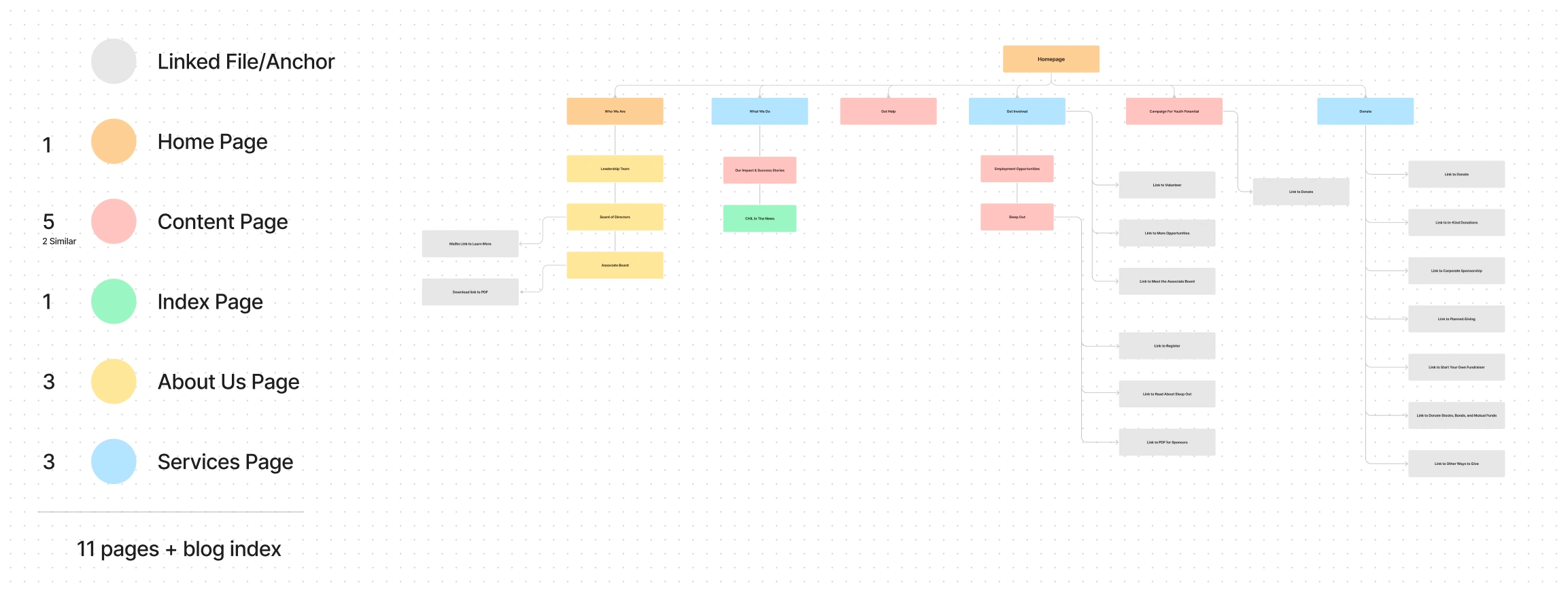
Color coded information architecture map showing similar page types.
THE FINAL SCREENS
The final product


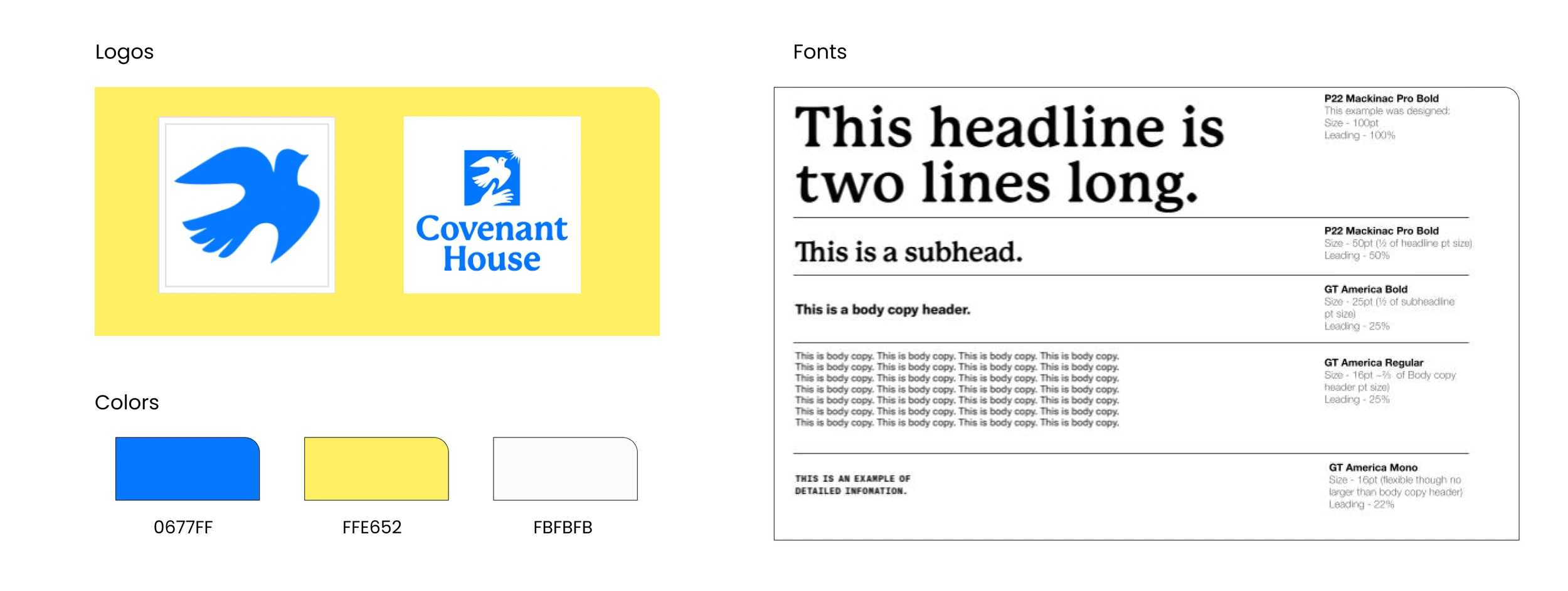
The Style Guide
The organization had its own brand playbook + toolkit so it was easy to focus on the UX aspects of the project.
CONCLUSION + LESSONS LEARNED
The impact this project will have on the community.
Transparency is key. Nowadays, it's easy for bad actors to whip together a professional-looking website to scam the public. As a non-profit, you must assure potential donors of your organization's integrity by being transparent about where donations go. We made sure to emphasize this in our designs.
Stay up-to-date with trends. Donors are busy working professionals who take their time seriously. As more efficient trends emerge for website design, it's crucial to stay up-to-date as this is what this set of users will expect. The public usually cuts non-profits some slack in this regard, but it's better still always better to meet the user where they are.
The impact this project had on me as a designer.
Communication is key. This was my first official UX project outside my UX Design Course so I learned a lot. Most importantly, I learned that I must find out who will work on the project upfront. It wasn’t until halfway into the project that I learned there was another designer involved in this project, which leads me to my next lesson learned...
Adaptability is crucial. I enjoy teamwork, but in this case, we were working on the same parts of the design, which got confusing. So I changed my approach, knowing that it would still help us achieve our end goal, and I even did some extra credit, having figured out some best practices for working with Wix.
Take inventory. My UX design course did not cover this, but I was up for the challenge. I did a lot of research and learned the importance of conducting this inventory. It was fascinating to see how all the parts combine to create the whole. It initially seemed a little overwhelming to think that all the content may need to be updated. But I saw how that would be identified upfront so that the marketing team could work on that while I moved forward in the design process.
Don't give yourself more work to do. In the UX course, we were taught to design each page individually. But this project and further research taught me about building templates for similar page types. This significantly cut down on the stress associated with creating each page. It saves time and makes for easier maintenance by the client.
Thank you for reading!
🙏
Like this project
Posted Oct 2, 2024
Redesign outdated website for non-profit.

