AMAZON CASE STUDY — SYLVIA GONZALEZ
Sylvia Gonzalez
From Considering to Cart in Fewer Scrolls
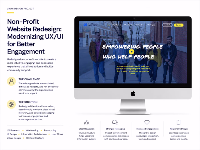
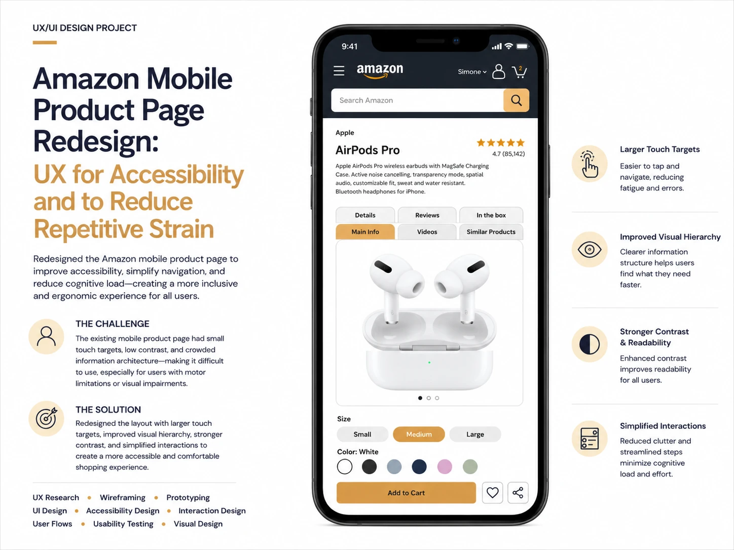
An alternative Amazon user interface for people with limited range of motion and hand joint mobility issues
CONTEXT
This is a practice project I worked on to keep my skills sharp as I work to land my dream ux job.
CHALLENGE
Users on mobile with hand joint mobility issues may abandon their shopping journey due to excessive scrolling.
People of all ages can experience mobility issues and pain in their hands. By making our products less scrolling intensive, we will be making them more accessible to those with pre-existing conditions, and we won't be contributing to future issues for others.
SOLUTION
A mobile product page that houses information under tabs and requires minimal scrolling is ideal for helping these users complete their journey without pain.
RESEARCH
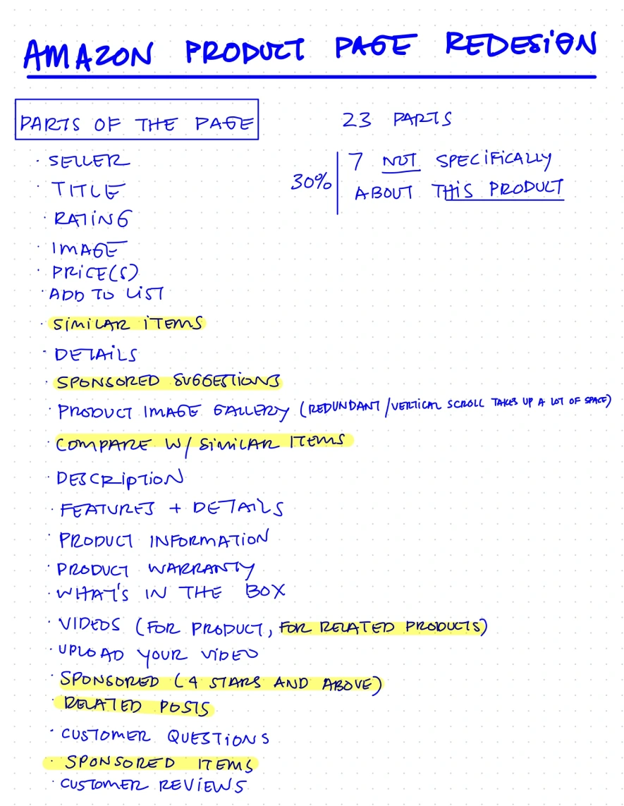
I started by taking inventory of exactly how many sections each product page contained.
Through my research, I found that the average product page on mobile contained 23 distinct sections. 7, or 30% of these sections, are not specifically about the product listed at the top of the page.
For someone with hand joint mobility issues or a limited range of motion, this excessive scrolling can be what causes them to abandon the shopping experience.
Guiding Questions:
Is there a better way to present the shopper with the same amount of information that cuts down on scrolling?
Can we consolidate or group similar product information sections for a more cohesive experience?
Wireframes
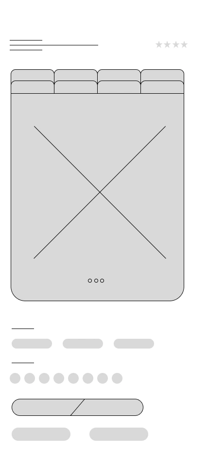
The answer to the question, "Is there a better way to present the shopper with the same amount of information that cuts down on scrolling?" was a no-brainer.
Group similar product information under tabs. I designed my wireframes in Figma and used them to inform the rest of my designs.
UI Design
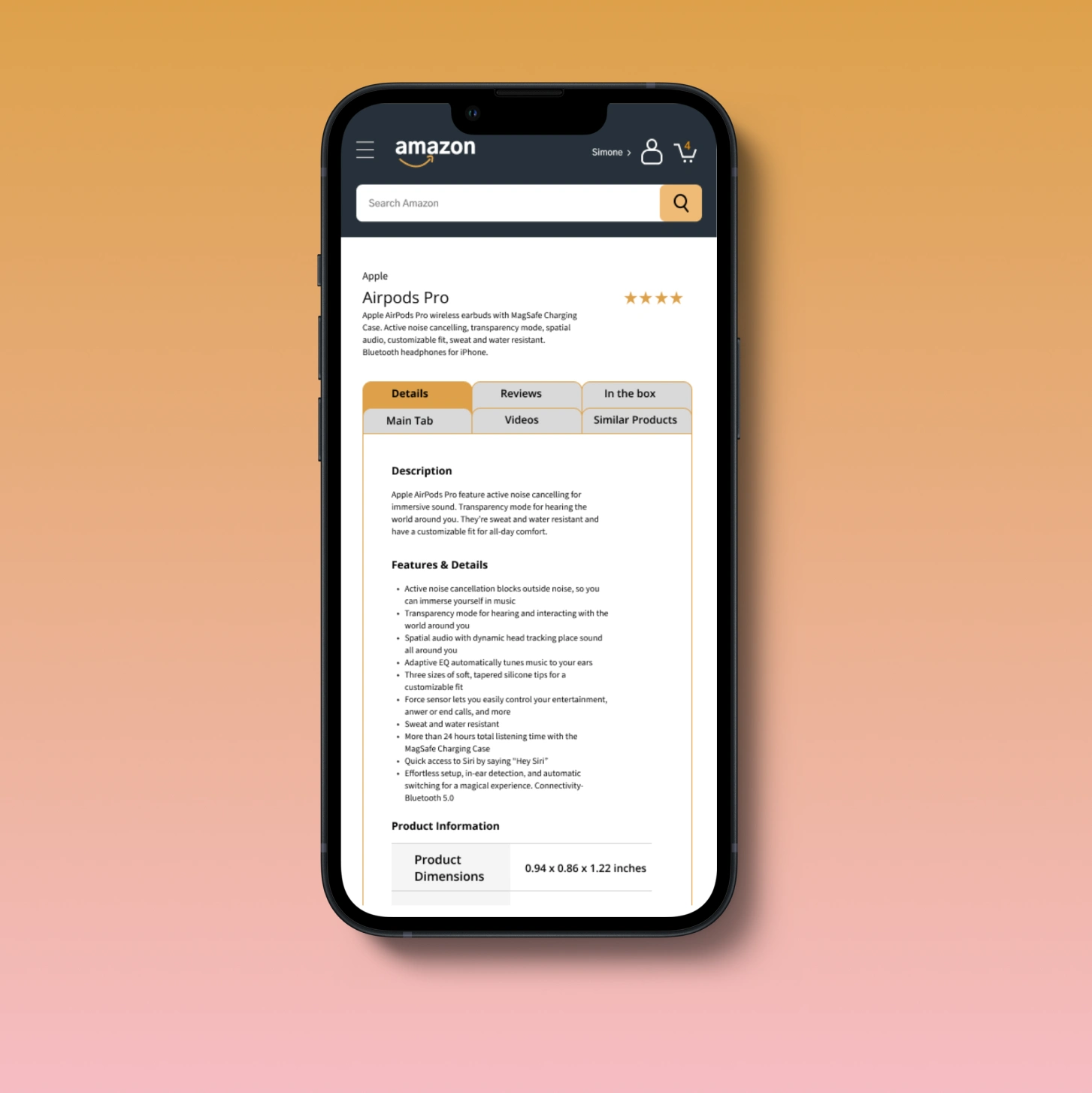
The Prototype
Grouping similar sections together cut down on scrolling time. It also groups content for those who are interested in it. No need for the user to scroll past tons of information they're not interested in. Now, with one click, they can get the information they want!
This simple redesign shows how powerful a few small changes can be. Those who once abandoned the shopping experience because it caused pain can now complete their journey on the site and purchase the items they were looking for!
Like this project
Posted Oct 2, 2024
Re-envisioned Amazon's product page on mobile for increased accessibility and to reduce repetitive strain.
Likes
1
Views
16