Boba Buddha
About the Brand
Boba Buddha is a brand that is as zen as it is colorful. The brand is an innovative take on the ever-popular Boba Milk Tea, taking it a notch further by pairing “Boba” with various fruity flavors.
Design Process
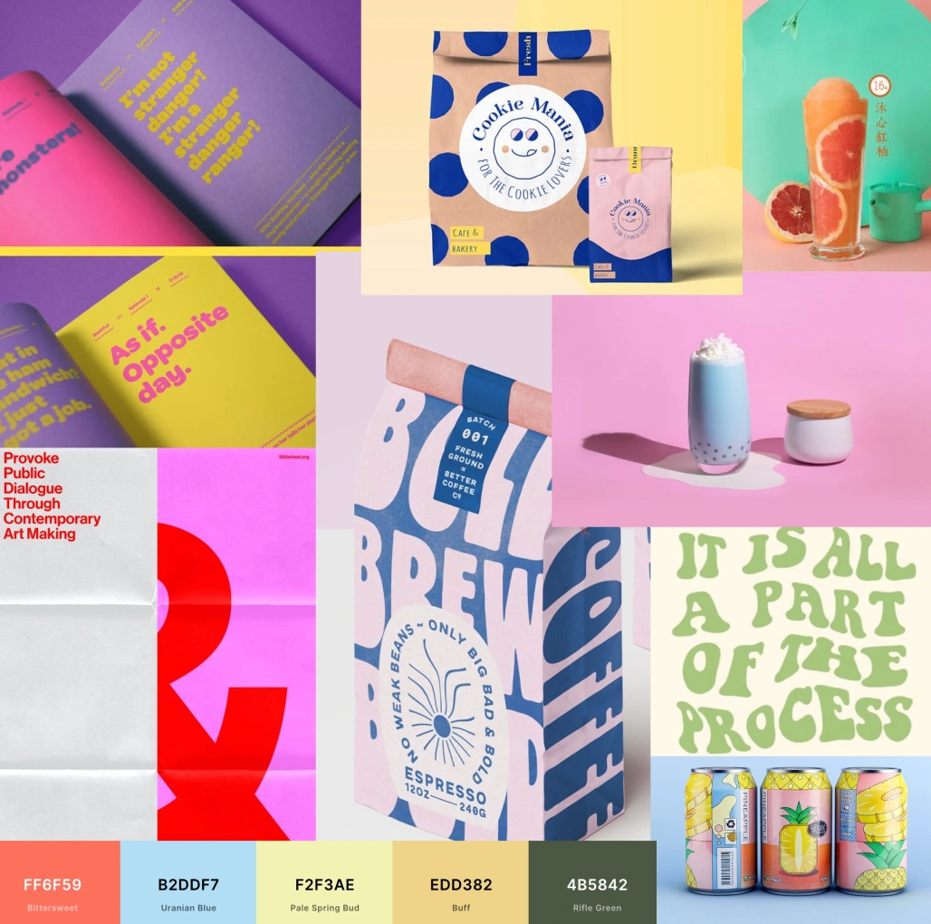
Moodboard
As it is with most of my design projects, designing for Boba Buddha began with the above moodboard. I utilized this moodboard to select a color palette that fits the vibrancy and youthfulness of the brand and also incorporated a number of typography and packaging references.
Final Product
Through this personal project, I created two alternate typeface logos, one for print usage, and the other for digital media usage. I incorporated various elements that attune well to the shape as well as the movement of the boba drink. For instance, within the logo, I created a slight playful wave, akin to the movement of the drink as it is being sloshed within the hands of customers. I also incorporated circles within the packaging - representing the chewy boba that is stellar to the drink.
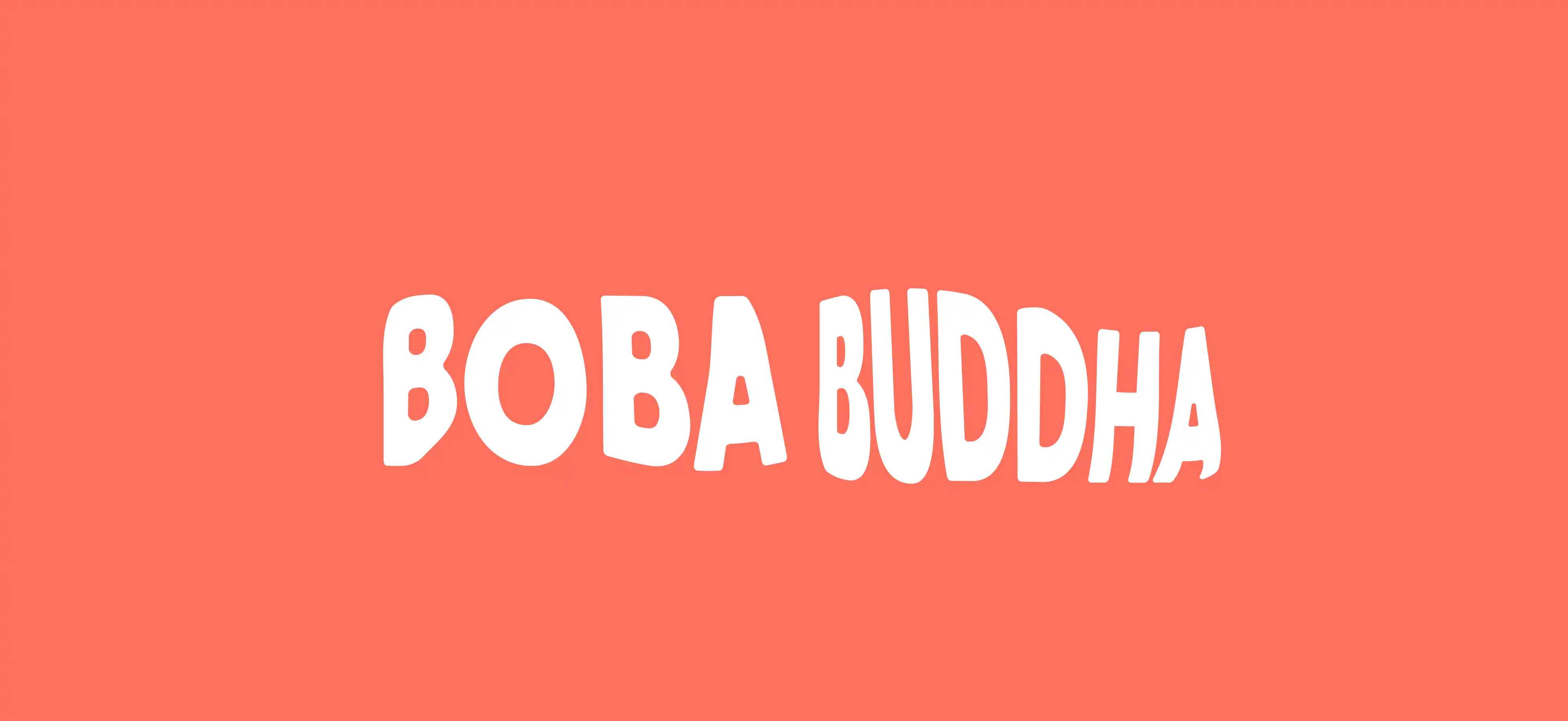
Finalized Typeface Logo
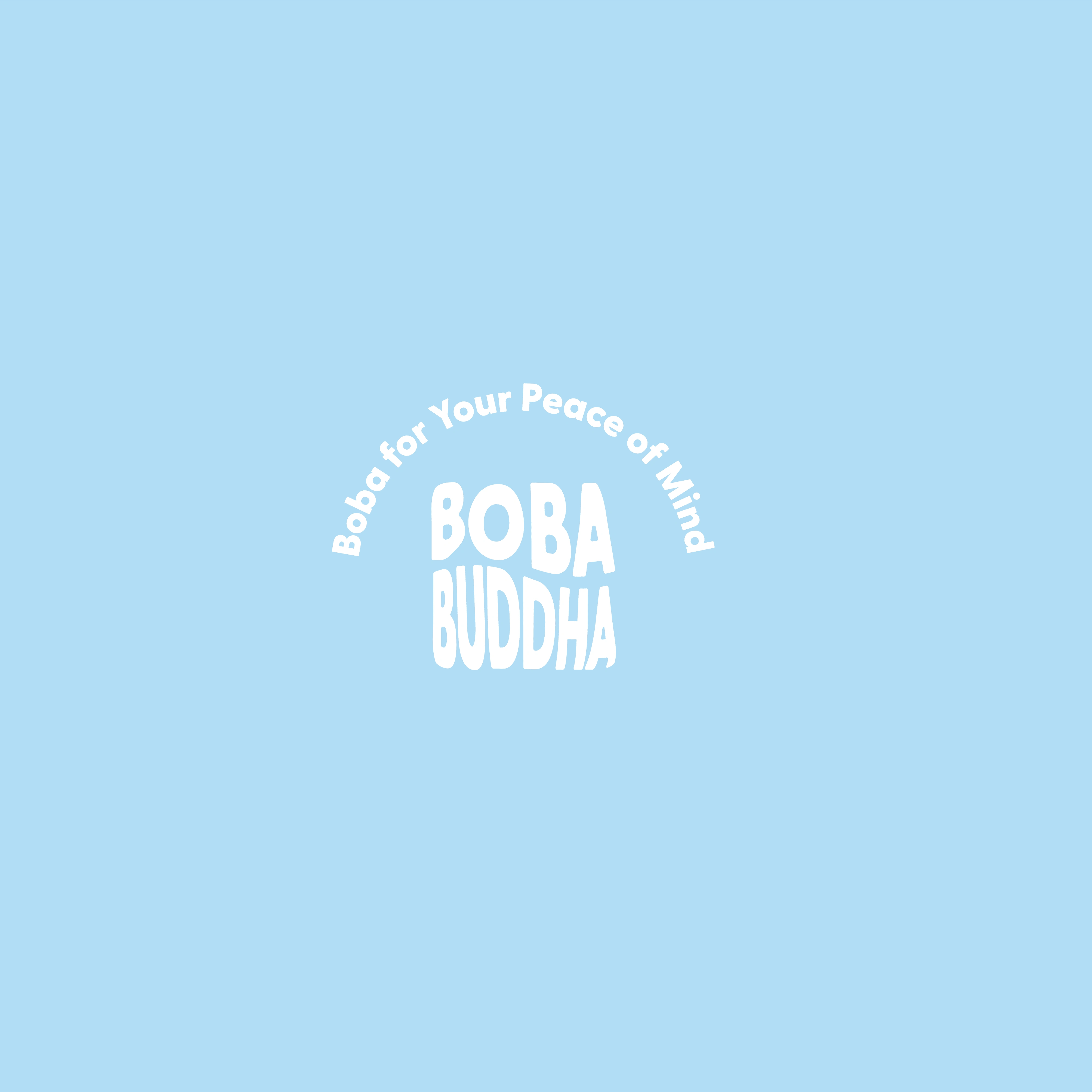
Typeface Logo Alternative
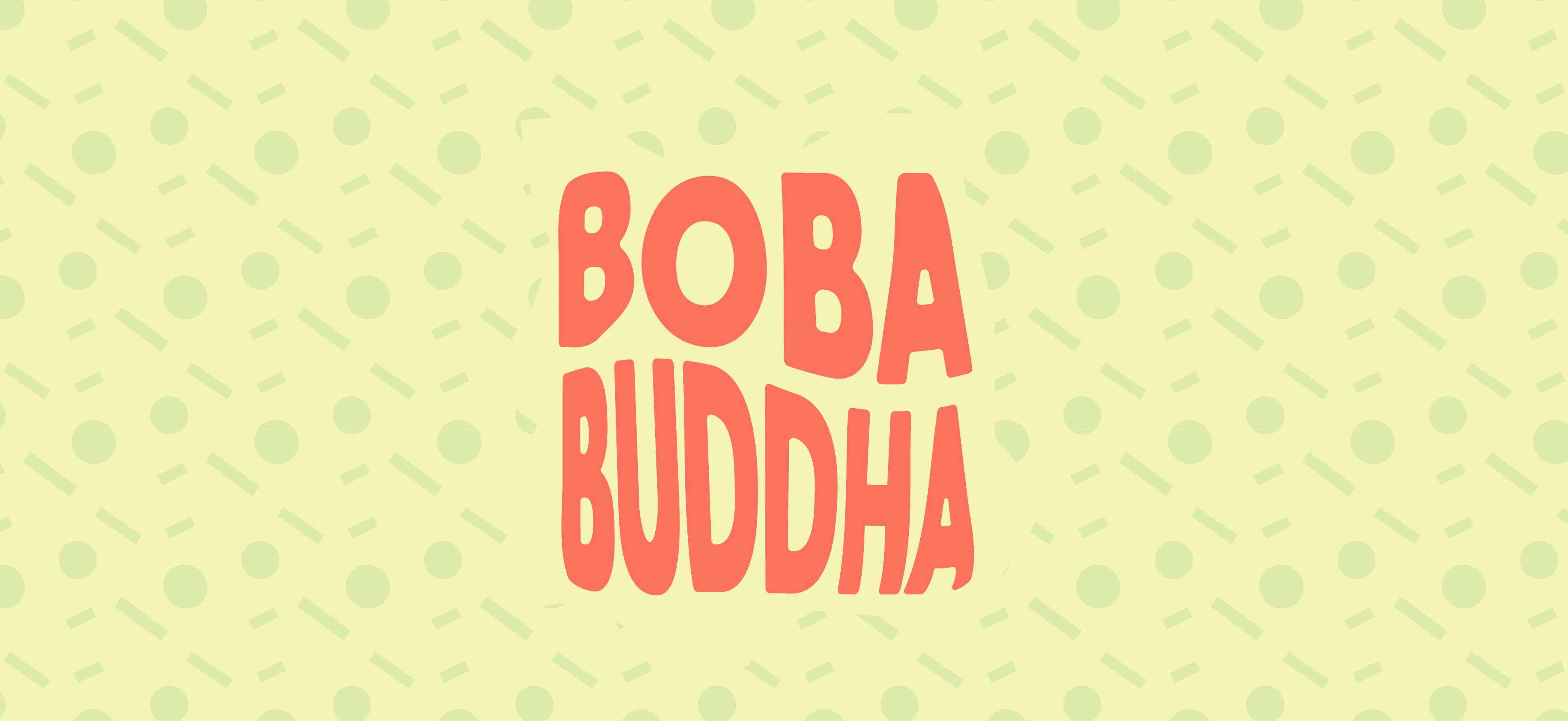
Typeface Logo on Brand Pattern
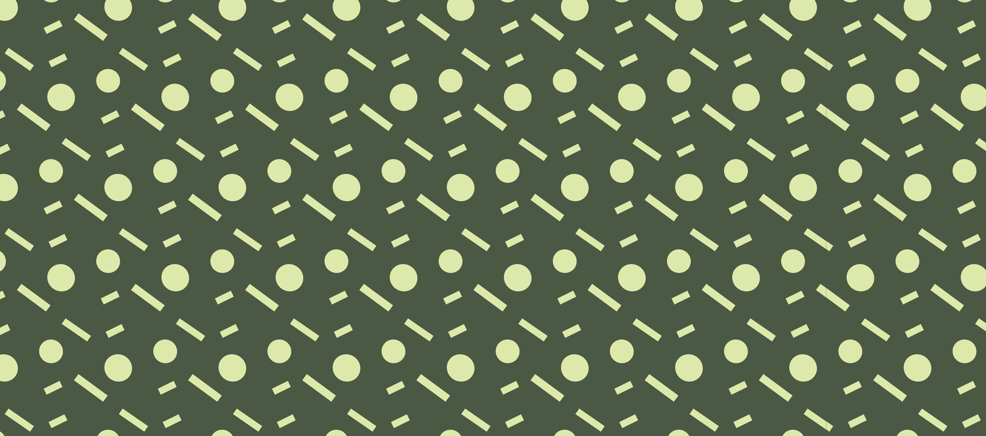
Boba Brand Pattern
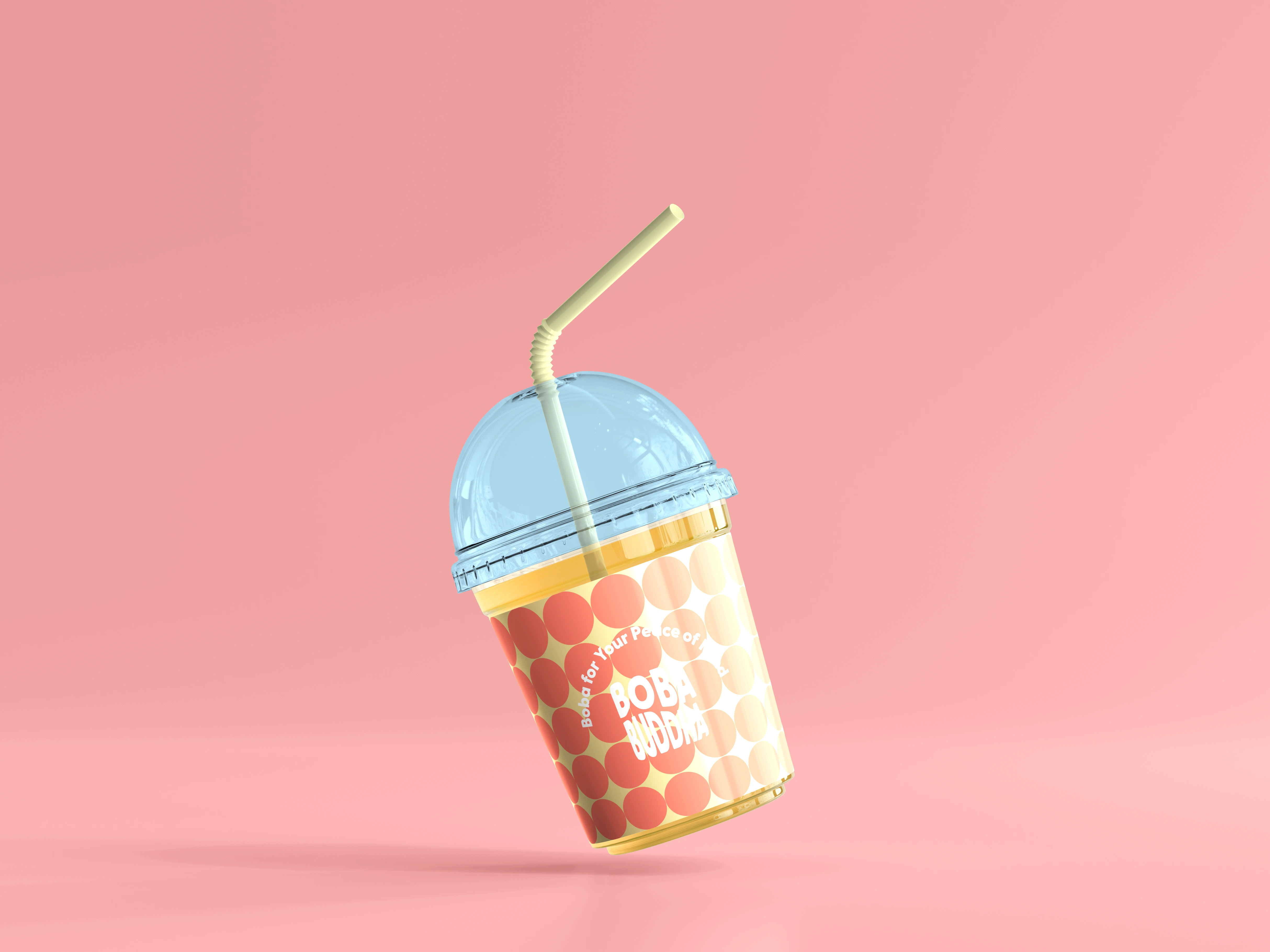
Finalized Packaging Design
Services: Brand Identity, Art Direction, Pattern Design, Logo Design, Packaging Design, Tagline
Like this project
Posted Mar 18, 2022
Boba Buddha is a brand that is as zen as it is colorful.
Likes
0
Views
12
