Responsive Website Design for WWG Magazine

Andrew Sani


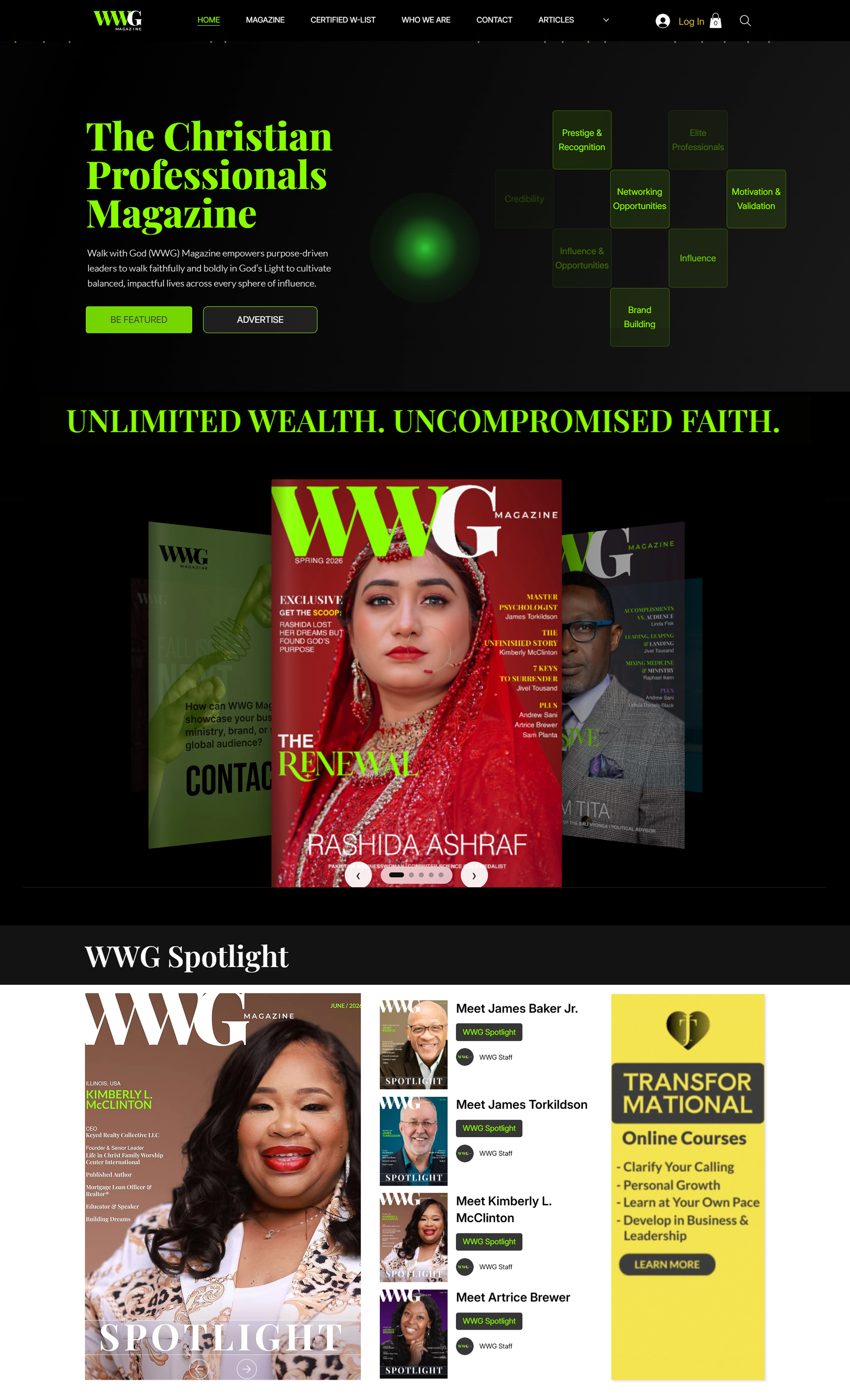
WWG Magazine homepage, The Christian Professionals Magazine headline over a green gradient, above the featured cover carousel and WWG Spotlight section
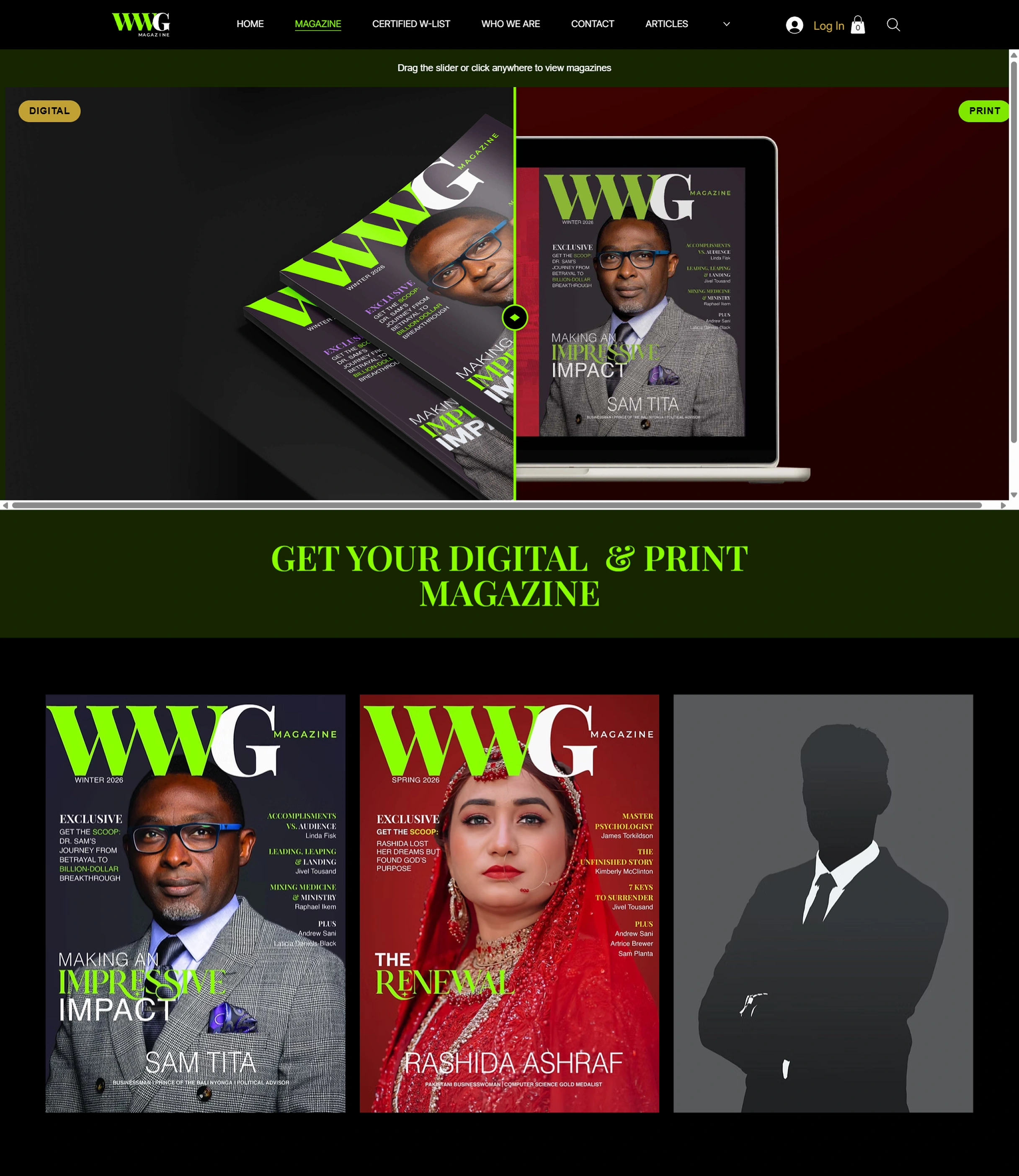
WWG Magazine issues page, a drag slider comparing the digital and print editions, above a row of full magazine covers
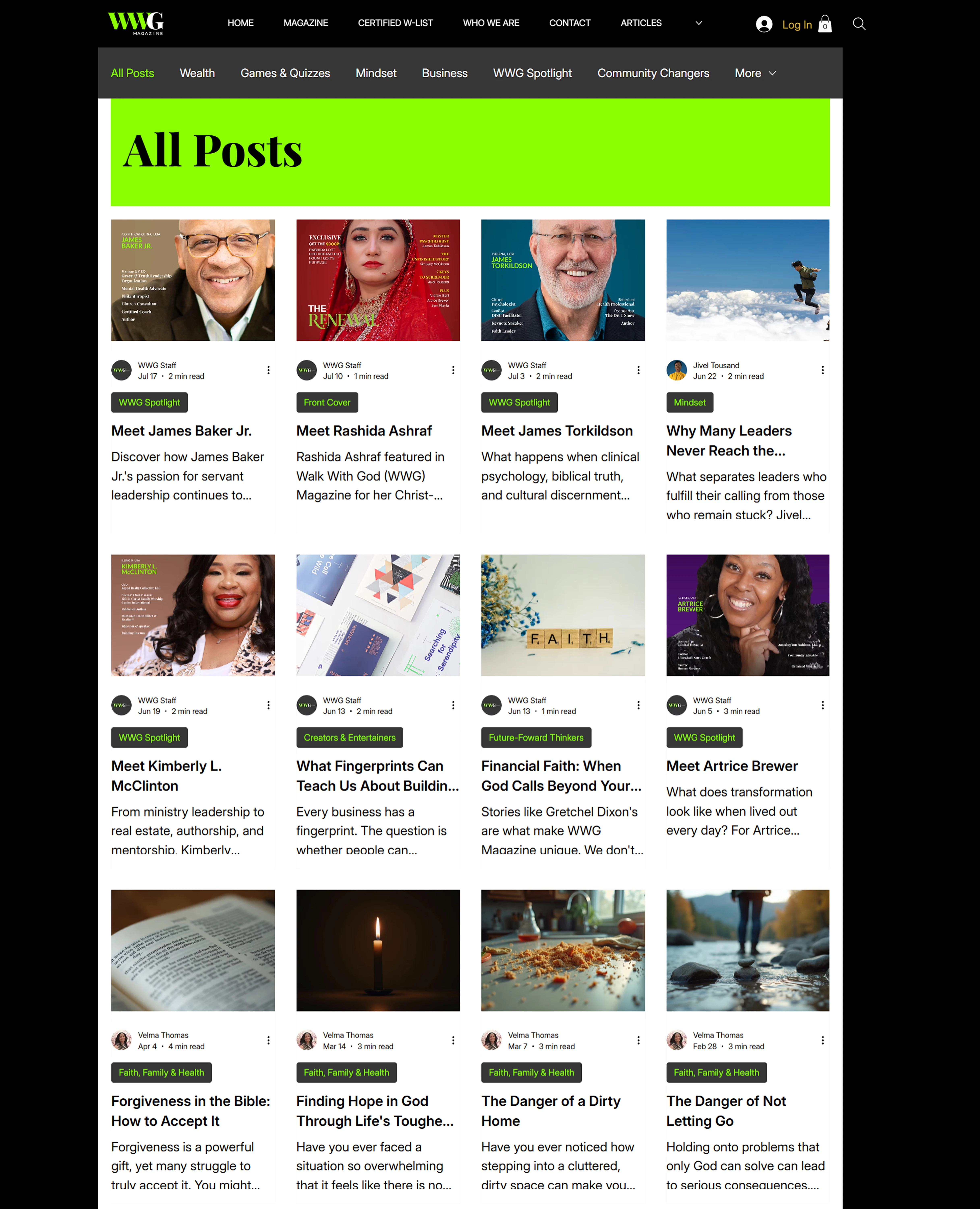
WWG Magazine articles index, a category filter bar above a grid of article cards
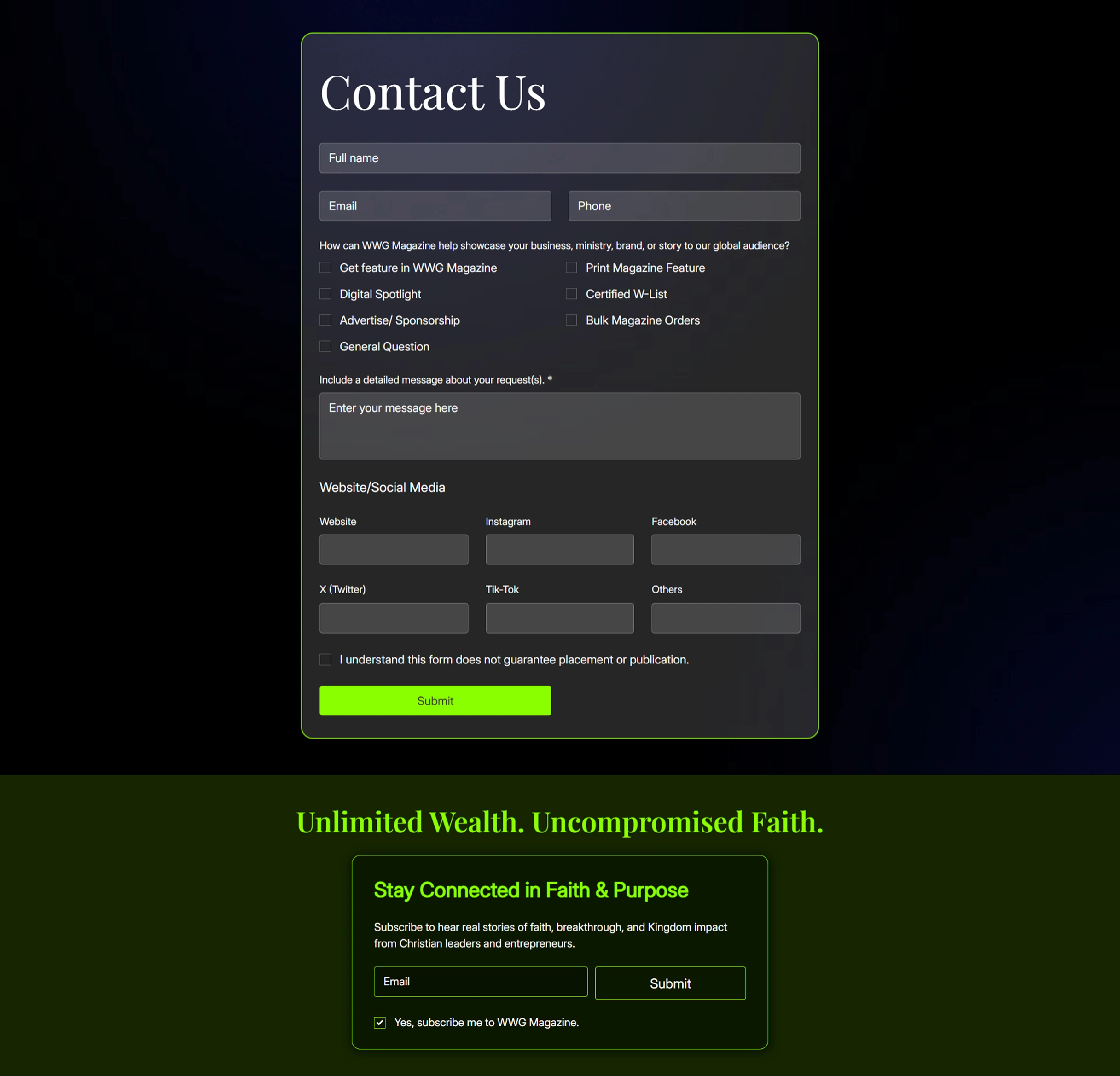
WWG Magazine contact page, a structured enquiry form with checkbox options, above the newsletter sign-up block
About WWG Magazine
Walk with God (WWG) Magazine is a digital and print publication for Christian professionals, entrepreneurs, ministry leaders, and executives who want their faith and their working life to point the same direction.
It publishes long-form features, cover stories, and community spotlights under a single promise: Unlimited Wealth. Uncompromised Faith.
How it started: WWG Magazine and Aneesi
WWG came to us before a single article was published. The vision was a brand-new digital publication that would stand apart from traditional online magazines, modern, visually engaging, built for editorial storytelling and interactive reading in equal measure.
There was a second requirement, and it mattered as much as the first. The magazine already had an established presence on social media. The website could not look like a different company.
The challenge
Most online magazines age badly. Readers meet dated layouts, interfaces that contradict themselves page to page, and mobile experiences that turn reading into work. The brief was to feel genuinely current and interactive without ever costing readability, and to carry one visual identity across every place a reader might find WWG.
Our work
01
Editorial-first user experience
We designed the site around how people actually read. Articles, featured stories, and content categories were organised to invite exploration while keeping navigation quiet and predictable, Faith at Work, Future-Forward Thinkers, Community Changers, Creators and Entertainers, each with its own front door.
Readers arriving for one story find three more without hunting for them.
The homepage end to end: every editorial section gets an entry point, and the sign-up lands once a reader has something to sign up for.
02
A clean, contemporary interface carries subtle animation and interactive elements that make reading feel active rather than passive. The magazine page pairs the digital and print editions behind a drag-to-compare slider, one interaction that explains the whole product without a paragraph of copy.
Micro-interactions and transitions add personality throughout. None of them compete with the story on screen.
03
Content discovery that scales
A publication is only as good as its second click. Filterable category navigation, author attribution, read-time estimates, and a consistent card system let the archive keep growing without the browsing experience degrading as it does.
04
Responsive development
The full experience was built out for desktop, tablet, and mobile, not scaled down for smaller screens, but reconsidered for them. The cover carousel becomes swipeable with the neighbouring issues still peeking in at the edges. The spotlight grid reflows to two-up. Display type holds its weight instead of collapsing into the body copy. Readers get the same intuitive journey whatever they are holding.
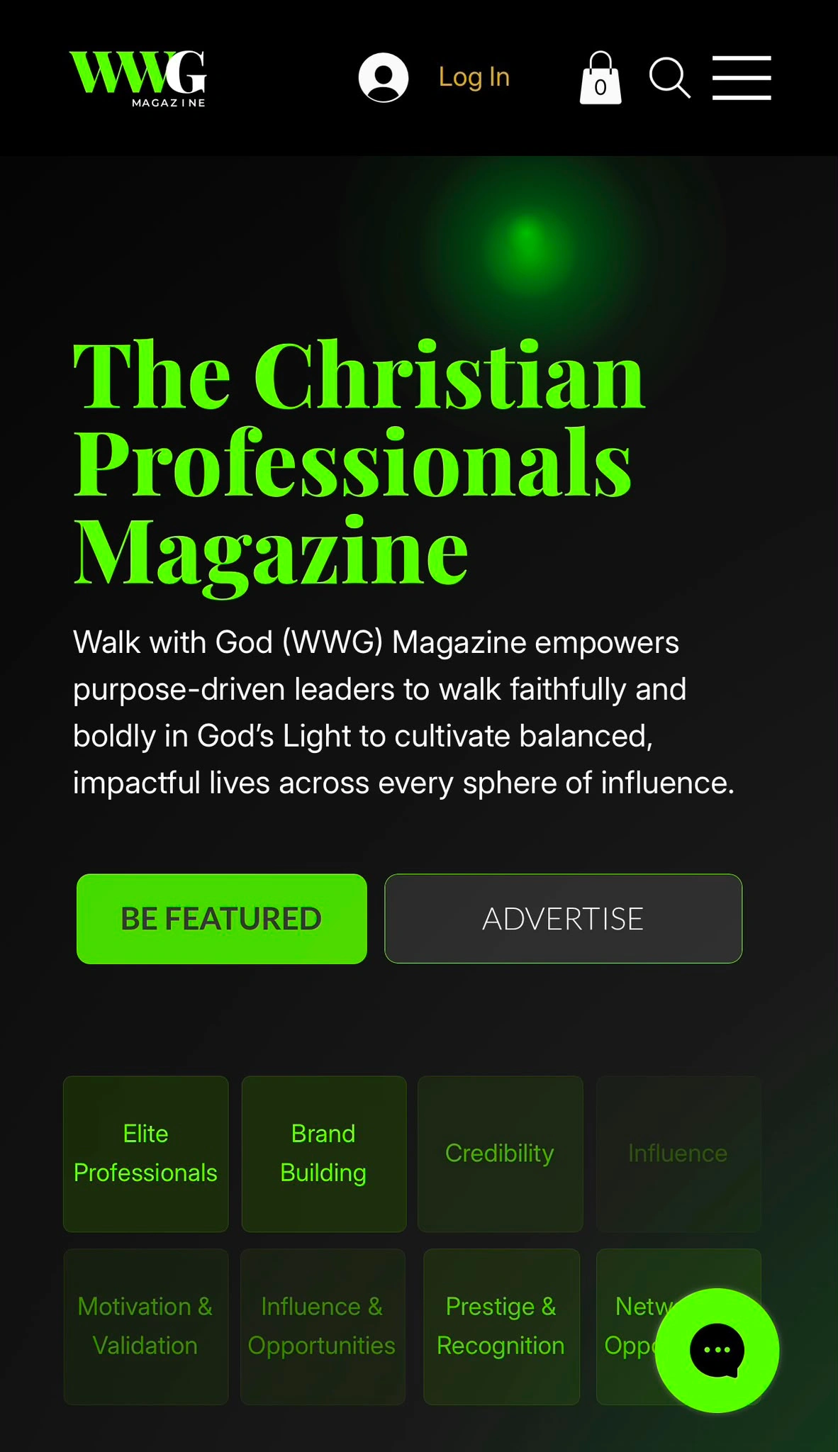
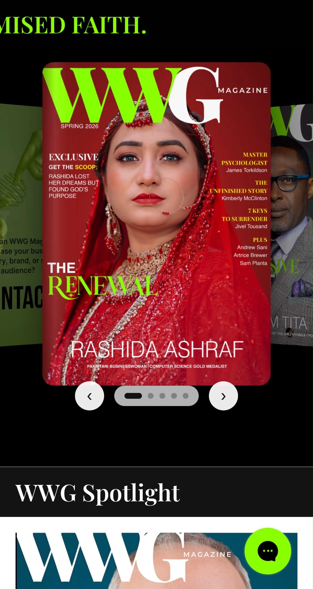
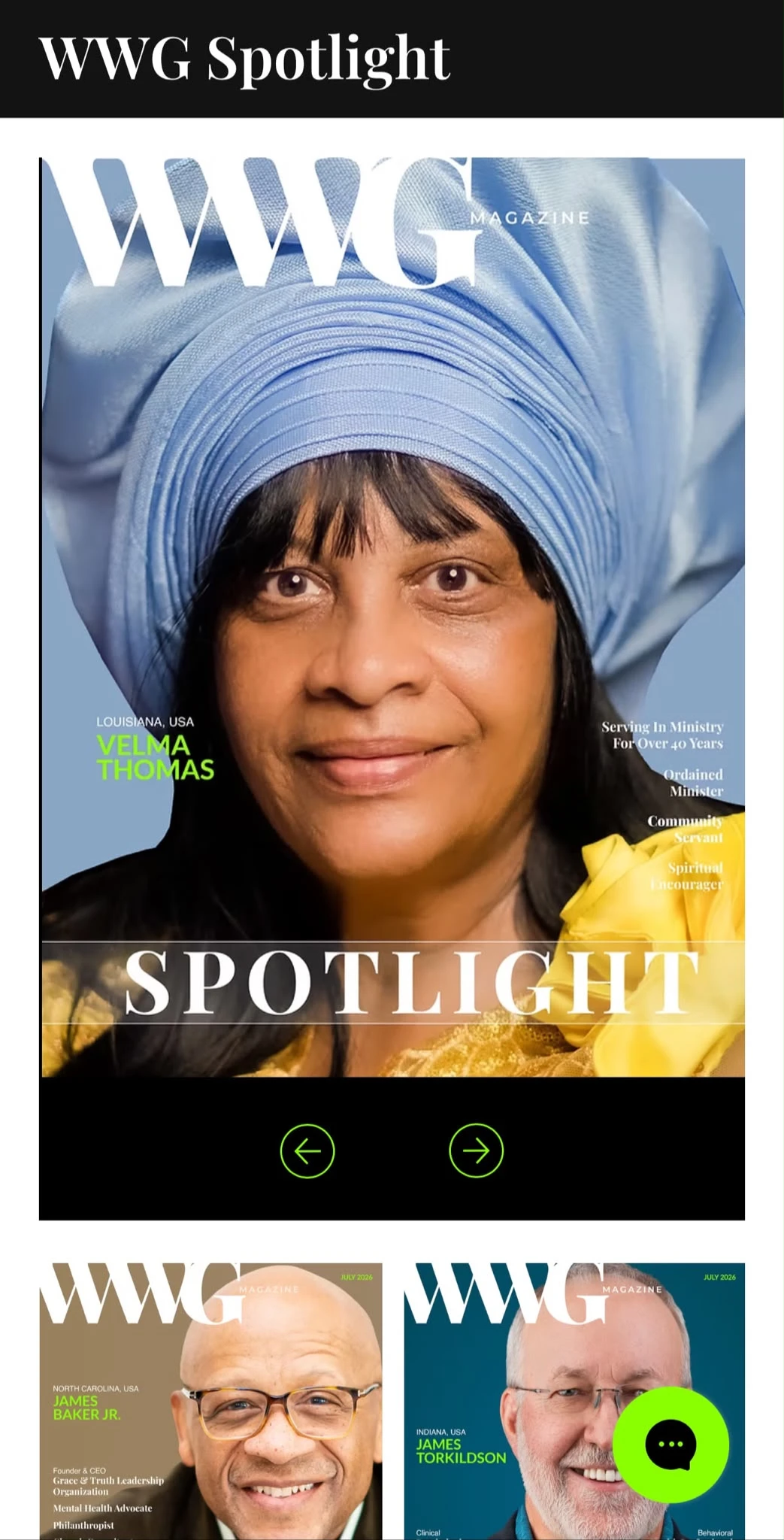
WWG Spotlight on mobile, a full-bleed cover with circular paging controls, above a two-up grid of further spotlight covers
05
One brand across every touchpoint
Typography, colour, imagery, and layout were all drawn from the identity WWG had already built on social. Conversion paths follow the same logic, the enquiry form sorts readers by what they actually want, from print features to Certified W-List placement, and the newsletter block speaks in the magazine's voice rather than a default template's.
Visual expression
The design blends editorial sophistication with modern digital craft, black and electric green, serif display type against clean sans body copy, and enough space around both to let the reading breathe.
Clean, minimalist layouts built around readability
Modern typography with a strong editorial hierarchy
Interactive animation that rewards attention instead of demanding it
Responsive components that adapt rather than shrink
Strategic whitespace doing the heavy lifting on legibility
A cohesive visual system aligned with WWG's social channels
The results
WWG Magazine launched with a digital foundation built for the publication it intends to become, not just the one it was on day one.
A digital magazine built from the ground up on Wix Studio
An engaging reading experience through considered interaction and motion
A fully responsive site optimised for every device
Improved content discovery through clear information hierarchy
One consistent brand experience across website and social platforms
A scalable platform that supports future editorial growth
Like this project
Posted Aug 2, 2026
Designed a responsive, interactive website for WWG Magazine to enhance user experience and brand consistency.
Likes
1
Views
4
Timeline
Sep 17, 2025 - Oct 30, 2025
Clients
Jivel Tousand