Website Redesign for Acupuncture by Danielle

Andrew Sani


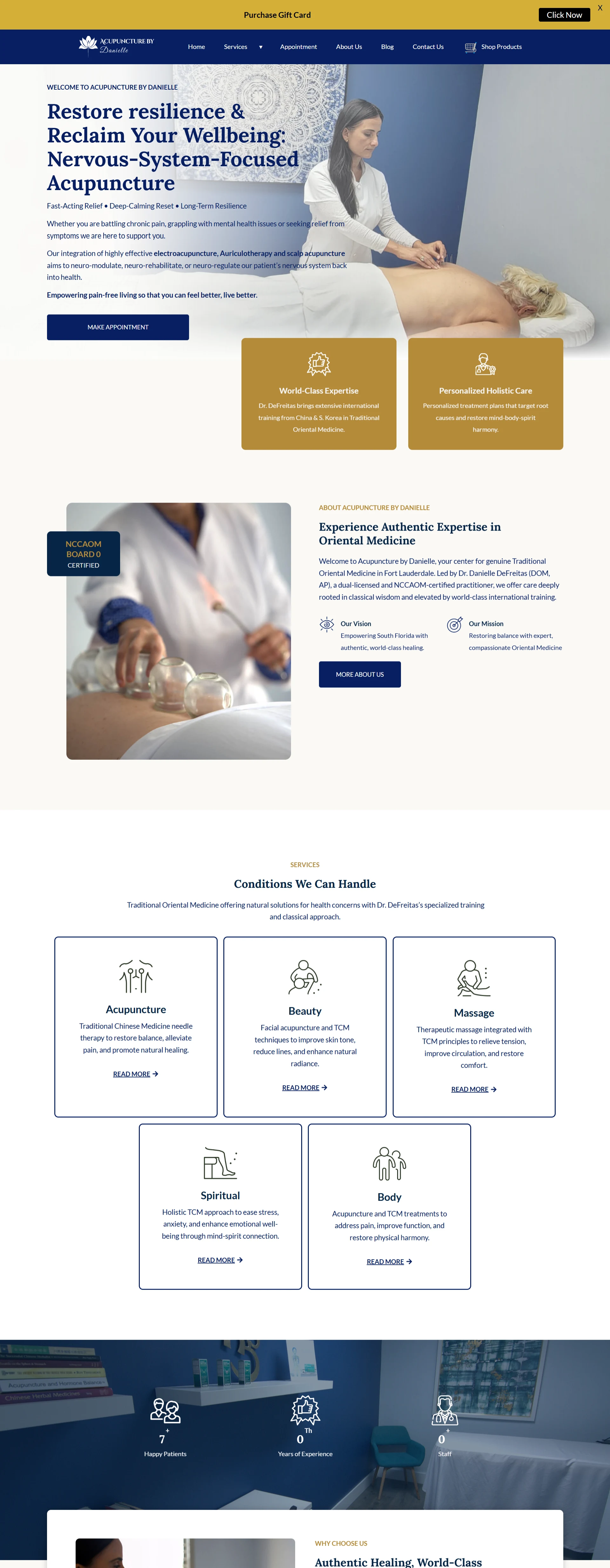
The redesigned Acupuncture by Danielle homepage, a navy and gold hero reading Restore Resilience and Reclaim Your Wellbeing, above credential cards, practitioner introduction and a grid of treatment categories
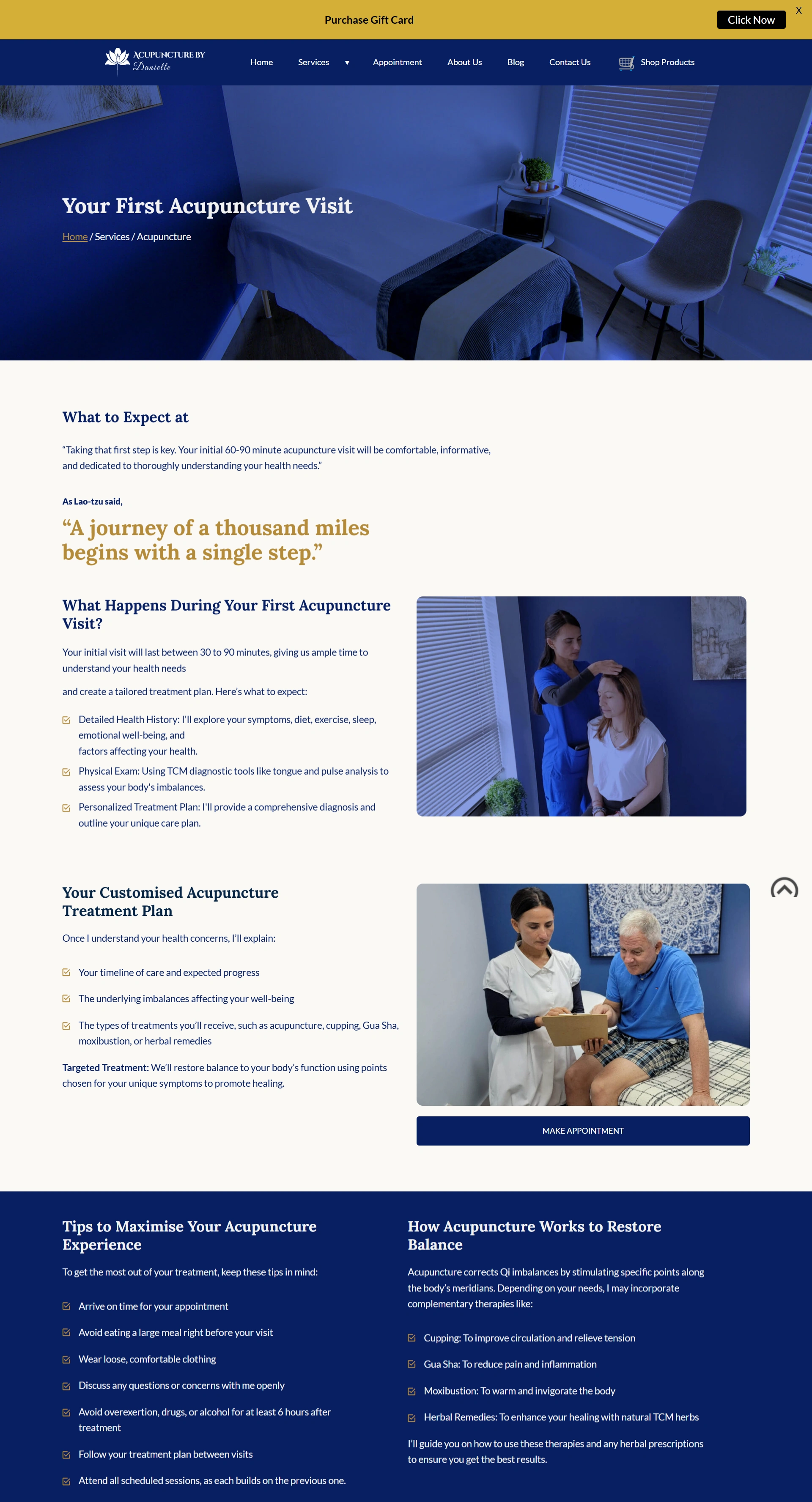
The Your First Acupuncture Visit page, explaining what happens during an initial consultation, treatment planning, and tips for getting the most from a session
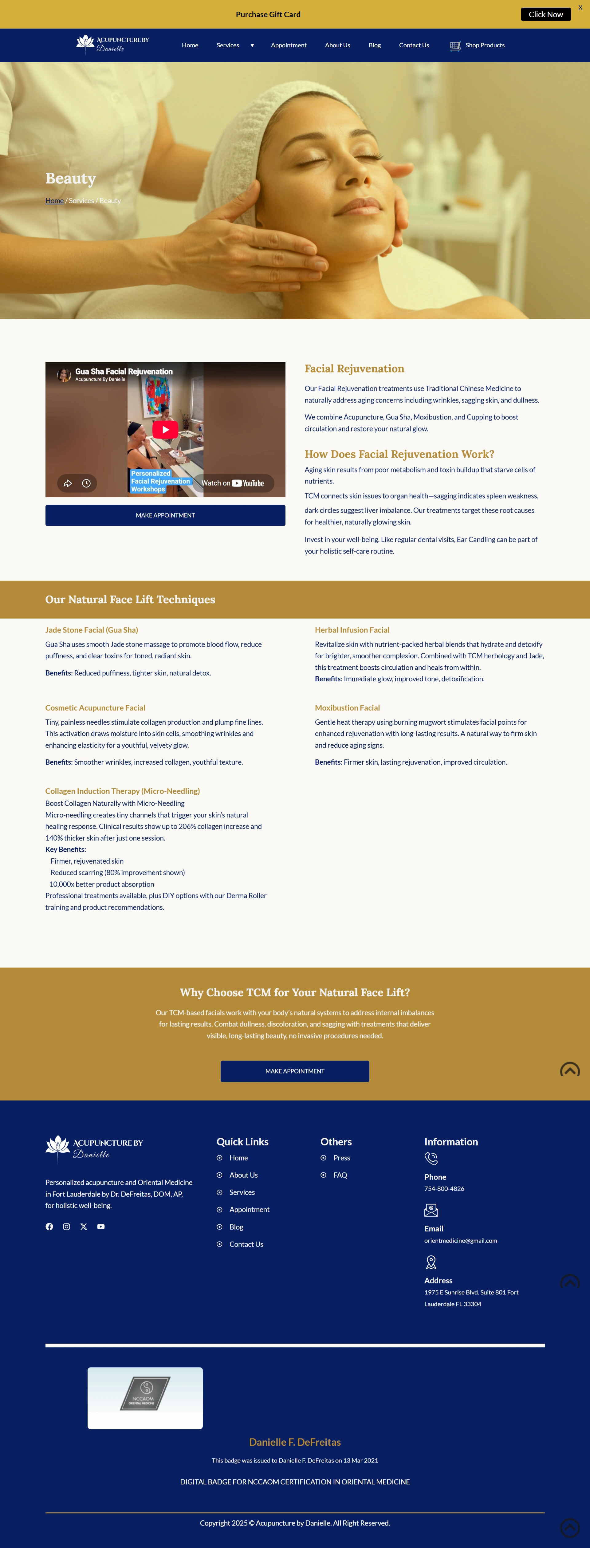
The Beauty treatments page, covering facial acupuncture and TCM techniques for skin tone and natural radiance
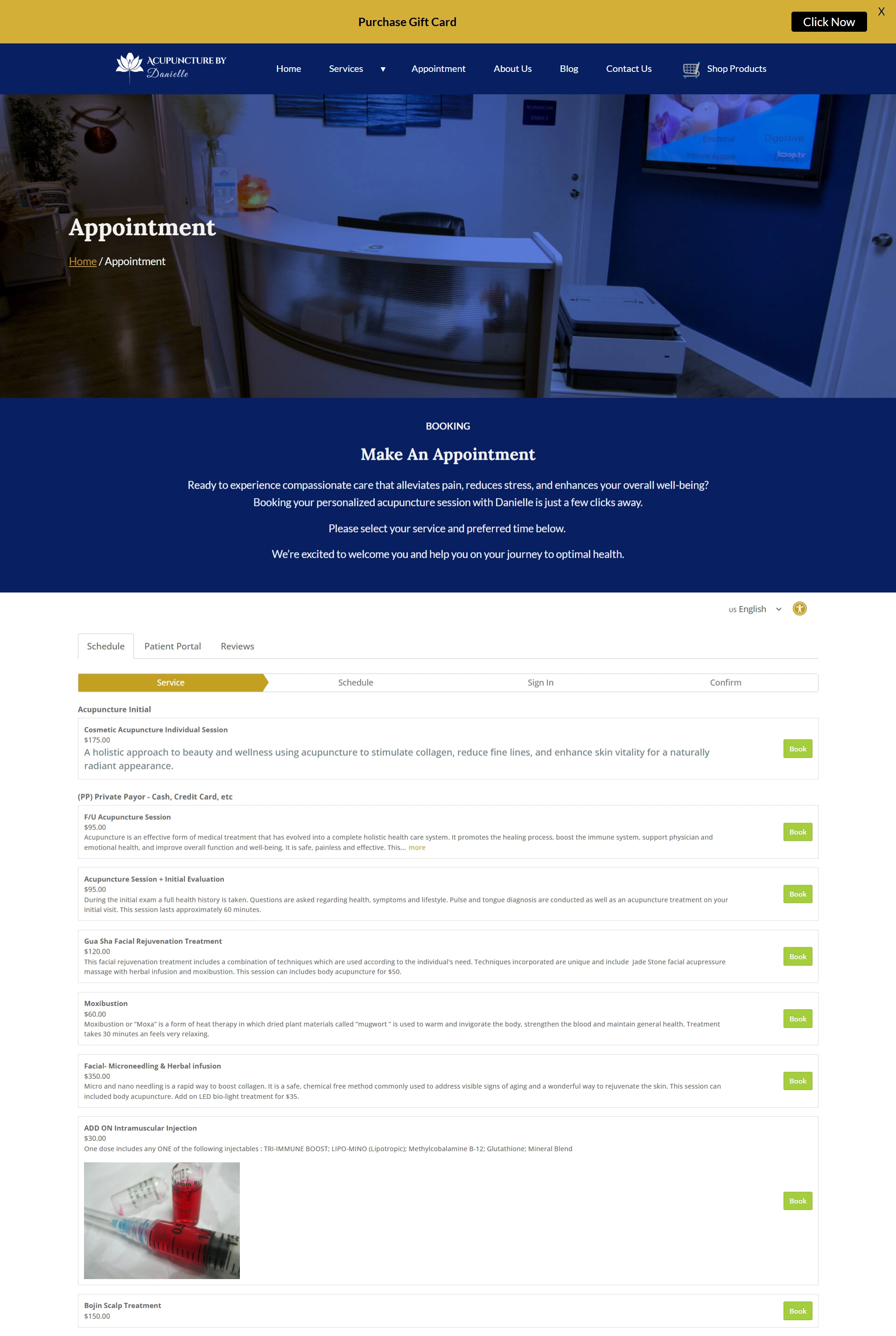
The appointment page, with a structured booking flow for new and returning patients
About Acupuncture by Danielle
Acupuncture by Danielle is a Traditional Chinese Medicine practice in Fort Lauderdale, led by Dr. Danielle DeFreitas (DOM, AP), a dual-licensed and NCCAOM board-certified practitioner with international training from China and South Korea.
The practice treats chronic pain, mental health concerns, and long-term resilience through nervous-system-focused acupuncture, alongside beauty, massage, and holistic care.
The existing website carried the essential information. What it lacked was the visual appeal, user experience, and strategic messaging to turn a curious visitor into a booked appointment.
How it started: Acupuncture by Danielle and Aneesi
Wellness is a trust purchase. Before anyone books a first acupuncture appointment they want to know what will happen to them, who is holding the needles, and whether this practice knows more than the last website they read.
The old site answered none of that quickly. So the redesign was scoped as a branding and business-growth project rather than a visual refresh.
The challenge
Six issues were holding the site back. The visual design was dated and did not reflect the quality of the practice. The user experience was inconsistent, which made information hard to navigate. There was almost no visual storytelling to educate visitors about Traditional Chinese Medicine. Calls-to-action were weak, which cost appointment conversions. Mobile needed real optimisation. And branding was applied unevenly from page to page.
The old homepage showed all of it at once: a dark collage of red and orange behind yellow script lettering, ten navigation items crammed into a single black strip, and stock photography of pebbles and flowers doing the work that a practitioner photo and a clear promise should have been doing.
The brief was to build a premium digital experience that earns trust, teaches, and moves people naturally toward booking a consultation.
Our work
01
The customer journey, end to end
The redesign opened with a full evaluation of the customer journey, checking that every page answered the questions visitors actually arrive with and removing friction from the path to booking.
The homepage now leads with a specific promise, Restore Resilience and Reclaim Your Wellbeing, followed by the three things a nervous patient wants to know: fast-acting relief, deep-calming reset, long-term resilience. One button follows. Make Appointment.
Before
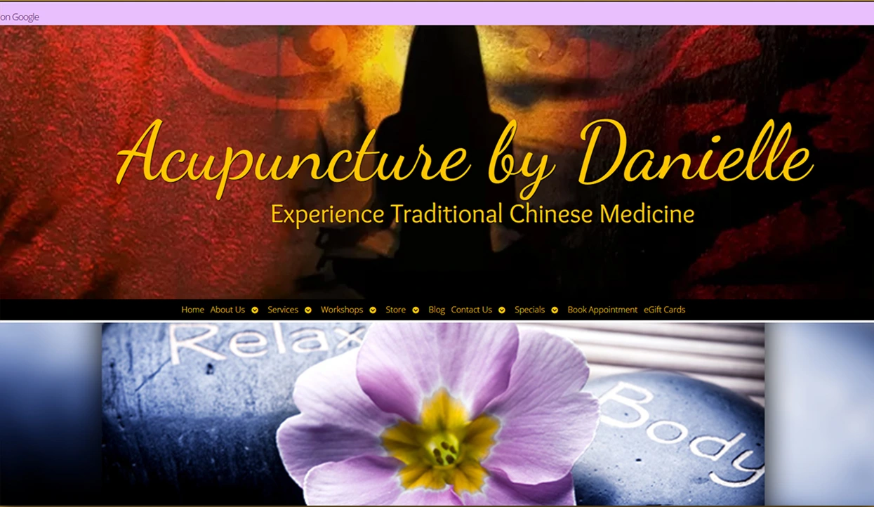
After
Credibility first, and one obvious next step instead of ten competing ones.
02
A design system built to feel calm
A modern system was developed around clean typography, a calming palette, high-quality photography of the actual practice, and generous whitespace. Deep navy carries authority, gold carries warmth, and the space between them does more work than either.
Every treatment category, practitioner detail, testimonial, and booking option now sits inside the same component set, so the brand holds together and new services cost very little to add.
03
Credentials where hesitation happens
Trust signals were moved to the points in the page where a visitor is deciding whether to believe the practice. Two credential cards sit directly beneath the hero: World-Class Expertise and Personalized Holistic Care. The NCCAOM board certification badge sits alongside the practitioner introduction rather than buried in a footer.
Vision and mission are stated in one line each, not three paragraphs.
04
Teaching, not just listing
The biggest gap was education. Traditional Chinese Medicine is unfamiliar to most first-time patients, and a list of service names does nothing to close that gap.
Treatments were reorganised into five clear categories, Acupuncture, Beauty, Massage, Spiritual, and Body, each with its own page. A dedicated Your First Acupuncture Visit page walks a nervous patient through the whole thing: how long the first session runs, what a health history involves, how the diagnosis works, what to wear, what to avoid beforehand, and how cupping, Gua Sha, moxibustion, and herbal remedies fit in.
Answering the fear is what converts. Listing the service is not.
The page that does the persuading: every question a first-time patient is too polite to ask, answered before they book.
05
Booking as the through line
Appointment sits in the primary navigation on every page, and every treatment page closes on the same action rather than trailing off. The gift card promotion and product shop were given their own routes so commerce never competes with the clinical content.
06
Responsive and unhurried
Every page was optimised for desktop, tablet, and mobile. Subtle animation and micro-interactions add polish through the scroll, kept light enough that performance and accessibility are never the price of it.
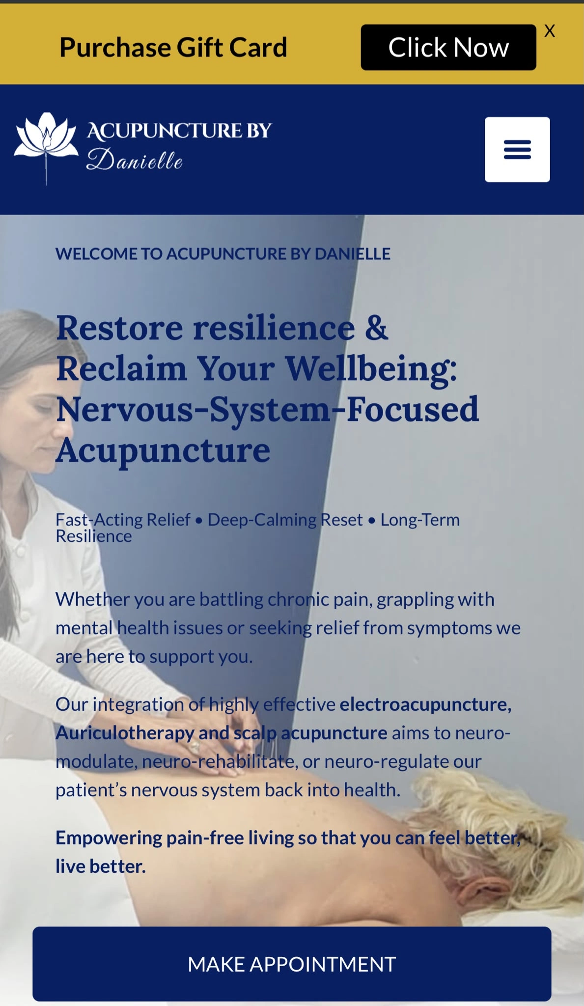
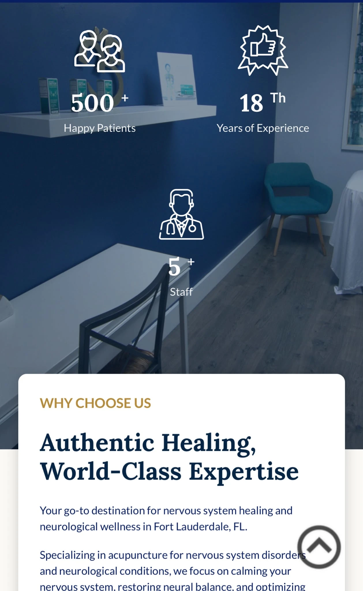
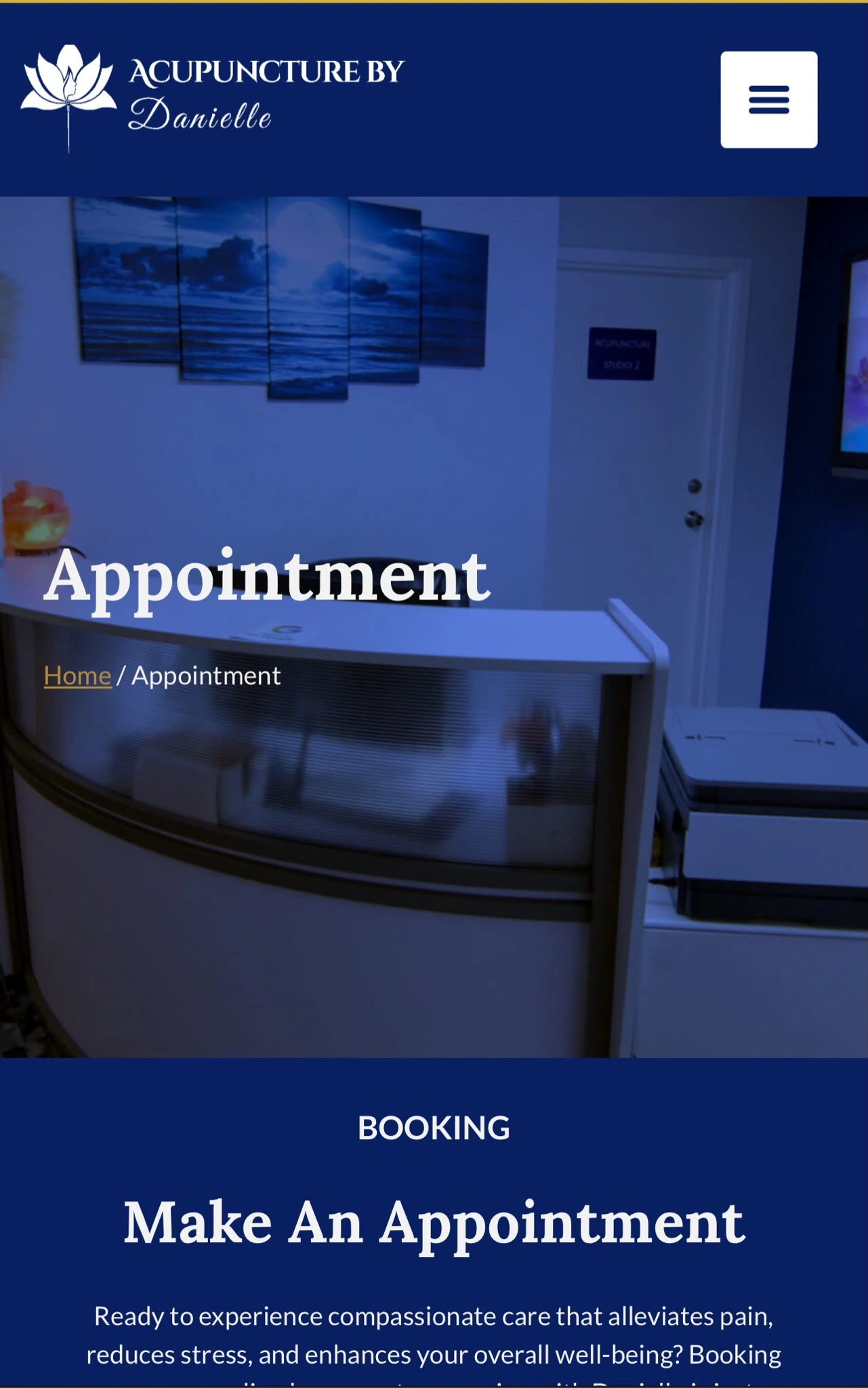
The appointment page on mobile, with the booking flow reachable without pinching or zooming
Visual expression
A wellness practice cannot look chaotic. The visual system had to feel like the room the treatment happens in: quiet, clean, and clearly run by someone who knows what they are doing.
Deep navy and gold replacing a collage of red, orange, and yellow
One serif display face with a clean sans for body, in place of script lettering
Photography of the real practice and practitioner, not stock pebbles
Generous whitespace carrying the sense of calm the practice sells
Consistent icon, card, and button systems across every treatment page
Credential badges treated as design elements rather than afterthoughts
The results
The redesign turned the website from a brochure into a strategic marketing asset. It now shows the expertise, teaches the unfamiliar, and gives a hesitant visitor a reason and a route to book.
A complete redesign with a refined, wellness-led visual identity
Modern responsive layouts optimised for every device
Improved information architecture and intuitive navigation
Clear content hierarchy that simplifies complex wellness information
Interactive animation and micro-interactions that hold engagement
Strategic calls-to-action that support appointment bookings
Consistent branding across every page and touchpoint
A scalable architecture ready for new services and marketing
Like this project
Posted Aug 2, 2026
Redesigned website for Acupuncture by Danielle to improve UX and appointment conversions.
Likes
0
Views
9
Timeline
Apr 30, 2025 - Jul 9, 2025