Jivel Tousand Website Redesign

Andrew Sani


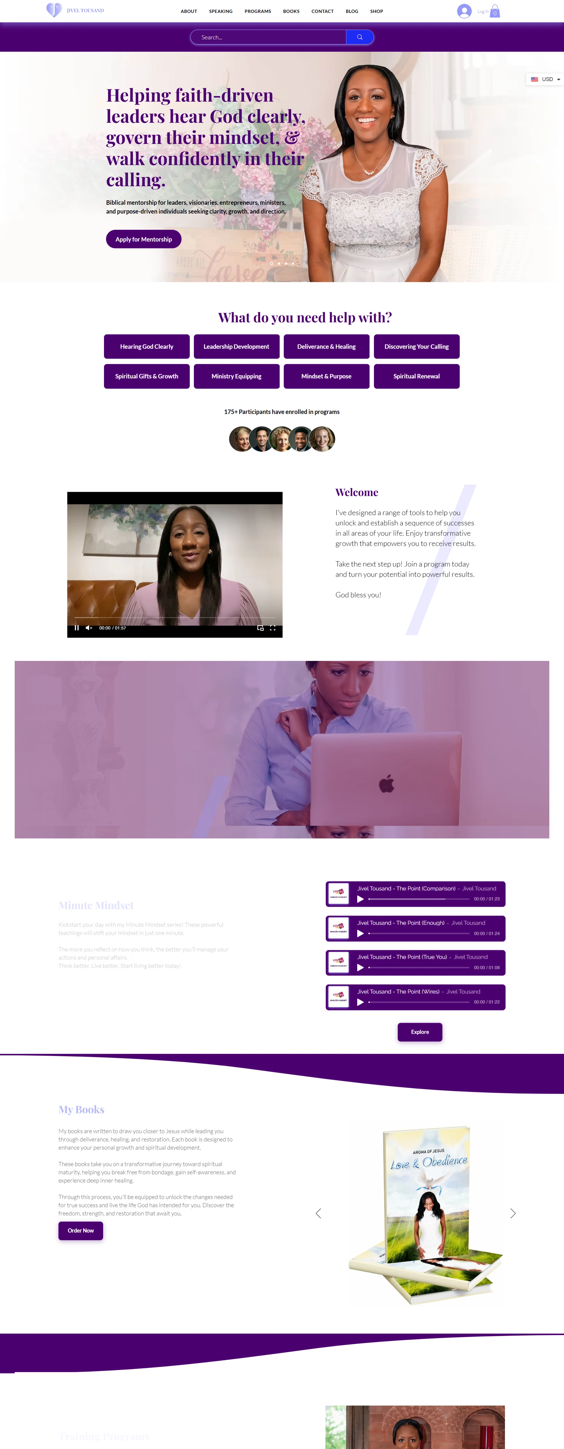
The redesigned Jivel Tousand homepage, a positioning headline over a branded hero, a grid of need-based entry points, welcome video, audio series and book shop
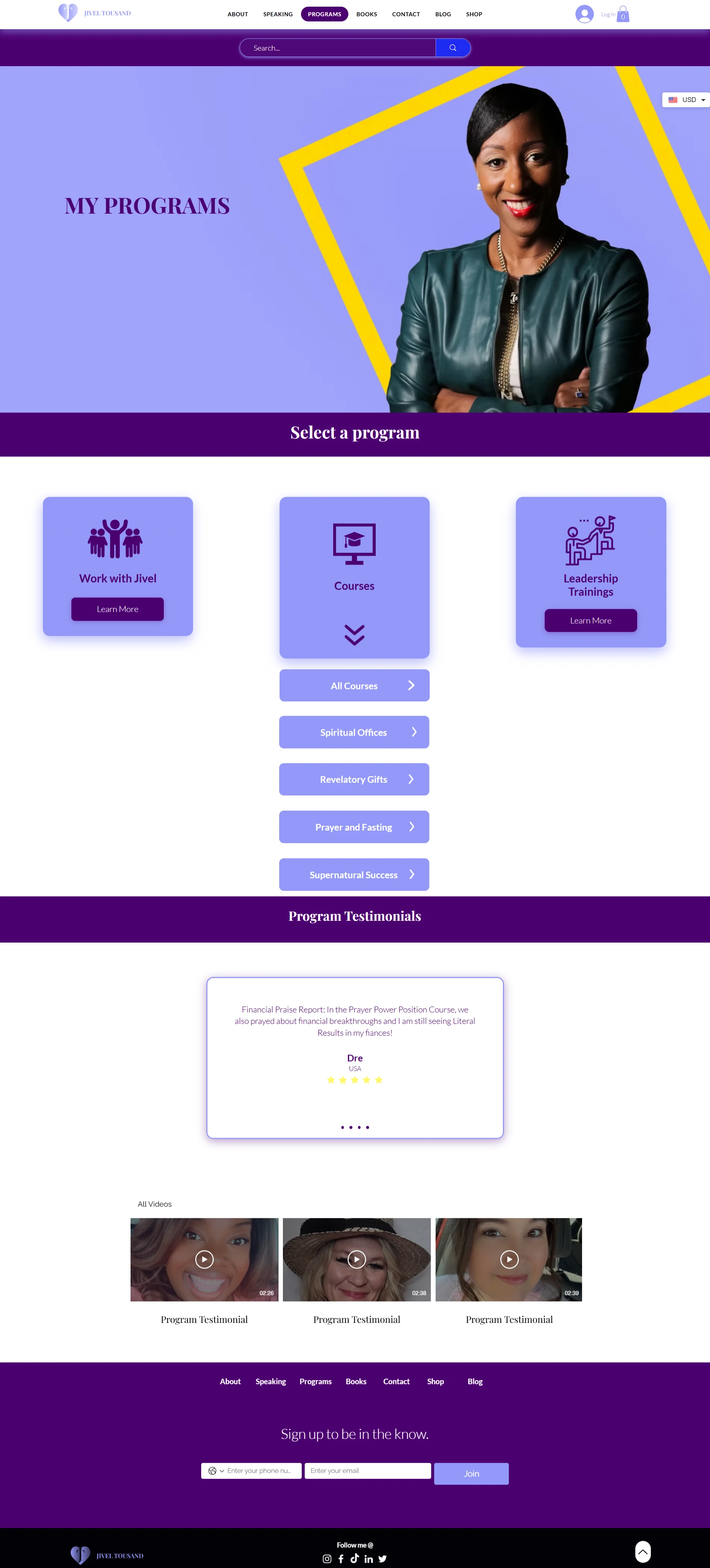
The Jivel Tousand programmes page, training programmes laid out on a consistent card system
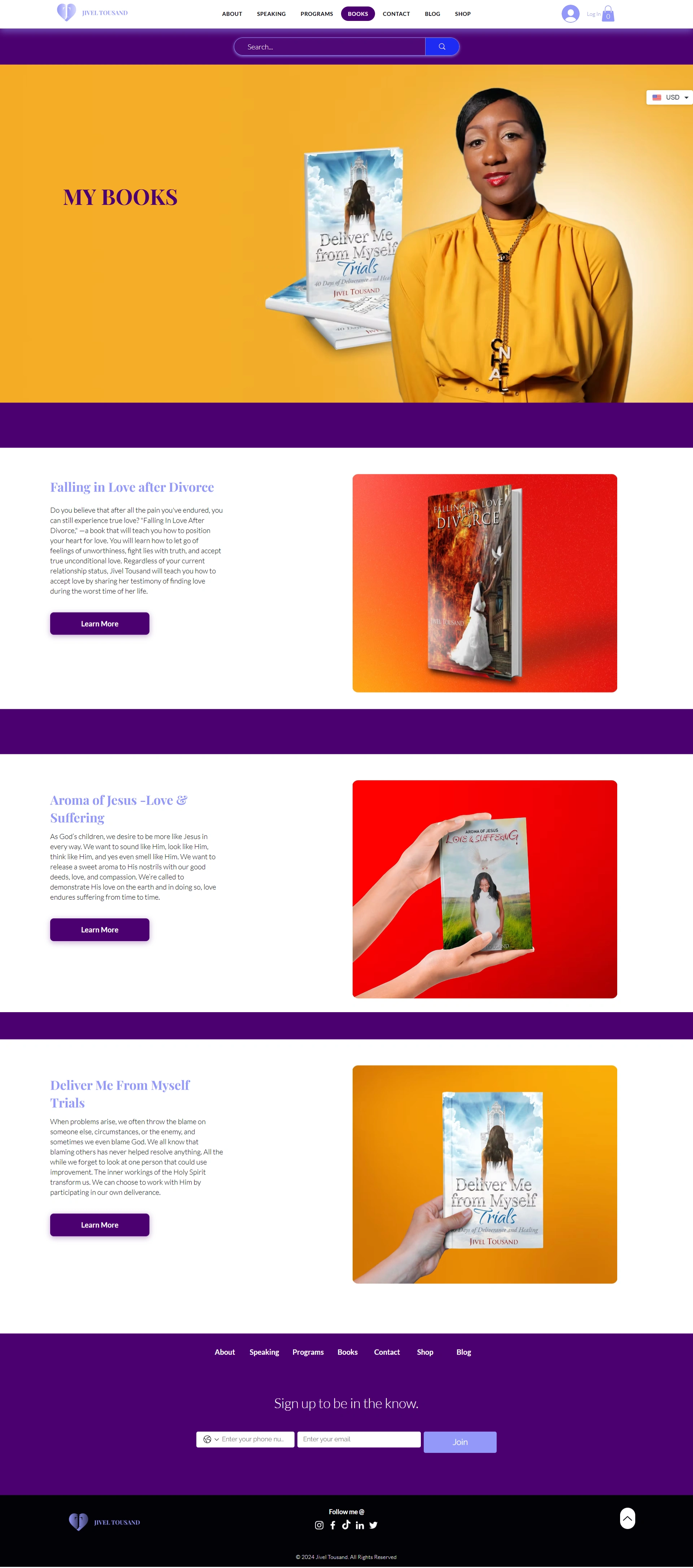
The Jivel Tousand books page, published titles with covers, descriptions and a direct purchase path
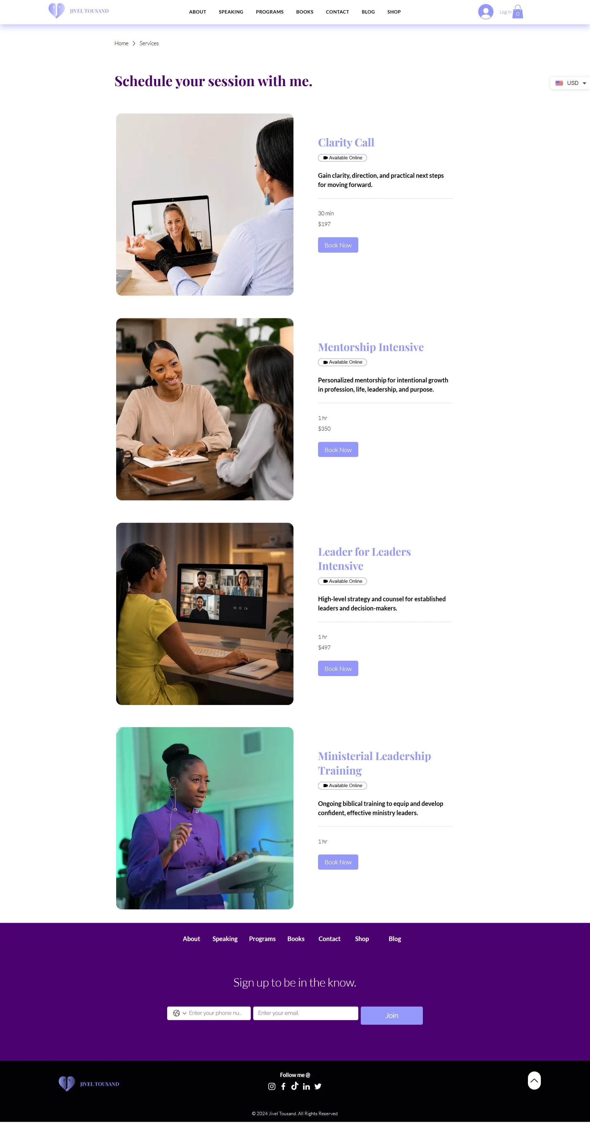
The Jivel Tousand booking page, sessions listed with duration and price, each with its own booking flow
About Jivel Tousand
Jivel Tousand is a speaker, entrepreneur, and leadership mentor working with faith-driven leaders, visionaries, and purpose-led professionals, alongside published books, training programmes, and one-to-one mentorship.
The existing website held genuinely valuable material. What it lacked was the visual sophistication, user experience, and clear messaging to turn a visitor into a client.
How it started: Jivel Tousand and Aneesi
The brief was not a refresh. The site no longer reflected the premium nature of the brand or the expectations of the people arriving at it, and the gap was costing enquiries.
So the project was scoped as a reimagining from the ground up, a modern digital experience that communicates credibility, inspires confidence, and supports long-term growth rather than one that simply looks newer.
The challenge
Six problems were limiting the old site, and they compounded each other. An outdated visual design weakened the professional image. Content hierarchy was inconsistent, so important information was hard to find. Calls-to-action were limited, cutting off opportunities to engage. Navigation lacked clarity. Mobile fell short of a comfortable browsing experience. And the visual identity was applied unevenly from page to page.
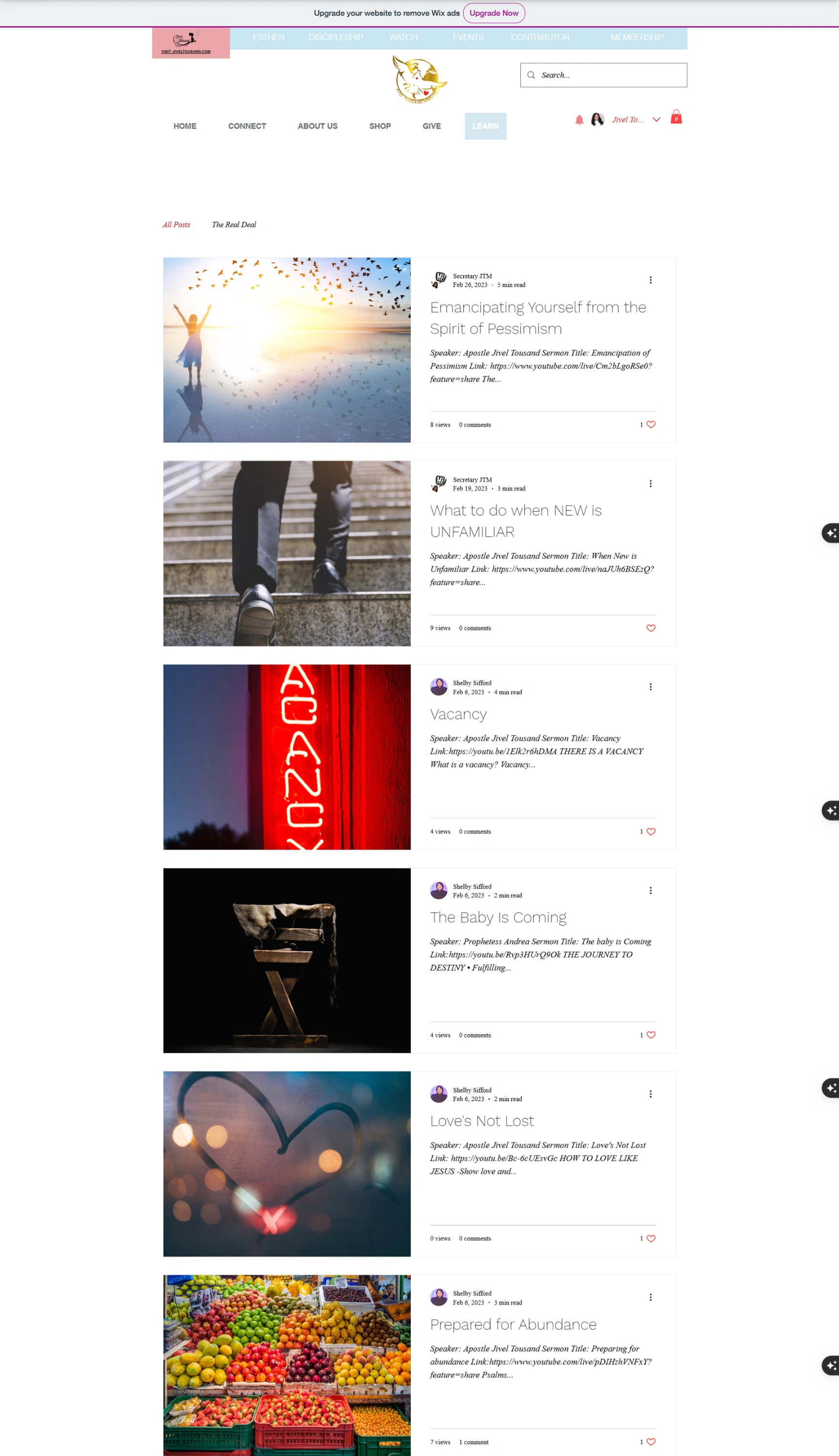
The old homepage showed it plainly: two separate navigation bars competing at the top, four typefaces on a single screen, body copy set in light grey below comfortable reading contrast, and long vertical gaps where content had been removed but the spacing never was. The blog had the same problem in a different form, posts whose entire body was a speaker name and a pasted video link.
The objective was a site that felt modern, premium, and conversion-focused, while staying easy to manage and scalable as the business grew.
Our work
01
Structure and journeys before visuals
The redesign opened with a full review of site structure, user journeys, and brand positioning. Every page was assessed on one question: what is a visitor meant to do here, and does the page make that obvious?
The homepage now leads with a single positioning statement and one primary action, Apply for Mentorship, instead of four buttons of equal weight. Below it, eight need-based entry points let visitors self-select by the problem they arrived with, because people rarely browse a mentorship practice by service name.
Before
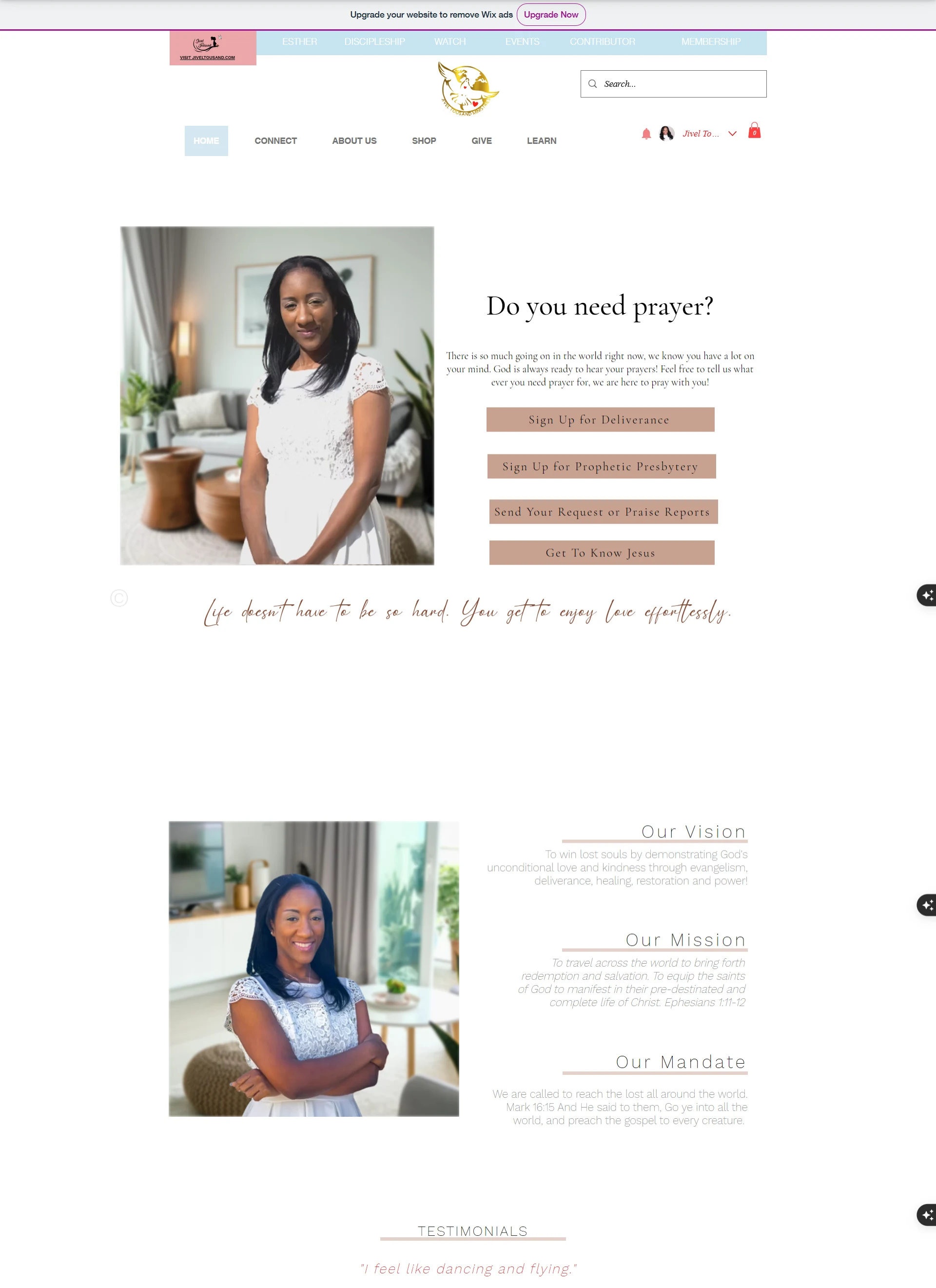
After
The homepage now states a position before it asks for anything.
02
Information architecture and navigation
Two navigation bars collapsed into one: About, Speaking, Programs, Books, Contact, Blog, Shop. Seven destinations, each mapping to something the business actually sells or publishes, and each reachable in a single click from anywhere on the site.
03
A design system, not a set of pages
A modern design system was developed around consistent typography, colour, spacing, and imagery, reusable components rather than isolated page updates, so the brand holds together and the site stays cheap to extend.
Three unrelated pastels resolved to a single deep purple carried across headings, buttons, dividers, category tags, and the footer. Four typefaces became two. Body copy moved to full contrast. Strategic visual hierarchy was introduced to bring key messages, services, testimonials, and calls-to-action forward instead of leaving them level with everything else.
04
Turning the archive into a library
The blog was rebuilt as a two-column card grid with category filters across the top, Prophetic Assessment, Freedom Testimonies, Leadership, Wealth, so years of teaching became browsable by subject rather than by date alone.
Every post now leads with a titled cover image instead of a raw link, and the newsletter sign-up closes the scroll rather than sitting nowhere at all.
Before
After
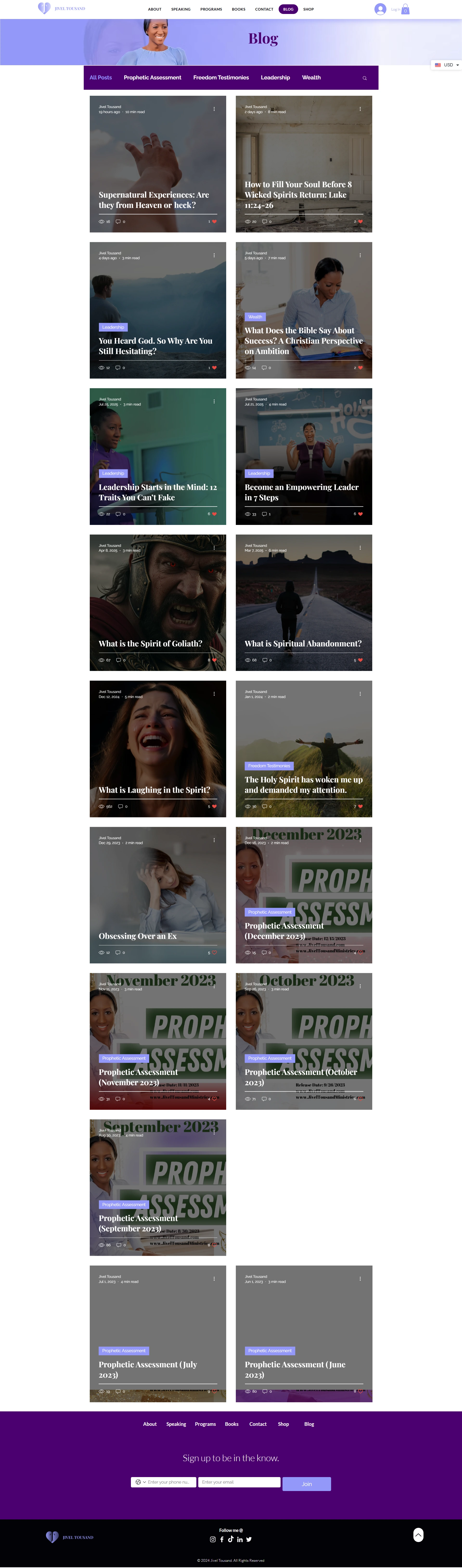
The redesigned blog, category filter tabs above a two-column grid of cover-image cards, closing on a newsletter sign-up band
05
Conversion paths with somewhere to land
Limited calls-to-action were the clearest commercial problem. Mentorship applications, session booking with duration and price, the book shop, course enrolment, and the product catalogue each got a proper template rather than a paragraph pointing elsewhere. Cart, account, and currency selection are present on every page.
06
Responsive at the core
The interface was designed responsive-first rather than adapted afterwards. Display type holds its weight at phone width instead of collapsing into the body copy. The eight entry points restack without losing their grid. Navigation folds into one menu and search stays reachable above the fold.
Subtle animation and interactive elements add polish throughout, kept light enough to protect performance and accessibility.

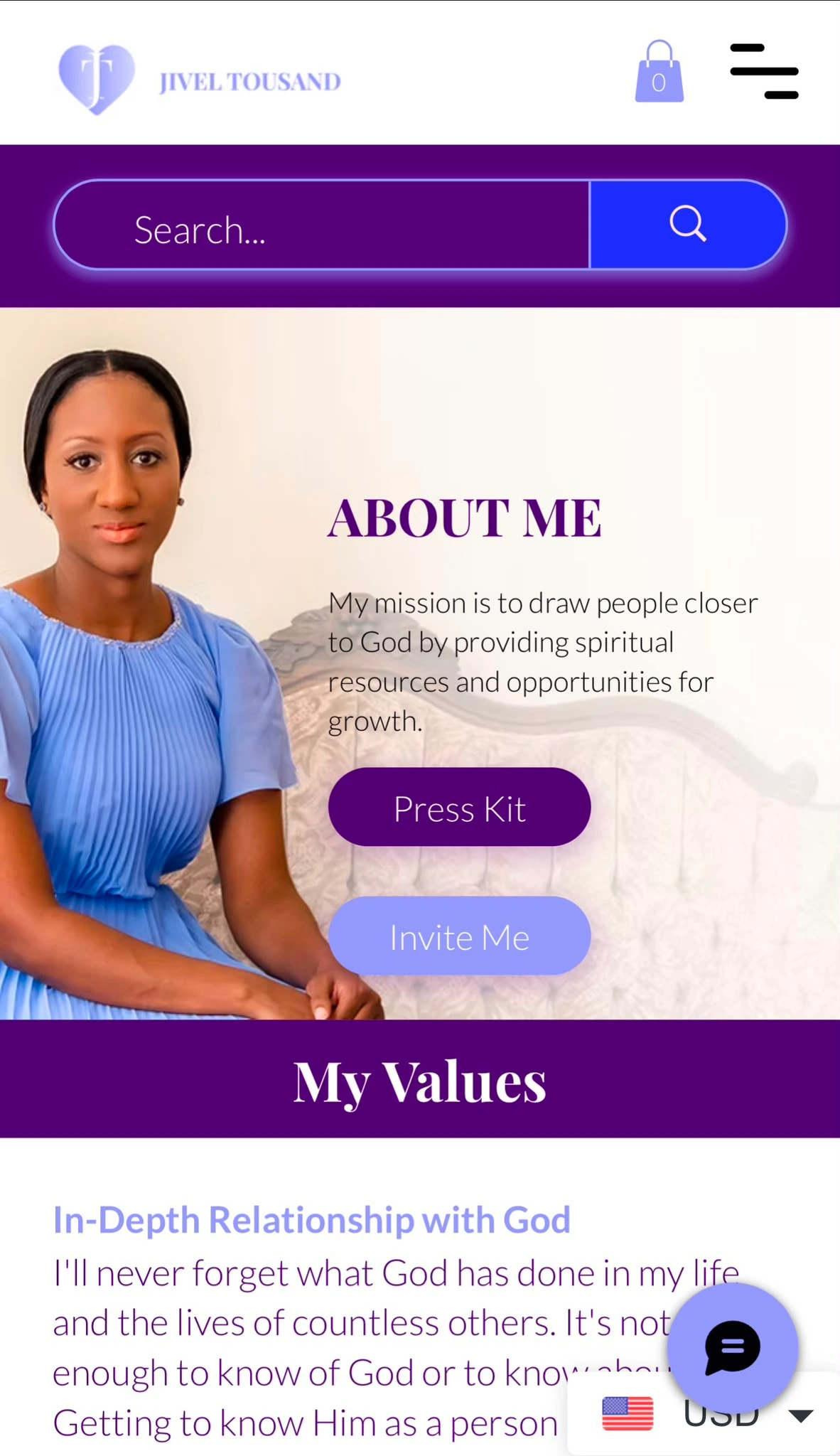

The Jivel Tousand mentorship page on mobile
Visual expression
The design had to read as premium without losing warmth. This is a practice built on trust, and the work is personal, so the system had to carry authority and stay human at the same time.
A single deep purple replacing three unrelated pastels
Two typefaces doing the work that four were failing at
Full-contrast body copy, corrected from light grey on white
Curved section dividers that give the scroll a rhythm
Consistent card and button systems across every template
Strategic hierarchy bringing services, testimonials, and CTAs forward
Photography used deliberately, not as filler for empty space
The results
The redesigned site turned Jivel Tousand's online presence into a modern, conversion-focused platform, one that reflects the quality of the brand and, more usefully, sells on its behalf.
A complete redesign with a refined visual identity
Improved information architecture and navigation
Modern, responsive layouts optimised for every device
Clear content hierarchy that improves readability and flow
Strategic calls-to-action that increase visitor engagement
Consistent branding across every page
A scalable foundation that supports future content and growth
Like this project
Posted Aug 2, 2026
Redesign of Jivel Tousand's website with modern visuals and improved user journeys.
Likes
0
Views
4
Clients
Jivel Tousand