Juliana Lino Arquitetura — A website for two audiences

Marcela Silva


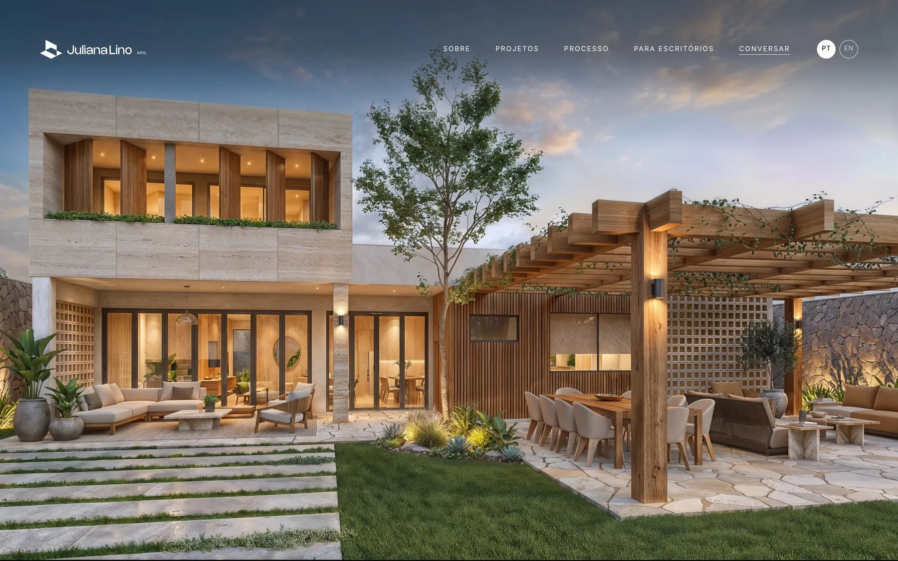
Juliana Lino has worked with residential architecture, renovations and interiors in Brasília since 2018. As the studio grew, its website no longer represented the full range of services. Technical drawing and project documentation for other architecture studios also needed a clear place in the experience.
I took the project from start to finish: strategy, brand identity, information architecture, UI design, bilingual copy and the build. The site is live in Portuguese and English at julianalino.com.
Two audiences, two paths
A family planning a renovation and a studio that needs construction documents are looking for different things. I mapped the pages and navigation around both. Residential projects lead the portfolio. Studios get their own item in the menu and land on a page made for them.
A brand drawn like a building
The new symbol is a volume in axonometric view, the way architects draw. It puts the studio's craft into the mark itself.
A system that holds up
Five base colors, two typefaces and twelve text styles, with buttons, links and visual rules documented in Figma. A 12-column grid on desktop becomes one column on mobile.
Let the projects carry the page
Images lead every layout. Text stays short, and a few words in italics point to measure, orientation and material. The portfolio opens as a list of ten projects by name, place and year. Hovering a name shows its image, so a visitor can scan the whole body of work before clicking.
Showing the process on a real house
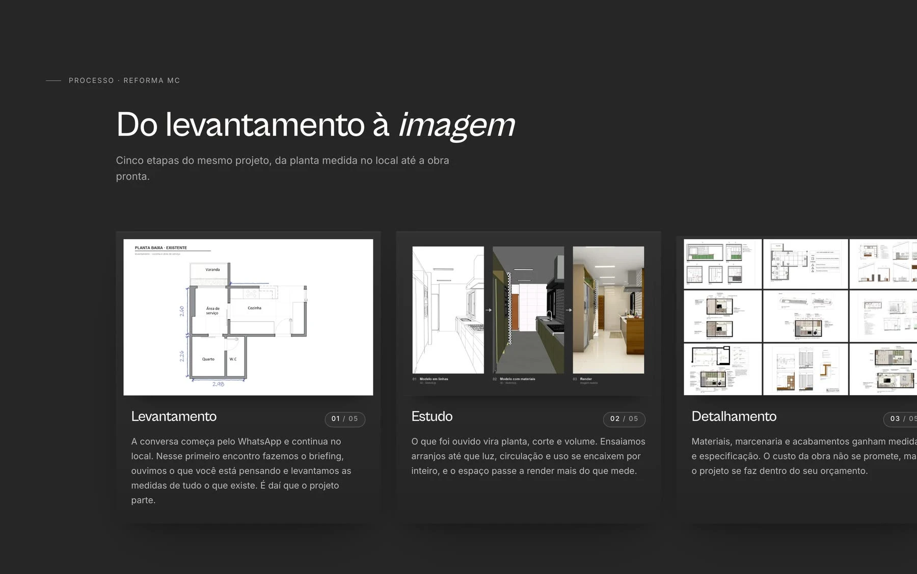
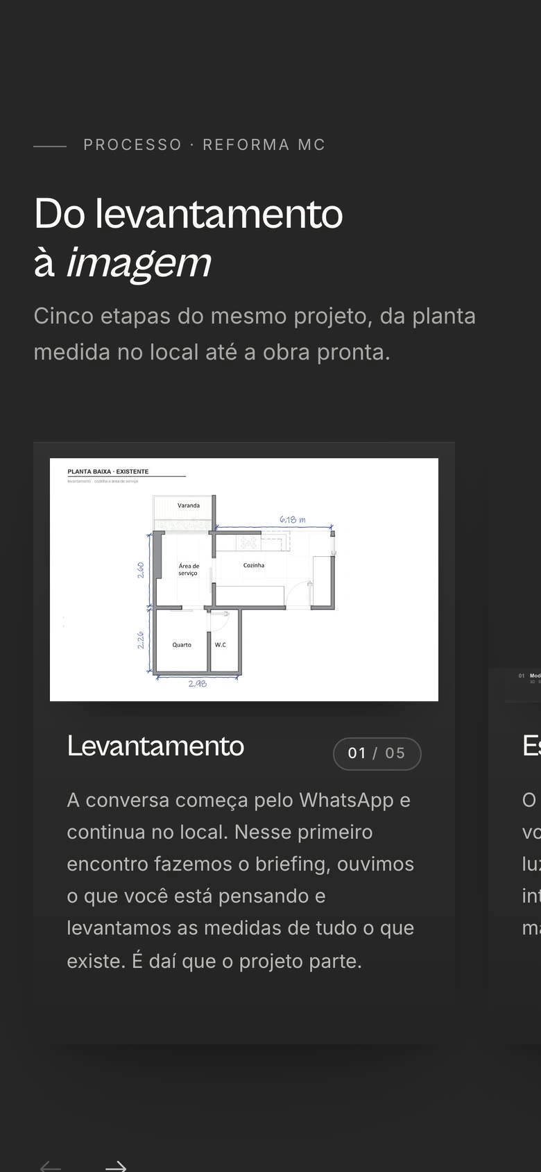
One renovation walks through the five stages of the work, from the site survey to the final render, with a drawing for each step. A client understands what they are paying for before the first call. Each project page also tells the story of the home before the photos.
Process
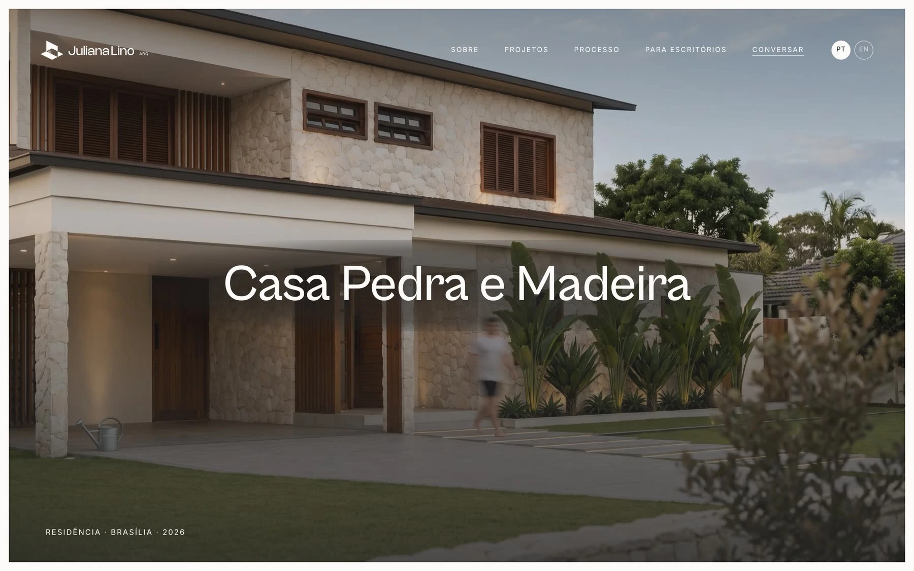
Project page
A page that sells to other studios
Juliana also produces construction documents, joinery details, 3D models and renders for other firms. On this page, choosing a service puts a real drawing sheet next to its description, so a studio sees the quality before asking for a quote. Process, packages and the quote request all live on the same page.
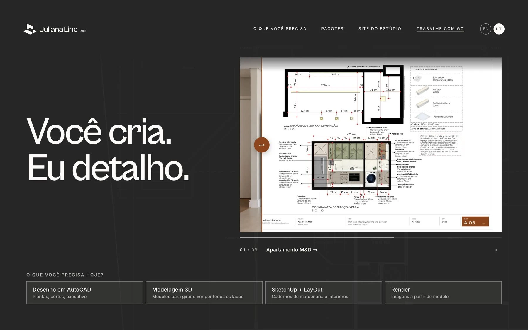
The page for other studios
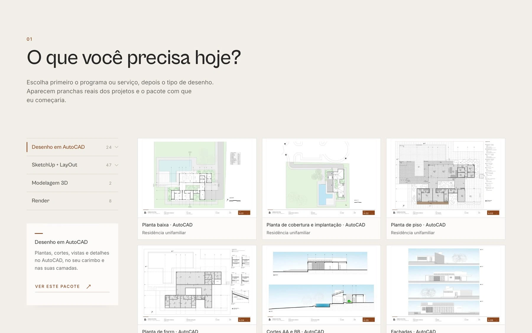
The choice next to the sheets
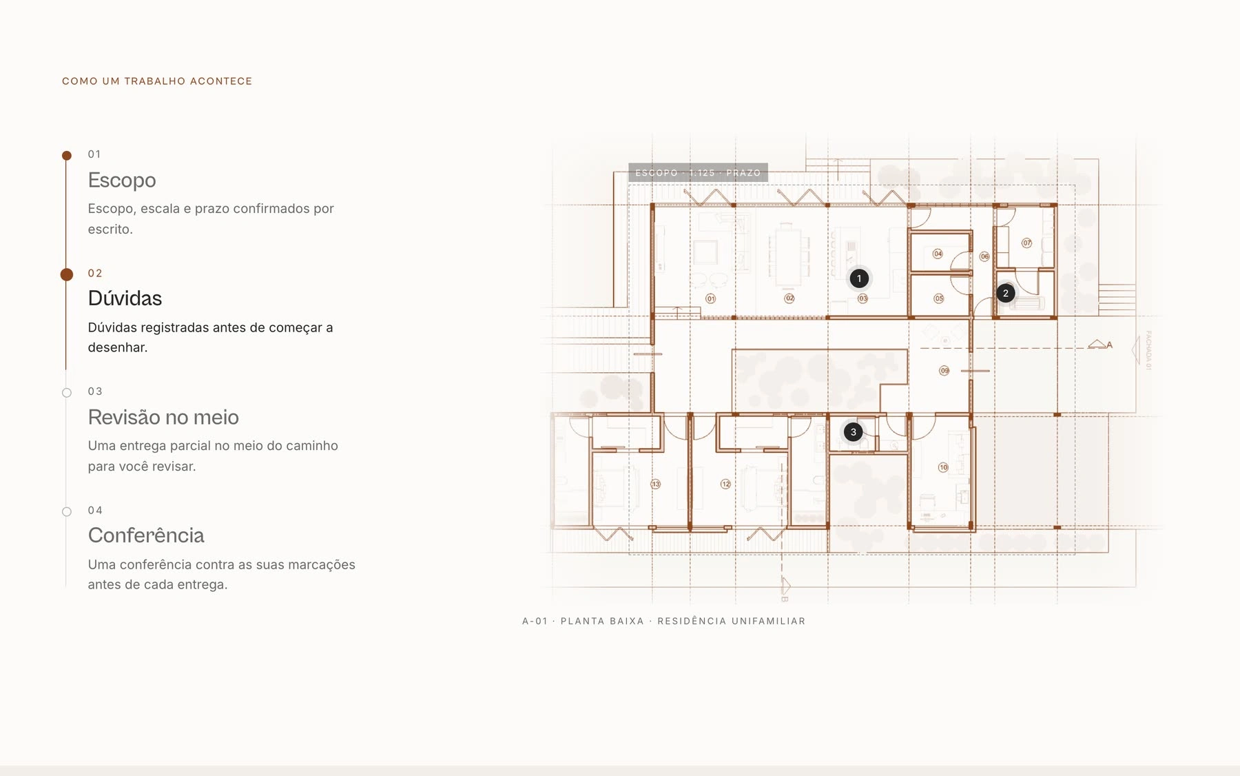
Mobile, page by page
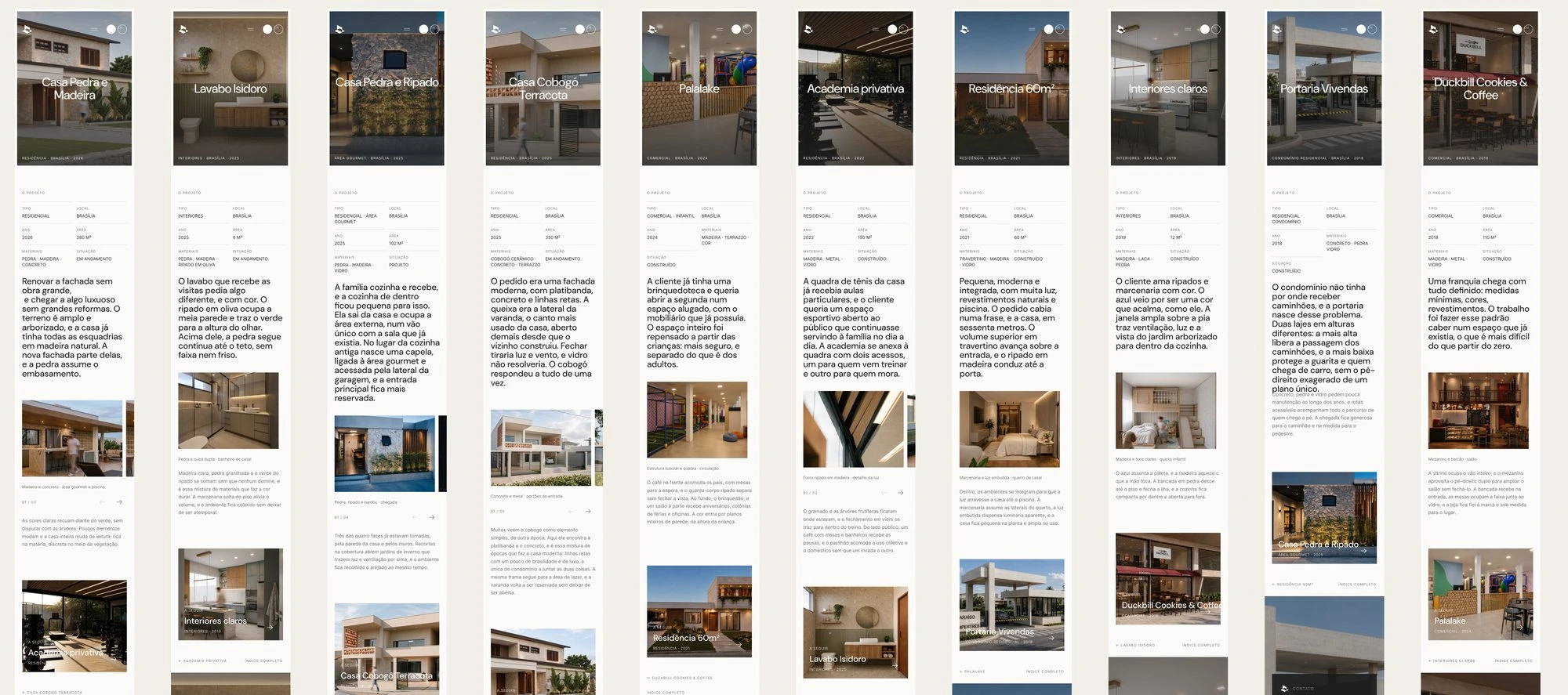
On a phone, navigation moves into an overlay menu and the image and process carousels respond to swipe. Each of the ten project pages has its own mobile layout.
One language from site to feed
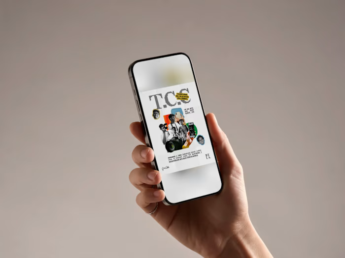
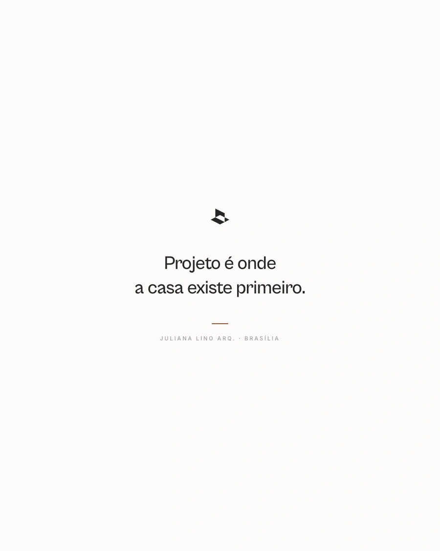
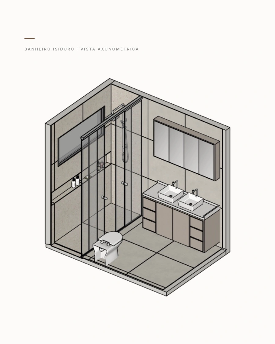
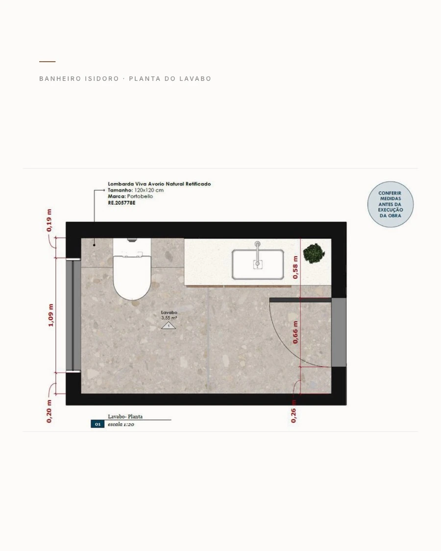
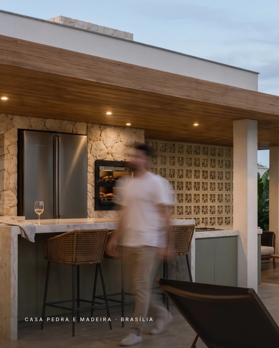
The Instagram launch posts reuse the website's visual language: technical drawings, isometric views, the same typography and the studio's own project photos.
Designed in Figma, built in code
Every page has a 390 px mobile layout and a working prototype in Figma. I built the site myself with Claude Code and Vercel, then checked typography, hierarchy and interactions in the browser against the design. Since one person did both, nothing got lost in a handoff.
Outcome
Brand and website live in two languages, an organized portfolio, a dedicated area for technical services, and Instagram launch posts that follow the same visual language. The full case is on my site:
Like this project
Posted Nov 6, 2026
Brand identity and bilingual website for an architecture studio, with dedicated experiences for residential clients and fellow architecture firms.