Brand Identity+Strategy+Copywriting for Formeta Studio
Chhavi Malik
1 collaborator
Brand Identity, Copy & Strategy for Formeta Studio
Built Formeta’s brand from the ground up.
Defining the positioning, narrative, voice, and identity of the creative studio that is designed for clarity, trust, and craftsmanship.
Every element, from the brand’s tone to its web architecture, was shaped to reflect what we stand for: calm precision, human-centered clarity, and creative systems that convert.
Project Overview
Formeta wasn’t just another “studio brand” project.
It is a framework for how we think and operate.
The challenge was to create a brand and story that felt as strategic as it was personal. Something grounded, not flashy. Confident, not corporate.
The goal was simple:
Build a studio identity that could speak to founders and established teams alike balancing warmth with structure, and emotion with clarity.
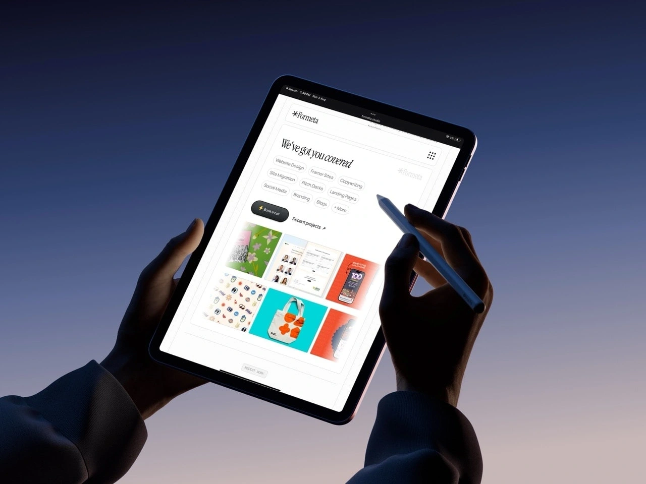
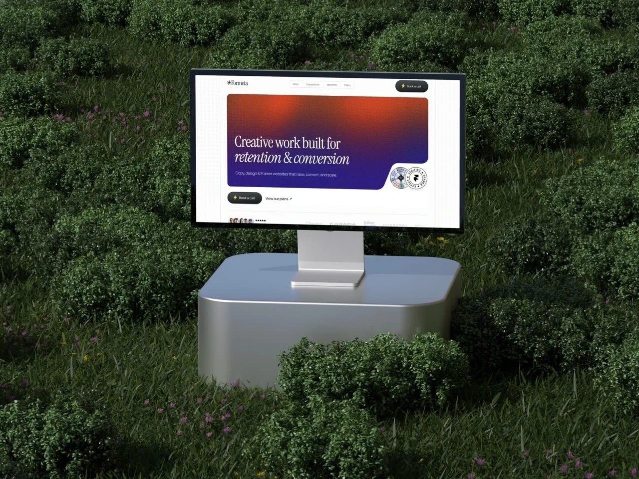
The result is a cohesive creative system that extends across messaging, brand visuals, and the website experience built in Framer.
1. Brand Strategy & Positioning
Defined the studio’s core pillars: clarity, trust, and craft.
Positioned Formeta as a creative partner for founders and growth-focused teams who value reliability and depth over volume and speed.
Developed our internal narrative frameworks on how we talk about design, storytelling, and business outcomes to ensure consistency across every touchpoint.
2. Brand Identity & Visual Direction
Collaborated with my Co-founder/Sr. Designer for the conceptual development of Formeta’s identity system from color palette to typographic direction and logo mark usage.
The identity had to feel timeless yet intentional, designed to convey calm confidence and strategic precision rather than visual noise.
3. Messaging System & Website Copy
Architected the site flow and copy narrative; every page structured to convert curiosity into clarity.
Defined tone of voice guidelines across web, case studies, and outreach.
Crafted the website copy to reflect both our process and our values.
Balanced creative depth with commercial purpose making “clarity” not just a design value, but a communication principle.
4. Site Architecture & Information Flow
Mapped the content hierarchy, page structure, and internal navigation logic before design began.
Every section was designed to serve a function whether it was building trust, reducing friction, or proving outcomes.
The end result was a sitemap that not only supported storytelling, but also scaled naturally as the studio evolved.
5. Cohesion Across Brand Systems
Worked closely with Ansh to ensure the design, motion, and copy read like one language.
The typography, tone, and pacing were all aligned to a single principle: make good work feel effortless.
Process
Defining the Foundation
Started by distilling what Formeta stood for.
Identified emotional anchors like trust, clarity, and ownership, which later became our strategic filters for all design and copy decisions.
Voice Development
Created the verbal identity system — a blend of confidence and calm.
Every word was chosen to feel intentional, avoiding marketing clichés or studio jargon.
Structural Clarity
Built a sitemap and content architecture that served both conversion and brand narrative goals.
Structured pages to tell a story, not list services.
Integration with Design
Collaborated with my co-founder to weave the messaging directly into layout and motion.
The visuals and copy were built together, not layered on top of each other.
Key Highlights
Defined brand strategy, pillars, and tone of voice.
Built complete messaging and copy system across website and social platforms.
Architected website content structure and flow before design phase.
Led Formeta’s visual identity direction and brand rollout.
Ensured cross-disciplinary coherence between design, messaging, and experience.
Results
The outcome is a studio identity that feels measured, confident, and human.
Formeta’s brand now communicates what we practice: precision, trust, and clarity.
It doesn’t sound like a studio trying to prove itself.
It sounds like one that already knows who it is.
Visit the live site → formeta.studio
Like this project
Posted Oct 9, 2025
Developed Formeta Studio's brand identity, messaging, and website for clarity and trust.
Likes
4
Views
36
Timeline
Sep 9, 2025 - Sep 11, 2025
Collaborators