Case Study: Veloura Skincare Premium Brand Experience
Hina Manzoor
Case Study: Veloura Skincare - From Vision to Premium Brand Experience
Client Overview: Brand Name: Veloura Skincare
Industry: Skincare / Beauty / Wellness
Mission: To redefine skincare luxury by blending elegance, nature, and scientific efficacy.
Target Audience: Women aged 24–45 who seek premium, elegant, clean skincare with visible results.
1. Brand Strategy & Discovery
We began by establishing a core identity for Veloura that went beyond superficial beauty. The essence was rooted in natural sophistication pairing botanical strength with a luxurious user experience.
Brand Values:
Purity with purpose
Wellness in simplicity
Elegance that empowers
Tone of Voice:
Serene, Empowering, and Sophisticated
Positioning Statement:
"A skincare brand designed to nurture your skin’s vitality with minimalist luxury and ethical integrity."
Moodboards, inspiration palettes, and competitor benchmarking helped carve a unique identity.
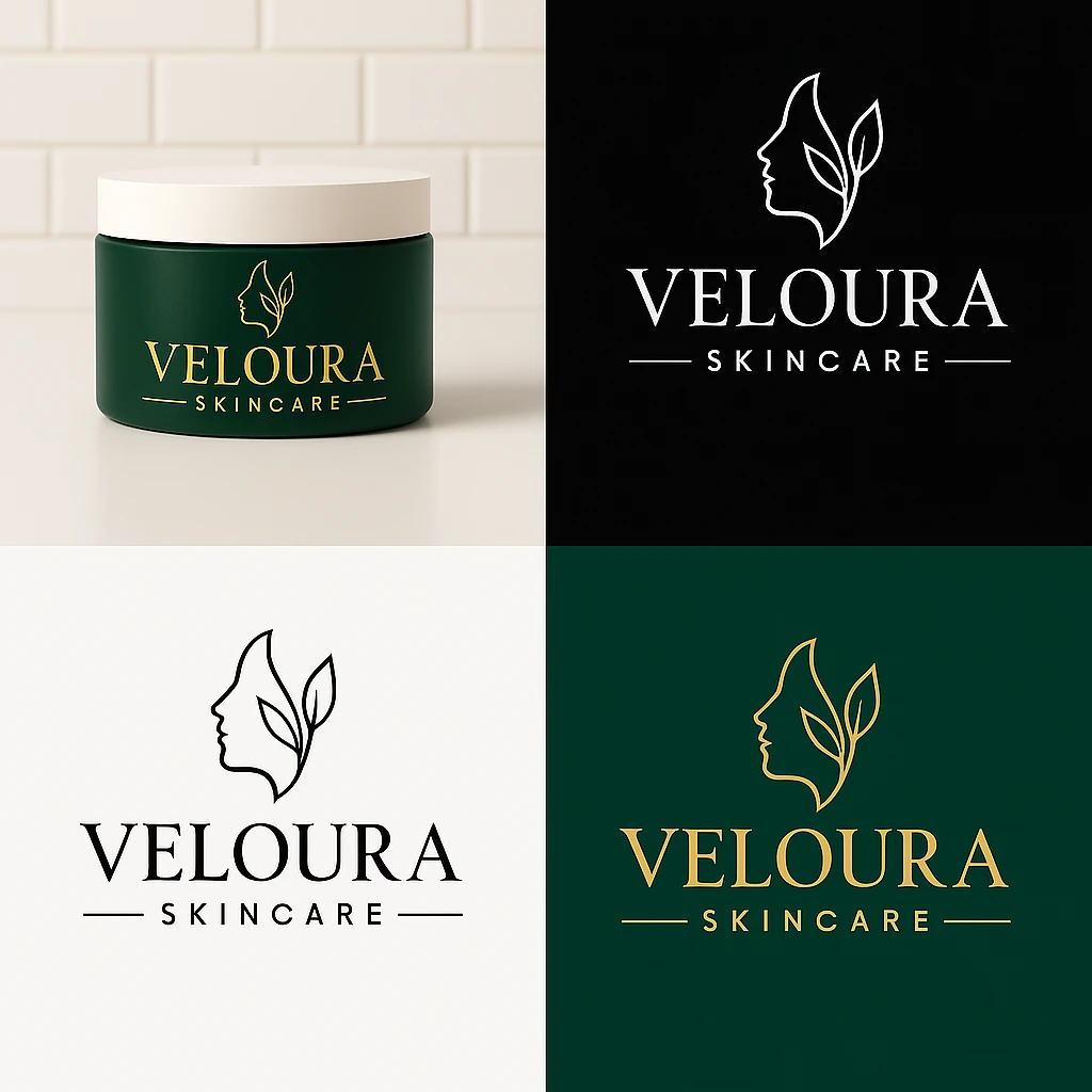
2. Logo Design
The Veloura logo was crafted to embody the brand’s premium aesthetic and organic soul.
Icon: A minimalist side-profile face with leaves intertwined representing harmony between nature and skin.
Typography: A refined serif font, elegant yet bold, signifying trust and luxury.
Color Palette:
Deep Forest Green (#14332A) – Nature, calm, trust
Soft Gold (#D1B97F) – Luxury, warmth
Creamy White – Simplicity, hygiene
Logo Variants Delivered:
Full Color
Black on White
White on Green
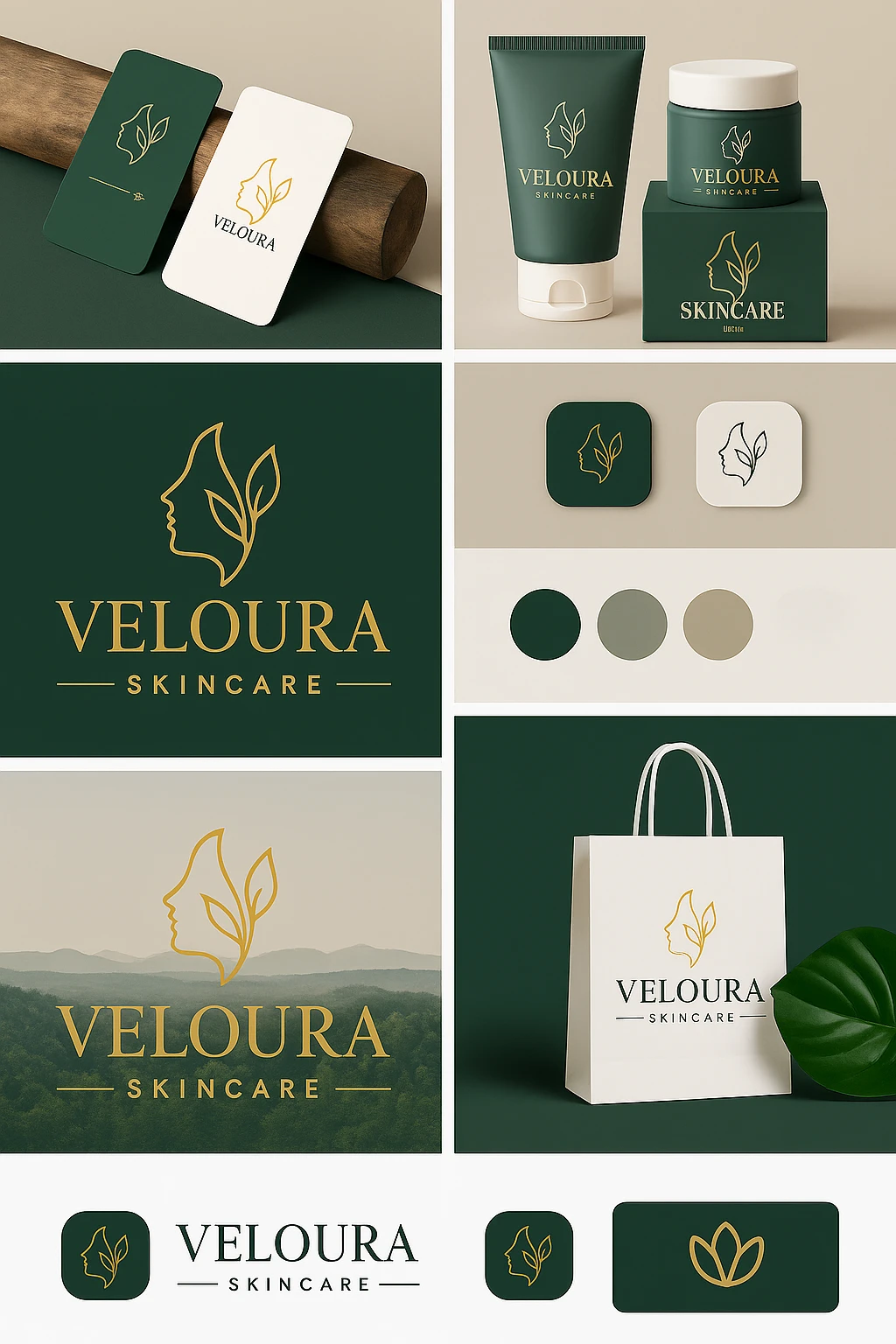
2. Brand Identity Design
Each element was developed for consistency and sophistication:
Jar & Tube Designs: Forest green packaging with gold logo and white caps
Serum Bottle: Matte green with dropper pipette gold branding over white cap
Box Packaging: Structured, bold, featuring embossed logo and minimal copy
Mockup Settings:
White tile backdrops for clinical trust
Natural props (stones, leaves, linen) for earthy elegance
Hyper-realistic 3D mockups brought this system to life across various touchpoints
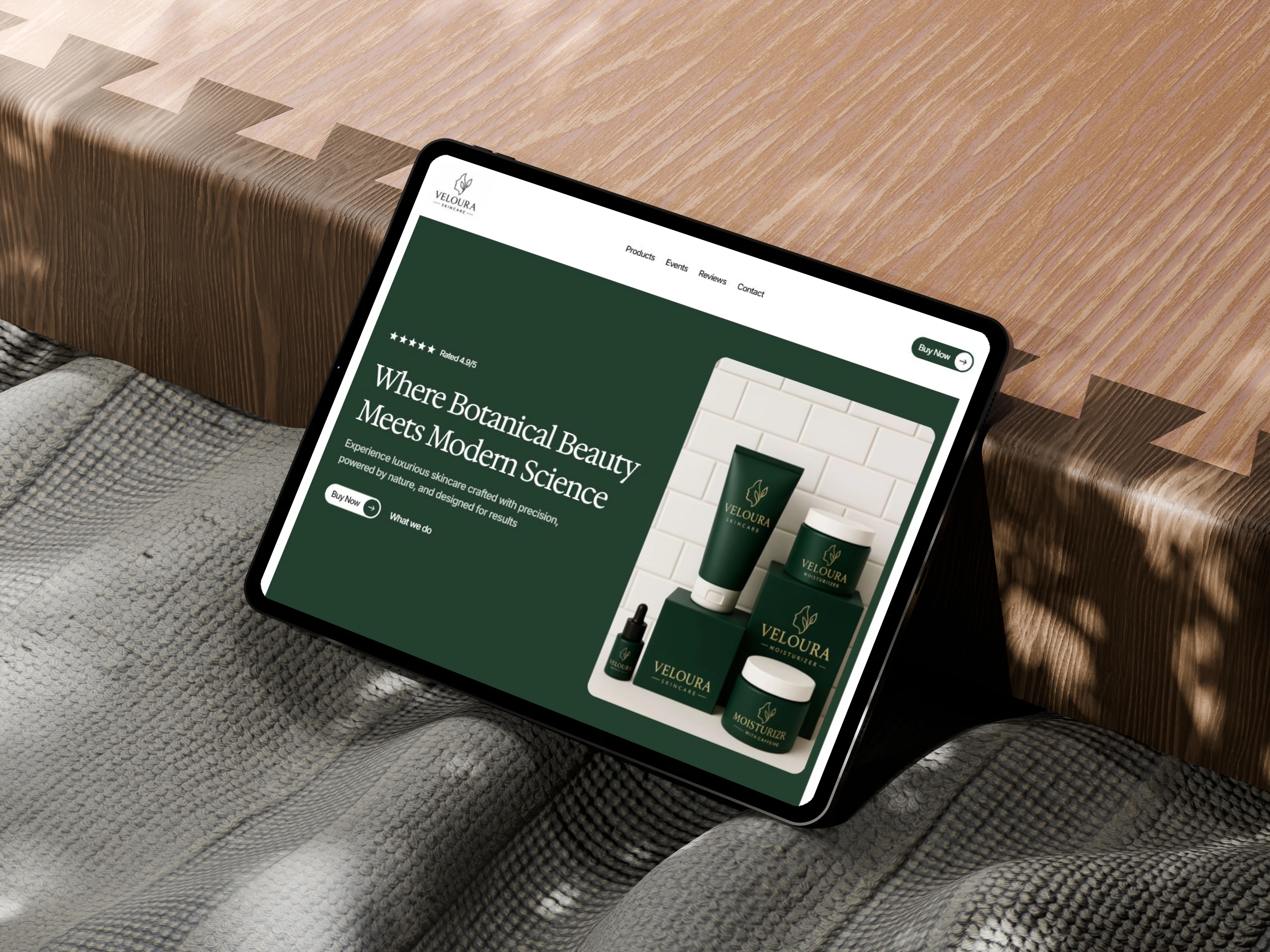
4. Website Hero & UX Design
The website was built around user-friendly, luxury-driven UX
Full-width image showing product arrangement in clean, natural light
Mobile-first design, soft animations, sticky header
The visual flow was clean, with calming colors, ample white space, and elegant product showcasing.
Homepage design
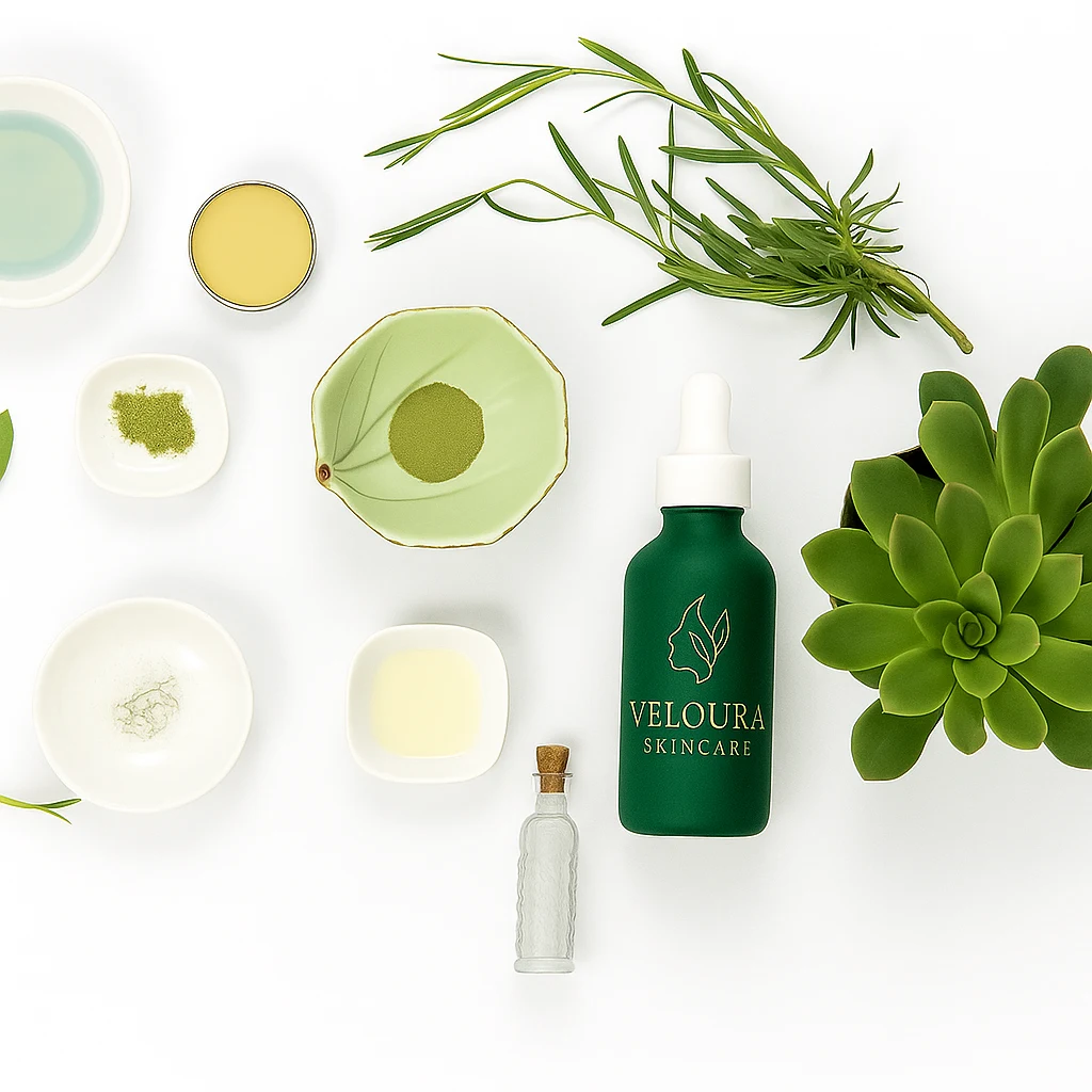
5. Social Media Design System
To maintain consistency across Instagram & Pinterest, we created a complete post design ecosystem:
Assets Created:
Carousel templates
Educational skincare reels
Product launch mockups
Promotional banners
Quotes & reviews with gold frame branding
Visual Language:
Flat lay product photography
Natural backdrops (leaves, tiles, linen)
Typography: DM Serif + Inter
Text overlays with subtle shadowing for clarity
Social media post
6. Creative Product Mockups
I designed high-end mockups to build authority. These elevated the brand presence to premium e-commerce standards.
7. Outcome & Reflections
Veloura transformed from a concept to a complete luxury skincare ecosystem.
What was achieved:
Distinct brand identity
Cohesive packaging visuals
Elegant, conversion-optimized website
Scroll-stopping content for socials
Final Thought:
"Veloura wasn’t just about looking luxurious, it was about feeling intentional, clean, and alive. This project shows how branding isn’t a logo or font, it’s the emotion you create and the standard you uphold."
Thanks for Watching!
Want to discuss your project? Get in Touch on Contra!
Like this project
Posted Feb 13, 2026
Designed and developed full brand experience for skincare products with experience of working with ecommerce brands.
Likes
1
Views
1