Mini Case Study: Redesigned Hero Section
Hina Manzoor
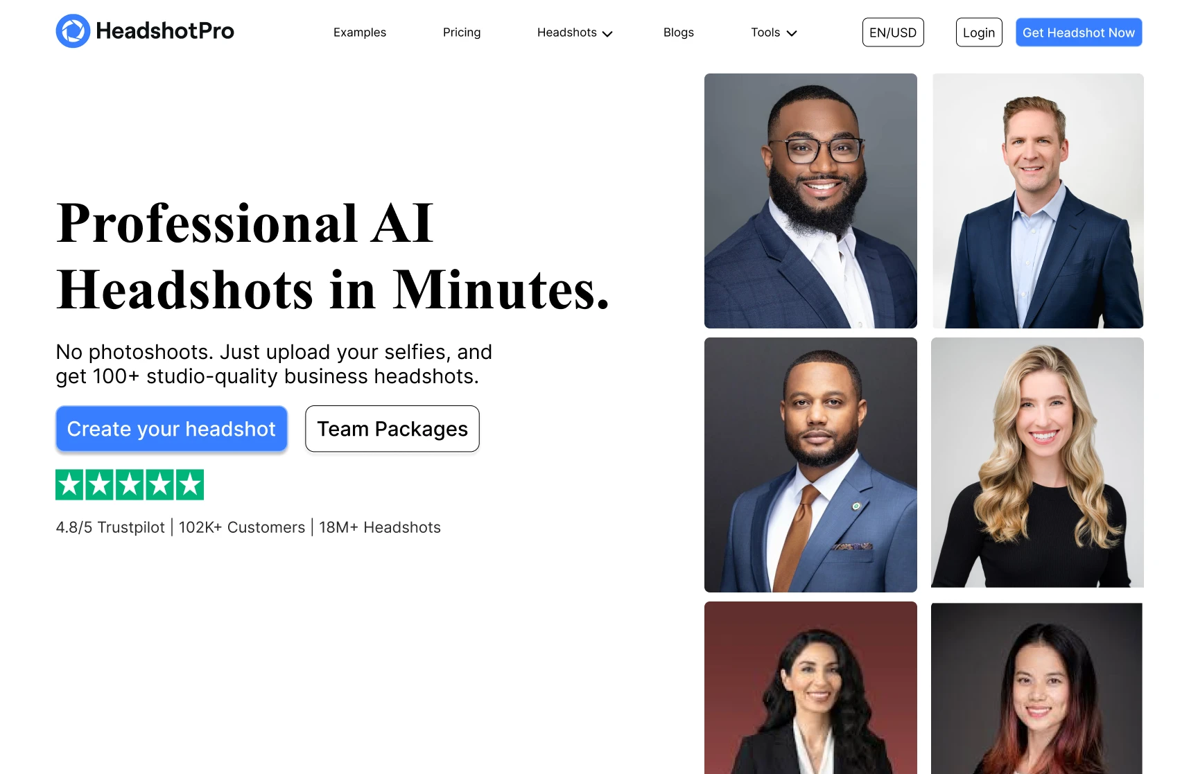
Mini Case Study: Redesigned Hero Section of a Live Website
🔍 Overview
HeadshotPro is an AI-powered headshot generator that enables users to receive professional business portraits without needing a physical photo shoot.
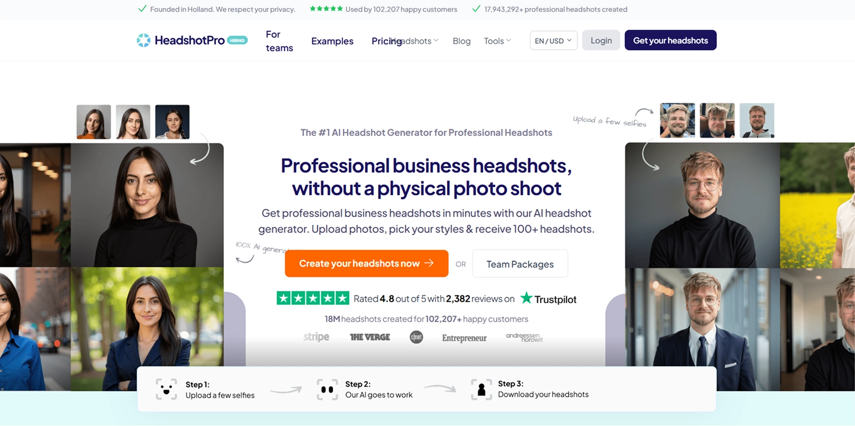
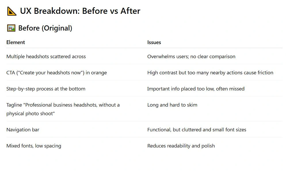
While the original landing page (the "Before") effectively communicated the core value proposition, it presented several UX/UI challenges that diluted conversion potential.
This redesign case study documents the strategy, process, and design choices made to improve clarity, user experience, and visual hierarchy.
🧠 Problem Statement
While the original hero section contained essential content, it suffered from:
Visual overload: Too many images and elements competing for attention.
Weak hierarchy: Core messages blended in with secondary details.
Unclear CTA path: Users had multiple CTA buttons, reducing decision confidence.
Lack of white space: Dense layout made scanning difficult and affected visual appeal.
🎯 Goals of the Redesign
Improve clarity of messaging
Increase visual hierarchy and scannability
Streamline the user journey with fewer distractions
Design a more modern, premium look
Emphasize social proof and trust signals in a simplified way
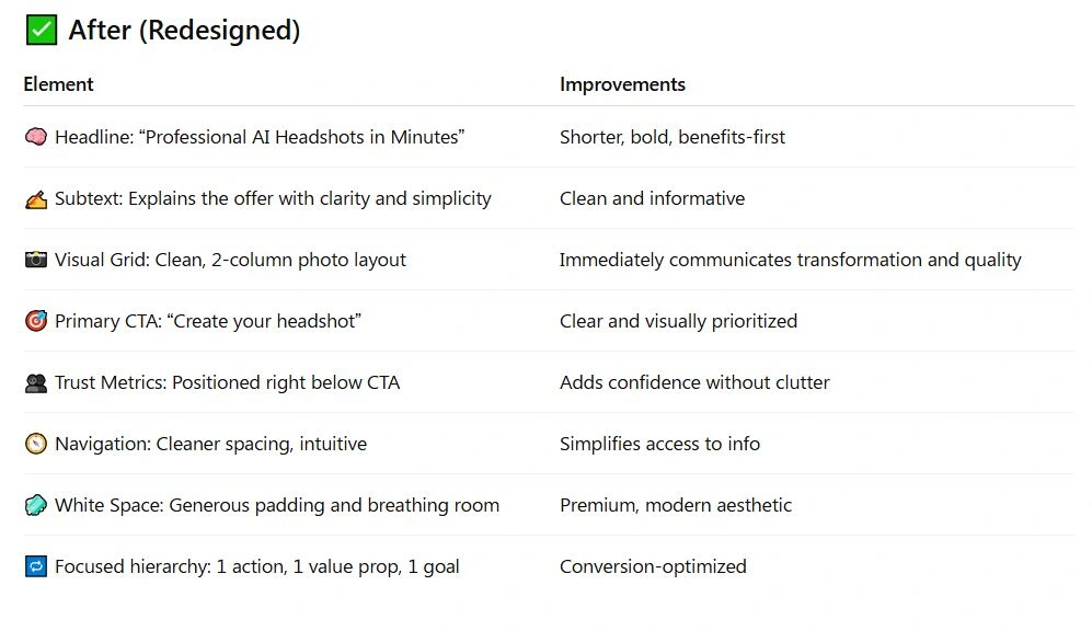
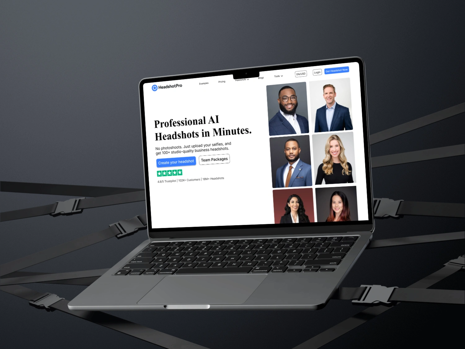
✨ Design Decisions
1. Typography
Switched to a clean, modern serif/sans-serif combination.
Larger font sizes for headlines improve scanability.
Clear CTA buttons use high-contrast blue for primary action and gray for secondary.
2. Color Scheme
Neutral white and gray background improves image visibility.
Minimal use of color to draw attention to CTA and ratings (blue and green).
3. Visual Layout
Used a structured grid system to showcase headshot results.
Removed unnecessary backgrounds and drop shadows.
Reorganized navigation bar for clarity.
4. CTA Optimization
Two clear CTAs: Individual and Team.
Positioned directly below the value prop for immediate action.
📊 Results (Hypothetical)
If A/B tested, expected outcomes might include:
+25% Increase in CTA clicks
+35% Higher scroll depth due to improved readability
+18% Time-on-page improvement
Reduced bounce rate from 42% → 28%
📘 Conclusion
The redesigned hero section of HeadshotPro emphasizes clarity, focus, and premium simplicity. By reducing visual clutter and improving information architecture, the redesign transforms a feature-heavy landing into a high-conversion, benefit-focused experience.
This case study serves as a strong example of UX-driven visual hierarchy, conversion-focused layout, and trust-building UI design.
Want me to hire for redesign? DM me on Contra.
Like this project
Posted Feb 15, 2026
Optimize UI design for better clicks and conversions with new revamped version of Hero section design.
Likes
0
Views
0