
Hina Manzoor
Web Designer | Figma, Framer, Shopify & Motion with Rive


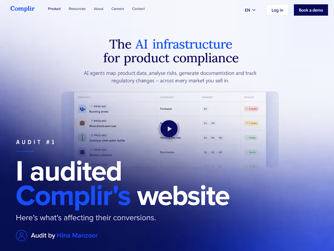
𝐑𝐞𝐝𝐞𝐬𝐢𝐠𝐧𝐞𝐝 𝐚 𝐬𝐭𝐚𝐫𝐭𝐮𝐩 𝐡𝐞𝐫𝐨 𝐬𝐞𝐜𝐭𝐢𝐨𝐧 𝐭𝐨 𝐢𝐦𝐩𝐫𝐨𝐯𝐞 𝐜𝐥𝐚𝐫𝐢𝐭𝐲 𝐚𝐧𝐝 𝐜𝐨𝐧𝐯𝐞𝐫𝐬𝐢𝐨𝐧𝐬.
Most landing pages don't fail because they look bad.
They fail because visitors don't understand the product within the first few seconds.
For this redesign, I audited the hero section of Complir and identified a few UX issues:
• Generic value proposition that didn't clearly communicate the outcome.
• Competing CTAs that weakened the primary action.
• Visual hierarchy that made everything fight for attention.
• An outdated scroll indicator that added little value.
So I redesigned the hero with a focus on strategy, not just aesthetics.
✅ Clearer messaging that explains the product instantly.
✅ Stronger visual hierarchy to guide the eye.
✅ Better CTA placement with a clear primary action.
✅ A more modern, conversion-focused layout.
Good design isn't about making things prettier.
It's about making them easier to understand.
I'd love to hear your thoughts:
What's the first thing you notice when you land on a SaaS homepage?
#WebDesign #UIDesign #UXDesign #LandingPage #SaaS #WebsiteDesign #Figma #ConversionDesign #ProductDesign #Startup #Redesign #DesignAudit
1
88
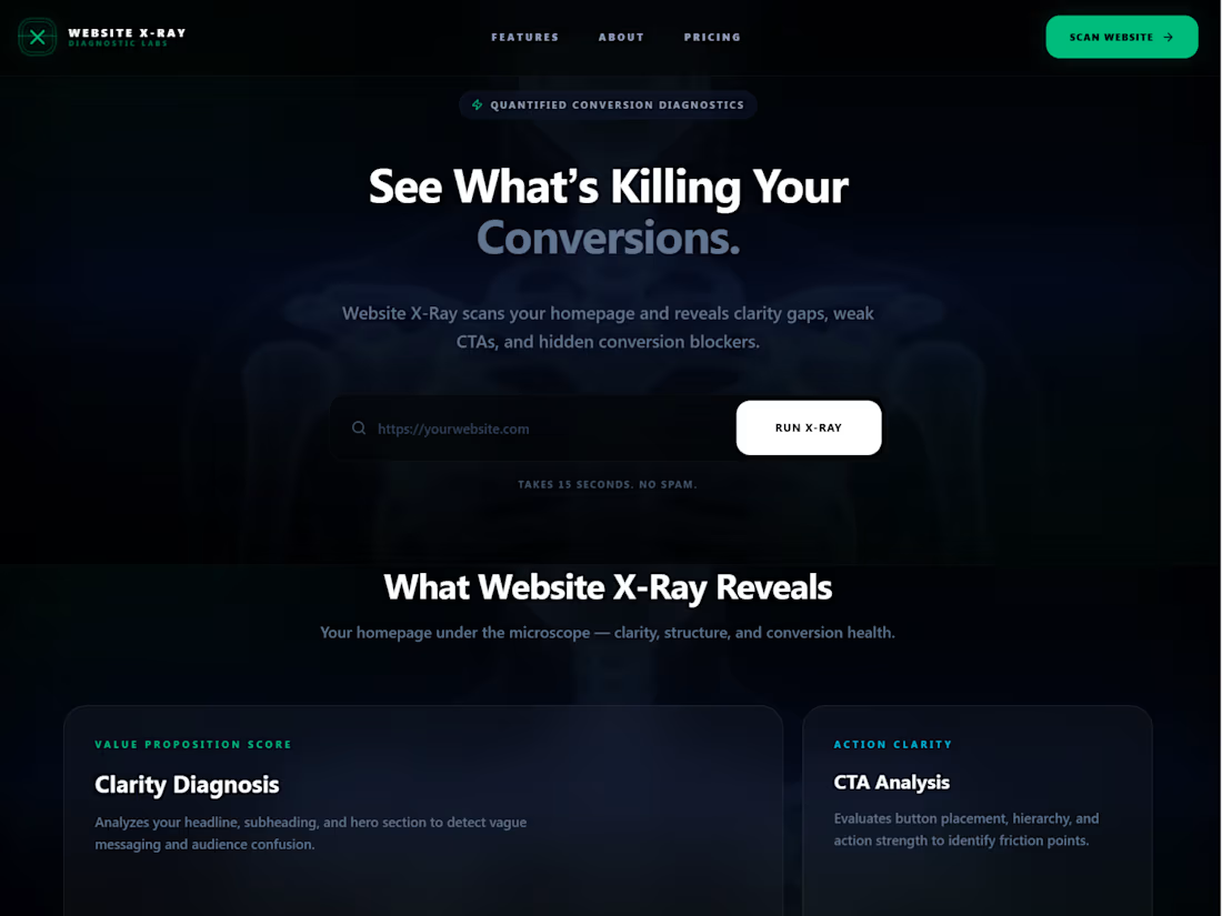
𝗪𝗲𝗯𝘀𝗶𝘁𝗲 𝗫-𝗥𝗮𝘆 𝗗𝗶𝗮𝗴𝗻𝗼𝘀𝘁𝗶𝗰 𝗟𝗮𝗯
I design websites.
And I’ve realized something.
Most websites don’t need more traffic.
They need clarity.
Before every redesign, I audit.
But audits usually live inside static PDFs.
So I built a tool:
𝗪𝗲𝗯𝘀𝗶𝘁𝗲 𝗫-𝗥𝗮𝘆 (https://websitexraylab.figma.site/) — a diagnostic experience built entirely in Figma Make.
Instead of reading an audit, users experience their website being analyzed in real time.
Built during #FigmaMakeathon.
Try it here:
https://websitexraylab.figma.site/
Social post on X (https://<https://x.com/Hina_HMofficial/status/2028474008002249209?s=20>) and LinkedIn (https://www.linkedin.com/posts/hinamanzoor_figmamakeathon-activity-7434239520046309376-ivhk?utm_source=share&utm_medium=member_desktop&rcm=ACoAAC6nFzQBTNaJMucQYWh3wqXMB92qzXxwIFk) for Submission.
8
8
250
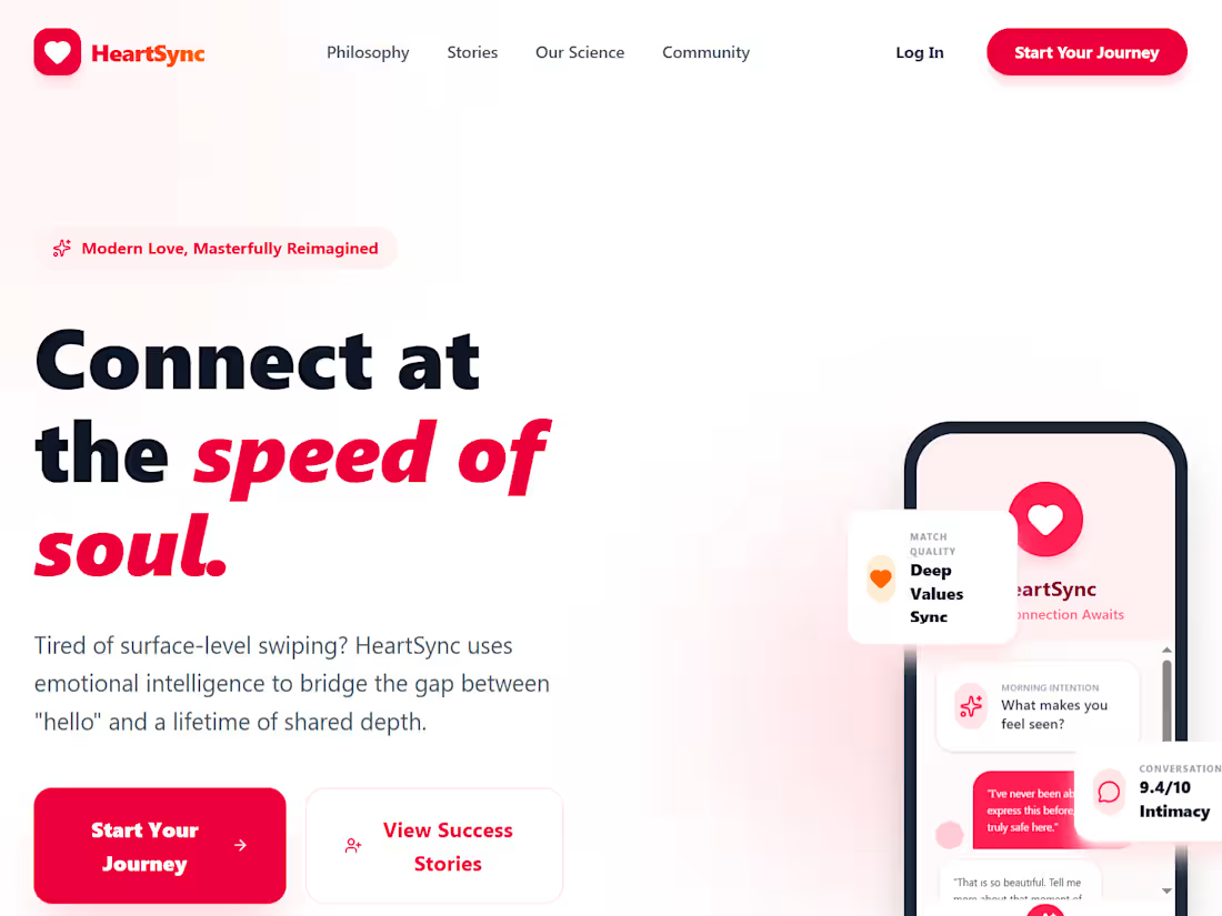
I always used to wonder how AI helped us in becoming more efficient, especially as a designer, where we can design a screen or landing page much faster than writing detailed prompts and tools, not getting what we want.
So, here come the 2 tools in my hand, @Wispr Flow (https://contra.com/company/wispr_ai_897302) and @MagicPath (https://contra.com/company/magicpath) and these tools helped to fill the gap between what I want and what I get on the screen.
Tried a simple prompt, and the results are insane. Like if you think the same and have a love corner in your heart about these tools how they are making designers' lives easy so they can focus on thinking about a better world and creativity flows just out of thier mind right into the screen.
2
4
290
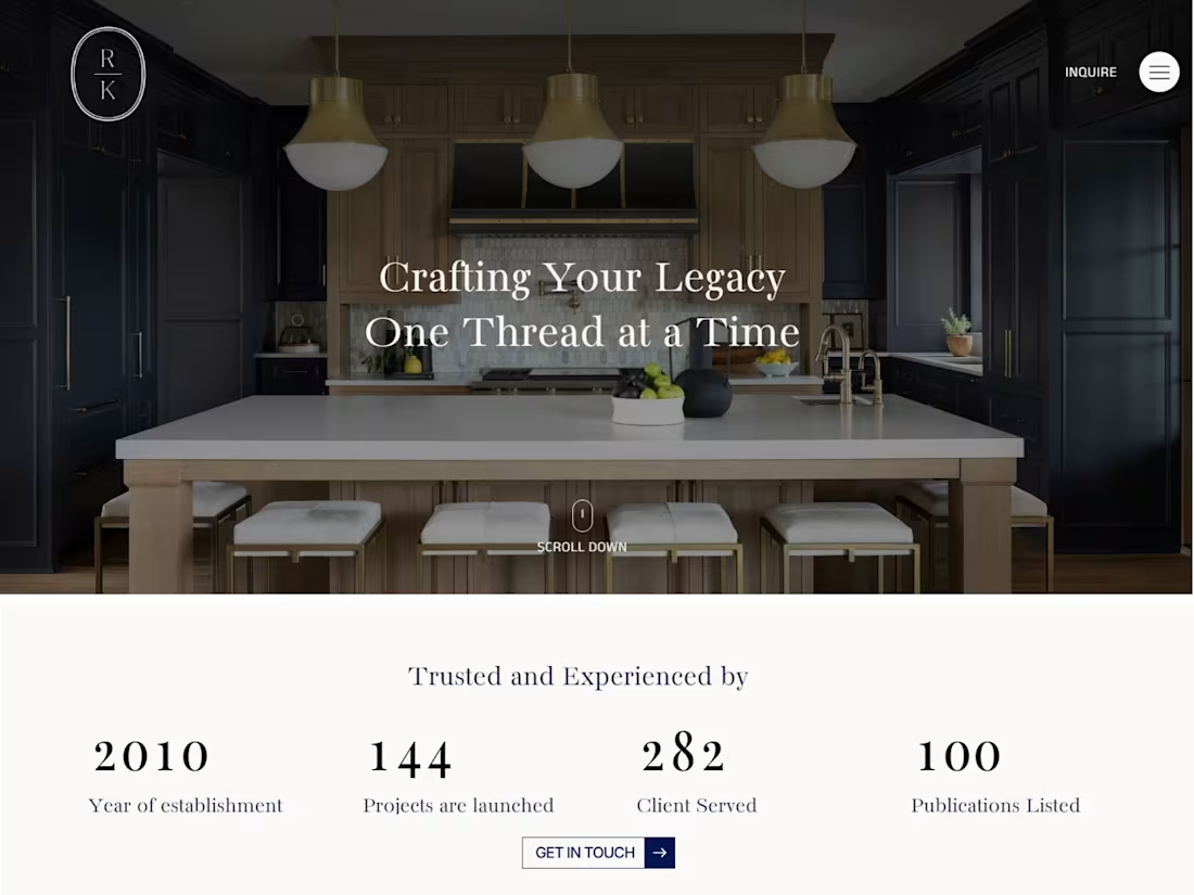
Renae Keller Interior Design — Full Website Redesign
0
10