𝐑𝐞𝐝𝐞𝐬𝐢𝐠𝐧𝐞𝐝 𝐚 𝐬𝐭𝐚𝐫𝐭𝐮𝐩 𝐡𝐞𝐫𝐨 𝐬𝐞𝐜𝐭𝐢𝐨𝐧

Hina Manzoor

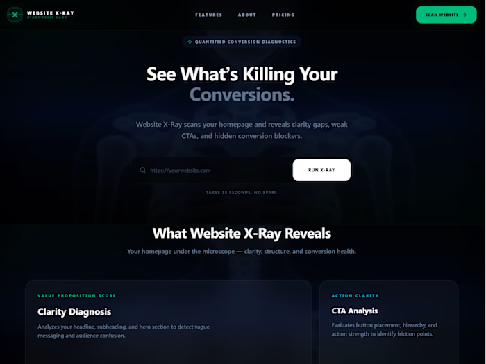
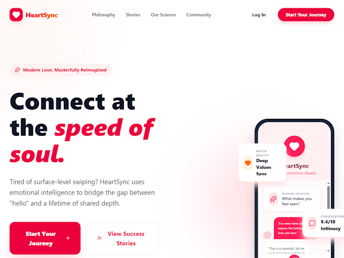
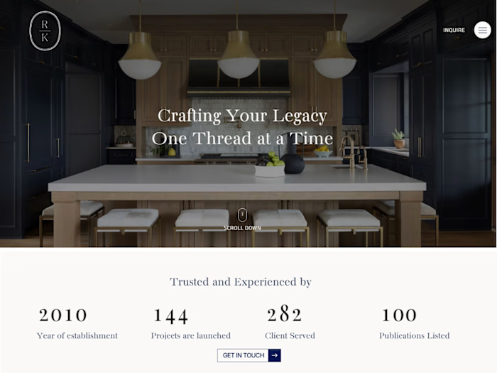
𝐑𝐞𝐝𝐞𝐬𝐢𝐠𝐧𝐞𝐝 𝐚 𝐬𝐭𝐚𝐫𝐭𝐮𝐩 𝐡𝐞𝐫𝐨 𝐬𝐞𝐜𝐭𝐢𝐨𝐧 𝐭𝐨 𝐢𝐦𝐩𝐫𝐨𝐯𝐞 𝐜𝐥𝐚𝐫𝐢𝐭𝐲 𝐚𝐧𝐝 𝐜𝐨𝐧𝐯𝐞𝐫𝐬𝐢𝐨𝐧𝐬.
Most landing pages don't fail because they look bad.
They fail because visitors don't understand the product within the first few seconds.
For this redesign, I audited the hero section of Complir and identified a few UX issues:
• Generic value proposition that didn't clearly communicate the outcome.
• Competing CTAs that weakened the primary action.
• Visual hierarchy that made everything fight for attention.
• An outdated scroll indicator that added little value.
So I redesigned the hero with a focus on strategy, not just aesthetics.
✅ Clearer messaging that explains the product instantly.
✅ Stronger visual hierarchy to guide the eye.
✅ Better CTA placement with a clear primary action.
✅ A more modern, conversion-focused layout.
Good design isn't about making things prettier.
It's about making them easier to understand.
I'd love to hear your thoughts:
What's the first thing you notice when you land on a SaaS homepage?
#WebDesign #UIDesign #UXDesign #LandingPage #SaaS #WebsiteDesign #Figma #ConversionDesign #ProductDesign #Startup #Redesign #DesignAudit
Like this project
Posted Jul 6, 2026
𝐑𝐞𝐝𝐞𝐬𝐢𝐠𝐧𝐞𝐝 𝐚 𝐬𝐭𝐚𝐫𝐭𝐮𝐩 𝐡𝐞𝐫𝐨 𝐬𝐞𝐜𝐭𝐢𝐨𝐧 𝐭𝐨 𝐢𝐦𝐩𝐫𝐨𝐯𝐞 𝐜𝐥𝐚𝐫𝐢𝐭𝐲 𝐚𝐧𝐝 𝐜𝐨𝐧𝐯𝐞𝐫𝐬𝐢𝐨𝐧𝐬. Most landing pages don't fai...
Likes
0
Views
15