Indonesian National Museum Homepage Redesign
Nauval Pradipta
📖 About the Project
The Indonesian National Museum (Museum Nasional Indonesia) is one of the country’s most important cultural institutions, housing thousands of collections that represent the nation’s heritage.
However, its existing website homepage felt outdated and cluttered. Instead of drawing visitors in, the design risked overwhelming them with too much information and weak visual hierarchy. My redesign focused on reimagining the homepage as a modern, accessible, and inspiring entry point — one that sets the tone for the entire museum experience.
⚠️ The Problems
Through my review of the original homepage, I found several issues:
Cluttered Hero: A busy image slider made the main message unclear.
Weak Hierarchy: Visitors couldn’t quickly identify the museum’s key services.
Overloaded Content: News and agenda lists were long, making the page tiring to scroll.
Missed Opportunities: No strong highlights for collections or upcoming events.
Standard Layout: The overall look felt generic, not reflecting the prestige of a national museum.
The challenge: How can one page tell the museum’s story in a way that feels clear, modern, and engaging?
🧭 Design Approach
I adopted Swiss Style (International Typographic Style) to guide the redesign:
Grid System: A modular layout to bring order and consistency.
Typography First: Large, bold headings for clarity and presence.
Minimal Palette: White background, black typography, and red accent to reflect Indonesia’s identity.
Strong Visuals: Full-width hero image and large section visuals to communicate prestige and storytelling.
Content Simplification: Focused on essentials — About intro, 3 key services, agenda highlights, and collection teaser.
🖼️ The Redesigned Homepage
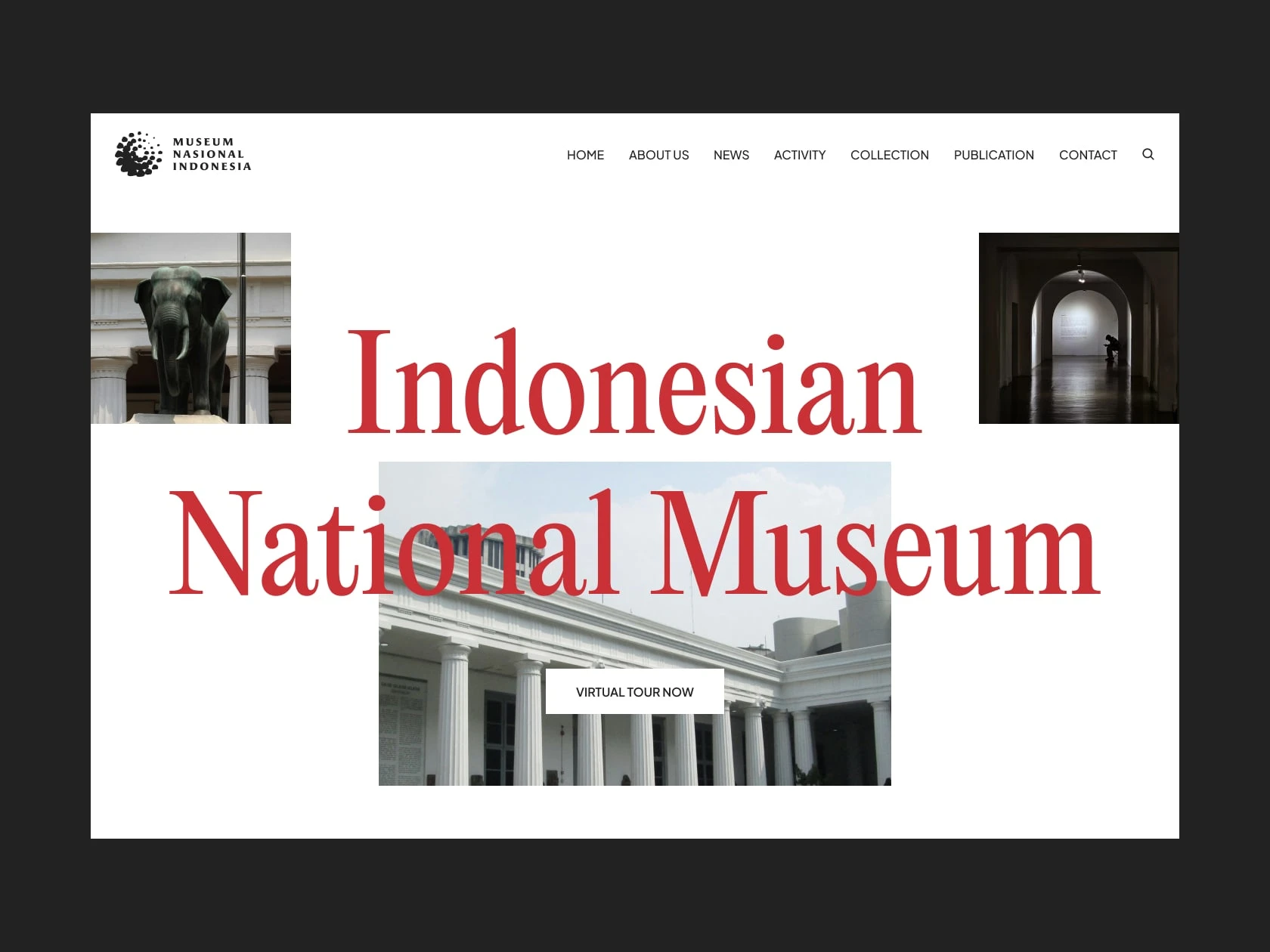
Hero Section
Full-width photo of the museum building.
Bold heading “Indonesian National Museum” with tagline.
Primary CTA button for visitors.
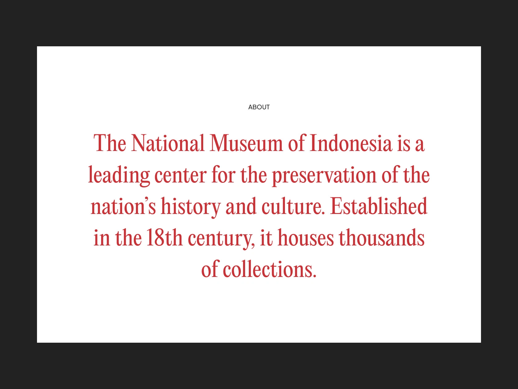
About Museum
Short, welcoming paragraph introducing the museum’s significance.
Clearer storytelling without overwhelming text.
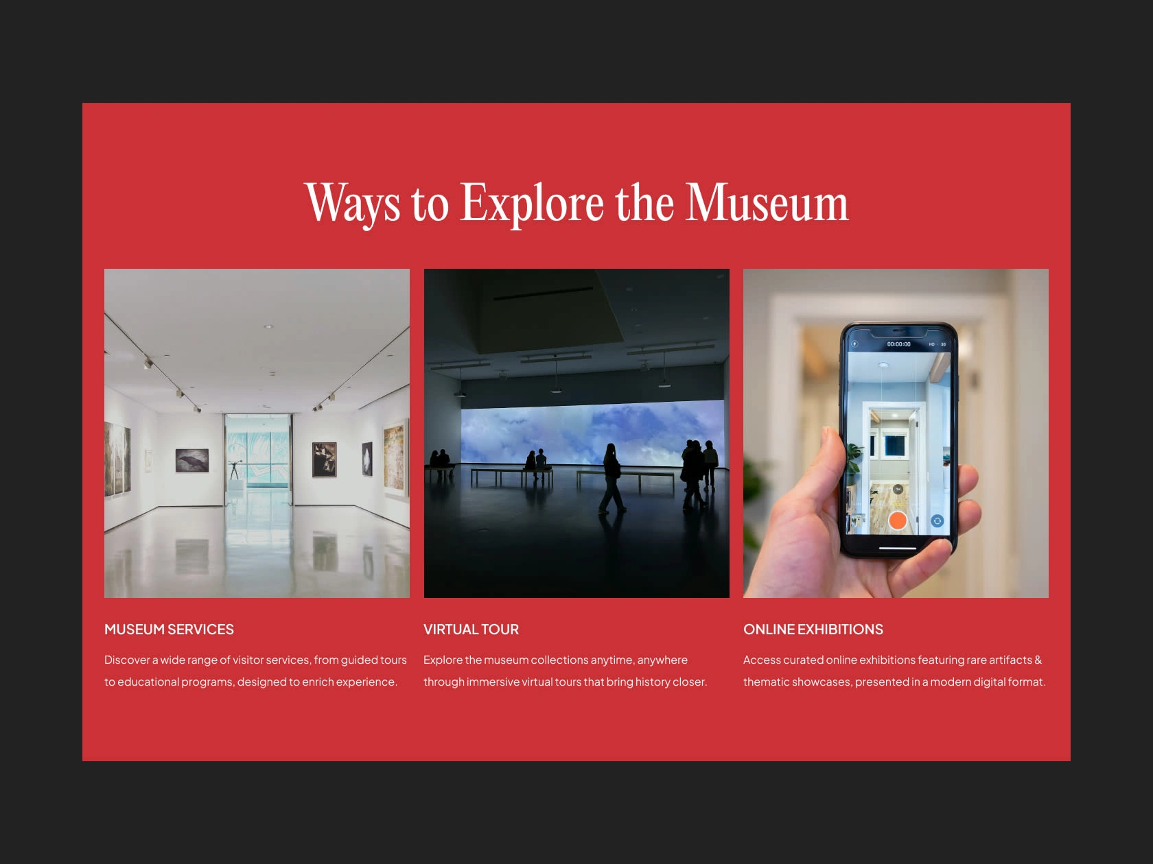
Key Services
Museum Services: Guided tours & educational programs.
Virtual Tour: Online access to collections.
Online Exhibitions: Digital showcases of rare artifacts.
Presented in a 3-column grid with concise descriptions.
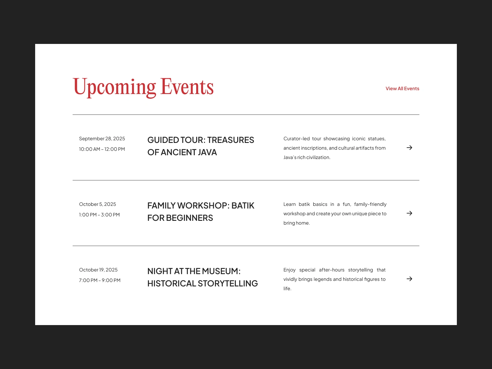
Upcoming Events
Clean list of 3 highlighted events with date, time, and title.
Shortened descriptions for quick readability.
CTA to “View All Events.”
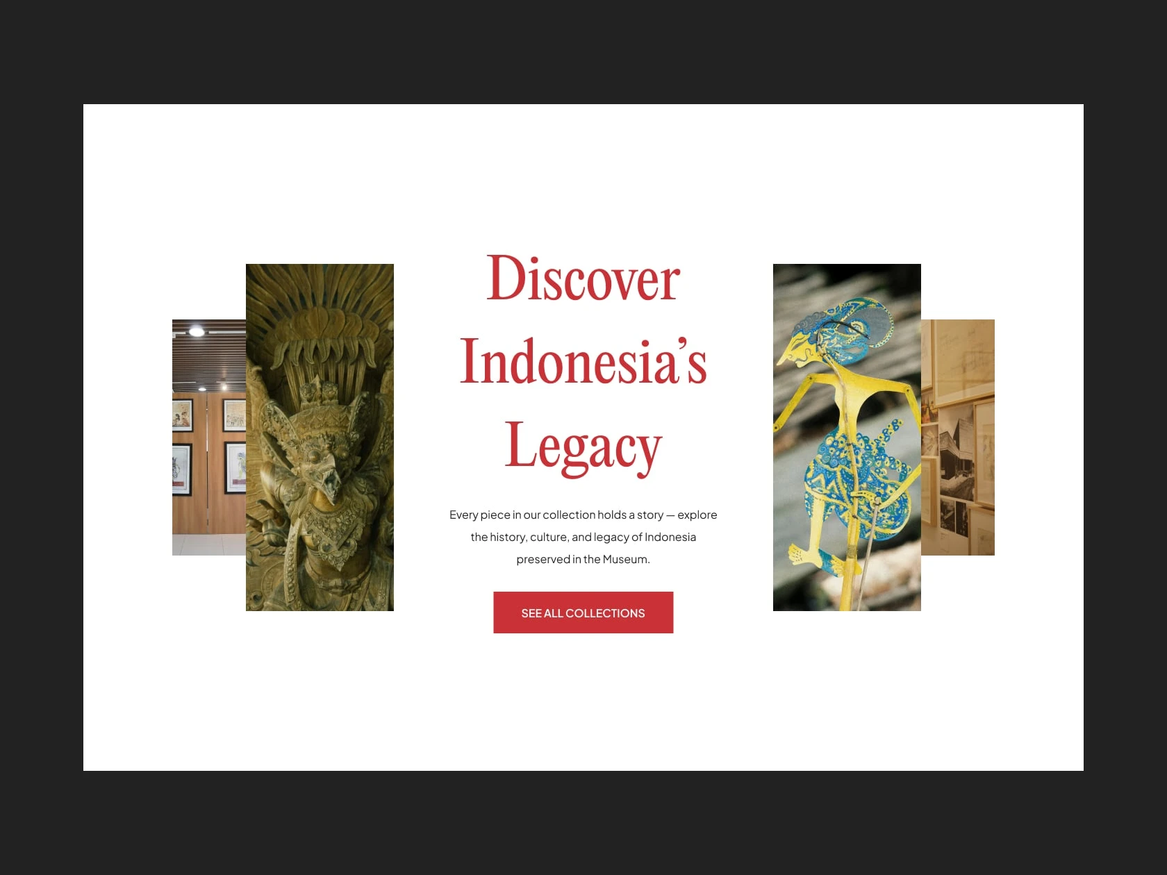
Featured Collection
Section header: Discover Indonesia’s Legacy.
Short description highlighting the scope of collections.
CTA button: See All Collections.
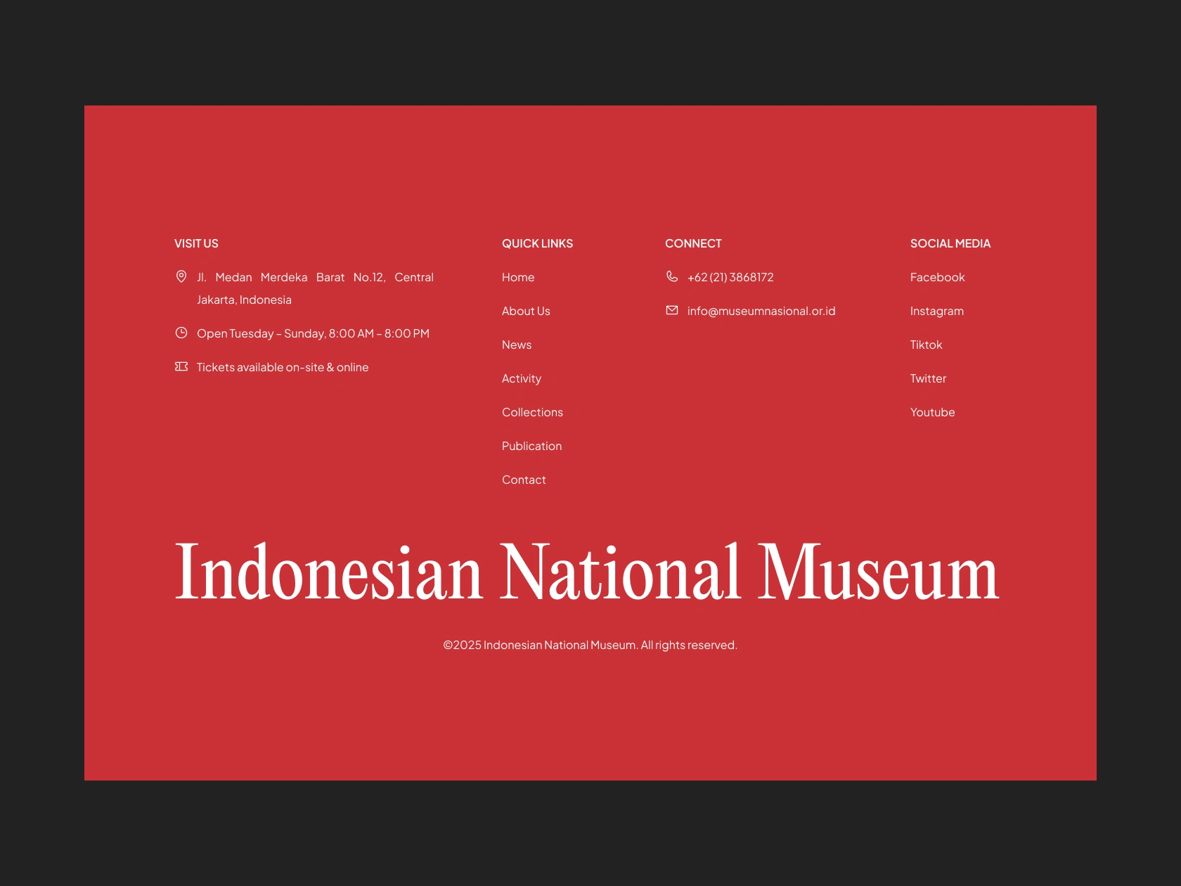
Footer
4-column layout: Visit Us, Quick Links, Connect, Social Media.
Contact info, address, and social links consolidated.
🌟 Outcome
Clarity: Visitors instantly understand what the museum offers.
Stronger Identity: Swiss Style gave the page a timeless, credible look.
Engagement: Events and collections are now clear entry points, encouraging further exploration.
Modern Feel: Motion design (via Jitter) added smooth transitions to sections, making the homepage more dynamic and interactive for presentation.
🎨 Design Preview
Hero Section
About Section
Ways to Explore Section
Upcoming Events Section
Collection Section
Footer
💡 Reflection
This project showed how even a single redesigned page can reshape perceptions. By applying a clean and timeless design approach, the homepage now acts as a strong digital gateway to Indonesia’s cultural heritage.
The redesign emphasizes that first impressions matter, especially when introducing a national museum to a global, digital audience.
Like this project
Posted Sep 15, 2025
A redesign of the Indonesian National Museum homepage using Swiss Style principles. Focusing on clarity, bold typography, and a modern cultural identity.
Likes
0
Views
138