Awe London
IniOluwa Abiodun
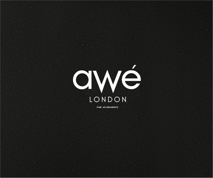
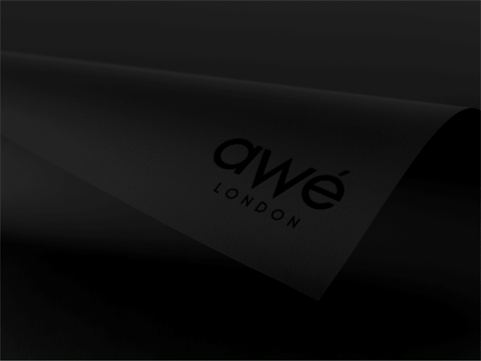
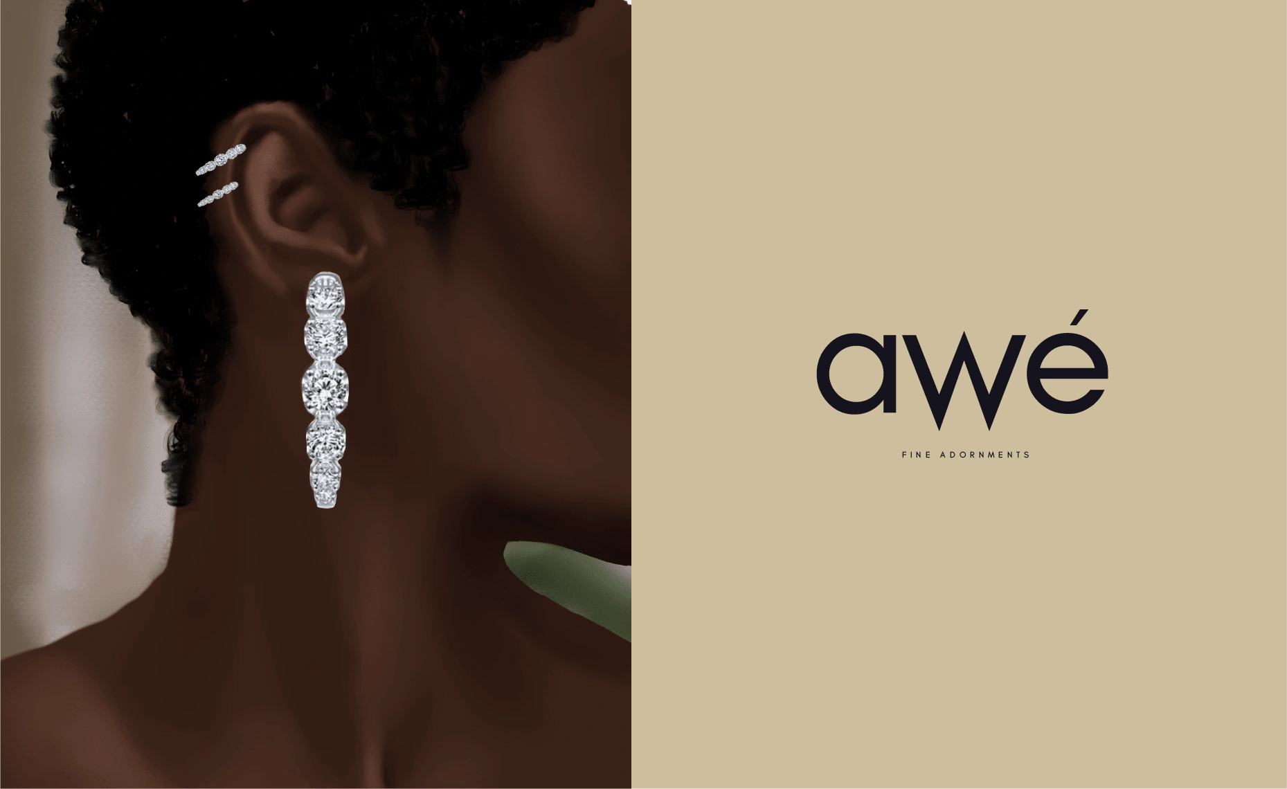
Awe London Logo
The Client:
Awe London is a fine jewellery brand curated by a mother-daughter duo, using ethically sourced African gems to create pieces that celebrate life's big moments and every day in between.
The Brief:
Create a brand experience that highlights the important ethical sourcing of African gems while positioning the brand for its entry into the world of luxury gems.
The Solution:
In creating this identity, it was important to reference the work being done to ethically source African gems, especially in an industry that has spent years profiting off these same gems being mined and refined unethically.
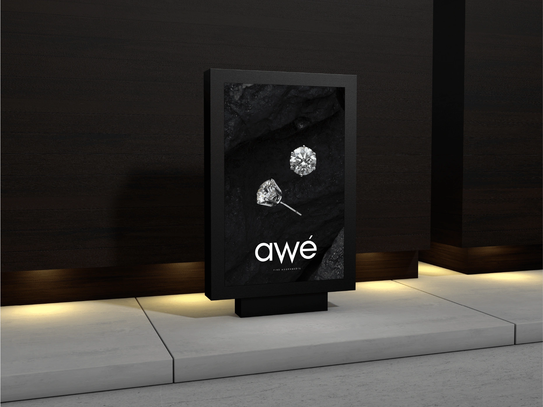
The "W" typeface was modified to be longer than the remaining letters to signify digging deeper than the surface or going beyond the usual to ensure proper practices.
The Campaign
To help launch its first collection, three key pieces from the collection were to be illustrated capturing "joy" and "elegance". Captured in the video below is the development process of the first illustration capturing "joy".
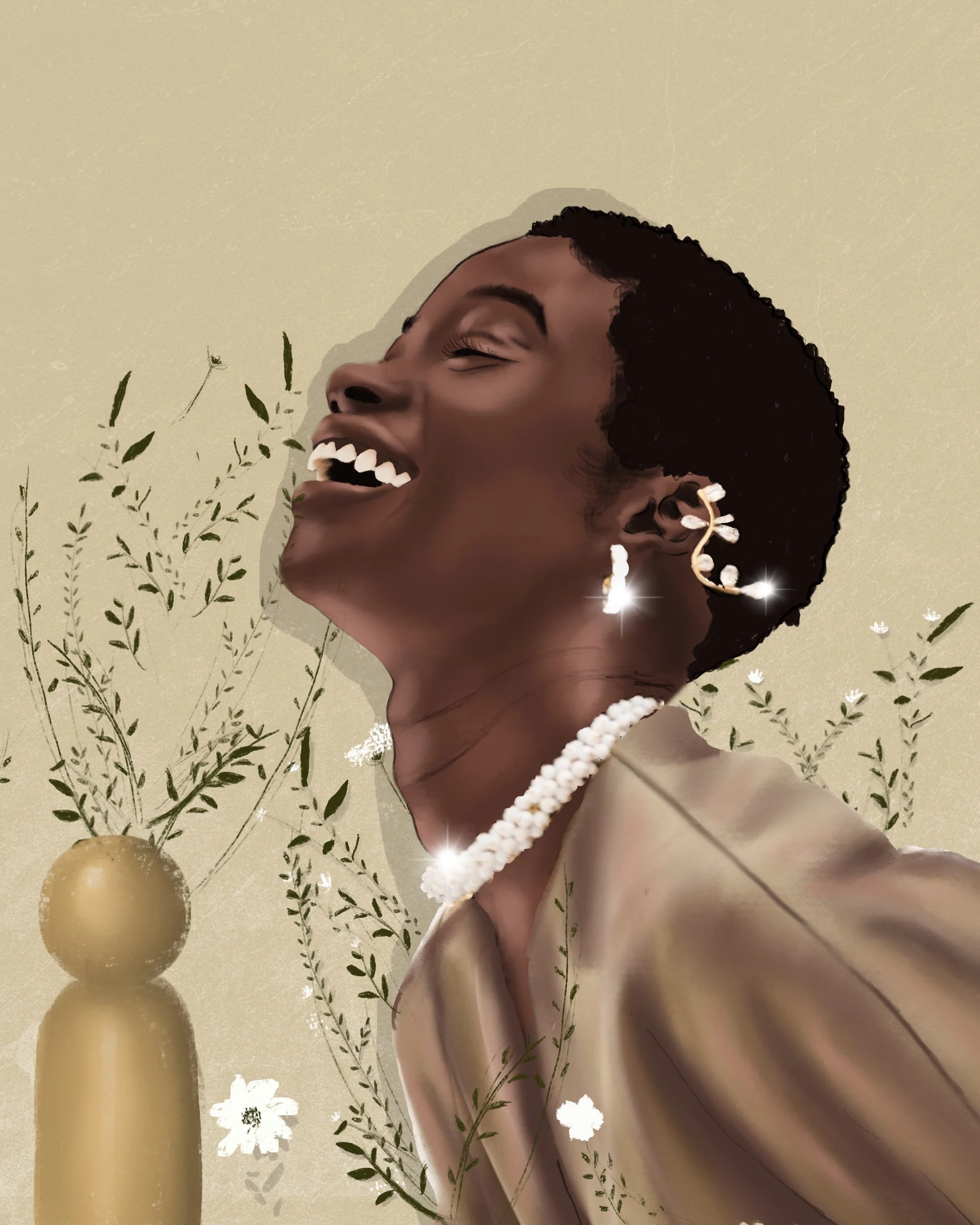
The Final Illustration for "JOY"
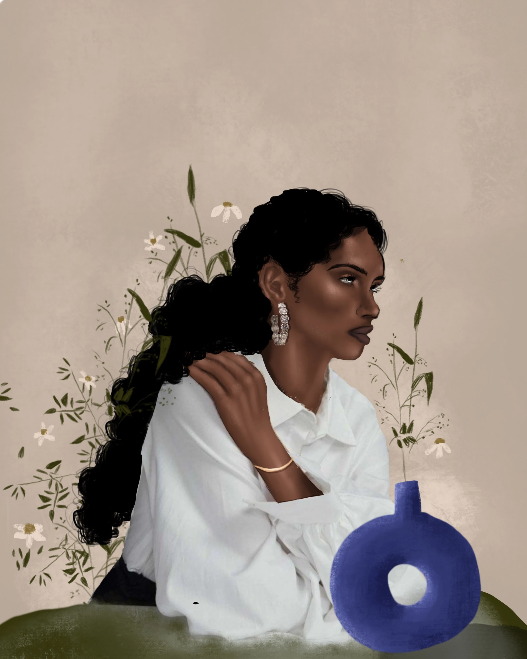
ELEGANCE 1 of 2
ELEGANCE 2 of 2
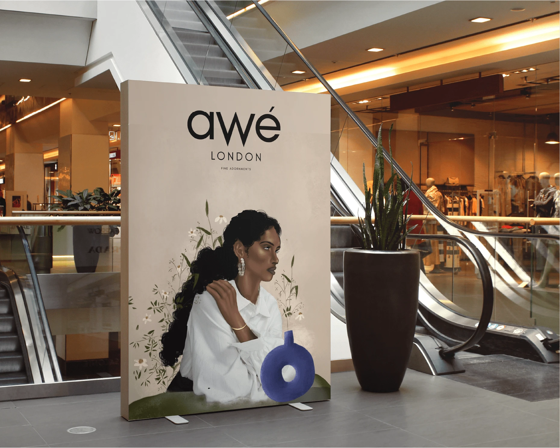
Illustration on Billboard in a Mall
Like this project
Posted Jan 15, 2022