LittleSprouts
The Client🍇
LittleSprouts is an educational centre for pre-school kids. Their mission is to create a nurturing environment that fosters connections children need, ahead of starting primary school.
The Brief🏏
The client was particularly clear that the need to stand out in the sea of pre-schools in Nigeria was a priority for them. The new identity should be warm and inviting not just for the kids but for the parents too.
The Solution🧑🎨
Research carried out over 3 weeks showed many Nigerian pre-schools did not create an experience around the brand. Once they had a logo and chose some colours, there was no real sense of direction as to how the brand should look, feel and be experienced by the customers (parents) and ultimately, the end-users (the children). After research, we explored the brand's creative strategy with the client, diving beyond demographics to understand the pains, needs, wants, desires and pain points of the various personas we created.
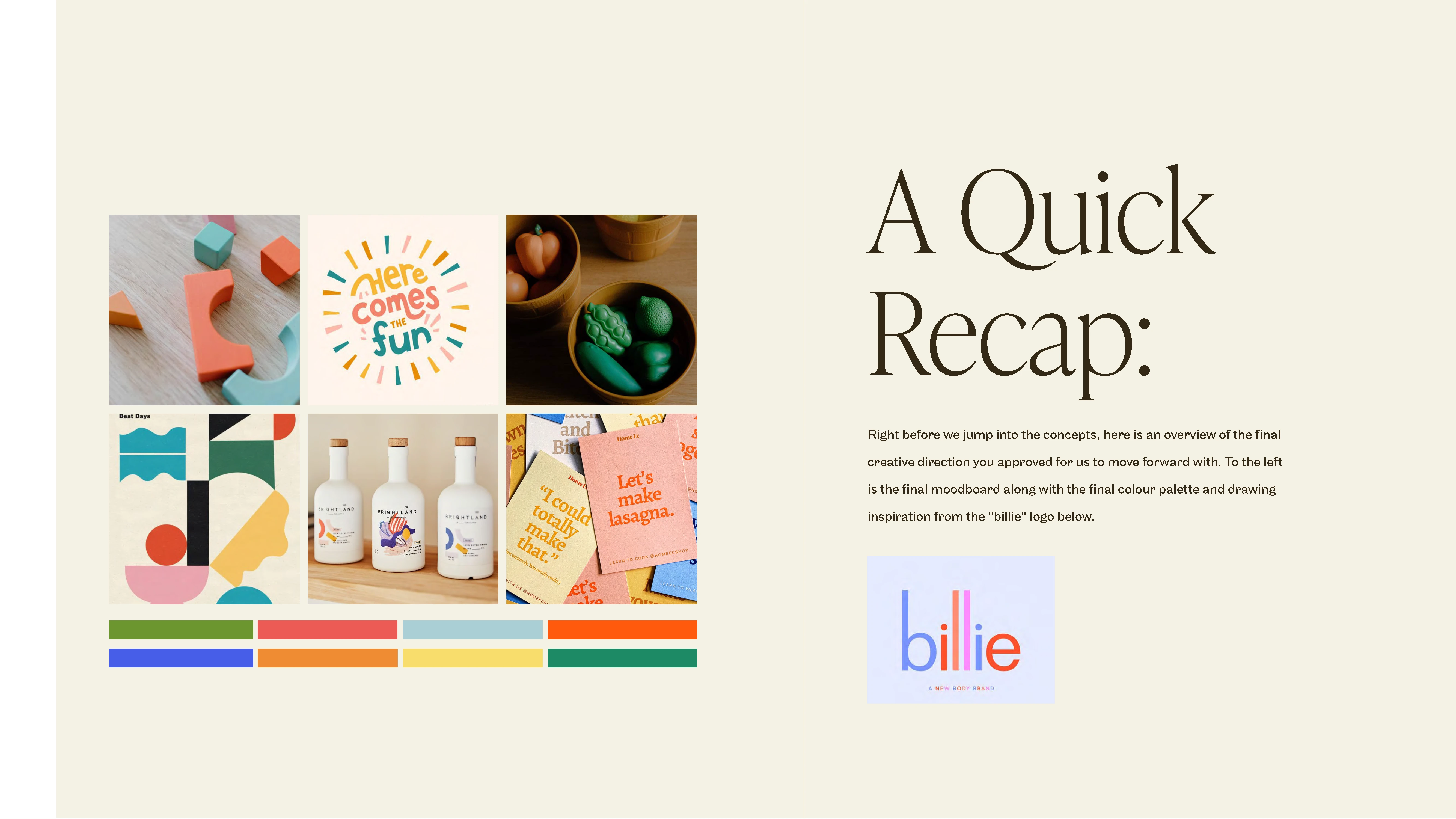
The final moodboard created for the project with the typography that was referenced.
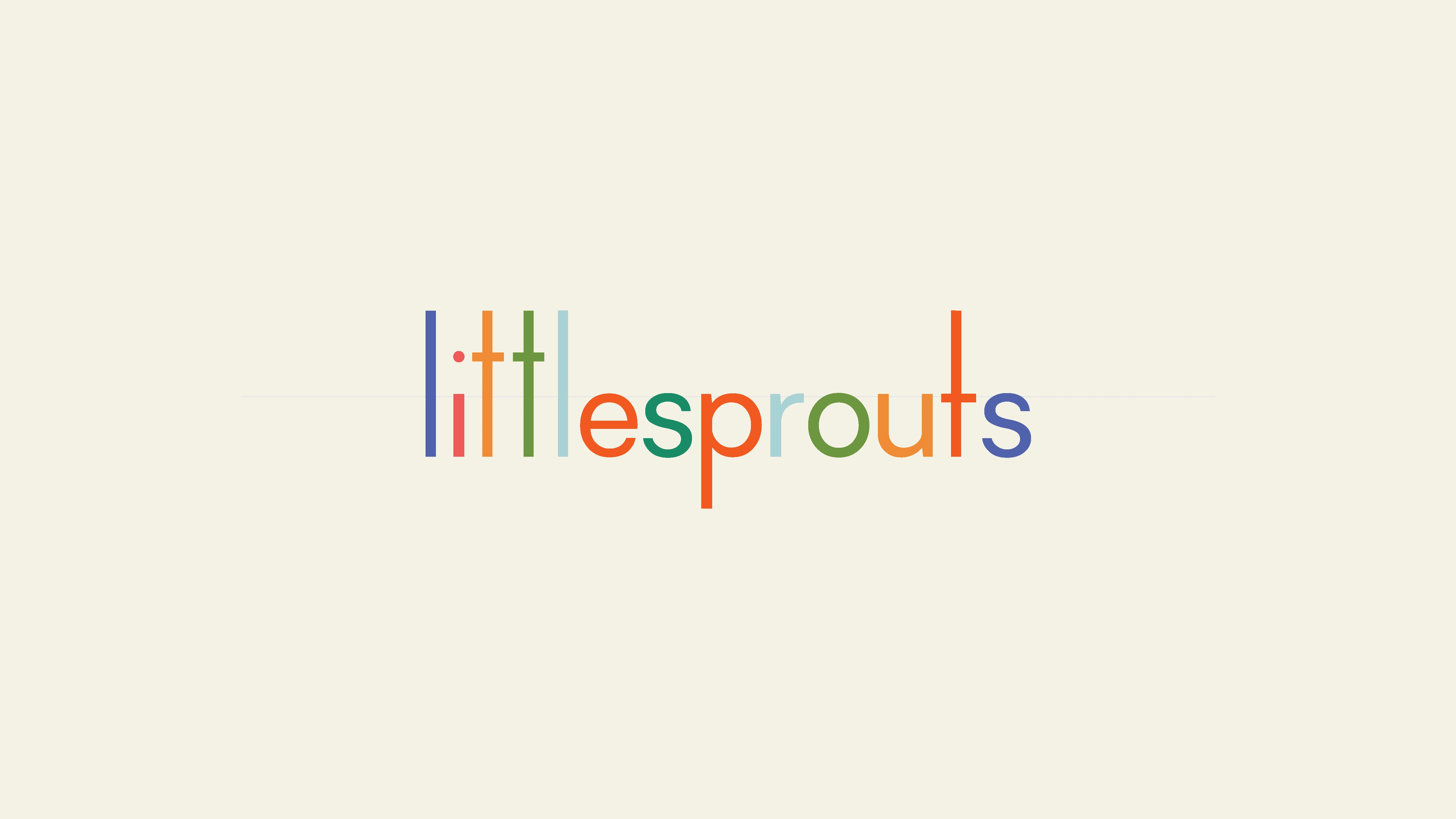
This first concept feels graceful, measured and signalled quality. To convey how the brand is inviting yet focused on quality education, we stayed away from the expected use of sprouts or leaves in the logo design.
Instead, we extended the letters in "little" to show the vision of growth you see for the children who pass through your care. We kept the "t" in "sprouts" level to signal to be down to earth and coming down to the level of the kids to create an environment that fosters their all-round development.
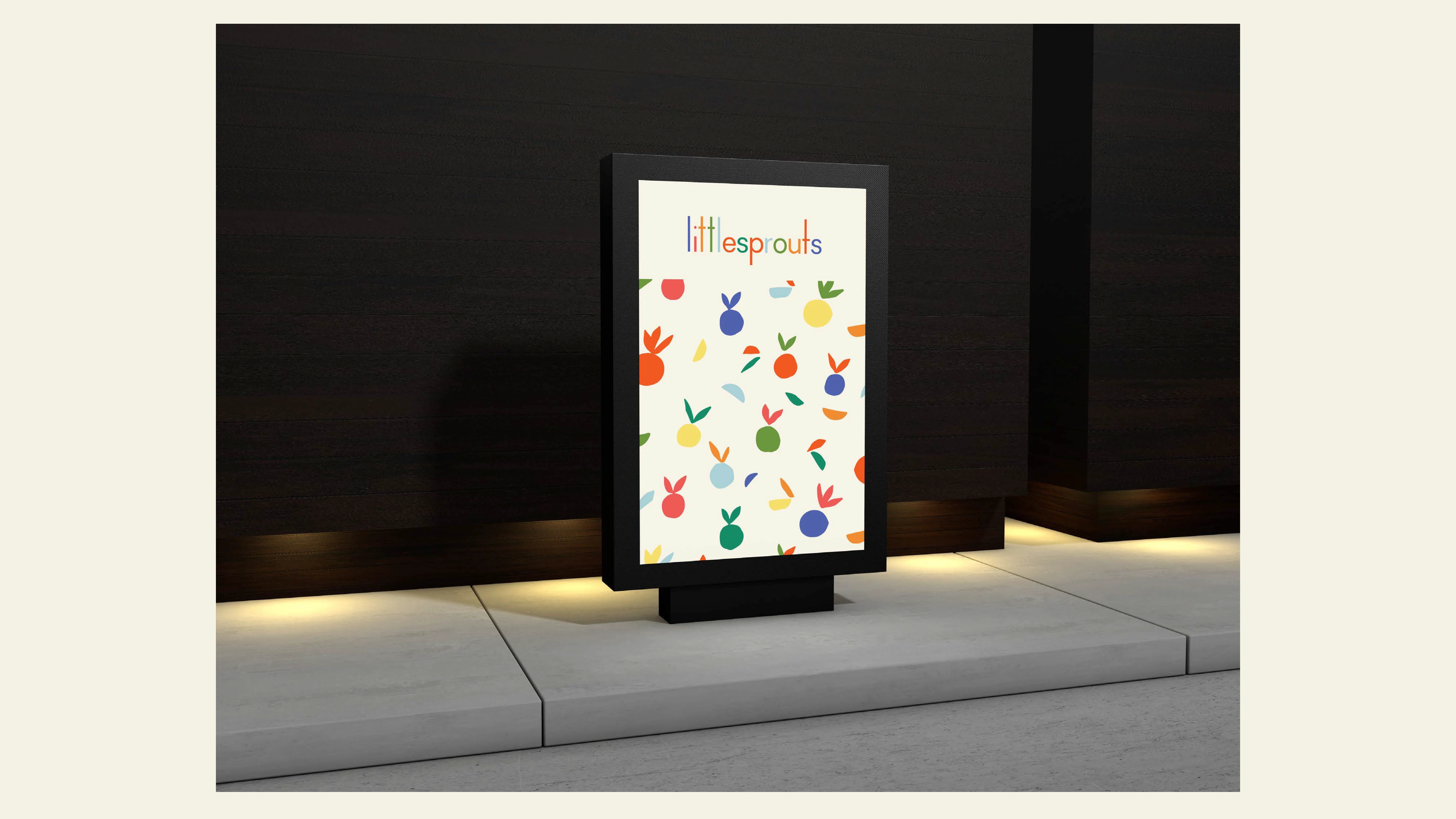
First concept in action.
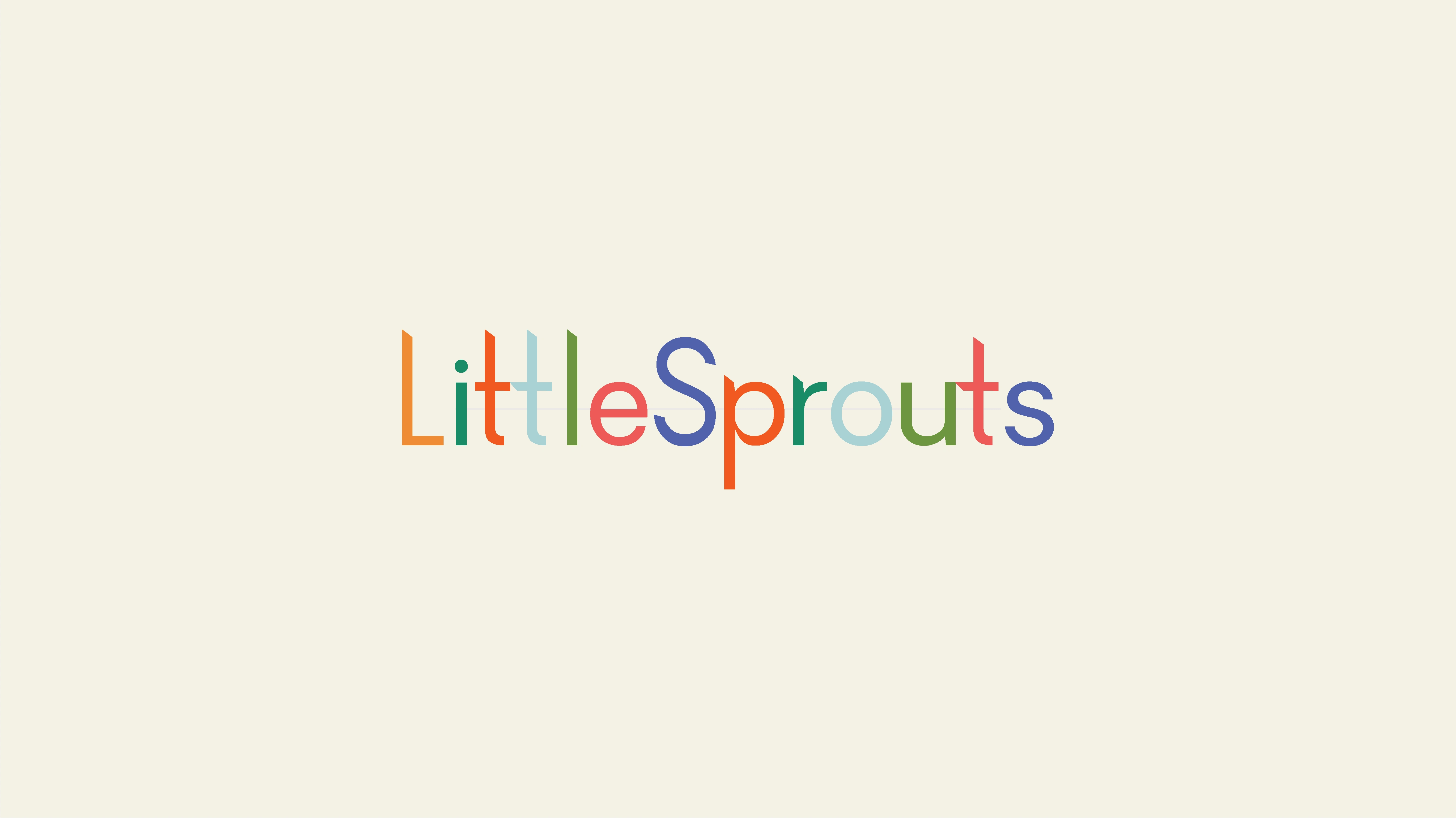
Second concept
This concept feels distinct and elevated. We focused on the brand values of exclusivity, warmth, growth. We customized every letter in the logo to allow for a truly custom experience for the brand. The sharp corners on the letters are a nod to sprouts pushing through the soil as they begin to grow. The elongated letters also signal carefully crafted attention to detail. To allude to the part of the vision that includes inter-generational relations, we subtly connected "tt" in "Little" and "ut" in "Sprouts".
The end result is a logo that feels well-organized, with elegant lines, creating a sense of support and trustworthiness in anyone viewing this concept.
The client identified strongly with the second concept. Once approved, we kicked off creating the assets in what will become the brag-worthy design system of this new brand.
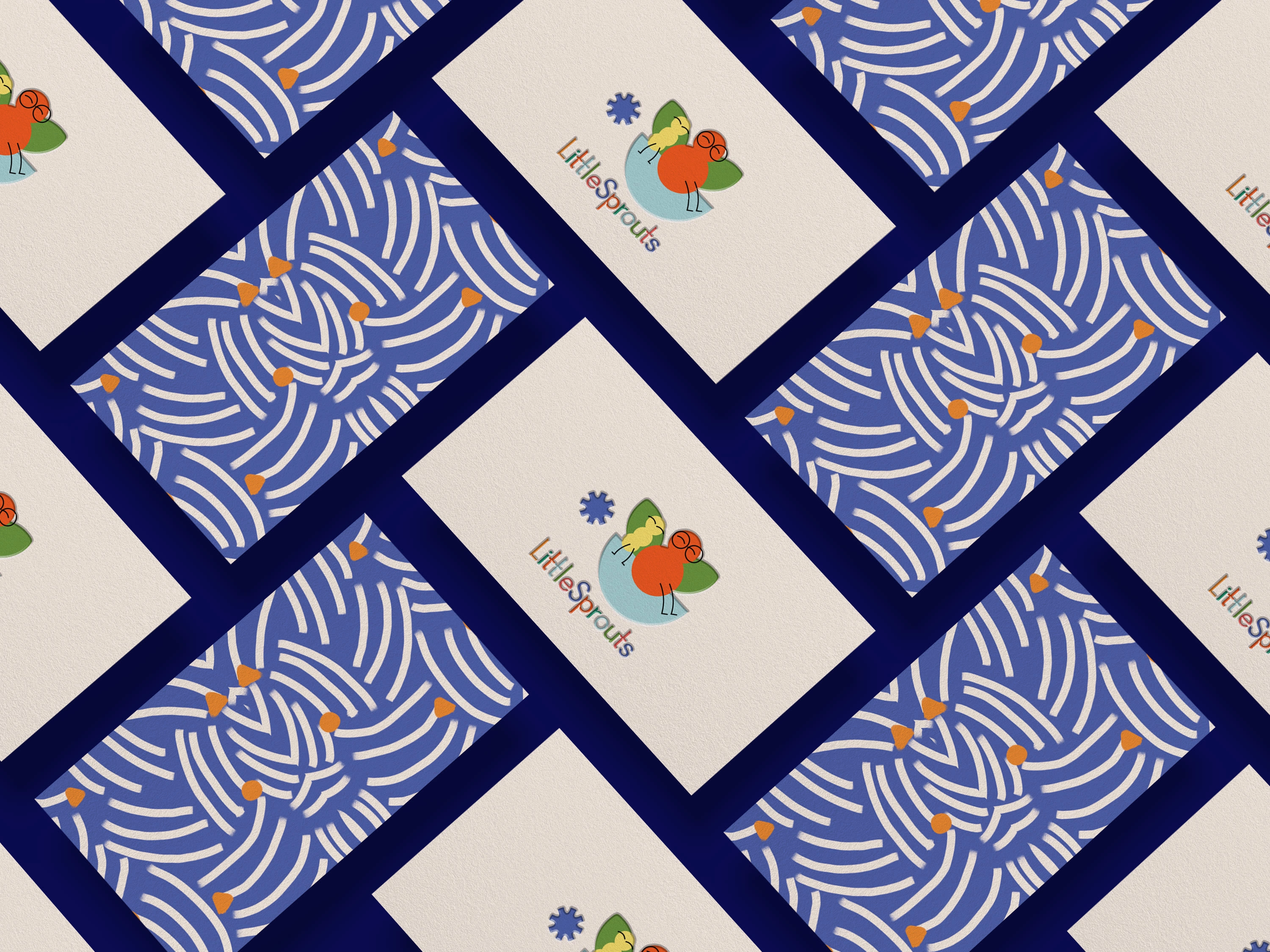
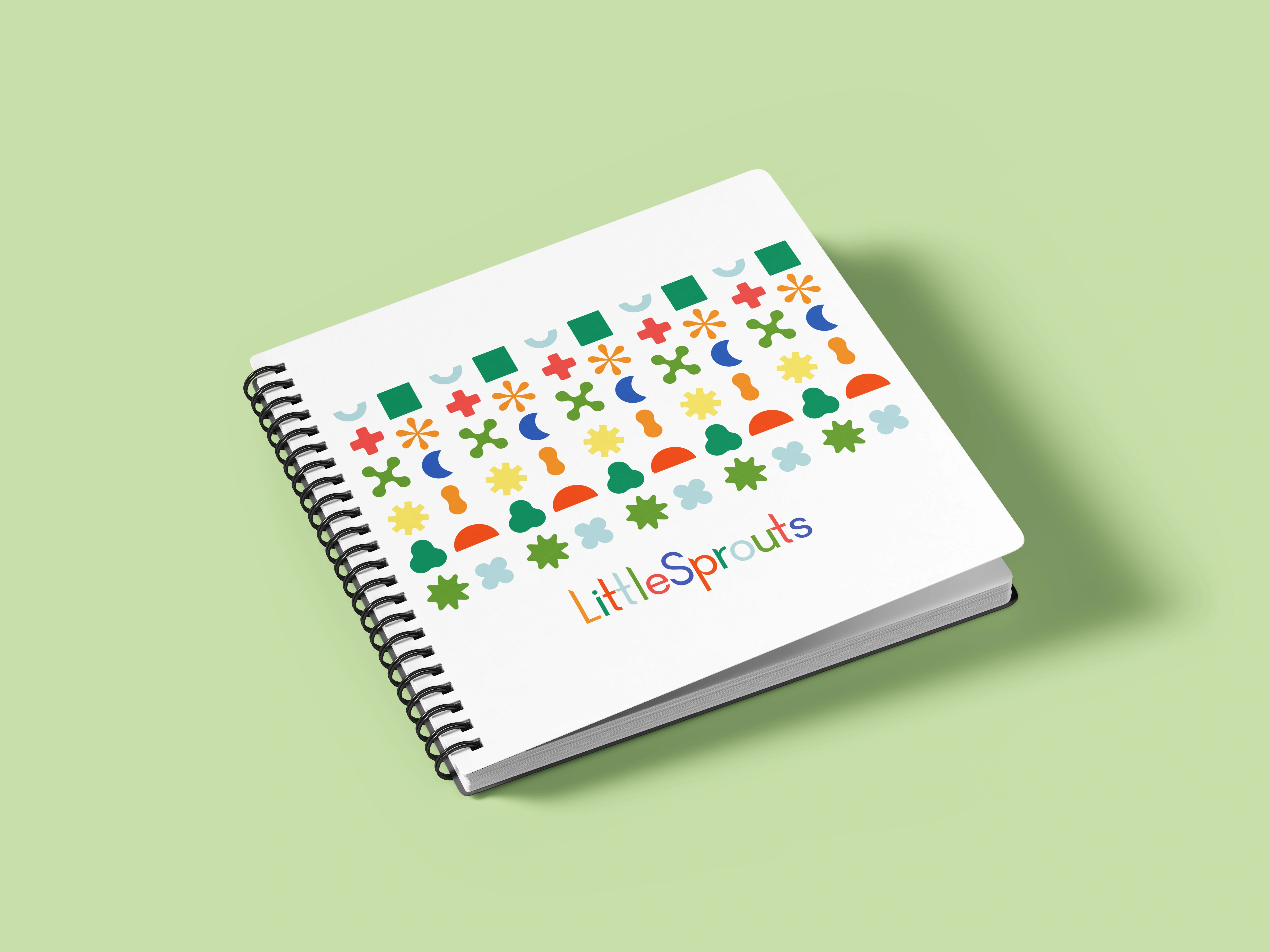
One of many brand patterns created as part of the visual design system
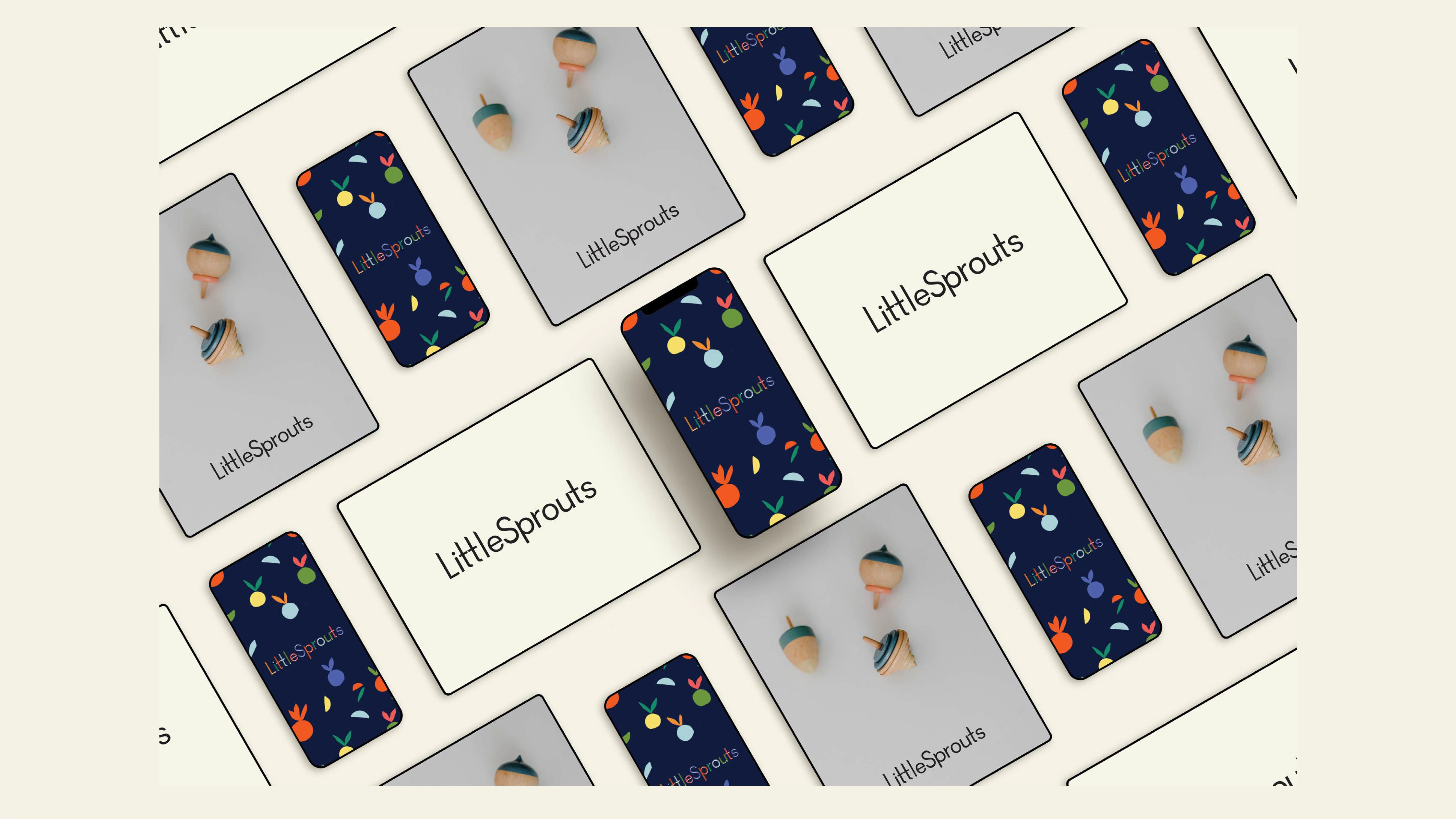
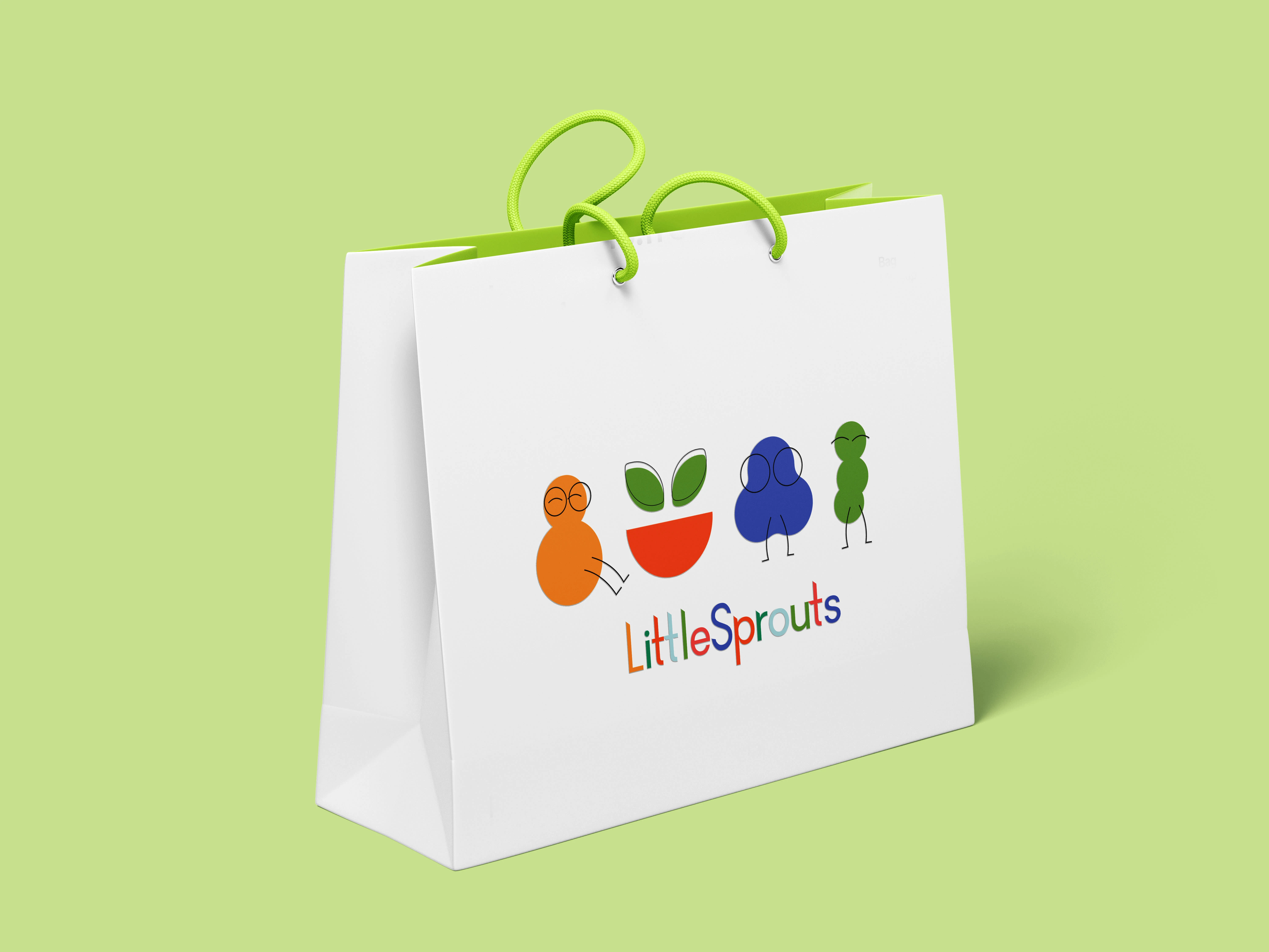
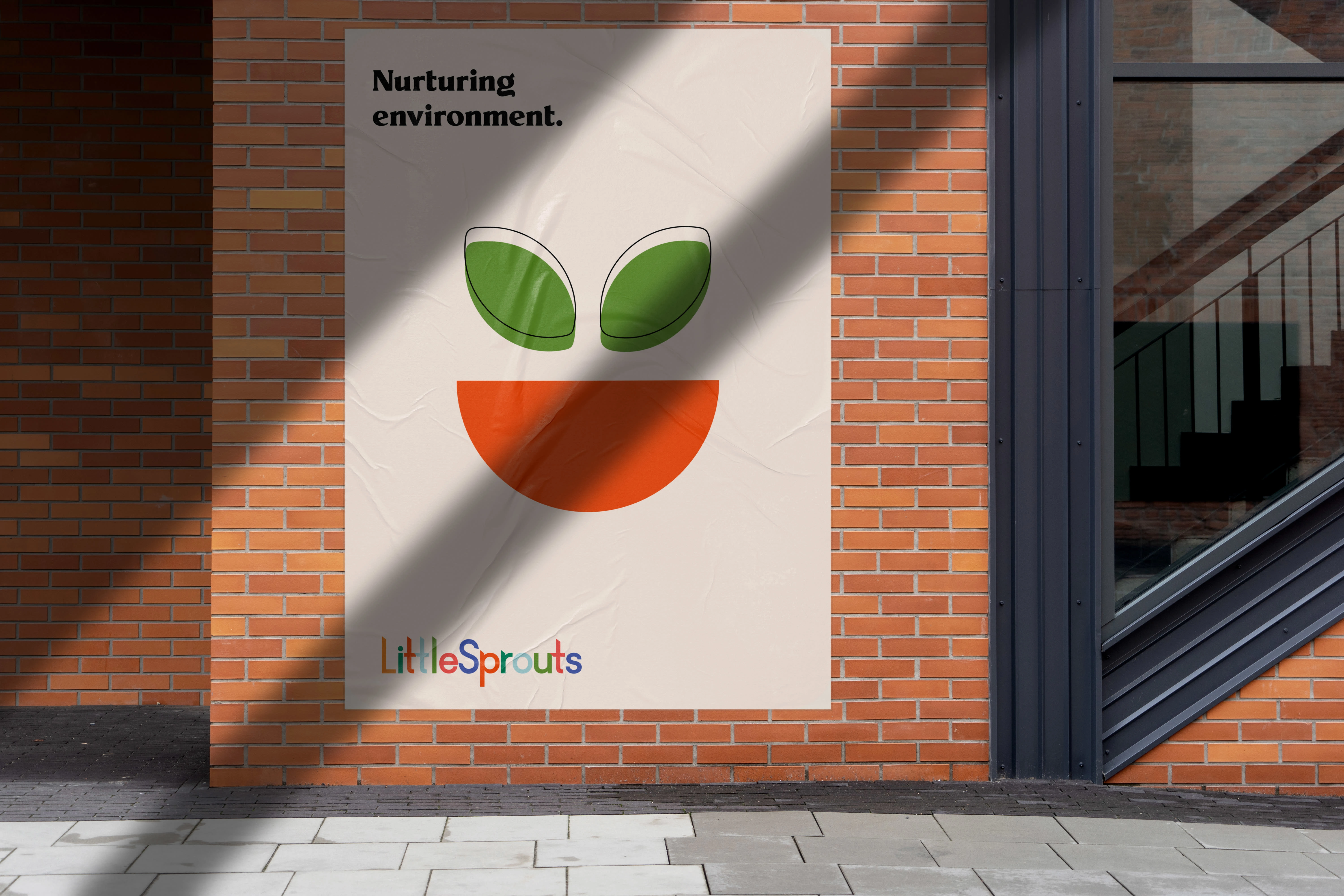
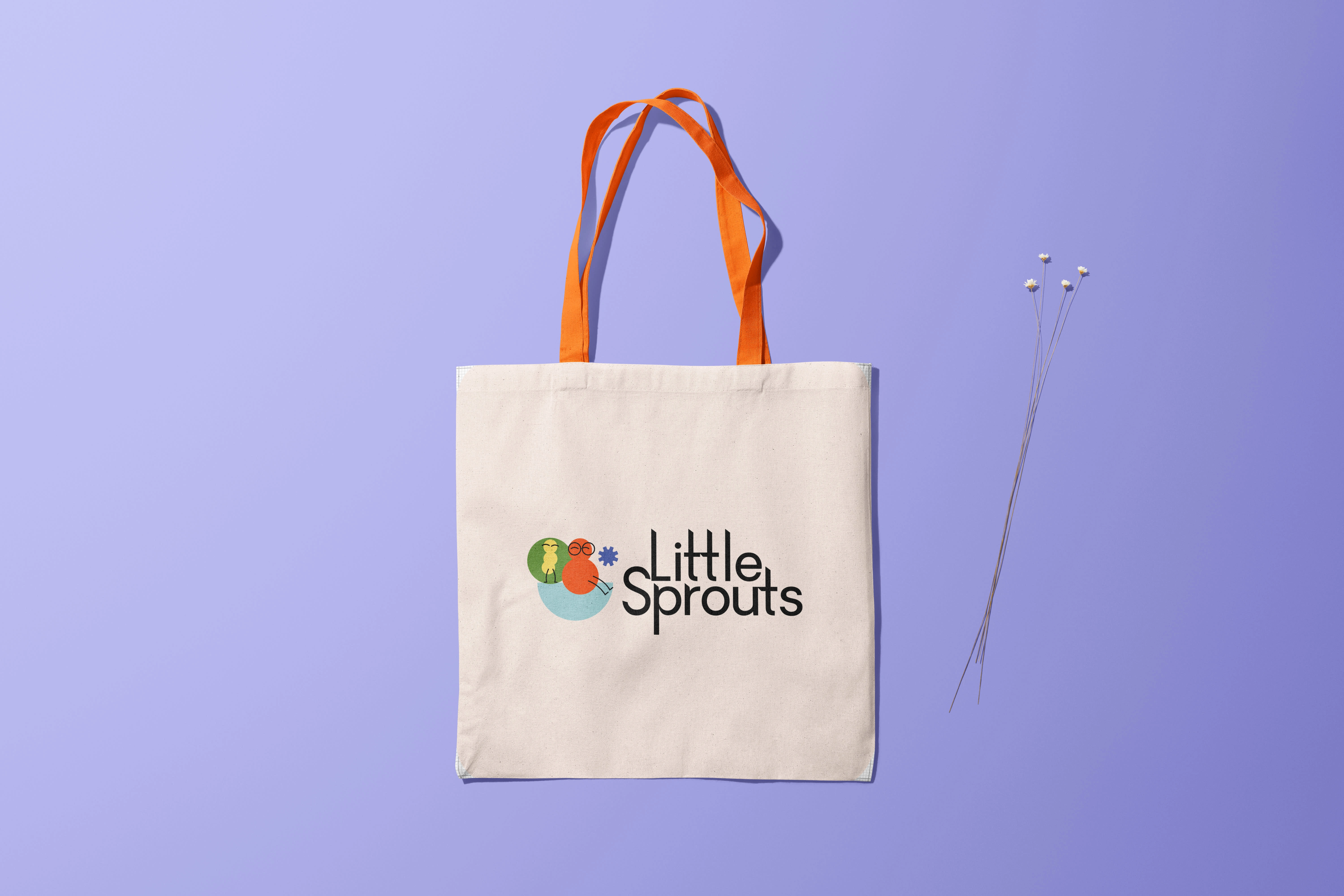
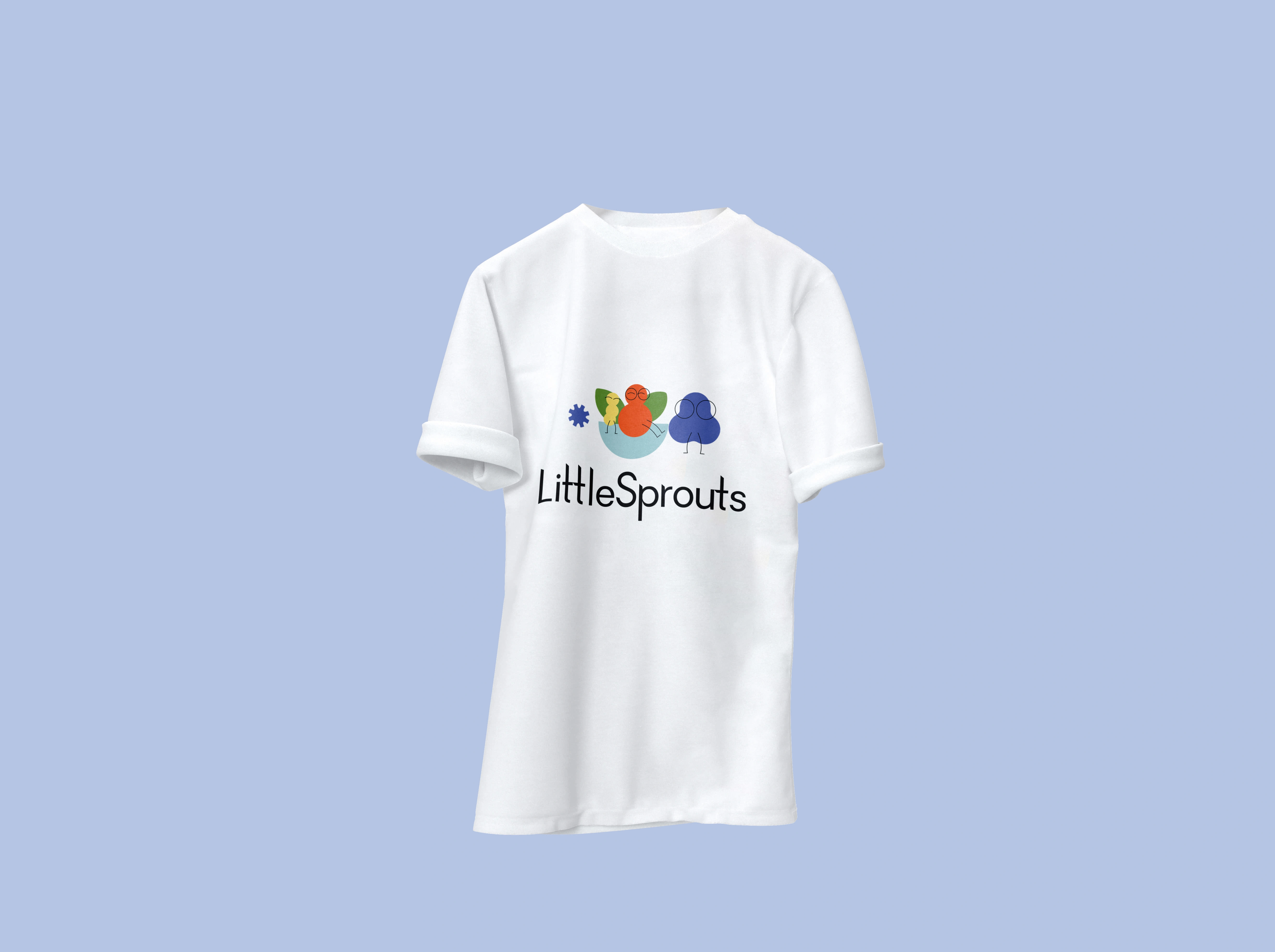
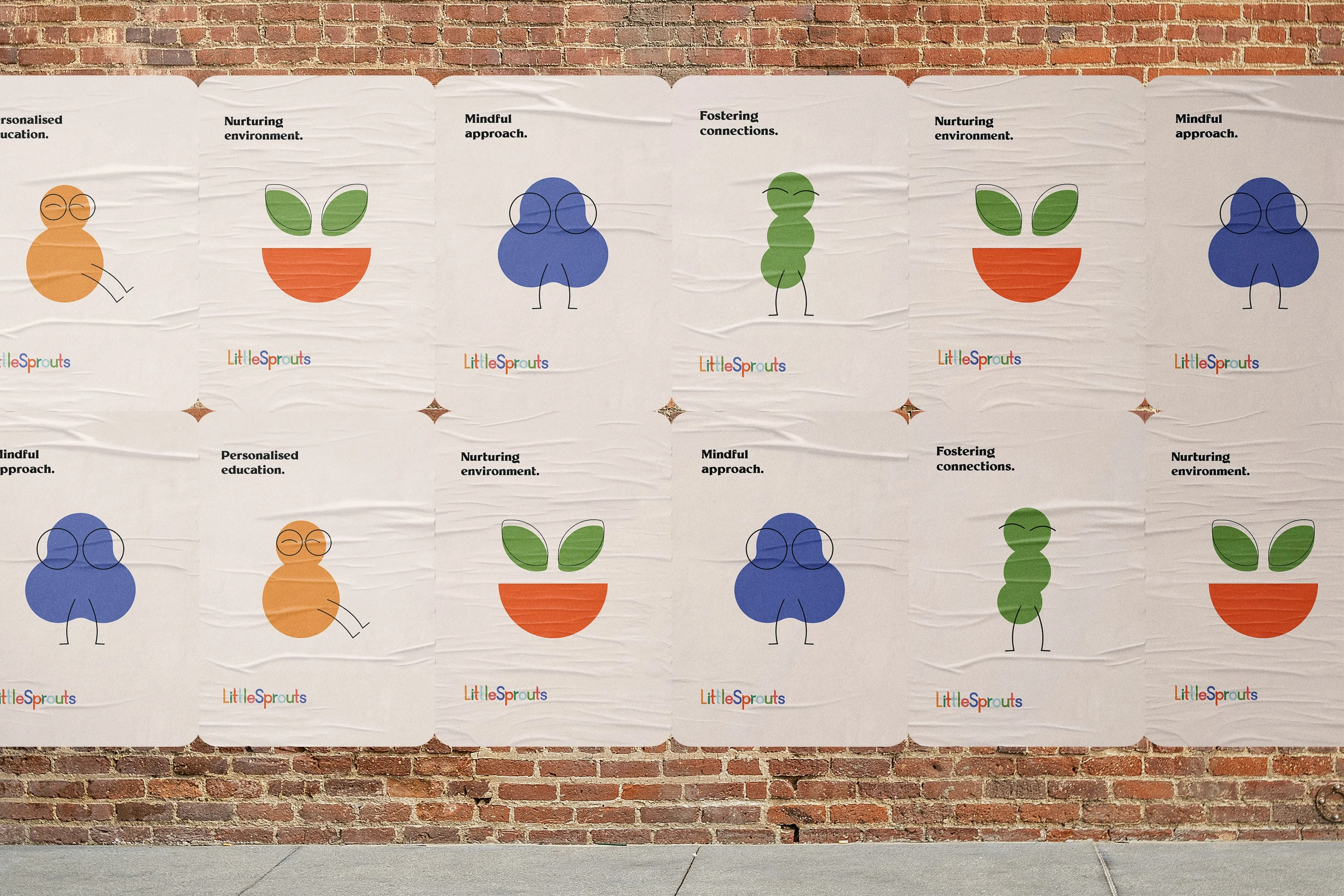
Joyful characters that illustrate the brand's values.
Like this project
Posted Jan 15, 2022


