Memories of Ventotene and S. Stefano – University Project

Chiara Pucci


Ricordi di Ventotene e S.Stefano (in English: Memories of Ventotene and S.Stefano) is the rebranding of the existing Marine Protected Area (MPA, for short) of Ventotene and Saint Stephen islands. The MPA aims to promote environmental education about the delicate balance of marine eco-systems, the relevance of our impact, and methods to safeguard the MPA's natural treasures to make people understand the impact they can have on the environment, in order to protect the environmental heritage for future generations and to ensure that they too know how to pass on this natural legacy.
Following is the summary of the contents of the Brand Research and Brand Identity books made to be hypothetically presented to the client.
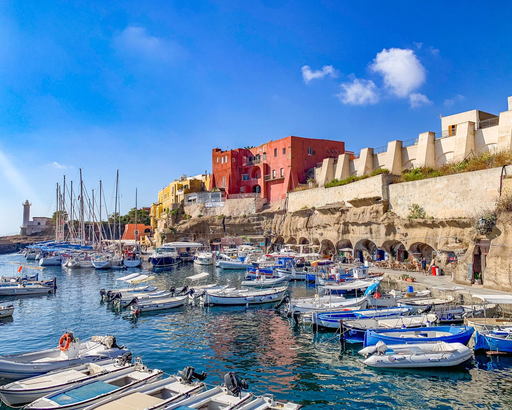
Porto Romano (Roman Harbour)
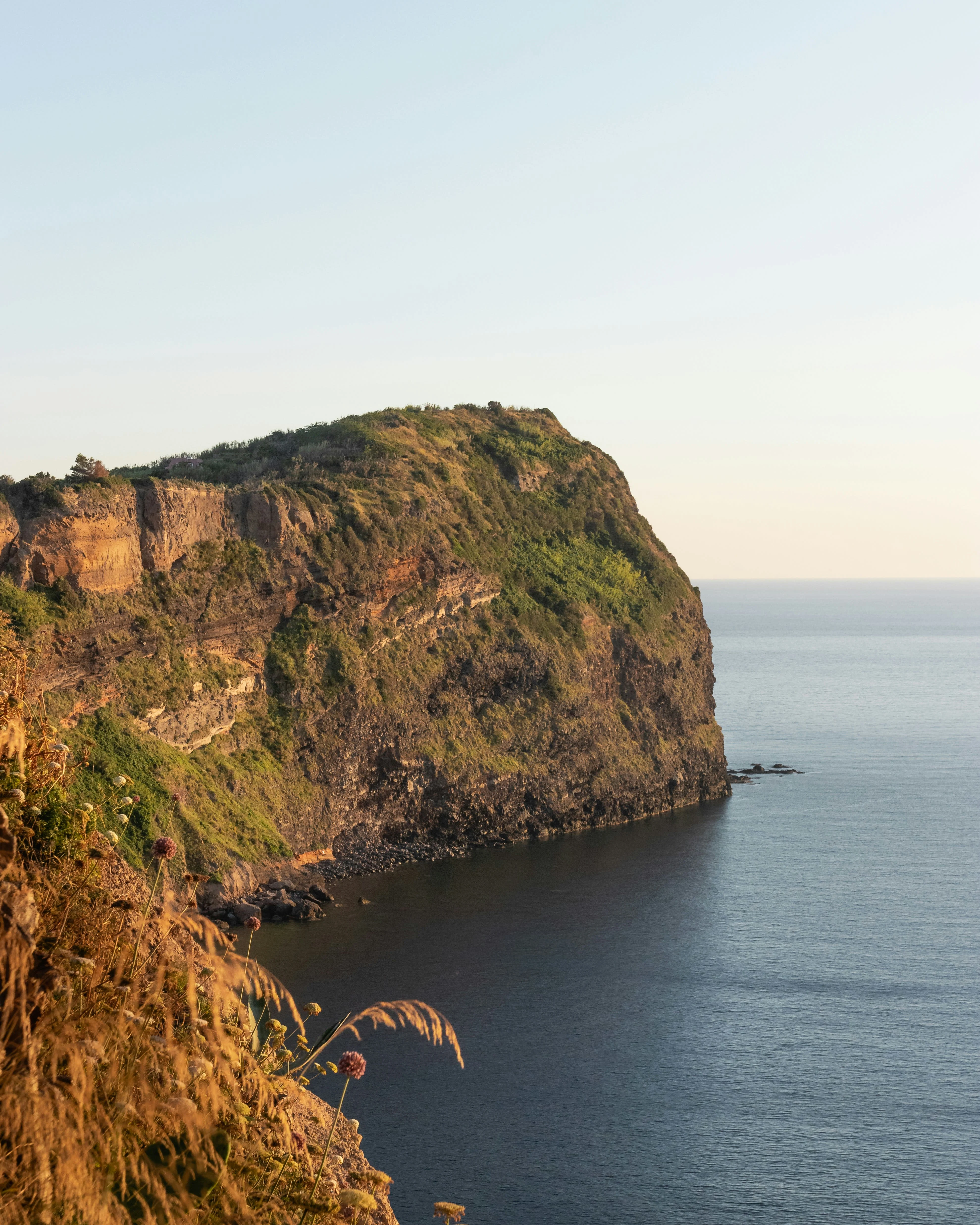
Punta Pascone (Pascone Point)
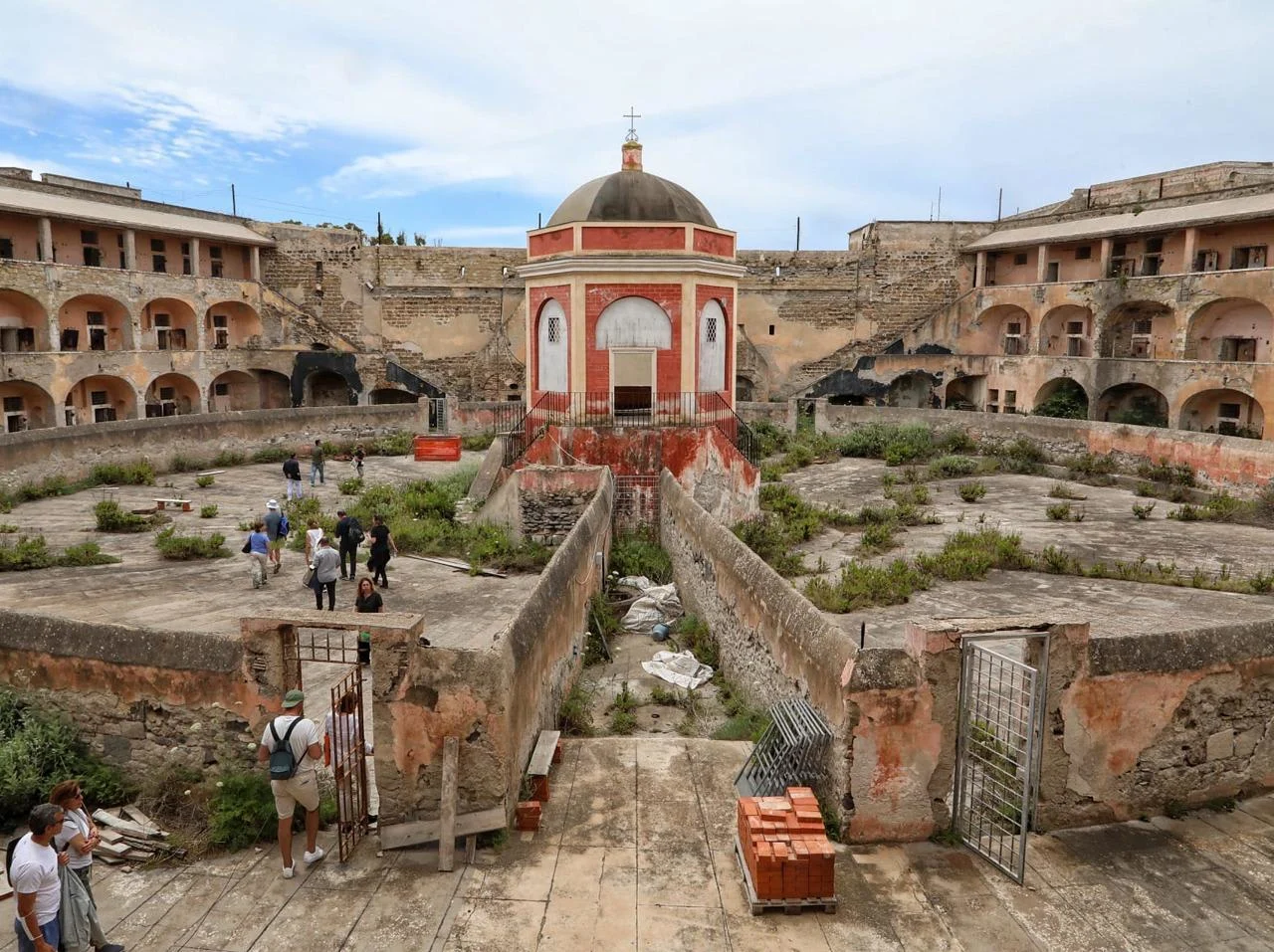
Santo Stefano island's ex-prison
The Current Brand
Ventotene and Santo Stefano are part of the Pontine Archipelago and were formed by the stratification of lava following eruptions of a volcano adjacent to them, which no longer exists today. The island was first discovered by humans in the late Neolithic period due to the presence of obsidian, a material used for making blades and tools.
The MPA is zoned, according to which there are more or less restrictions on what activities can be carried out.
Current brand mark and logotype
As can be seen, the current brand mark and logotype are very complex. This means that the brand mark alone is difficult to remember and recognise. In addition to this, a complex trade mark is more expensive than a graphically simple one when it is to be printed on objects or signs. If the graphic and verbal communications carried out by the Islands can be defined as a brand, it is incoherent, weak and overall looks like its elements do not belong together.
Current naming: Area Marina Protetta Riserva Naturale Statale Isole di Ventotene e Santo Stefano (Marine Protected Area Natural State Reserve Islands of Ventotene and Santo Stefano).
Current feedback from tourists: Summarising all the reviews, the MPA is ignored because of the few educational programmes and the scarcity of information about the area and of encouragement to preserve its legacy. It is seen, especially in summer, as a seaside tourist destination, not very well maintained and with few services.
Conclusions following the research: The new brand will mainly have to pass on knowledge so that the MPA's marine ecosystem can also be experienced by future generations; share the MPA's values; create more visitor traffic to finance the MPA's economic and human resources and improve its overall services and maintenance.
The Whole Brand
In the waters of Ventotene & S.Stefano MPA we find not only beauty, but also fragility. We must all understand the need to protect, preserve and safeguard the precious marine and terrestrial life that characterises this small paradise. The Ventotene and Santo Stefano MPA is more than just a destination: it is a call to action. Well-founded and organised educational programmes teach and coach people in the conservation of the MPA's heritage from a young age, while also encouraging them to explore the area. Hence, emotional involvement with visitors becomes crucial, together with whom the common goal is simple: to protect our memories of pristine waters to ensure a thriving marine ecosystem legacy for generations to come.
Starting from the objectives of MPAs in general as well as this specific one, but also given the goals I provided to be achieved through rebranding (not reported in this post), it then becomes intuitive what the personality traits of the Ventotene & Santo Stefano MPA should be:

Personality traits from Brainstorming
Exploiting Jung's Archetypes Model, and focusing on Explorer, Sage, Caregiver, we can define a whole new MPA personality:
Attitude-Behaviour: authentic, passionate, curious, protective, adventurous, values knowledge and conservation.
Goals: Experiencing the world, expanding one's own knowledge and that of others, protecting nature.
Strategy for achieving goals: surprising and making people experience new things in a new way, conveying empathy and inspiring security and confidence, by involving them in conservation.
Recommended colours: natural tones of blue and green, with shades of yellow, so as to recall marine elements caressed by the sun.
Values
Exploration and Curiosity: encourage exploration of new places, activities and knowledge, and promote curiosity about the MPA's natural legacy.
Knowledge: through reliable sources, one can learn about everything; the truth is objective and scientific.
Protection and Conservation: the MPA's heritage is special and important to the ecosystem, so it must be protected through the right practices for environmentally sustainable conservation.
Education: Not all visitors are aware of the conservation practices or the various species of flora and fauna that inhabit these islands. Through the right educational programmes for the youngest, and information programmes for the less young, everyone can contribute to maintaining knowledge of the MPA and preserving its legacy.
Voice
Once the personality and values of the brand have been defined, one can turn to voice it, i.e. the way the brand addresses visitors-costumers.
Informative and Reliable: the voice must provide clear explanations and insights, and show a deep understanding and knowledge on the subject matter.
Concise, Clear and Accessible: The voice must provide definitions and explanations in a simple manner and must use terms that everyone can understand, regardless of their level of knowledge on the subject.
Curious, Engaging and Lively: At the same time, the voice must encourage curiosity, especially of the youngest, participation in heritage conservation in the area and its discovery, and must be lively.
Friendly and Respectful: The voice must be welcoming, friendly and helpful towards all visitors, regardless of their level of knowledge, expertise or experience, and regardless of their appearance and origin.
Naming & Pay-off
Through the 5 Whys method, we derived the name of the MPA's new brand. We thus derived:
Ricordi di Ventotene e S.Stefano (Memories of Ventotene and S.Stefano)
This creates an emotional bond with the visitor and responds to the empathic character outlined above.
The MPA, however, cannot only make memories, it must also protect its own legacy and educate others to do the same. So we get more keywords: PROTECT LEGACY. Finally, to encourage tourists visit the MPA, its language must be more international. So if on the one hand the naming helps tourists understand the Italian character of the MPA, on the other hand, at least for the payoff, the language must be English. The pay-off is therefore:
Protect our legacy, protect our memories
The MPA's Guardian and Guide
In order for the MPA to be truly engaging, especially with children and teenagers, I have introduced a character that incorporates the personality of the brand, and indeed is a personification of it, so it will incorporate its personality traits. The character was created to be used specifically for educational programmes for young visitors, but can also be a guide within the various signposts that will be placed on the islands. He has sea-green skin, long, flowing hair like kelp algae and sparkling blue eyes that reveal the secrets of the abyss when looked at intently. He carries a trident made of salvaged fishing nets, and wears shorts made of sand. Although he has no wrinkles and has a youthful appearance, he is over 500 years old.
Vento, the MPA's guardian and guide
Name: Vento (in English: Wind, but also part of the name Ventotene)
Vento's Mission:
To conduct educational programmes and host interactive art and science workshops for children and teenagers, teaching them about the wonders of the sea and the importance of conservation, respect and preservation of the environment;
Serve as a symbol of eco-conservation, constantly reminding them of their commitment to respect for the MPA's heritage, encouraging tourists to behave responsibly and follow sustainable practices;
Share your passion, knowledge and love for the MPA so that you can inspire visitors to become guardians of Ventotene and Santo Stefano's legacy.
Vento's key quote: 'Exploring the marine world is like embarking on an endless voyage of discovery. Let us protect this legacy so that future generations can share this wonder. Let us protect our memories'.
Brand's Mission and Vision
Mission: Promoting environmental education about the delicate balance of marine ecosystems, the importance of our impact and methods to safeguard the riches of the MPA.
Vision: To make people understand the impact they can have on the environment, so that they can safeguard the environmental legacy for future generations, and ensure that they too know how to pass on this natural heritage.
Palette
In line with the brand identity of Ricordi di Ventotene e Santo Stefano, the colours are lively while at the same time empathetic, friendly, and suitable for all genders and ages. They recall the colours of the natural elements of the MPA: the sea, the seaweeds, the sand.

Ricordi di Ventotene e S.Stefano colour palette
Primary colour shades are to be used in graphics or situations where no one element is to be emphasised over another. Auxiliary colours are used when the primary, secondary and tertiary colours are exhausted, or when the situation calls for greyscale colouring.
Blue, although here more aqua green, represents reliability, while it is reminiscent of the depths of the sea, thus triggering an inner reflection in the observer.
Green has been scientifically proven to relax people, because of the association we humans make with nature. Green is also associated with health, freshness and quality.
Yellow is associated with energy, lightness, brightness, warmth and happiness.
The Brand Logo
Logomark: The name Ricordi di Ventotene e S.Stefano, while effective and emotive, is very long. To represent the brand on occasions where the space is limited, there is therefore a need for a logomark.
Memories are nothing more than mental photographs, so to create the pictogram I started from the gesture we all make when we want to pretend to take a picture, a mental one.
It is also important that the logomark gives a sense of authenticity, and craftmanship. That is why I decided to make it by hand in Photoshop.
(A friend of mine posing for the) Logomark concept
Logotype: The logotype must be of the same consistency as the logomark, thus authentic, per the brand identity. Therefore, it too was created in Photoshop as a calligraphic script.
Logotype
Lockup: The following is the positive (first) and negative (last) version of the lockup (logomark+logotype).

Ricordi di Ventotene e S.Stefano lockup
Patterns and icons were also produced, but are not displayed here. Mockups were also produced for banners (for summer educational programmes), brochures, signposts and a new website.
Like this project
Posted Mar 1, 2024
RICORDI DI VENTOTENE E S.STEFANO – Here I summarise my workflow, from research to final products, in order to create a strong, coherent and empathic brand.