FLIPP – University Project
Chiara Pucci
FLIPP is a fictional Book Publishing House, with affiliated bookstores, that focuses on the distribution of books rooted in Western and Eastern global culture, aiming to reintroduce them in a different way and have them appreciated by new generations, while also by their parents.
Keywords from Brainstorming used for Brand Concept
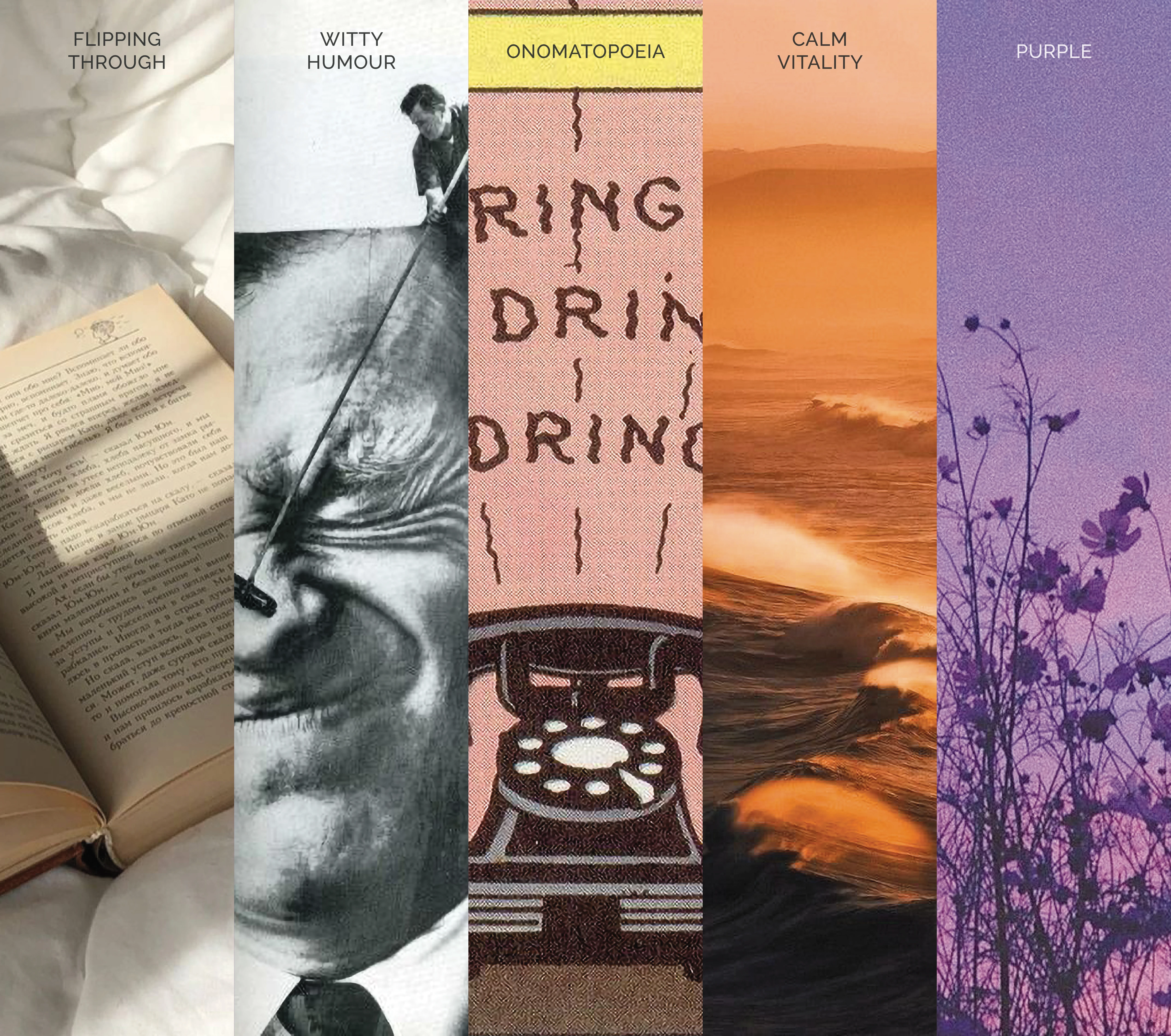
From the keywords, the foundational concepts that would later make the Brand were:
Special Experience: the customer would be flipping through pages that would have a specific tactile texture, for they would remember FLIPP's books better than others;
Witty Humour: FLIPP was to come across as knowledgeable but also kind and witty, to make young people understand that books are fun and full of alternative worlds;
Onomatopoeia: the sounds one can hear inside of a bookstore (the flipping of the pages of a book, the rustling of a book being put back on the shelf, and so on) were to be included in the identity of the publishing house, hence FLIPP was the perfect name;
Calm vitality: like plants, small waves and mountains, FLIPP is calmly lively, slowly and quietly changing the world, making its clients go on mental adventures;
Purple: the main colour for the brand has to be purple, the colour of ambition, creativity and magic.
The Whole Brand
VISION: To educate and shape future generations of adults as capable of inspiring others.
MISSION: To accompany the new generations in their growth, shaping them through books.
VALUES: Respect and tolerance, Adventure and Curiosity, Imagination and Originality.
PERSONALITY: Fun, Calmly Lively, Reliable, Ambitious
VOICE: Intuitive, Optimistic, Considerate, Colloquial
TAGLINE: For the inspiring adults of tomorrow
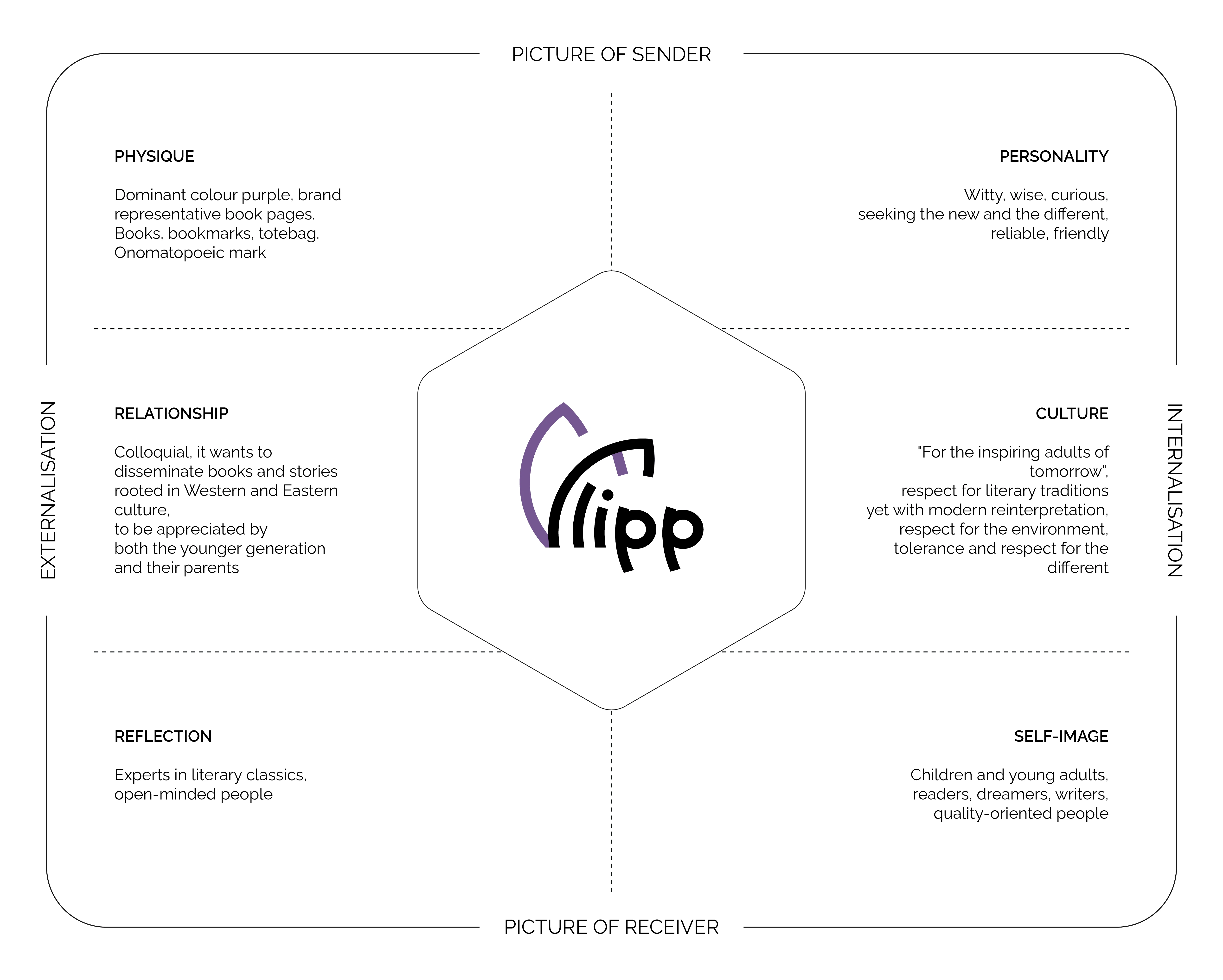
FLIPP Brand Identity in a Nutshell: Kapferer's Prism
The logomark, included in the wordmark, resembles some pages of a book being quickly flipped through. The bar of the F in FLIPP coincides with a bookmark.
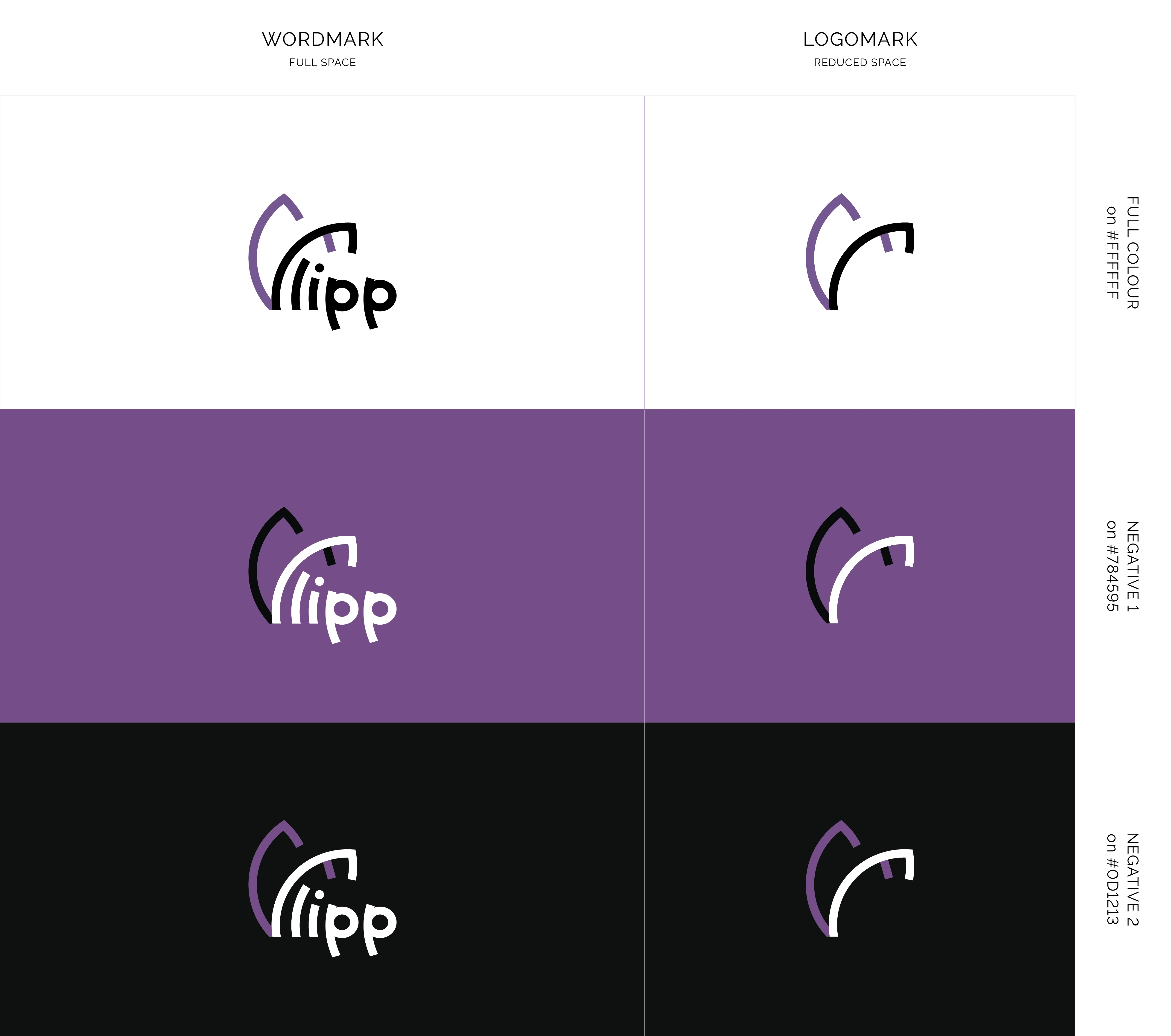
Logo Versions, Uses and Colorations
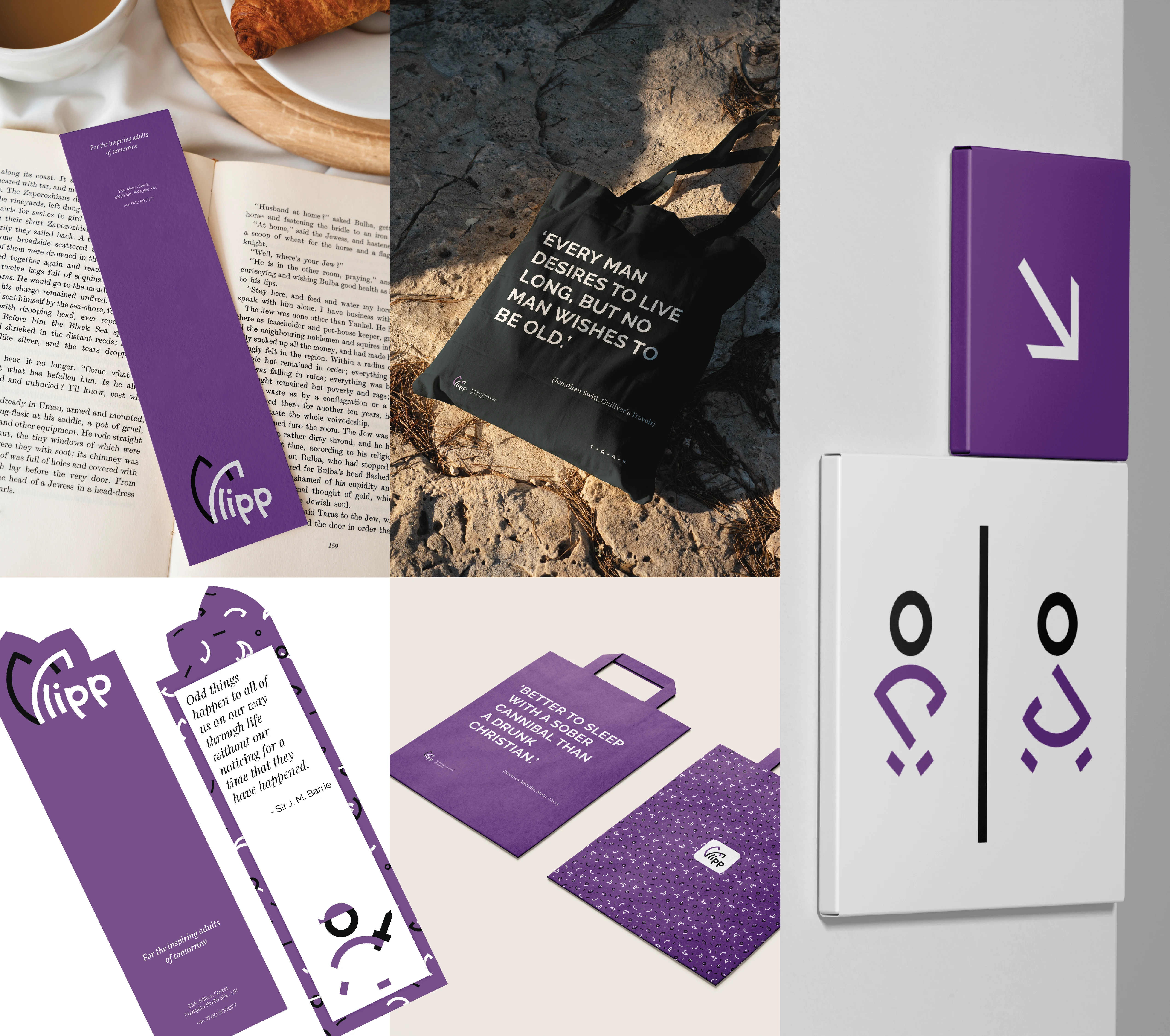
Collaterals
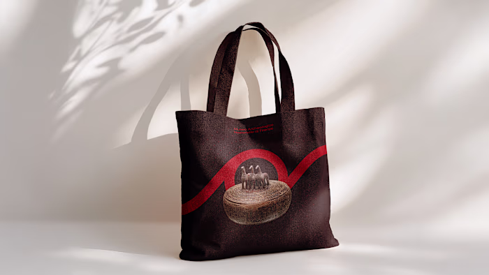
Included in the collaterals were the icons for both in-store and online shopping, but also patterns to be used for bookmarks, shopping bags or tote bags, for example.
Both were created using the same elements which the logo is made of.
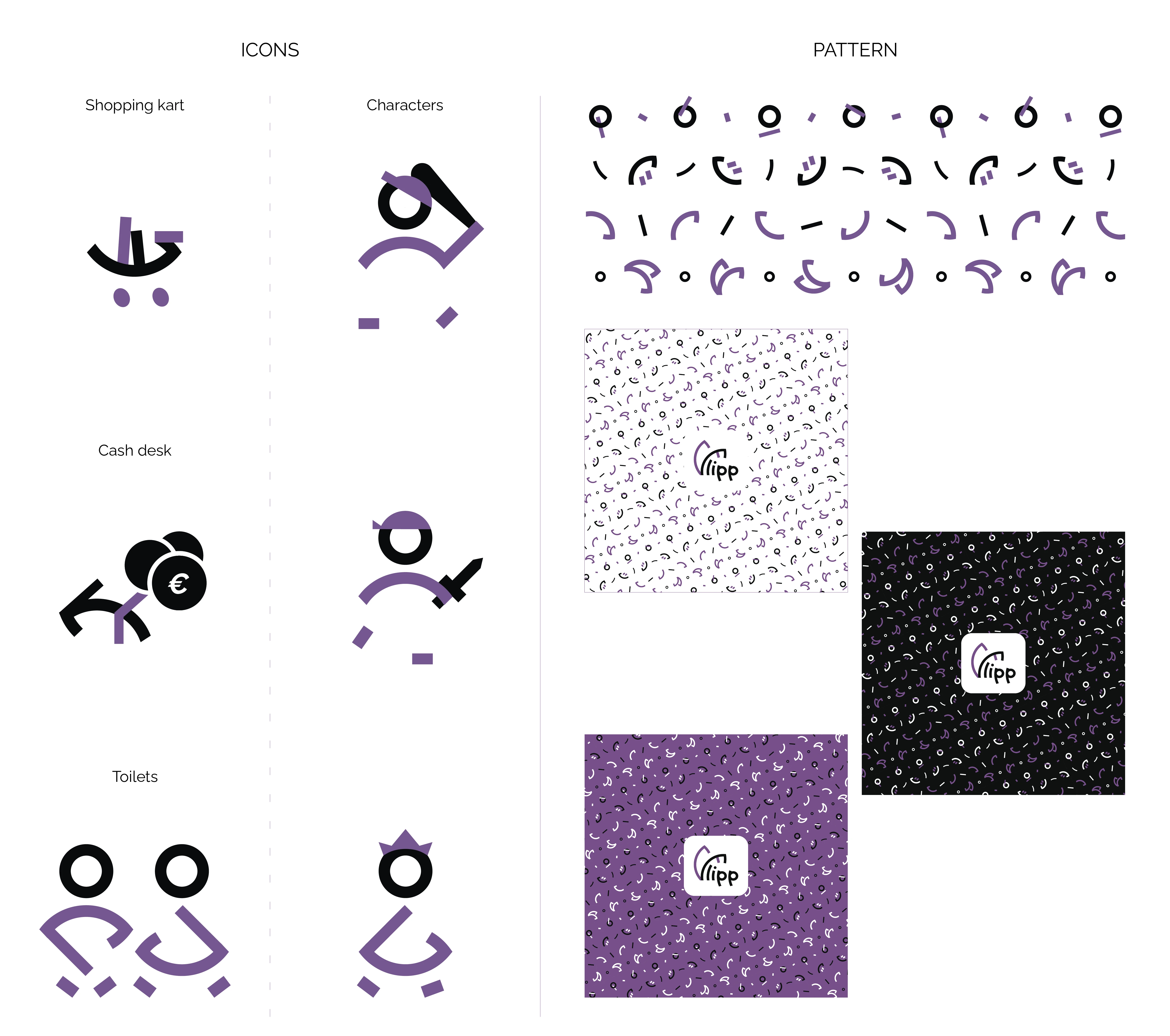
Icons and Patterns

Advertising Mockup
General Mockups
Book Series – TRAK
TRAK is a publishing series, a collection of classics from the adventure genre. What they have in common is the fact that they have been translated into films over the years. The name of the book series follows the same onomatopoeic principle as the publishing house's name.
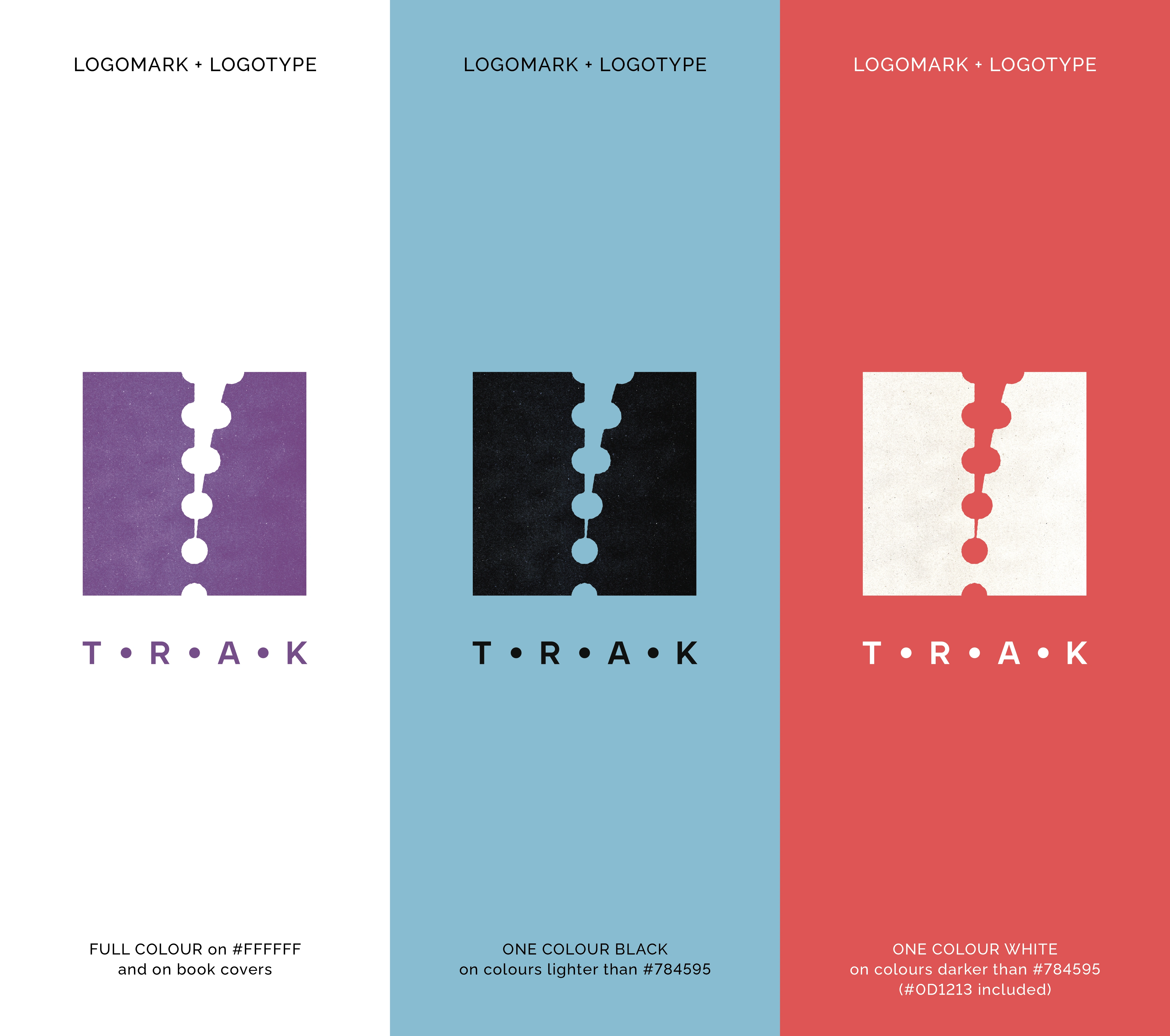
The book covers were inspired by movie tickets sold in the 1950s and 1960s in the United States. "TRAK" is the sound these tickets made when ripped to register an admission to the movie theatre.
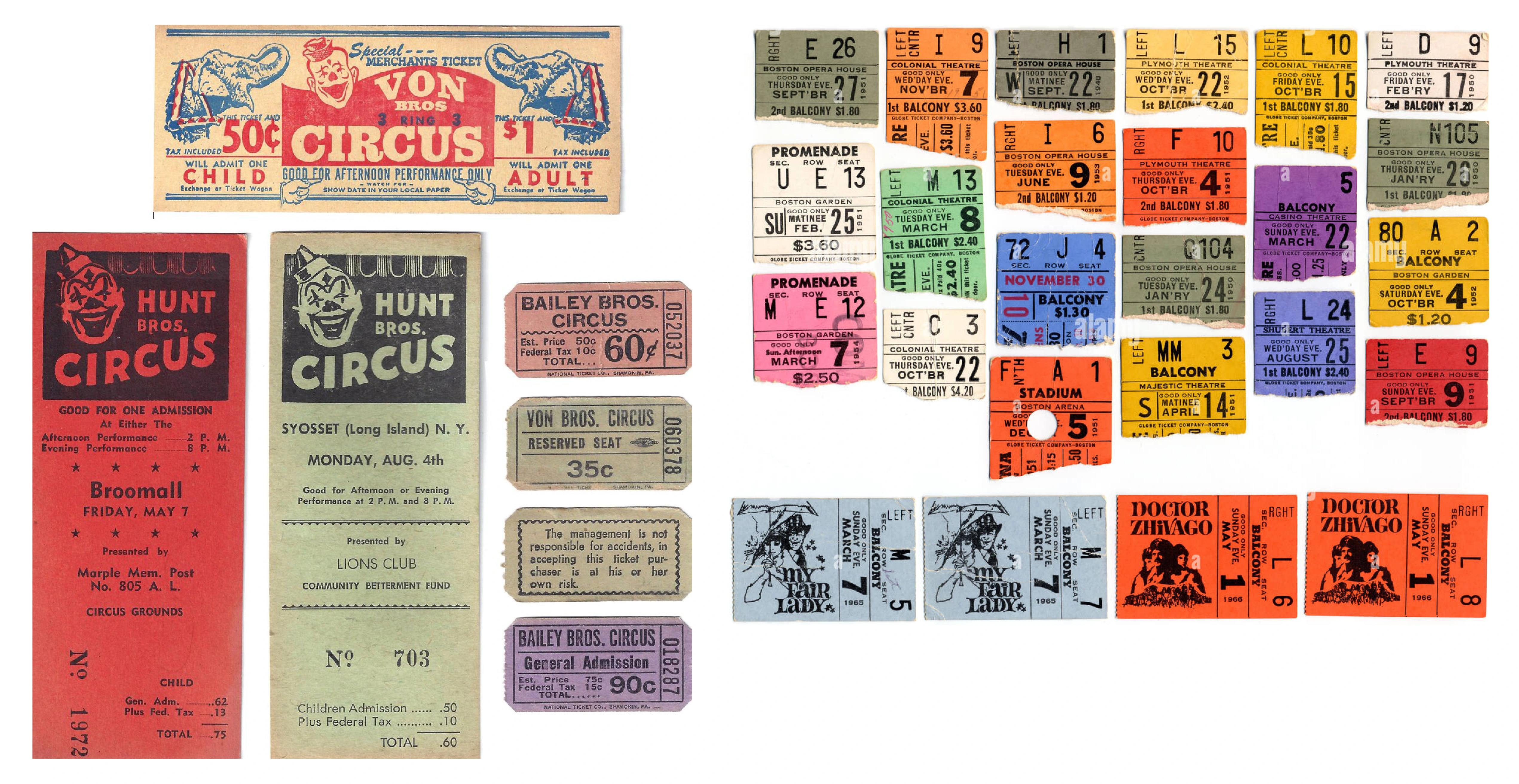
Inspiration for the TRAK book series
Book series choices and order
The dimensions of the book are 115 mm x 184 mm, with a ratio of 1:1.6, referring to Robert Bringhurst's The Elements of Typographic Style. The format is pocket-size, so that they can have a reasonable price while maintaining an attractive appearance.
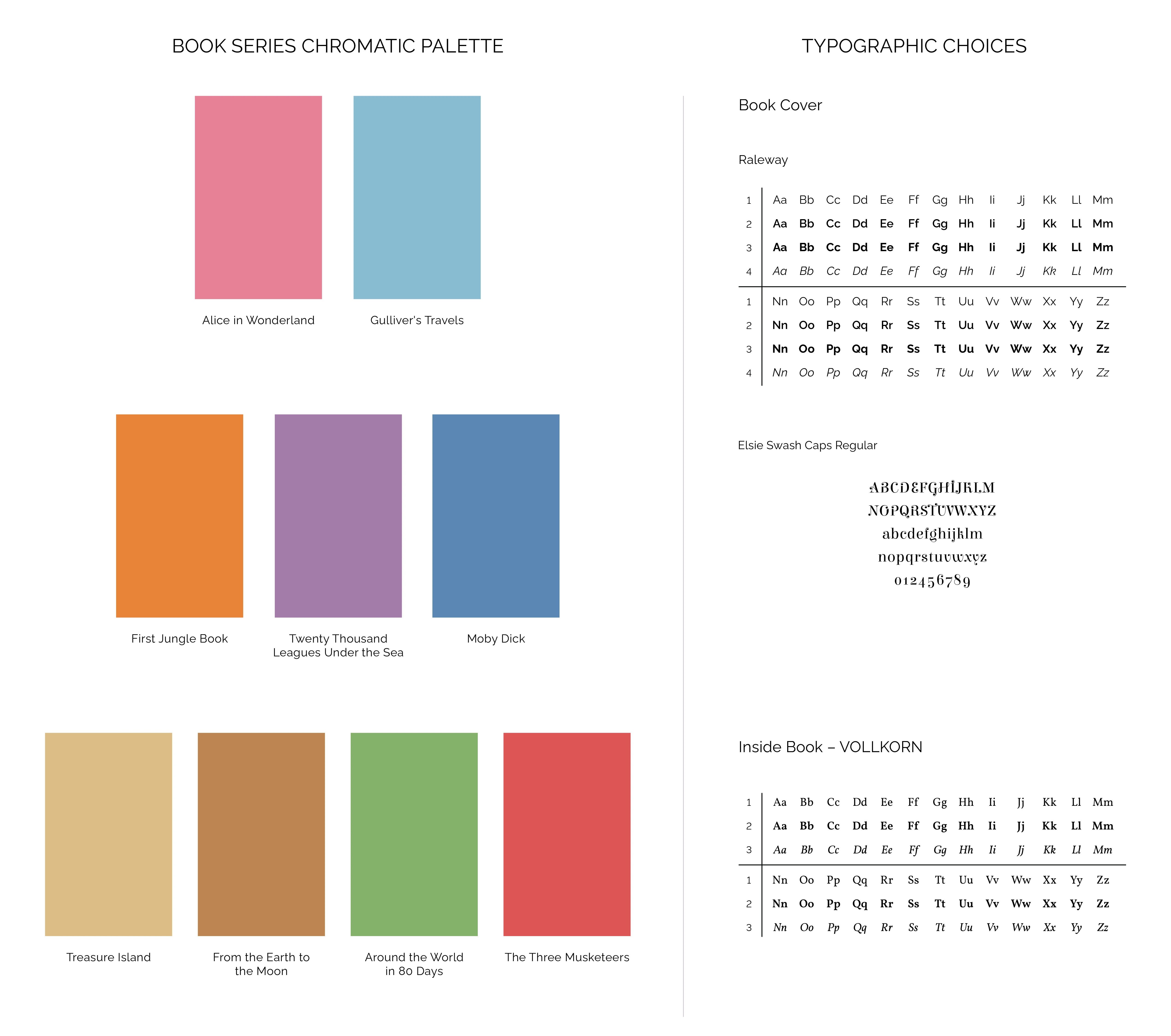
Book series chromatic palette and typographic choice
Alice in Wonderland
Gulliver's Travels
First Jungle Book
Twenty Thousand Leagues Under the Sea
Moby Dick
Treasure Island
From the Earth to the Moon
Around the World in 80 Days
The Three Musketeers
The book series order was chosen according to the theme or features in common between two adjacent classics:
1, 2 and 3 are united by the fact that the protagonists do not belong to the context in which they find themselves;
in 3 and 4 the stories occur in a place remote from society;
in 4 and 5 there is the theme of the sea;
in 5 and 6 the characters believe in a prize/treasure, a concept that is linked to 7 where there is the prize of discovery;
7 and 8 share the theme of the journey (to and through remote places);
in both 8 and 9, the story succeeds because the characters work as a team.
Like this project
Posted Apr 29, 2024
Branding for a fictional publishing house and its first book series