Enhancing Twitter's Paywall UX for Premium Upgrades
Will Taylor
In working with a Twitter (X.com), I assisted in improving the overall paywall experience of users upgrading to Premium or Premium Plus from their free accounts. In 3 weeks, I delivered end to end workflows from various entry points of the UI in which the paywall experience would appear.
Timeline: ~ 3 weeks
Role: UI designer
Tools: Designed in Figma
Type of plan: UI design workflows utilizing existing brand guidelines
Services: UI Design, UX Flows
Want to upgrade from a free account to Premium or Premium Plus? No Problem
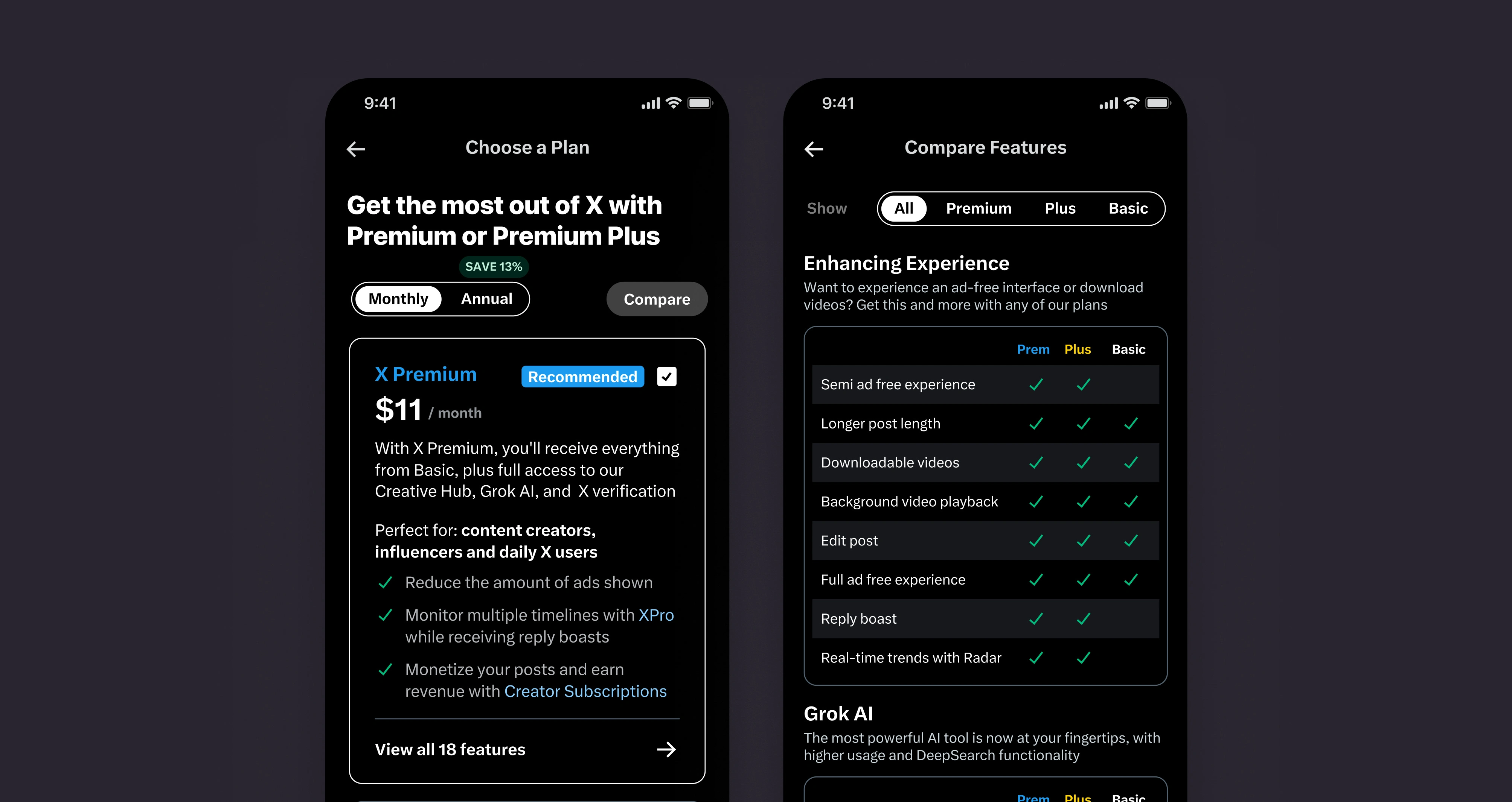
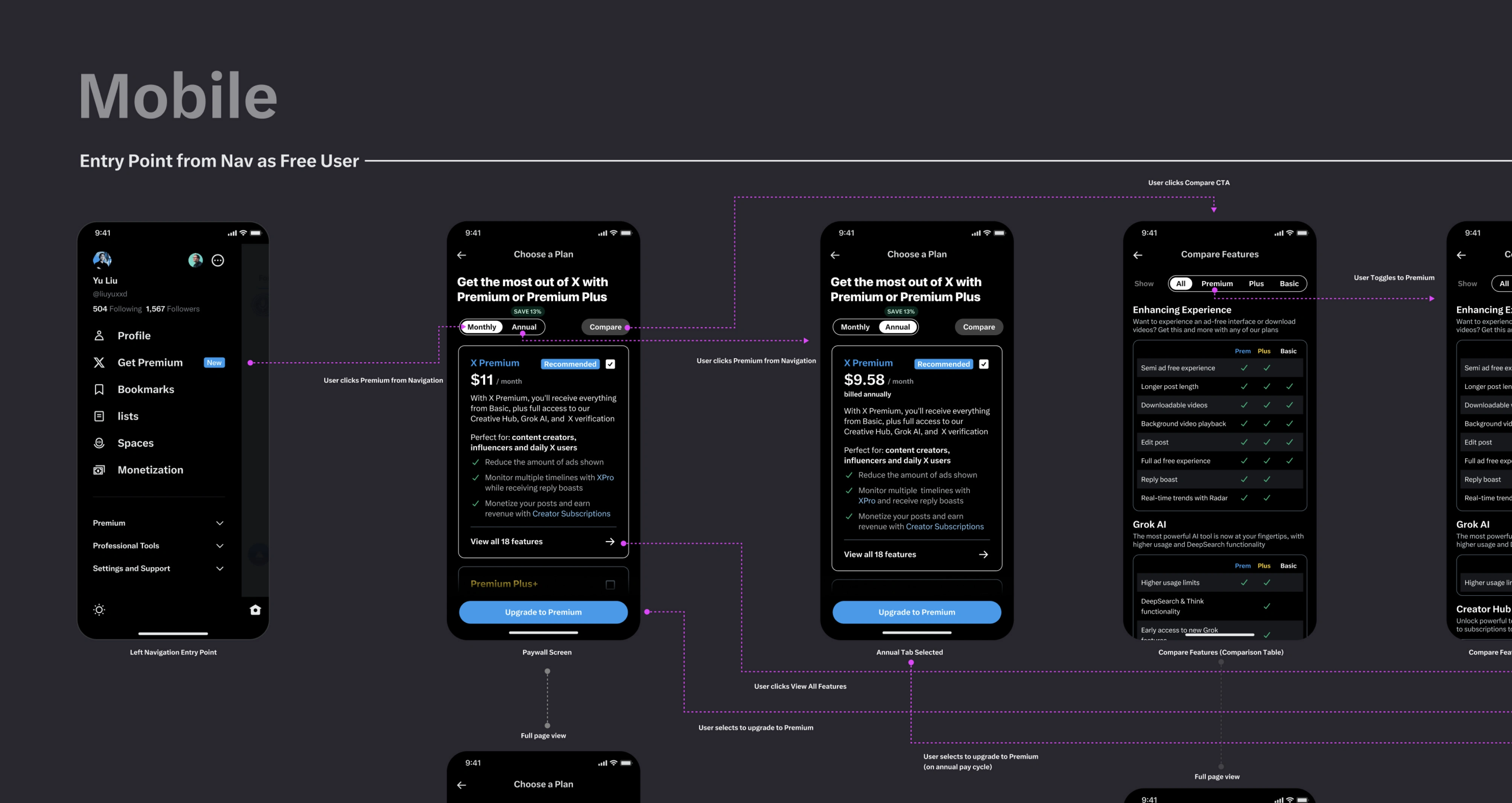
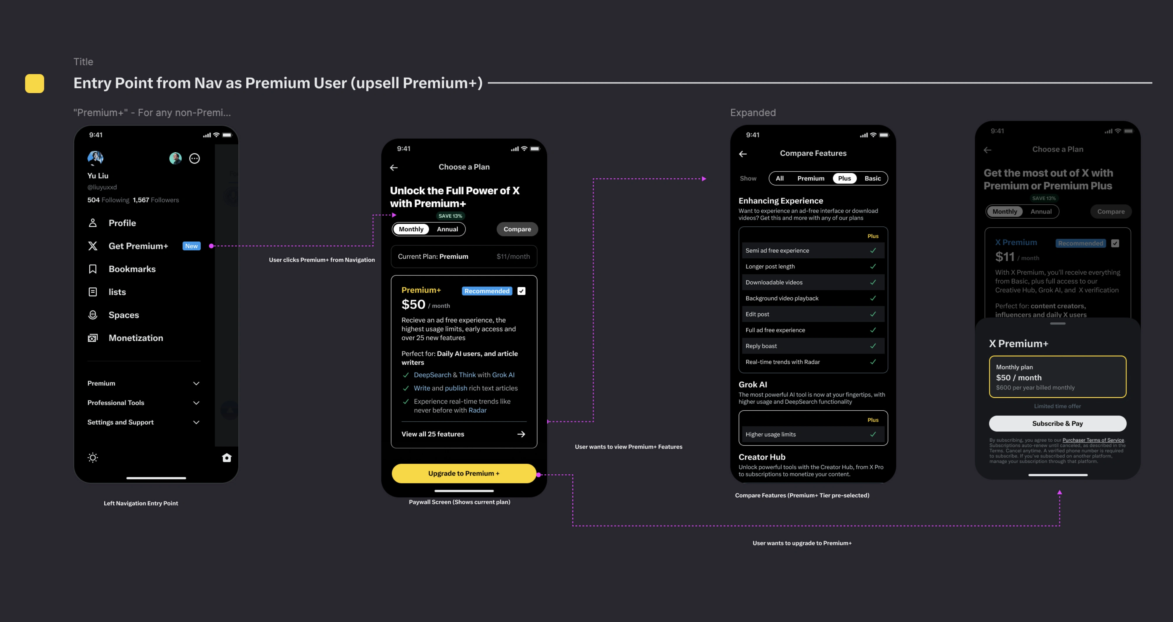
One of the very first tasks, was illustrating how a user may upgrade directly from the navigation experience on web and mobile. This could be a user who has a free account and wants to upgrade to Premium/Premium Plus, or a Premium user who wants to get the most out of X.com with Premium Plus features. After taking a full UX audit of the current twitter workflows across responsive web and native mobile experiences, I also researched various high traffic paywall experiences, both directly and indirect competitors prior to conceptualizing a design.
The result, a fully created UX flow in high fidelity for a user navigating from the navigation to the paywall pages, and into the checkout experience.
Identifying the problem:
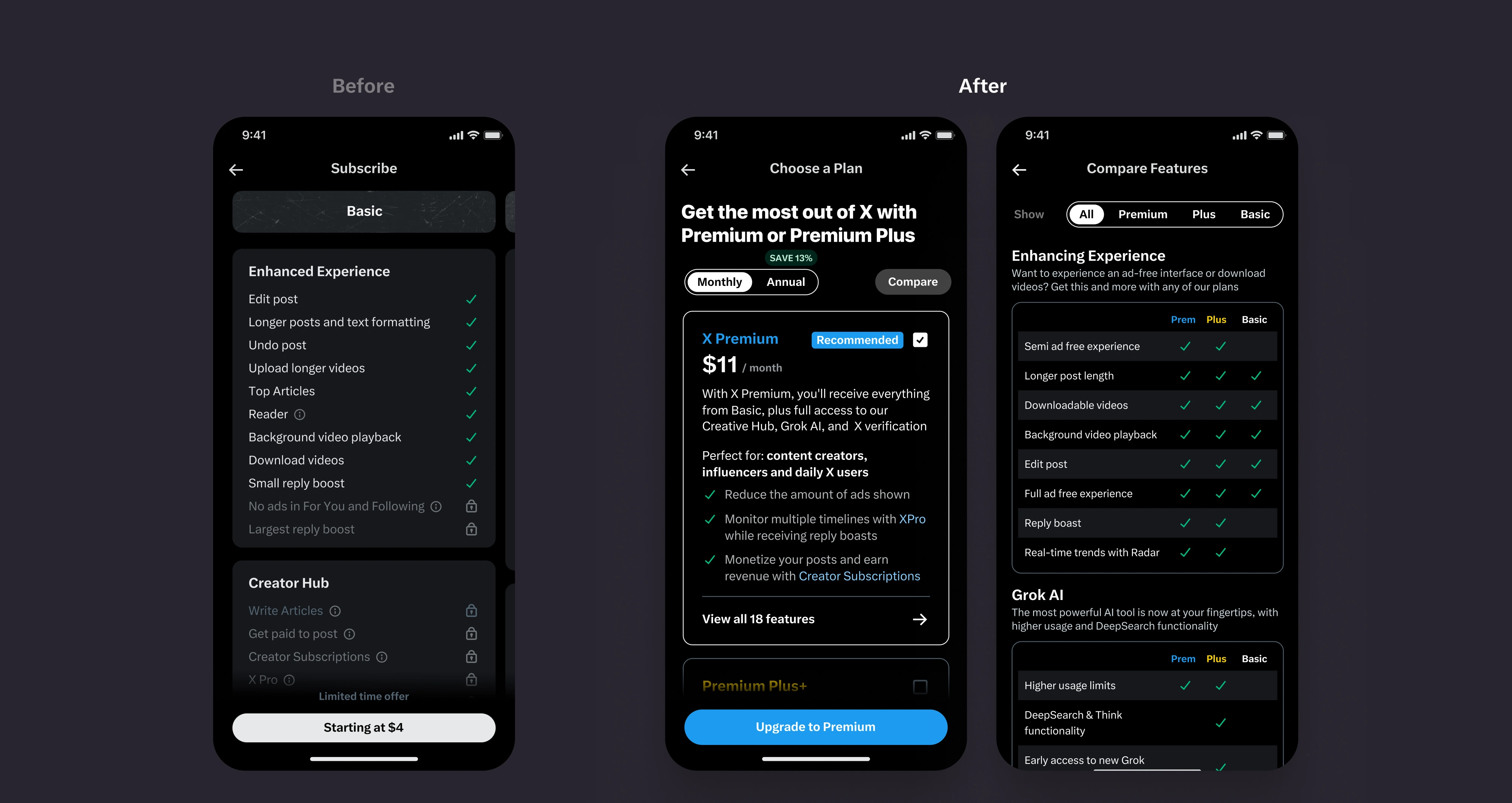
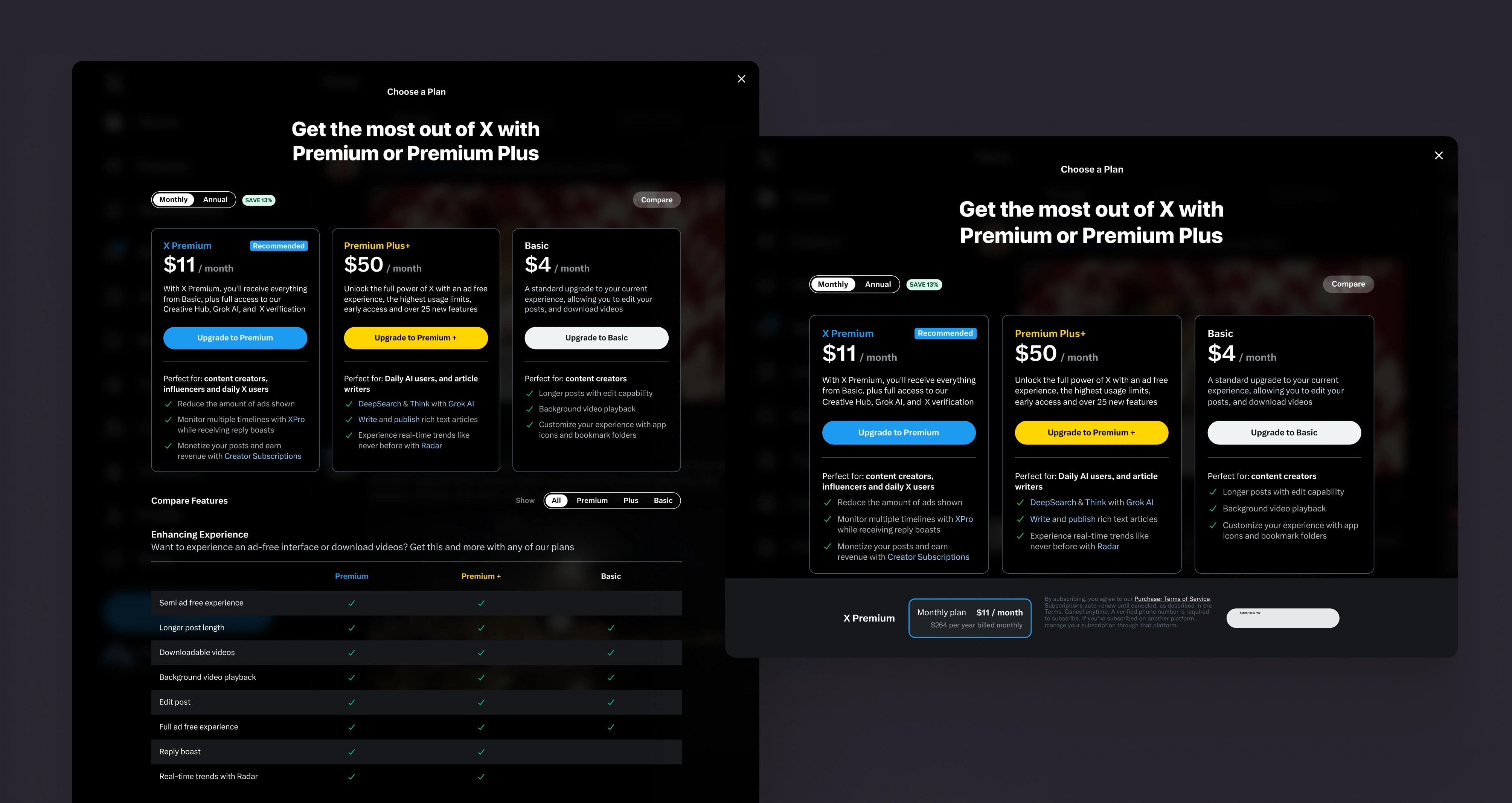
From provided user tests and feedback, users were having a hard time finding and comparing plans across high traffic mobile experiences, and do not know the difference between the tiers and why it is important to upgrade.
In addition, in the current UX the tiers were hidden behind a gesture scroll, off view, with little to no visual that there were more tiers available. Lack of context around what the primary use case for each tier, and which tier is meant for each particular user group.
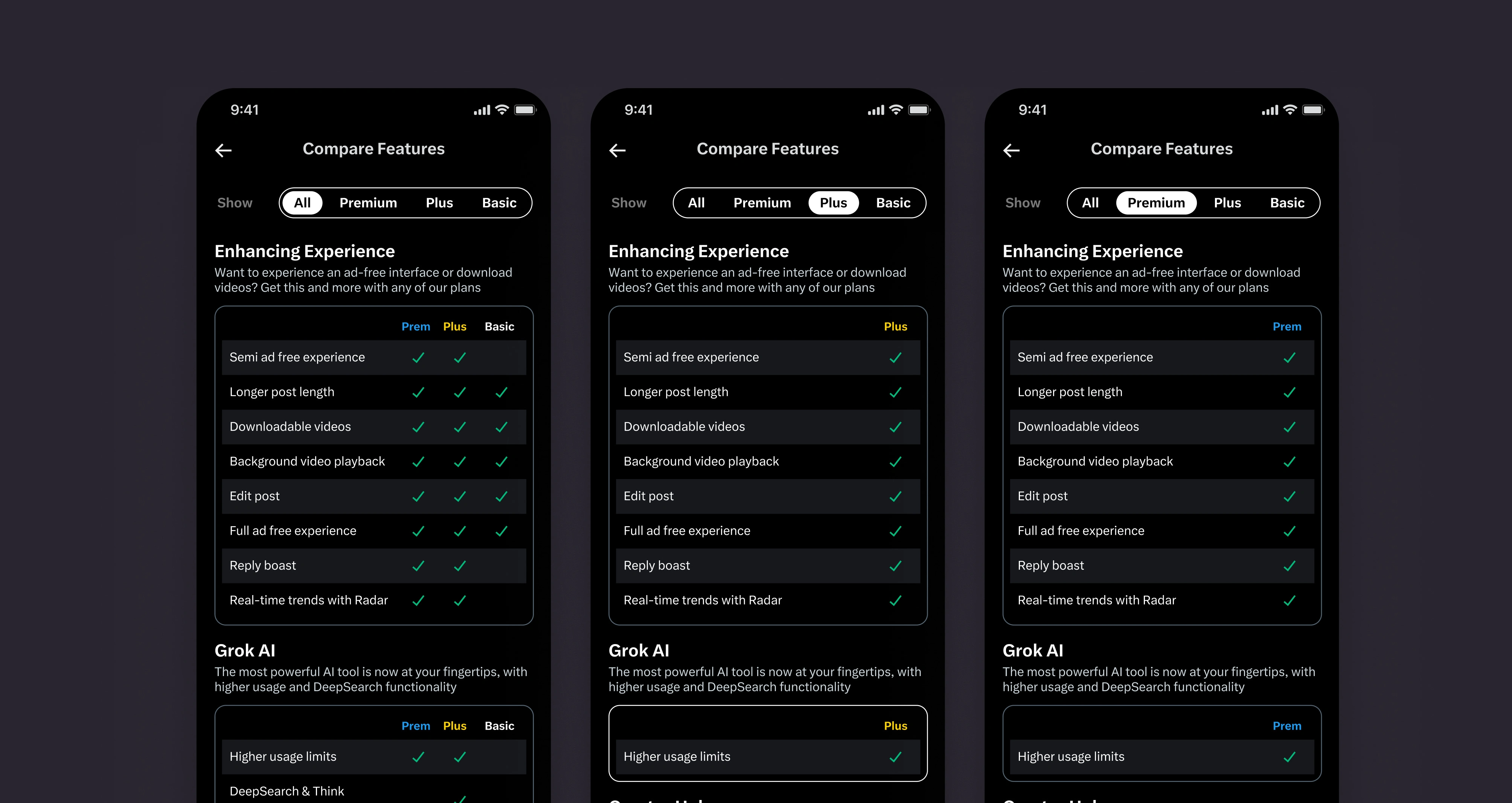
The solve: A newly created comparison table view, that highlights all available features across each tier, with the ability to toggle between the tiers that a user would like to sign up for. the gesture horizontal scroll was replaced with a one page vertical scroll, with a visual showcase of each tier card. Each tier card, also included more content (with collaboration with X.com stakeholders), and a brief description of the main feature differences between them.
User journeys to the paywall from featured specific elements and new color coding for tiers
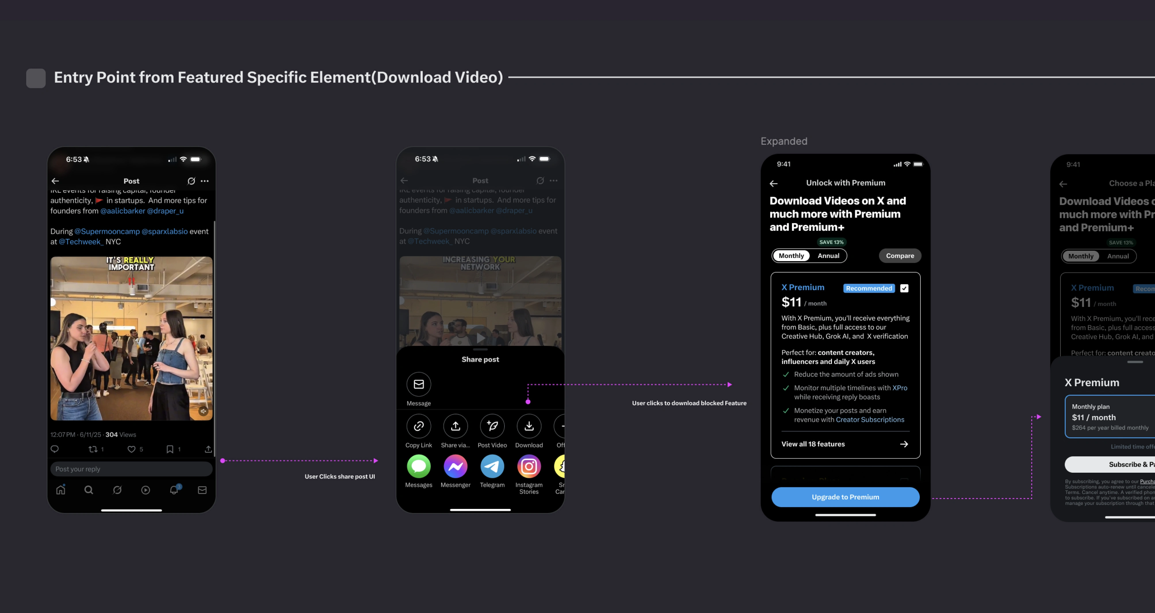
In addition to outlining the primary upsell flow from the navigation area, I also created experiences for specific featured functionality elements throughout the application. These elements (such as downloading video provided by the portfolio example) are made available behind specific tiers, but are viewable for everyone. If a user that does not of the tier in which that functional element provides, a paywall sheet will appear with custom content, highlighting and upselling the benefits of that tier.
We also introduced a new color combination for Premium Plus tier groups, that when a user sees or interacts with a Premium Plus feature, the yellow color will visually create a distinction between Premium (blue) features and free (standard gray) feature sets.
Like this project
Posted Sep 16, 2025
Was tasked to improve Twitter (X.com) overall paywall experiences for premium tier upgrades across responsive web and native mobile.
Likes
0
Views
57
Timeline
Jun 1, 2025 - Jun 20, 2025
ClientsTwitter