Brand Design for a seaside Spa / Gym
PACIFIC CALM
About the Brand
Pacific Calm, a high-end gym and spa, is located on the Pacific West Coast. In addition to the services you might expect out of an ordinary gym, they offer yoga classes in-house, a spa, and their whole brand is connected to relaxation and calmness, not just exercise.
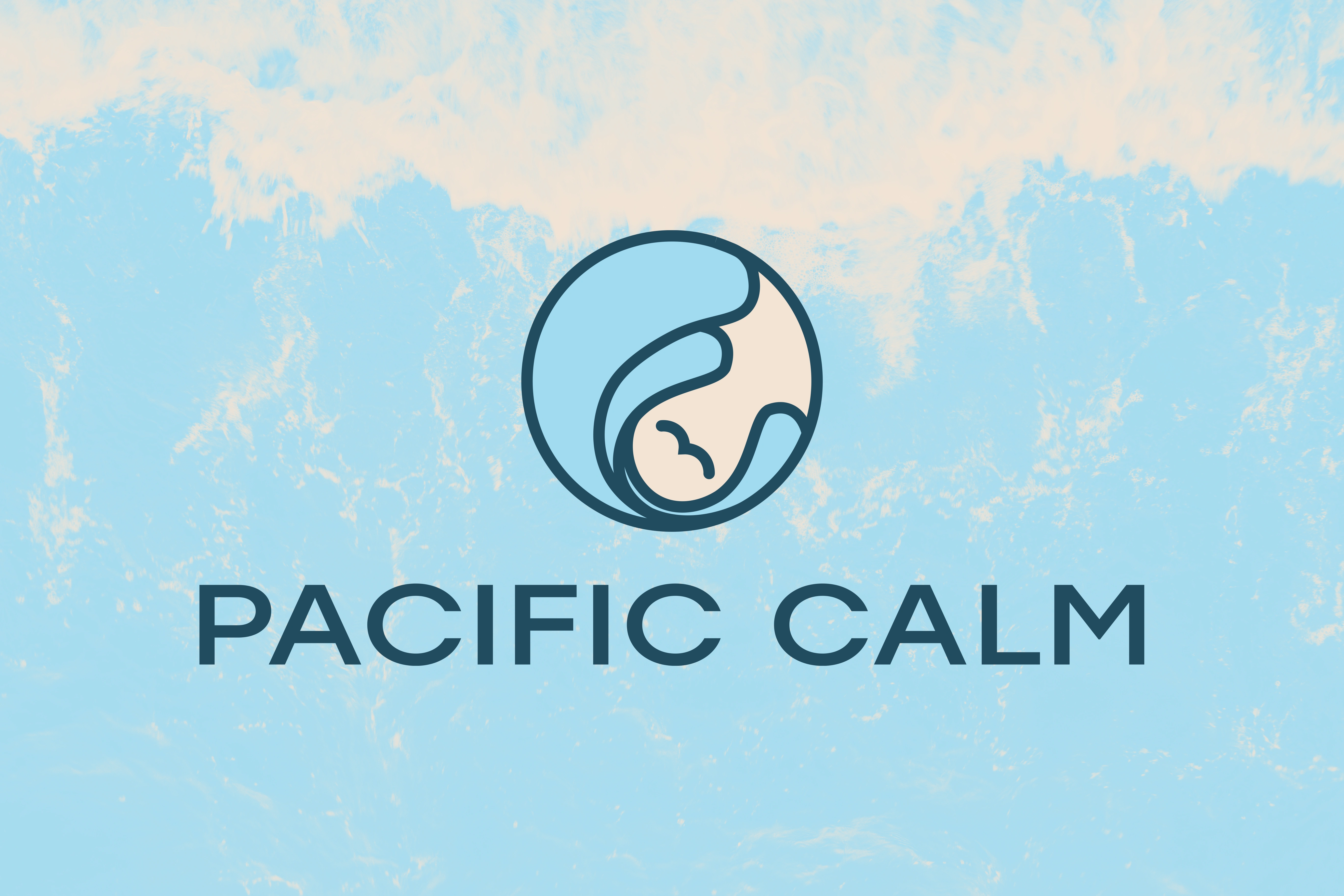
The primary logo over a washed-out background.
Brand Personality
Serenity
Self-improvement
Soothing
Energising
Mental health
Smooth lines

Serene advertisement for the spa, with wordmark logo
The reasoning behind the designs
Pacific Calm wanted to incorporate water into the logo design in some way, so I decided to go with a wave motif for the main imagery. The logomark has 2 meanings, the primary one being a nature scene with a wave and a bird flying through the middle, symbolising the overcoming of hardships and the location of the business all in one. The secondary way to interpret the logo is a woman lying on her back, while we get a bird-eye view of her. Since the target audience of the company is predominantly female, I decided it was representative to include a woman in the logo, even in a subtle way.
Connecting to the target audience and the desired brand image as well, I decided to use smooth lines, circles, and in general a visual experience that radiates serenity. This way, the viewers gaze flows nicely, and the soft blue colours calm the mind in the meantime.
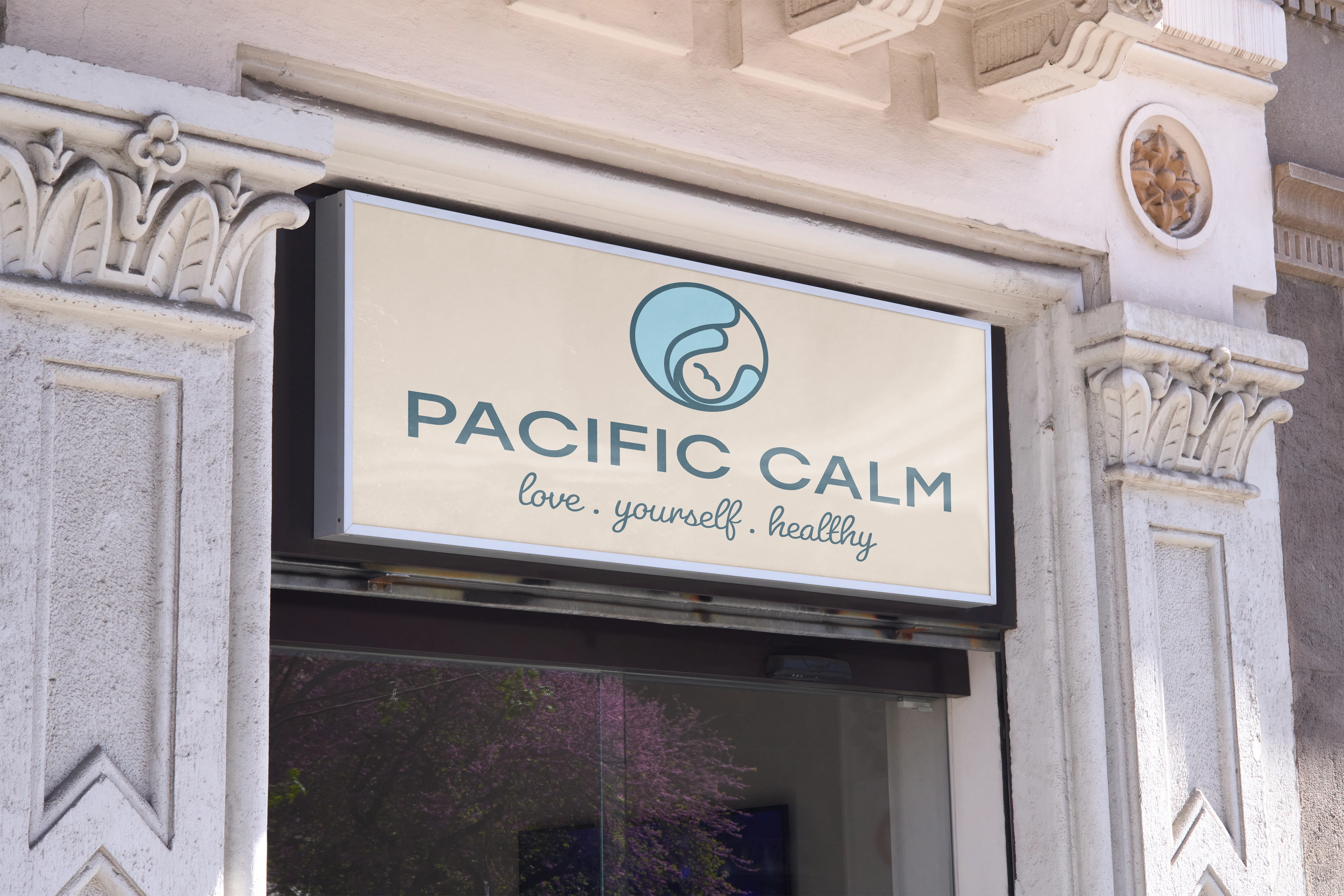
Mockup of the sign of the Spa on an ancient style building
It was also a primary objective to create a brand that could be used in the future as a basis for merchandising. For better visualisation, I also created a few mockups for possible uses of the logo and branding elements.
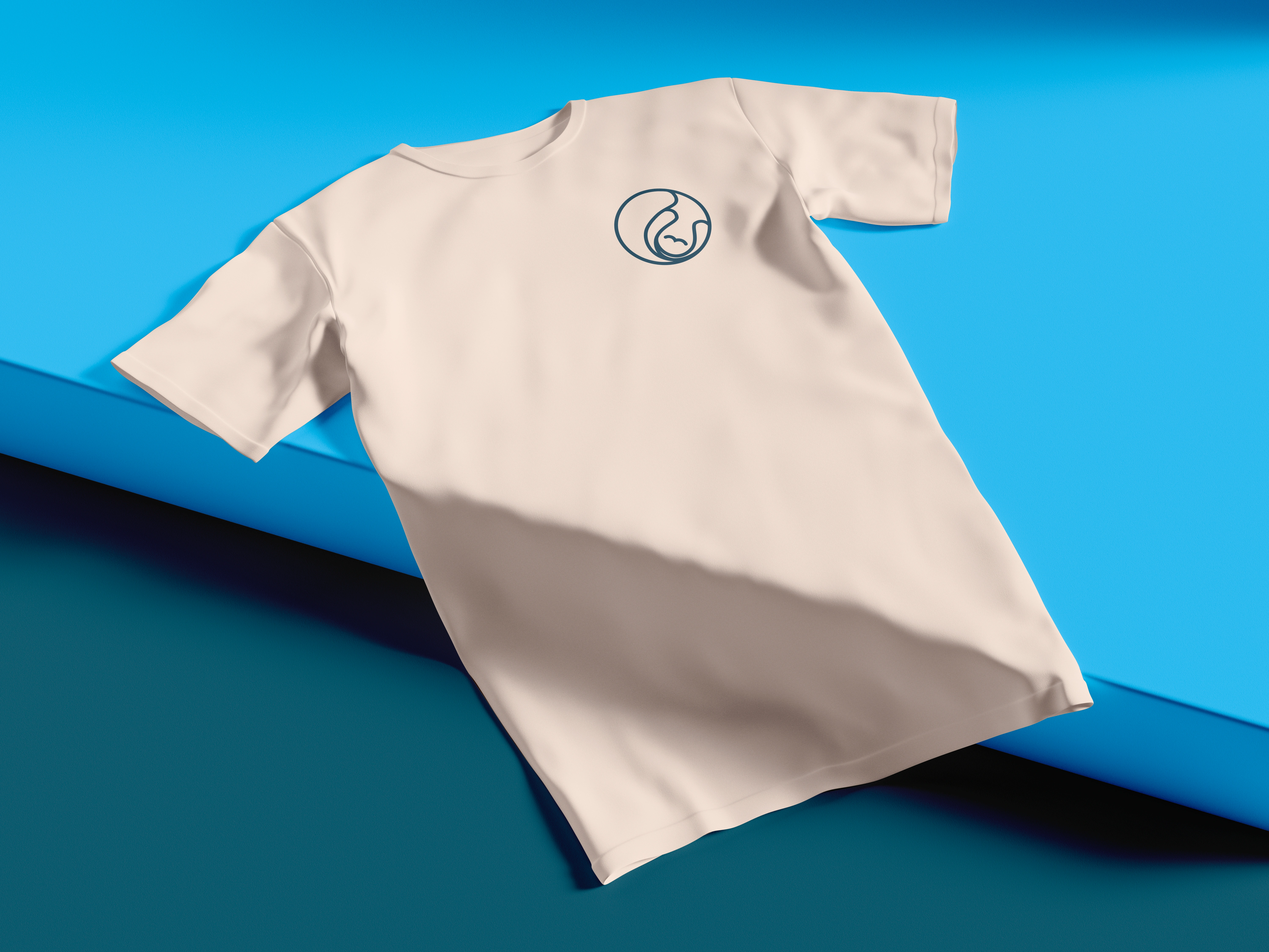
T-shirt mockup for merchandising purposes
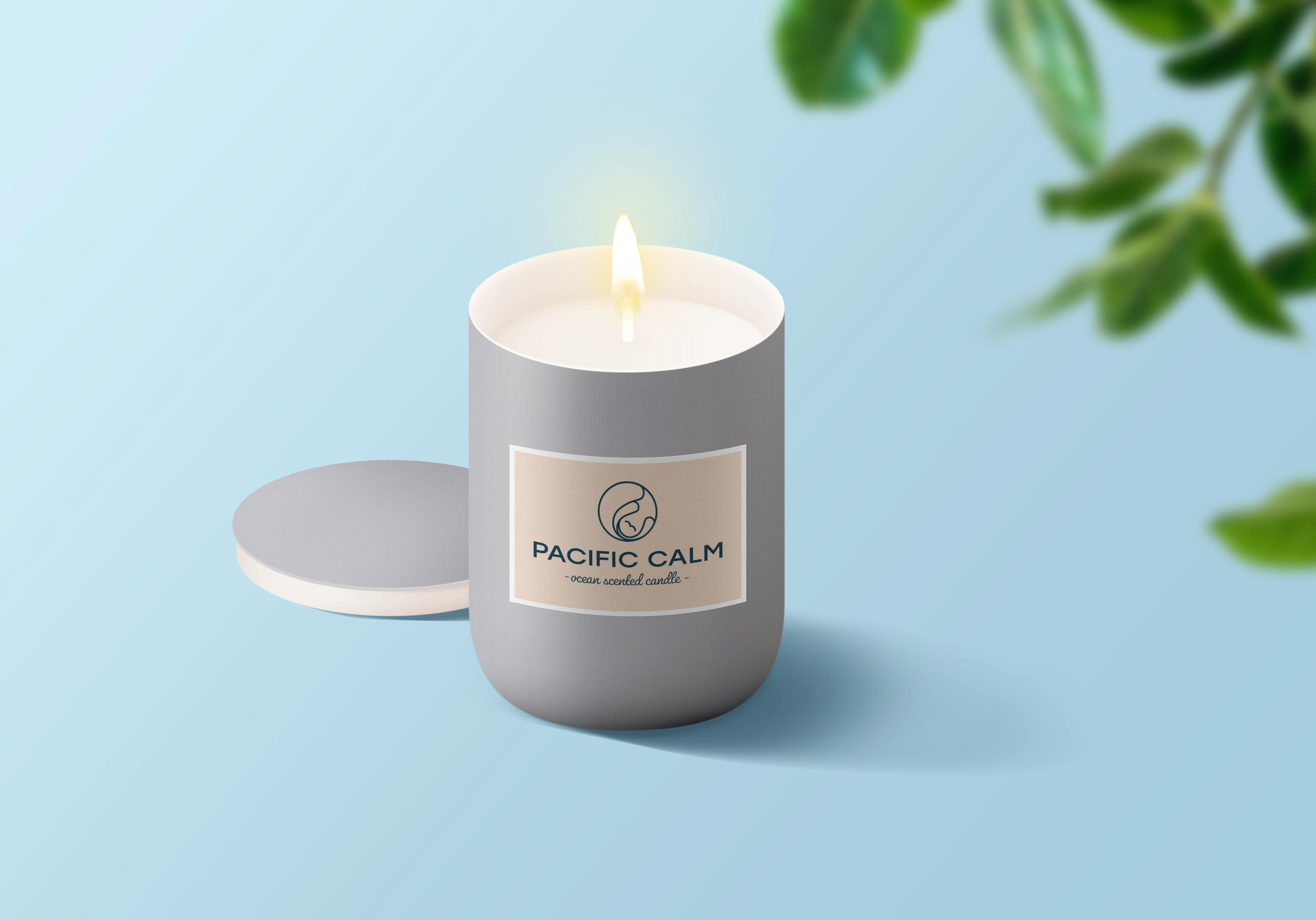
Scented candle with branded sticker
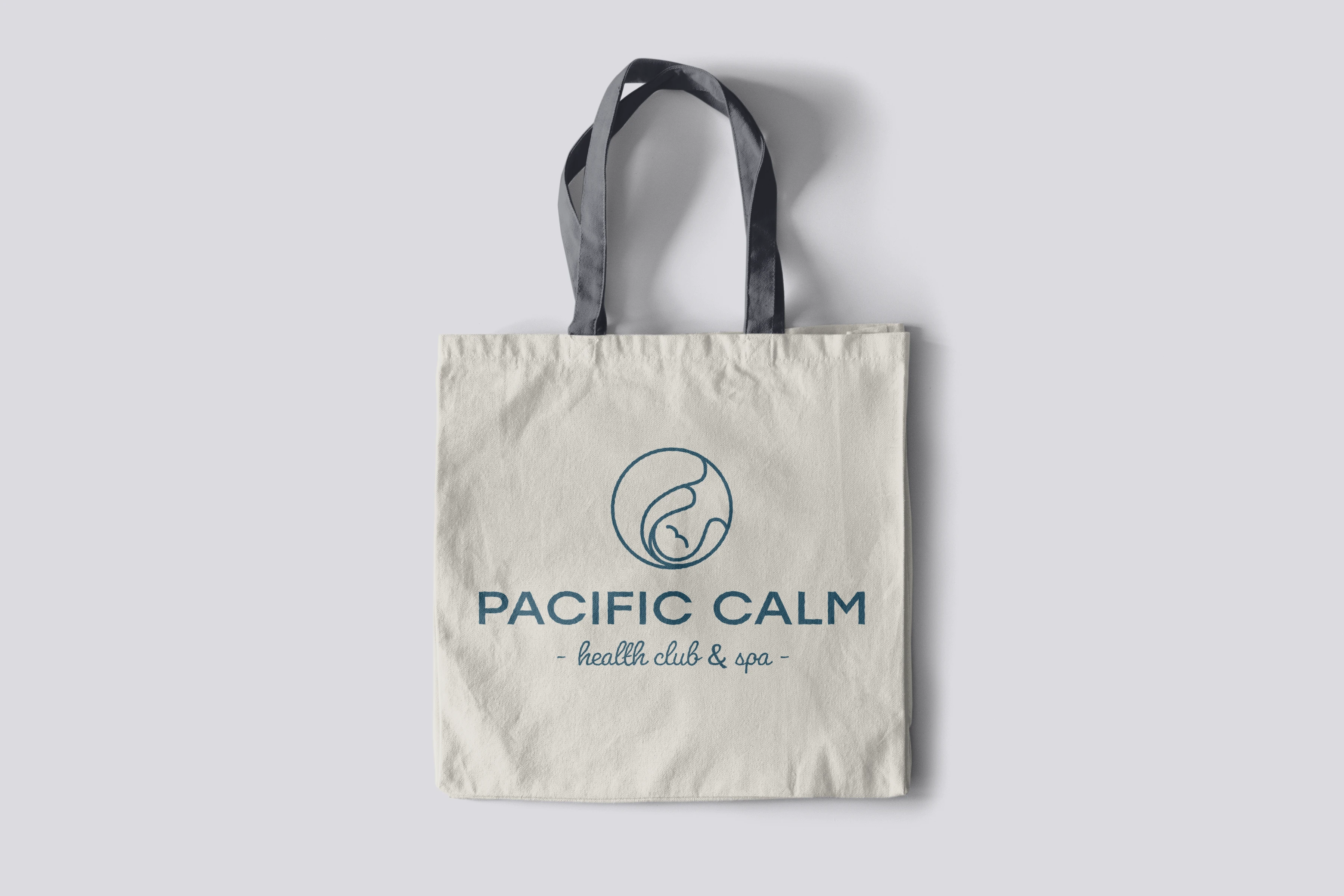
Mockup of branded canvas bag
Like this project
Posted Jan 7, 2024
Developed an eye-catching branding package for a wellness gym, complete with logo, brand visuals and apparel designs, for increased brand recognition and sales.

