TITAN22 Mobile App Redesign
Overview

What is TITAN
TITAN Philippines is a renowned retailer specializing in basketball sneakers and apparel. To enhance the omnichannel shopping experience for its customers and increase app sales and conversion, I led the company’s mobile app redesign.
Why Redesign?
In a daily average range of 10,000 to 50,000 users, more than 60% use mobile phones to purchase products in TITAN. In that 60% allocation of mobile users, only 10% to 15% use the mobile app, while the rest use their mobile web browsers to visit the main website. It just shows that there is an uneven distribution between web and mobile sales, and there are major points of improvement we could make to increase app sales and conversions.
Problem Discovery
Retailers set up their marketplaces and online stores by establishing both a website and an app to reach the target audience, encourage new purchases and, as a result, increase both sales and revenue. Companies are able to increase brand awareness and reach to a much wider audience. Top online shops and marketplaces thoroughly approach mobile app development and make sure their websites and apps are not only functional but have an intuitive user interface and well-defined user experience. While these goals fall directly under TITAN’s radar, their execution is not the same case.
To understand why the company’s mobile app converts significantly lower despite having more mobile users as compared to web users, I conducted initial 1-to-1 user tests wherein 5 participants shared their experiences in using TITAN’s mobile app.
How do users navigate through the app to shop for new or specific products?
Finding New Products
When looking for TITAN latest releases, users found it easy to see the latest drops in the ‘Home’ section, but they found it difficult to look for new releases and products filtered by brand, type, and other attributes based on user category (i.e. men, women, youth) because selecting a user category led them to a general product listing page with infinite scrolling. Some users go through several screens just to view brands based on user category, while others go to the website instead to have the assurance that “everything TITAN offers is found in the website.”
Finding Specific Products
Users expressed that looking for specific products in the app is more tedious than on the website because the sort/filter functions do not reflect accurate results based on user input. This problem, however, is caused by the third-party Shopify search engine used by TITAN, OnionNav. As a workaround, some users tend to scroll all the way to the bottom of the product pages in the app, while others simply use the website instead.
Overall Sentiments with App Navigation
Although users appreciated that the ‘Home’ page housed all of the essential product sections and categories for ‘easier’ navigation, they found this to be more tedious because they needed to scroll all the way up and down the page just to look for a specific collection or section they’re interested in. Moreover, some users stated that there were instances where several page tabs were added in the navigation bar to feature hot collections and sale items. This pushed the ‘Shop All’ and ‘Access’ pages further to the right side of the screen, where they needed to scroll all the way to the left just to visit these pages.
💡 To summarize, there are 2 pain points experienced by TITAN’s app users:
Sort/Filter Bugs. Sorting/filtering results do not reflect accurate results due to poor search engine integration.
Poor Navigation. The app ambiguously presented its products instead of implementing a user-based categorization structure to map out content based on the corresponding user type.
The Solution
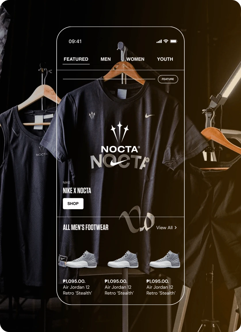
The key difference between the initial app design and my proposed design is in the navigation, where the primary pages are the user categories (i.e. men, women, youth), and a ‘Featured’ page for product promos, events, and upcoming drops.
Within each user category page, there are sections dedicated to featured products, new releases, product types (footwear, apparel, accessories), brands, and sale items. To maximize usability, a combination of visual elements, such as high-quality product images, concise descriptions, and clear pricing, were implemented.
The primary challenge was working within the constraints of Tapcart's feature set. Unlike other no-code builders such as Webflow and Framer, Tapcart’s limited blocks and absence of advanced functionalities, such as transitions, element states, and adding sections within collection pages, presented obstacles to achieving a seamless and immersive user experience. However, despite these limitations, I maximized the code blocks to deliver an intuitive navigation system. For instance, I designed promo and carousel cards based on Tapcart’s image block dimensions.
Results
Overall, users expressed how the user-based categorization approach enabled them to browse through the app easier than the initial app design. The app felt similar to other retail apps such as Nike and LSKD which gave them a sense of familiarity while navigating through the app. They also expressed that finding the latest drops and draws in the ‘Featured’ page as well as the featured collections in the carousel sections made them feel that the designs were “well thought out”.
I asked the 5 participants to rate the app design on a scale of 1-10 (lowest-highest):
All 5 participants (100%) rated the overall navigation with a 9 or 10
All 5 participants (100%) rated the overall design with a 9 or 10
All 5 participants (100%) would want to recommend the app to their peers
Success Metrics
✅ at least 3/5 participants find the app ‘easier’ to navigate through compared to the initial app design
✅ at least 3/5 participants liked the app’s overall design
✅ at least 3/5 participants would use the app again and would recommend it to peers
✅ at least 3/5 participants find it ‘easy’ to view the latest drops or releases per user category
Actual Performance
Since its launch, the TITAN22 mobile app has been well-received by both new and loyal customers. The app has seen a significant increase in sales, with customers enjoying the convenience of shopping on-the-go.
In addition, the app has helped TITAN22 gather valuable data on customer behavior and preferences, allowing them to tailor their marketing strategies and product offerings. For instance, the app opened doors to offer app-exclusive drops or promos especially for women, which greatly contributed to the company’s efforts in exceeding the 2022 sales target of PHP 1B.
Like this project
Posted Sep 13, 2023
TITAN Philippines is a renowned retailer specializing in basketball sneakers and apparel. I led the mobile app redesign to improve their omnichannel experience.


