KadaKareer Website Redesign
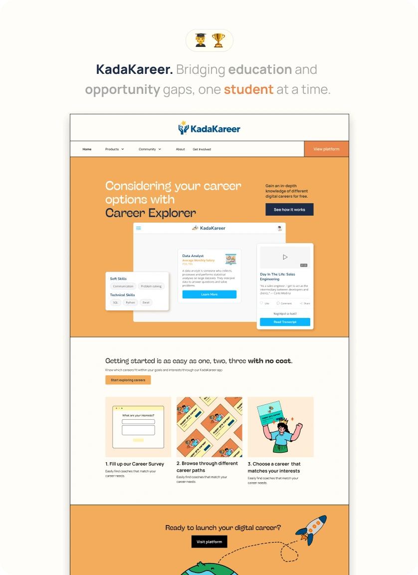
Website link: https://www.kadakareer.com/
Increasing engagement through KadaKareer's landing website redesign
I was assigned to work with KadaKareer's Design team in redesigning their website to clarify KadaKareer's free offerings for its students and coaches.
What is KadaKareer
KadaKareer is an edTech platform that aims to educate and empower underprivileged students in the Philippines through free mentorships and workshops for digital careers.
The Challenge
After its MVP launch, there were low conversion rates for Kadet signups which revealed several opportunities we might improve on to increase signups and engagement. One of which is to redesign the website in order to clarify KadaKareer’s free offerings for its students. Here are some pain points experienced by our users when using the website.
Students feel like there are hidden charges for availing of KadaKareer’s services. This is caused by the lack of emphasis on the 'freeness' of KadaKareer's services in its copywriting.
Students and coaches often get confused between the KadaKareer platform and the website. There were no clear CTAs that connected the website to the platform.
Users often feel lost when navigating through the website. The flow of information leaves users overwhelmed with its content, leading them to leave the website and platform early.
The Solution
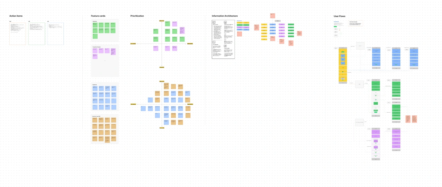
The first half of the project timeline was dedicated to user research and analysis and interaction design to use as a foundation for the website redesign. To expedite the process, the team created wireflows based on the consolidated insights and the site map. To expedite the process, the team created wireflows based on the consolidated insights and the site map.
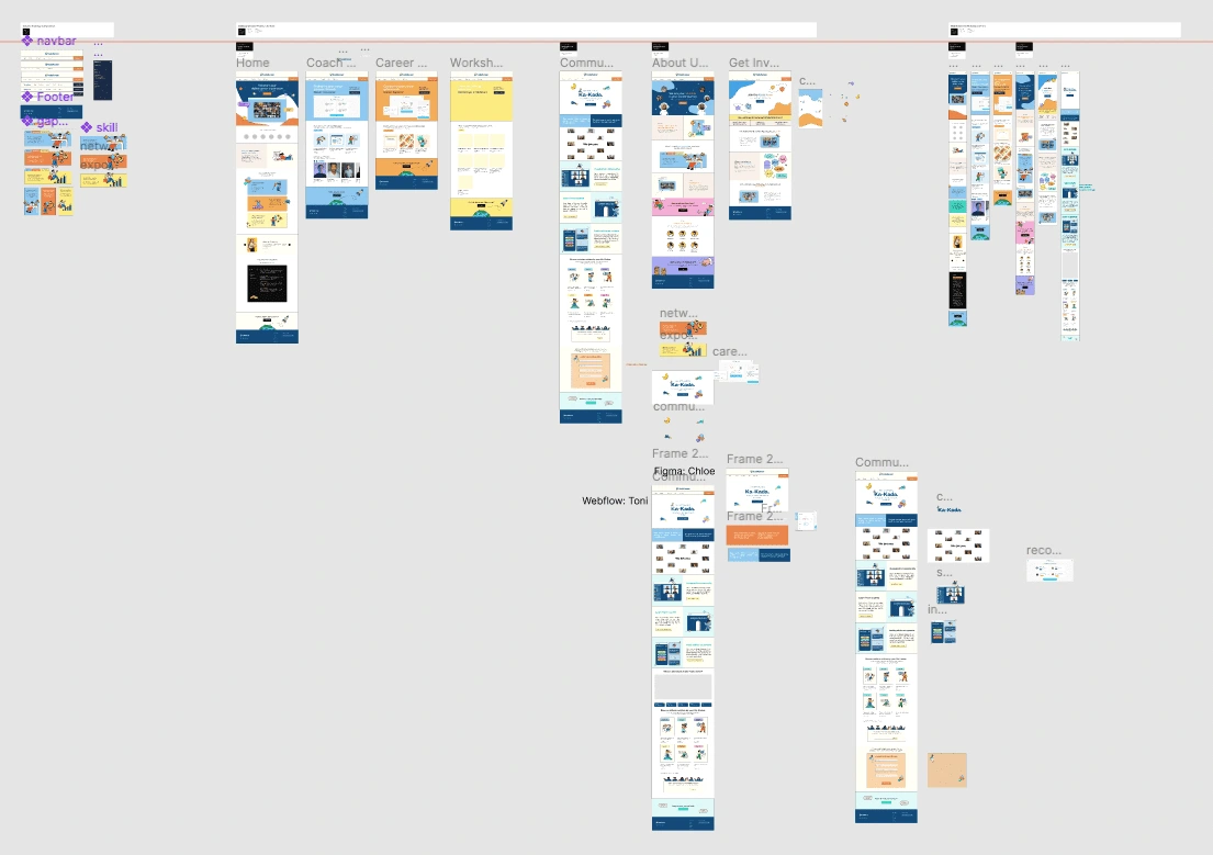
The last half of the project timeline was dedicated to designing responsive mockups and prototypes. The four main pages of the website are Home, Products, Community, and About pages. I was assigned to design the Home and Products pages.
Design Results
The redesign of KadaKareer's landing website aimed to address the identified pain points and improve user engagement. After dedicated efforts by the design team, the project has yielded several key design results that enhance the overall user experience and promote KadaKareer's free offerings:
Clarity of Free Offerings: One of the primary objectives of the redesign was to emphasize the "freeness" of KadaKareer's services. The design results reflect this goal by implementing clear and concise copywriting throughout the website. The language used effectively communicates that KadaKareer provides free mentorships and workshops for digital careers, eliminating any confusion about hidden charges.
CTA Integration: To bridge the gap between the website and the KadaKareer platform, the design team strategically integrated clear and prominent Call-to-Action (CTA) buttons. These CTAs guide users seamlessly from the website to the platform, ensuring a more cohesive user journey and reducing confusion.
Improved Information Architecture: Users feeling overwhelmed by the website's content has been addressed through a revised information architecture. The design results include a streamlined navigation system that simplifies the flow of information. Users can now easily find the resources and information they need, reducing frustration and encouraging longer stays on the website.
Wireflows and Site Map: The use of wireflows and a well-structured site map formed the foundation of the redesign process. These tools helped the design team to visualize the user journey, information hierarchy, and interactions, ensuring that the final design aligns with user needs and project objectives.
Visual Enhancements: While functionality and clarity were the main focus, visual enhancements were also integrated to create an appealing and engaging user interface. The design results feature an updated color scheme, typography, and imagery that align with KadaKareer's mission and resonate with its target audience.
Responsive Design: Ensuring that the website functions seamlessly on various devices was a priority. The design results include a responsive design approach, making the website accessible on desktops, tablets, and smartphones. This adaptation further enhances user engagement and accessibility.
In summary, the design results of the KadaKareer website redesign project have successfully tackled the pain points identified during user research. The emphasis on clarity, user-friendliness, and a seamless transition to the platform ensures a more positive experience for both students and coaches, ultimately leading to increased signups and engagement on the KadaKareer platform.
Like this project
Posted Sep 13, 2023
I led KadaKareer's website redesign to improve conversions and engagement through its restructured information architecture, user-centric branding, and copy.


