RB Paper Smiths
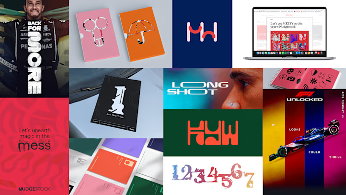
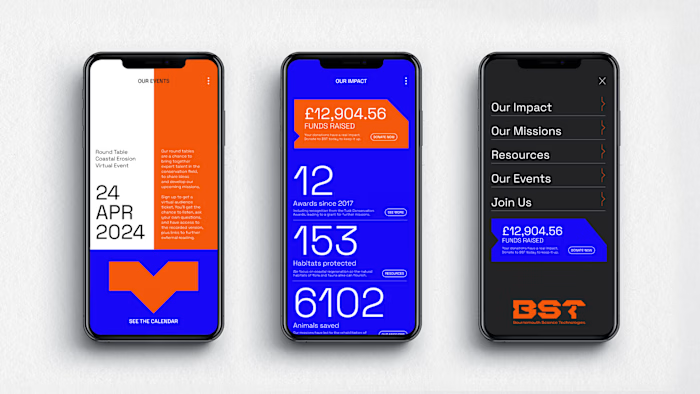
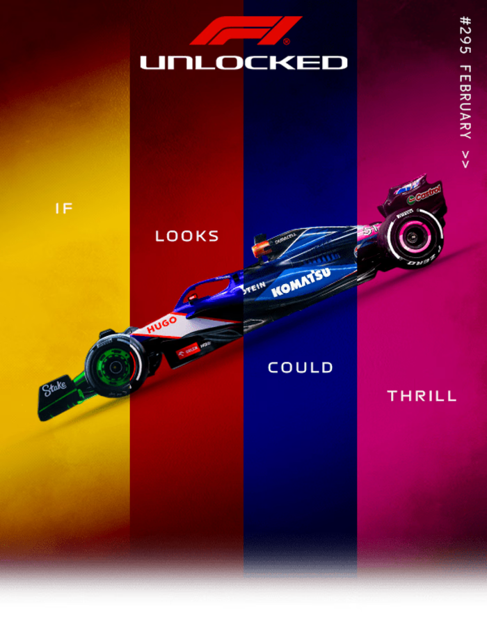
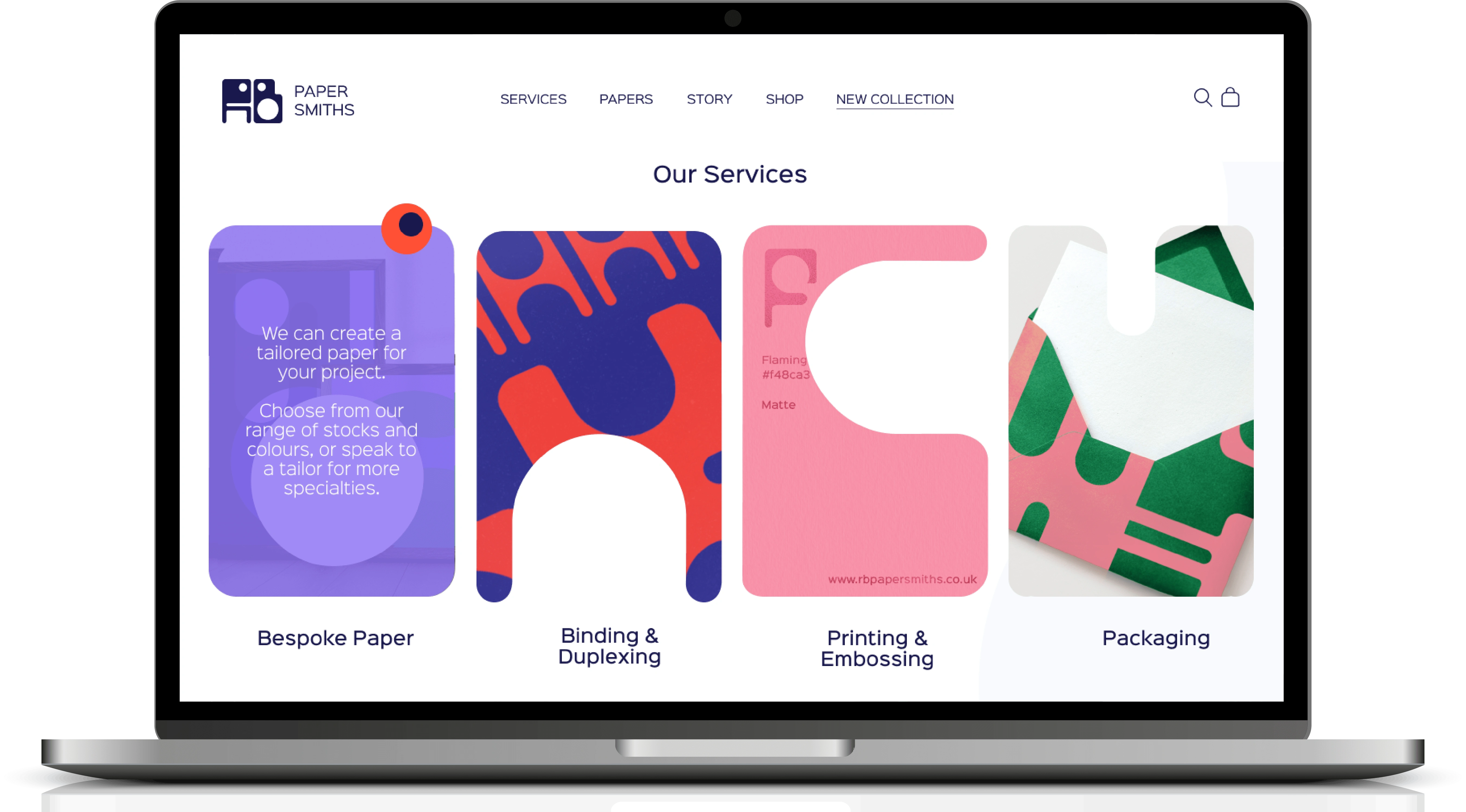
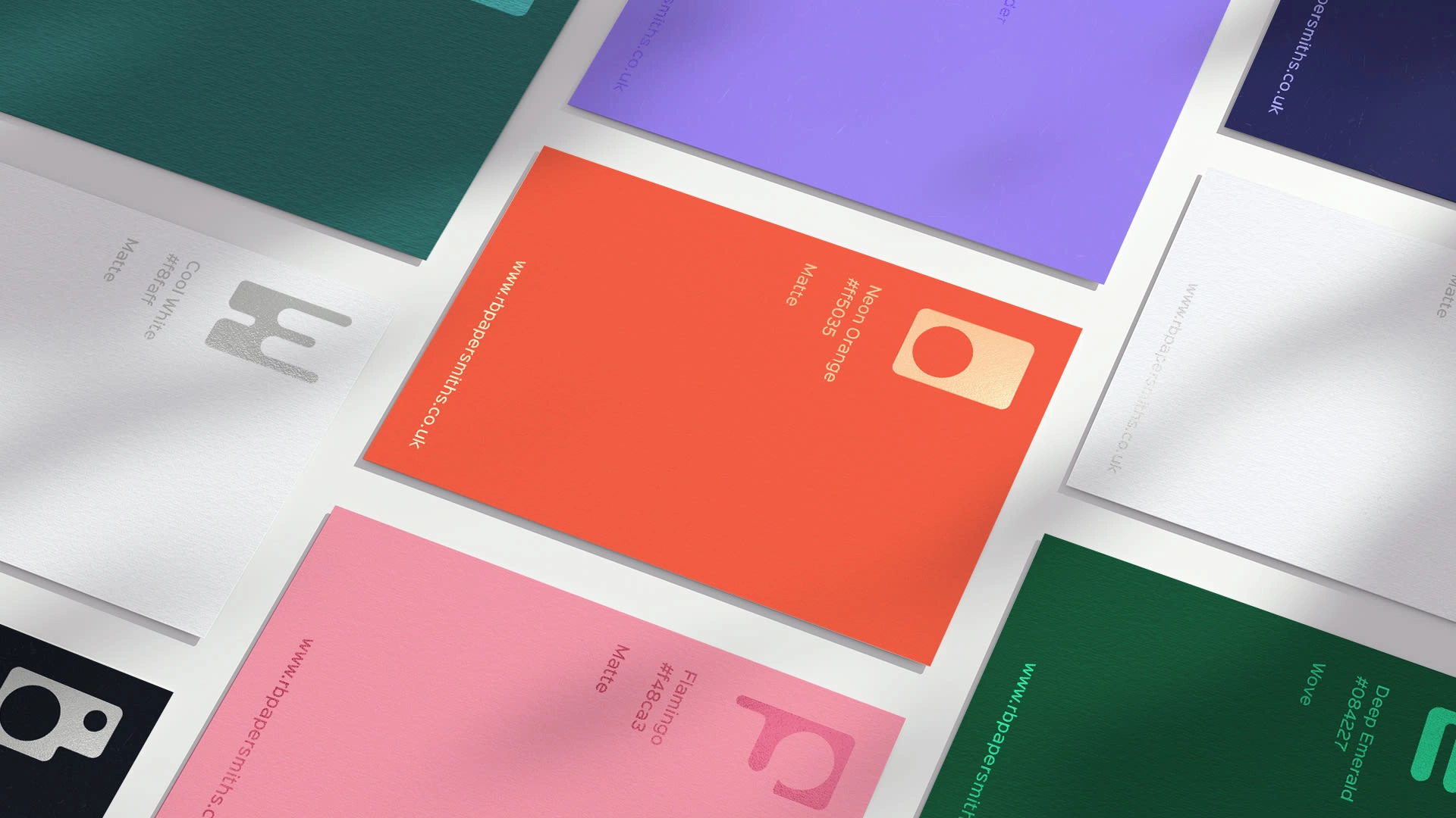
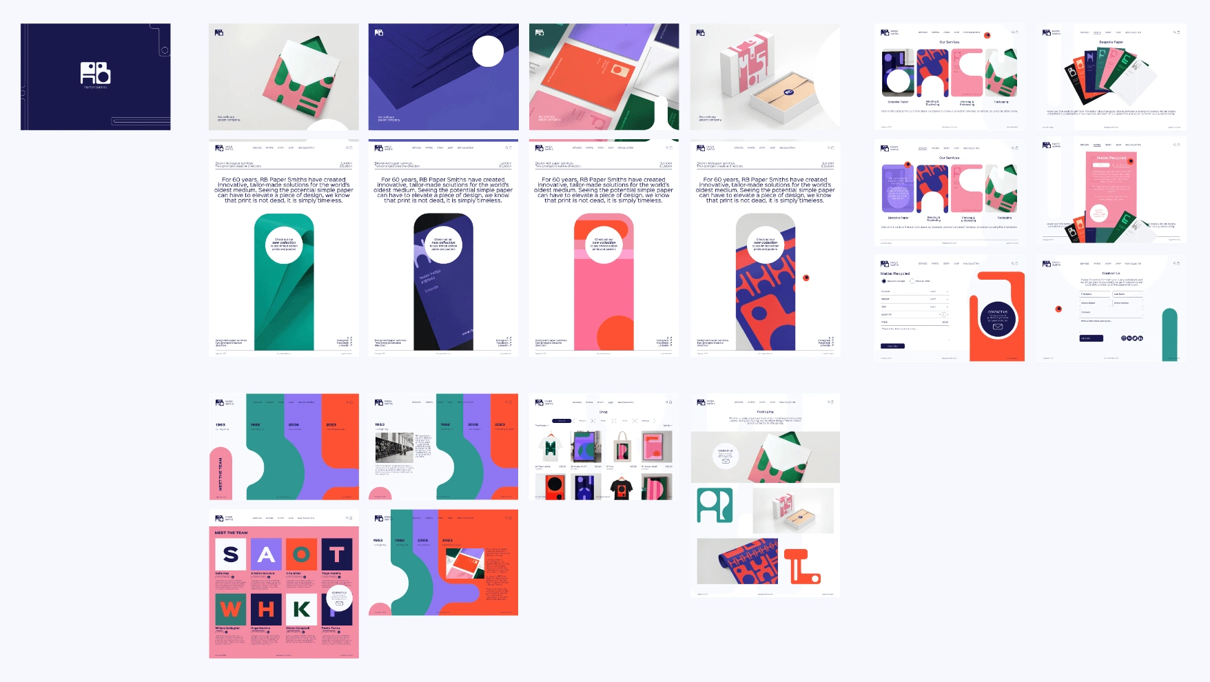
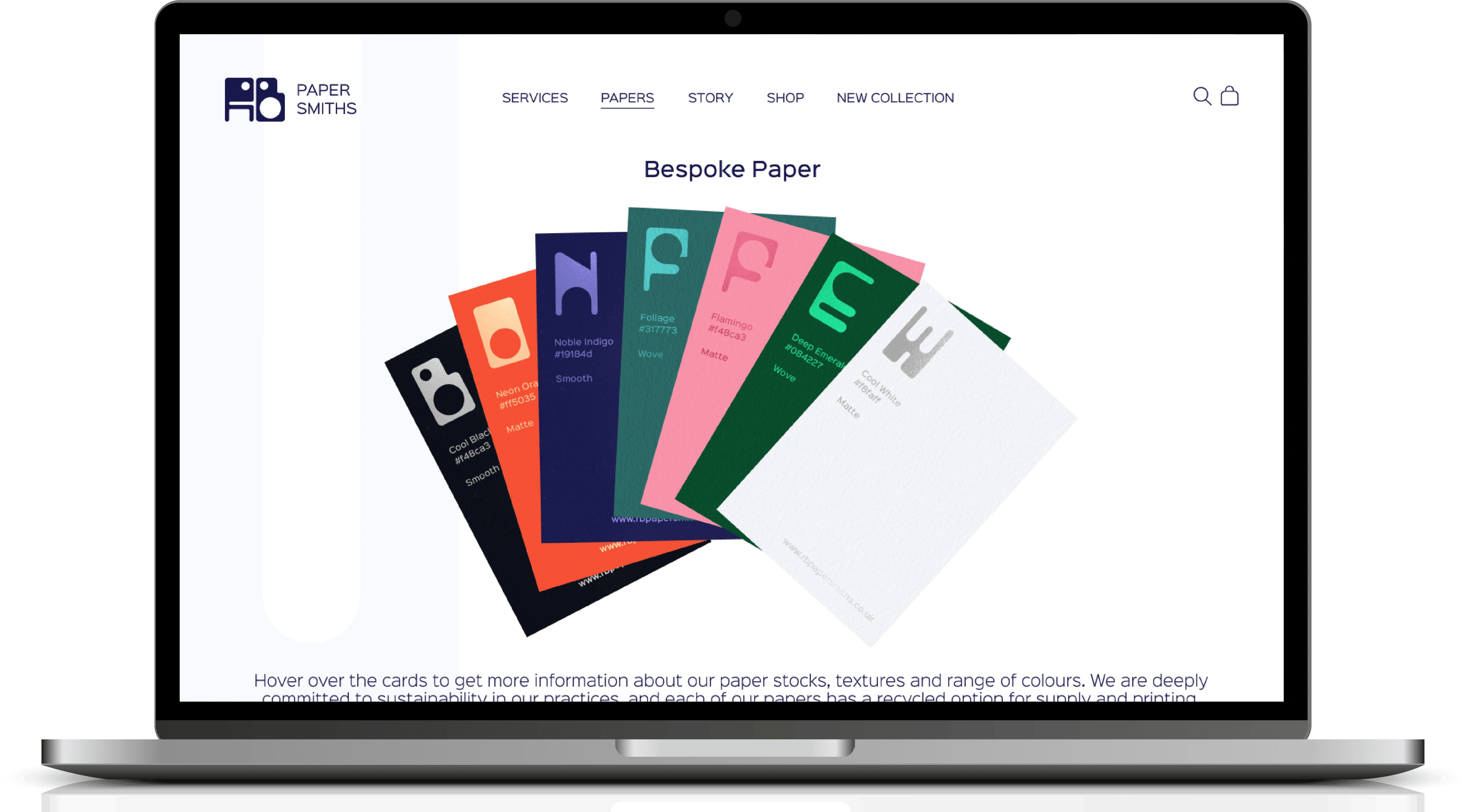
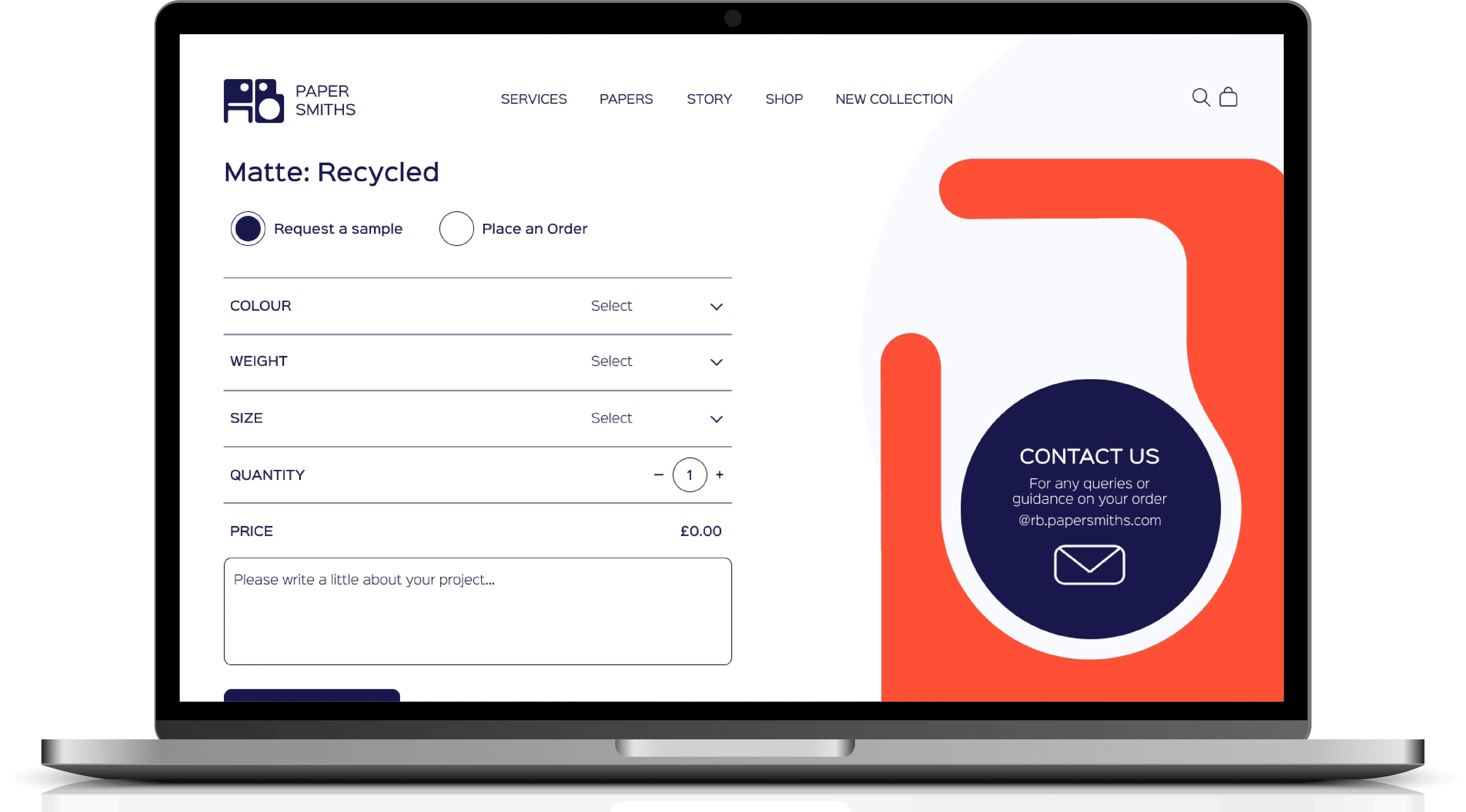
A full brand, from type design to packaging to posters, with a focus on the UI design for a flagship website and store.
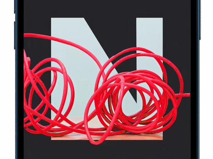
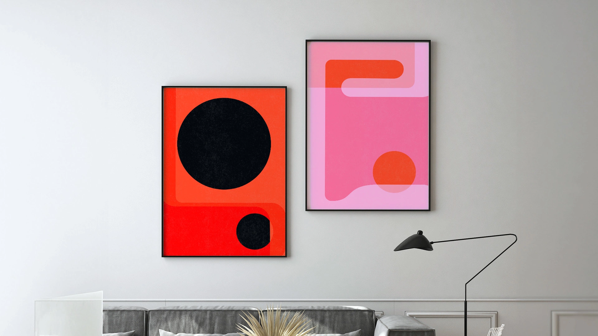
The brand visuals are rooted in bespoke typography that takes inspiration from the paper-making process. These letterforms are used to tie together all parts of the campaign, including as content devices in Figma.
With a selection of brand colours that echo retro wallpapers, and a user journey that prioritises fluidity and patterns, this wesbite stands out from the competition.
Like this project
Posted May 16, 2024
A full branding campaign, from type design to packaging to posters, with a focus on UI design for a flagship brand website.

