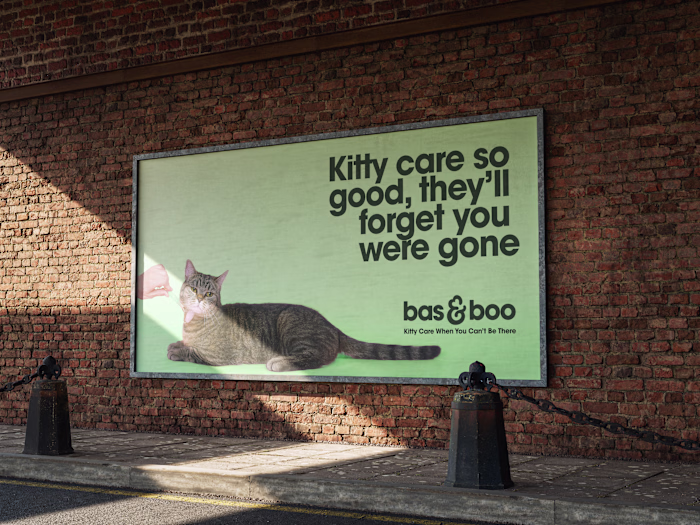
Brand Identity Design for Deep Wave
Robin Son
Deep Wave is a veteran-owned red light therapy business focused on making treatments feel more accessible, relaxing, and affordable.
Their identity needed to communicate both credibility and comfort, without falling into the overly sterile or clinical look common in wellness. They wanted something that stood out, while still feeling grounded, supportive, and trustworthy.
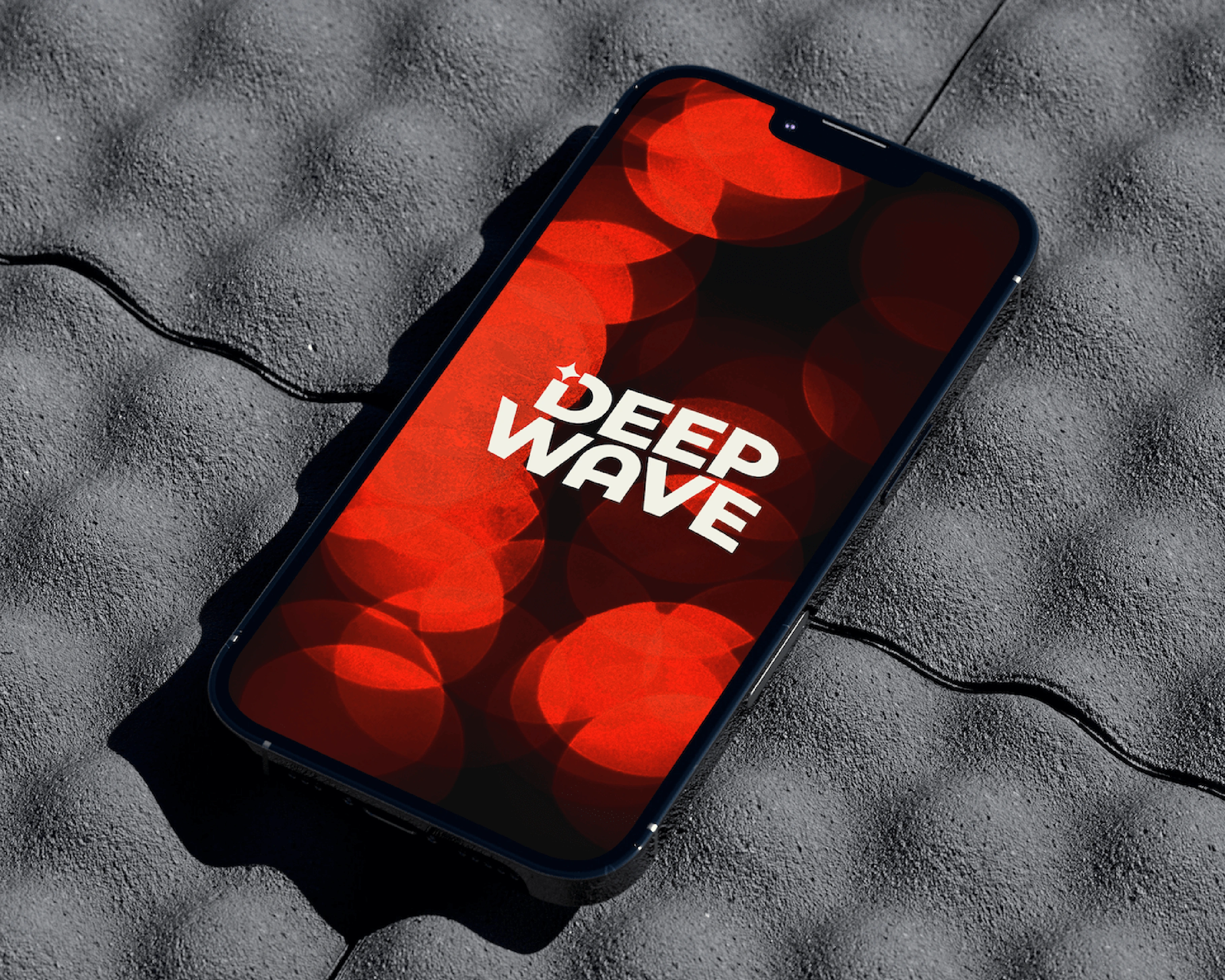
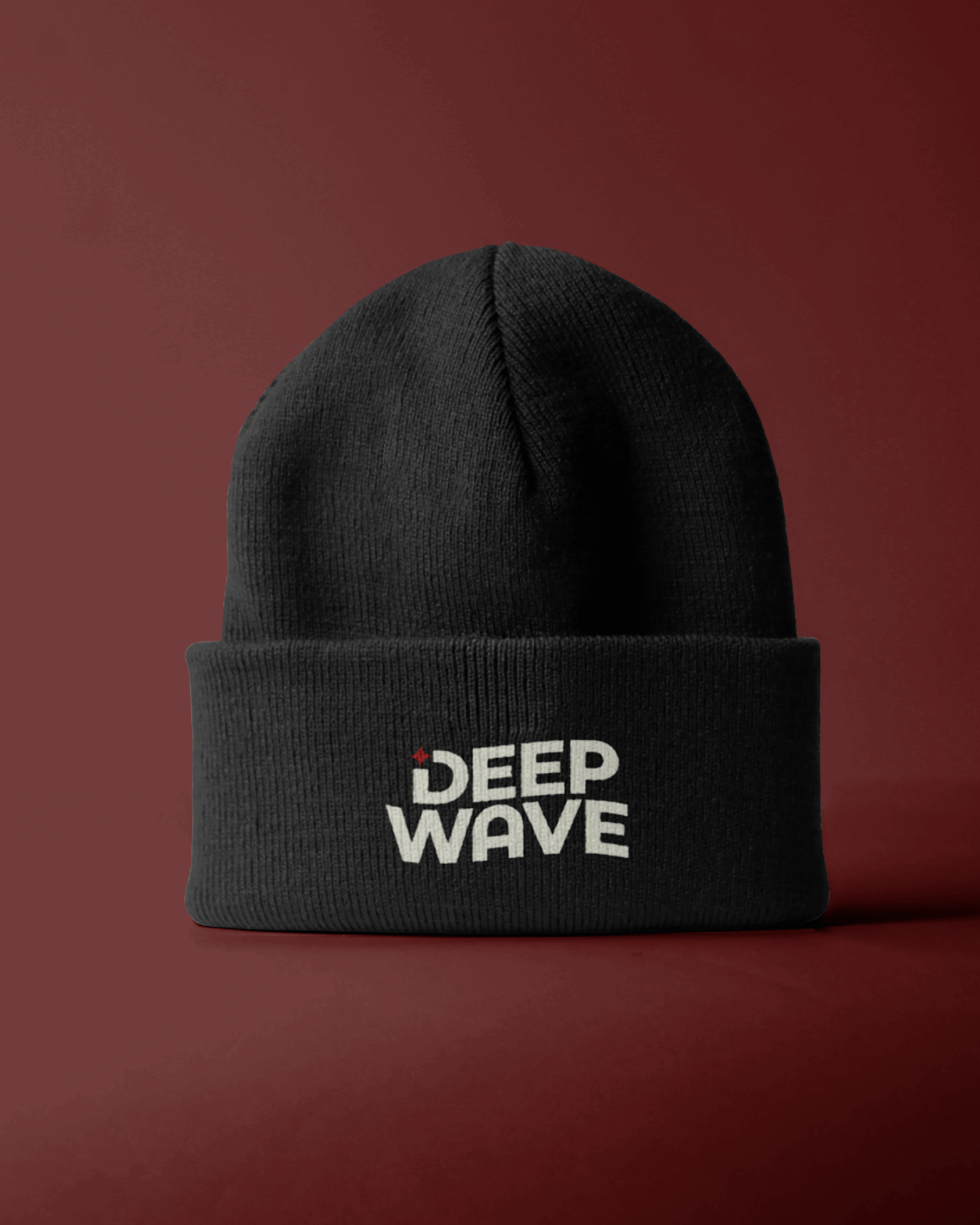
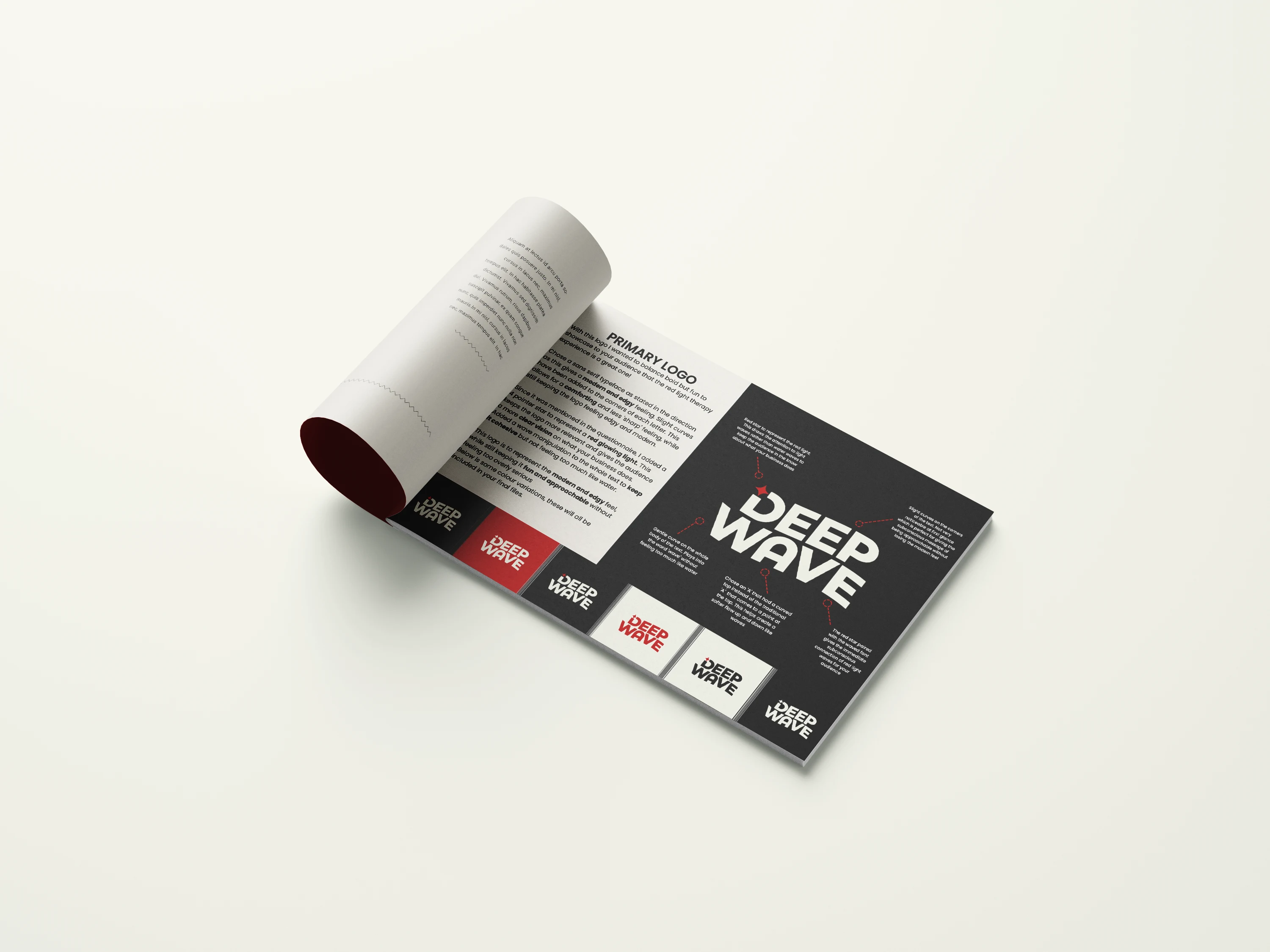
Red light waves, not water waves
We added a star icon to nod toward red light therapy making it clear this is a red light wave, not a water wave.
Calming, not cold
The off-white base gives warmth and softness, helping the brand feel more like wellness than medical treatment.
Bold and trustworthy
The deep red and charcoal pairing gives a strong, grounded feel and adds enough edge to grab attention without losing trust.
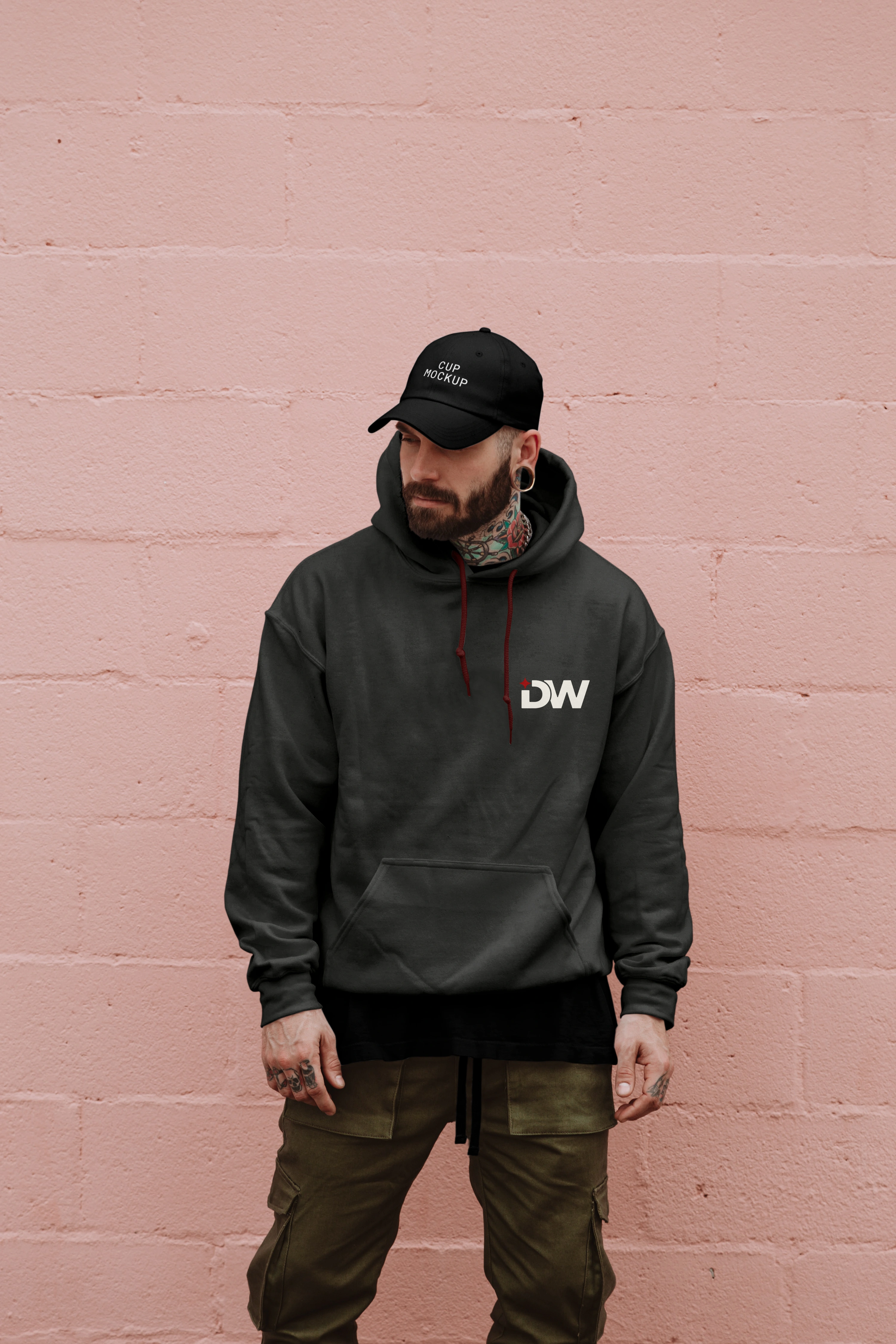
We chose colours that reinforce the experience Deep Wave offers: red for strength and healing, charcoal for a modern edge, and warm white to suggest calm and ease.
Together, they signal both professionalism and care which is exactly what’s needed for a treatment that’s personal, physical, and science-led.
Like this project
Posted Jul 7, 2025
Developed a brand identity for Deep Wave, focusing on credibility and comfort.
Likes
0
Views
7