Cashyst Brand Identity Redesign
Cashyst is a licensed private investigation firm that helps individuals recover unclaimed money across the US.
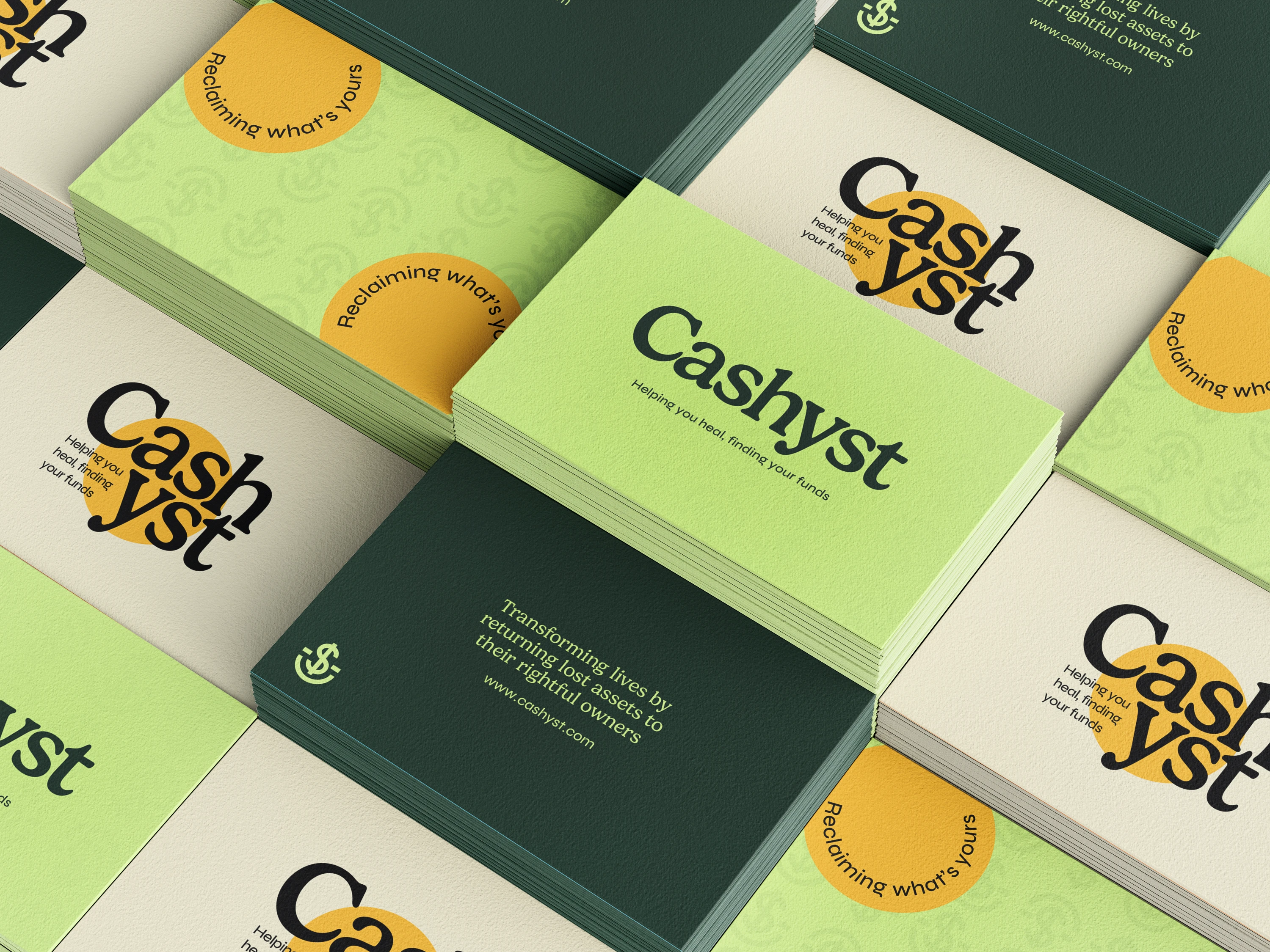
They came to me as their service they offered was strong, but the branding felt outdated and didn’t reflect the professionalism or clarity clients needed to feel at ease.
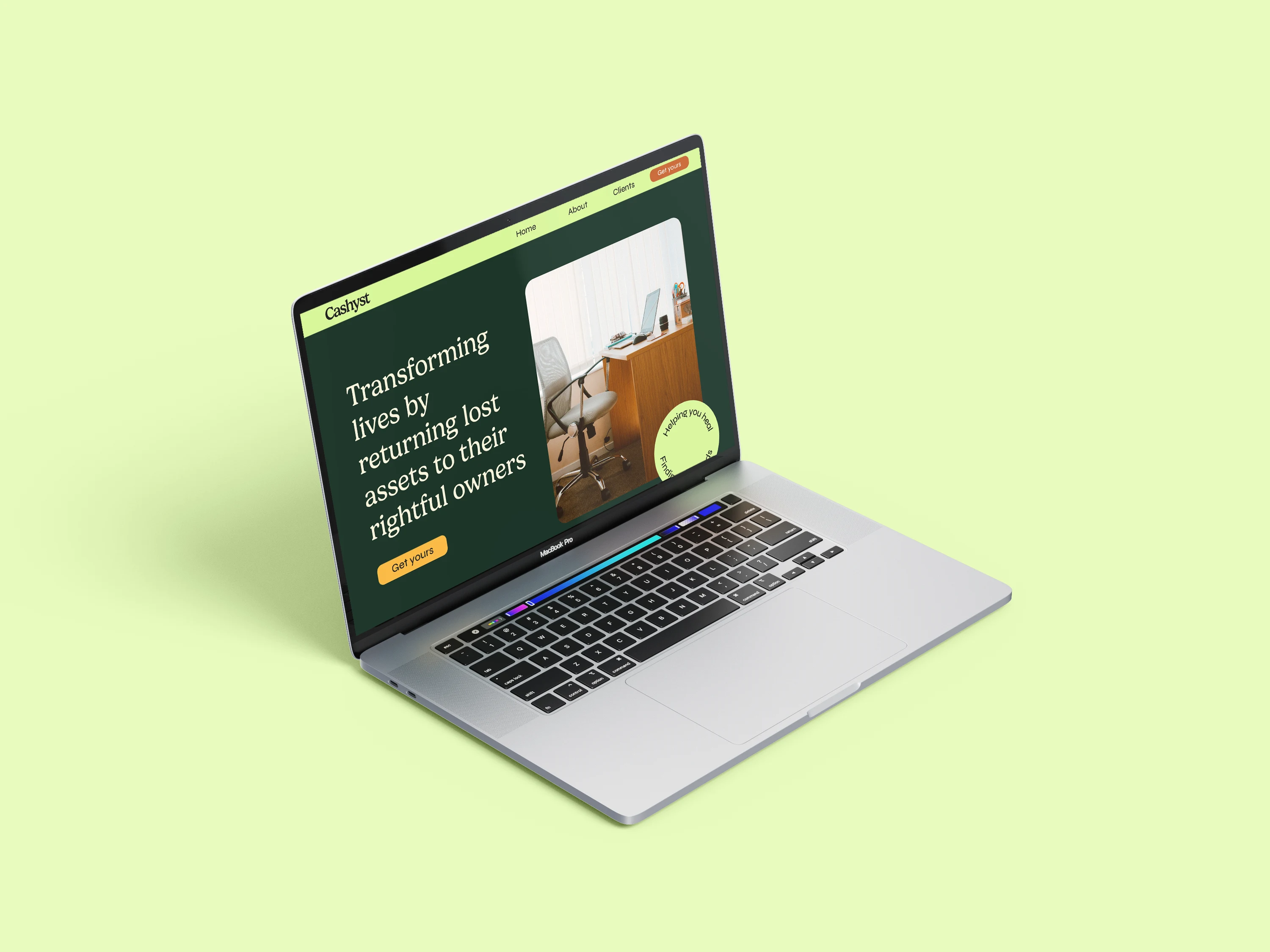
The goal was to create a brand that felt modern, trustworthy, and easy to understand. We created a visual identity that would help Cashyst stand out from competitors while still feeling secure and approachable.
Logo & Brandmarks
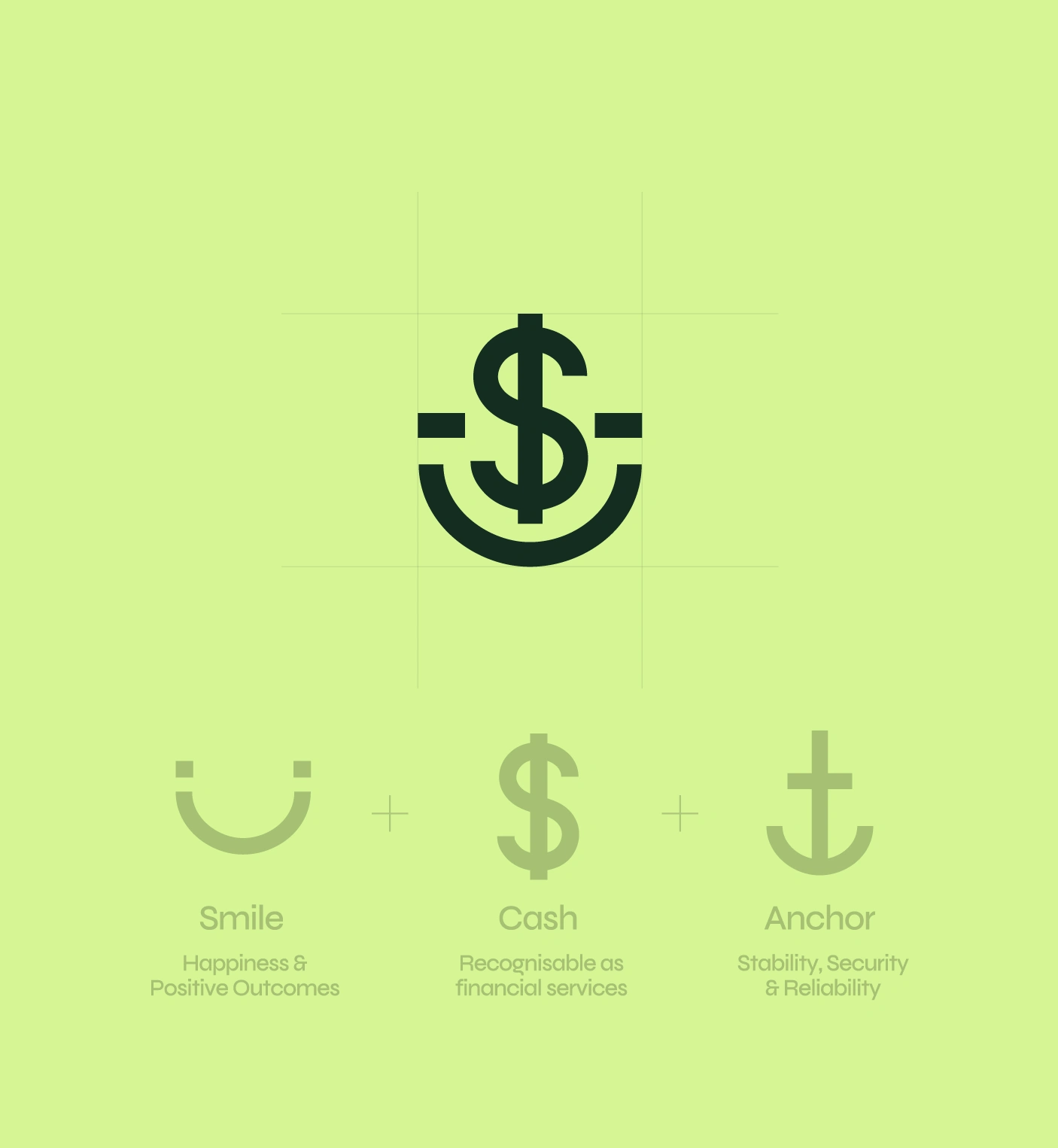
The symbol combines three elements, a smile, a dollar sign, and an anchor, to reflect positive outcomes, financial clarity, and stability.
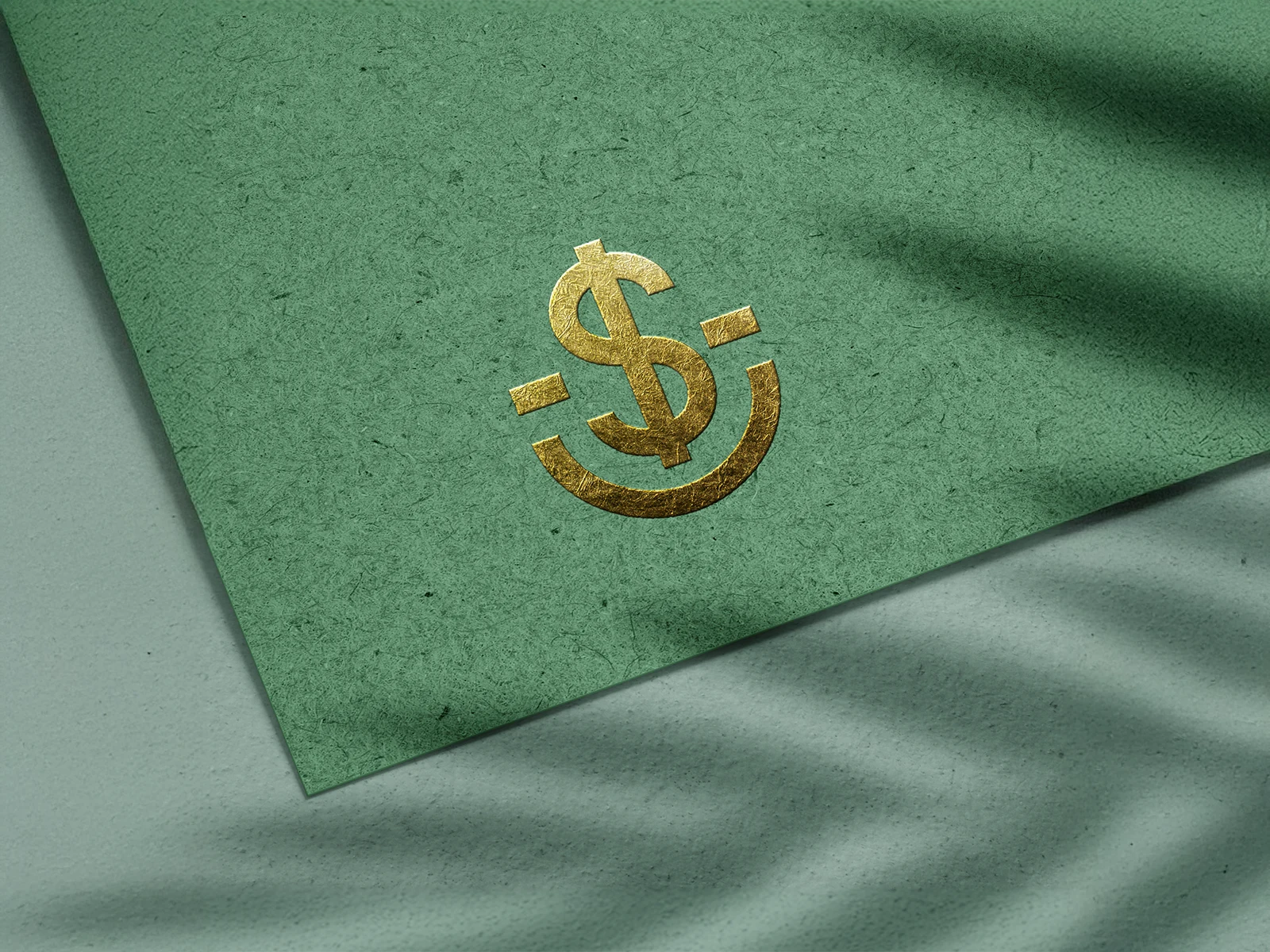
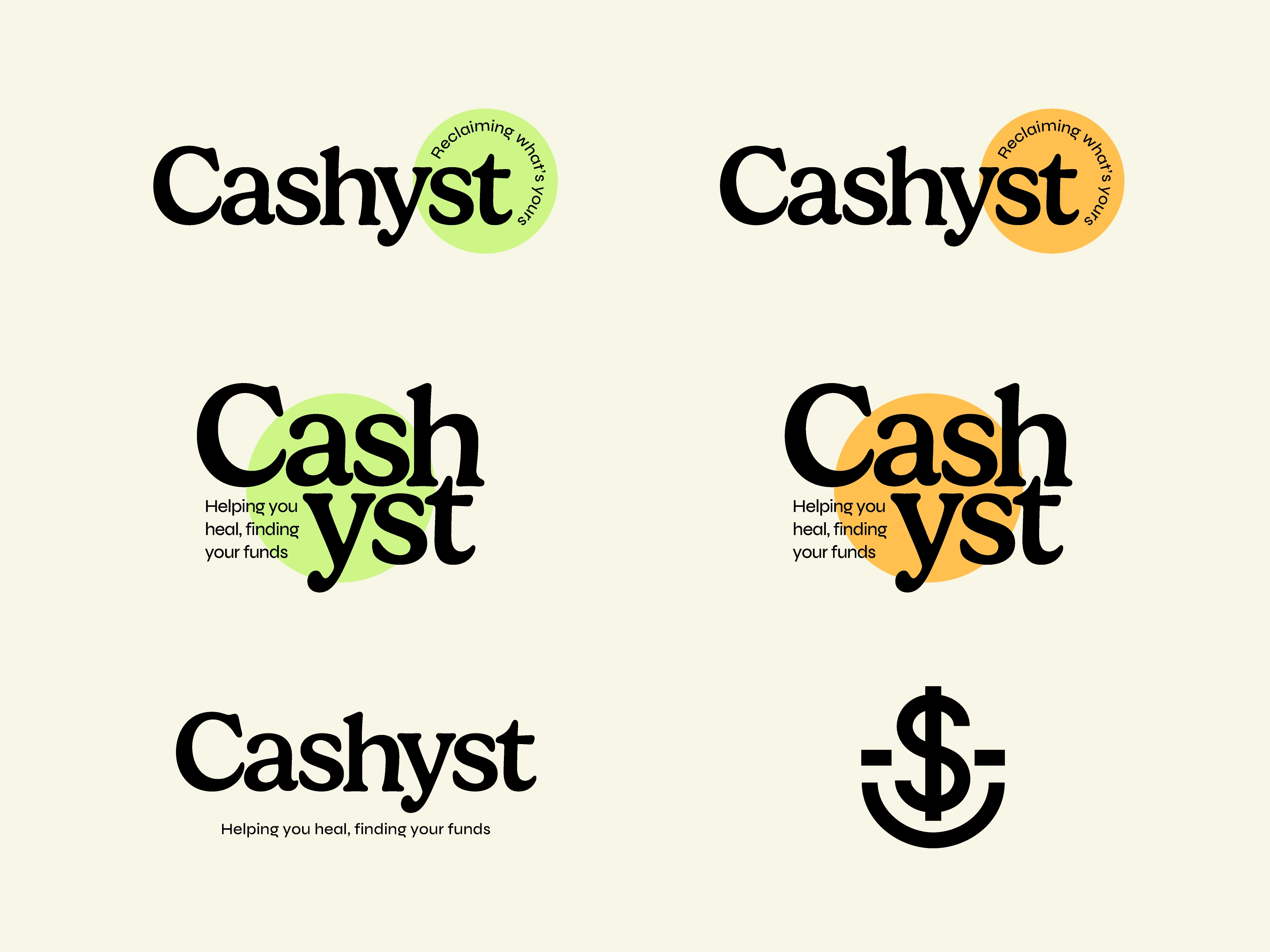
We paired it with a bold, modern wordmark and clean layout system to support recognisability and create visual consistency across all formats. The logo is simple but layered, with just enough personality to feel human without losing credibility.
Colour & Typography
The colour palette balances boldness with calm. We used a soft lime green to stand out and feel fresh, grounded it with deeper forest greens, and added a bright orange for contrast and warmth.
Typography was kept clean and minimal to maintain trust. The main font is structured and legible, while supporting type adds a touch of softness where needed (especially across social and print).
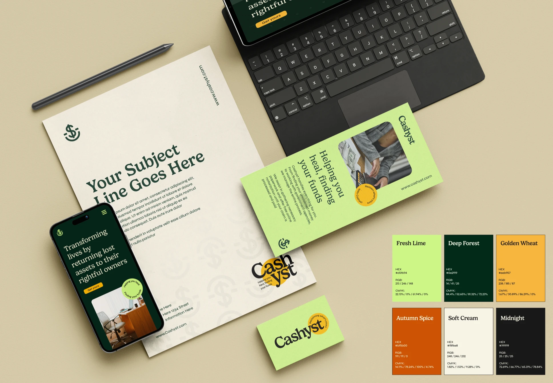
Print & Brand Collateral
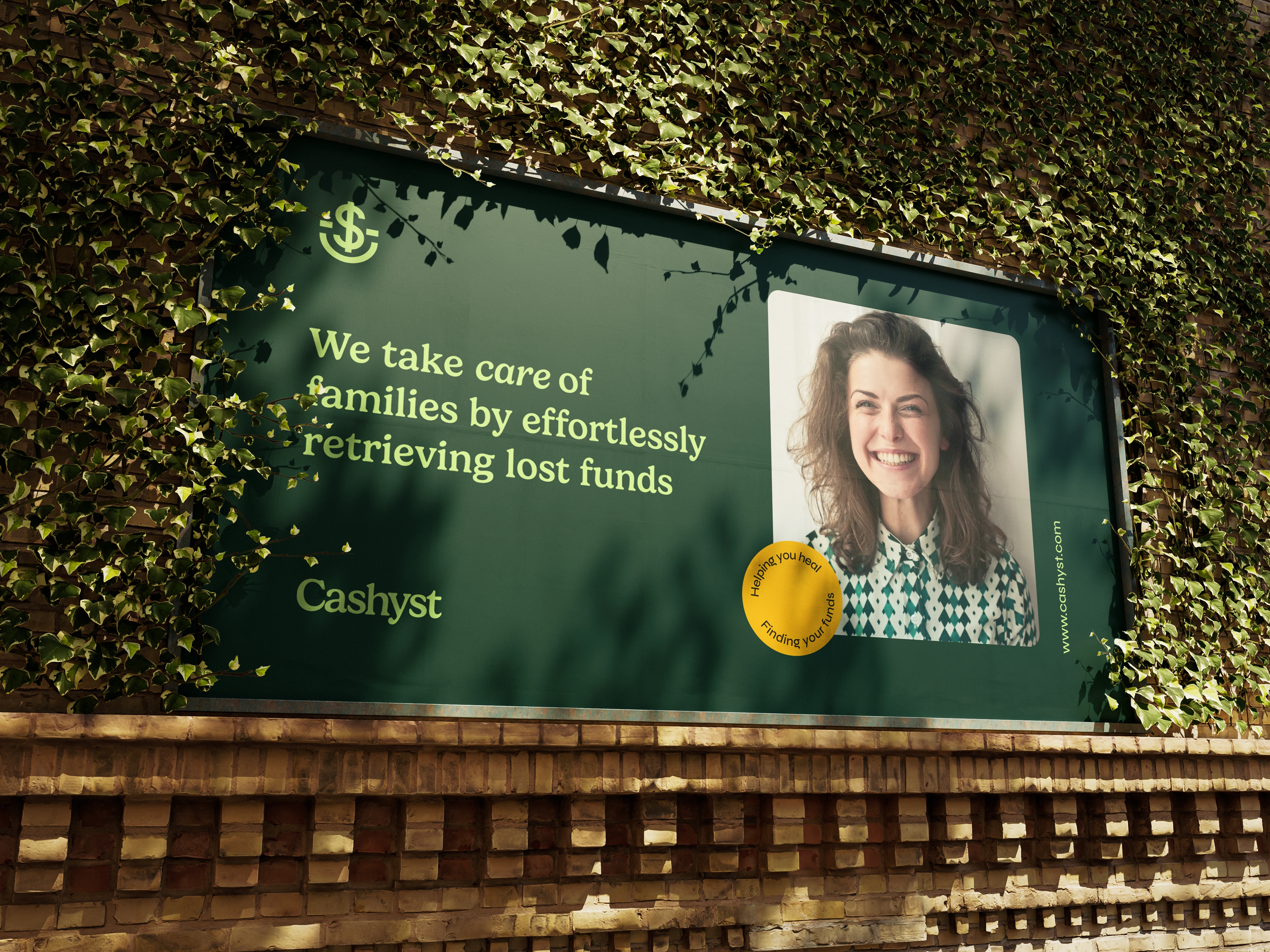
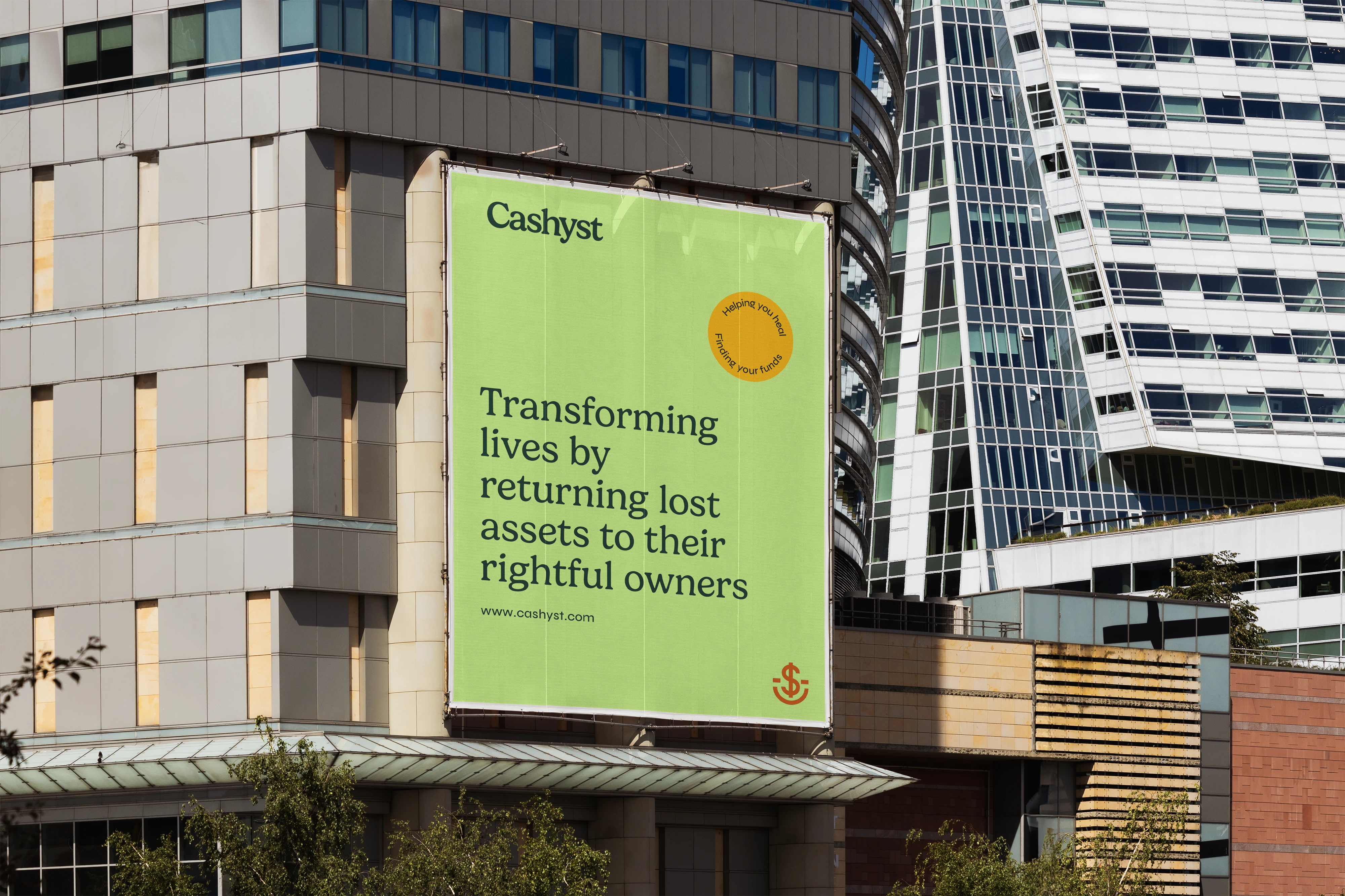
Print materials like business cards and signage were designed to feel clean, clear, and reassuring with enough flexibility to adapt across public ads, direct mail, and office displays.
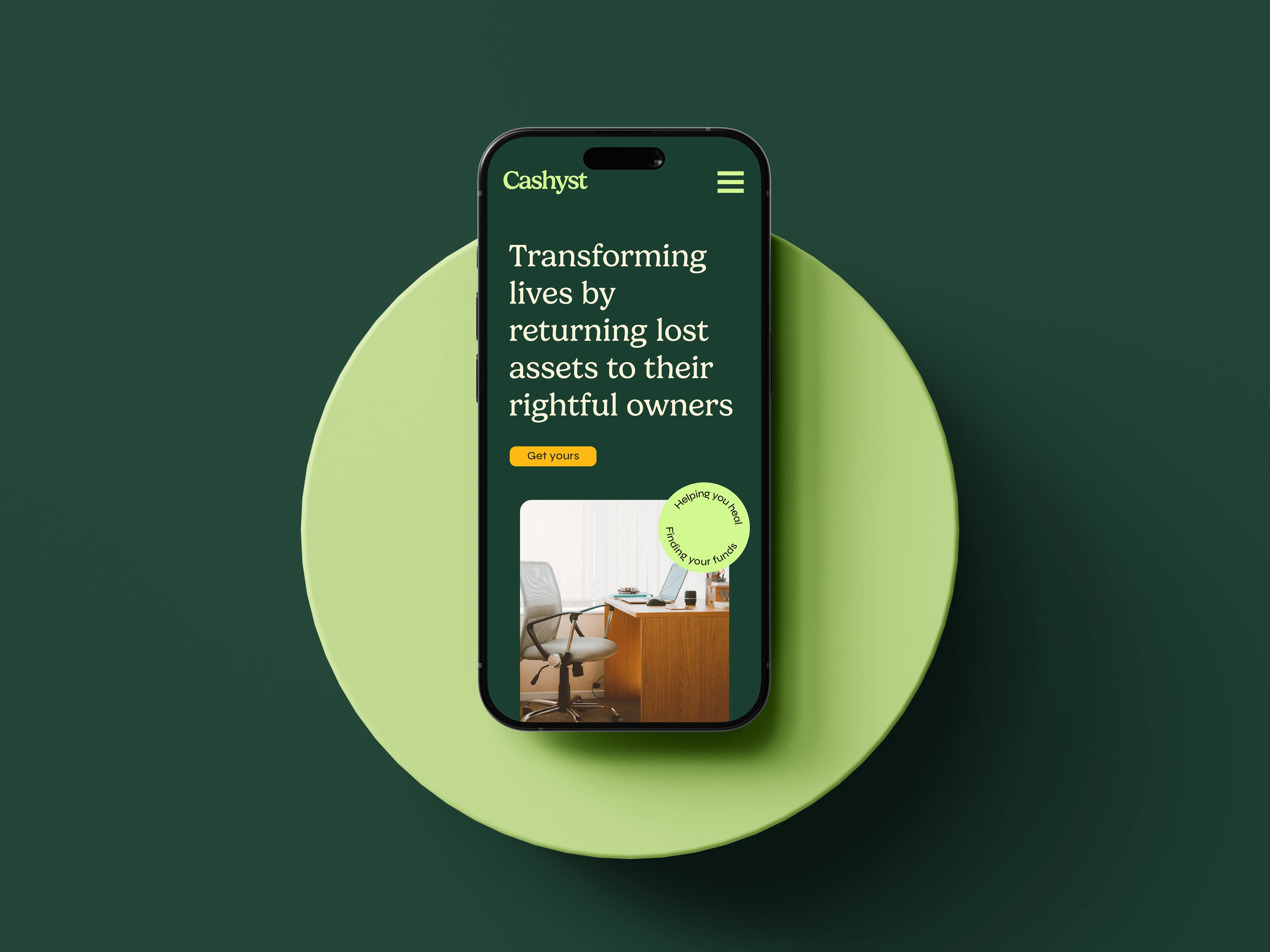
The tagline layouts and bold headlines are used consistently across assets to help people immediately understand what Cashyst does and how they help.
Recognition
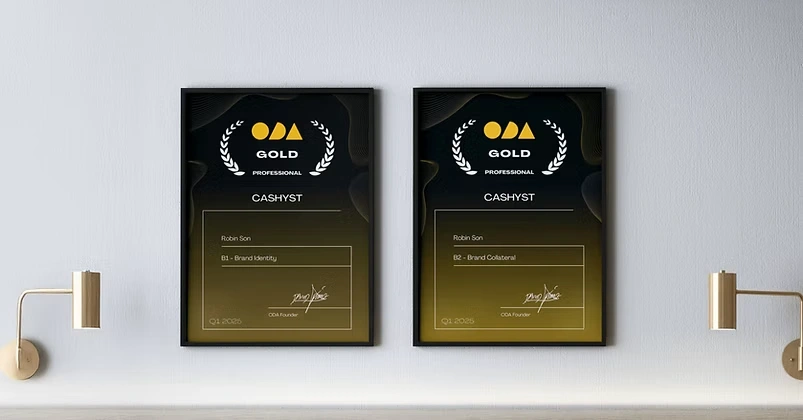
Cashyst’s visual identity was selected as a finalist in two categories at the 2024 Online Design Awards:
Gold Brand Identity and Gold Brand Collateral.
Client Feedback
Like this project
Posted Jul 7, 2025
Created a modern, trustworthy brand identity for Cashyst.

