Blue Poppy Skincare Brand Identity Rebrand
Robin Son
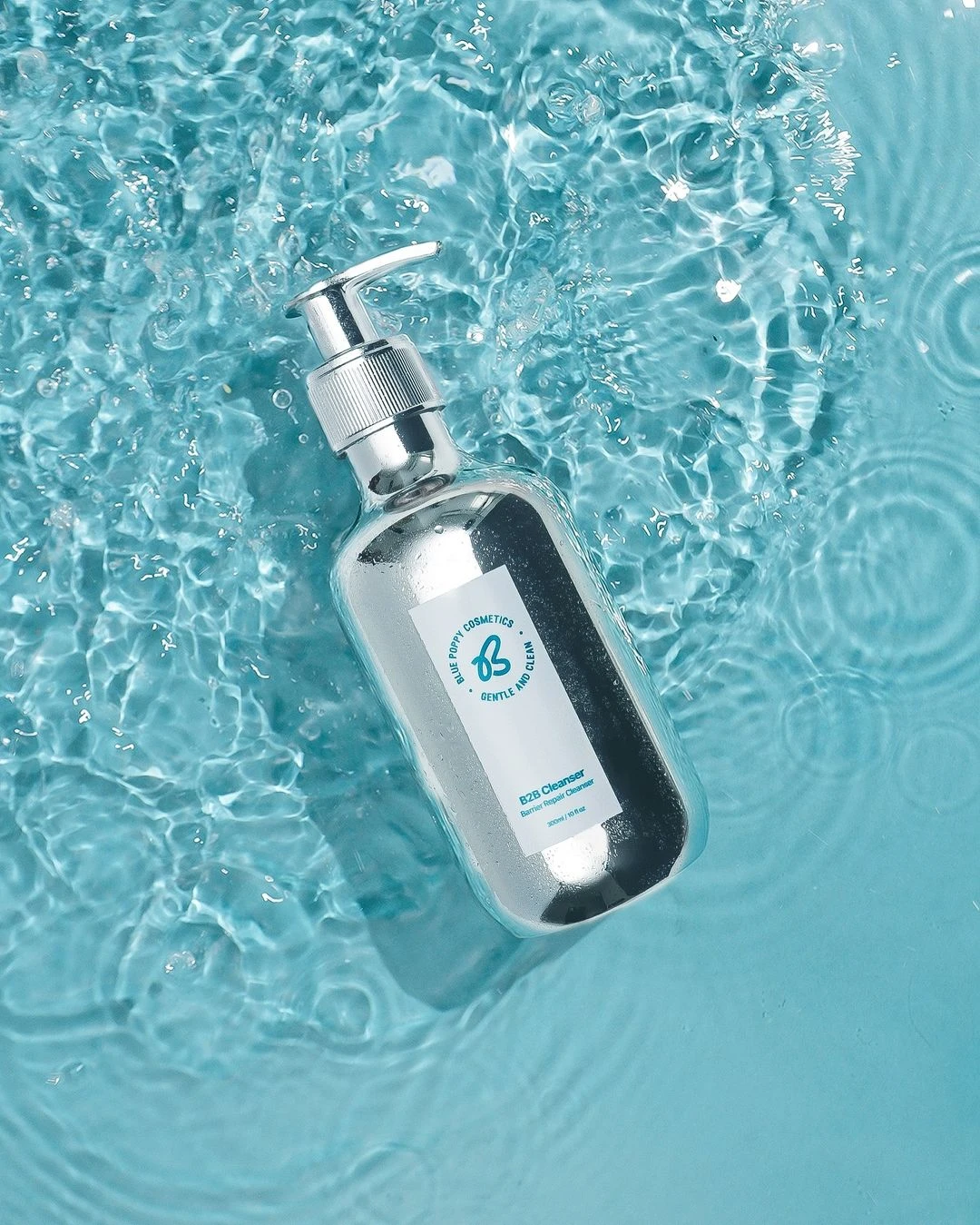
Blue Poppy is a Nigerian skincare brand founded by two sisters, focused on simple, effective products for everyday use.
They came to me because their brand visuals weren't consistent, didn’t reflect the quality of their product and were not easy to use across different formats.
Our goal was to create a visual identity that felt bold, clean and became something they could grow with and feel proud to show off.
Logo Design
The main logo uses a combination type with a playful Y and B to reflect the shopping experience: fun from beginning to end.
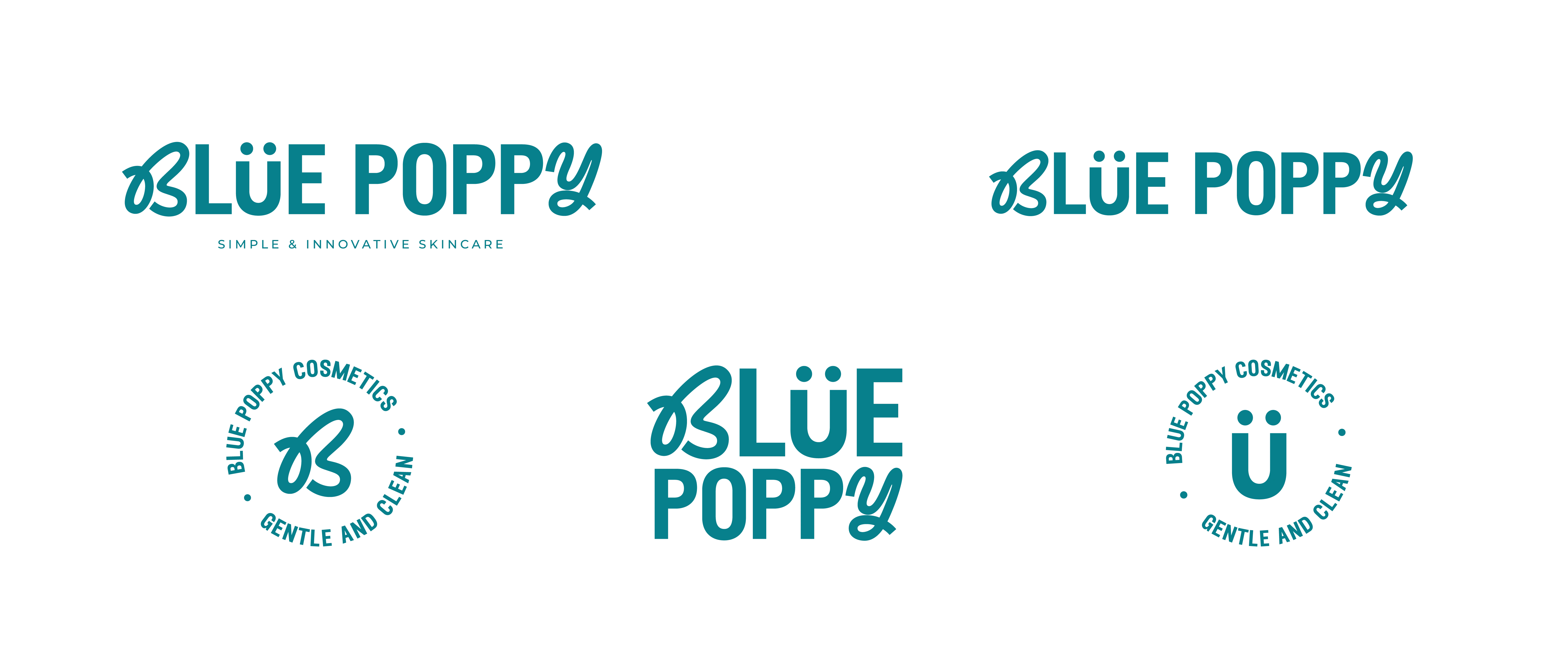
We kept the umlaut from their original logo for brand recognition (as requested by the client). The new “B” shape subtly nods to a butterfly, another small callback to their previous brand identity.
Clean layouts were used to reduce overwhelming feelings from customers, helping the brand feel simple and confident in a saturated space with lots of consumer choice.
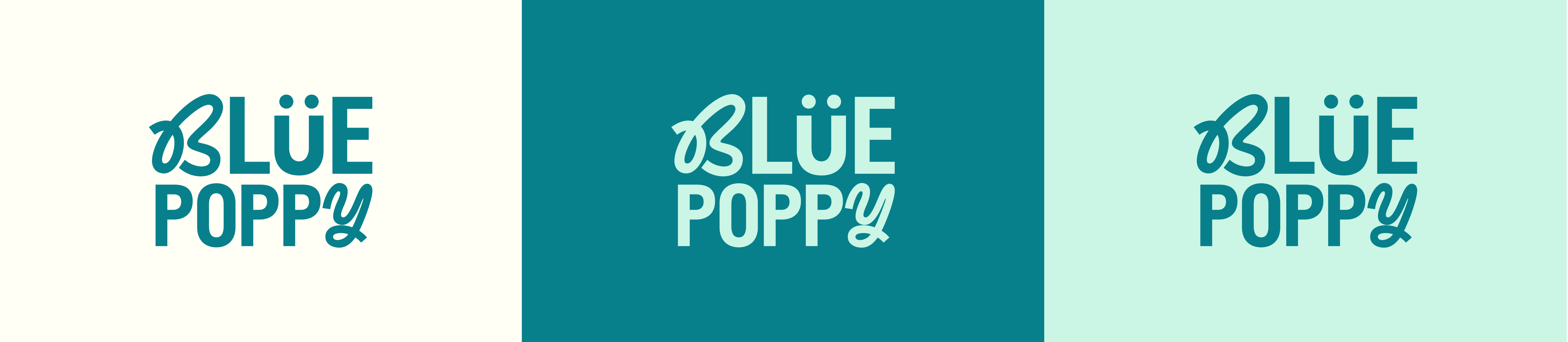
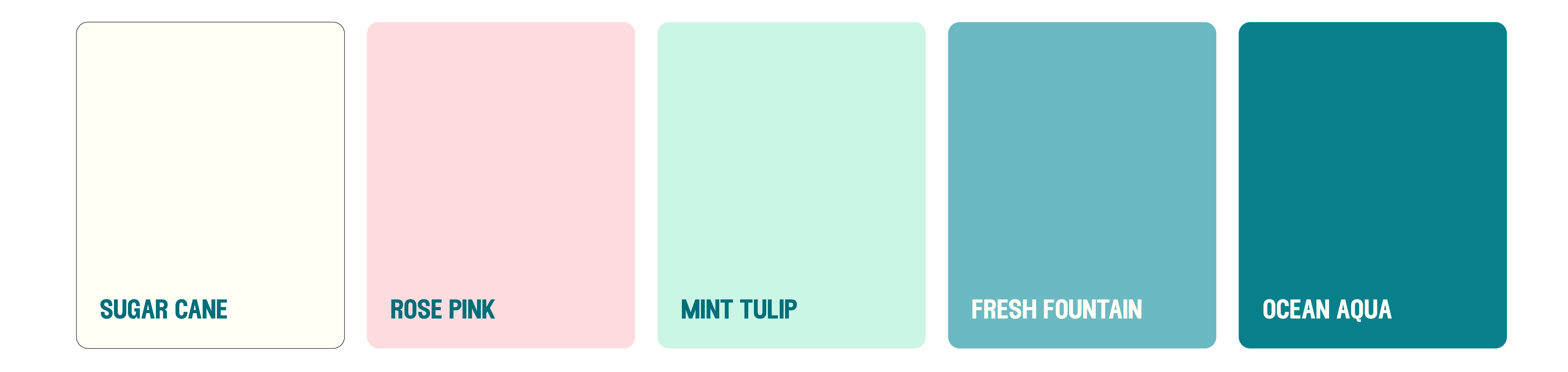
Brand Colours
We blended blue (from the name Blue Poppy) with green (to represent their value of sustainability) to create a teal that feels fresh but grounded.
A soft pink was added to represent the two sister founders: opposite skin needs, one shared solution. The palette reflects harmony in contrast, just like their products.
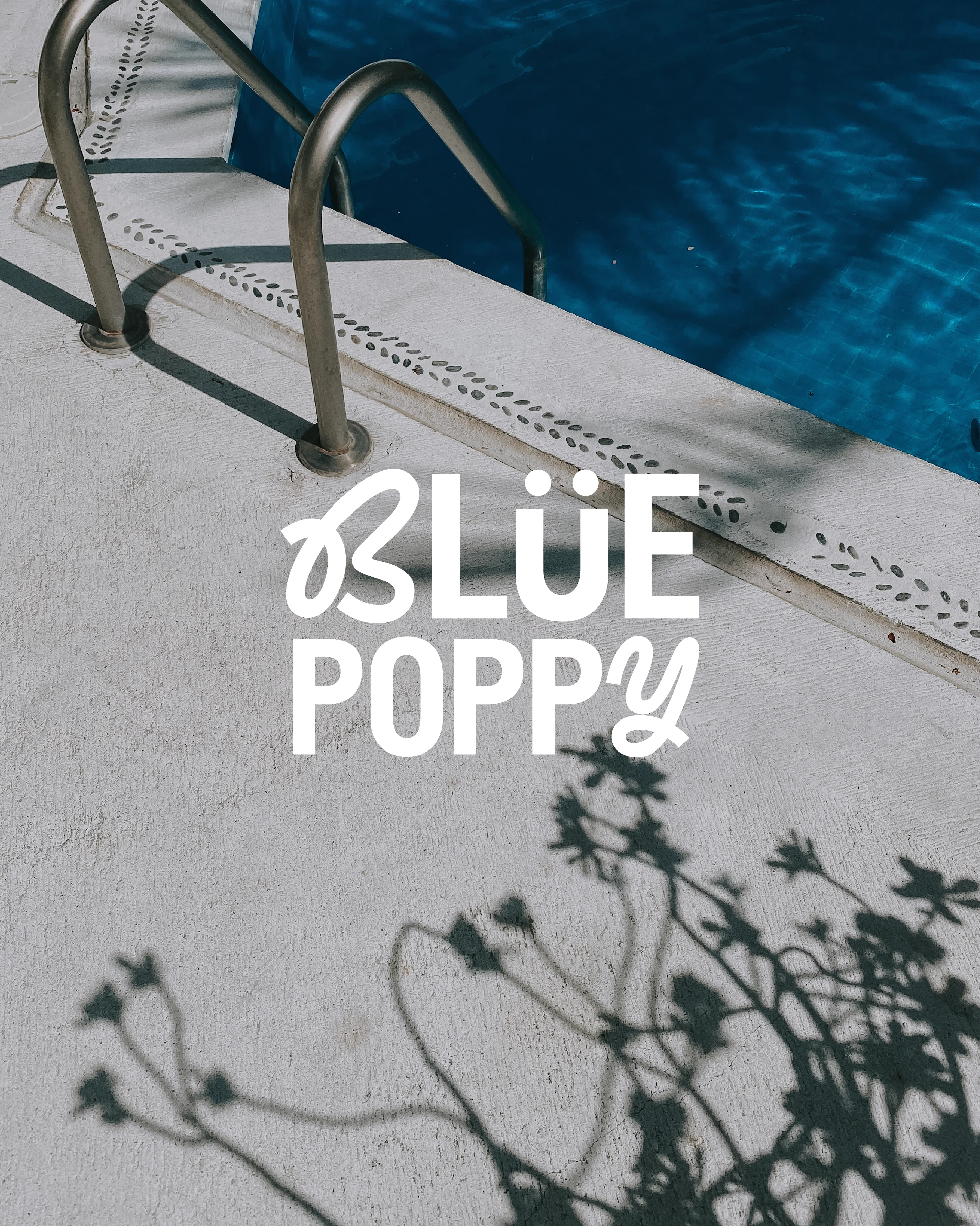
This palette was encourage throughout the brand photography too.
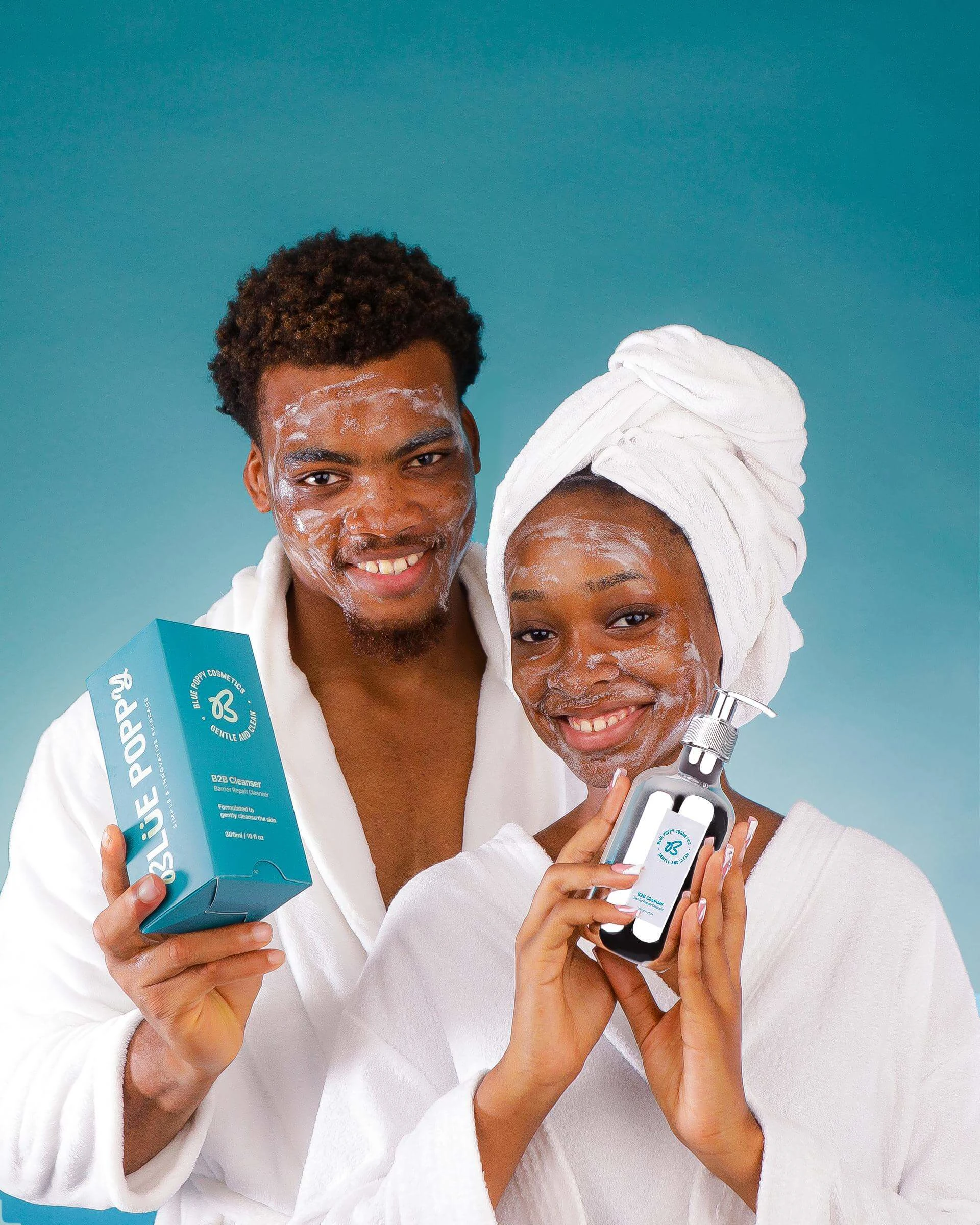

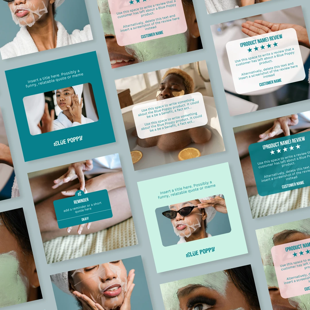
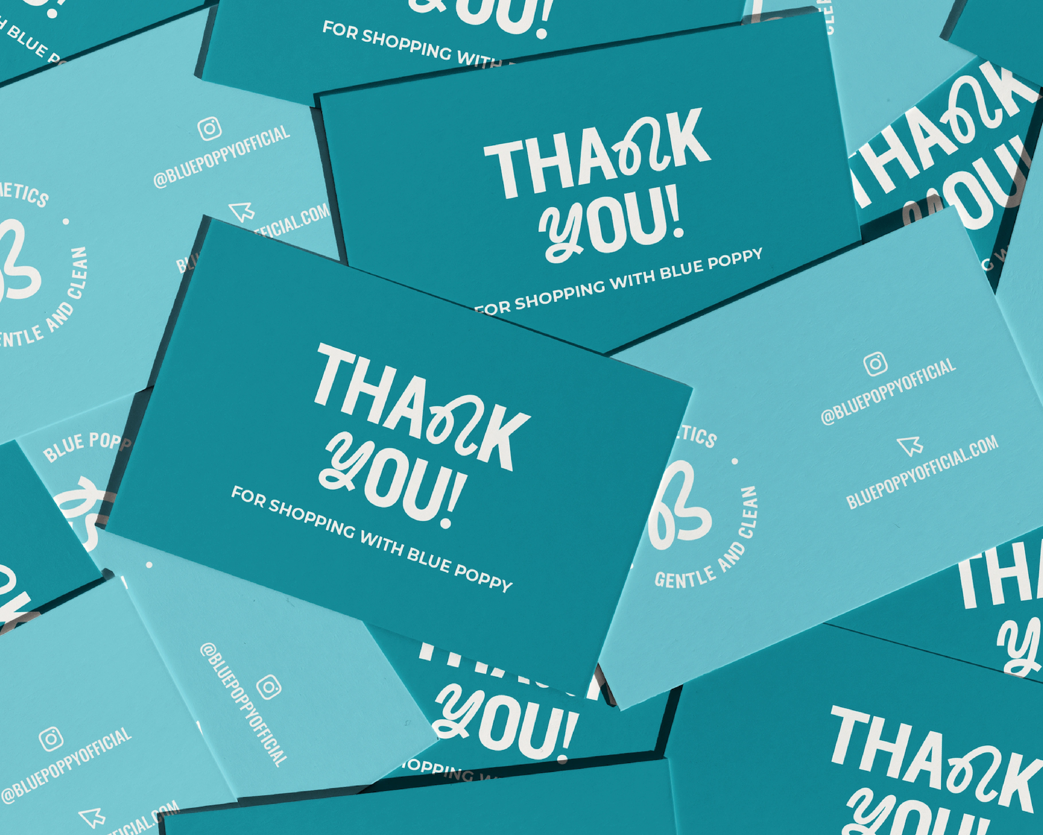
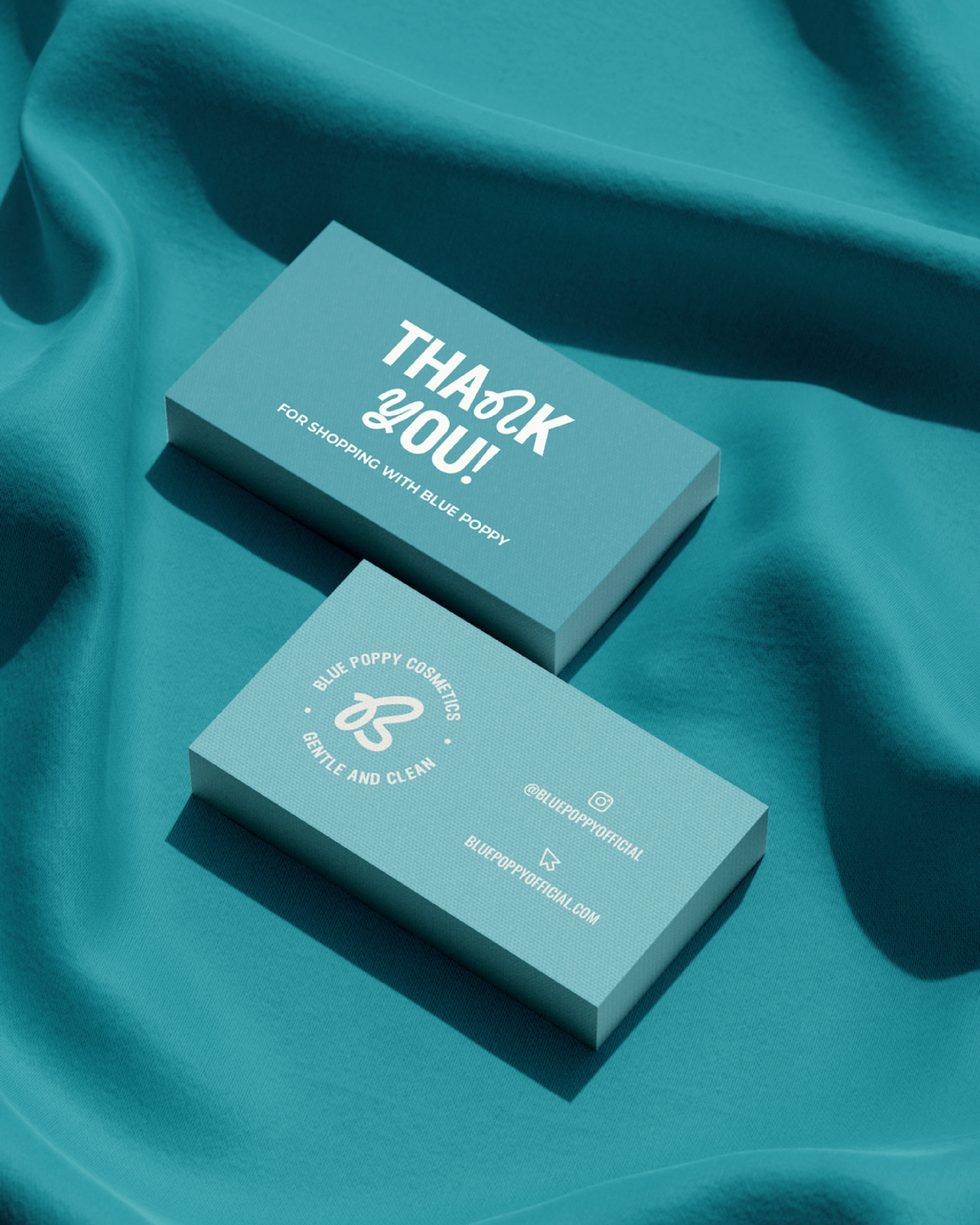
Brand Application
We also created a set of social templates and visual guidelines so the team could keep things consistent as they grow without needing to start from scratch every time.
Everything was built with ease of use in mind: quick to edit, easy to recognise, and flexible enough for different types of content.
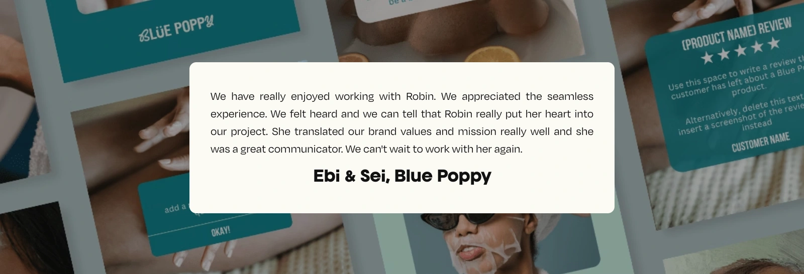
The Client
The final brand is something they feel confident using day-to-day, whether they’re posting on Instagram, sending out an order, or prepping for their next launch.
Like this project
Posted Jul 7, 2025
Developed a bold, clean visual identity for Blue Poppy skincare.
Likes
0
Views
6