Punjab Solar | Corporate Website Design

Fahad Qaseem Khawar


The Brief
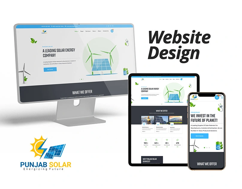
Punjab Solar needed a professional corporate website that reflected their position in the solar energy industry. The site had to communicate trust, technical expertise, and sustainability while making it easy for potential clients to explore services and get in touch. Built on WordPress with Elementor for easy ongoing content management.
Design Approach
The design prioritized clean layouts, strong visual hierarchy, and a color palette rooted in greens and blues to reinforce the solar/energy brand identity. Every section was structured to guide visitors from awareness to action: hero, services overview, project showcases, and clear CTAs.
Responsive design was a priority from the start. The site needed to perform on mobile just as well as desktop, given the mix of B2B and consumer traffic.
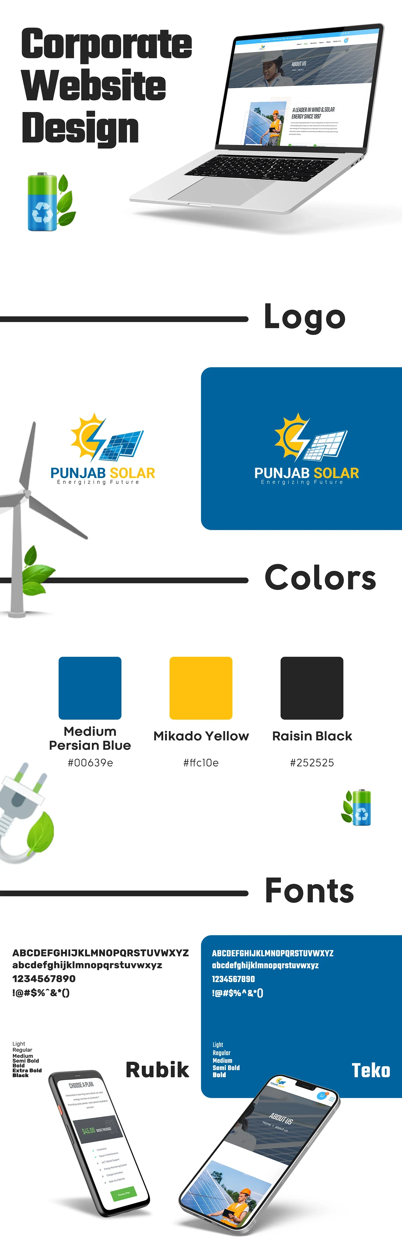
Website Overview
Key Pages & Features
The site includes a full services breakdown, project portfolio, about section, and contact forms. Each page was designed with conversion in mind: minimal friction, clear information architecture, and consistent branding throughout.
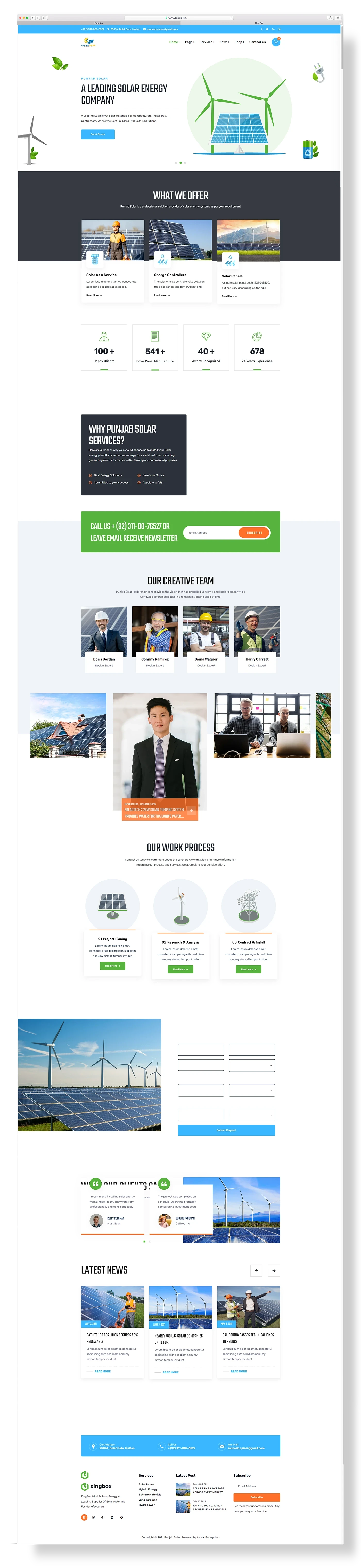
Page Layouts
Deliverables
Full corporate website design and development
WordPress + Elementor build for easy client editing
Responsive design (mobile, tablet, desktop)
Service pages, portfolio section, contact forms
SEO-friendly structure and fast load optimization
Live site: punjabsolar.pk
Like this project
Posted Jul 1, 2026
Likes
0
Views
7
Timeline
Feb 1, 2023 - Ongoing
Clients
Ecombranding.co