Elegant Website Design | WordPress & Elementor

Fahad Qaseem Khawar


The Brief
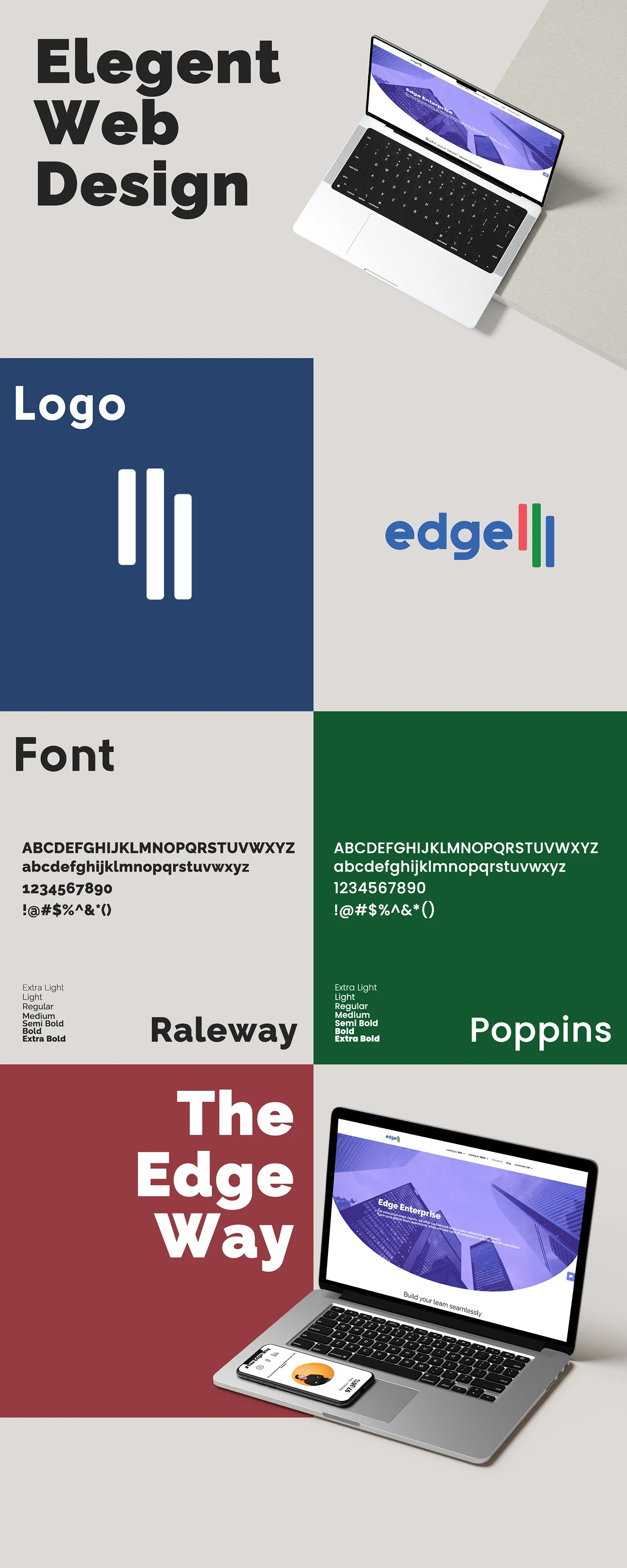
OnEdge needed a polished, modern website that reflected their brand identity and worked as a conversion tool, not just a digital brochure. The site had to be elegant, fast, and easy for the client to manage after handoff.
Design & UX Approach
The design started in Figma with wireframes and high-fidelity mockups. The focus was on clean layouts, generous whitespace, and a visual hierarchy that guides visitors toward key actions. Every section was designed to feel intentional: hero, services, about, and contact all flow naturally without clutter.
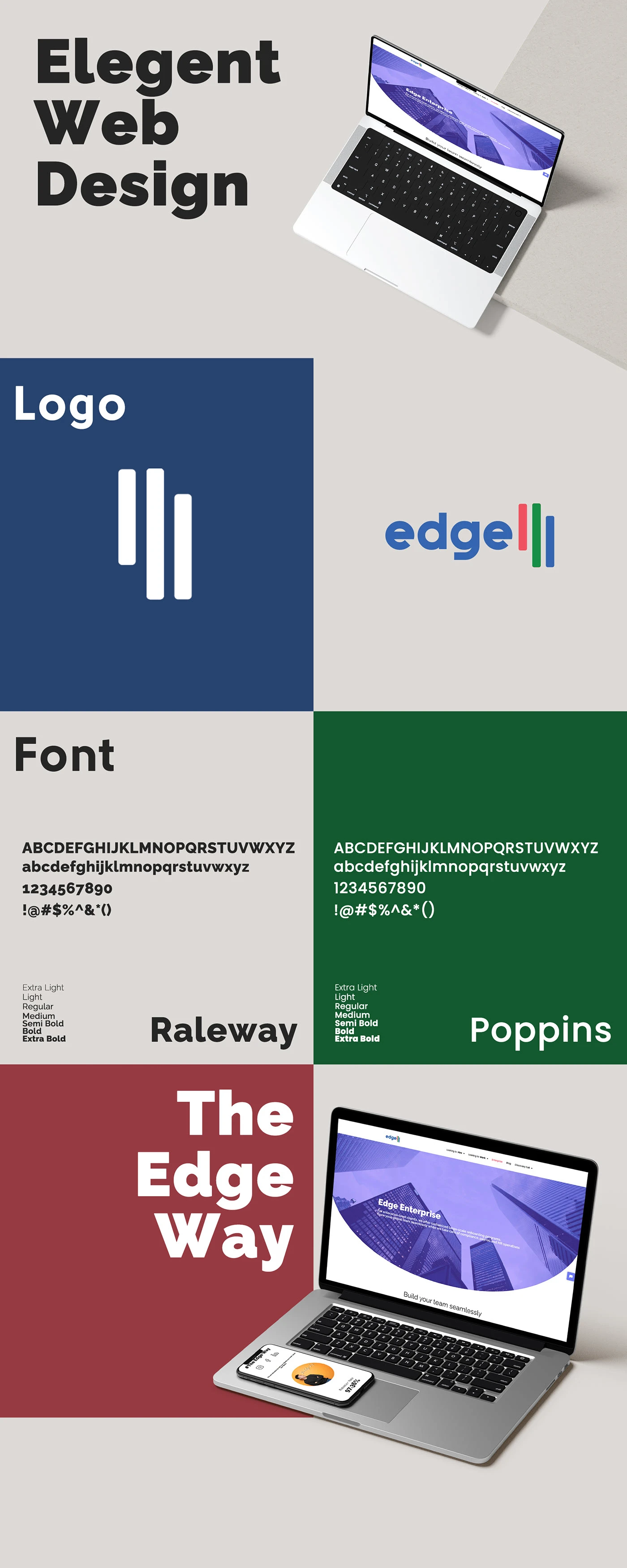
Website Hero Section
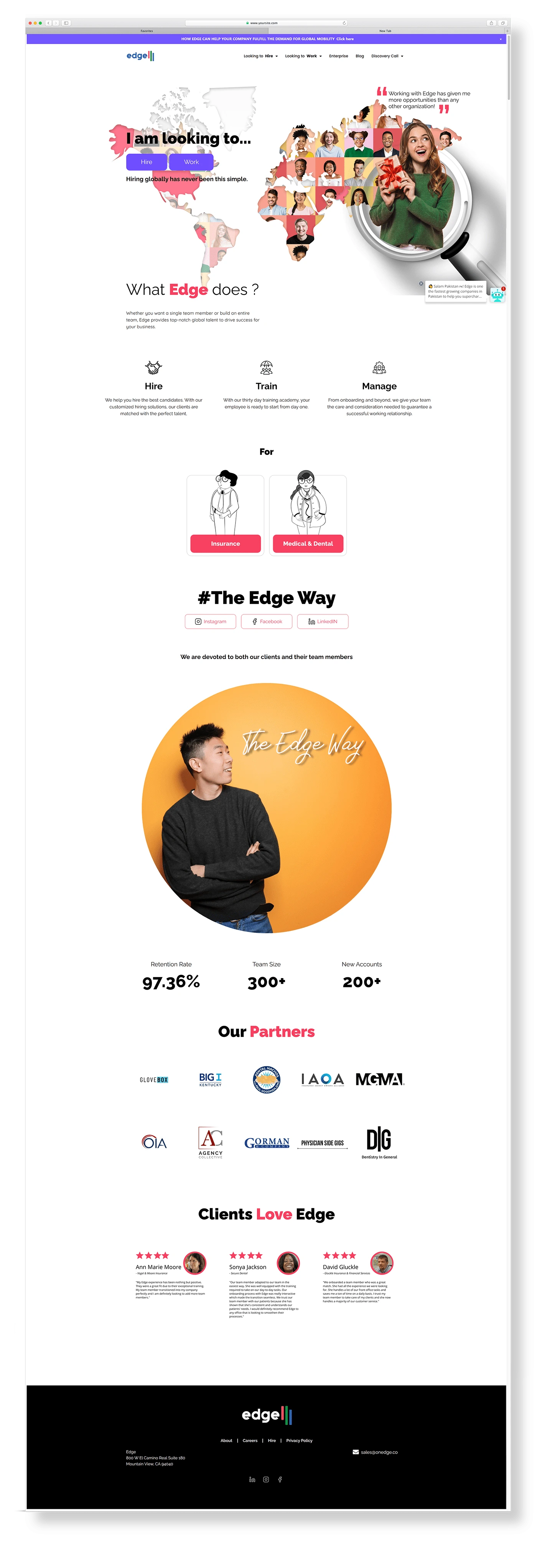
Page Layout Detail
Development
The site was built on WordPress using Elementor, giving the client full control over content updates without touching code. Performance was a priority: optimized images, minimal plugin bloat, and clean CSS kept load times fast. The site is fully responsive across desktop, tablet, and mobile.

Full Page View
Animation & Interaction
Subtle scroll animations and micro-interactions were added to bring the design to life without slowing the experience. These details make the site feel premium and keep visitors engaged as they move through the content.
Deliverables
Custom WordPress website built with Elementor
Figma design files (wireframes + high-fidelity mockups)
Fully responsive design (desktop, tablet, mobile)
Scroll animations and micro-interactions
SEO-ready structure and optimized page speed
Client handoff with CMS training
Live site: onedge.co
Built with Adobe Photoshop, Figma, and WordPress (Elementor).
Like this project
Posted Jul 1, 2026
Likes
0
Views
11
Clients
Ecombranding.co