Collaborated with a talented German design team on the Aura ...
Jeroen van Eerden
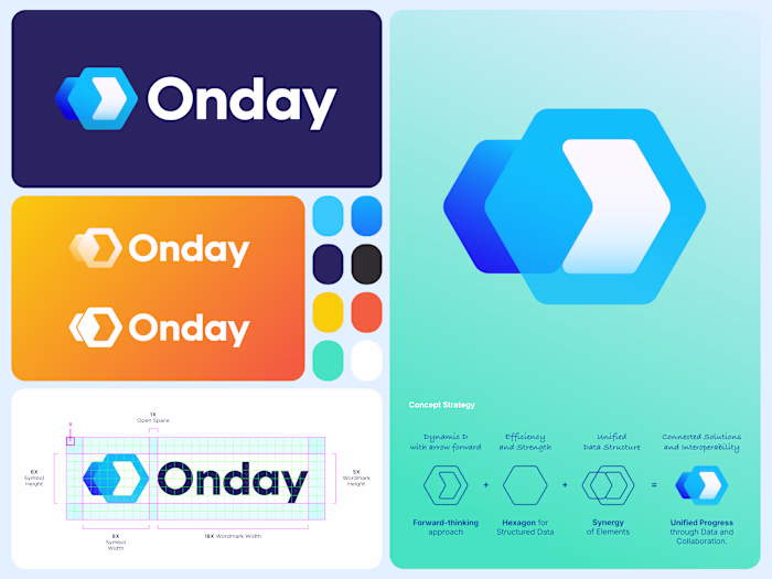
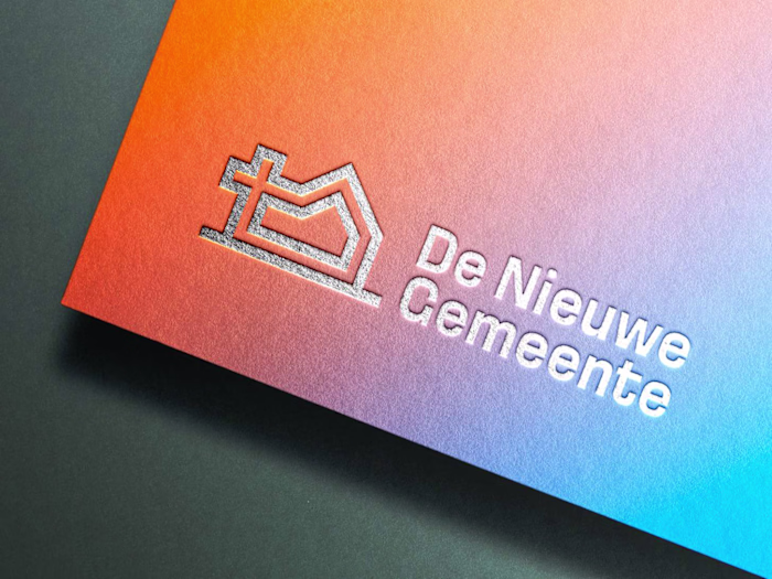
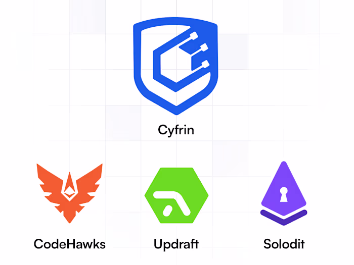
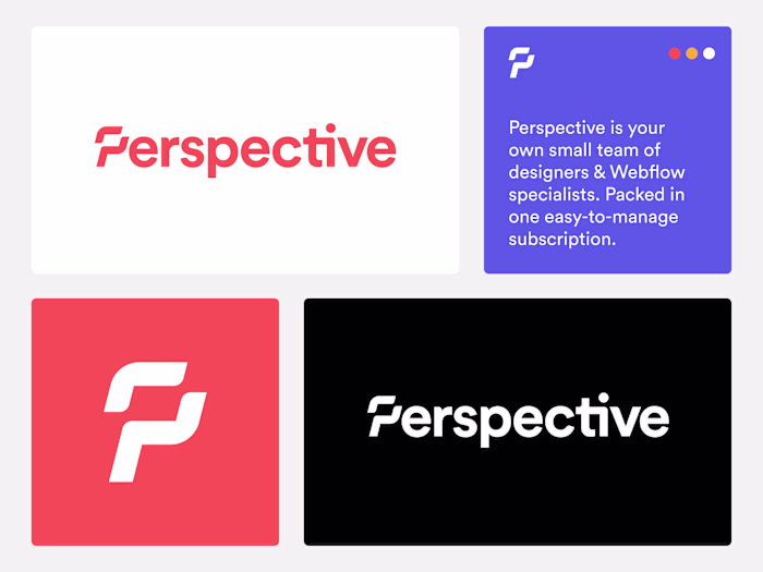
Collaborated with a talented German design team on the Aura Apps rebrand — creating a cohesive system of product logos under one umbrella identity. I focused on clarity, structure, and meaning, while introducing my signature use of vivid, modern colors to help the lineup stand out within Atlassian’s saturated app ecosystem and bring fresh energy to the brand.
I’m super excited with how this turned out — and even more thrilled to see these products now live in the marketplace!
A cohesive identity system that unites all tools under one clear, modern visual language.
Learn more about the Aura Apps.
Like this project
Posted Oct 15, 2025
Collaborated with a talented German design team on the Aura Apps rebrand — creating a cohesive system of product logos under one umbrella identity. I focused...
Likes
0
Views
1
Timeline
Jan 15, 2025 - Jun 11, 2025
Clients
Seibert Group