Cyfrin Logo & Visual Identity

Cyfrin is a leading provider of smart contract security audit services, tools, and education. As an umbrella brand, it oversees several sub-brands: CodeHawks, Updraft, and Solodit. While CodeHawks recently updated its logo in-house, Updraft and Solodit had outdated and overly detailed designs that no longer reflected the modern, minimal identity Cyfrin wanted to project. The challenge was to create a cohesive and modern brand system while preserving the individuality of each sub-brand.
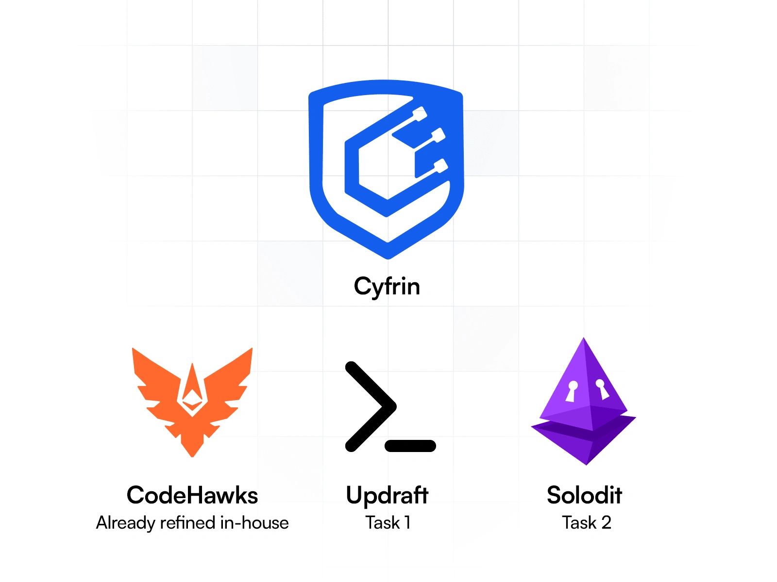
Current brand system - Goal was to make the other 2 fit the brand family
The Challenge:
Updraft and Solodit’s logos needed a complete overhaul to align with Cyfrin’s bold vision.
Outdated styles: Solodit’s logo was too detailed and lacked versatility.
Lack of cohesion: The sub-brand logos felt disconnected from Cyfrin’s identity.
Versatility needs: The new designs had to work in light/dark themes, small/large sizes, and standalone applications. The goal was to create a cohesive brand system where each logo feels distinct but part of a unified family.
Logo & identity for the Solodit brand:
I worked closely with Cyfrin’s creative team to craft modern, minimalist designs for Updraft and Solodit. The first focus was to refine their Solodit logo. While some of these concept elements were preferred, there was just too much going on in this current design.
Research & Concepting
To begin, I revisited Solodit’s existing logo and engaged in detailed discussions with the Cyfrin team. We identified several areas for improvement, including its overly detailed design, lack of scalability, and limited versatility across different mediums. Together, we evaluated how to refine the logo while preserving the essence of the original concept.
I also conducted online research to assess current trends, competitors’ designs, and innovative approaches in the blockchain and security industries. This helped me understand what had already been done and identify gaps or opportunities to experiment with unique visual solutions.
From there, I developed two key design approaches:
Minimal Refinements: Subtle improvements to the existing logo, focusing on simplification, scalability, and alignment with the Cyfrin brand system.
Revolutionary Alternatives: More experimental and bold directions to explore fresh perspectives while staying true to Solodit’s identity.
Concept Exploration
I presented both approaches to the Cyfrin team to ensure alignment. My goal was to give them a clear picture of how the redesigned logos could evolve and work seamlessly with the Cyfrin ecosystem.
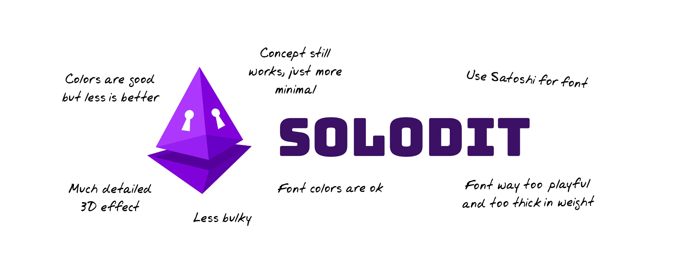
All points to keep in mind while tackling this logo re-design challenge
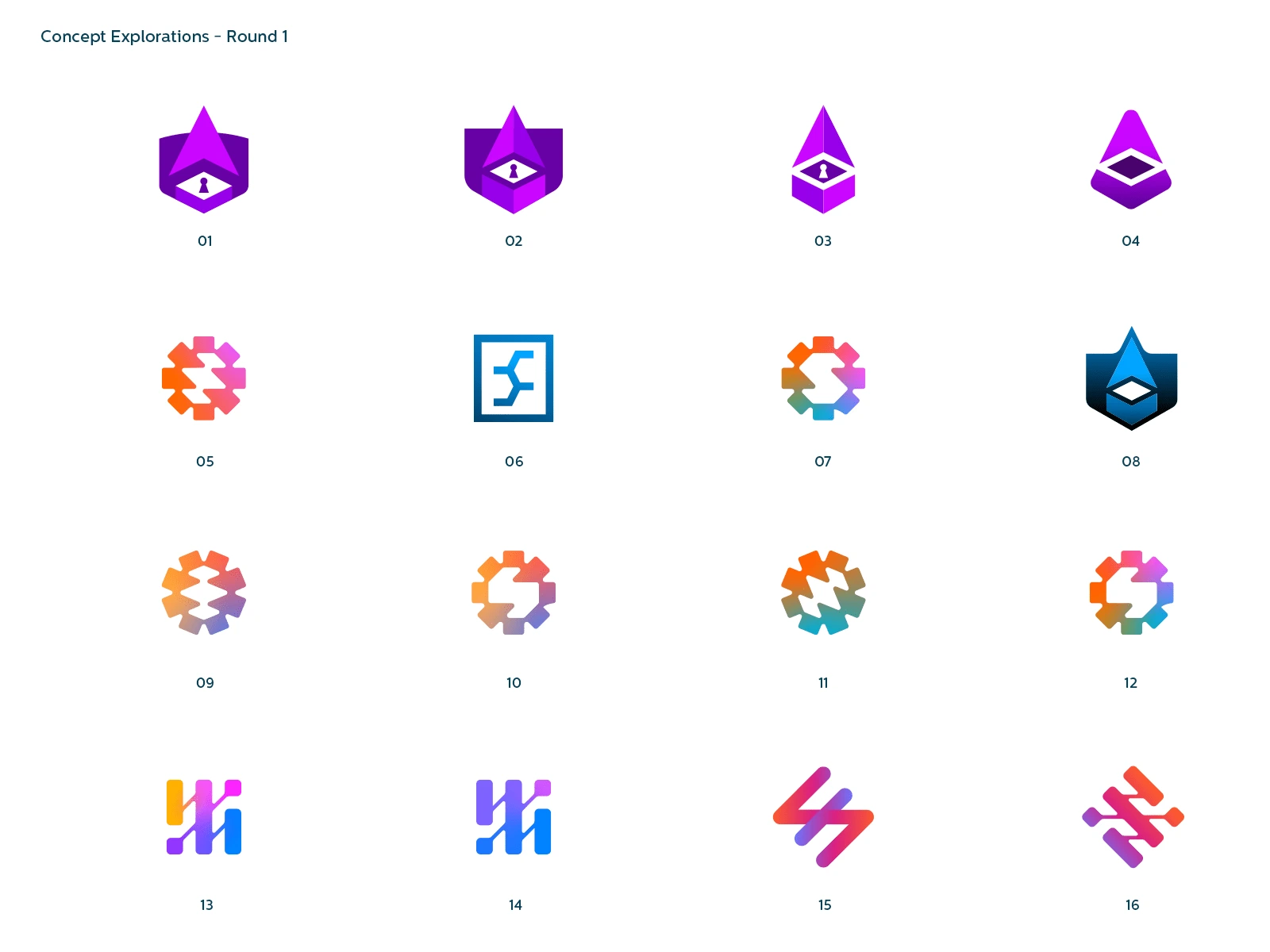
The first round of concepts I presented - focus started to come more towards the top row
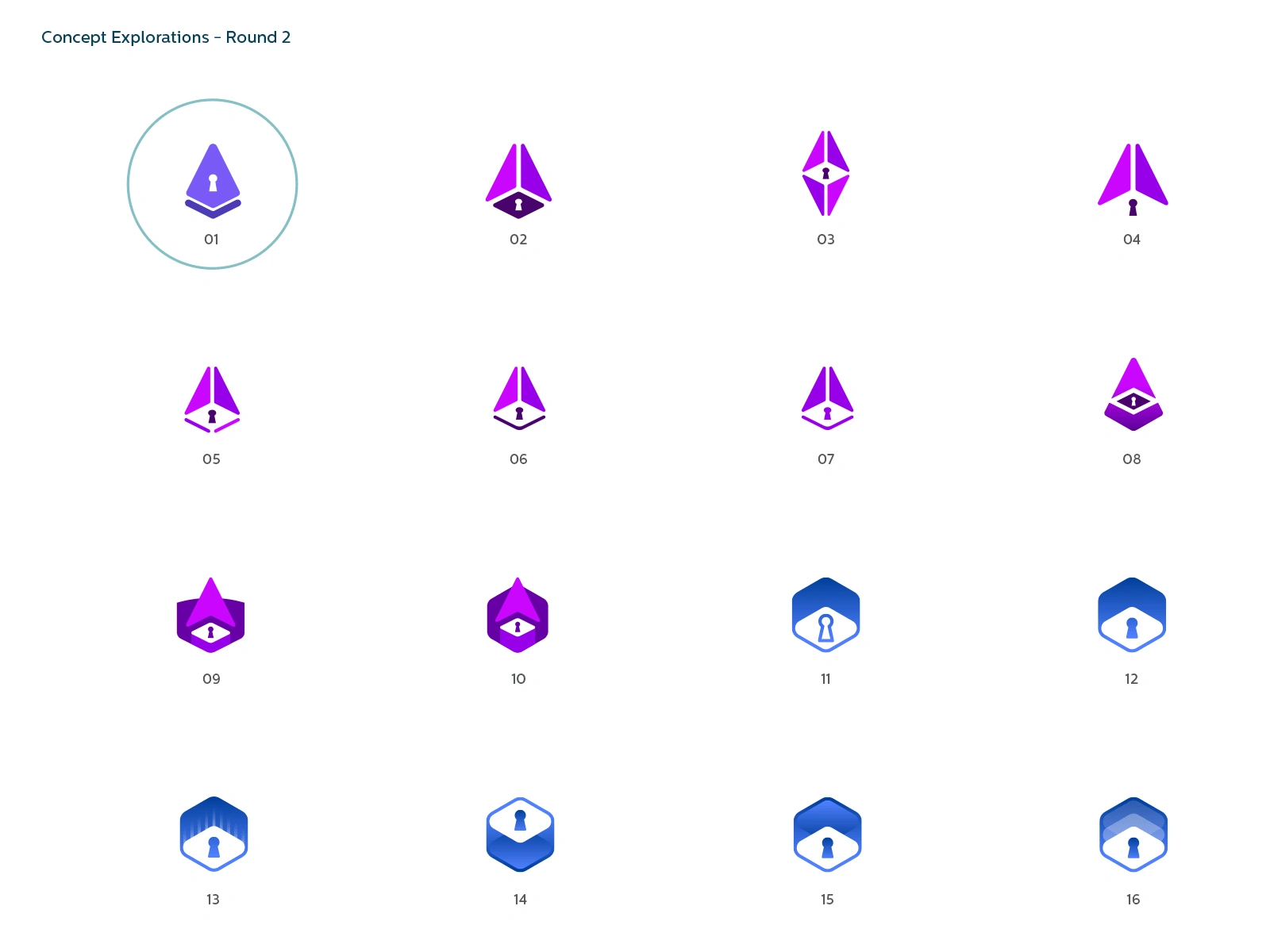
The second round was the moment we landed on the most suited design
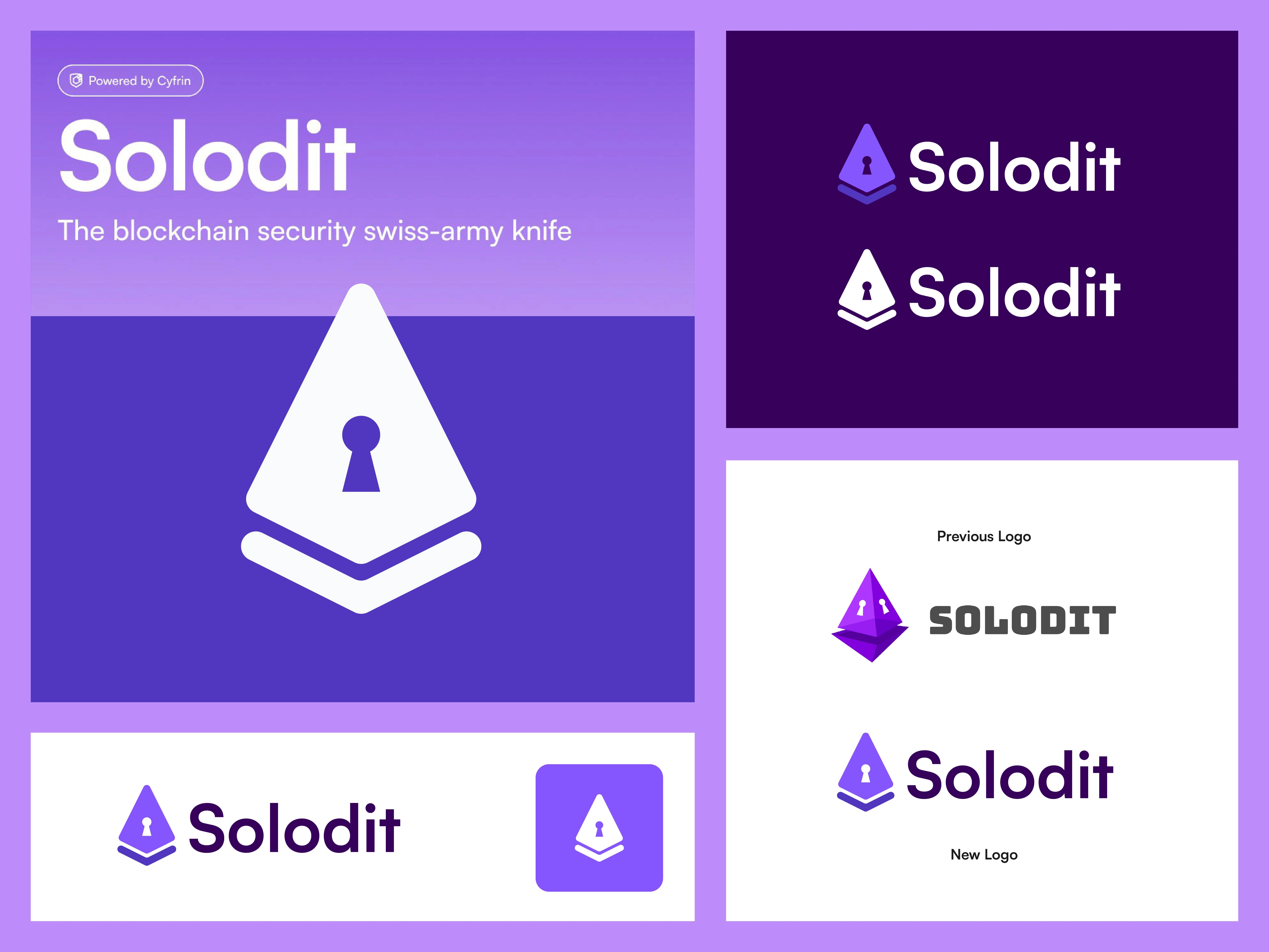
After several round of fine-tuning the concept proportions, we landed on a clean and suiting logo design to replace the previous logo. Fitted nicely together with the other two logos (Cyfrin and CodeHawks).

Light and Dark mode for the Login screen
Logo & identity for the Updraft brand:
After successfully finalizing the Solodit logo, attention turned to Updraft, Cyfrin's sub-brand focused on blockchain education and developer courses. The key challenge here was ensuring the new logo matched the minimalistic, modern approach established with Solodit while complementing Cyfrin’s overall visual system.
1. Cohesion with the Brand System
The goal was to maintain a unified visual identity across all sub-brands. With Solodit finalized, its clean, minimal design served as a benchmark for Updraft.
Color Palette: We carefully analyzed Cyfrin's existing brand palette and selected a color for Updraft that complemented the system without redundancy or clashing.
Design Approach: The logo needed to reflect Updraft’s focus on education and growth, while keeping a clean, professional, and scalable design—avoiding any overly complex details that could compromise its versatility.
2. Concept Development for Updraft
Building on lessons learned with Solodit, I approached Updraft’s logo with:
Simplification: Ensuring the design was minimal and versatile while capturing the essence of upward momentum (symbolizing career growth and education).
Color Exploration: Testing various shades and tones to find one that matched the brand palette, ensuring harmony with Cyfrin, Solodit, and CodeHawks.
Symbolism: Exploring concepts tied to growth, knowledge, and progress, such as upward arrows or abstract elements representing learning paths.
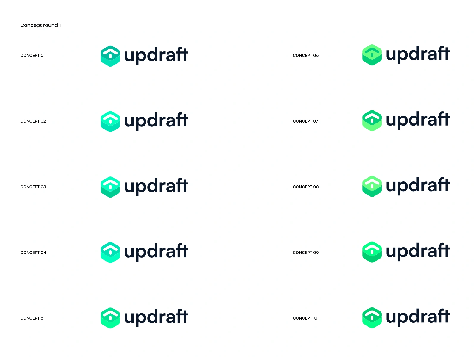
We knew that some sort of 'green' could fit well with the overal brand system. This round showed several elements that were appreciated quickly, hence we proceeded with exploring some deeper on this route.

This had the best match among the explorations. The subtle arrow upwards, along with the green hexagon refering to data and education where a great match.
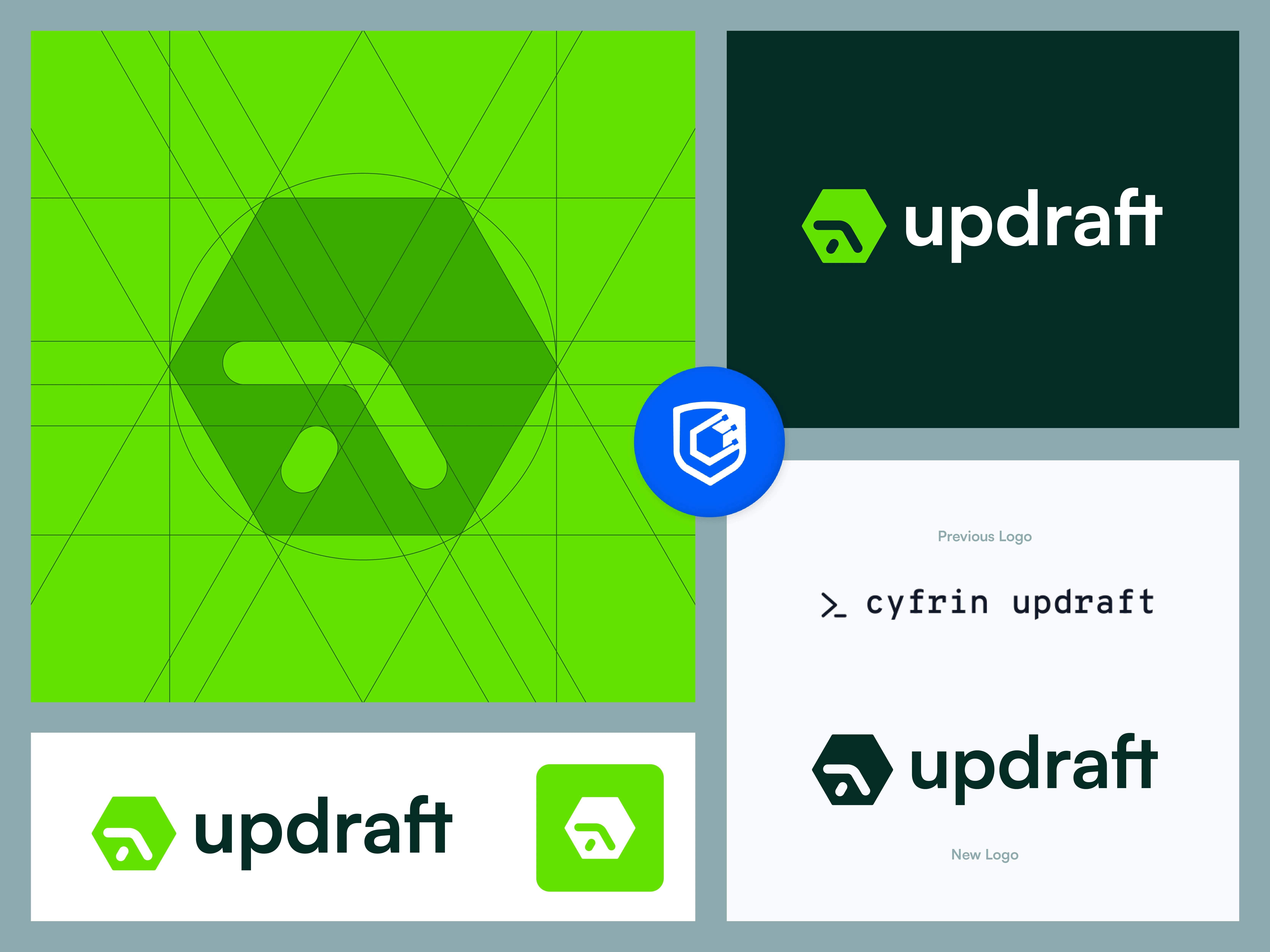
Presentation of the new logo and identity for Updraft along with some technical allignments.
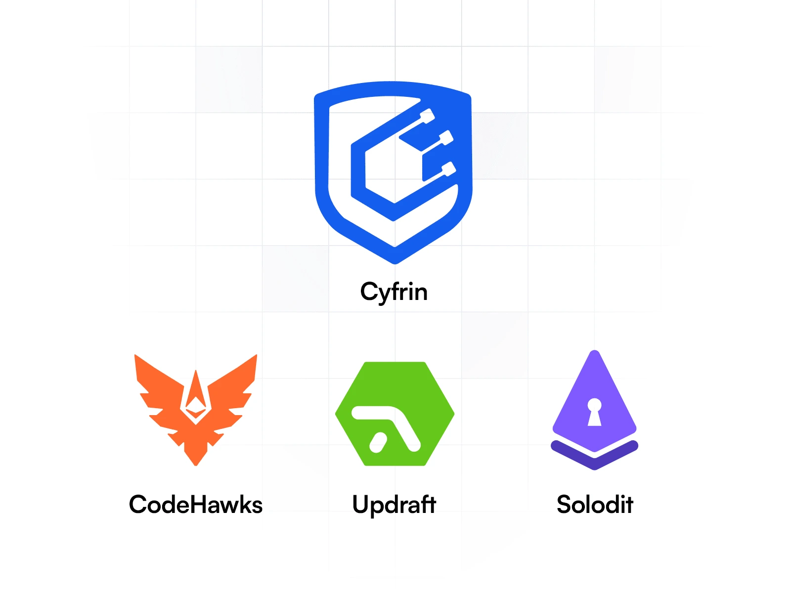
Final presentation with all updated logos - forming a clean and vibrant brand system.
The Cyfrin rebrand demonstrates the power of cohesive design in aligning a company’s visual identity with its mission. The new logos for Updraft and Solodit not only solve previous challenges but also set the stage for Cyfrin’s ambitious future.

Like this project
Posted Nov 22, 2024
Redesigned logos for Cyfrin’s Updraft and Solodit, creating a cohesive, modern brand system with minimal, versatile designs and aligned color palettes.
Likes
3
Views
46
Clients
Cyfrin


