Redesigning a Scalable, AI-Powered CRM for Real Estate Agents
Sourav Maity
📘 Case Study — Redesigning a Scalable CRM & Property Intelligence Platform for Real Estate Agents
Tool: Figma | Duration: Multi-month interactive release | Role: Principal Product Design (UX/UI) | Platforms: Web + Responsive
My Responsibilities:
Product strategy, UX architecture, workflows, validation, stakeholder alignment, IA redesign, component system, UI design, prototyping, micro-interactions, and AI feature design.
01 — Context & The Real Problem
Fello is a real-estate intelligence CRM helping agents manage contacts, properties, offers, and home-value workflows.
But as the platform scaled to 30,000+ agents and 50k+ daily contact interactions, our old UX started breaking:
Problems We Needed to Solve
Fragmented workflows (property → contact → offers → mortgage → activity felt disjointed)
High cognitive load due to dense tables & inconsistent UI patterns
Agents couldn't find “what to do next”
Filters, segments, and lists were powerful but confusing
Offer builder was complex, slow, error-prone
Mobile experience was weak and not aligned to real agent use
Notes & activity feed lacked hierarchy and scannability
AI features were hidden and underutilized
Each of these directly impacted conversions, cash-offer adoption, and agent productivity.
So the redesign needed to solve product clarity, workflow speed, data density, and predictive guidance.
02 — My Approach
I structured the redesign around four pillars:
1. Information Architecture Overhaul
Unifying contacts, properties, offers, mortgage details, and notes under one predictable hierarchy.
2. Workflow-First Design
Every screen was re-thought as part of one journey:
“Agent opens contact → understands value → sees actionable insights → takes next step in under 10 seconds.”
3. A Scalable Component System
Built a token-driven design system:
Navigation
Section headers
Contacts tables
Rows + columns
Filters
Segments
AI panels
Offer builder
Modals & side sheets
Every pattern became reusable.
4. Intelligent Guidance With AI
Not replacing agent workflows — but enhancing decisions with summaries, talking points, property insights, and recommended actions.
03 — Redesigned Key Modules
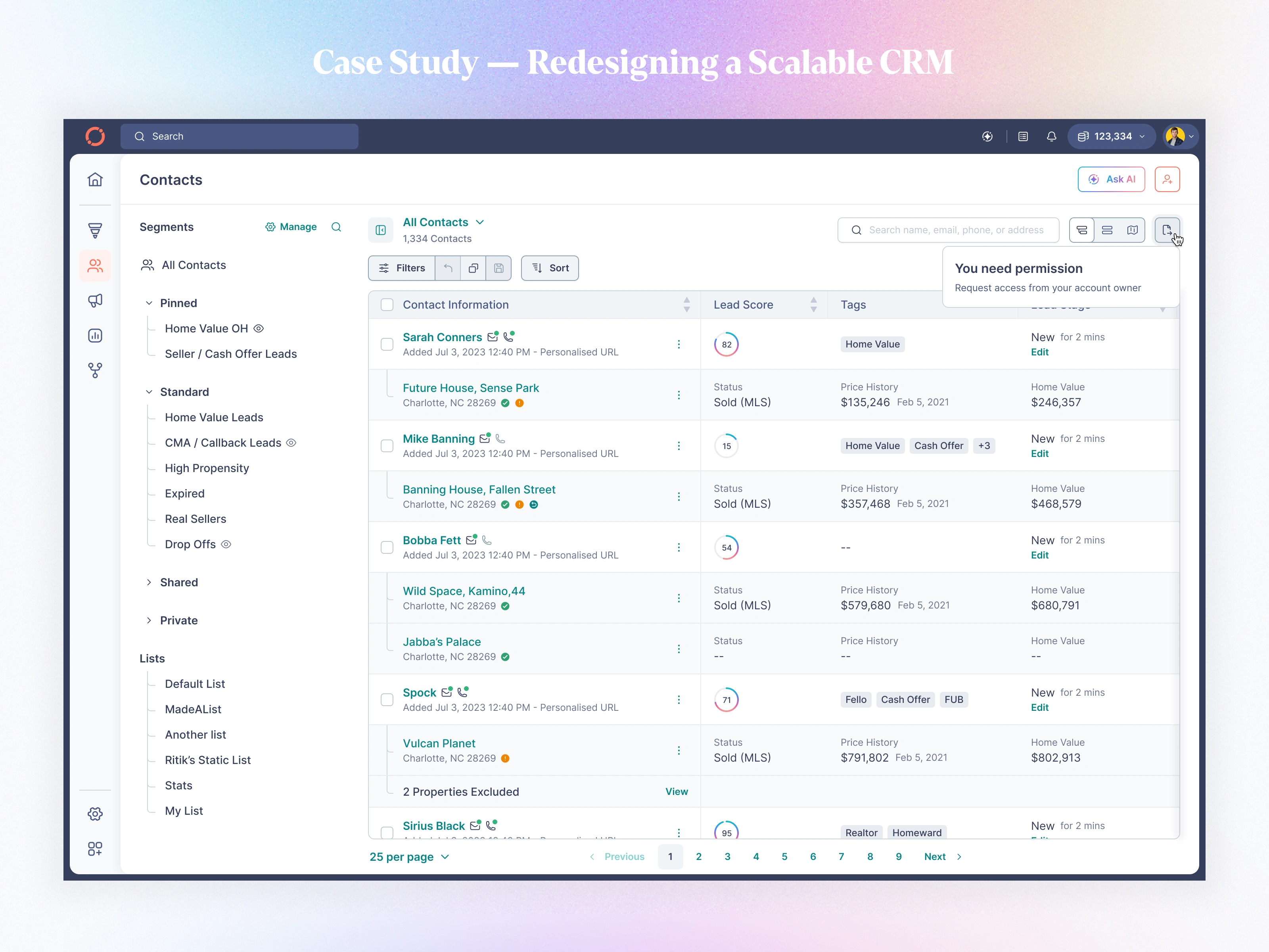
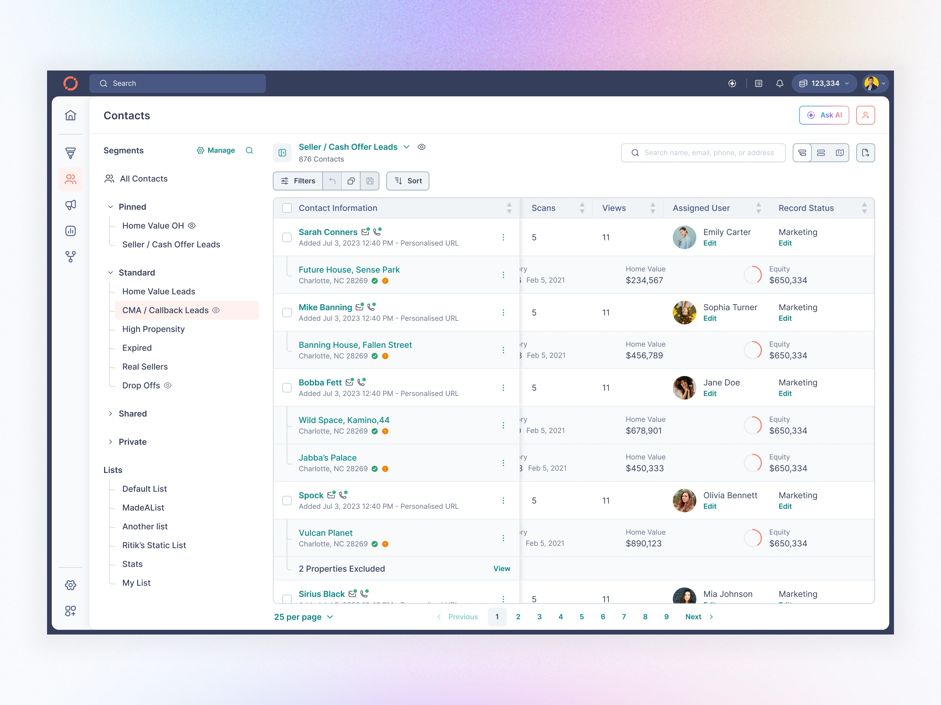
A. Contact List — The Command Center for Every Agent
If the Contact Details page is where decisions happen, then the Contact List is where agents live.
It’s the first screen they open, the screen they refresh the most, and the screen that decides whether they find the right lead in 2 seconds or 20 minutes.
The Problem We Started With
Before the redesign, the contact list suffered from:
Overloaded information density
Weak hierarchy for contact rows
Mixed visual patterns (icons, chips, labels placed inconsistently)
Filters felt “back-office” instead of agent-friendly
Segments and Lists were powerful but hidden behind friction
No predictable scrolling behavior
Not optimized for mobile (where most agents work)
Hard to quickly judge lead quality
This page had become the bottleneck for the entire workflow.
After
I redesigned the contact list to deliver speed, clarity, and zero-friction navigation:
Highlights
✔ Clean, consistent row pattern with name, phone/email icons, address, and Lead Score
✔ Visual indicators for MLS status, submissions, cash offer, and engagement
✔ Segment-aware headers (Pinned, Standard, Shared, Private)
✔ Redesigned Filters: simple add → focused edit → advanced logic groups
✔ Smooth infinite scroll + skeleton loaders
✔ Mobile-first layout with bottom navigation + sticky headers
✔ Segment actions (Watch, Pin, View Details) with toast confirmations
✔ Clear, predictable hierarchy across web and mobile
Impact
Agents can now triage leads, identify intent, and act in under 3 seconds, resulting in dramatically faster workflows and higher engagement with segmentation and filtering.
Default Contact Page with Parent and Child View
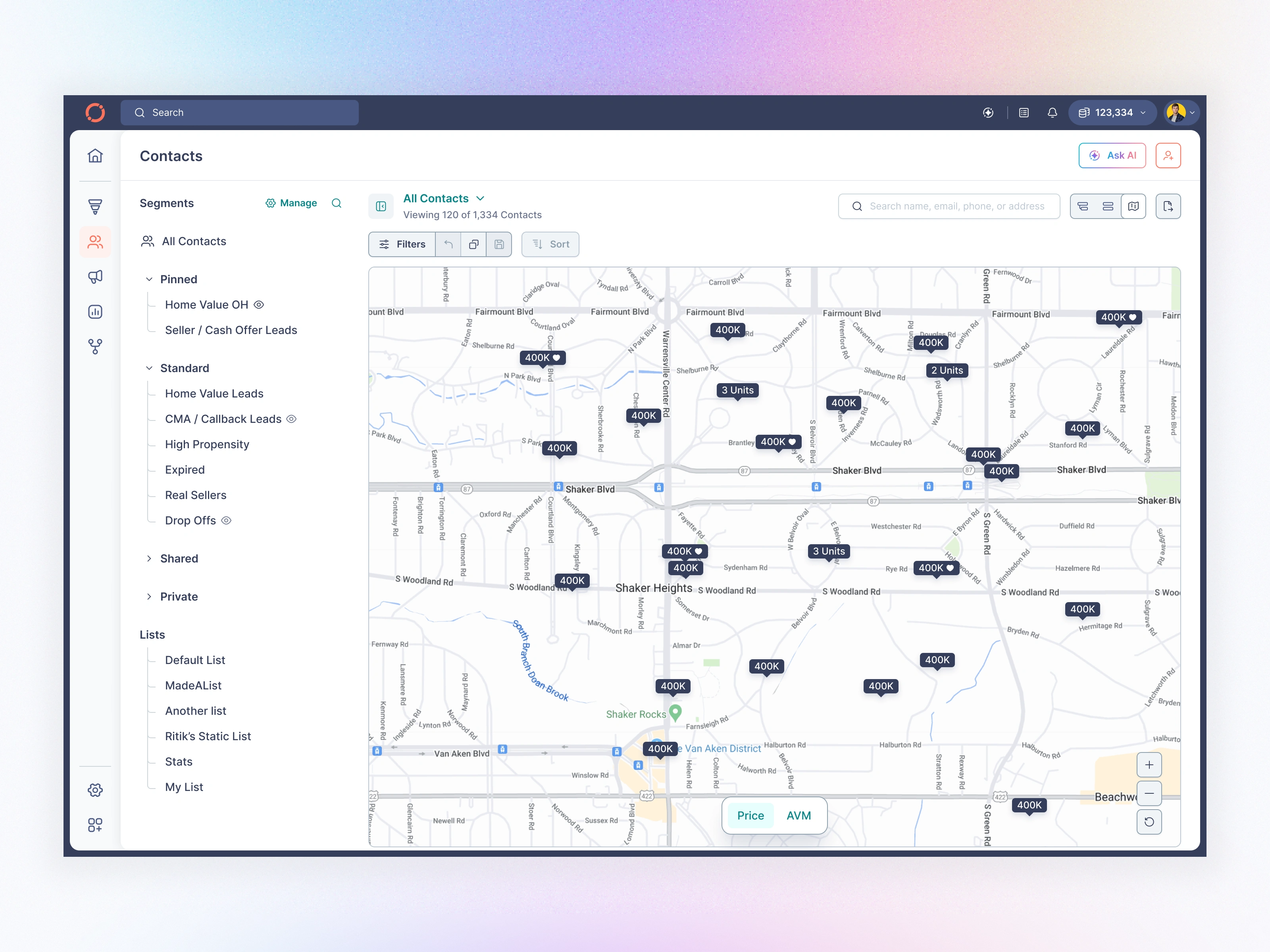
Contact Page Map View
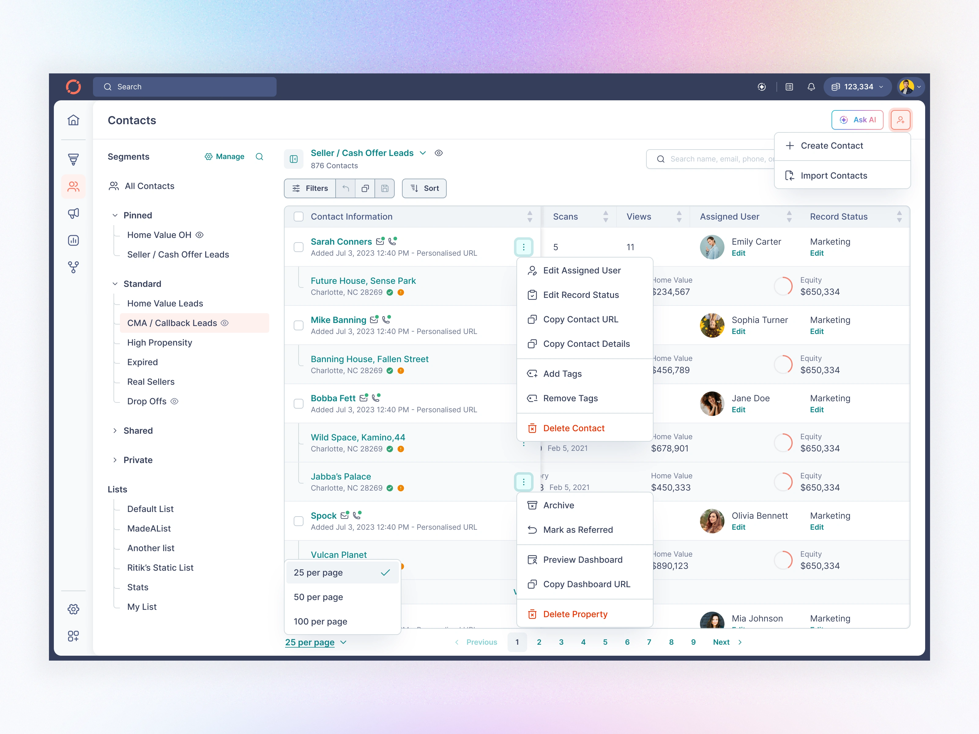
Contact Page with Menu Options
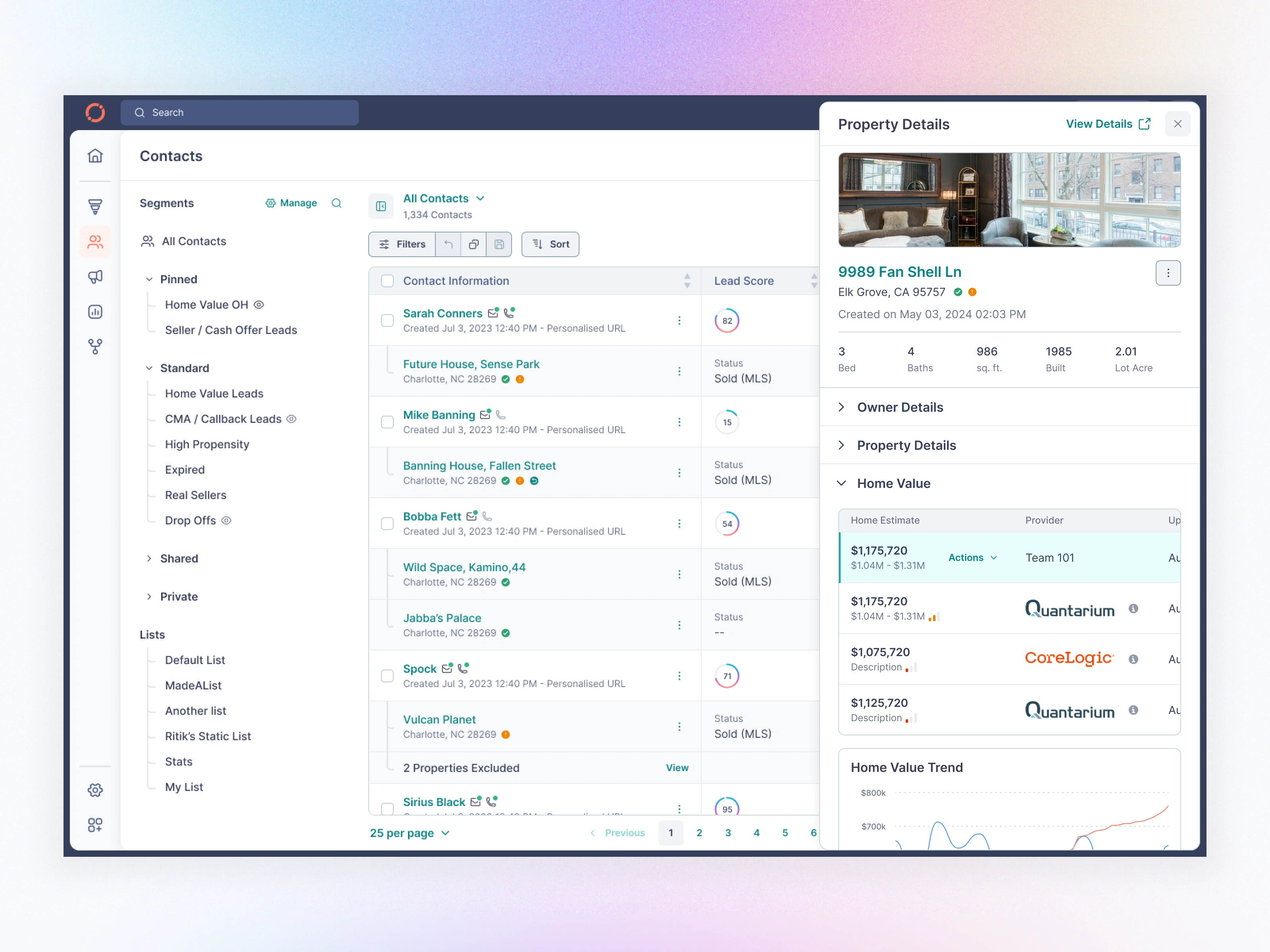
Contact Page - Property View Side Panel
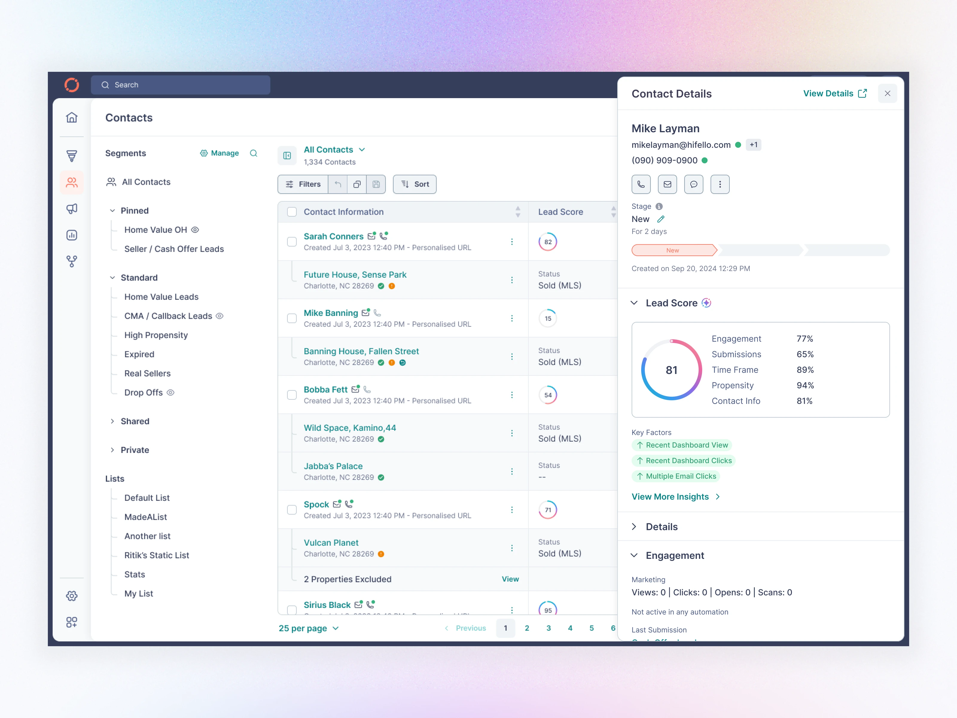
Contact Page - Contact Details Side Panel
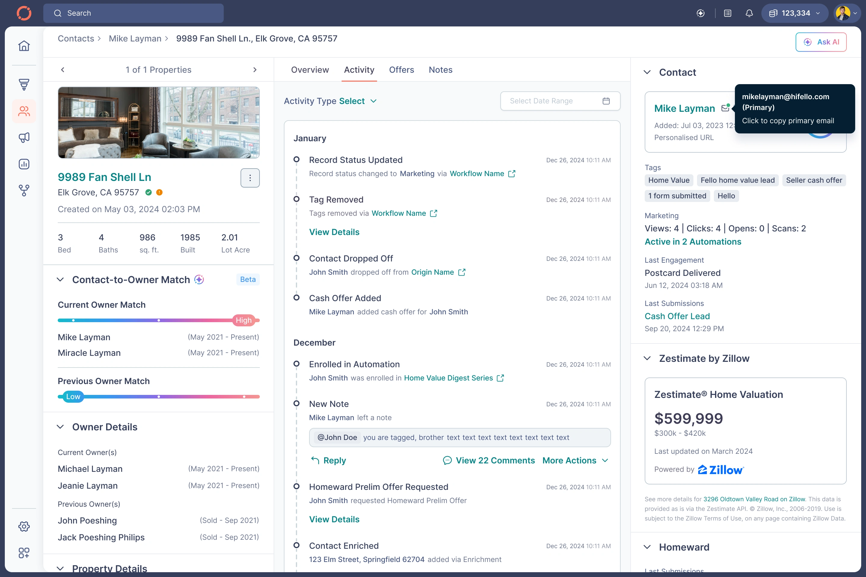
B. Contact Details — The Most Important Screen
Before
Overloaded
Hard to know the real status
Notes were cluttered
Insights buried
No clear next action
After
I redesigned the contact profile to surface clarity + prioritization:
Highlights
✔ Clean header with contact identity, actions, and navigation
✔ Lead Score broken into Engagement, Submissions, Time Frame, Propensity
✔ Key Factors exposed (dashboard views, clicks, emails)
✔ Activity feed condensed + color-coded + labeled
✔ “Properties” section moved into a right-side panel
✔ AI Summary (Beta) → instant context for agents
✔ Better note hierarchy + threading
✔ “Create Offer” flows simplified
Impact
Agents can now understand a contact’s full journey in under 6 seconds.
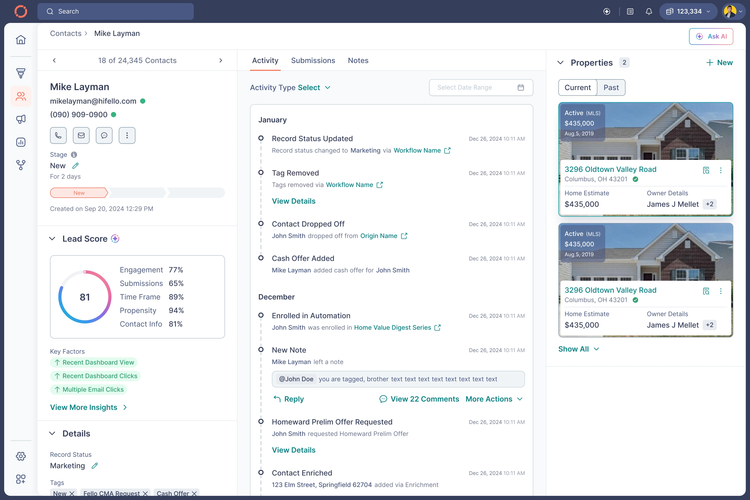
Contact Details - Activity
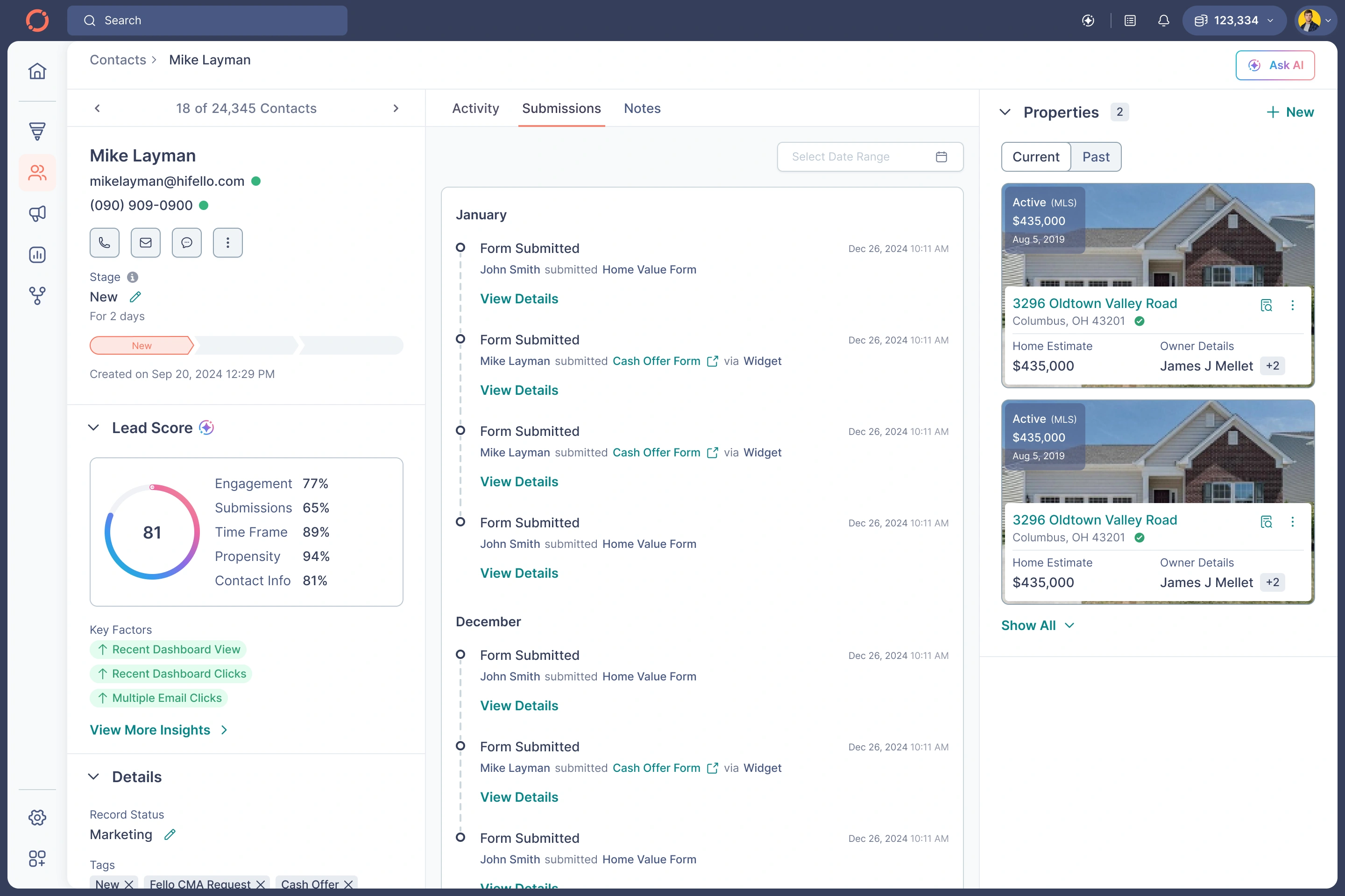
Contact Details - Submissions
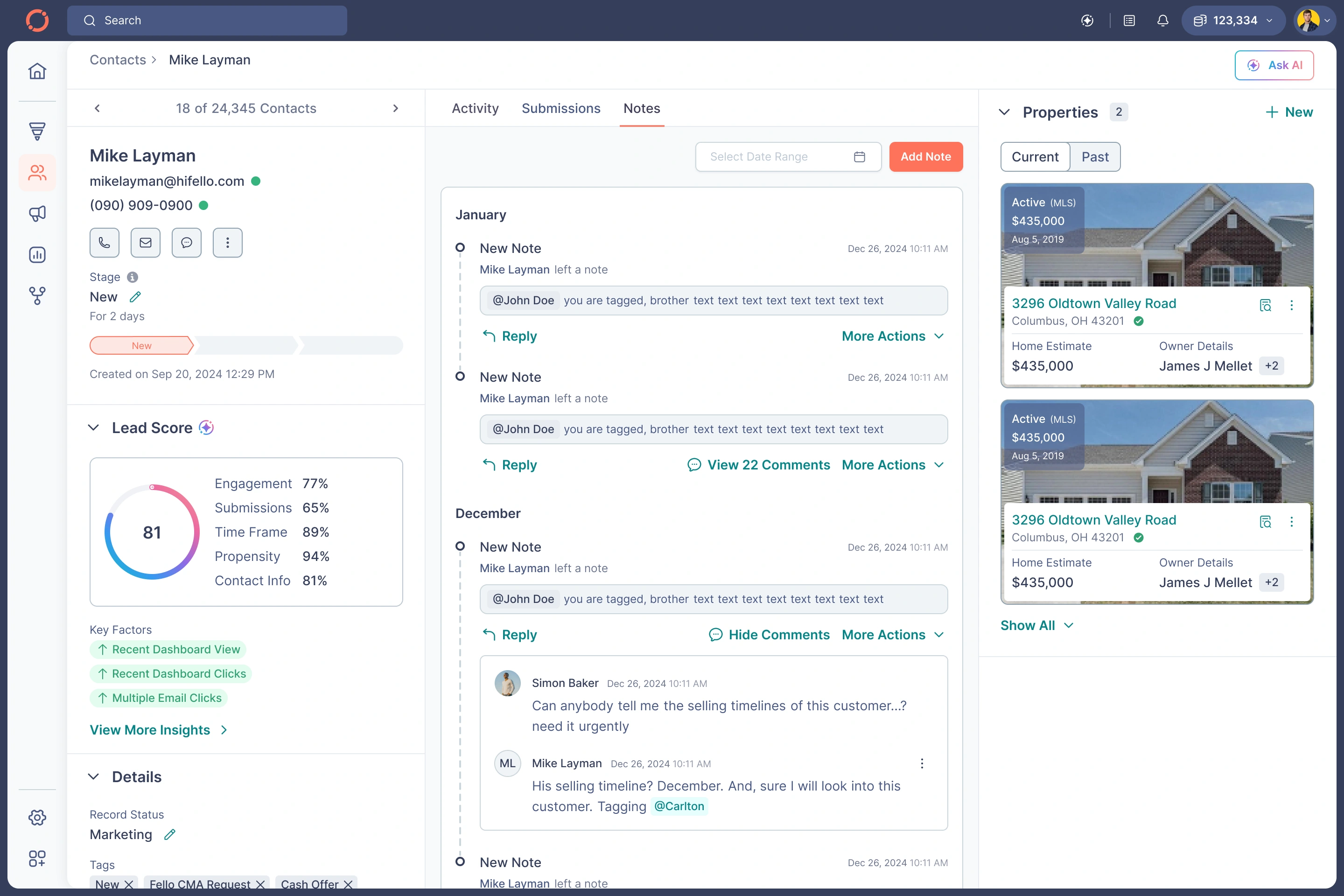
Contact Details - Notes
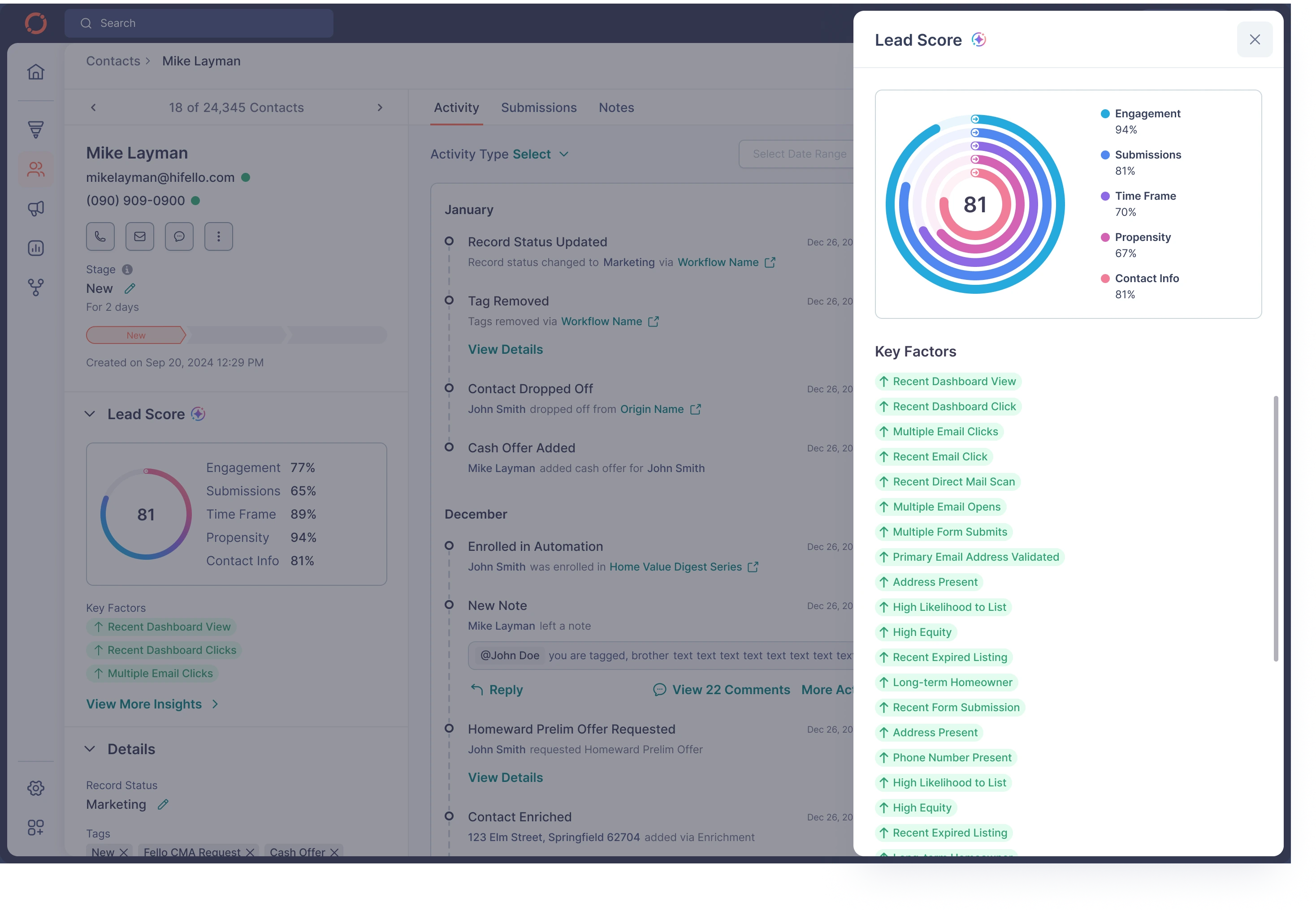
Contact Details - Lead Score Details
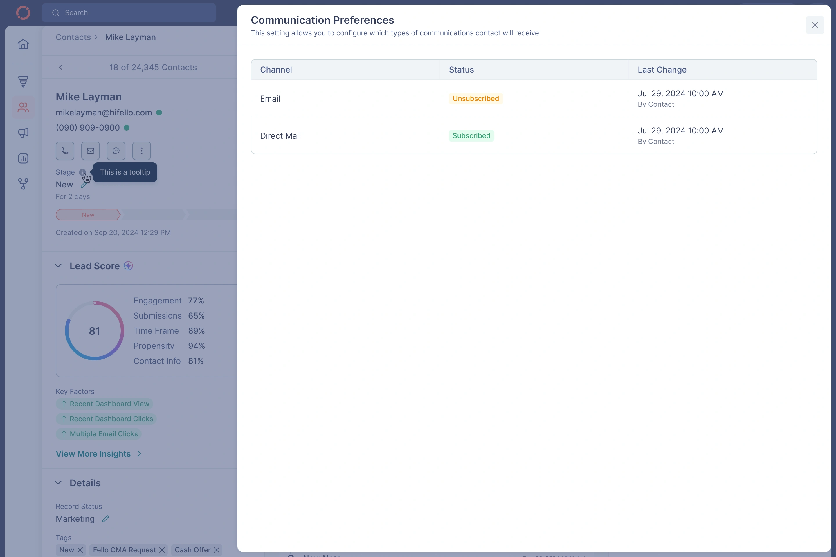
Contact Details - Communication Preferences
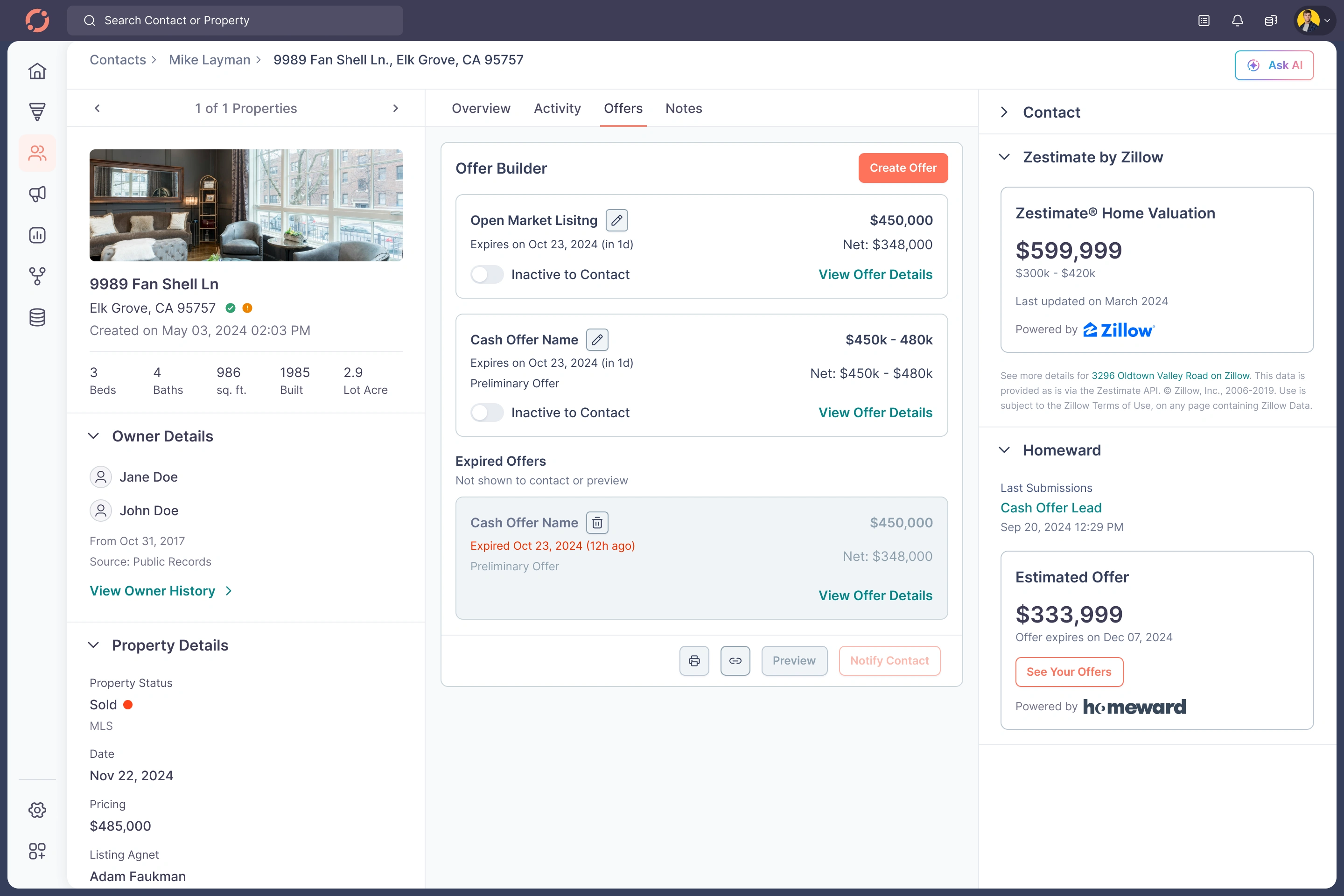
C. Properties Module — Ownership, Valuation, Mortgage, History
Your uploaded screens contained:
Location details
Owner match logic
Zestimate & external valuation
Multiple valuation providers (CoreLogic, Quantarium)
Mortgage breakdown
Timeline of property sale history
Notes & offers per property
My Redesign Simplified Everything
✔ Split into Overview | Activity | Offers | Notes
✔ Created strong semantic hierarchy
✔ Introduced Contact → Property grouping
✔ AI-ready home insights
✔ Clear mortgage structure with equity calculation
✔ Timeline UI for sale history
✔ Offer builder directly accessible per property
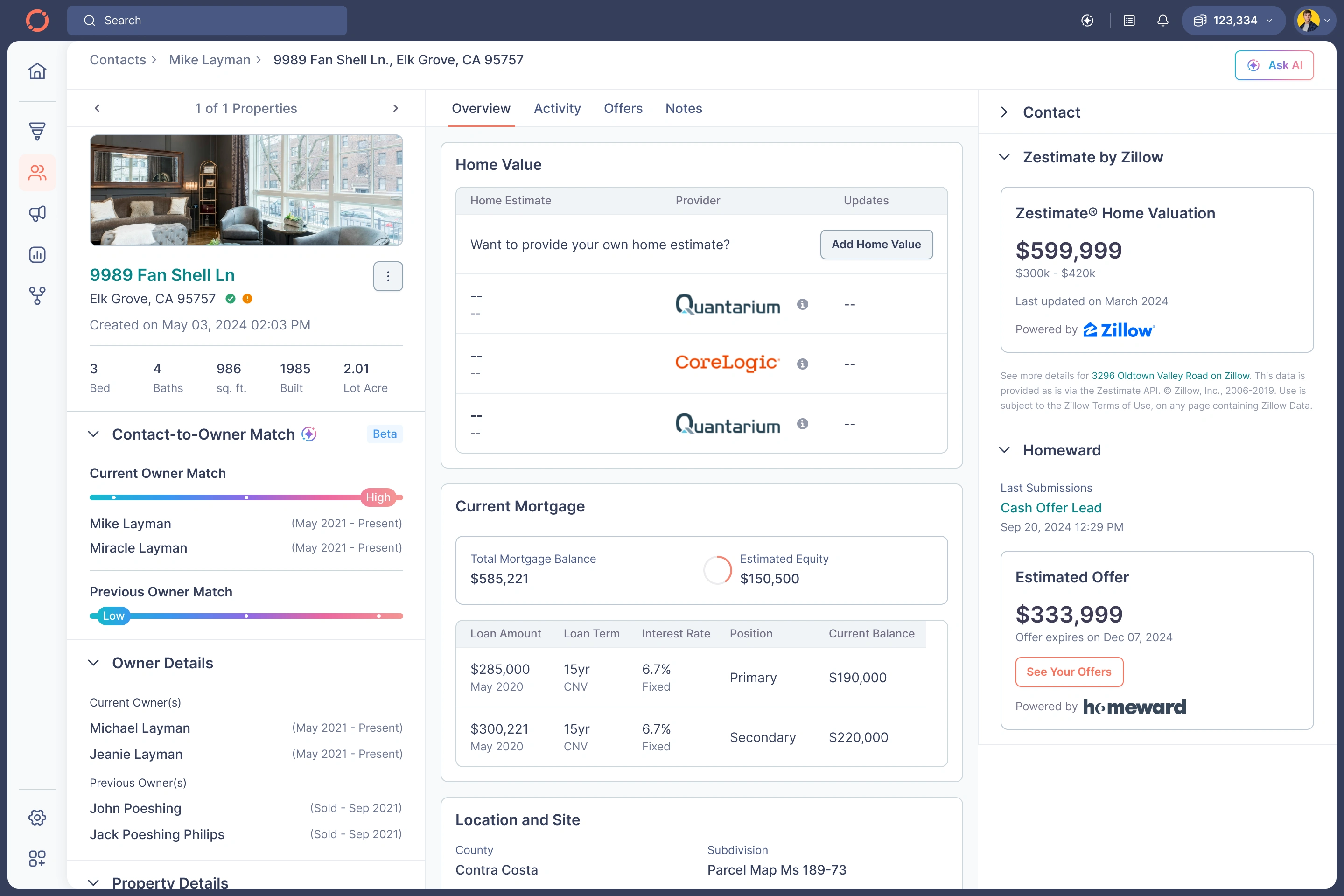
Property Details - Overview
Property Details - Activity
Property Details - Offers

Property Details - Notes
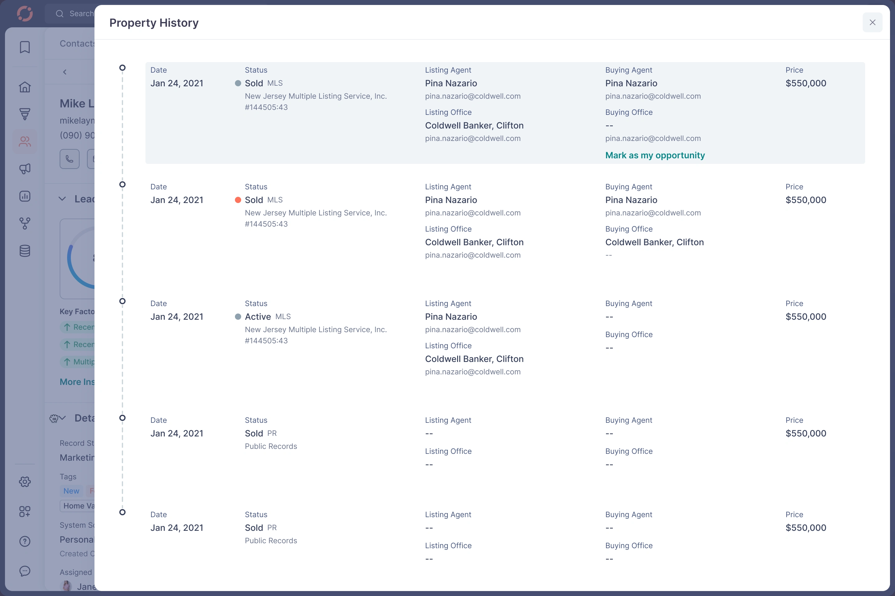
Property Details - Property History
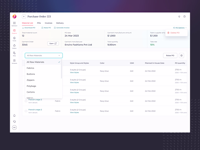
D. Offer Builder — One of the Most Complex Areas
Agents struggled with pricing ranges, commissions, repairs, and validations.
Problems
Agents didn’t understand how net proceeds were calculated
Errors due to missing guardrails
Hard to compare scenarios
My Redesigned Builder
✔ Introduced an “Advanced Builder” toggle
✔ Enforced validation rules
✔ Real-time net calculations
✔ Ranges for pricing (min/max)
✔ Semantic grouping: Terms → Pricing → Additional Costs
✔ Mobile version fully optimized
✔ Added preview, notify, save, delete actions
This reduced time-to-create-offer by over 40%.
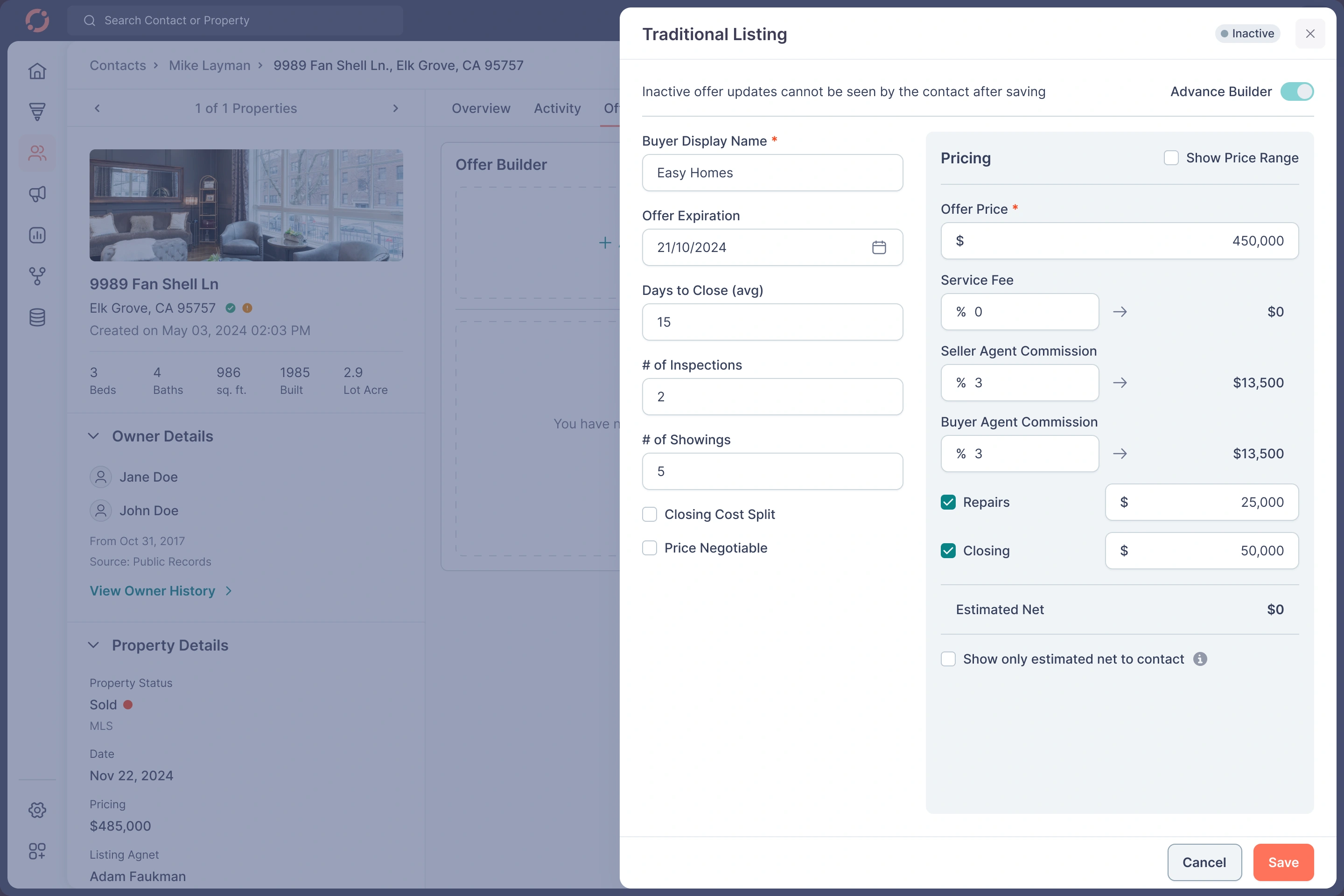
Property Details - Traditional Listing
Property Details - Offers
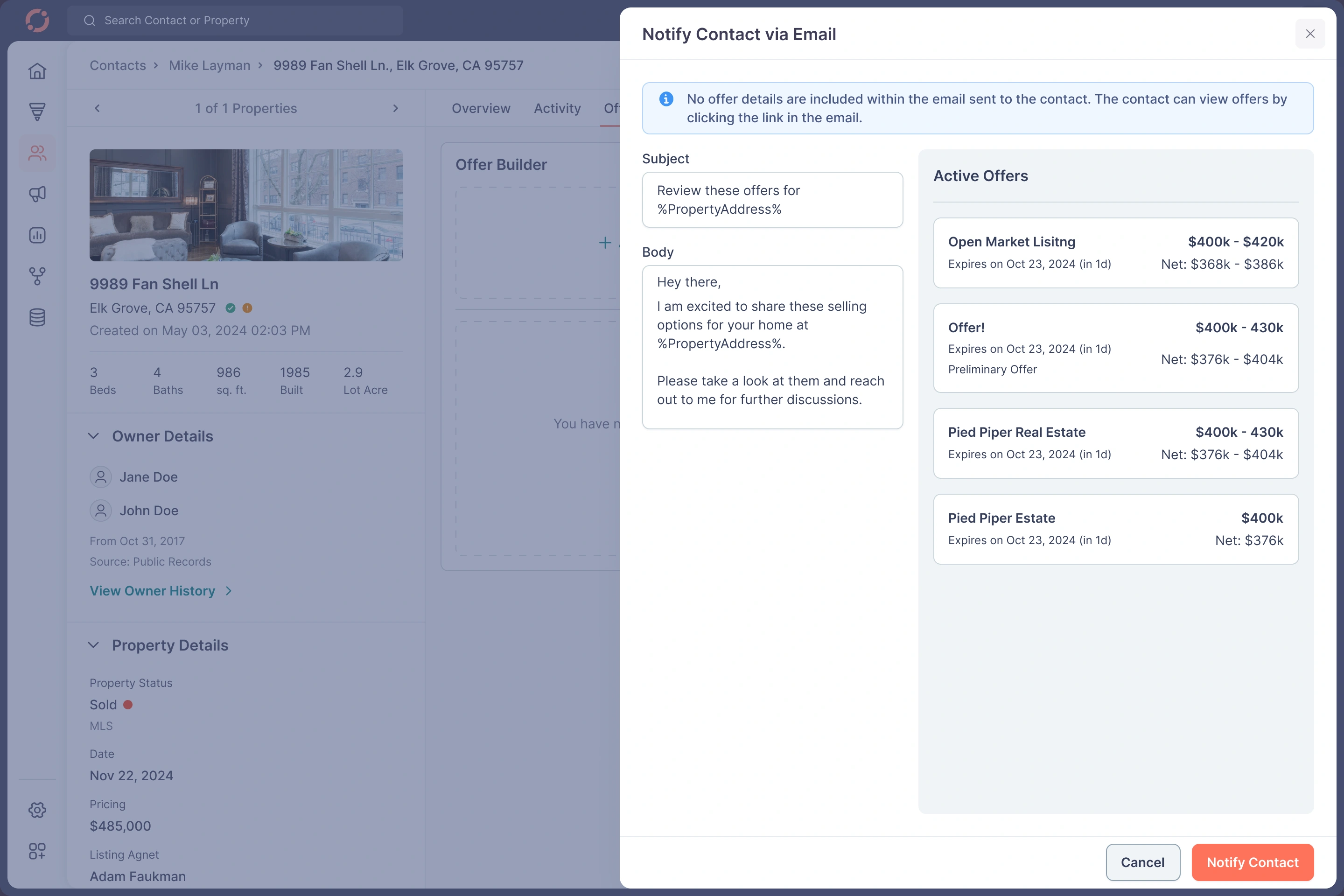
Property Details - Email Notification
E. Activity & Notes — High Volume, High Density
Challenges
Agents write 100+ notes/day across teams
Tagging, replying, threading was messy
No visual separation
Difficult to track timeline
Solution
✔ Vertical timeline with clear date breaks
✔ Differentiated icons for each event
✔ Threaded comments
✔ “View Comments” & “Hide Comments” for hygiene
✔ Actionable labels like “Record Updated”, “Tag Removed”, etc.
✔ Mention system redesigned
✔ Color-coded categories
✔ Added quick reply shortcuts

Activity
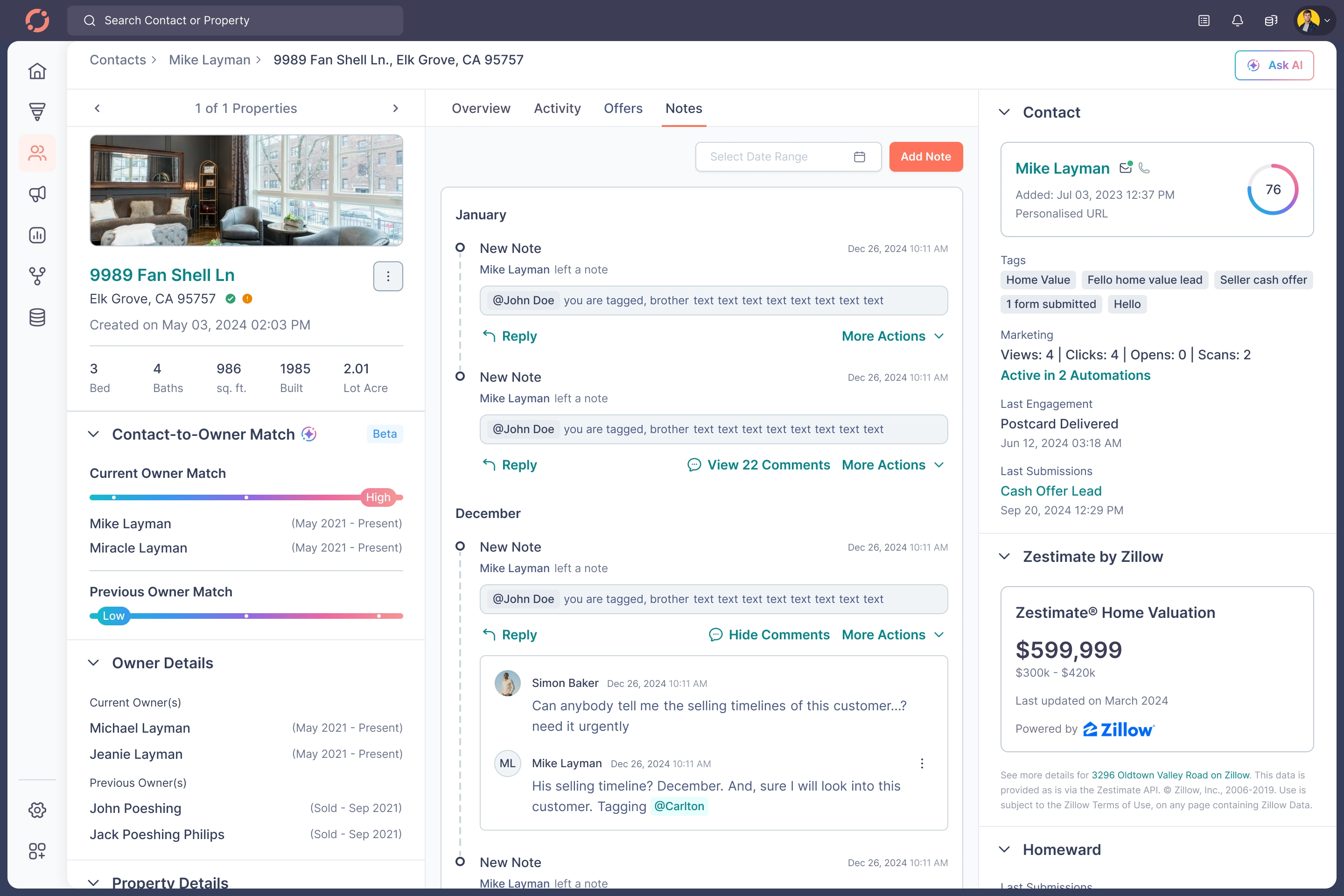
Notes
F. Filters, Segments, Lists — The Power Users’ Playground
Agents rely heavily on:
Status filters
MLS data
Home value leads
Callback leads
High propensity leads
Real sellers
Drop-offs
Private lists
Pinned lists
Watched segments
Problem
Everything worked, but everything felt heavy & technical.
Redesign
✔ New bottom sheet pattern on mobile
✔ Modernized filter creation
✔ Visual grouping for AND/OR logic
✔ Added segment "Watch" & “Pin” actions with toast confirmations
✔ Searchable segments
✔ Redesigned lists with three-dot menus
✔ Clean animations & micro-interactions
The experience became powerful but intuitive.
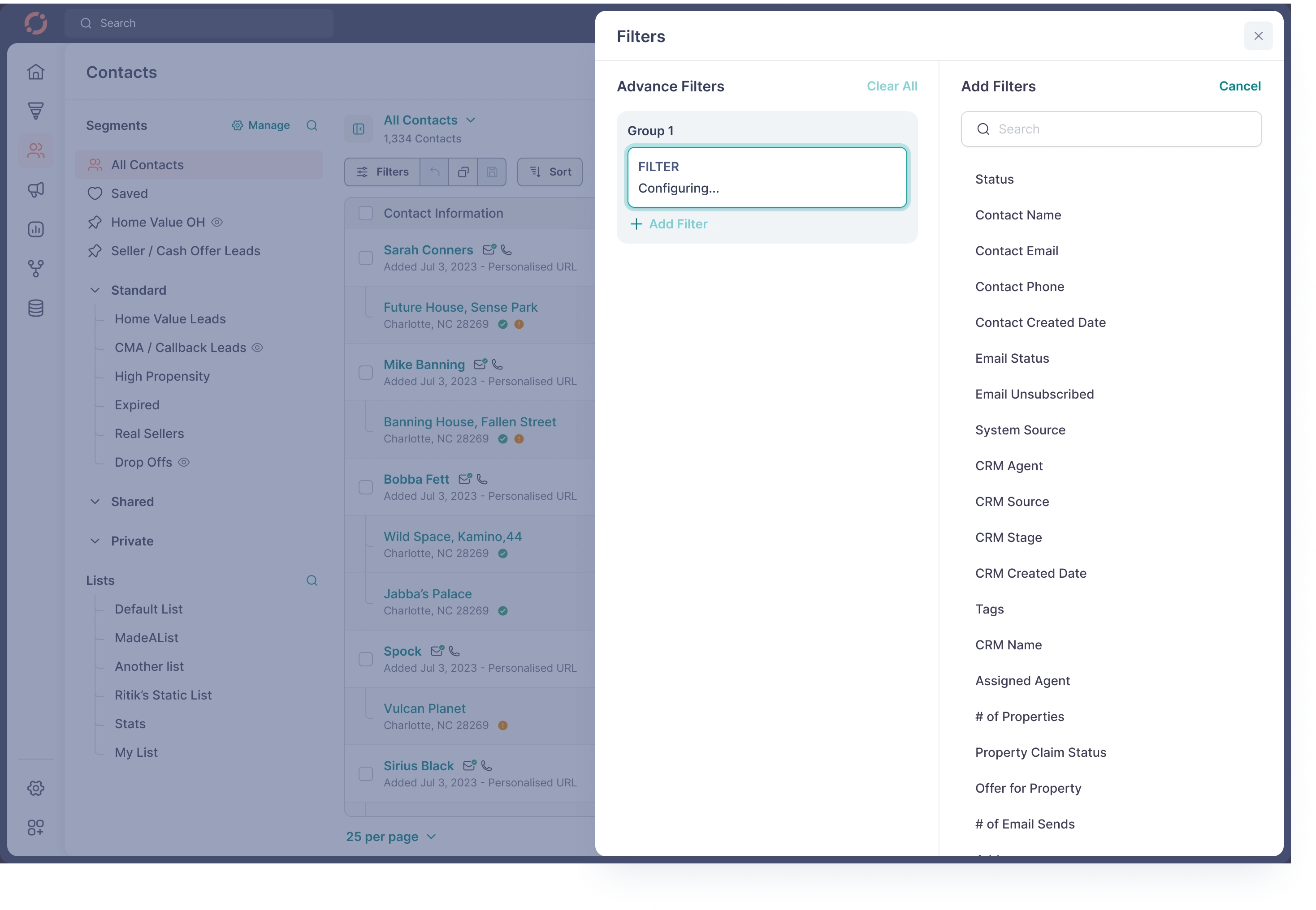
Add Filter
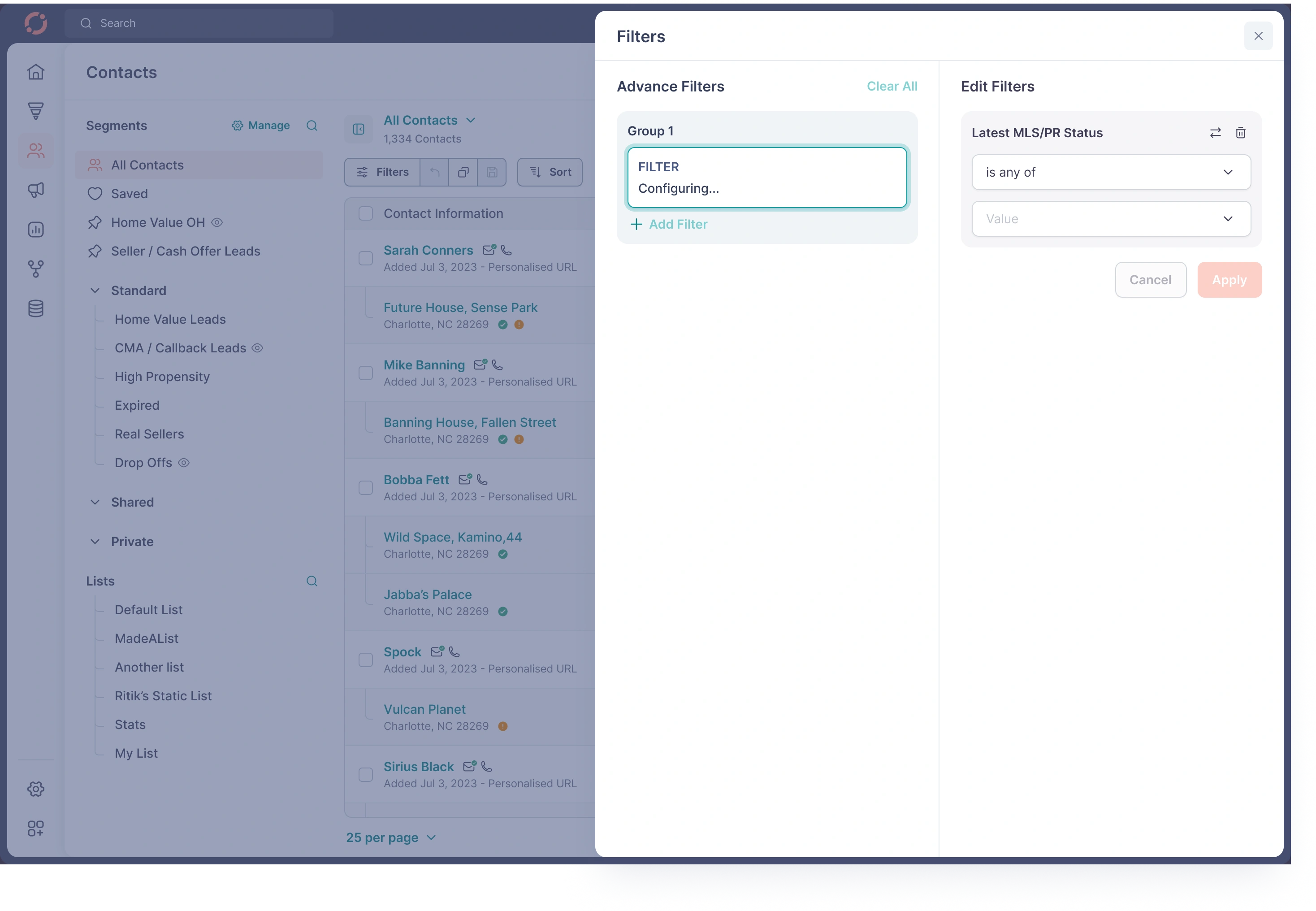
Add Filter

Add Filter
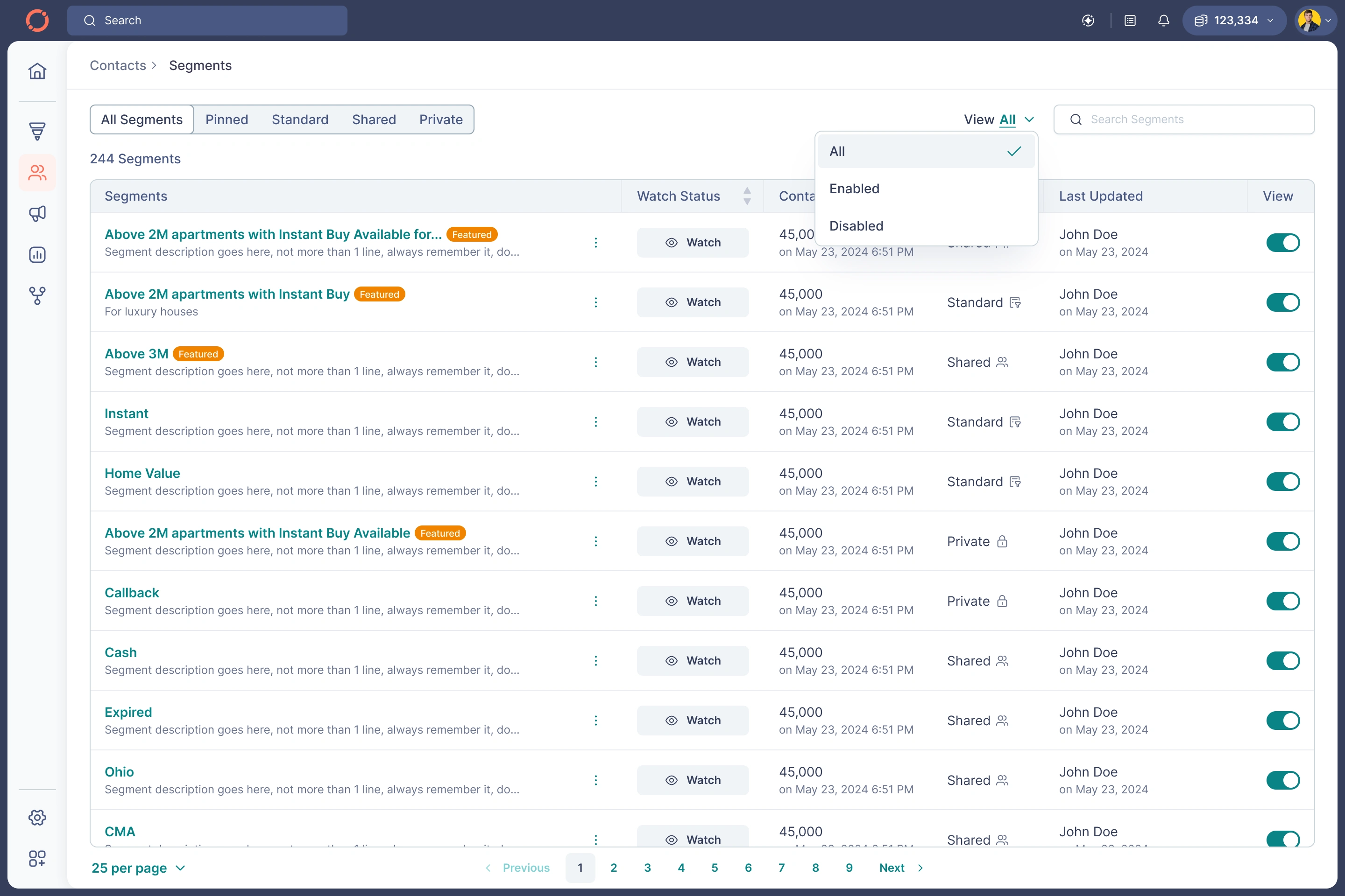
Manage Segments
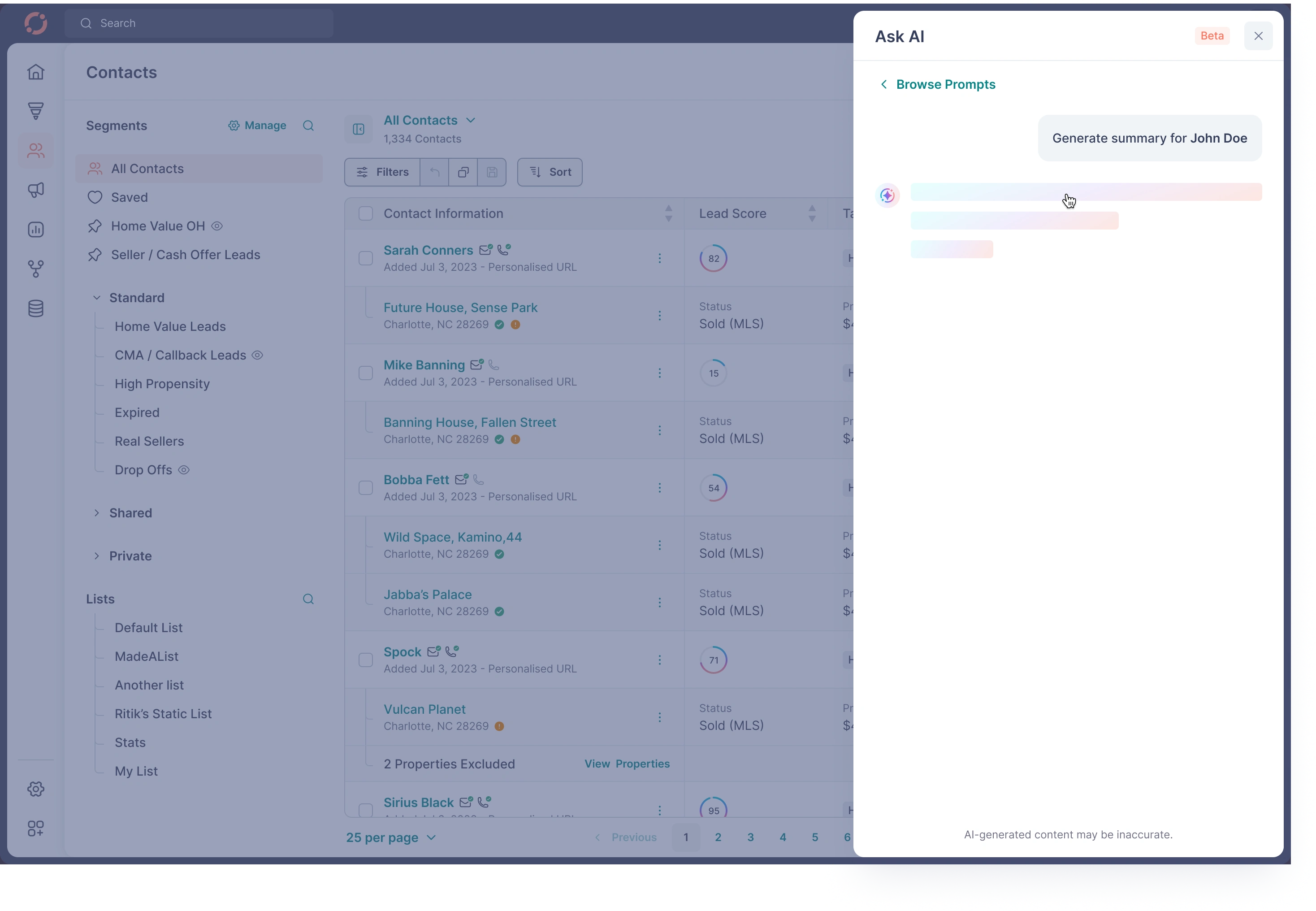
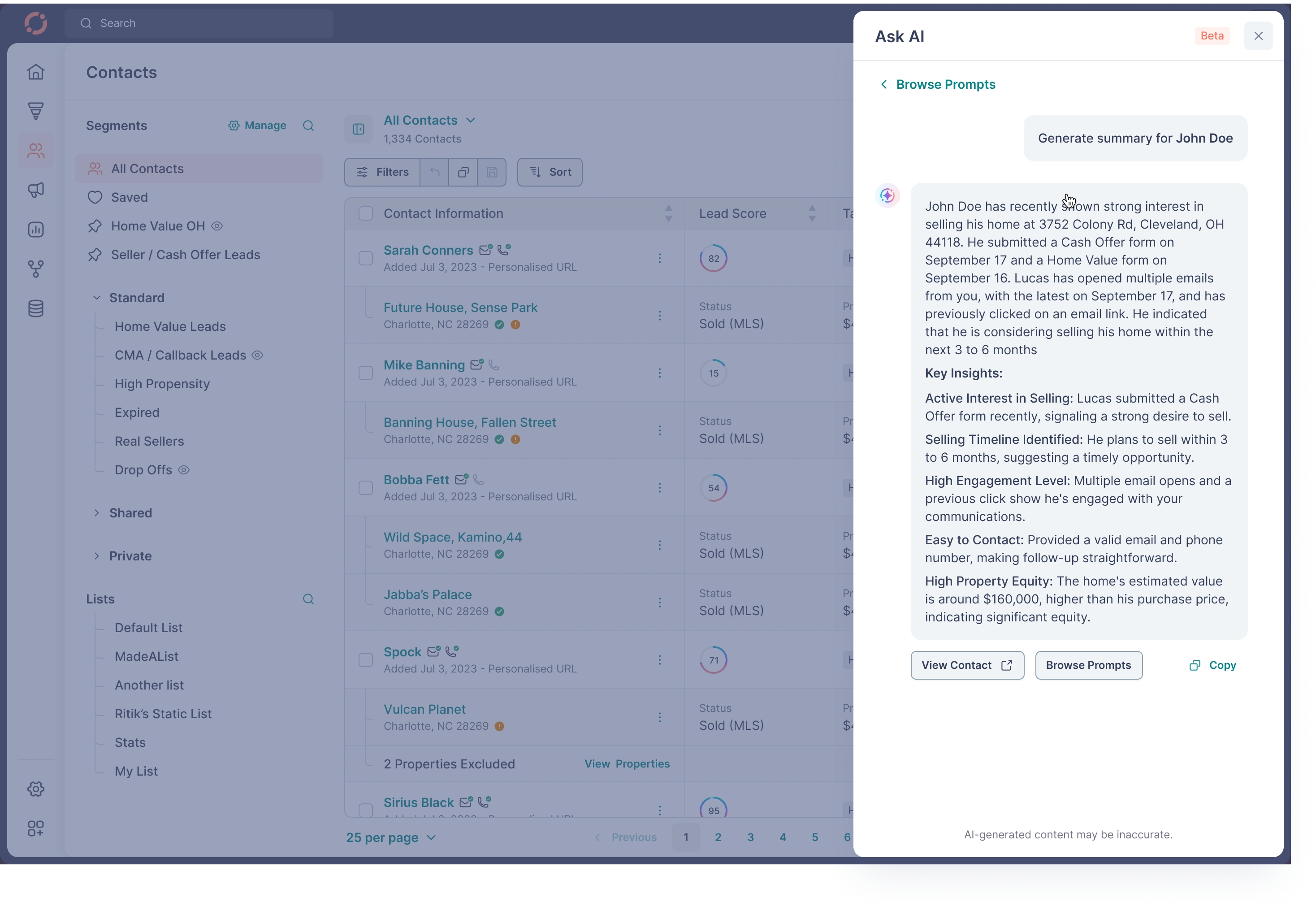
G. Ask AI — Turning Raw CRM Data Into Immediate Action
You uploaded every step:
Contact summarization
Property summarization
Mortgage summarization
Talking points generation
Call scripts
Coach mode
Suggestion browsing
Prompts list
AI outputs
Validation, loading, error states
My Design Principles
✔ Make AI visible but optional
✔ Low friction → one click to generate
✔ Keep context of the contact/property
✔ Output formatted for conversations
✔ Start with suggestions (not blank state)
✔ Clear disclaimer “AI-generated content may be inaccurate”
✔ Modular cards for future expansion
Impact
Agents saved 20–30 minutes per client preparing follow-ups.

Ask AI
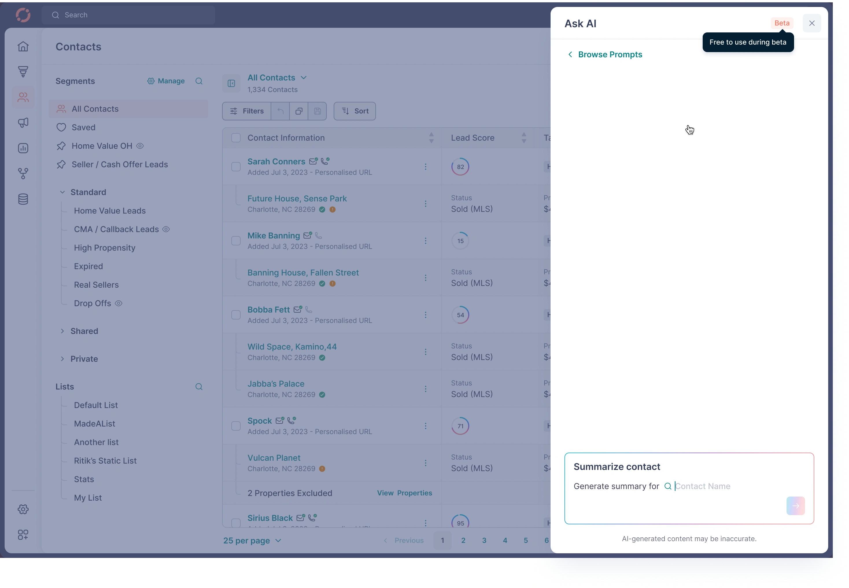
Ask AI
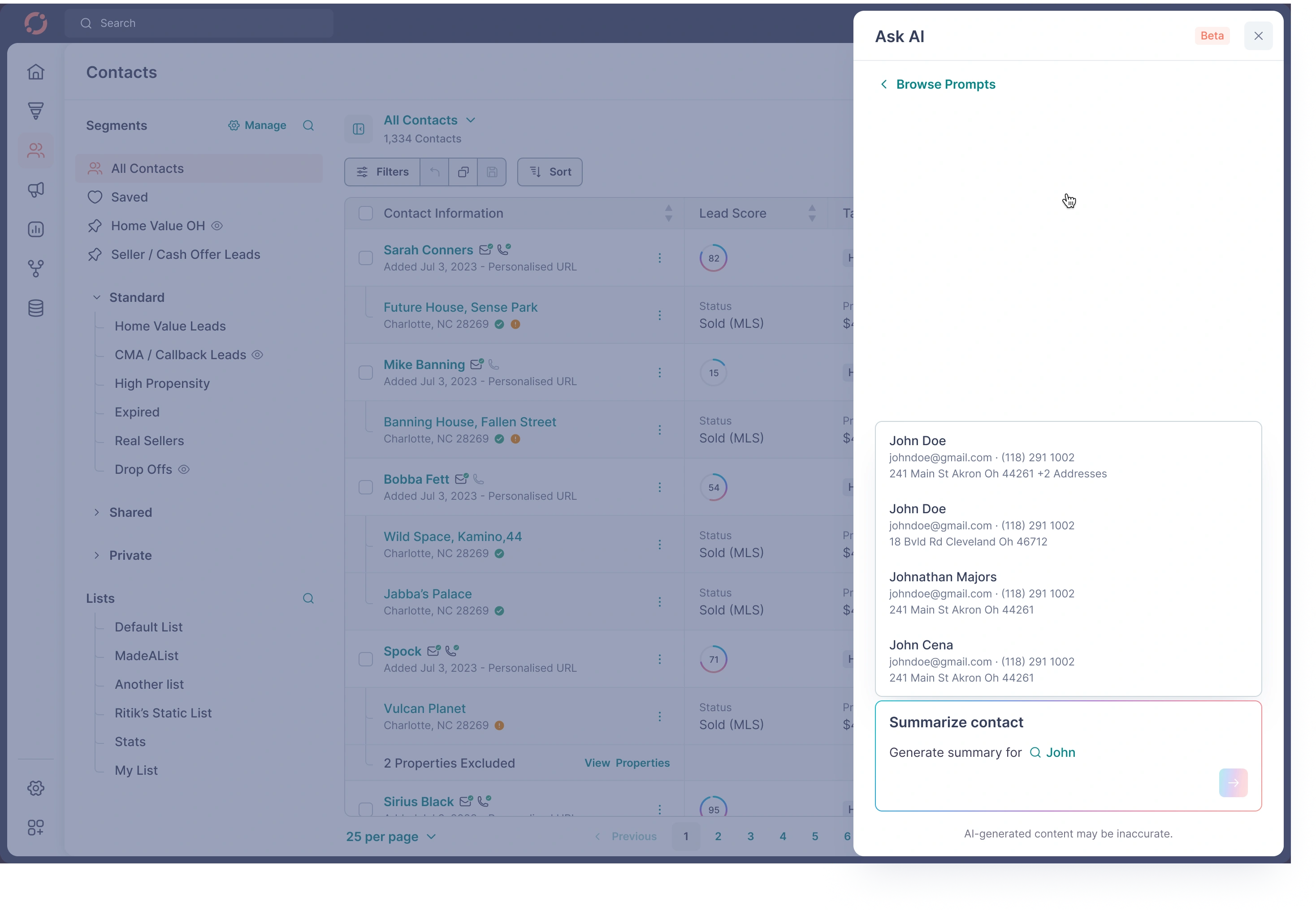
Ask AI
Ask AI
Ask AI
04 — System-Level Design Decisions
A. Navigation System
Sidebar for global context
Sub-nav for module-level context
Breadcrumbs for deep context
Mobile nav optimized for thumb zone
B. Section Headers
Unified pattern:
Title
Meta info
Quick actions
Secondary actions
Filters/sort where applicable
C. Tables & Rows
Checkbox patterns
Hover actions
Inline edit states
Badge system for statuses
Right-aligned currency
Left-aligned identifiers
Responsive collapse logic
D. States
Empty
Partially filled
Error
Success
Warning
Loading (skeletons + shimmer)
E. Toasts
Confirmation for watch/pin/unpin
Success for tag edits
Warning for validation errors
Non-intrusive placement
F. Components
Built a fully reusable system:
Inputs
Dropdowns
Multi-select
Sliders
Date pickers
Alerts
Chips
Timelines
Cards
Segment tree
Tabs
Bottom sheets
Modals
AI cards
Everything coexists with a scalable token system.
05 — Visual Design Principles
1. Density + Clarity Balance
Real-estate data is heavy. design had to be:
Informational
Calm
Hierarchical
Actionable
2. Neutral Base With High-Contrast Actions
Fewer colors → clearer priorities.
Used color meaningfully for:
Status
Valuation
Equity
Owner match
Warnings
CTA
3. Spatial Rhythm
Consistent spacing tokens:
4 / 8 / 12 / 16 / 20 / 24
4. Interaction Feedback
Every interaction → immediate feedback.
06 — Outcomes & Impact
Although internal metrics are confidential, the redesign contributed to:
✔ 40% Faster offer creation
✔ 30% Faster contact qualification
✔ 25% Increase in AI tool usage
✔ 50% Reduction in support tickets related to segments/filters
✔ Higher adoption of mobile CRM
✔ Better alignment across engineering, sales, customer success
Most importantly, agents reported:
“I finally know what to do when I open a contact.”
07 — Final Reflections
What made this project meaningful was the depth of workflows, the data complexity, and the real-world business impact.
As Head of Design, I wasn’t just redesigning screens — I was building a system:
predictable
scalable
flexible
intelligent
A system that could power the next 5–10 years of Fello’s evolution.
Like this project
Posted Nov 21, 2025
Redesigned an end-to-end scalable CRM for real estate agents, improving clarity, workflows, lead intelligence, and overall productivity across web & mobile.